Blue paint colors
2,171 colors, 21 brands
Blue is the color people reach for when they want a room to feel calm, but it is also one of the trickiest families to get right on a wall. The word covers everything from a barely-there sky tint to an inky navy, and the same swatch can read soft and serene in one room and cold and gloomy in another. The difference usually comes down to two things: the undertone hiding inside the blue, and the light the room actually gets.
The Fast Answer
Don't want to compare 2,171 blue colors? These four cover most real projects.
Pick by Shade
Every blue band leans somewhere. Start from the direction you want — each row shows the truest colors in that band, and the link opens the full cross-brand hub.
Light Blue
Dark Blue
French Blue
Warm Blue
Soft Blue
Azure
Blue Rooms
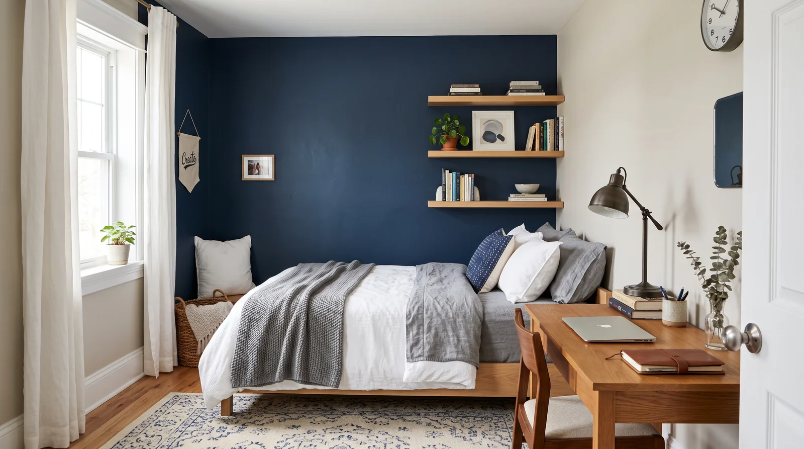
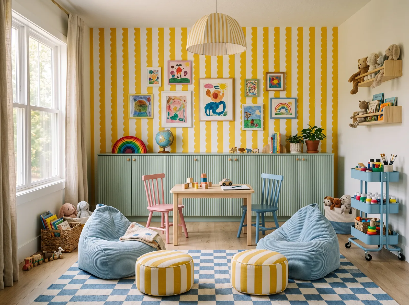
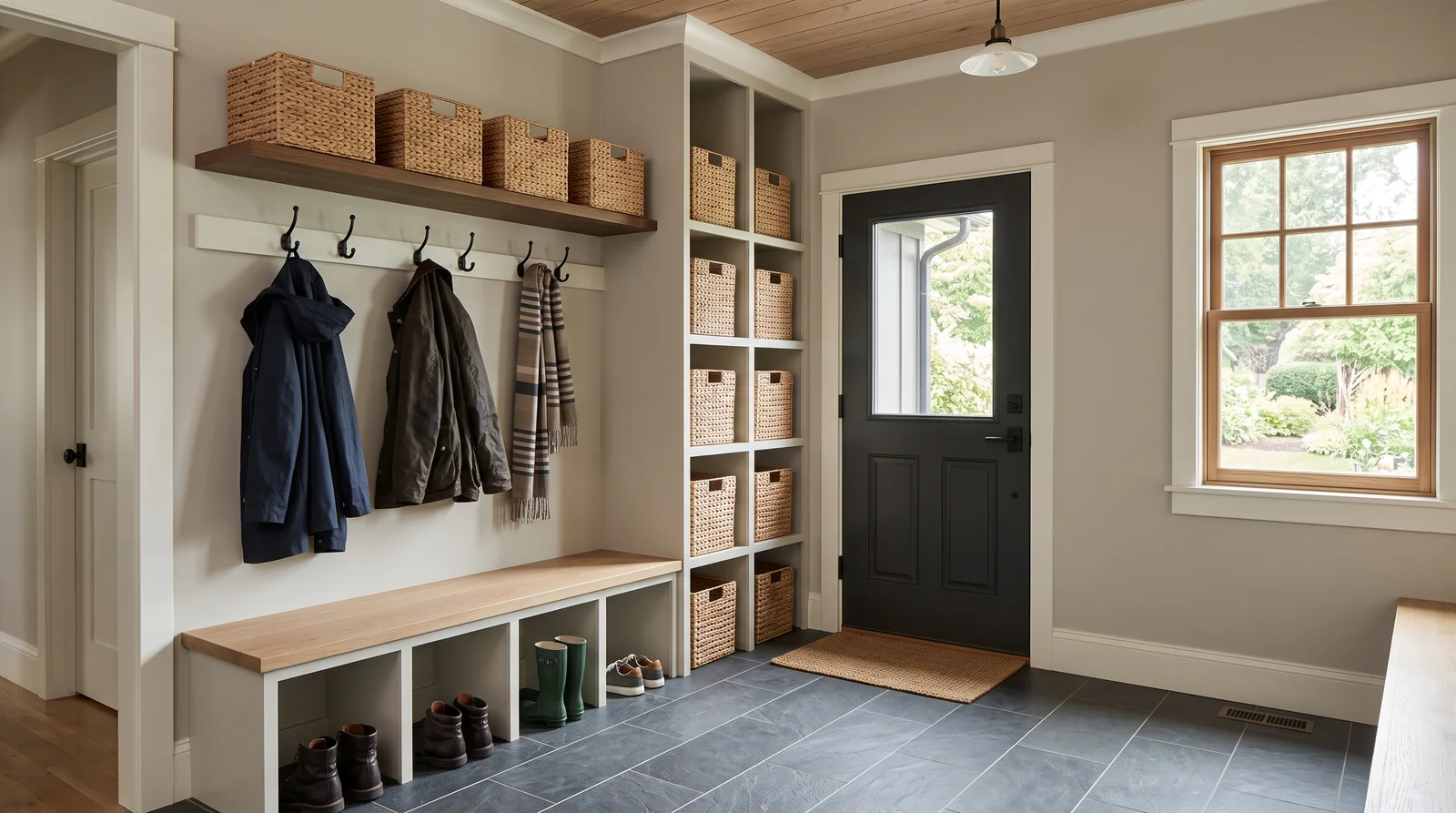
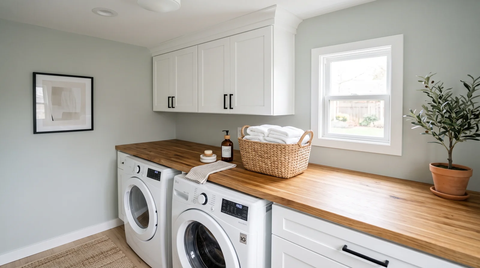
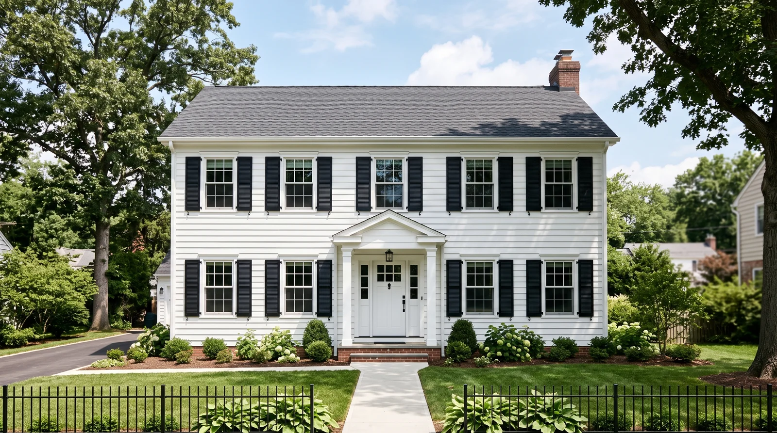
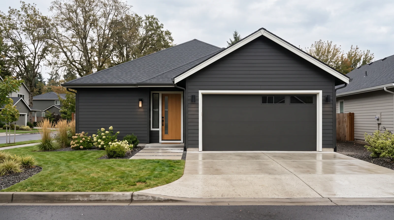
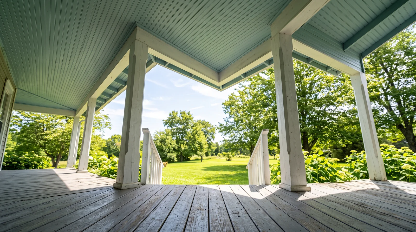
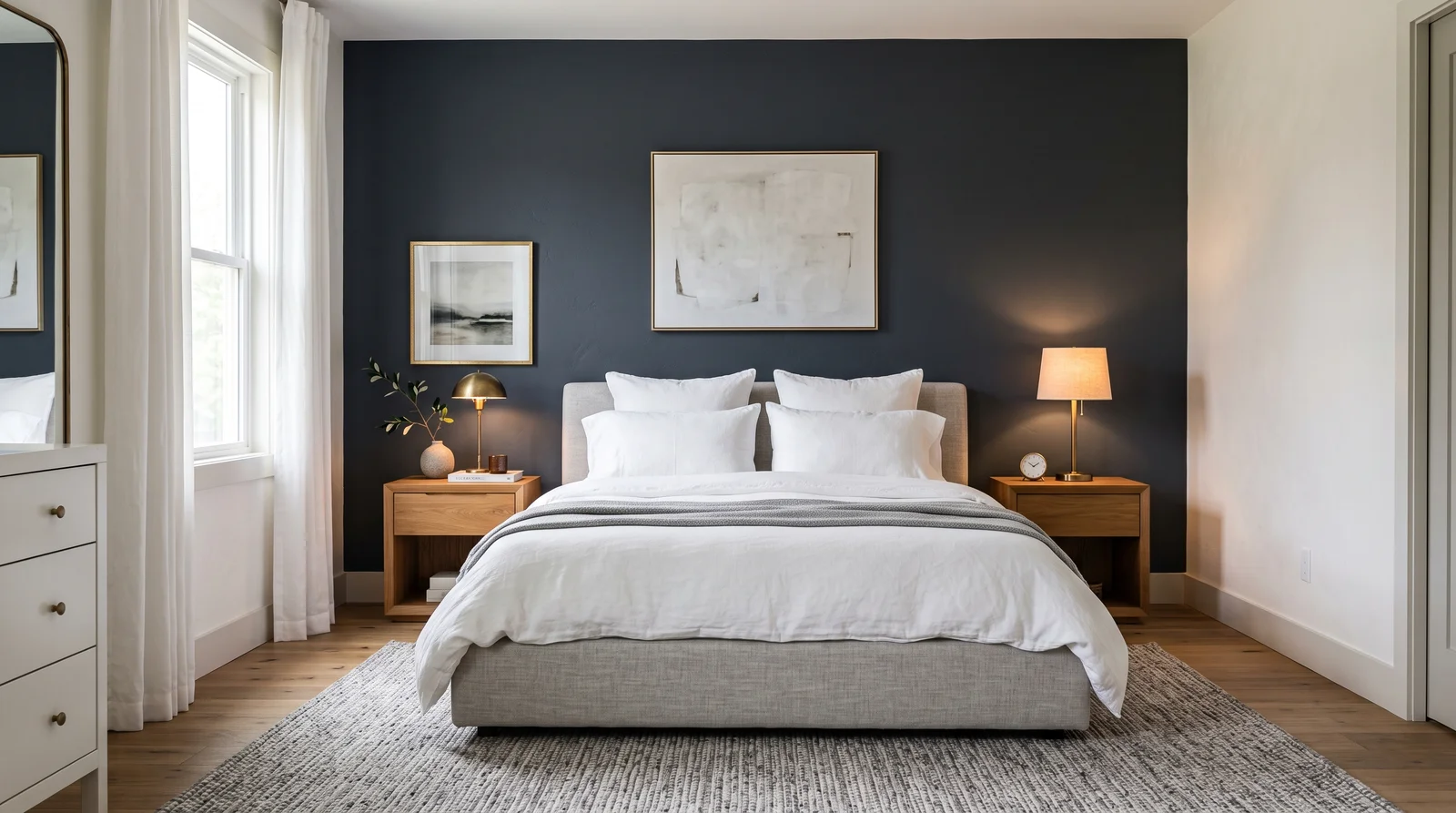
Each room page shows blue picks from every US brand side by side, so you can compare in context.
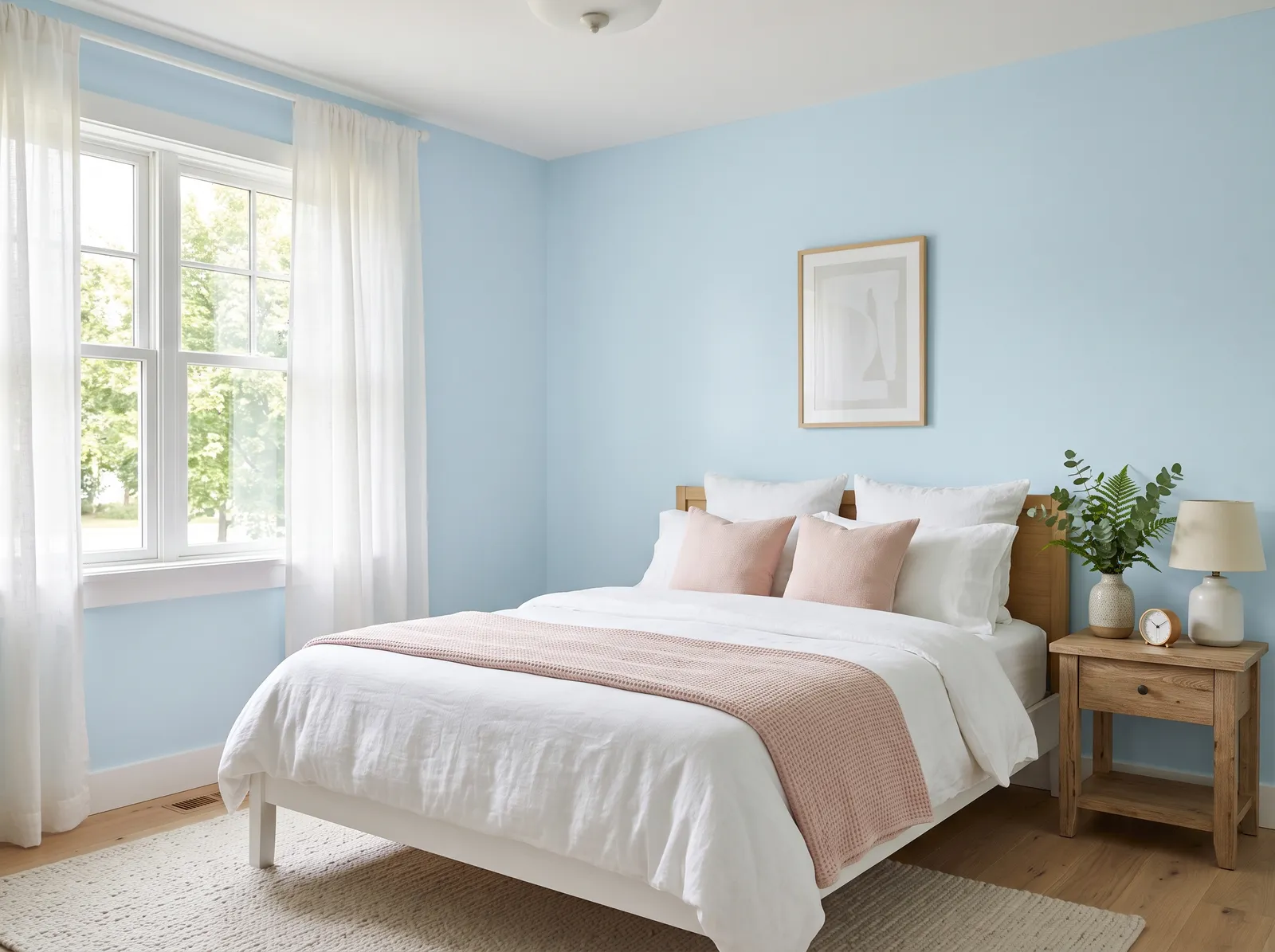
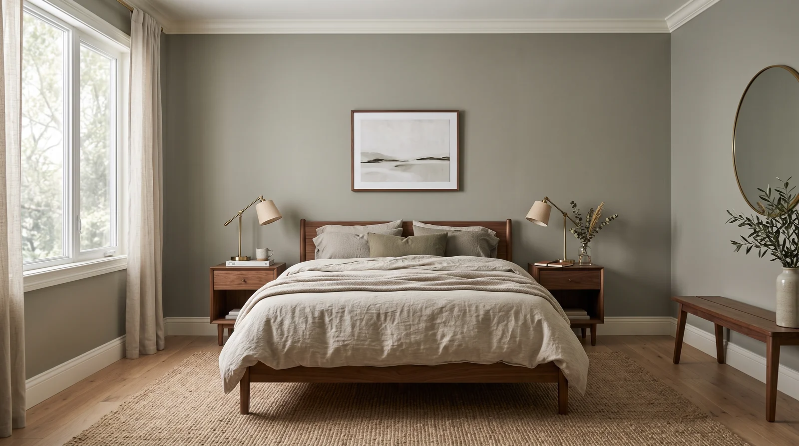
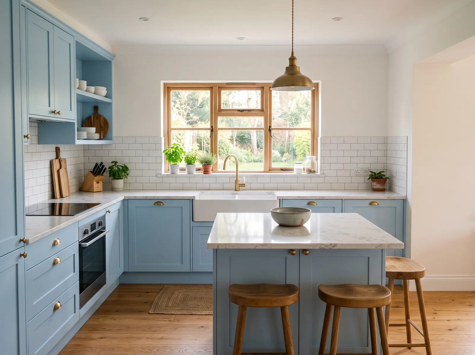
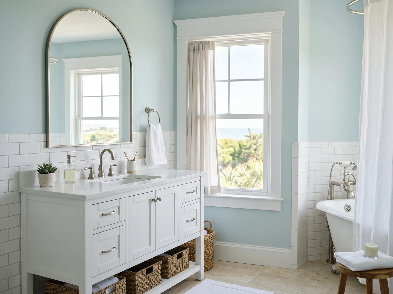
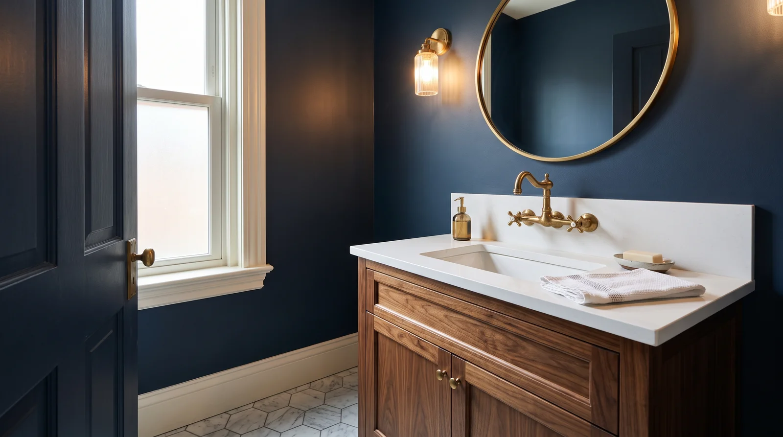
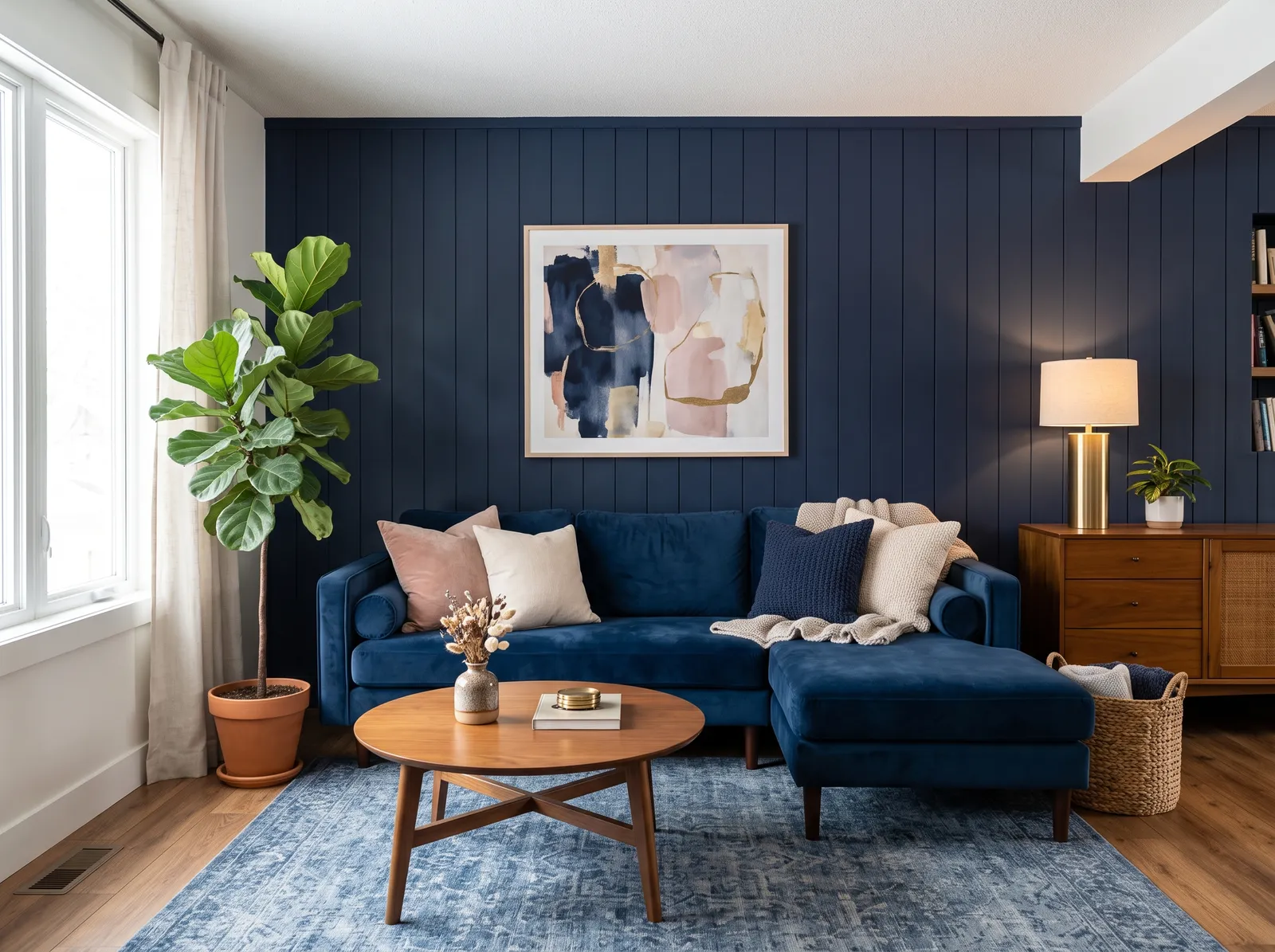
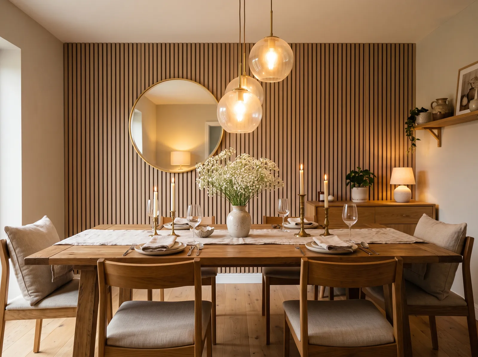
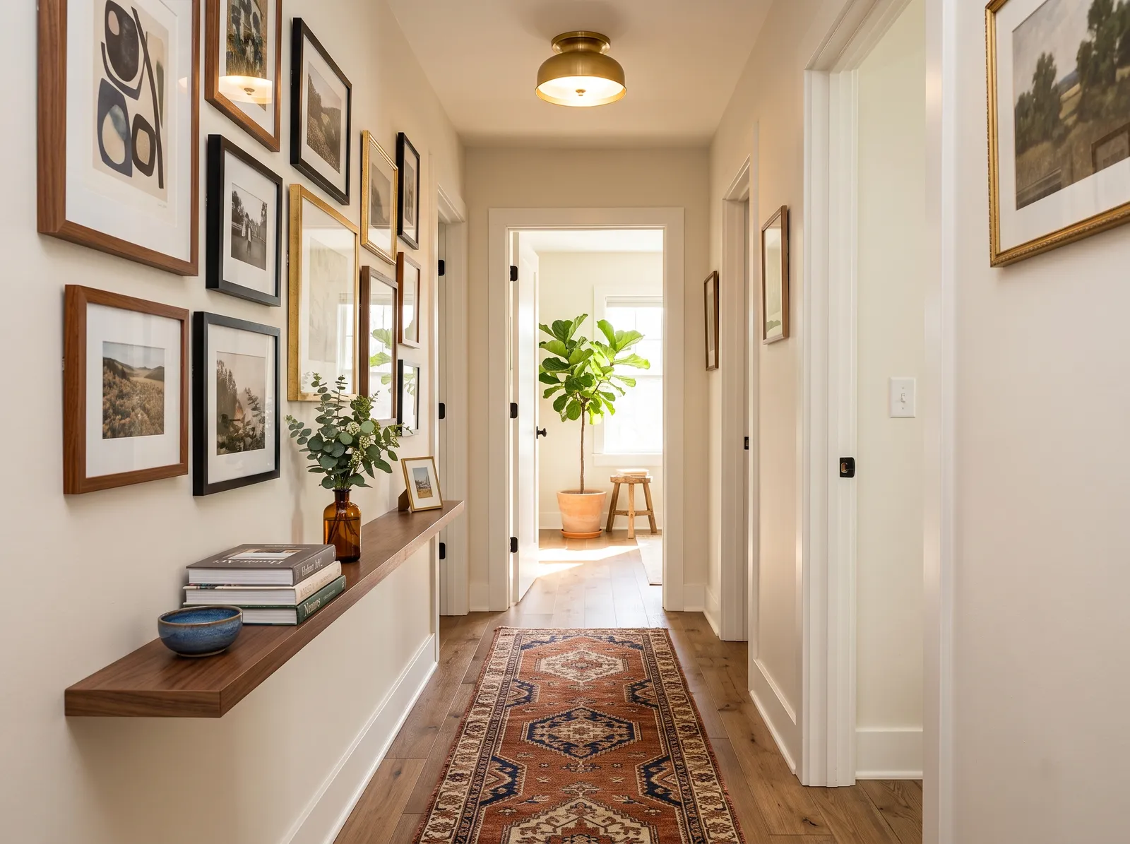
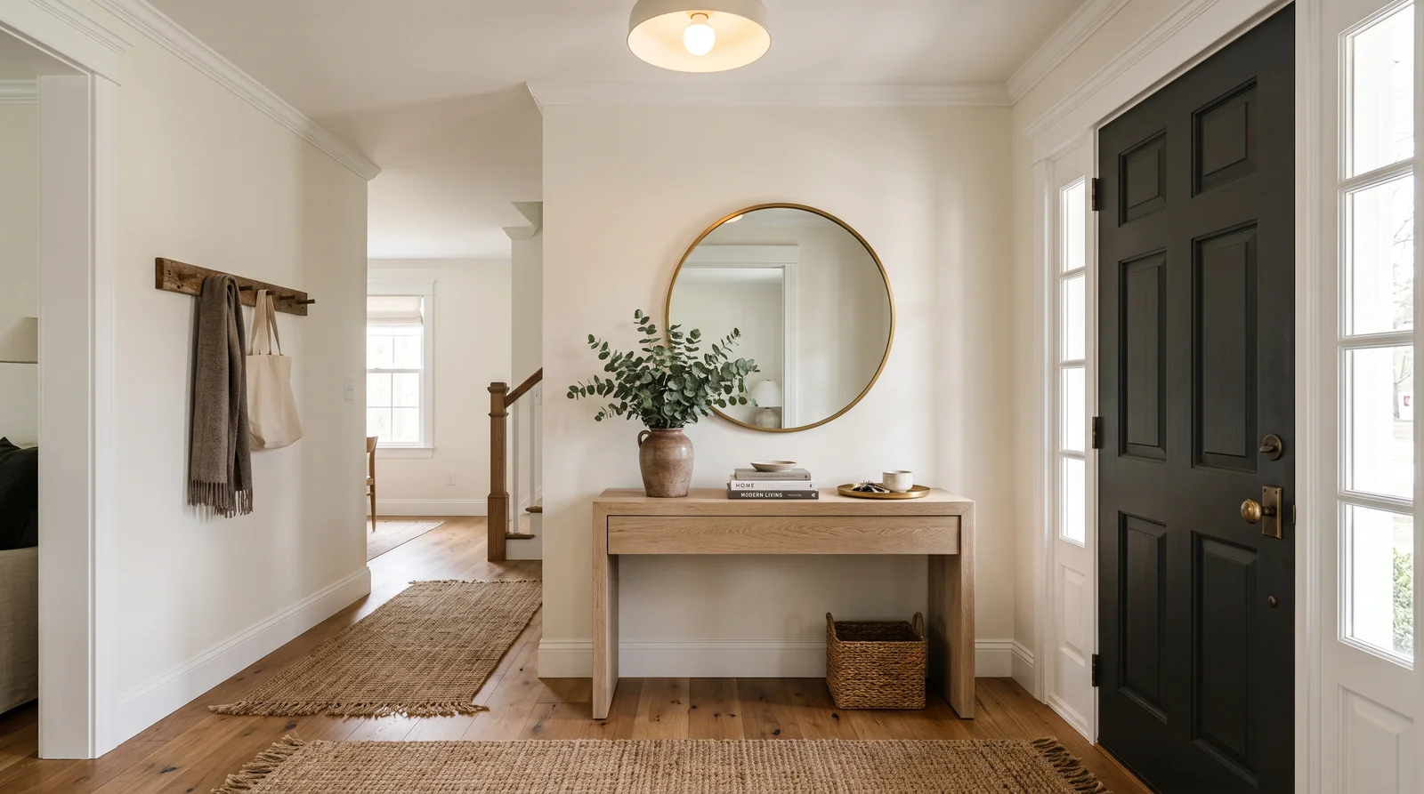
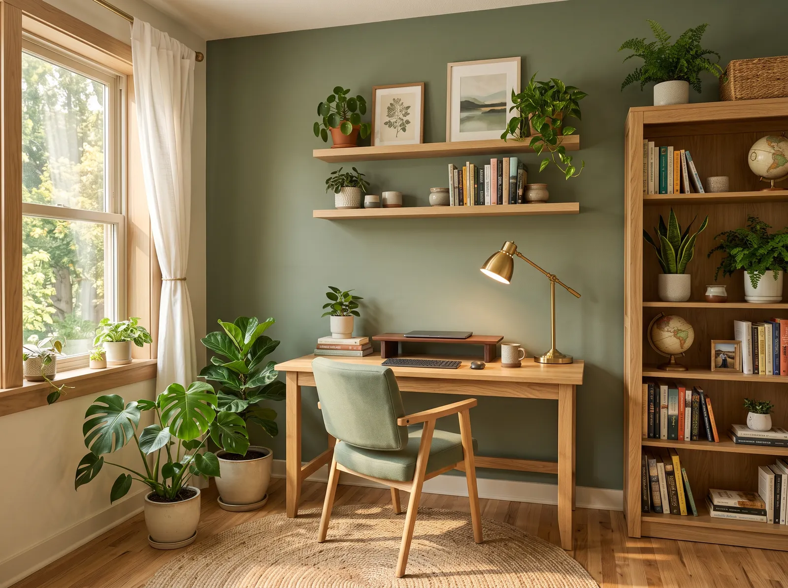
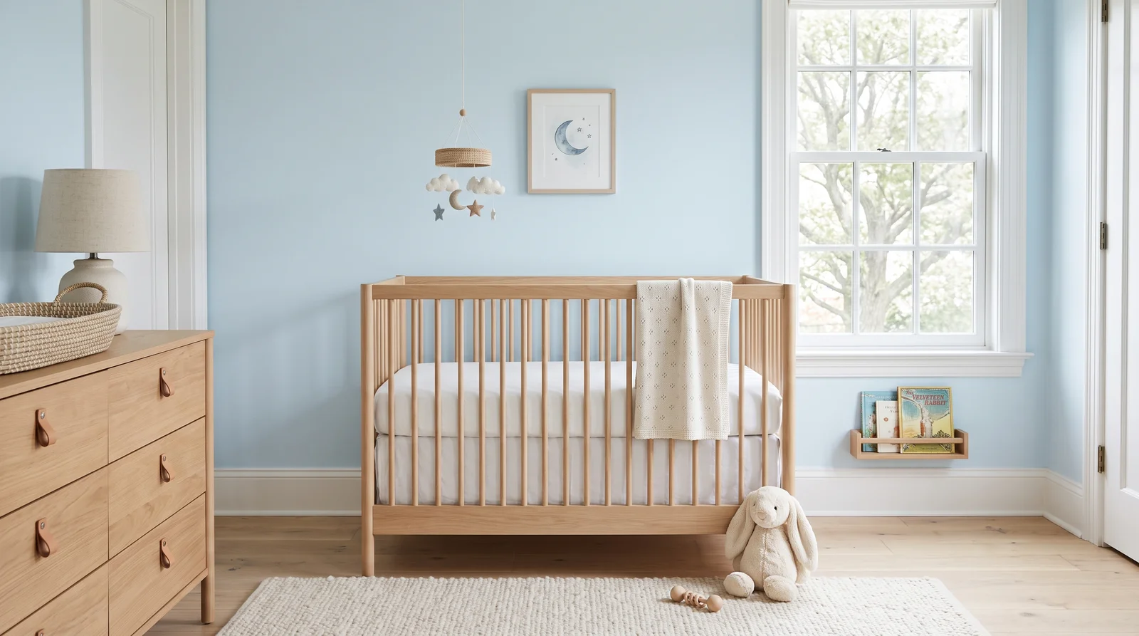
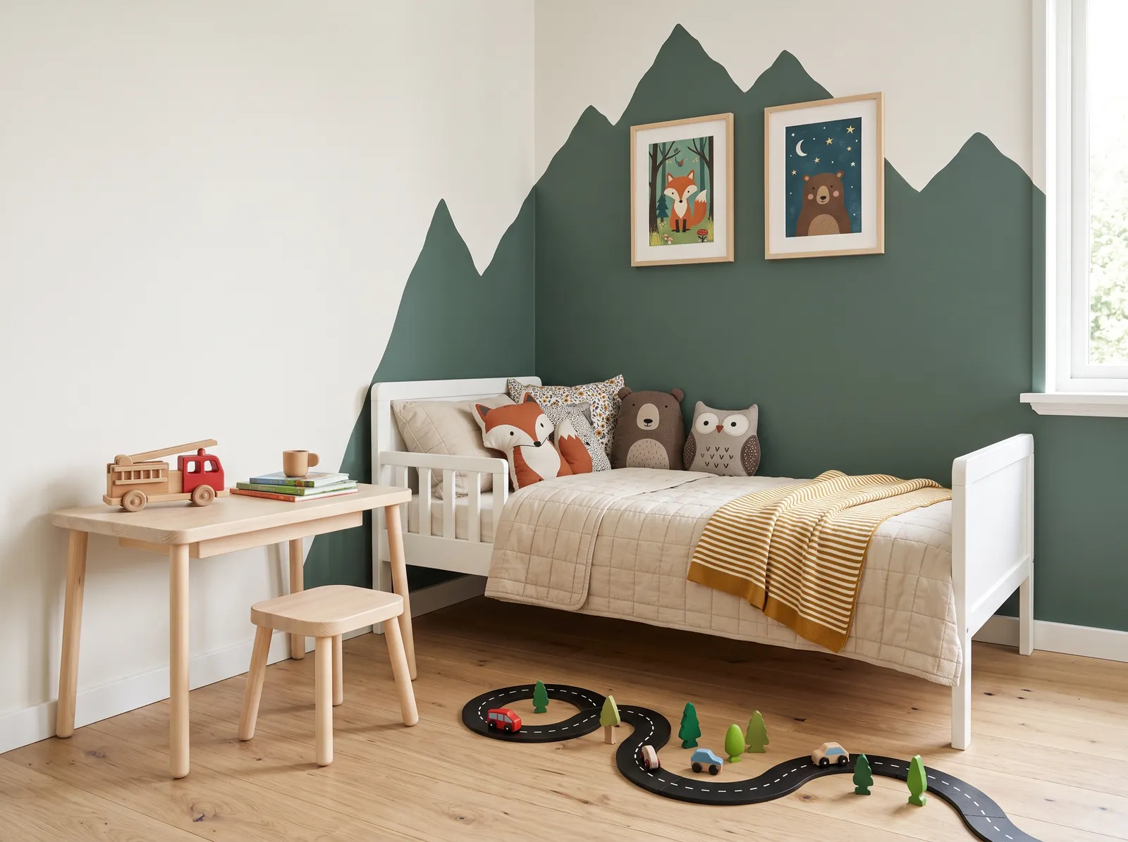
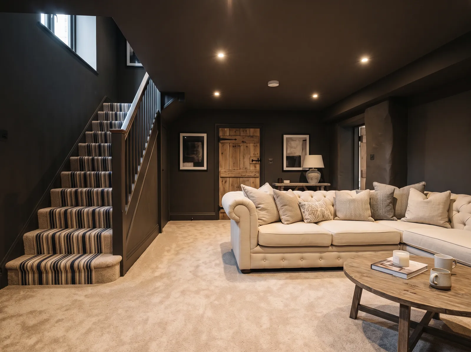
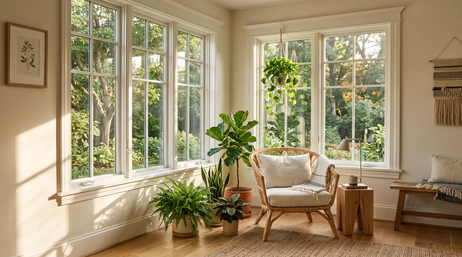
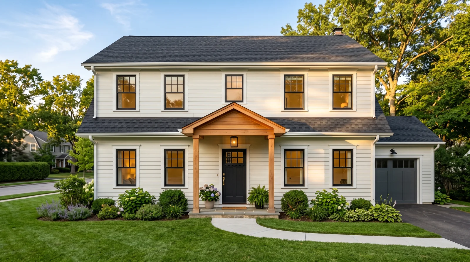
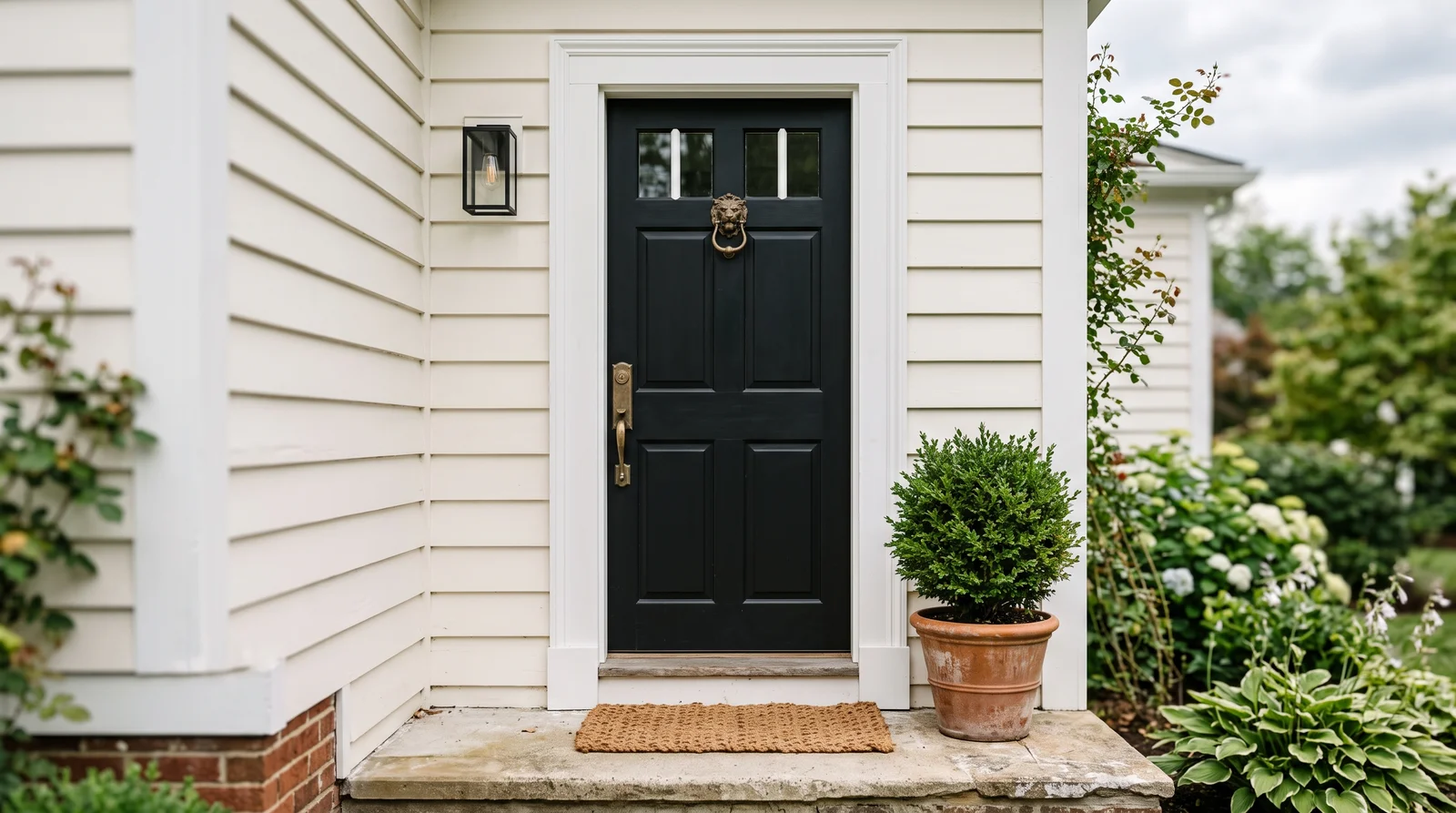
All 2,171 blue paint colors
Grouped by undertone (warm → cool)Hex values are display approximations from each brand's published swatch tools — not guaranteed to match a physical sample under controlled lighting. Order a brand-direct sample before specifying.
Blue by Brand
Every US brand's blue lineup on its own page — counts shown, no favorites.
Other color families
See Any Blue on Your Own Walls
No page can promise how a blue behaves in your light. Upload one photo of your room and try every color on this page — before you buy a sample.
TRY THE VISUALIZER →More on blue paint colors
This guide is the top-level map for the whole blue family, not a single brand's lineup. Every major US paint brand makes dozens of blues, and the good news is that you are not locked into any one of them. The color you fall for is mixed to order at the store, so a blue you spot from one brand can almost always be cross-matched to the closest version at another.
Read this first, then go browse the swatches knowing what to look for. We will cover the undertones that trip people up, how to read LRV so a blue does not turn out darker than you pictured, how blue behaves in different rooms and light, and the pairings and mistakes that separate a blue you love from one you repaint in a year.
What Makes a Blue, and the Undertones to Watch
Every blue leans somewhere. Some carry a drop of green and read fresh and watery. Some carry a drop of red or purple and feel richer, almost moody. Some are softened with gray and behave like a quiet neutral. The pure, primary blues are actually rare on walls because they can feel loud, so most paint blues are nudged one way or another.
The undertone is what you are really choosing. A green-leaning blue feels coastal and breezy; a violet-leaning blue feels dressier and cooler; a gray-blue is the safe, livable middle. Hold two blue chips that look identical side by side and one will almost always look greener or grayer than the other. That hidden lean is what decides how the color feels once it covers a whole room.
Reading LRV So Your Blue Lands Where You Expect
LRV, or light reflectance value, is a number from 0 (black) to 100 (white) that tells you how light or dark a color is. It is printed on most paint chips and it is the single most useful number when you shop for blue, because blue darkens dramatically on a wall and a chip can fool you.
For blues, a rough guide: LRV in the 60s and 70s gives you the soft, airy blues that keep a room feeling open. The 40s and 50s are mid-tone blues with real presence that still take light well. Below about 25 you are into navy and deep blues that turn cozy and dramatic but soak up light, so they need either good daylight or a room you are happy to make intimate.
How Blue Reads by Room and by Light
Light direction changes blue more than almost any other color. North-facing rooms get cool, indirect light that pushes blue colder and can make it feel flat or icy, so a slightly warmer or grayer blue, or one with a touch of green, holds up better there. South-facing rooms get warm, generous light that softens blue and lets even a deeper navy feel rich rather than heavy.
The room's job matters too. Bedrooms and bathrooms are where soft blues earn their reputation for being restful. Studies, dining rooms, and powder rooms are where deep blues shine, because those are spaces you often use in the evening, where lamplight turns navy warm and enveloping. Always tape a big sample on the wall and look at it in the morning and at night before you commit, because blue rarely looks the same at both ends of the day.
Pairing Blue With Trim, Ceilings, and Other Colors
Blue gets along with most whites, but the white you choose sets the mood. A crisp, cool white trim makes a blue look sharp and clean; a soft or warm white trim takes the chill off and makes the same blue feel more comfortable. For ceilings, a plain white usually works, though a pale blue overhead can make a room feel taller and is a classic move on porches and bedrooms.
For coordinating colors, the easiest fix for blue's natural coolness is a warm partner. Cream, sand, natural wood, brass, and soft tans all warm a blue room without fighting it. If you want contrast instead of warmth, navy pairs beautifully with crisp white and a black or wood accent for a tailored, classic look. The rule of thumb: let one blue lead, keep the trim and ceiling lighter, and bring in at least one warm tone so the space never tips cold.
The Most Common Mistakes With Blue Paint
The biggest one is judging blue from a tiny chip or a phone screen. Blue intensifies and darkens at full size, so the color that looked gentle on the card can feel saturated and cold across four walls. The second is ignoring undertone: people buy a blue they loved in a showroom, then find it turns green or purple in their own light because the room's light is different.
The other classic miss is going all-cool. A blue room with cool-white trim, gray floors, and no warm note anywhere can feel like a waiting room. Add a warm white, a wood tone, or a brass fixture and the same blue suddenly feels intentional and inviting. And do not skip the sample step, especially for navy, where the gap between the chip and the painted wall is widest.
Any Blue You Like, Matched Across Brands
None of these blues are off-the-shelf only. Paint is mixed to order at the store from a base and a tint formula, which means the color you choose is made fresh for you in whatever finish and quantity you need. That also means you are not stuck with a single brand.
If you find a blue you love from one brand but prefer another brand's paint quality, price, or store location, the color can be cross-matched to the closest equivalent. The match is rarely identical to the last drop, but it is close enough that most people cannot tell on the wall. Browse the swatches by feel first, then sort out the brand and finish when you are ready to buy.
The Questions Everyone Asks
How do I know which undertone a blue has?
Put the chip next to a few other blues and a plain white card. Against the white, you will start to see whether your blue leans green, gray, or purple. The lean that shows up in the store will show up even more on a full wall, so trust what you see in comparison rather than the color alone.
What LRV should I look for if I want a soft, airy blue?
Aim for an LRV in the 60s or 70s. Those blues keep a room feeling open and light and are the most forgiving in smaller spaces. If you drop below about 40 you are moving into mid-tone and then deep blues, which have more drama but make the room feel cozier and darker.
Will a navy make my room look small or dark?
It will make the room feel cozier and more intimate, which is often the point. Navy soaks up light, so it works best in rooms with decent daylight or rooms you mostly use in the evening, like a study or dining room. Pair it with crisp white trim and a warm accent so the depth reads as rich rather than gloomy.
Why does my blue look gray or green once it is on the wall?
That is the undertone showing itself under your room's specific light. North-facing and cool light can pull a blue toward gray or green, while warm light softens it. It is normal, which is exactly why you sample on the actual wall and check it at different times of day before buying the gallons.
What trim and ceiling colors go with blue walls?
A soft or warm white trim keeps a blue feeling comfortable, while a cool, crisp white makes it look sharp and clean. White ceilings are the safe default, but a pale blue ceiling can make a room feel taller and is a nice touch in bedrooms and on porches.
Can I get a blue from one brand mixed by a different brand?
Yes, in most cases. Paint is tinted to order, so a store can cross-match a blue to the closest version in another brand's base. It will not always be identical down to the last drop, but it is usually close enough that you would not notice on a finished wall.
How much paint should I buy before committing to a blue?
Start with a sample pot, not gallons. Paint a large square, ideally on more than one wall, and live with it for a couple of days in both daylight and lamplight. Blue shifts more than most colors between the chip and the wall, so the sample step saves you from repainting later.
Ask a Question