Room Colors · Blue Dining Room
8 Best Blue Dining Room Paint Colors for 2026
ideas, combinations, and real rooms
8 curated picks from real blue dining rooms — with the exact colors, honest reasons why, and the combinations that hold the room together.

Former interior stylist who can spot a green undertone from across a room. Jessica writes the color and mood pieces — what to choose, what pairs, and why your "white" looks pink.
The Fast Answer
Don't want to read 8 picks? These four are the safe answers.

Top Picks for the Blue Dining Room
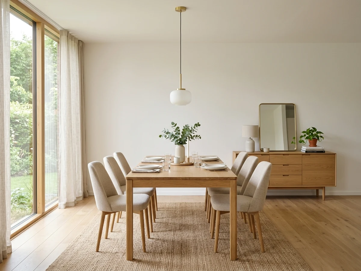
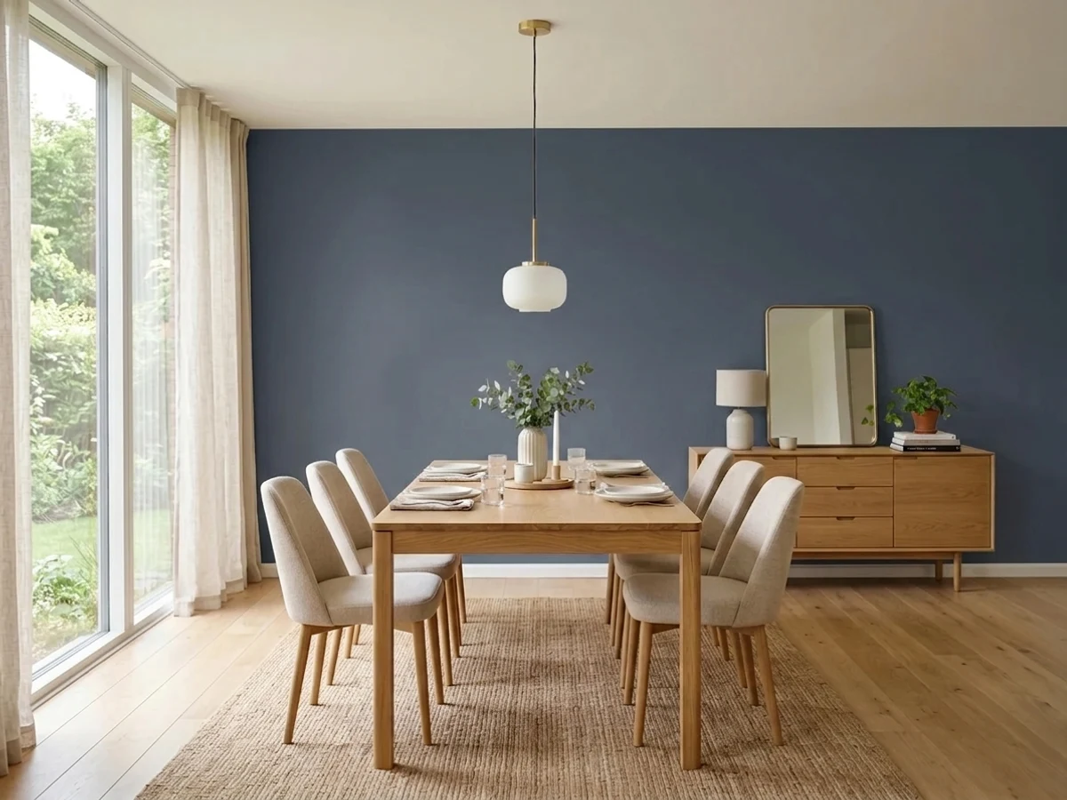
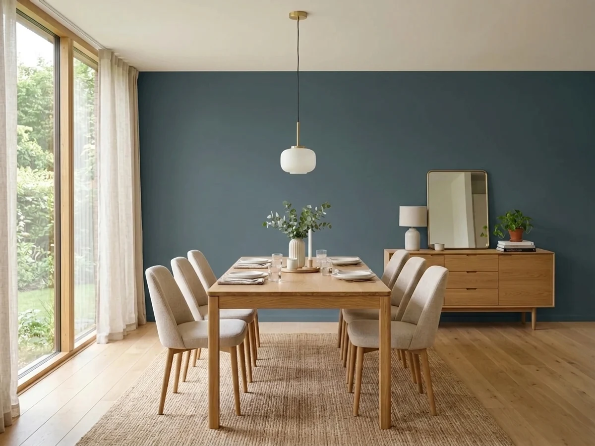
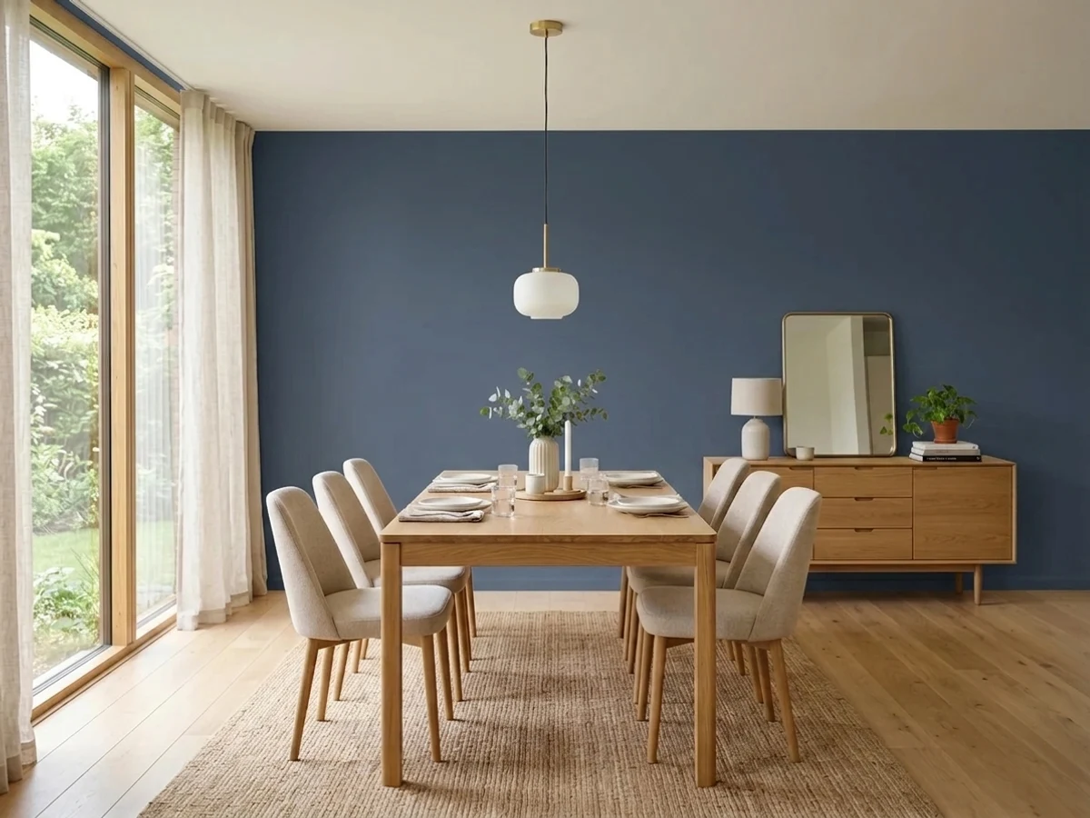
Tap a shade to see the blue dining room in it, then try it on your own room.
The cult dining-room dark blue — blooms under evening light, photographs beautifully.
Blue Dining Room Color Trends 2026 — What's In, What's Out


- Pale Cornflower Blue — Light, cheerful cornflower blues that were popular for casual dining rooms feel too soft next to 2026's deeper, richer blue choices.
- Cool Sky Blue With White Trim — Bright, cool sky blue paired with stark white trim reads dated; 2026 pairs deep blue with warmer trim and metal tones.
- One Blue Accent Wall — Isolating blue to a single accent wall feels timid; 2026 dining rooms commit to blue on all walls or skip it for full effect.
The 8 Best Blue Dining Room Paint Colors
Every pick below is a real rendered blue dining room, not a chip. The lead color first; the swatches are the full scheme in the photo — walls, furniture, textiles, accent.

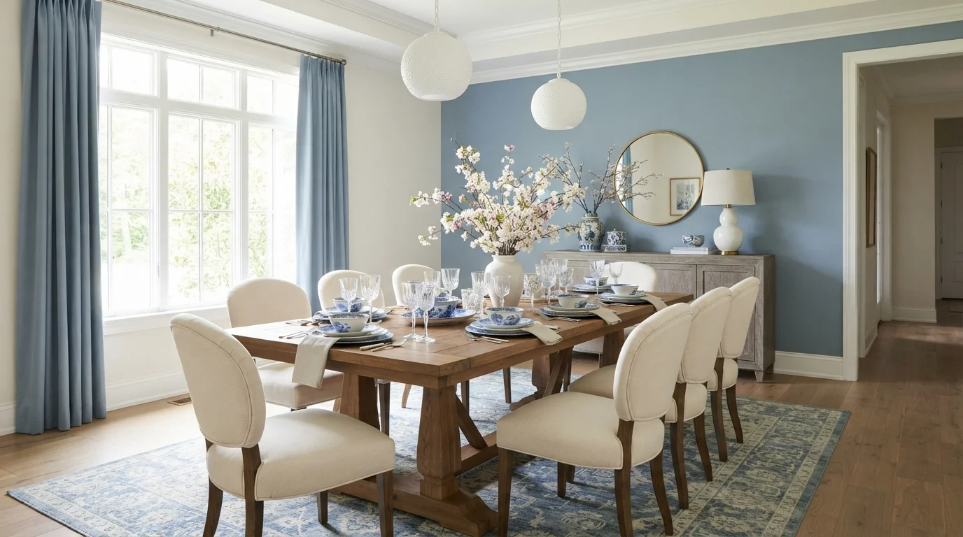
Soft sky blue walls and crisp white seating create a peaceful, light-drenched dining space made for leisurely gatherings.
Dusty sky blue is a gentle, soothing blue with soft grey qualities. In this space, it coats the accent wall and echoes across the floor-length window drapes, while soft off-white covers the surrounding walls and trim. A warm wooden dining table anchors the room, surrounded by cream upholstered chairs and grounded by a blue-and-ivory patterned rug. The entire room feels peaceful, refined, and breezy. Pairing cool blues with rich natural wood tones adds instant balance and prevents the space from feeling cold. It is ideal for anyone who loves an elegant, relaxed coastal aesthetic.
SEE FROZEN LAKE ON YOUR WALLS →
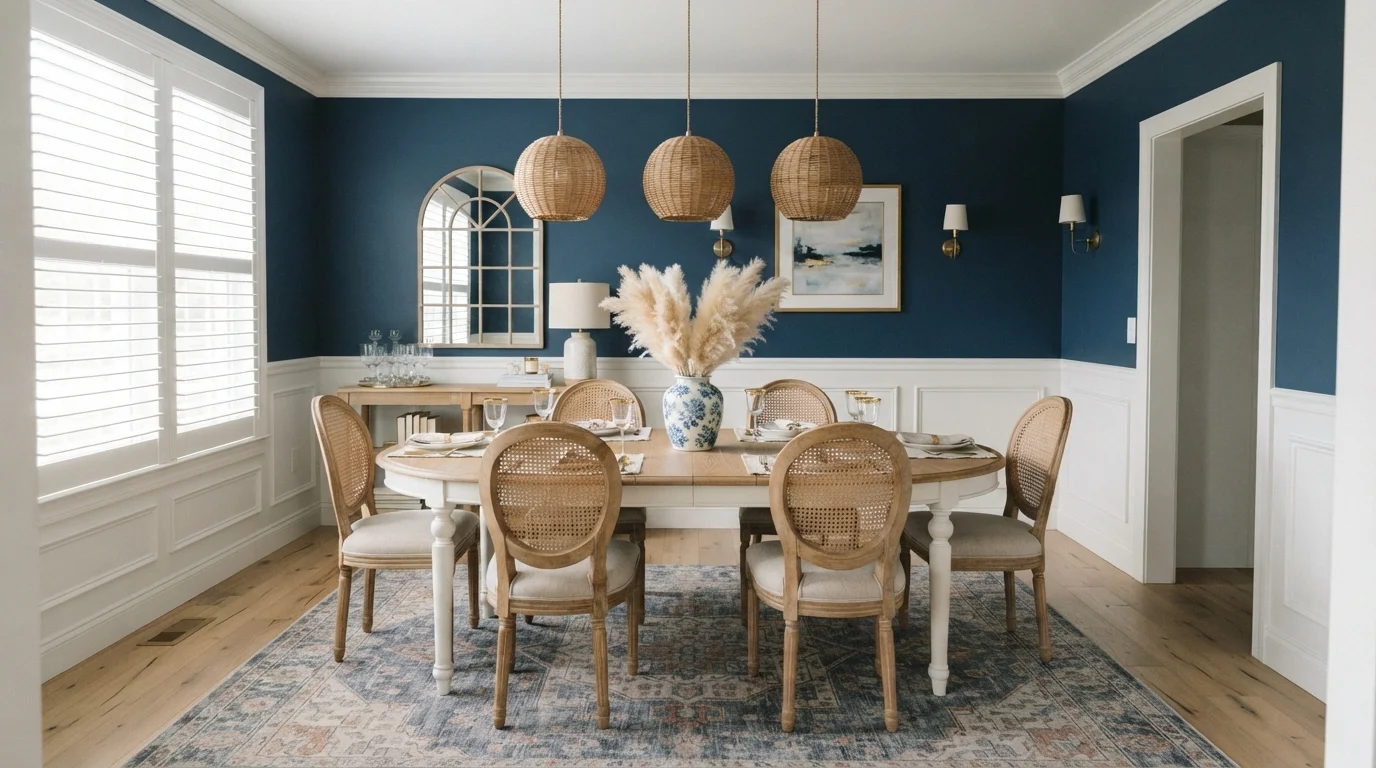
Rich navy walls meet airy cane textures and crisp white paneling for a timeless, elegant gathering space.
Navy blue is a deep, classic shade of blue. Here, rich navy covers the upper walls, balanced by bright white wainscoting and trim below. Cane-back chairs in light weathered wood surround an oval dining table, all resting over a faded blue and peach patterned rug. The room feels grounded, welcoming, and effortlessly refined. Crisp white paneling keeps the dark walls from feeling heavy, while woven textures and natural wood soften the look. It is perfect for anyone who loves traditional design with a relaxed coastal twist.
SEE DOWNPOUR BLUE ON YOUR WALLS →
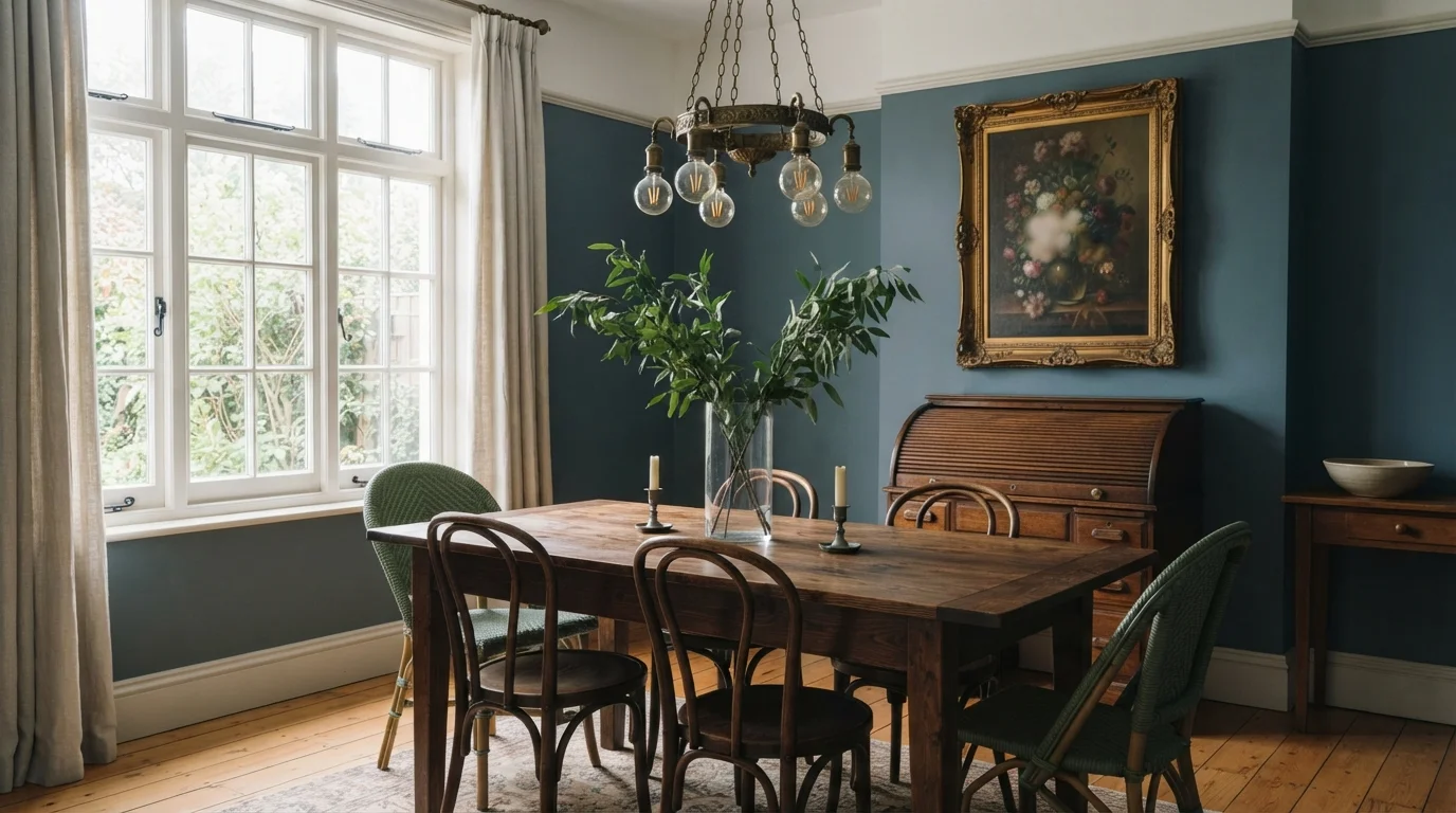
Cool slate blue walls and rich antique woods blend effortlessly for a timeless, lived-in gathering space.
Slate blue is a dusty, calm blue with soft gray depth. In this dining room, cool blue coats the walls, setting a striking backdrop for a rustic dark wood table, classic bentwood chairs, and textured woven bistro seats. The whole room feels grounded, cozy, and full of character. This pairing works because cool blue shades make warm, aged wood tones stand out beautifully. It is perfect for anyone who wants a historic, European cafe vibe at home.
SEE CANYON BLUE ON YOUR WALLS →
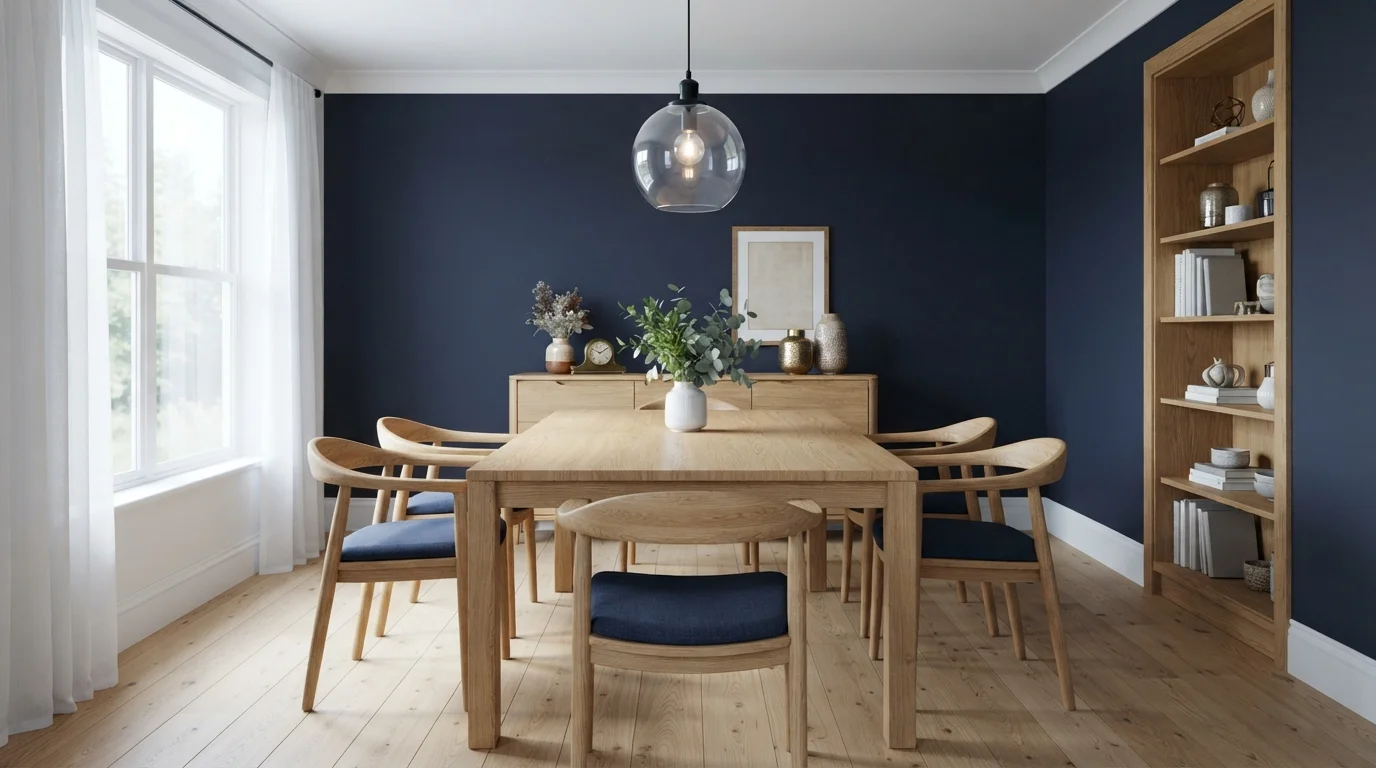
Deep midnight walls wrap natural oak furniture in a cozy, intimate glow that feels sophisticated and grounded.
Deep navy is a rich, midnight dark blue. In this dining room, bold dark blue coats the accent walls, framed cleanly by crisp white ceiling trim and baseboards. Warm natural wood chairs with navy cushions surround a matching timber dining table and sideboard. The room feels deeply dramatic, grounded, and intimate for evening meals. The warm golden wood tones pop instantly against cool dark walls to keep the room feeling balanced. It is perfect for anyone who loves cozy, stylish spaces built for evening dinner parties.
SEE NIGHTLIFE ON YOUR WALLS →
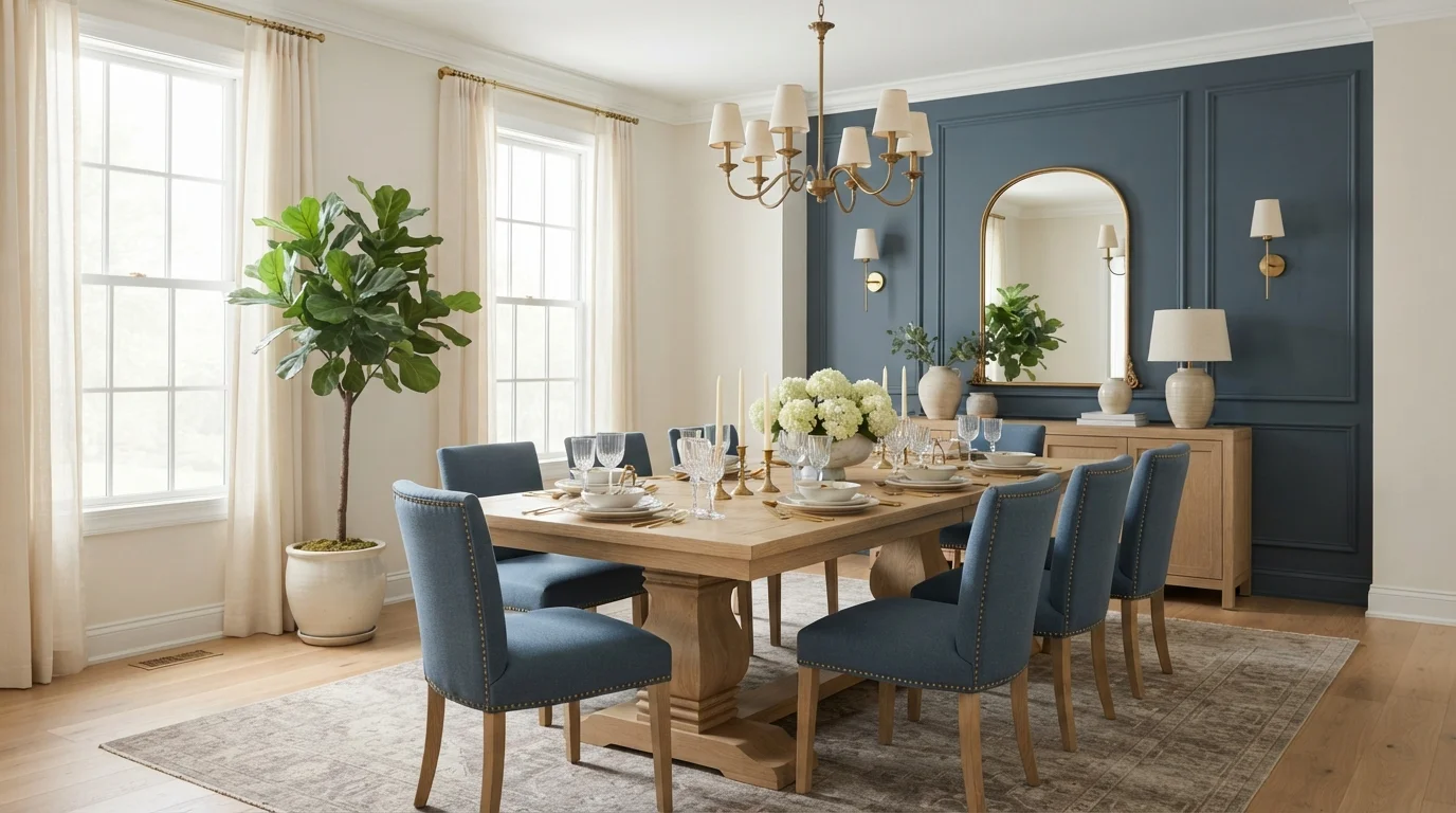
Rich slate blue walls pair with warm oak and soft cream tones for an inviting, elegant gathering space.
Slate blue is a deep, soothing mix of navy and cool gray. In this dining room, the color covers the paneled accent wall, complemented by creamy off-white walls and matching blue upholstered chairs around a natural oak table. The room feels cozy, grounded, and thoroughly sophisticated. This combination works beautifully because the warm honey wood and soft brass fixtures balance the deep blue tones so the space never feels dark or chilly. It is perfect for anyone who loves timeless, tailored style with an inviting touch.
SEE DAY SPA ON YOUR WALLS →
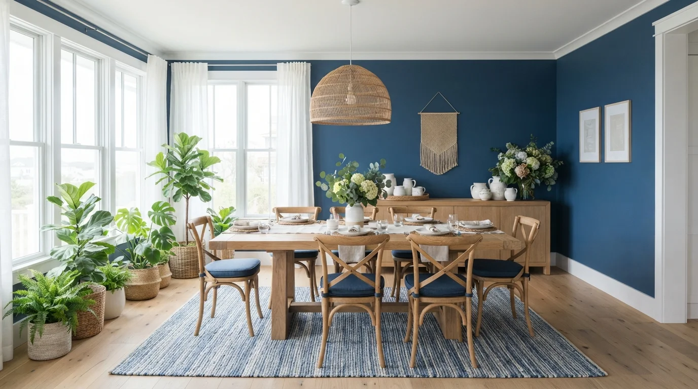
Crisp sunlight highlights warm wood furniture anchored by a dramatic deep blue accent wall and woven coastal textures.
Deep blue is a bold, ocean-inspired shade that brings immediate depth. In this dining room, a rich blue accent wall stands behind a light oak table, blue-cushioned bentwood chairs, and a striped blue area rug. The room feels fresh, relaxed, and welcoming. Warm natural wood tones and woven wicker textures balance the cool blue walls so the room stays bright rather than dark. It is a fantastic choice if you want to bring an easygoing, beach-house feel to everyday family meals.
SEE ATLANTIC TIDE ON YOUR WALLS →
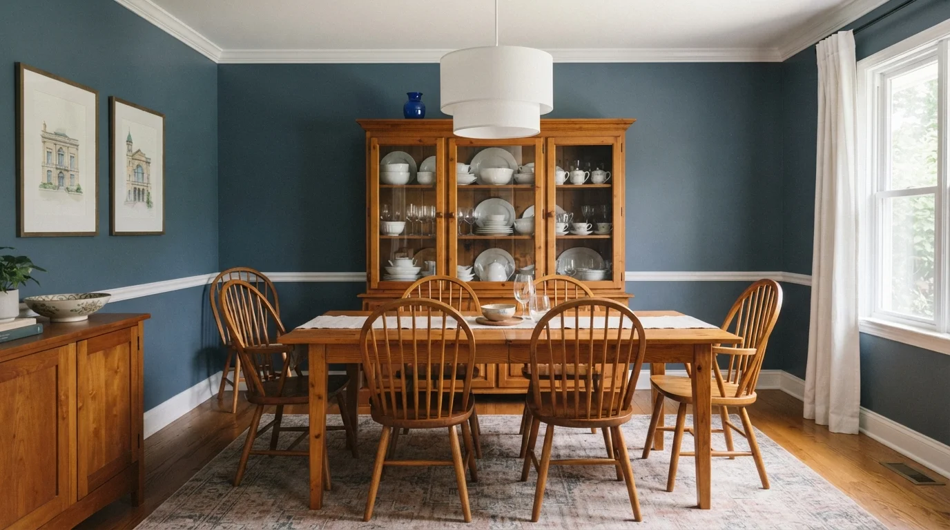
Rich slate blue walls frame warm amber wood furniture for a cozy, classic dining space that feels instantly welcoming.
Slate blue is a muted, smoky blue with calming gray notes. In this dining room, deep blue coats the walls while crisp white accents the crown molding and baseboards. Rich honey-toned wood glows across the dining table, spindle chairs, and vintage display cabinet, grounded by a subtle patterned rug. The room feels grounded, serene, and delightfully timeless. This pairing works because cool blue creates a striking contrast that makes natural wood tones stand out. It is perfect for anyone wanting an inviting, classic dinner setting.
SEE IT ON YOUR WALLS →
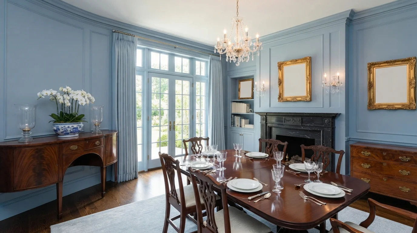
Cool cornflower walls and lustrous mahogany create an atmosphere of grand, sunlit tradition and refined grace.
Powder blue is a soft, calming shade of blue with a gentle gray cast. In this dining room, the walls, crown molding, and trim are painted the same serene blue, paired with rich mahogany furniture, white drapery, and cream upholstery. The room feels graceful, airy, and thoroughly elegant. The combination works because the cool blue walls allow the deep, reddish-brown wood tones and gleaming gold frames to truly stand out. It is ideal for anyone who loves classic, historic style with a fresh feel.
SEE NEW TOILE ON YOUR WALLS →Blue Dining Room Wall Color Combinations
A wall color never works alone. These are the full schemes from the rooms above — the lead color first, then the supporting colors that make the photo work.
Soft sky blue walls and crisp white seating create a peaceful, light-drenched dining space made for leisurely gatherings.
TRY THIS PALETTE →Rich navy walls meet airy cane textures and crisp white paneling for a timeless, elegant gathering space.
TRY THIS PALETTE →Cool slate blue walls and rich antique woods blend effortlessly for a timeless, lived-in gathering space.
TRY THIS PALETTE →Deep midnight walls wrap natural oak furniture in a cozy, intimate glow that feels sophisticated and grounded.
TRY THIS PALETTE →Crisp white trim is the standard partner for every navy on this list — it's what keeps Hale Navy or Very Navy from swallowing the room's architecture, especially around windows, a chair rail, or wainscoting. If your dining room already has warm oak or walnut floors and a wood table, lean into that pairing rather than fighting it: Newburyport Blue and Encore both read warmer against natural wood tones, while Sea Serpent's smokier undertone plays well with darker walnut and matte black hardware.
For metal accents, navy takes brass and warm gold especially well — a brass chandelier or sconces against Blue Danube or In the Navy is a classic upscale dining room combination, and it's a big part of why these colors keep showing up in higher-end dining rooms. If you want more contrast, pair any of the darker picks (Very Navy, Blue at BM 2066-10) with ivory or cream upholstered dining chairs so the seating doesn't disappear into the walls.
More Dining Room Color Ideas
Set on a color family already? Each page has its own real rooms and picks.
Light or Dark Blue Dining Room Colors?
Go Light (LRV 60+) If…
The room is small, faces north, or has to work at every hour. Light warm colors make it feel bigger and stay calm in evening light — the light you actually live in.
Go Dark (LRV Under 20) If…
You want the cocoon effect and the room has real daylight. Dark works best on one feature wall — or fully color-drenched in a large room with good windows.
Even within this list, there's a real spread. Blue Danube (LRV 11) is the lightest of the group and the one to reach for if your dining room is small, has one window, or shares an open sightline with a brighter kitchen or living room — it still reads as a true saturated blue, just with a little more bounce. Very Navy (LRV 4) and In the Navy (LRV 5) are the darkest, closer to black-blue in low light, and they're best in dining rooms that either get generous natural light during the day or are used almost exclusively at dinner and evening hours, where the depth becomes the whole point rather than a liability.
A good rule for a room this specific: if you eat there mostly at night, go as dark as you like — Hale Navy, Newburyport Blue, or Very Navy will all look richer under lamp and candlelight than they do on the paint chip. If the dining room doubles as a daytime workspace or gets hit with strong afternoon sun, Blue Danube or Sea Serpent hold their color without going murky.
See It. Love It.
Paint It.
Upload one photo of your blue dining room and try every color on this page on your own walls — in your own light, before you buy a drop of paint.

Hale NavyBeforeSheen And Finish For A Navy Dining Room
Use eggshell or matte on the walls for any of these colors — a flatter finish absorbs light instead of bouncing it back in a distracting way, which matters more on a dark navy than on a pale color. Save satin or semi-gloss for trim, doors, and wainscoting only; the contrast in sheen between the deep wall color and the glossier white trim is part of what makes the room look finished rather than just dark.
If your dining room has wainscoting or a chair rail already, painting the lower panel in a satin white or off-white and the upper wall in Newburyport Blue or Hale Navy is a reliable way to keep the room from feeling like a cave, even at LRV 6 or 7.
Full Room Or Accent Wall
Because these colors are all dark, a lot of people default to just one accent wall to play it safe — but a full-room navy dining room, all four walls, is usually the better result. A single dark wall next to three lighter ones tends to look unfinished or like an afterthought; wrapping the whole room in Blue Danube or Encore instead gives you that enveloping, restaurant-dining-room feeling the color is chosen for in the first place.
If you do want to test the water before committing to four walls, paint the wall behind a buffet, hutch, or built-in first. That's usually the wall with the least window interruption, so you get the truest read on how the color behaves in your specific light before painting the rest of the room.
Mistakes To Avoid With This Combination
The most common mistake is judging the color only in daytime light and then being surprised at how it looks at dinner. Test any of these navies — Hale Navy, Very Navy, In the Navy — under the actual bulb you'll use at night, ideally a warm 2700K bulb on a dimmer, since that's when the room does most of its work.
The second mistake is skipping the white trim contrast to "keep it moody." Without a clean white or off-white trim line around doors and windows, a dark navy dining room loses its edges and can look like an unfinished, under-lit room instead of an intentional one. The third is choosing a north-facing room's darkest option (Very Navy, LRV 4) when that room gets little natural light during the day — in that case, Blue Danube or Newburyport Blue keeps enough LRV to still read as blue rather than near-black.
About Blue Dining Room Paint Colors
A blue dining room works because of when you actually use the room. Most dining rooms get lived in after dark, under a chandelier or pendant, not in midday sun — so a saturated navy like Hale Navy (Benjamin Moore HC-154, LRV 6) or Very Navy (Behr M500-7, LRV 4) never has to compete with harsh daylight. Under warm bulbs, that low LRV stops reading as "dark" and starts reading as enveloping, the way a good restaurant dining room feels.
The eight picks here all sit in a tight LRV band, roughly 4 to 11, which is deliberate: this is a room where depth is the point. Newburyport Blue (Benjamin Moore HC-155) is the most classic navy of the group and the safest starting point if you've never painted a room this dark before. Blue Danube (Benjamin Moore 2062-30) and Sea Serpent (Sherwin-Williams SW 7615) both lean smoky rather than crisp, so they flatter candlelight instead of fighting it. Encore (Valspar 8002-45G) and In the Navy (Sherwin-Williams SW 9178) both read as warm, welcoming navies for a table where people linger.
Every one of these is a mix-on-demand color — walk into any Benjamin Moore, Sherwin-Williams, Behr, or Valspar retailer and they can match the exact code. None of them require a specialty order, so there's no reason to settle for "close enough" from a sample chip.
The Questions Everyone Asks
What color should I paint my blue dining room?
If you want one answer, start with the safe picks above — Frozen Lake, Downpour Blue, Canyon Blue, Nightlife. They read well in any light and survive furniture changes. Then check the light: strong afternoon sun wants a step cooler, a north-facing room wants a step warmer.
is navy blue too dark for a dining room?
Not for a room that's mostly used at night. Dining rooms get evening light more than daylight, so a navy like Hale Navy (LRV 6) or Very Navy (LRV 4) reads as cozy and enveloping under a chandelier rather than gloomy. Keep the trim crisp white, use a warm 2700K bulb on a dimmer, and the darkness becomes the feature, not the flaw.
what's the best blue for a small dining room?
Blue Danube (Benjamin Moore 2062-30, LRV 11) is the lightest of the true navies here and works best in a small or dimly lit dining room, since it still reads saturated without going nearly black. Newburyport Blue (HC-155, LRV 7) is the next-safest step up if you want a bit more depth but still need the room to feel open.
what trim color goes with a navy blue dining room?
Crisp white or a warm off-white trim is the standard pairing for every navy on this list, from Hale Navy to Encore. It defines the windows, doors, and any wainscoting so the room reads intentional instead of murky. If your millwork already leans warm, a soft white keeps it from clashing with the blue's undertone.
should i paint my whole dining room navy or just one wall?
Painting all four walls usually looks more finished than a single accent wall, because one dark wall next to three light ones can look unplanned. Full-room navy, like Blue Danube or Encore, gives the enveloping effect people actually want from a dark dining room. If you're unsure, test on the wall behind a buffet or hutch first.
what sheen should i use for dining room walls?
Eggshell or matte on the walls for any of these navies — it absorbs light rather than bouncing it in a distracting way, which shows more on a dark color than a pale one. Reserve satin or semi-gloss for trim and doors only, so the sheen contrast between wall and trim helps define the room.
What two-color combination works best in a blue dining room?
The reliable pattern is a quiet main color plus one deep accent on a single wall. Keep trim and ceiling in one warm white so the two colors are the only event in the room — the combination cards above show complete schemes from real rooms.
What colors make a blue dining room look bigger?
High-LRV, slightly warm colors — LRV 60–75 is the sweet spot. Paint the walls and trim close to the same light color so the corners blur, and keep the ceiling white. Stark cool white actually works against you; it creates hard shadows that show the room's edges.

Ask a Question