Room Colors · Porch Ceiling
5 Best Porch Ceiling Paint Colors for 2026
ideas, combinations, and real rooms
5 curated picks from real porch ceilings — with the exact colors, honest reasons why, and the combinations that hold the room together.

Former interior stylist who can spot a green undertone from across a room. Jessica writes the color and mood pieces — what to choose, what pairs, and why your "white" looks pink.

Top Picks for the Porch Ceiling
Pick a color family, tap a shade to see the porch ceiling in it, then try it on your own room.
Porch Ceiling Color Trends 2026 — What's In, What's Out


- Sprayed-Everything Contractor White — One untinted flat white blown across ceiling, trim, and posts reads like nobody made a decision — a warm white chosen on purpose is a different thing.
- Saturated Pool Aqua — Bright turquoise ceilings overshoot the haint blue tradition; overhead, saturated color reads twice as loud as it does on the chip.
- All-Gray Exterior Hangover — Flat gray porch ceilings from the gray-everything era make a shaded porch feel like concrete instead of sky.
- Untested Overhead Color — Committing from a vertical wall swatch keeps burning people — color on a horizontal ceiling reads completely different, so sample on the boards themselves.
The 5 Best Porch Ceiling Paint Colors
Every pick below is a real rendered porch ceiling, not a chip. The lead color first; the swatches are the full scheme in the photo — walls, furniture, textiles, accent.

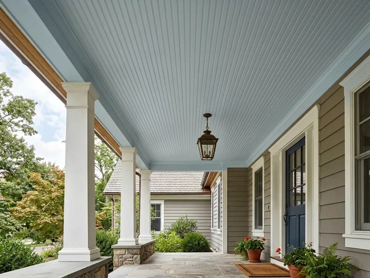
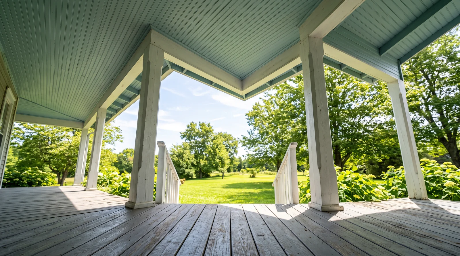
Benjamin Moore Palladian Blue overhead reads like a patch of soft Southern sky that stays cool even in July heat.
Palladian Blue (HC-144) is the color most people mean when they say haint blue — a balanced blue-green rooted in the Gullah tradition of painting porch ceilings to keep spirits (and, folklore says, wasps) moving along. At LRV 60 it holds its color in bright, shaded, and evening light, so the ceiling never washes out to white or sinks to gray. It sits happily over white trim, brick, and almost any siding color, which is why it survives every trend cycle. If your porch faces north and stays dim, step up to Breath of Fresh Air instead so the ceiling doesn't go moody on you.
SEE PALLADIAN BLUE ON YOUR WALLS →
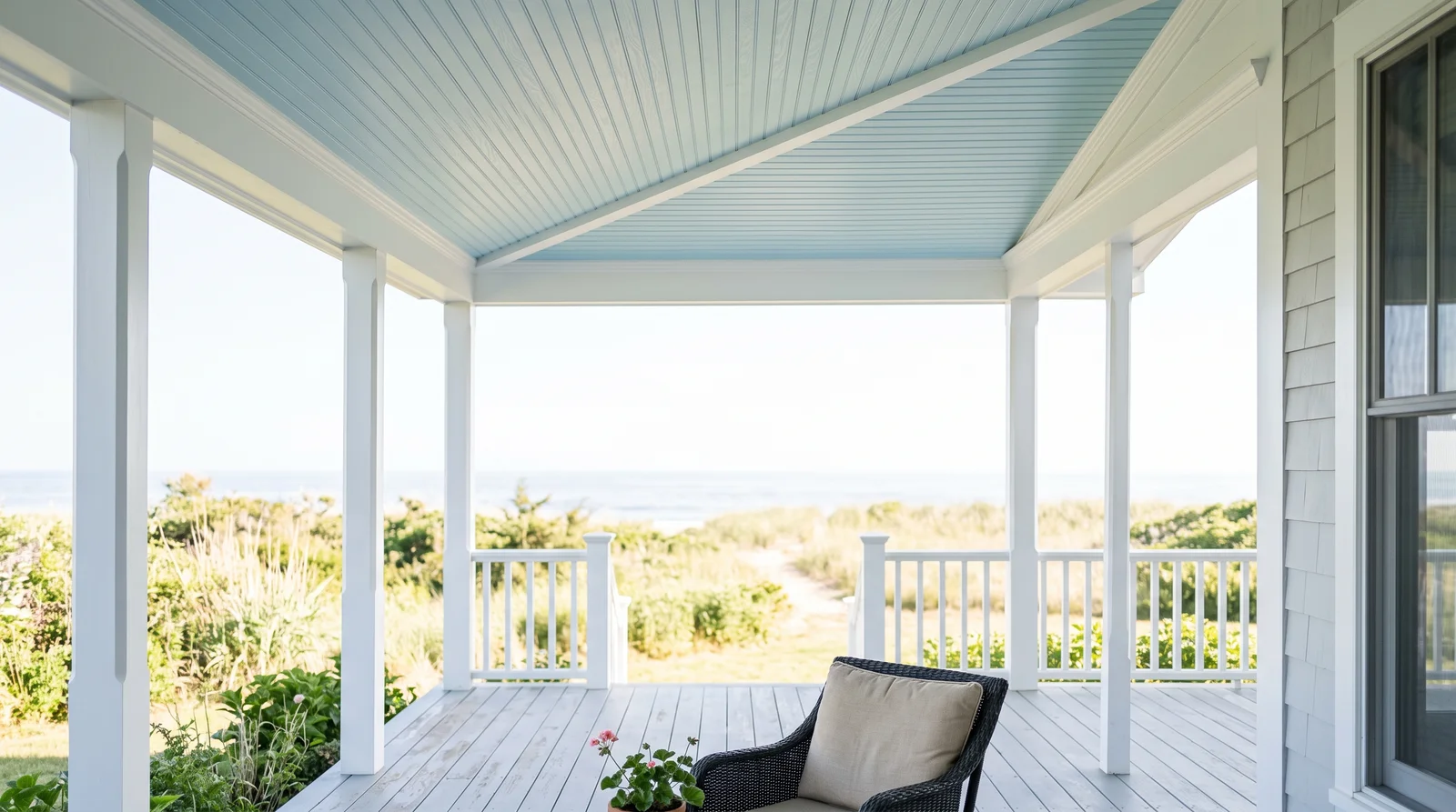
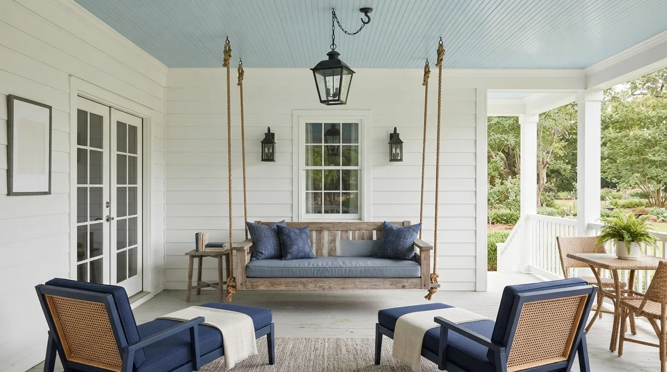
Benjamin Moore Breath of Fresh Air is the barely-there blue that reads almost white until you glance up and feel the ceiling lift.
At LRV 69 this is the lightest true haint blue on the list, and the safe pick for a shaded or north-facing porch where deeper blues turn dull. Overhead, colors read stronger than they do on a wall — a horizontal surface bounces sky and ground light back at you — so a shade that looks faint on the chip lands exactly right on the ceiling. It keeps white trim, light siding, and pale stone feeling airy instead of introducing a hard color break. If your porch bakes in full sun and the blue vanishes, that's your sign to move to Palladian Blue for one more step of pigment.
SEE IT ON YOUR WALLS →
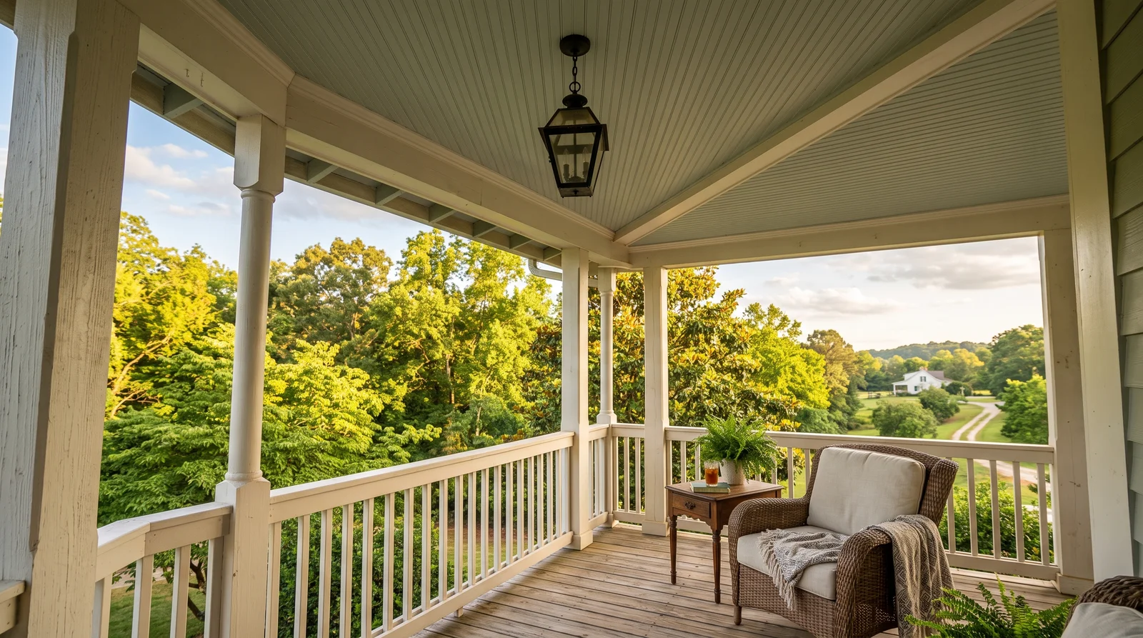
Sherwin-Williams Sea Salt leans green like shallow coastal water — the haint blue for houses that already love sage and driftwood tones.
Sea Salt (SW 6204) is the green-leaning branch of the haint blue family, and the one to pick when your exterior palette runs warm — tan siding, natural wood door, brass or bronze fixtures. Under an open porch it picks up bounced green from the yard and reads softer and grayer than it does indoors, which keeps it from ever looking minty. LRV 63 means it stays luminous even under a deep roof overhang. If you want the ceiling to read clearly blue rather than green, Palladian Blue is the neighbor shade to reach for instead.
SEE SEA SALT ON YOUR WALLS →
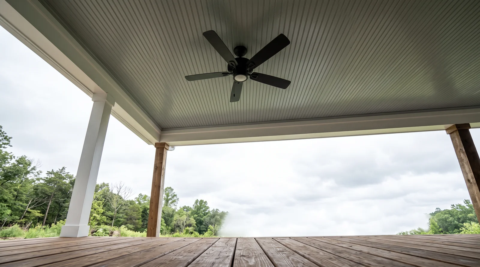
Benjamin Moore Beach Glass is the moodiest haint blue here — a weathered gray-green that feels like sea fog settling under the roof.
This is as dark as a porch ceiling should go, and it's the right call on houses with deep-toned siding, black window trim, or a charcoal roof, where a pale sky blue would look like an afterthought. At LRV 50, Beach Glass keeps real presence overhead — you see a deliberate color, not a tint — while still bouncing enough light to keep the porch from feeling capped. It flatters natural wood floors and black fixtures better than any lighter pick on this page. On a small or heavily shaded porch, drop to Sea Salt so the ceiling doesn't visually lower the roof.
SEE BEACH GLASS ON YOUR WALLS →
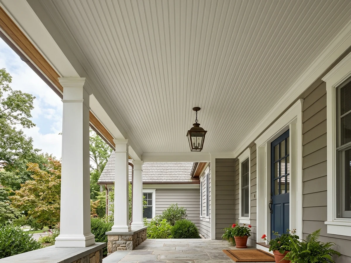
Sherwin-Williams Alabaster overhead gives the porch a warm, even glow at dusk — the honest choice when blue isn't your house.
Not every porch wants the haint blue story. On a house with strong body color or historic trim, a warm white ceiling in Alabaster (SW 7008, LRV 82) keeps the porch bright and lets the front door carry the personality. The trick is matching temperature: Alabaster's softness pairs with cream trim and warm light bulbs, while a house trimmed in cooler whites should use White Dove or Pure White overhead so the ceiling doesn't read yellow against it. Painted in the same white as the trim, the roofline visually disappears and the porch feels taller — the opposite move from Beach Glass, and just as deliberate.
SEE ALABASTER ON YOUR WALLS →Porch Ceiling Wall Color Combinations
A wall color never works alone. These are the full schemes from the rooms above — the lead color first, then the supporting colors that make the photo work.
Benjamin Moore Palladian Blue overhead reads like a patch of soft Southern sky that stays cool even in July heat.
TRY THIS PALETTE →Benjamin Moore Breath of Fresh Air is the barely-there blue that reads almost white until you glance up and feel the ceiling lift.
TRY THIS PALETTE →Sherwin-Williams Sea Salt leans green like shallow coastal water — the haint blue for houses that already love sage and driftwood tones.
TRY THIS PALETTE →Benjamin Moore Beach Glass is the moodiest haint blue here — a weathered gray-green that feels like sea fog settling under the roof.
TRY THIS PALETTE →The easiest, most classic combination is a soft blue or green ceiling over crisp white beadboard trim, columns, and rails. The white frames the color and keeps everything looking clean, and it works whether your siding is white, gray, brick, or a warm neutral. A bright shade like Tiffany Blue especially wants that white to keep it from feeling loud.
For the floor, a gray, greige, or natural-wood porch deck grounds a blue or teal ceiling without competing with it. Black or dark-bronze light fixtures and house numbers give a calm shade like Seafoam or Robin Egg a little contrast and definition, so the ceiling doesn't float. Keep one or two of these elements quiet so the painted ceiling stays the star.
Porch Ceiling Color Ideas by Color
Set on a color family already? Each page has its own real rooms and picks.
Light or Dark Porch Ceiling Colors?
Go Light (LRV 60+) If…
The room is small, faces north, or has to work at every hour. Light warm colors make it feel bigger and stay calm in evening light — the light you actually live in.
Go Dark (LRV Under 20) If…
You want the cocoon effect and the room has real daylight. Dark works best on one feature wall — or fully color-drenched in a large room with good windows.
A porch ceiling gets most of its color from bounced light, not direct sun, so it almost always reads a little deeper and a little grayer than the chip. A north-facing or shaded porch can turn a clear Aqua cool and dull, so go a step warmer or brighter than you think, toward Robin Egg or a true Sky Blue. A bright south- or west-facing porch can wash out a pale shade, so a color with a bit more body like Seafoam or Tiffany Blue holds its own.
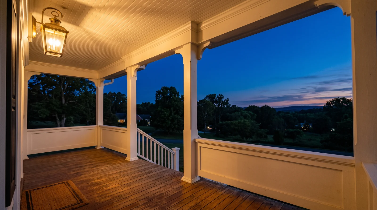
Check it morning and evening. Daylight will show the soft, sky-like side of the color, while a warm porch light at night can pull blues slightly green and greens slightly gold. Tape a real painted sample to the ceiling and look up at it across a full day before you commit.
LRV, or light reflectance value, tells you how much light a color throws back, on a scale from near 0 (very dark) to near 100 (near white). For a porch ceiling you usually want a higher LRV, roughly in the 60s and up, so the ceiling stays bright, makes the space feel taller, and helps light carry into a shaded porch. Pale picks like Ice Blue and Sky Blue sit in this brighter range.
If your porch is large, sunny, and you want a more intimate, enveloping feel, you can drop lower with a richer Aqua or teal in the 40s to 50s. Just know a deeper ceiling reads cozier but can make a small or dim porch feel lower and darker, so match the LRV to the mood and size you actually have.
See It. Love It.
Paint It.
Upload one photo of your porch ceiling and try every color on this page on your own walls — in your own light, before you buy a drop of paint.

Lost in the 80sBeforeThe Best Color Directions For A Porch Ceiling
Blue is the classic choice, and for good reason. A pale, slightly grayed blue like Sky Blue or Ice Blue reads as open sky and keeps the porch feeling airy and a touch cooler on hot afternoons. It is the safest, most timeless direction and flatters almost any house color underneath.
Greens and teals give you a fresher, more current feel. Seafoam and Robin Egg lean soft and restful, while Aqua and Tiffany Blue bring a bit more personality and pop. Pick blue when you want quiet and traditional; lean teal or green when you want the ceiling to feel like a small, happy surprise.
The Right Finish For An Outdoor Ceiling
Use an exterior paint here, not an interior one, even though the ceiling is sheltered. Porches deal with humidity, temperature swings, and the occasional blown-in rain, and exterior formulas are built to handle that without peeling or growing mildew.
For sheen, a satin or a low-luster eggshell is the sweet spot. It shrugs off moisture and wipes clean of dust and cobwebs, but it stays soft enough that it won't bounce harsh glare back down at you the way a gloss would. Save gloss for the trim and rails, where the extra shine and toughness earn their keep.
Common Mistakes To Avoid
The biggest one is using interior paint or a flat finish to save money. It will trap moisture, mildew, and chalk within a season or two, and you will be repainting far sooner than you planned. The second is picking the color from the chip alone; bounced shade will make it darker and grayer overhead, and people are often surprised by how much.
Going too bright or too saturated is another trap. A vivid Aqua that looks playful on a card can feel cartoonish across a whole ceiling, so when in doubt, choose the softer, slightly grayed version. Finally, don't skip primer on bare or weathered wood and don't paint in damp, cold, or blazing-hot conditions, since the finish needs the right temperature to cure and stick.
About Porch Ceiling Paint Colors
A painted porch ceiling is one of the oldest, friendliest tricks in American home design. A soft blue or green overhead stretches the day a little longer, keeps the space feeling calm, and tradition says it even reads like sky to the bugs and birds. Whatever you believe about that, the look works: it makes a porch feel finished instead of forgotten.
This page is about picking the right color for that ceiling specifically, not your walls or your front door. Porch ceilings live with bounced sunlight, humidity, and a lot of looking-up, so the color and the finish both matter. Blues and teals lead the field here for good reason, and the example shades on this page run that whole range.
Every color shown can be mixed to order at a paint counter, and a shade you like in one brand can almost always be cross-matched to another. So choose by how the color looks and feels first, then match it to whatever paint line you prefer.
The Questions Everyone Asks
What color should I paint my porch ceiling?
If you want one answer, start with the safe picks above — Palladian Blue, Polar, Lost in the 80s, Eucalyptus Leaf. They read well in any light and survive furniture changes. Then check the light: strong afternoon sun wants a step cooler, a north-facing room wants a step warmer.
Why are porch ceilings painted blue?
It is an old Southern tradition. A pale blue ceiling, often called haint blue, was thought to mimic the sky and ward off insects and bad spirits. Today most people do it because it simply looks calm, finished, and a little brighter overhead, and blues like Sky Blue or Ice Blue still do that beautifully.
What sheen should I use on a porch ceiling?
A satin or low-luster eggshell in an exterior paint is the best choice. It resists moisture and mildew, wipes clean of dust and spiderwebs, and stays soft enough to avoid harsh glare when you look up. Skip flat, which holds dirt and moisture, and skip high gloss, which is too shiny overhead.
Do I need exterior paint for a covered porch ceiling?
Yes. Even though it is sheltered, a porch ceiling deals with humidity, temperature swings, and occasional blowing rain. Exterior paint is made to handle that without peeling or growing mildew, while interior paint will fail much faster in those conditions.
Should I match my porch ceiling to my walls or trim?
No, the ceiling is meant to be its own soft accent. The classic look is a blue or green ceiling like Seafoam or Robin Egg over white trim, columns, and rails. Keep the trim and floor fairly neutral so the painted ceiling stays the highlight.
Will the color look different once it is on the ceiling?
Almost always, yes. A porch ceiling gets mostly bounced, shaded light, so the color reads a little deeper and grayer than it does on the chip. Tape a real painted sample up and look at it morning and evening before you commit, and lean a touch warmer or brighter on a shaded porch.
Can I get these colors in any paint brand?
Yes. Every shade shown here can be mixed to order at a paint counter, and a color you like in one brand can be cross-matched to another. Choose the color you love first, then match it to whatever exterior paint line you prefer.
What color works best for a dark or shaded porch?
Go brighter and slightly warmer to fight the gloom. A clear Sky Blue or a soft Robin Egg with a higher light reflectance value will help bounce light around and keep the space from feeling like a cave. Avoid deep or heavily grayed teals on a dim porch, since they can make the ceiling feel even lower and darker.
What two-color combination works best in a porch ceiling?
The reliable pattern is a quiet main color plus one deep accent on a single wall. Keep trim and ceiling in one warm white so the two colors are the only event in the room — the combination cards above show complete schemes from real rooms.
What colors make a porch ceiling look bigger?
High-LRV, slightly warm colors — LRV 60–75 is the sweet spot. Paint the walls and trim close to the same light color so the corners blur, and keep the ceiling white. Stark cool white actually works against you; it creates hard shadows that show the room's edges.

Ask a Question