Lost in the 80s
The dusty sky blue with the loudest name in Backdrop's deck, reviewed honestly: where it stays calm and bright, the light that flattens it, and what to pick instead.

Jessica has spec'd whites and neutrals for more than 300 rooms and keeps a sample wall of painted drawdowns in her studio. Every color review is checked against real reader rooms in the comments and re-tested when a formula changes. About the testing process →
- 1Wolf Gray21
- 2Resolute Blue40
- 3Lost in the 80s51
- 4Honolulu Blue62
- 5After Rain68
The Fast Verdict
Despite the name, Lost in the 80s is not a shoulder-pad, neon statement color. It is a quiet, grayed-down sky blue — the lightest of Backdrop's four-color blue family — and at LRV 51 it holds real color without ever going moody. That makes it an easy pick for bedrooms, nurseries, and small home offices that want blue without commitment. The one real catch is how you buy it: Backdrop is online-only, so you are testing a self-priming, eco-formula paint against your own room's light with a peel-and-stick swatch, not a can cracked open under hardware-store fluorescents.
Bedrooms and nurseries with real daylight · calm home offices and reading nooks · bathrooms that want blue without going full spa-teal · gender-neutral kids' rooms
You wanted the neon 80s drama the name promises · your room is dim, north-facing, and short on lamps · your floors or trim run honey oak · you need to see a real can in a store before you commit
- A genuinely calm, wearable dusty sky blue — not the cartoon-bright color the name implies
- LRV 51 keeps rooms feeling bright, unlike Backdrop's three much darker blue siblings
- Reads as a confident, real blue rather than a wishy-washy blue-gray chameleon
- Gender-neutral enough for nurseries and kids' rooms without tipping pastel-baby-blue
- 12-inch peel-and-stick real-paint swatches make it cheap to test before buying a gallon
- The name oversells drama the paint does not deliver — expect quiet, not neon
- Cool north light and cool-white bulbs flatten it toward a chalky, slightly cold blue-gray
- Fights honey oak floors and other warm yellow-orange wood
- Backdrop is online-only — no hardware-store can to check in your own room's light before ordering
What Color Is Lost in the 80s, Really?
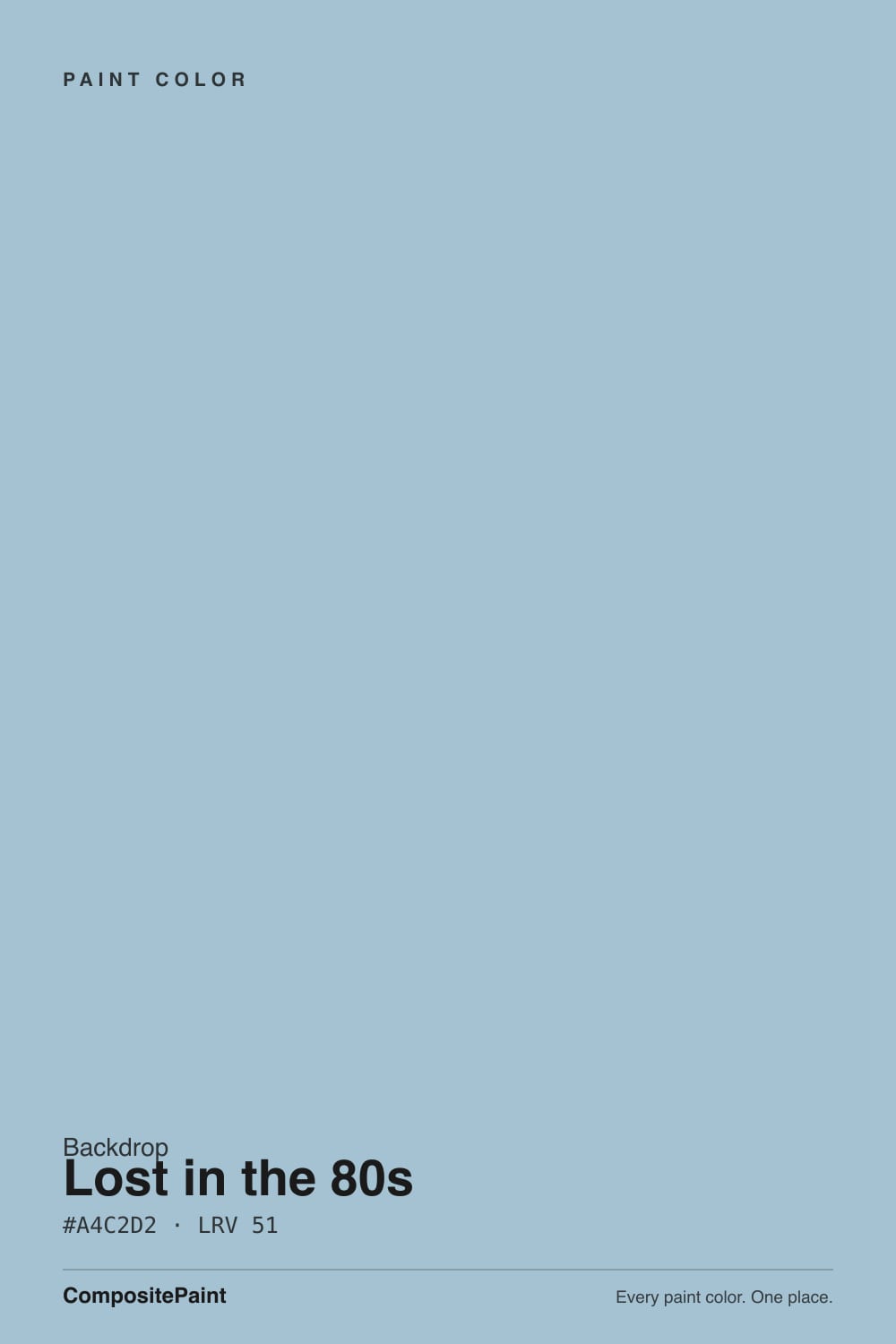
A dusty, grayed-down sky blue with a hue that sits squarely in blue territory — not teal, not periwinkle-purple. The saturation is turned down enough that it reads as calm rather than cartoonish, and at LRV 51 it is genuinely mid-light: bright enough to keep a room from feeling closed in, saturated enough to still register as a real color choice, not a whisper of one. Think chambray shirt, not Miami Vice — the paint is quieter than the name suggests.
Backdrop names its colors for vibe and memorability, not description, and Lost in the 80s is a good example: it is one of four blues in the brand's curated deck, and it is the lightest of the set by a wide margin. Mom Jeans (LRV 18), We Three Kings (LRV 8), and Last Call (LRV 6) carry the moody, near-navy end of the family; Lost in the 80s is the one built to actually brighten a room. If you want the drama the name implies, it lives in one of its darker siblings, not here.
Undertone in one line: blue first, with just enough gray mixed in to keep it from looking sweet or babyish. In flat, cool light it reads closer to a soft blue-gray; in real daylight or under warm bulbs the blue itself comes forward. If your sample looks washed-out and chalky, that is the light draining it, not a flaw in the paint — deck LRV and hex are canonical regardless of what your screen shows.
Where It Shines
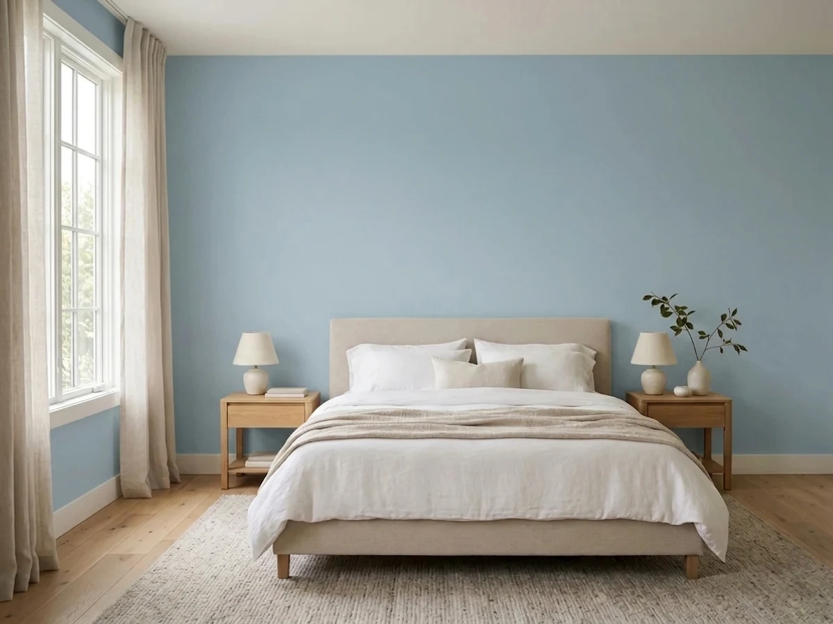
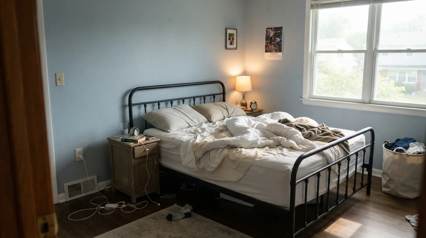
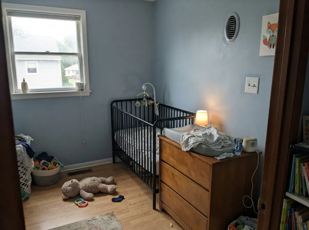
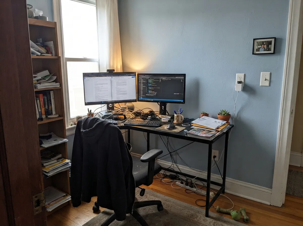
Give it real daylight and it earns its keep as a genuinely calm blue — not gray pretending to be interesting, not a pastel that disappears. It is at its best in rooms that get used at eye level and up close: bedrooms with white or cream linens, nurseries and kids' rooms where a confident but non-babyish blue reads gender-neutral, and small home offices where a cool color helps the room feel focused rather than sleepy. Paired with matte black hardware or walnut furniture it looks current, not themed. Because Backdrop ships direct and sells 12-inch peel-and-stick swatches of the actual paint, you can test the real color on your real wall before committing a gallon — a genuine advantage over guessing from a chip in a big-box aisle.
Where It Fails
Almost every regret story with a dusty blue like this one comes down to one of three predictable situations. None of them are the paint's fault, but if your room or your expectations match one of these, sampling bigger will only confirm the problem, not fix it.
Cheeky, nostalgic names are Backdrop's whole brand, and this one oversells. There is no neon, no Miami Vice, no shoulder pads waiting on the wall — Lost in the 80s is a quiet, grayed-down sky blue. If you actually want a loud, saturated statement blue, this is not it; a more playful, higher-chroma blue is the honest answer.
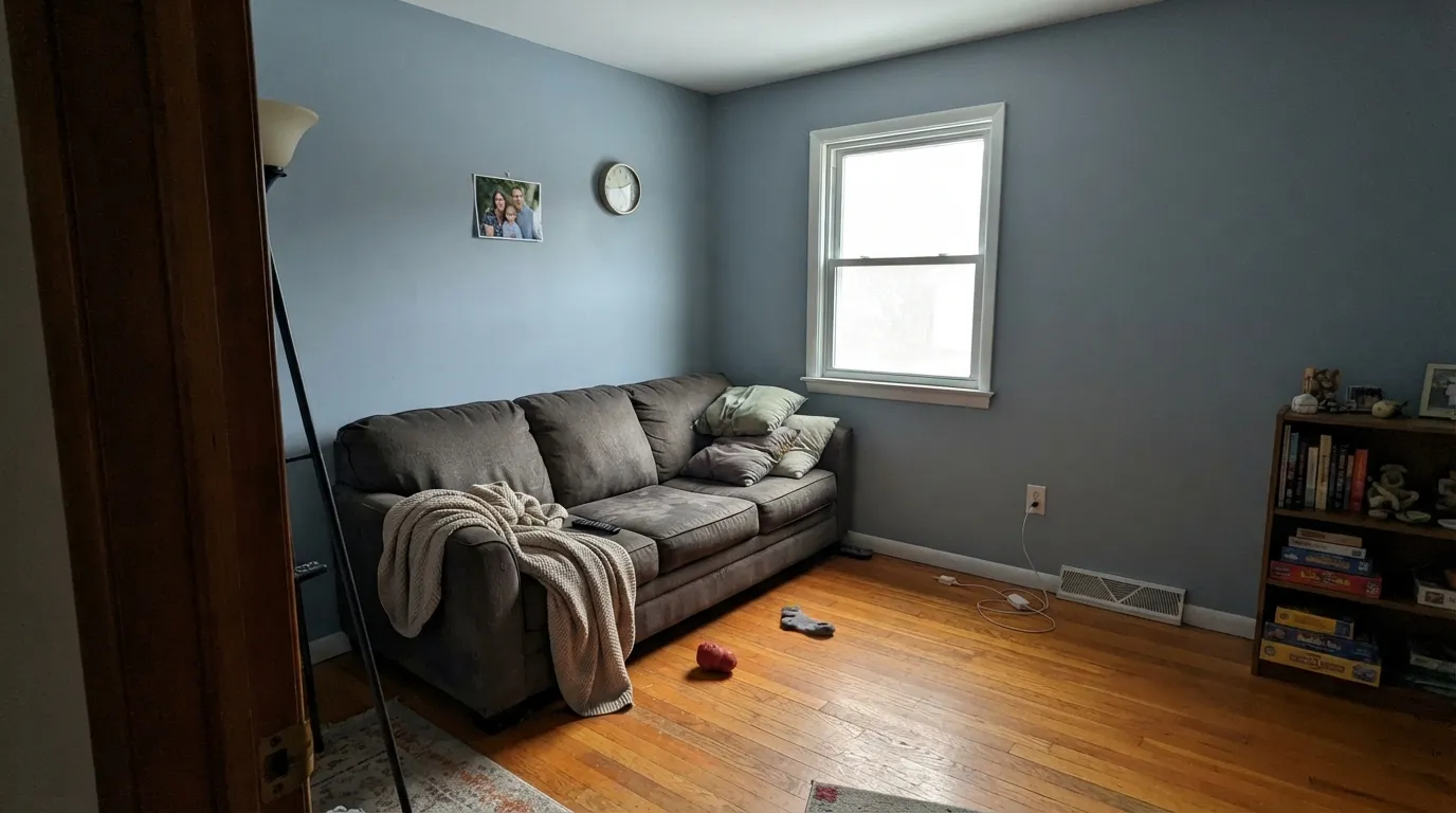
Cool, overcast daylight and cool-white bulbs flatten the blue toward a chalky, slightly cold gray — the kind of light that makes dusty blues like this one read institutional or waiting-room instead of calm. Warm 2700K bulbs and any real daylight bring the blue back; a dim north room with no lamps will not.
Blue and orange sit opposite each other on the color wheel, so warm yellow-orange wood pulls this blue cooler and grayer while the wood itself looks more orange next to it. Both sides lose. Walnut, white oak, and black metal are far better company than builder-grade honey oak.
Room by Room
A calm, wide-awake blue that still lets you sleep. White or cream bedding keeps it soft; black metal bed frames and matte hardware keep it from feeling precious. Eggshell finish, real daylight if you can get it.
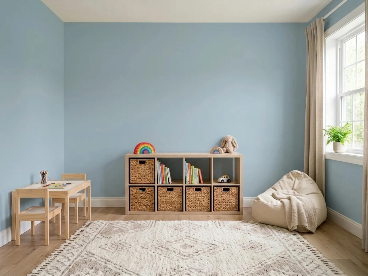
LRV 51 keeps the room bright even with smaller windows, and the color reads as a real, confident blue rather than a washed-out baby-blue pastel. Matte or eggshell hides wall texture and scuffs equally well.
A cool color that helps a small workspace feel focused rather than sleepy. Pairs well with black metal desks and shelving; skip it if the office is a windowless interior room with only cool overhead LEDs.
Cleaner and more clearly blue than the green-leaning spa colors this category usually reaches for. Works well on four walls or just a vanity; satin for durability where it gets splashed.
An island, a hutch, or lower cabinets under a neutral wall color works. A full kitchen of this blue over honey-oak floors is the exact clash described above — don't do it without a large rug or a different floor between them.
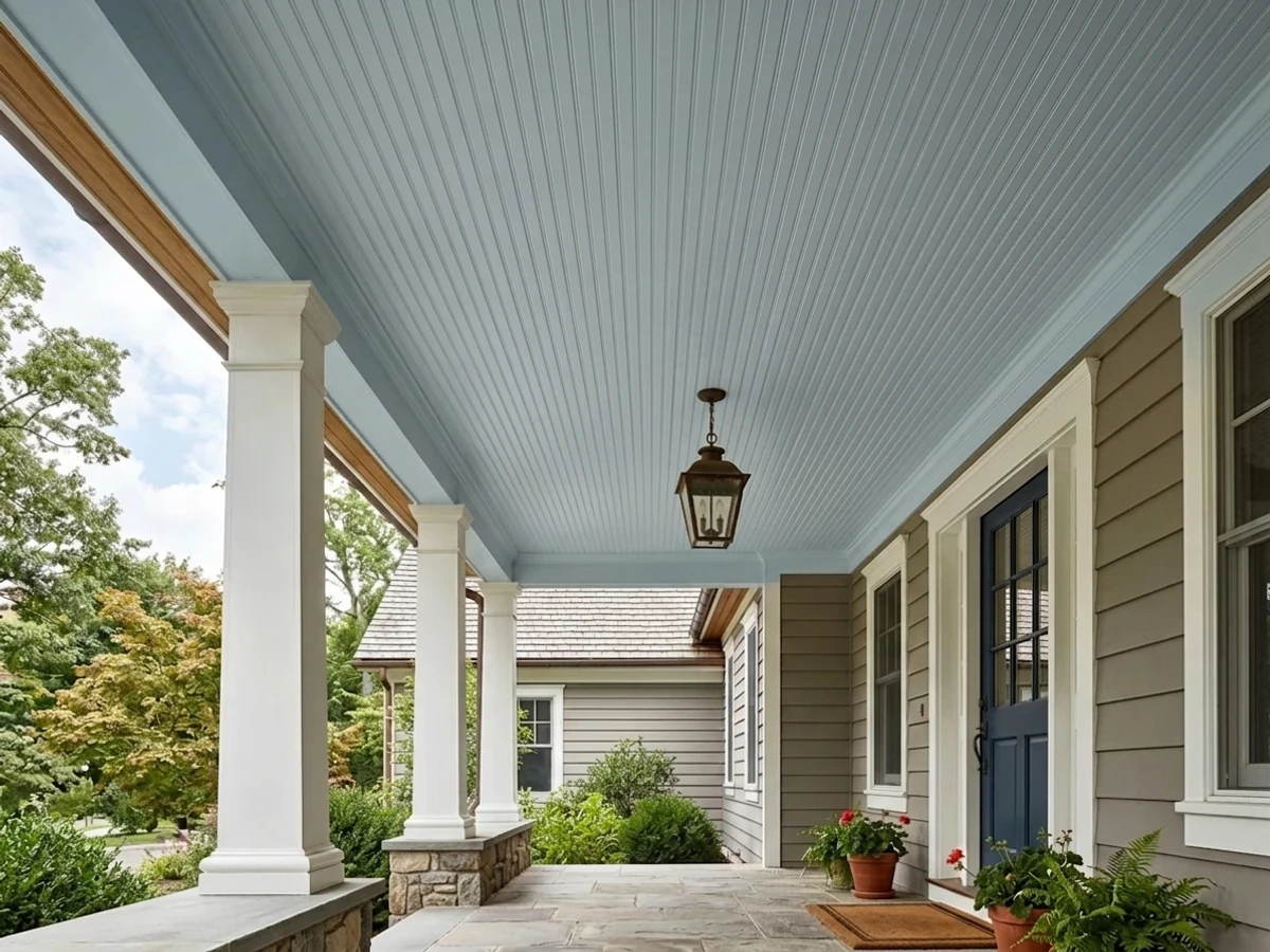
Backdrop does sell exterior paint, but as a newer DTC brand it does not yet have the decades of real-world weathering feedback that the established Benjamin Moore and Sherwin-Williams blues have. For a front door or shutters, pick a color with a longer track record outdoors.
Your Light Is the Risk
Real daylight keeps the blue clear and calm all day without draining it. The room the color was built for.
Cool, flat daylight strips the warmth out and leaves a chalky, slightly cold gray-blue. Test on the actual wall first.
Brighter and clearly blue at the sun hours, quieter and more gray-leaning the rest of the day. A gentle shift, not a mood swing.
2700K warm bulbs keep the blue readable and cozy. Cool white LEDs push it toward flat and gray-green — swap the bulb before you blame the paint.
Most complaints about Lost in the 80s are a light mismatch. Upload a photo of your actual room and see it on your walls — then ask for the same wall in north light or evening lamps before you buy a single sample.
Need It From Another Brand?
Any paint counter can custom-tint Backdrop BD-LO directly. If you would rather stay in one brand's own deck, these are the closest stock matches, measured as ΔE2000. Under 2 is a difference you will not see on the wall.
| Brand | Closest color | ΔE | LRV | |
|---|---|---|---|---|
| Behr | Alluring BlueICC-99 · Behr | 4.6 | 51 | Color page → |
| Benjamin Moore | Mediterranean Sky1662 · Benjamin Moore | 1.7 | 51 | Color page → |
| Valspar | Northern Sky Blue4008-5B · Valspar | 1.1 | 50.8 | Color page → |
| PPG / Glidden | Blue BowsPPG1158-3 · PPG / Glidden | 2.3 | 51 | Color page → |
| Glidden | Blue BowsPPG1158-3 · Glidden | 1.6 | 52 | Color page → |
| Dutch Boy | Water Drop238-3DB · Dutch Boy | 1.9 | 52 | Color page → |
Similar Backdrop Colors
The nearest shades to Lost in the 80s within Backdrop's own range, ranked by perceptual color distance — useful when you want the same look a touch lighter, darker, or warmer.
WCAG 2.1: AA is 4.5 : 1 for normal text, 3 : 1 for large text, AAA is 7 : 1.
Lost in the 80s vs the Colors You're Also Considering
Every Lost in the 80s sample board has the same rivals on it. The numbers show the real lightness gap — then it comes down to which risk you would rather live with.
Pick this for a cleaner, more confidently blue color with less green wobble.
Benjamin Moore HC-144 · LRV 53Palladian BluePick this if you want more green in the mix — Palladian Blue is the spa-leaning version of this same lightness.
Pick this if you want your blue to read as unmistakably blue, not gray with a secret.
Benjamin Moore HC-165 · LRV 36Boothbay GrayPick this for a deeper, moodier blue-gray that most people will call gray at first glance.
Within Backdrop, the closest cousin is Underdog (BD-UD), LRV 41. Underdog is ten points darker and much grayer, a moody blue-gray rather than a sky blue. On the wall the difference is bigger than the chips suggest: Lost in the 80s keeps a room light and clearly blue, while Underdog reads muted and sophisticated, closer to a stormy coastal gray. Pick Underdog for a den or adult bedroom that should feel enveloping; pick Lost in the 80s where you want brightness and an obvious blue.
Nuevo (BD-NU), LRV 38, is further away in character. It is a gray-green neutral with almost no blue in it, so it works where Lost in the 80s would feel too colorful, like a living room that needs to stay quiet.
Real Real (BD-RR), LRV 65, sits on the opposite side of the wheel, a warm greige that is lighter than Lost in the 80s. The two actually pair better than they compete: Real Real for the main living areas, Lost in the 80s for the bedrooms off the same hallway.
Lost in the 80s Coordinating Colors
The rule for coordinating with Lost in the 80s is simple: warm whites soften it, crisp whites sharpen it, and near-blacks ground it — but keep golden, honey-toned wood at arm's length. These are the partners that keep it reading calm and current:
About Backdrop, the Brand Behind the Name
Backdrop is a direct-to-consumer paint brand founded in 2018 by Natalie and Caleb Ebel, with Caleb bringing a background from Warby Parker's approach to reinventing a stodgy category. The brand's whole pitch is a curated, manageable deck of colors — around 50 — with memorable, often nostalgic or cheeky names in place of the numbered, paragraph-length names of the legacy brands. Lost in the 80s fits that pattern: it names a mood, not a description, which is exactly why the actual paint reads calmer than the name suggests.
The formula itself is a real point of difference: Backdrop's interior paint is self-priming, low-VOC, GreenWise certified, and free of formaldehyde, aimed at a buyer who wants an easy, fewer-steps paint job. Because Backdrop sells online only, with no big-box aisle to check a can under fluorescent light, it ships 12-inch peel-and-stick swatches of the real paint — worth ordering before you commit a full gallon, especially for a light-dependent color like this one.
Lost in the 80s With Wood Tones and Metals
White oak and walnut are the safest, best-looking partners — their cooler or neutral cast lets the blue stay calm instead of getting pushed toward gray. Black metal, whether matte black hardware or a black bed frame, reads current and grounds the color without adding a second competing hue.
The one wood to avoid is honey oak or any warm, orange-leaning trim: blue and orange sit opposite each other on the color wheel, so the two fight rather than complement. If honey oak floors are staying put, either add a large rug between them and the wall, or choose a warmer, less saturated neutral instead of this blue.
Three Ready Palettes Built on Lost in the 80s
A color is never alone on the wall. These are complete combinations in the 60-30-10 pattern, with the reason each one holds together. Every one opens in the visualizer.
A confident, gender-neutral blue instead of a pastel baby-blue; White Dove trim keeps the edges soft, and one near-black furniture note (crib rails, a bookshelf) keeps the room from feeling too sweet.
Try this palette in your roomA clean, spa-calm blue that reads unmistakably blue rather than teal; the warm white trim keeps a small bathroom bright, and one near-black frame or door gives it a finished, deliberate edge.
Try this palette in your roomCrisp white trim keeps the blue reading current rather than dated; Boothbay Gray on one wall or a bank of shelving adds depth without leaving the blue family, so the room feels curated instead of mismatched.
Try this palette in your roomLost in the 80s FAQ
Is Lost in the 80s more blue or gray?
Blue — clearly, with just enough gray mixed in to keep it calm instead of candy-bright. It is not one of those chameleon colors that flips fully gray in cool light; it just goes quieter and slightly chalkier. If your goal was actual gray, this is the wrong color.
Is it a good nursery color?
One of its best uses. LRV 51 keeps the room from feeling closed in, and the blue is confident enough to read as a real color choice without tipping into a pastel, gendered baby-blue. Matte or eggshell both work well.
What trim white goes with it?
A warm off-white like White Dove keeps the room soft and cohesive; a crisper white like Chantilly Lace or Alabaster sharpens the contrast if you want the blue to read more modern. Either works — pick based on how much contrast you want, not because one is more correct.
Can I see a real paint sample before ordering a gallon?
Yes — Backdrop ships 12-inch peel-and-stick swatches of the actual paint, which is genuinely more reliable than a printed chip. Since Backdrop sells online only, that swatch is your best chance to test the color against your own room's light before committing.
How does it compare to a Benjamin Moore or Sherwin-Williams blue?
Chromatically it sits closest to Benjamin Moore's Palladian Blue, just with less green in the mix, and it is noticeably calmer than a saturated sky blue like Honolulu Blue. The honest difference is track record: BM and SW blues have decades of real-world reviews behind them, while Backdrop is a newer, smaller-batch brand.
Does it work with honey oak floors?
Not well. Blue and orange are complementary, so warm honey oak pulls the blue cooler and grayer while making the floor look more orange. White oak, walnut, or black metal are much better partners.
Have you painted with Lost in the 80s?
Rate it — one tap helps the next reader decide.
Ask a Question