Wrought Iron
America's favorite front-door near-black, reviewed honestly: why it is not the true black most people think they are buying, and where that helps.

Jessica has spec'd whites and neutrals for more than 300 rooms and keeps a sample wall of painted drawdowns in her studio. Every color review is checked against real reader rooms in the comments and re-tested when a formula changes. About the testing process →
- 1Wrought Iron8
- 2Kendall Charcoal15
- 3Retreat21
The Fast Verdict
Wrought Iron is the near-black people reach for when true black feels too hard. It has almost no undertone — just a whisper of green-gray — so it reads as black indoors and as a deep charcoal outdoors in sun. That softness is the whole point on a front door, on an island, on millwork. It is also the single thing people complain about: if you wanted a door that looks black at noon, this is not it.
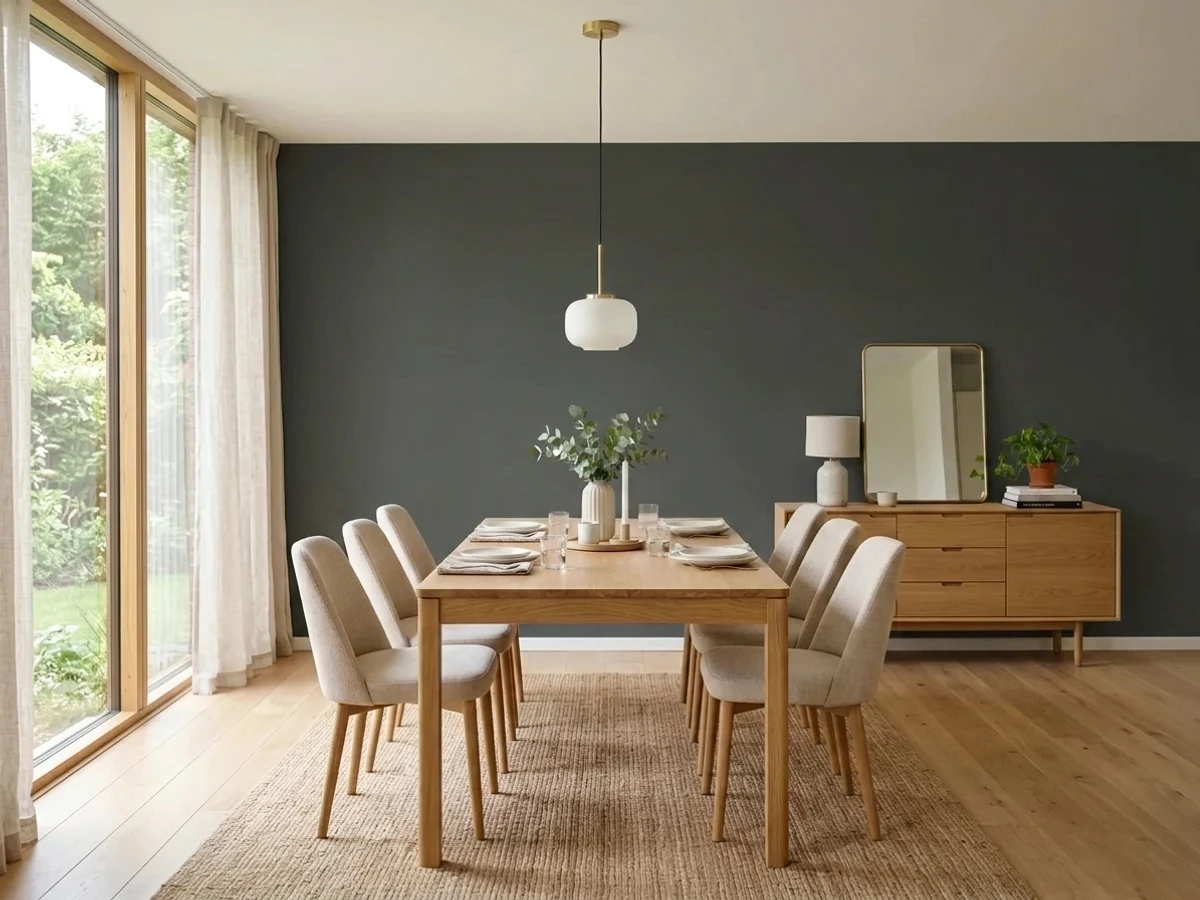
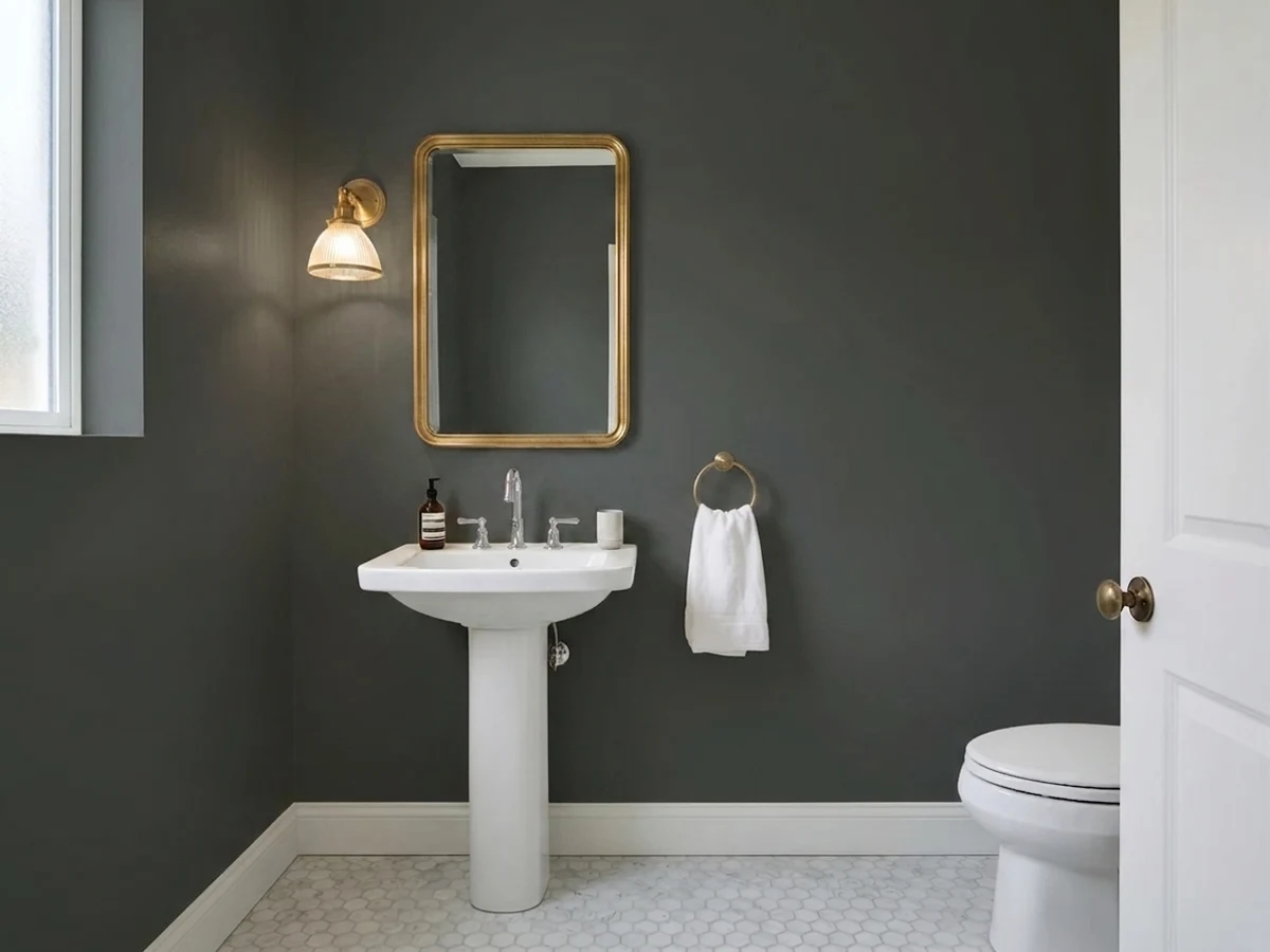
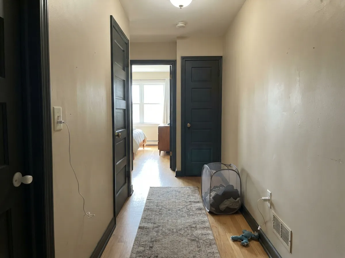
Front doors and shutters against white or light siding · Kitchen islands and built-ins that need a dark base · Interior doors and millwork under light walls · Small cocoon rooms — study, den, powder room
You want hard, true black · The room is dim and faces north · Your windows and hardware are already true black · You need wall paint you can touch up invisibly
- Reads black without the cold, hard edge of a true black
- Almost no undertone — sits under greige, navy, sage or white walls without arguing
- The green-gray whisper flatters warm wood, brick and brass
- Grounds a light kitchen or bath without adding a color you have to coordinate
- Softer contrast against white siding than black, so entries look designed rather than stark
- Not a true black — full sun turns it dark charcoal gray
- Looks washed out beside black-framed windows and true-black hardware
- Goes flat and featureless in dim north-facing rooms
- Touch-ups flash and roller marks show; near-blacks are unforgiving to repair
What Color Is Wrought Iron, Really?
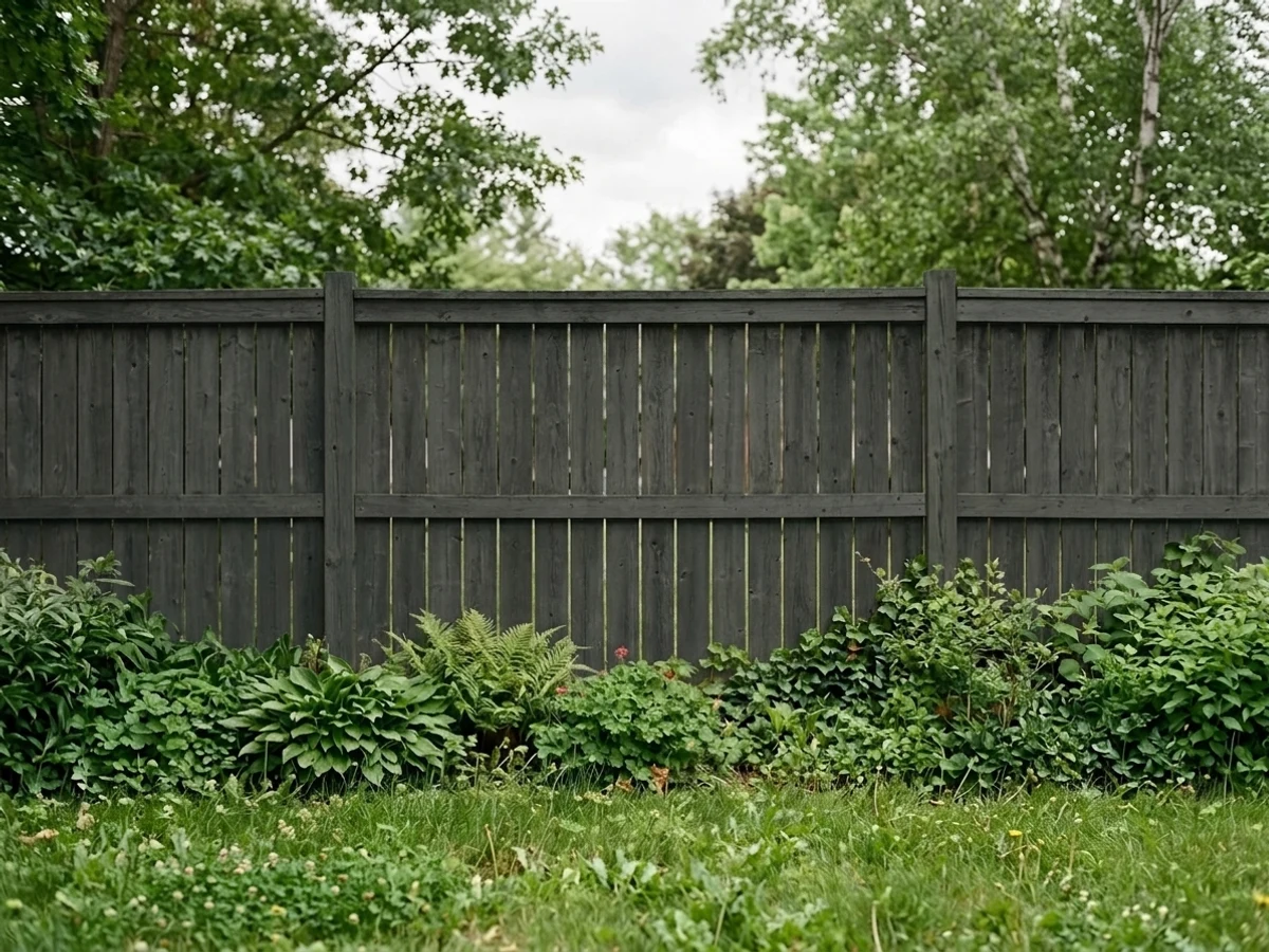
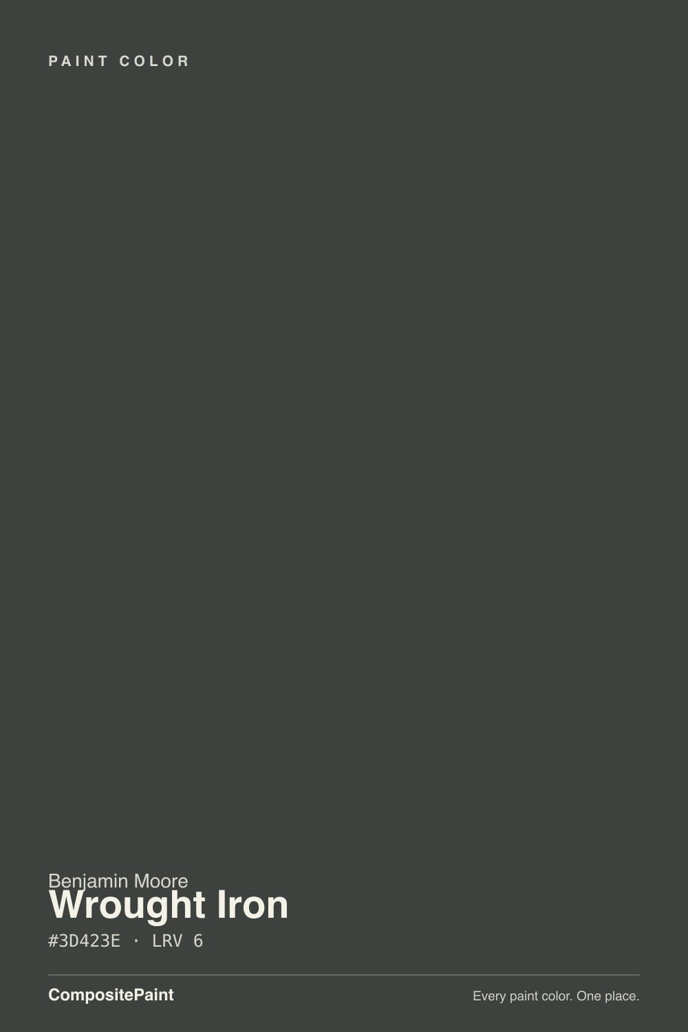
A near-black that is almost, but not quite, neutral. At only 4 percent saturation there is no real color in it — just a faint green-gray cast that keeps it off the hard, factory-black end of the scale. This is why people argue about it online: some see green, some are certain it goes navy, and both camps are describing the same paint. A color this close to neutral has almost nothing of its own to show, so it borrows from whatever is around it. Warm brick and brass pull the green forward. Cool gray stone, a blue sky reflecting off a glossy door, or a photo taken in open shade all push it toward blue.
LRV 8 sounds like black, and indoors it behaves like black. Outdoors it does not. A true black such as Sherwin-Williams Tricorn Black sits at LRV 3 and stays black in full sun; Wrought Iron has twice as much light to give back, and midday sun collects it. That is the gap that surprises people: on the paint chip and in the hallway it is black, and on a south-facing door at noon it is clearly dark charcoal gray. Against Benjamin Moore Onyx (2133-10) or Black (2132-10) indoors you can just see it lighten and soften.
Undertone in one line: essentially neutral with a green-gray whisper — never brown, and the blue people report is reflection, not pigment.
Where It Shines
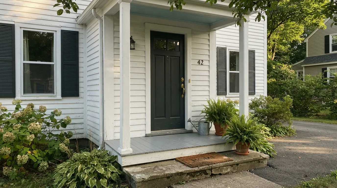
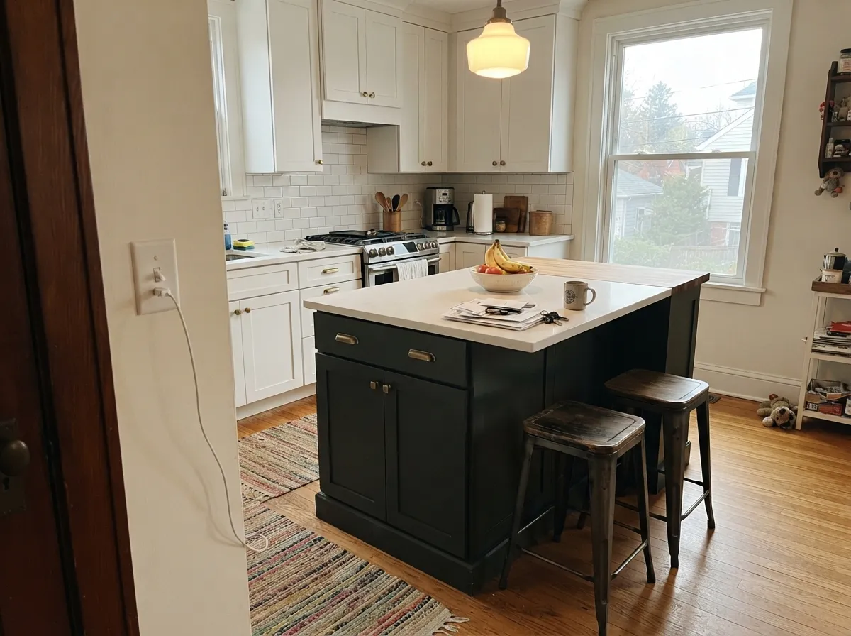
It is at its best doing one job in a light room: the door, the island, the built-ins, the shutters. Give it white or near-white around it and warm metal on it, and the softness that annoys black purists becomes the reason the whole entry looks expensive instead of severe.
Where It Fails
The bad reviews for Wrought Iron are unusually consistent. Almost none of them say the color is ugly — they say it was not the color the buyer thought they were getting, or that it swallowed a room. Three situations cause nearly all of it.
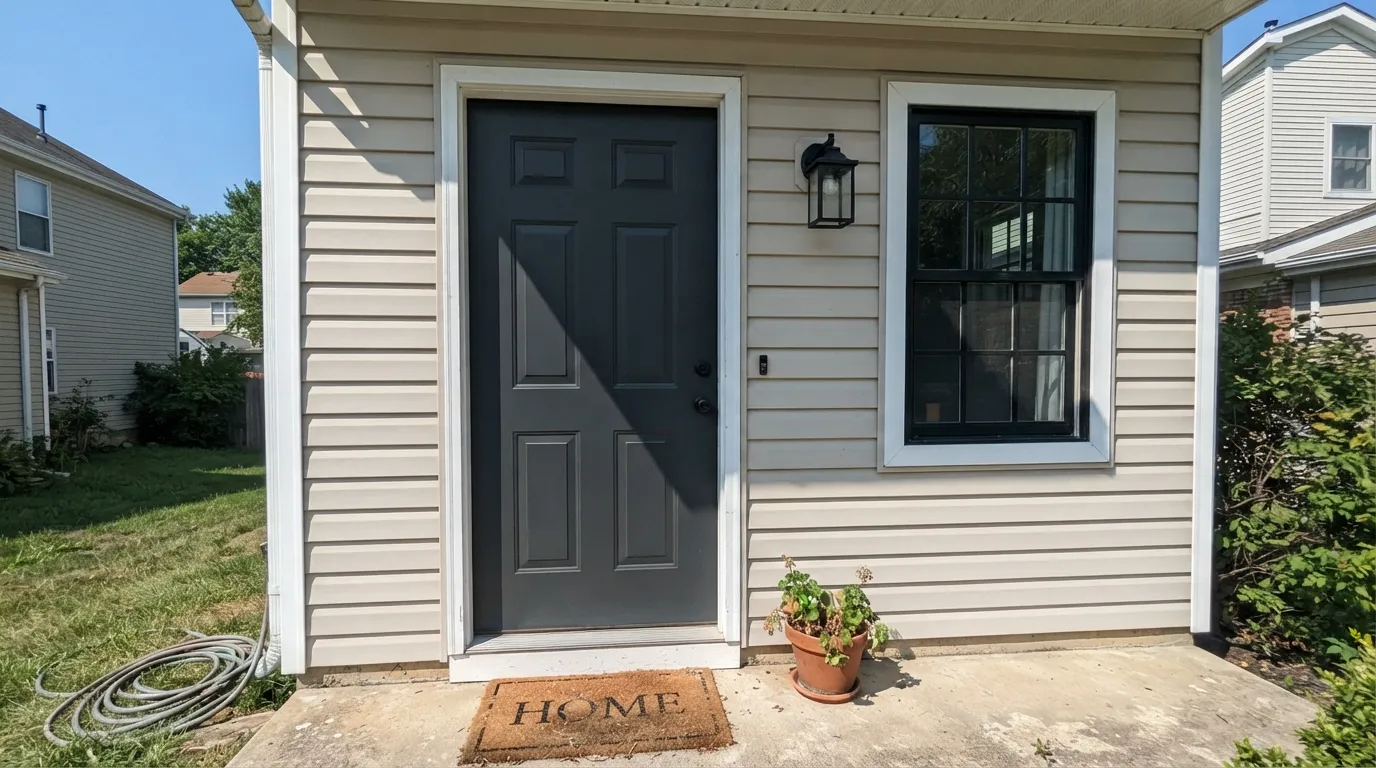
This is the number one complaint, and it is physics, not a bad batch. LRV 8 gives back enough light in direct sun that the door reads dark charcoal gray, not black — often with a cool cast from the sky. If you want a door that stays black at noon, use Benjamin Moore Onyx (2133-10) or Sherwin-Williams Tricorn Black (SW 6258).
Black-framed windows, matte black handles, black gutters — put Wrought Iron beside any of them and it looks washed out and slightly gray, like the door faded a year early. Nothing is wrong with the paint; it is losing a contest it was never built to win. Match the metal instead with Benjamin Moore Black (2132-10).
In low light the green-gray softness disappears completely and the walls go flat and featureless — corners vanish, and any millwork detail stops reading. People describe it as a black hole rather than a cozy den. For that room step up to Kendall Charcoal (HC-166) at LRV 13, or Chelsea Gray (HC-168) at LRV 22, which keeps shape and shadow.
Room by Room
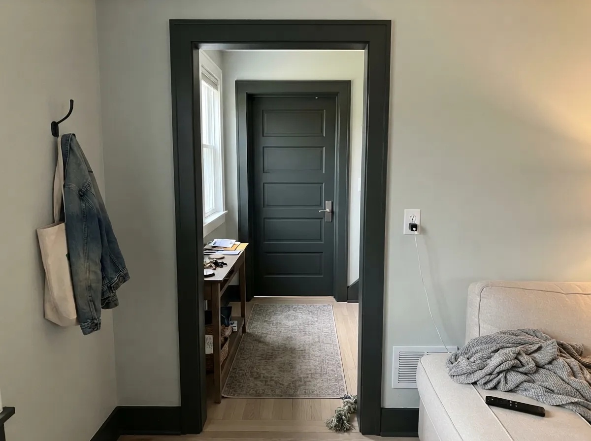
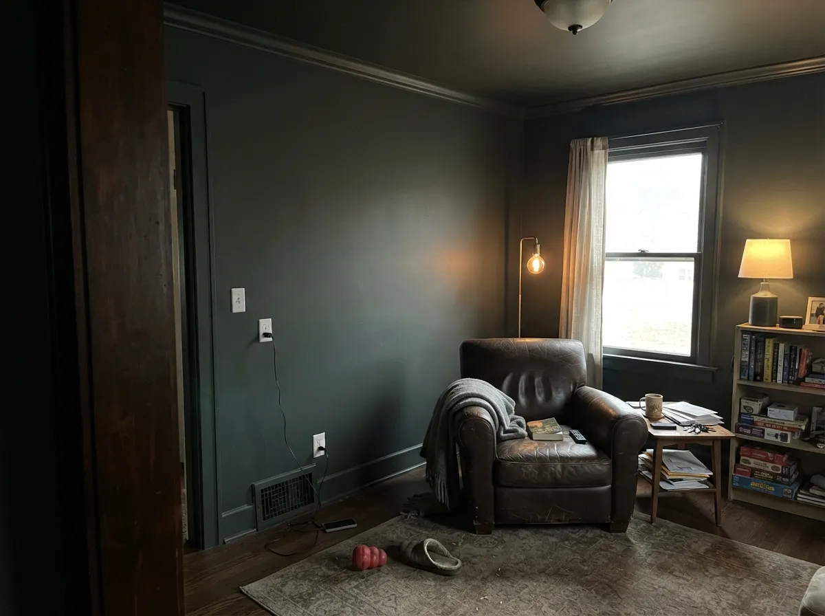
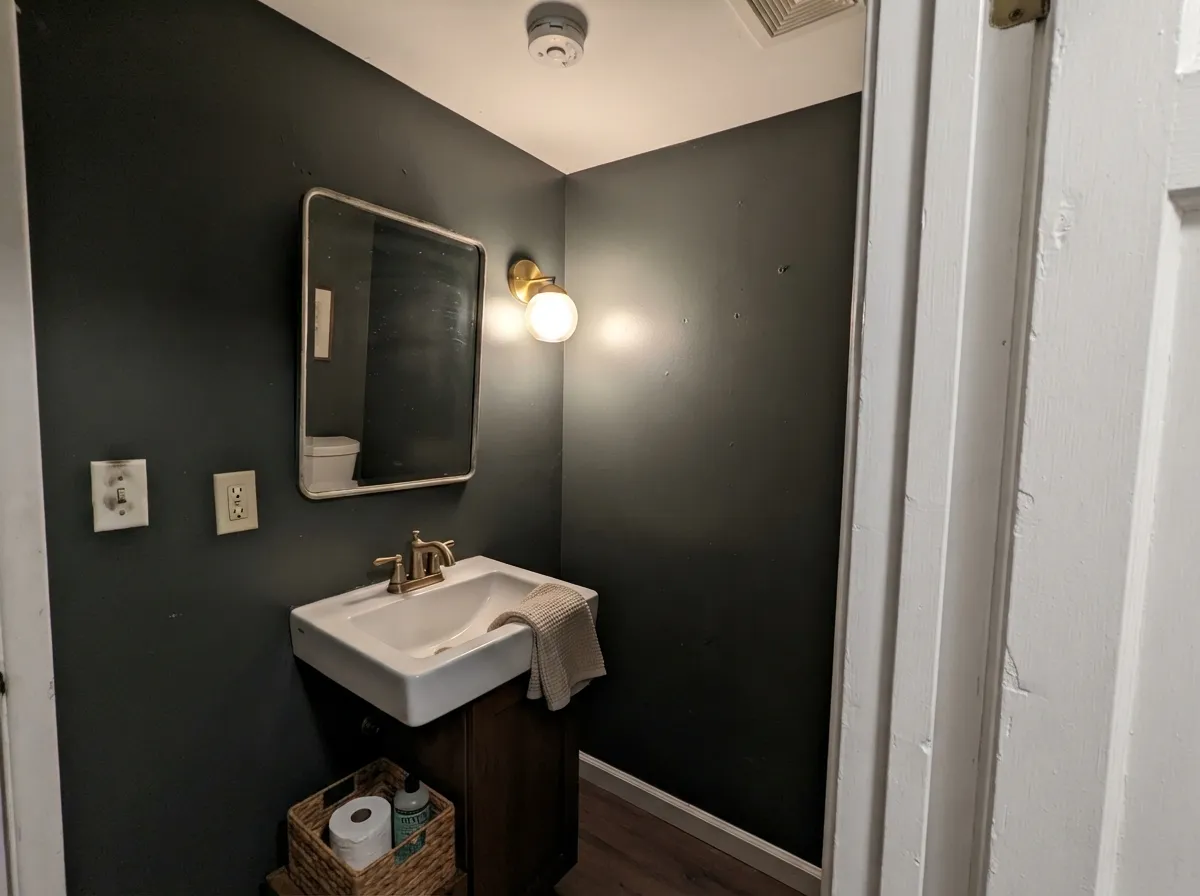
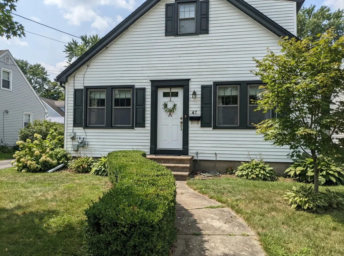
Your Light Is the Risk
Cool even light keeps it deepest and most solid. Indoors this is where it reads truest black.
Strong sun lifts LRV 8 into charcoal. Beautiful, but it is no longer black.
2700K bulbs bring back the soft green-gray. Cool 4000K LEDs flatten it to hard, dull black.
The one to sample outdoors, at noon, on the actual door. This is where buyers get surprised.
Most complaints about Wrought Iron are a light mismatch. Upload a photo of your actual room and see it on your walls — then ask for the same wall in north light or evening lamps before you buy a single sample.
Need It From Another Brand?
Any paint counter can custom-tint Benjamin Moore 2124-10 directly. If you would rather stay in one brand's own deck, these are the closest stock matches, measured as ΔE2000. Under 2 is a difference you will not see on the wall.
| Brand | Closest color | ΔE | LRV | |
|---|---|---|---|---|
| Sherwin-Williams | Rock BottomSW 7062 · Sherwin-Williams | 3.5 | 7 | Color page → |
| Behr | Night ClubN500-7 · Behr | 1.3 | 7 | Color page → |
| Valspar | Blindfold4007-2C · Valspar | 2.2 | 6.7 | Color page → |
| PPG / Glidden | WitchcraftPPG1037-7 · PPG / Glidden | 2.6 | 7 | Color page → |
| Glidden | WitchcraftPPG1037-7 · Glidden | 2.5 | 7 | Color page → |
| Dutch Boy | Anchored Blue434-7DB · Dutch Boy | 2.7 | 6 | Color page → |
Similar Benjamin Moore Colors
The nearest shades to Wrought Iron within Benjamin Moore's own range, ranked by perceptual color distance — useful when you want the same look a touch lighter, darker, or warmer.
WCAG 2.1: AA is 4.5 : 1 for normal text, 3 : 1 for large text, AAA is 7 : 1.
Wrought Iron vs the Colors You're Also Considering
Every Wrought Iron sample board has the same rivals on it. The numbers show the real lightness gap — then it comes down to which risk you would rather live with.
Pick this for softness — Wrought Iron never looks severe against white.
Benjamin Moore 2133-10 · LRV 3OnyxPick this if you want a door that still reads black at noon.
Pick this when you want the near-black to feel organic, not engineered.
Benjamin Moore 2125-10 · LRV 5Black PantherPick this for a cleaner, flatter black with nothing green in it.
Against Black Panther (2125-10), LRV 5, Wrought Iron is marginally lighter and carries its faint green-gray instead of Black Panther's flatter, more neutral character. Choose Wrought Iron when you want a softer, slightly warmer near-black; choose Black Panther for a cleaner, harder black.
Regent Green (2136-20), LRV 6, shares the same depth but pushes further into green-teal territory, so it reads more clearly as a dark color rather than a black. If you want people to see green, go Regent Green; if you want black that just happens to feel organic, stay with Wrought Iron.
Compared with Sherwin-Williams Iron Ore (SW 7069), LRV 6, the two are close in depth, but Iron Ore leans warmer and grayer with no green cast. Wrought Iron feels a touch cooler and softer. On a front door in warm sun the difference is subtle, so sample both side by side.
Wrought Iron Coordinating Colors
Because Wrought Iron is essentially neutral, it does not force a palette the way a navy or a green would. That is its real superpower: it will sit under almost any wall color without arguing. The useful rule is about contrast, not temperature — pick partners that are clearly lighter, so the near-black stays the one heavy note in the room.
These are the pairings that come up over and over in real kitchens and entries. Chantilly Lace when you want the crispest edge, White Dove when you want it gentler, the warm greiges for the walls in between, and Hale Navy when you want a second dark that reads as color rather than as a rival black.
Wrought Iron on Exteriors
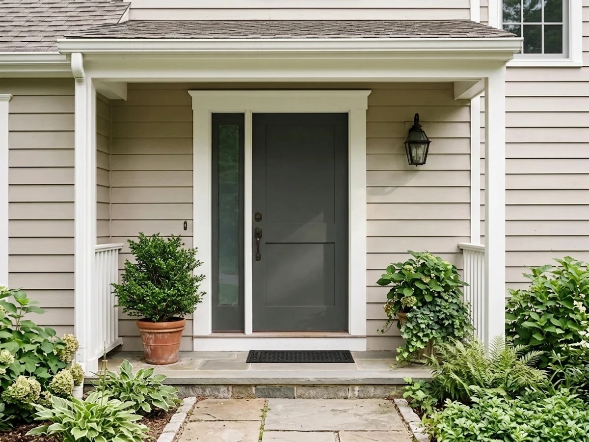
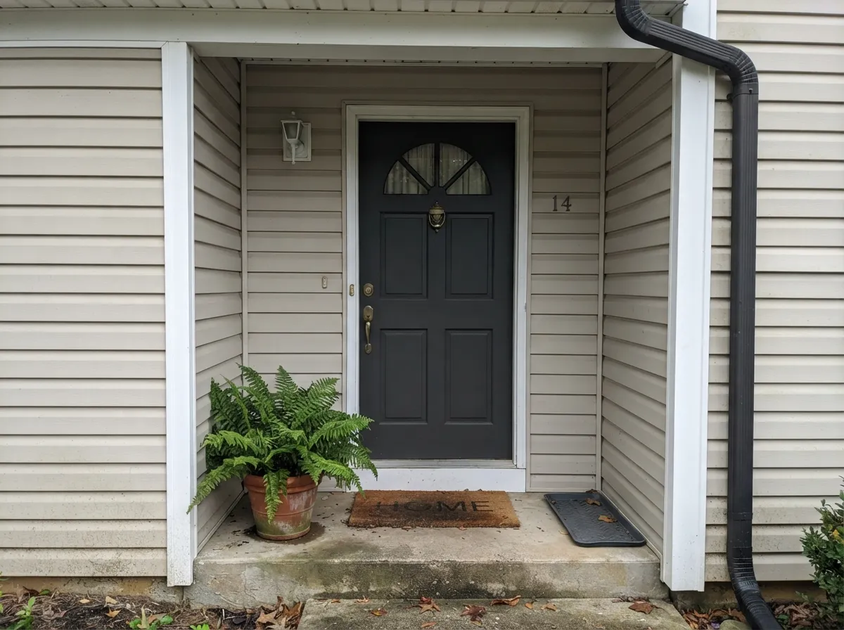
Outside is where Wrought Iron earns its reputation and also where it disappoints people, and both come from the same LRV 8. Against white or cream siding it gives a door and shutters real weight without the cut-out-hole look a true black leaves on a light facade. From the curb the entry reads intentional rather than severe, which is exactly why it shows up on so many modern-farmhouse exteriors.
Two things decide whether you will be happy. First, exposure: a north or east door keeps it deep and black-looking all day, while a south or west door in summer sun will read dark charcoal for hours. Second, what metal is already on the house — black window frames, black gutters, or black light fixtures will make the door look gray by comparison, and that mismatch is the complaint people write about a year later. Walk the house at noon with a large sample board held right against the door before you buy a gallon.
Wrought Iron on Cabinets and Islands
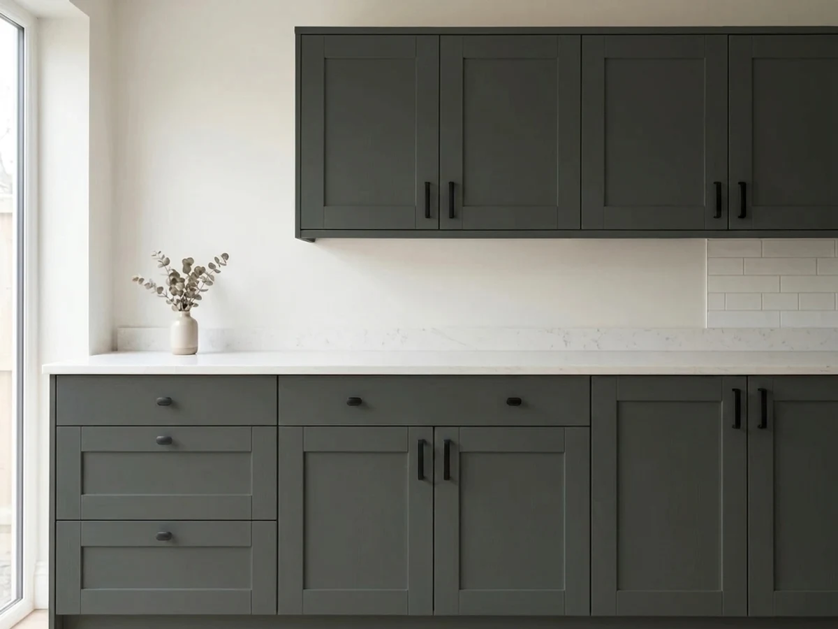
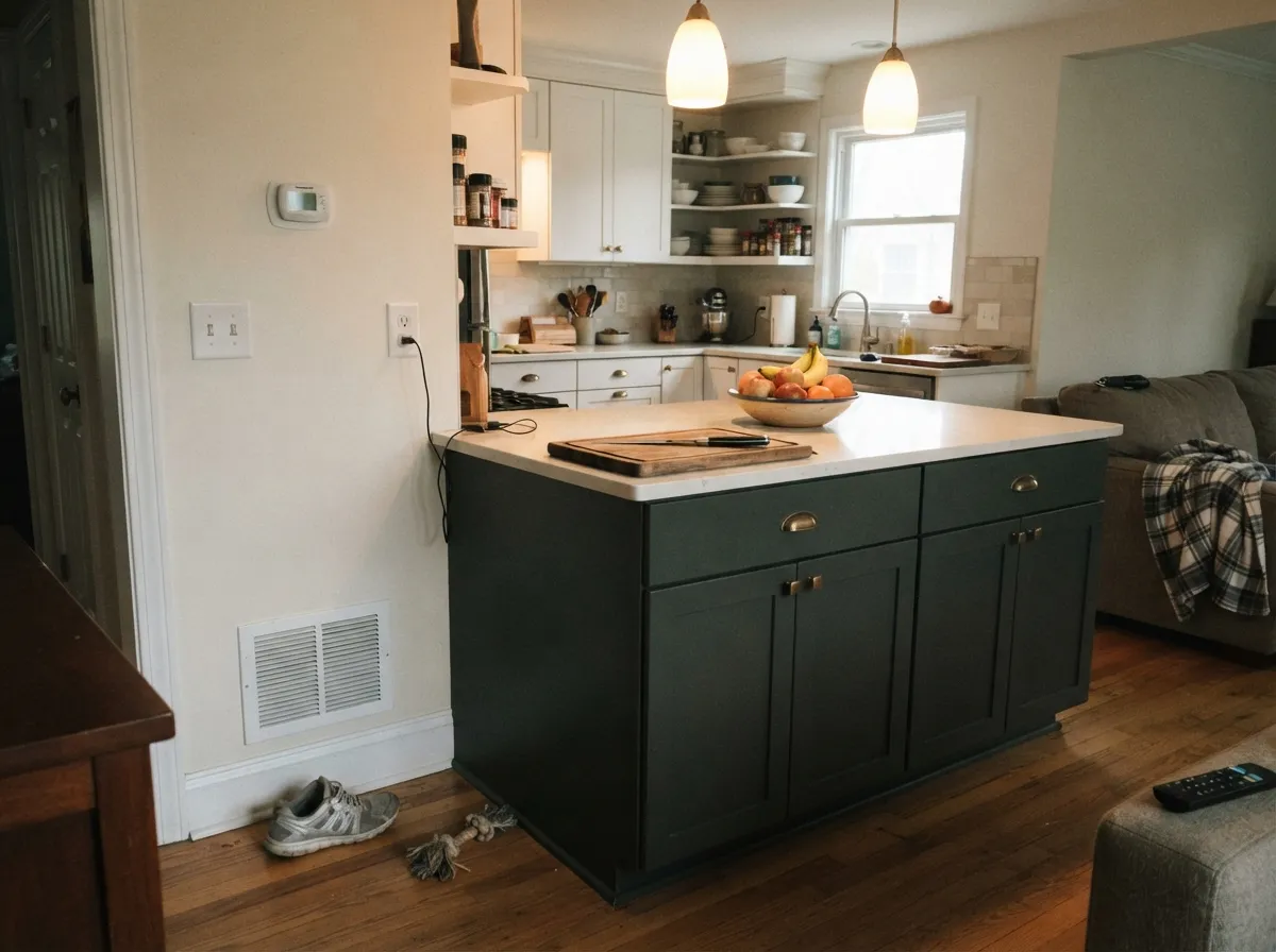
On an island or a run of lower cabinets this color does something a true black cannot: it stays dark without turning the base of the kitchen into a shadow. Use a satin urethane-fortified cabinet enamel and spray it if you can. If you are brushing, a fine foam roller with a light brush tip-off gives the closest result, because deep bases dry slowly and every stroke stays visible.
Plan for maintenance honestly. Near-blacks show dust, water spots and fingerprints around handles far more than a mid-tone, and touch-ups on a cured cabinet door usually flash a slightly different sheen. Keep a small sealed container of the same batch, and expect to wipe an island front more often than you would a gray one. In return you get a base that makes brass glow and lets a white perimeter look deliberately white instead of accidentally builder-grade.
Three Ready Palettes Built on Wrought Iron
A color is never alone on the wall. These are complete combinations in the 60-30-10 pattern, with the reason each one holds together. Every one opens in the visualizer.
Clean white siding does the 60 percent work and lets the door carry all the weight, while Wrought Iron's softness keeps the contrast from looking cut out with scissors. Revere Pewter on the garage doors takes them quietly out of the conversation instead of adding a second dark statement.
Try this palette in your roomThe island is the single dark anchor, so the near-black stays a 10 percent accent and never makes the room heavy. White Dove and Edgecomb Gray share a warm base that meets Wrought Iron's green-gray halfway, which is why brass hardware looks right across all three.
Try this palette in your roomOne color on walls and trim removes every contrast line, so a small room reads as a single deep box rather than a dark room with edges. The bright ceiling stops it from closing in overhead, and Manchester Tan in the hall makes the doorway a warm step down instead of a shock.
Try this palette in your roomWrought Iron FAQ
Is Wrought Iron actually black, or is it gray?
Both, depending on the light. Indoors and in shade it reads black. In direct sun, LRV 8 gives back enough light that it reads dark charcoal gray, which is the single most common surprise people report. Sample it outdoors at midday before you commit a front door to it.
Why does my Wrought Iron door look blue in photos?
Because it is nearly neutral, it picks up whatever light hits it, and open shade on a clear day is blue light bouncing off the sky. Phone cameras exaggerate that further. In person, standing at the door, the blue almost always disappears.
Wrought Iron or Onyx for interior doors?
Wrought Iron if the walls are warm white or greige and you want the doors to feel soft and architectural. Onyx (2133-10) if you have black windows, black hardware or a high-contrast modern look, because Wrought Iron will look faded next to true black.
What sheen should a Wrought Iron front door be?
Semi-gloss. It sheds rain and pollen, wipes clean, and the shine is what makes a near-black door look rich rather than chalky. Satin is acceptable on a fully shaded porch. Avoid flat outdoors, where dark paint holds dirt and shows every wipe mark.
How many coats does it take, and do I need primer?
Two coats over a gray-tinted primer. Skipping the primer over a white or light surface usually costs you a third coat, because deep-base paints carry less white pigment and cover thinly. Roll in one direction and keep a wet edge; near-blacks record every lap mark.
Can I paint a whole bedroom Wrought Iron?
Yes if the room has a real window and you use lamps at multiple heights. Keep the ceiling and bedding bright, and put trim in the same color to avoid hard lines. In a dim north-facing bedroom it goes dead flat — Kendall Charcoal (HC-166) is the safer dark there.
Does Wrought Iron fade on a sunny exterior?
Any near-black on a hot, south-facing surface will chalk and lose depth faster than a light color. Use an exterior line rated for deep bases, expect to refresh a full-sun door years before a shaded one, and check your door manufacturer's warranty first — some fiberglass and vinyl-clad doors restrict dark colors because of heat buildup.
Have you painted with Wrought Iron?
Rate it — one tap helps the next reader decide.
Ask a Question