Kendall Charcoal
The charcoal designers reach for by default, reviewed honestly: where it looks expensive, the rooms where it turns into flat black, and the greener side nobody warns you about.

Jessica has spec'd whites and neutrals for more than 300 rooms and keeps a sample wall of painted drawdowns in her studio. Every color review is checked against real reader rooms in the comments and re-tested when a formula changes. About the testing process →
- 1Urbane Bronze8
- 2Kendall Charcoal15
- 3Retreat21
- 4Stardew43
The Fast Verdict
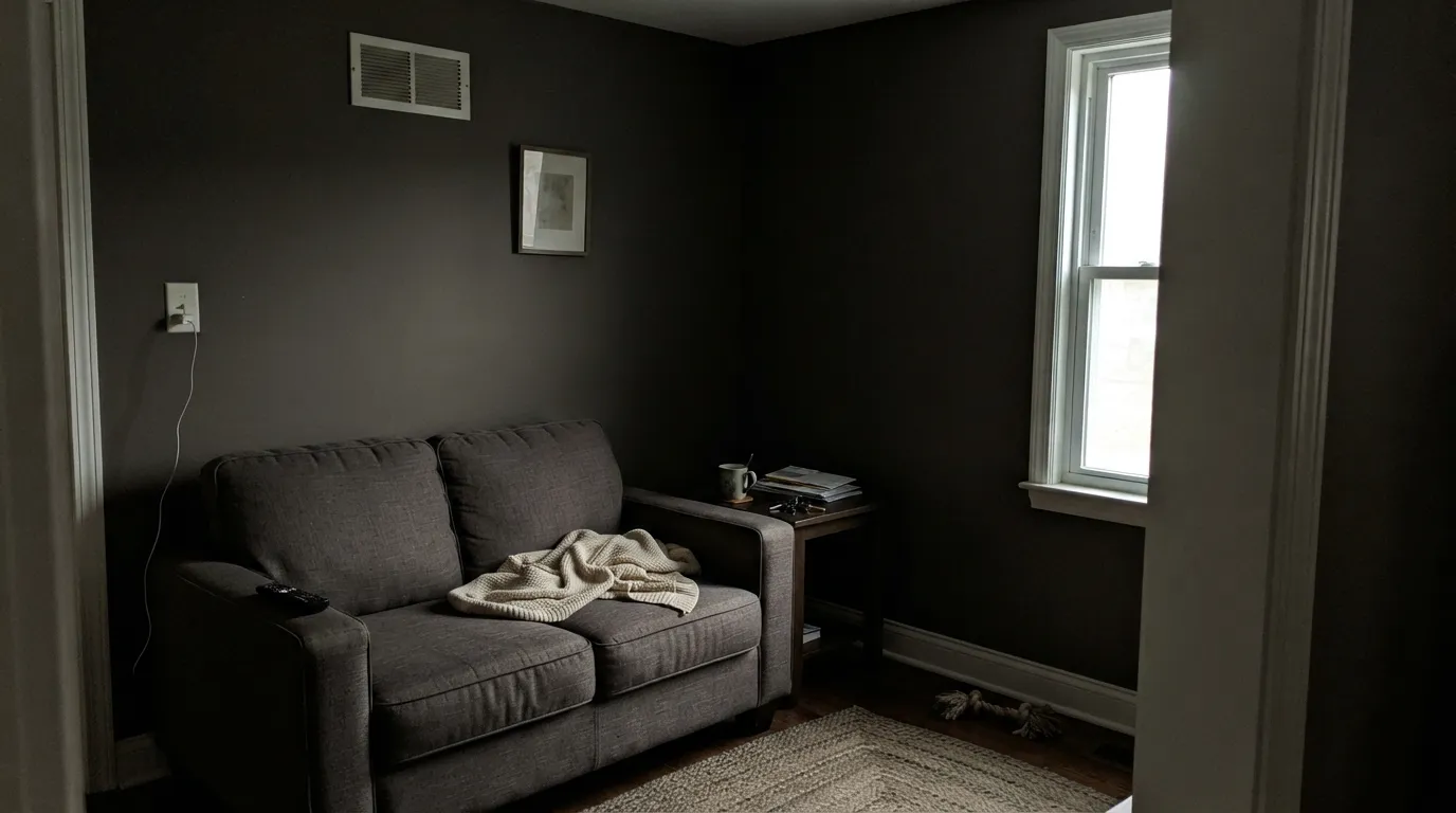
Kendall Charcoal is the dark gray that still looks like a color instead of a smudge of black. It is almost perfectly neutral with a hair of warmth, so it sits happily next to oak, brass and white trim without the cold slate edge most charcoals have. Give it daylight and it stays a rich, readable charcoal. Take the daylight away and it collapses into near-black, which is the single reason people regret it.
Studies, libraries and moody offices with real daylight · kitchen islands and lower cabinets · front doors and shutters · anyone who finds true black too harsh
Your only window faces north and the room stays dim · you want a cool blue-slate charcoal · your stone, tile and metals are all cool-toned · you want a cabinet color that hides dust
- Dark and dramatic without the coldness of a slate gray
- Warm enough to sit beside oak, walnut, brass and cream
- One-color rooms work — walls and trim at different sheens
- Reads as a real color, not a shadow, wherever daylight reaches it
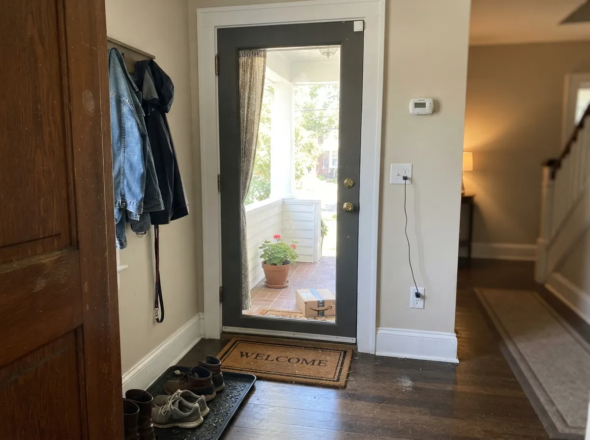
- One of the safest front-door and shutter colors made
- Turns into flat near-black in dim north-facing rooms
- Shows a green, drab cast in strong sun and against cool stone
- Lightens a lot on sunny exterior walls, so elevations do not match
- Touch-ups and roller marks show — this depth is unforgiving of sloppy work
What Color Is Kendall Charcoal, Really?
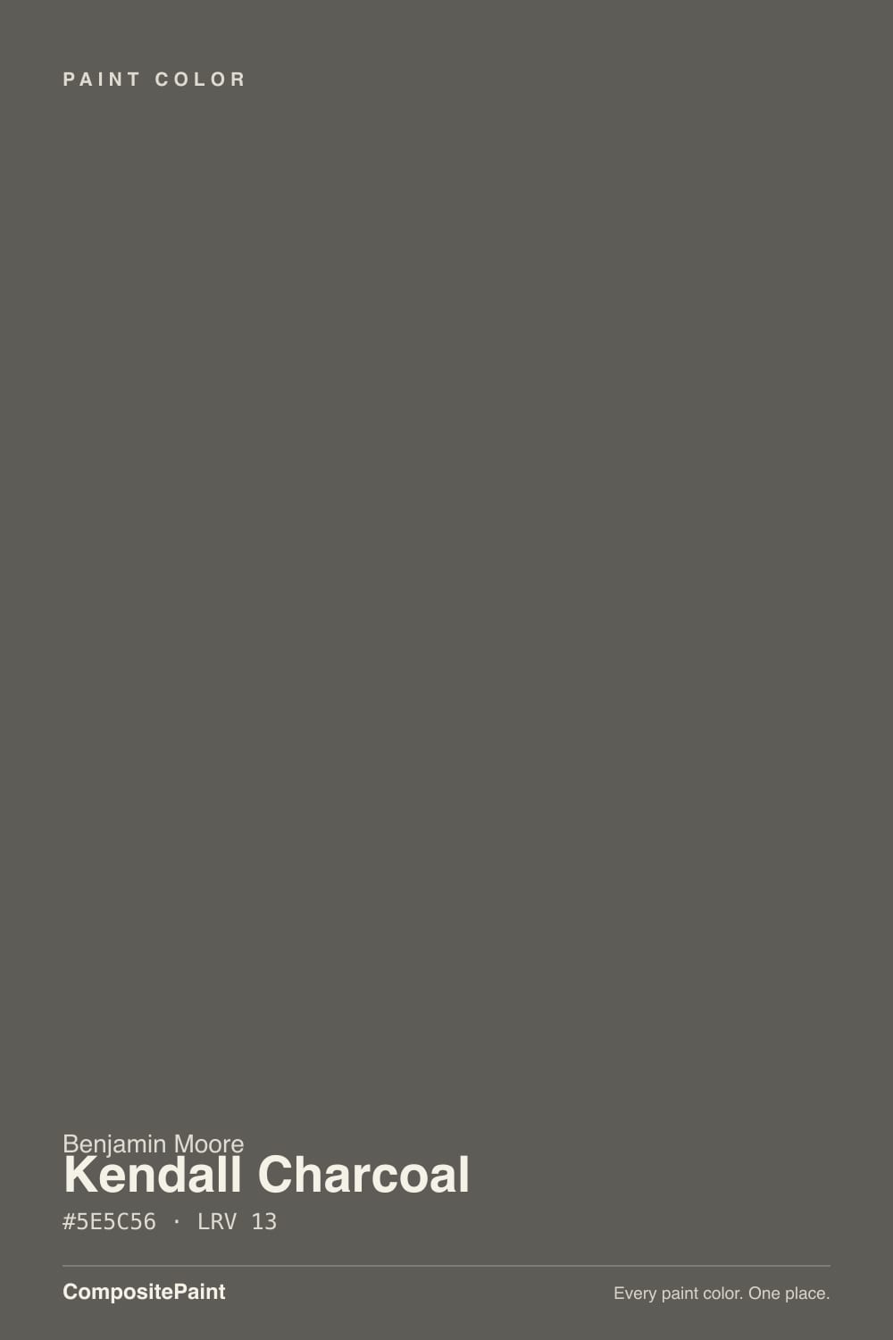
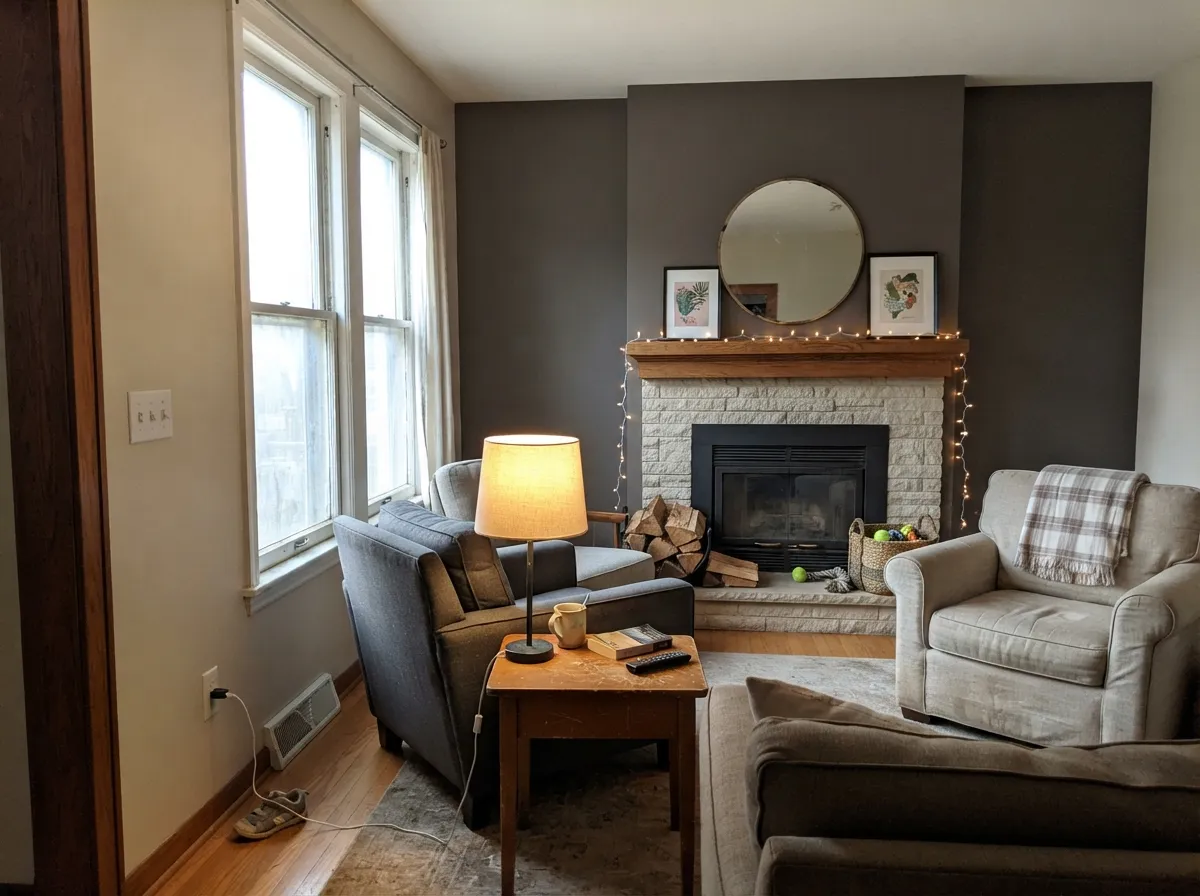
A dark gray that is very nearly neutral, with the smallest possible lean toward warm. The saturation is only about 4 percent, which is far too little to call it a brown or a greige — but the hue underneath sits in the yellow-tan range, and that is enough to change how it behaves. In practice that faint warmth shows up as a soft, drab, almost olive quality in bright light. That is why you will read people say it looks green: they are not wrong, they are just seeing the warm base in strong sun. It is never blue, and that is the point of the color.
At LRV 15 it reflects almost nothing back at you, and the number matters more here than it does for a mid-tone. Put it beside Chelsea Gray HC-168 at LRV 22 and Kendall looks like a different family — Chelsea is a gray you can live in, Kendall is a gray that surrounds you. Put it beside Wrought Iron 2124-10 at LRV 6 and the opposite happens: Kendall suddenly reads soft, gray, almost gentle. It lives in the narrow band where a color is dark enough to feel dramatic but still light enough to show its color instead of just reading as a shadow.
Undertone in one line: neutral charcoal with a whisper of warm olive — never blue, never purple. If your sample looks flat black, the room is too dim; if it looks green, the sun is too strong.
Where It Shines
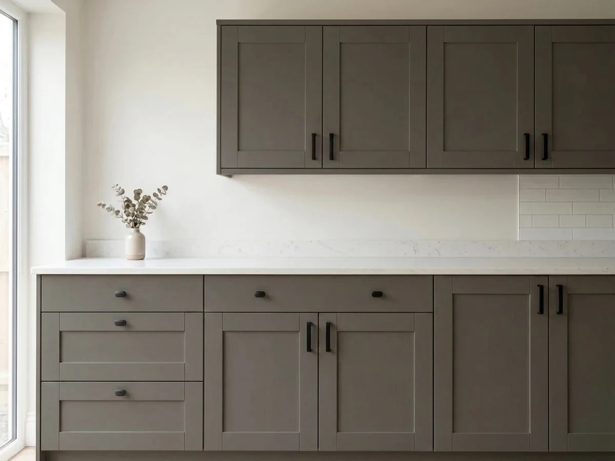
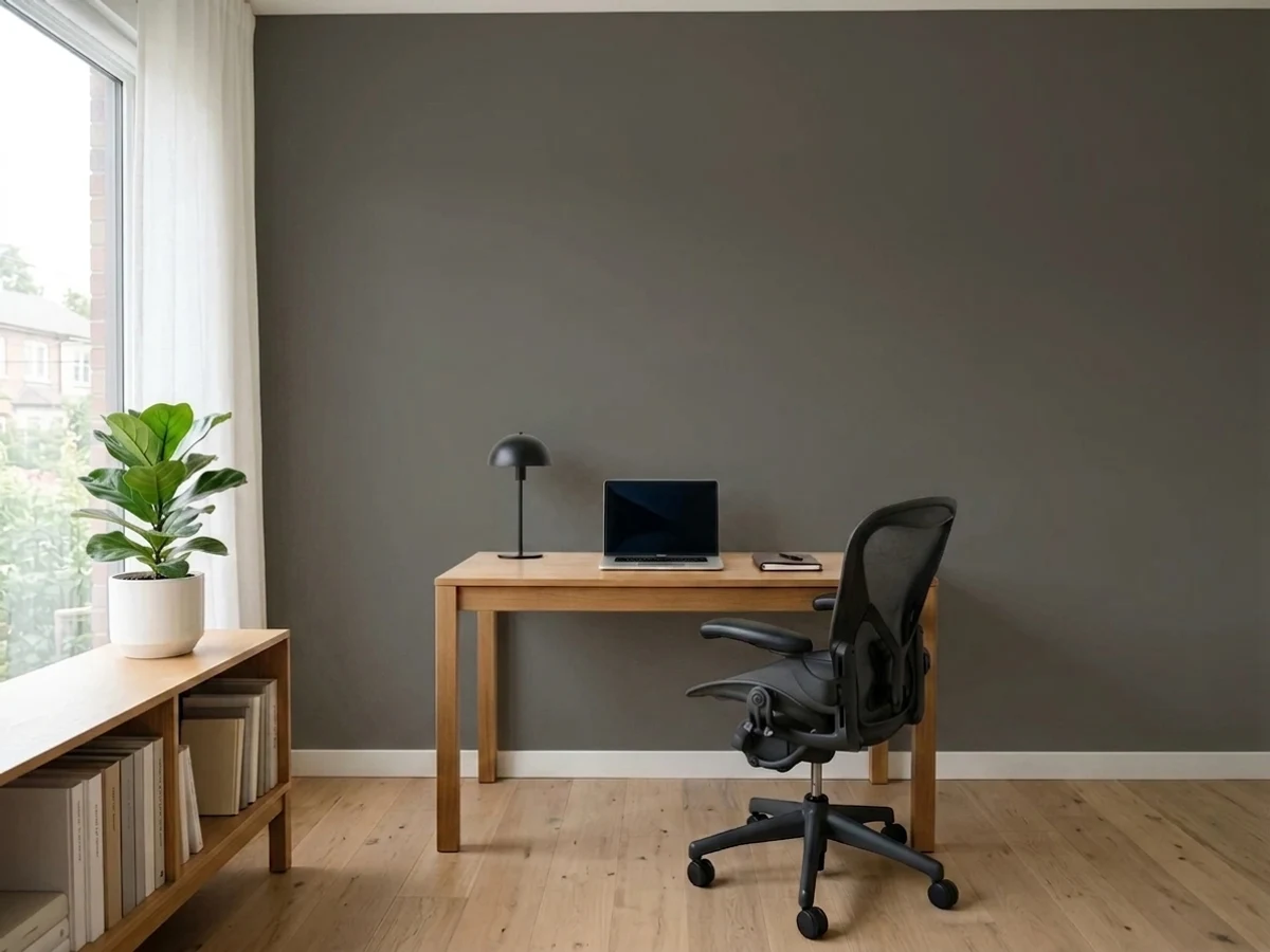
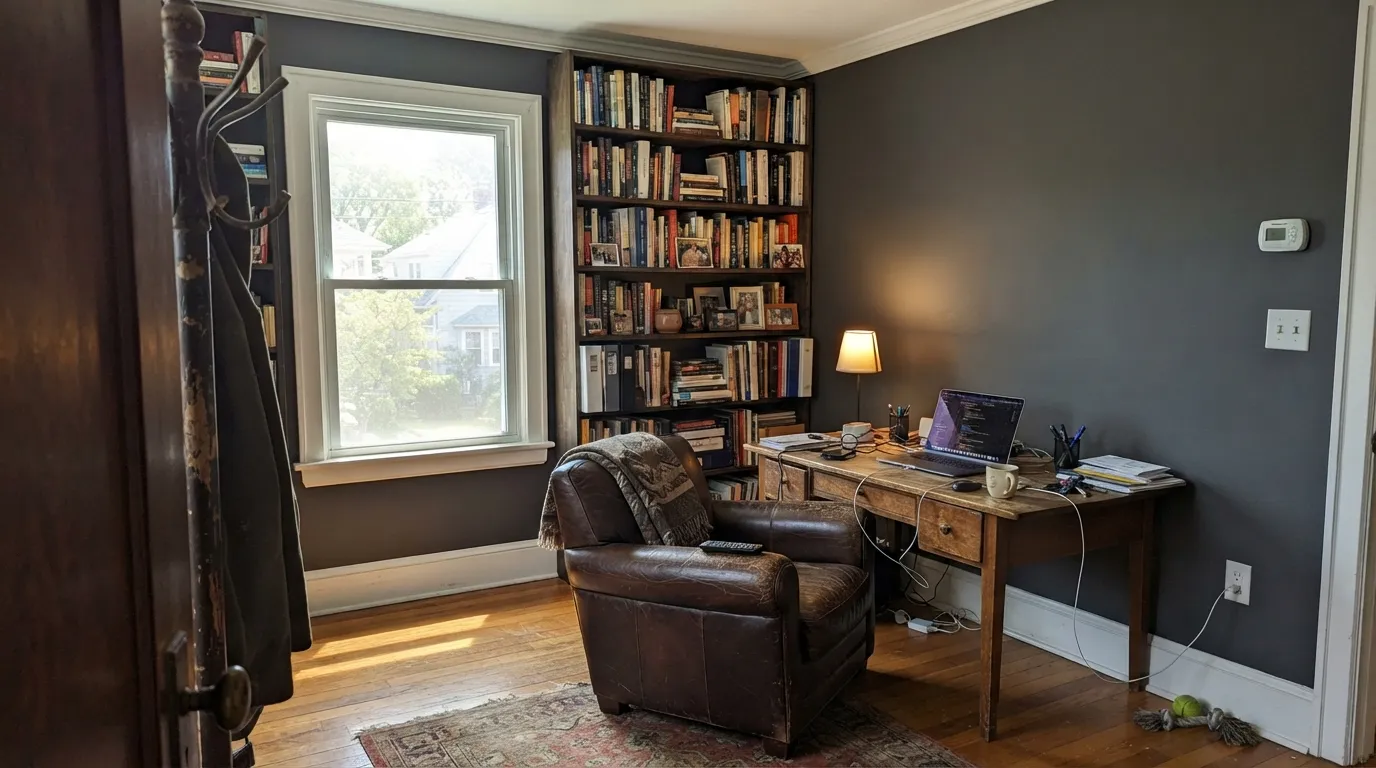
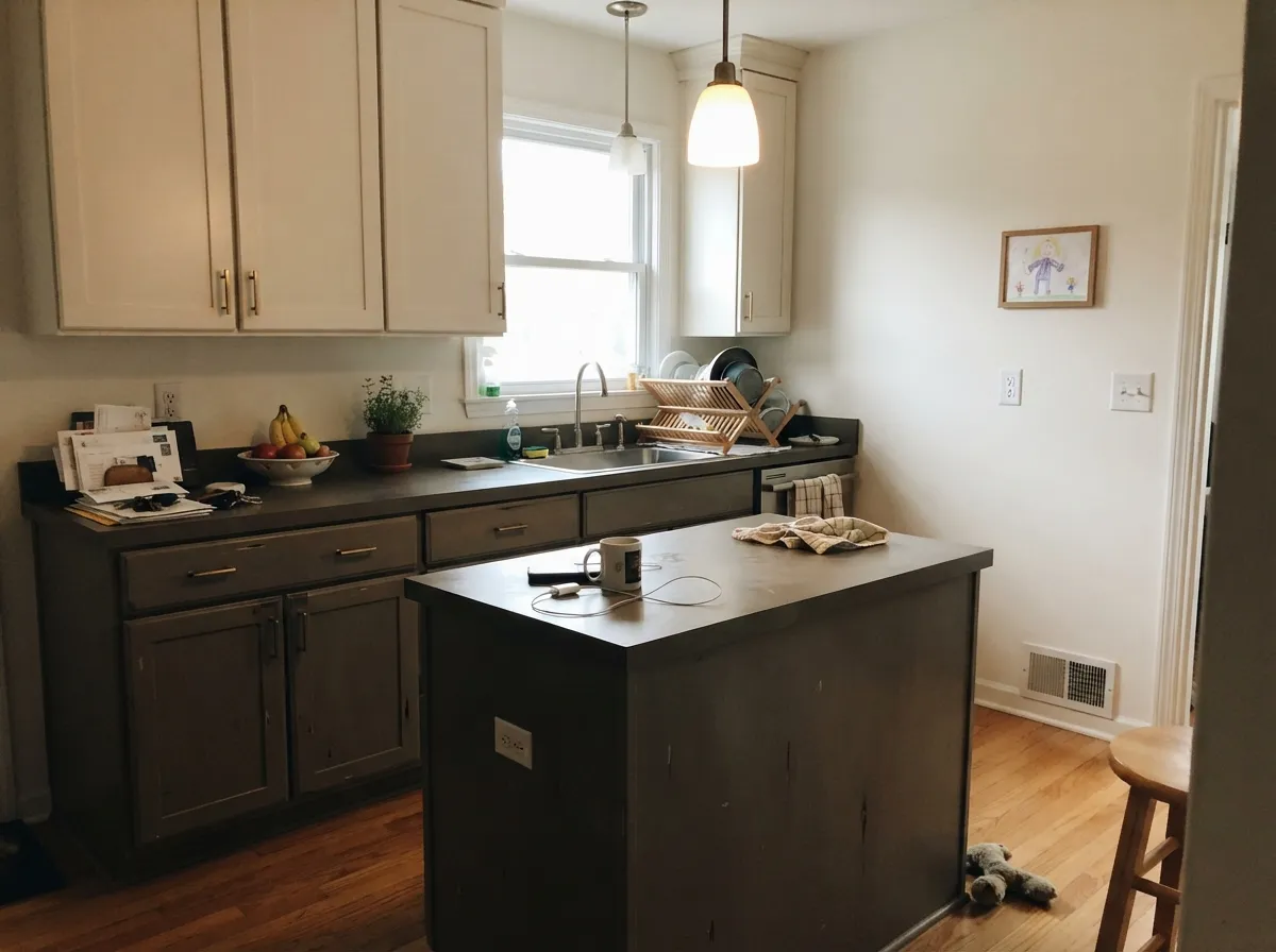
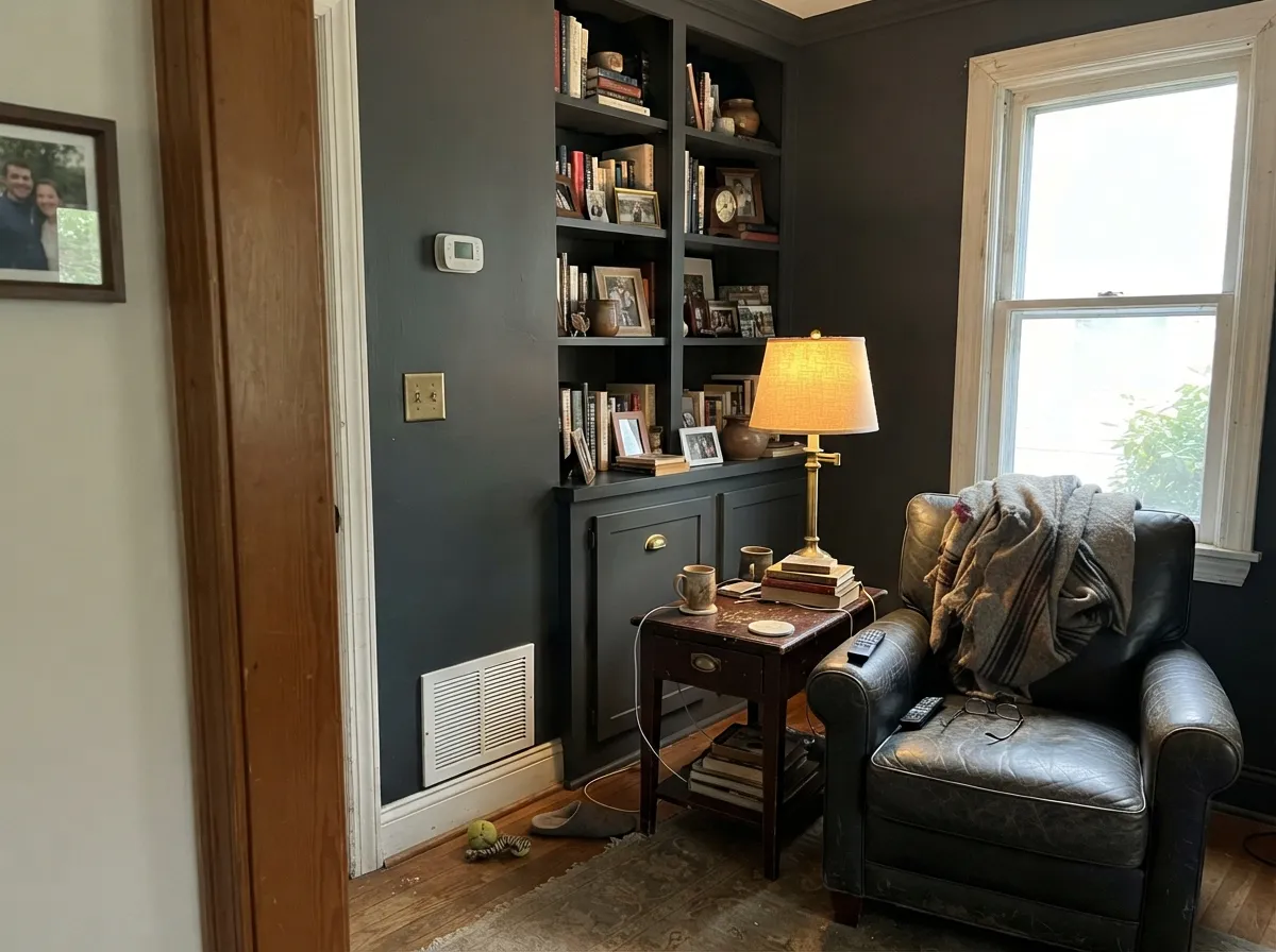
It earns its reputation in rooms that already have light to spend. A study or library with a decent window, walls and trim both in Kendall with only the sheen changing, is one of the most repeated designer moves of the last decade — and it works because the color has enough body to be interesting up close. Kitchens are its second home: on an island or lower cabinets it gives weight without the funeral seriousness of black, and it makes brass and warm wood look intentional.
Where It Fails
Nearly every disappointed Kendall Charcoal story lands in one of three situations, and all three are predictable before you open the can. The paint is not misbehaving in any of them — it is doing exactly what an LRV 15 warm-neutral does under those conditions.
This is the number one complaint. With no light to reflect, the color stops being charcoal and becomes an indistinct near-black — corners disappear, and people ask why they did not just paint it black and save the trouble. If the room is dim and you still want depth, step up to Chelsea Gray HC-168 at LRV 22, which keeps the same warm character with enough light left in it to read as gray.
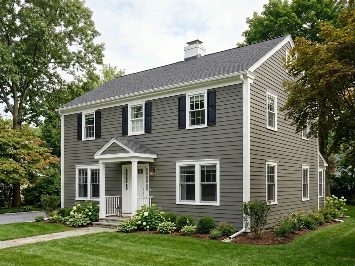
Outside it lightens dramatically. Homeowners expecting a near-black facade get a medium warm gray on the sunny side and a much deeper one on the shaded side, so the same house looks like two colors. If you want the dark to hold in full sun, use Iron Mountain 2134-30 or Sherwin-Williams Peppercorn SW 7674 instead.
Cool gray stone and true-black window frames pull the warm base forward, and the wall starts reading dusty or faintly green rather than crisp. It is the same trick that makes it look great against oak, working against you. In an all-cool room, Flint AF-560 at LRV 12 gives you the same depth with an honest slate-blue lean.
Room by Room
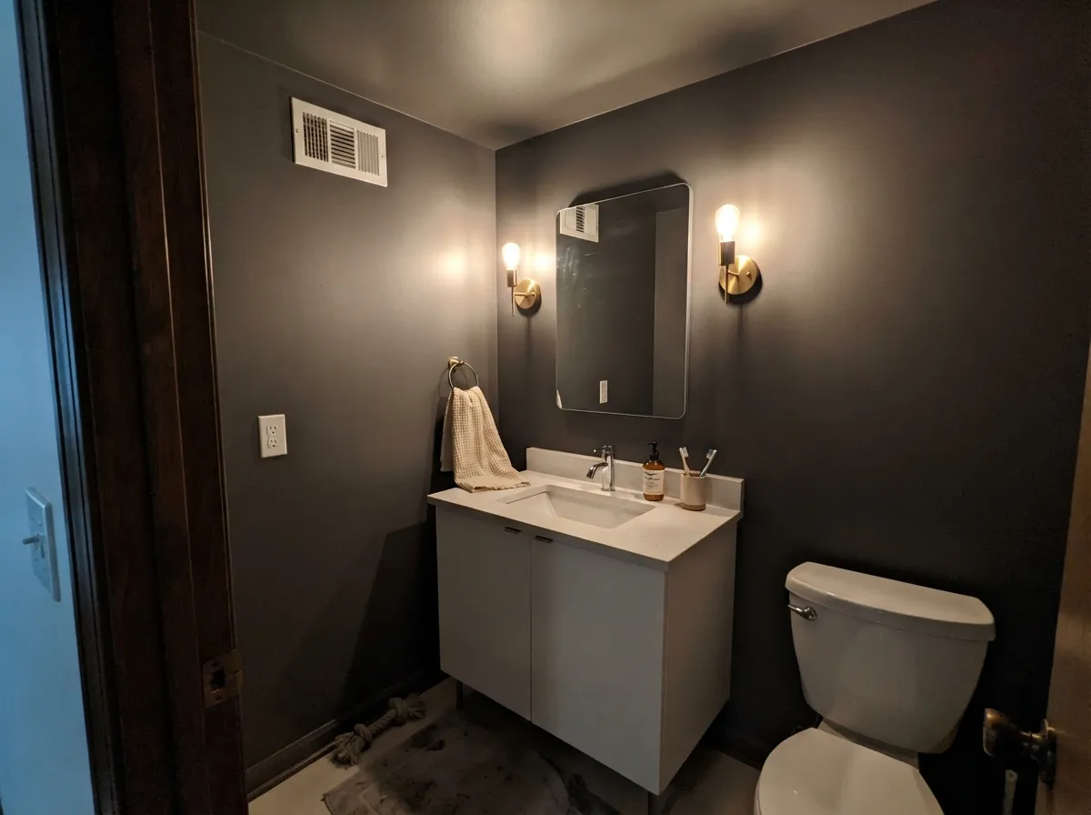
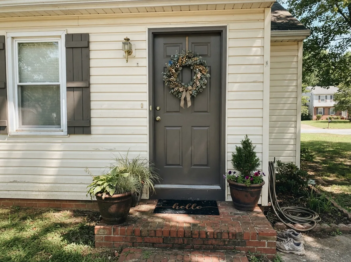
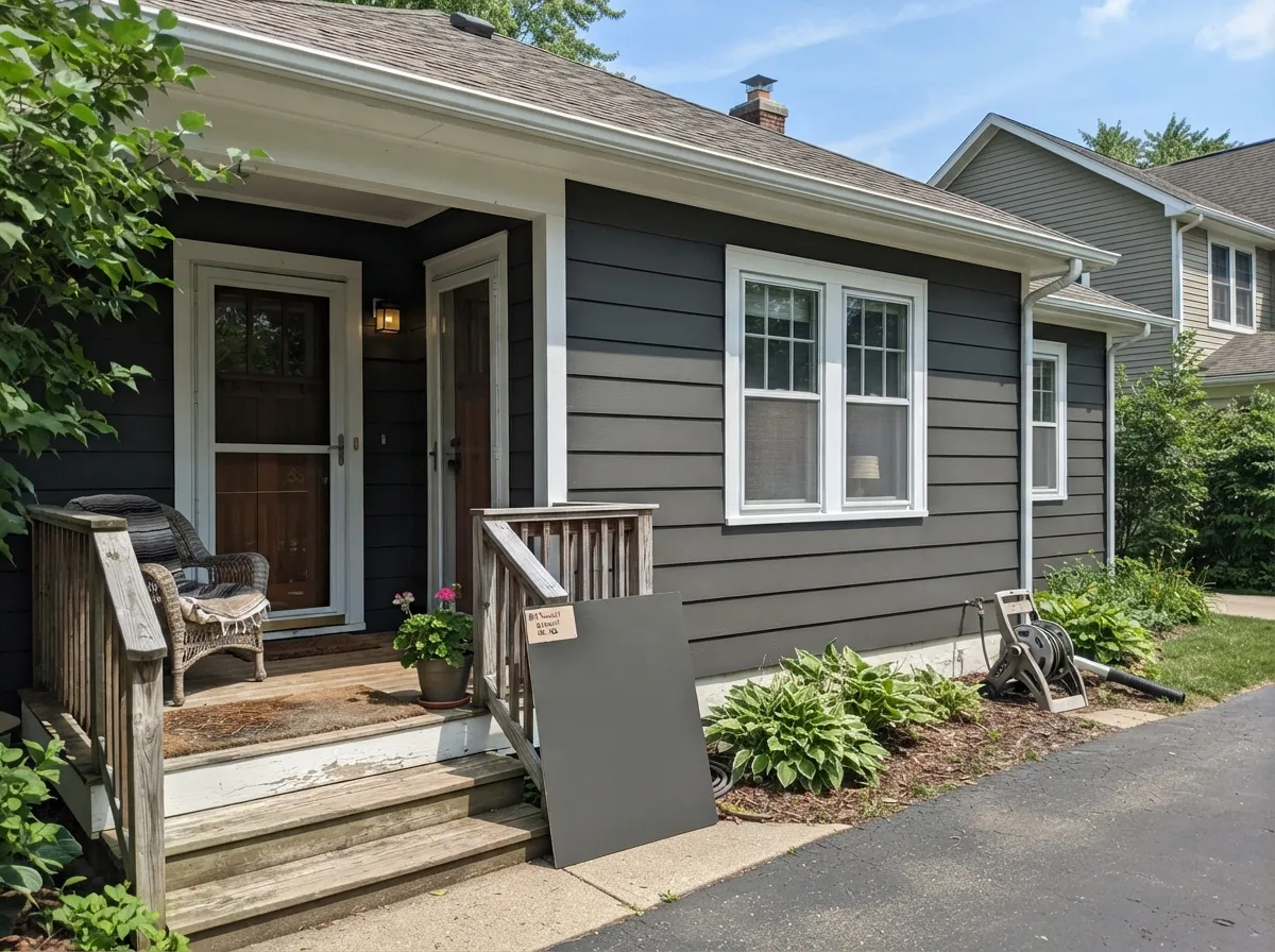
Your Light Is the Risk
Warm sun lifts it and the soft greige character comes out. The version of this color people fell in love with.
Cool, weak light drains it toward near-black and flattens the depth. The one exposure to test properly.
2700K lamps make it rich and warm. Cool daylight LEDs push it toward hard, greenish slate — change bulbs, not paint.
Reads several steps lighter than indoors, and the shaded elevation reads several steps darker. Sample every side.
Most complaints about Kendall Charcoal are a light mismatch. Upload a photo of your actual room and see it on your walls — then ask for the same wall in north light or evening lamps before you buy a single sample.
Need It From Another Brand?
Any paint counter can custom-tint Benjamin Moore HC-166 directly. If you would rather stay in one brand's own deck, these are the closest stock matches, measured as ΔE2000. Under 2 is a difference you will not see on the wall.
| Brand | Closest color | ΔE | LRV | |
|---|---|---|---|---|
| Sherwin-Williams | Storm WarningSW 9555 · Sherwin-Williams | 0.9 | 14 | Color page → |
| Behr | ChinchillaPPU24-03 · Behr | 1.7 | 13 | Color page → |
| Valspar | Ocean Storm4004-2B · Valspar | 1.7 | 13.3 | Color page → |
| PPG / Glidden | ArmoryPPG1009-6 · PPG / Glidden | 2.2 | 15 | Color page → |
| Glidden | Deepest Valley Green30GY 13/045 · Glidden | 3.2 | 13 | Color page → |
| Dutch Boy | Blackened Ore439-6DB · Dutch Boy | 2.4 | 13 | Color page → |
Similar Benjamin Moore Colors
The nearest shades to Kendall Charcoal within Benjamin Moore's own range, ranked by perceptual color distance — useful when you want the same look a touch lighter, darker, or warmer.
WCAG 2.1: AA is 4.5 : 1 for normal text, 3 : 1 for large text, AAA is 7 : 1.
Kendall Charcoal vs the Colors You're Also Considering
Every Kendall Charcoal sample board has the same rivals on it. The numbers show the real lightness gap — then it comes down to which risk you would rather live with.
Pick this for real drama — Chelsea never fully commits to dark.
Benjamin Moore HC-168 · LRV 22Chelsea GrayPick this if the room is dim or you want a gray you can put on all four walls.
Side-by-side comparison →Pick this for a softer, warmer charcoal that stays friendly with wood.
Sherwin-Williams SW 7674 · LRV 11PeppercornPick this if your painter works in Sherwin-Williams, or you want it darker and cooler.
Against Chelsea Gray HC-168, the difference is depth. Chelsea Gray sits much lighter at LRV 22 and reads as a mid-tone warm gray you can use on full rooms in average light. Kendall Charcoal at LRV 13 is markedly darker and more dramatic, better as a contrast or feature color. Choose Chelsea Gray when you want charcoal's character without the room going dark.
Flint AF-560 at LRV 12 is a near-identical depth but leans cool and slate-blue where Kendall leans warm-neutral. Side by side, Kendall looks browner and softer; Flint looks crisper and cooler. Pick Flint for a modern cool scheme, Kendall for a warmer traditional one.
Farrow and Ball's Down Pipe No. 26 at LRV 11 is a close alternative that carries a clear blue-gray cast, so it is the choice when you actually want that cool blue direction rather than Kendall's neutral warmth.
Kendall Charcoal Coordinating Colors
Because Kendall is close to neutral with a warm base, the safe rule is to stay warm around it and avoid cool blue-grays, which make it look drab by comparison. Warm whites, greiges and tans all read as the same family; the accents that work are the deep, warm ones. These are the partners that come up over and over:
Kendall Charcoal on Cabinets and Islands
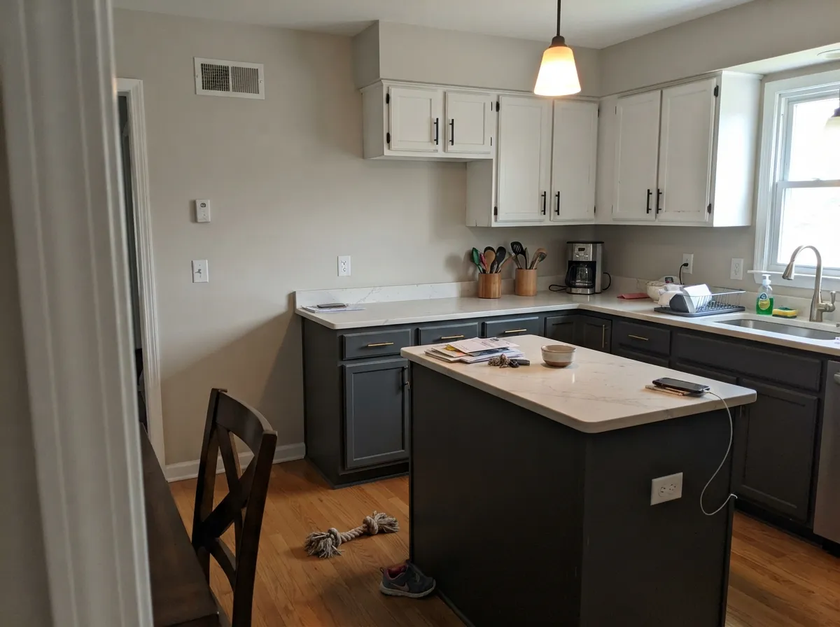
This is the use with the highest success rate, because cabinetry solves the problem that walls create. A dark island in a light kitchen gets plenty of reflected light from the counters and the windows, so the color keeps its charcoal character instead of sinking to black — and you get the drama without living inside it.
Two practical notes. Prep matters more than color choice here: at LRV 15 every sanding scratch and every drip is visible, so degrease, sand, use a bonding primer tinted gray, and spray or lay it off carefully with a fine finish brush. And accept the maintenance — dark satin doors near a sink or a trash pull-out will need wiping. If that bothers you, keep the charcoal on the island and the perimeter doors in White Dove OC-17.
Kendall Charcoal on Exteriors
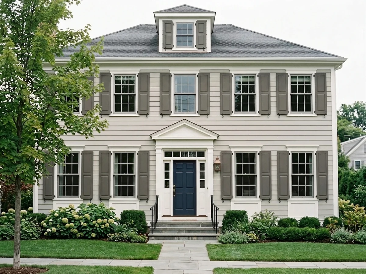
Outside, this color behaves almost like a different paint. Direct sun lifts it several steps and the warm base comes forward, so a sunny elevation can look like a medium warm gray while the shaded north side of the same house looks nearly black. That is not a defect — every dark exterior does it — but it catches people who sampled one wall and assumed the whole house would match.
The pairings are simple and they hold up. White or warm-white trim gives the classic charcoal-and-white facade; White Dove OC-17 is the softer choice and Chantilly Lace OC-65 the crisper one. Natural wood on a porch ceiling, a front door, or garage doors is what stops the house from reading flat, and warm metals like copper and aged brass look expensive against it. A deep red door in Caliente AF-290 is the one accent that never gets old on a charcoal house.
Three Ready Palettes Built on Kendall Charcoal
A color is never alone on the wall. These are complete combinations in the 60-30-10 pattern, with the reason each one holds together. Every one opens in the visualizer.
Kendall carries the room, White Dove trim gives the eye a warm edge to land on instead of a cold one, and the two share the same yellow-tan base so nothing clashes. Manchester Tan in the hall makes the doorway feel like a step into the dark room rather than a jolt.
Try this palette in your roomThe dark cabinetry sits at the bottom of the room where weight belongs, and the warm white uppers keep the ceiling line light. Edgecomb Gray walls bridge the two because its greige base is the same warm neutral family as Kendall's.
Try this palette in your roomCharcoal siding with warm white trim is the safest dark facade there is, and White Dove's softness stops the contrast from looking printed on. One warm red door supplies the ten percent of life a two-color house is missing.
Try this palette in your roomKendall Charcoal FAQ
Does Kendall Charcoal look green?
Sometimes, and it is the most common surprise with this color. The warm base sits in the yellow range, so under strong sun or beside cool gray stone it can flash a soft olive-drab. In average interior light with warm bulbs it reads as a plain dark gray. Sample it on the wall that gets the most sun, not the darkest one.
Will it make my room feel small and dark?
It will make the room feel smaller, yes — that is what LRV 15 does, and it is the point. The question is whether the room has enough daylight to keep the color looking like charcoal instead of black. If you only get one north window, use it on a single wall, cabinetry or the trim rather than all four walls.
Kendall Charcoal or Peppercorn?
Kendall is the warmer, softer one and it plays better with oak, brass and cream. Peppercorn SW 7674 is a touch darker and reads cooler and more modern, which suits black hardware and cool stone. If your house is traditional or transitional, Kendall. If it is contemporary with cool finishes, Peppercorn.
What sheen should I use on cabinets, and does it show fingerprints?
Satin, in a urethane-fortified cabinet enamel. And yes — dark satin doors show fingerprints and dust around the handles more than any light color will. It wipes off easily, but if nobody in your house wipes anything, put the charcoal on the island and keep the busy doors light.
Do I need a special primer and how many coats?
It mixes in a deep base, so ask for a gray-tinted primer and plan on two finish coats over it. Skipping the tinted primer is how people end up rolling three and four coats and still seeing patchiness. Load the roller properly and keep a wet edge — at this depth, lap marks and touch-ups do not blend away.
Is it dark enough to use as a front door color?
Yes, and it is one of the best. In sunlight it reads as a considered deep gray rather than the hard black a lot of doors get painted, and it does not fight red brick or warm stone. Use semi-gloss so the door reads crisp and sheds dirt.
Does it work on a whole house exterior?
It does, but sample every elevation before you buy. The sunny side will read a good few steps lighter than the shaded side, and people who only tested one wall are the ones surprised by the finished house. Pair it with White Dove OC-17 trim and it is hard to beat.
Have you painted with Kendall Charcoal?
Rate it — one tap helps the next reader decide.
Ask a Question