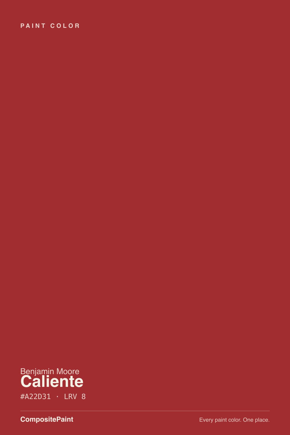
Caliente
Benjamin Moore's 2018 Color of the Year, reviewed honestly: the rooms where a true red still works, the coats nobody warns you about, and what to pick instead.

Jessica has spec'd whites and neutrals for more than 300 rooms and keeps a sample wall of painted drawdowns in her studio. Every color review is checked against real reader rooms in the comments and re-tested when a formula changes. About the testing process →
- 1Rookwood Dark Red3
- 2Caliente9
- 3Cinnamon Slate19
- 4Rejuvenate30
The Fast Verdict
Caliente is the red other reds get measured against: saturated, warm, faintly orange-leaning, and deep enough (LRV 9) that it reads as color rather than as a stain. Benjamin Moore made it Color of the Year for 2018 and still lists it among its red front-door picks, and both of those are honest recommendations. What it is not is easy. It takes a tinted primer and patient coats, it throws red light onto everything near it, and it is a one-room commitment — brilliant in a dining room, a powder room or on a door, wrong almost everywhere you would use a neutral.
Dining rooms that get used at night · front doors on white, gray or brick houses · powder rooms drenched floor to ceiling · one accent wall against warm neutrals · kitchen islands and hutches
You repaint rarely and hate commitment · the room is dim, north-facing and lamp-free · you are painting to sell · your floors are orange honey oak or your tile is terracotta · you want three coats to be the end of it
- The reference true red — warm and glowing without going rusty
- Deep enough (LRV 9) to read rich instead of loud
- A 2018 Color of the Year that survived as a door and dining classic
- Small rooms and front doors get instant, expensive-looking drama
- Warm white trim, brass, walnut and black all sit easily beside it
- Terrible hide — needs a gray-tinted primer plus two or three coats
- Bounces red light onto ceilings, trim and faces
- Clashes with honey oak, terracotta, sage green and cool gray stone
- The hardest color in the deck to repaint over, and a resale liability
What Color Is Caliente, Really?
A saturated, warm true red — the kind of red people picture when they say red, before any brick, wine or rust gets involved. The warmth is real but restrained: there is a faint orange lean that keeps it glowing rather than icy, and not enough of it to tip the color into terracotta or barn. That middle position is the whole reason it became famous. Blue-reds go cold and formal on a wall, orange-reds go rustic; Caliente sits between them and reads confident instead of costumed. It lives in Benjamin Moore's Affinity collection, the deck's more complex, deeper mixes, and it was named the brand's Color of the Year for 2018.
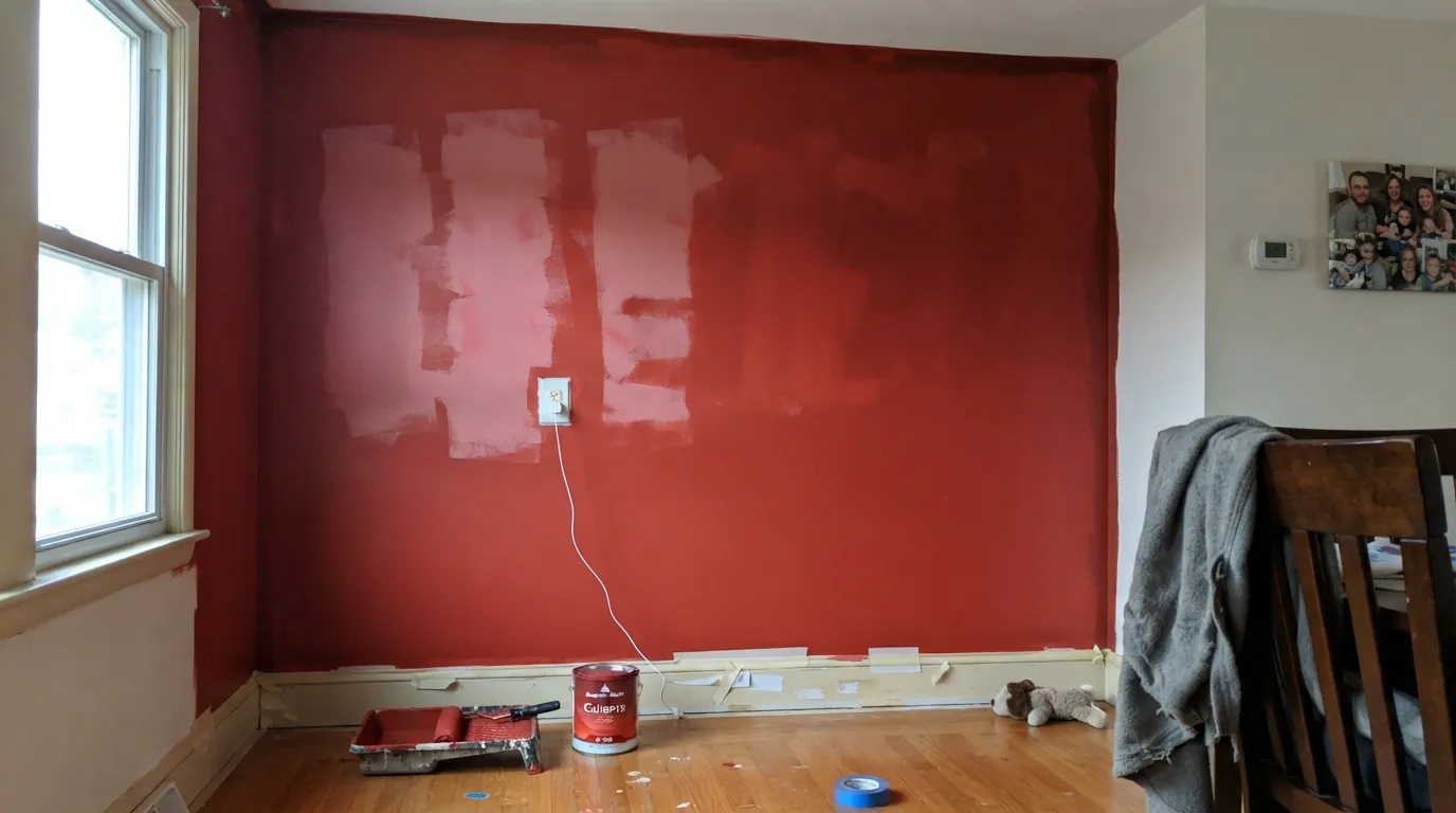
At LRV 9 it is genuinely dark — the same light-reflectance neighborhood as a navy or a charcoal — but it never looks dark, because the chroma is enormous. That combination is what makes it tricky to sample. A 2-inch chip looks like a bright, friendly red; four walls of it read deep, enveloping and much more serious. It also means the paint has almost no hide: red pigment covers badly, and the number-one Caliente complaint has nothing to do with the color and everything to do with the pink, streaky second coat.
Undertone in one line: warm red with a whisper of orange — never blue, never brown. If your sample looks rusty, that is a golden floor or warm bulbs pushing it; if it looks flat and dried-blood dark, the room has no light and this color needs some.
Where It Shines
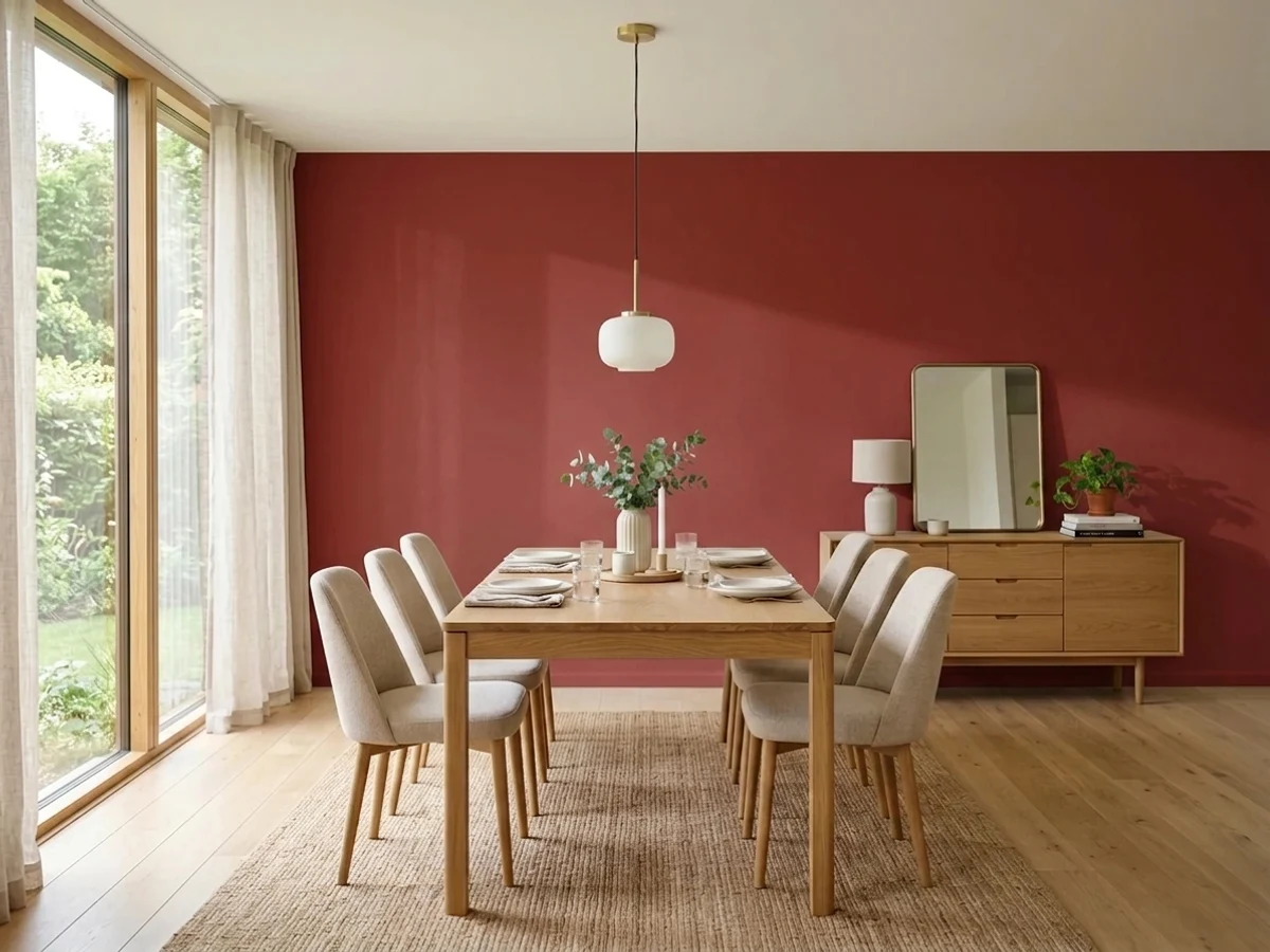
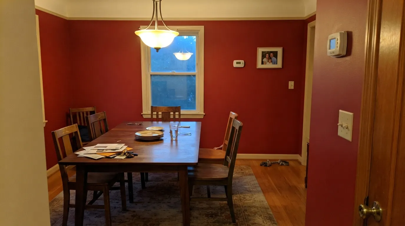
This color is built for rooms that turn the lights on. Under warm lamps and candles the red goes velvety and the room feels like a restaurant you had to book — which is exactly why the dining room is its best address, and why red-walled dining rooms outlive every trend cycle that tries to kill them. Its second job is the small, high-drama surface: a powder room drenched to the ceiling, a kitchen island, a hutch, or the front door, where Benjamin Moore itself puts it. Give it warm white trim, unlacquered brass, walnut and cream linen, and it looks like a decision, not an experiment.
Where It Fails
The bad Caliente stories are remarkably consistent, and only one of them is about taste. Two are about physics — how red pigment covers, and where red light goes once it is on a wall. All three are predictable before you open the can.
Red pigment has the worst hide in the deck. Rolled straight over white primer, coat one is a shock, coat two is a blotchy pink-red with visible roller lanes, and people panic on the internet at exactly that point. The fix is boring and non-negotiable: a gray-tinted primer first, then two full finish coats — three if you are brushing a door. Skip the tinted primer and you will buy the extra gallon instead.
A wall this saturated bounces color. White ceilings pick up a pink cast, white trim looks faintly warm-dirty on the shadowed side, and everyone's face in your dining room photos comes out flushed. This is not a defect, it is what deep red does — but plan for it: keep the ceiling a warm white rather than a cold one, do not put a cool blue-gray white next to it, and never wonder why the phone camera makes the room look sunburned.
Honey oak floors and terracotta tile share Caliente's orange side and turn the whole room into one hot smear with no contrast. Sage or muted green anywhere nearby reads as Christmas, no matter how sophisticated both colors are alone. And cool blue-gray marble or gray LVP fights it outright — the stone goes blue, the wall goes purple-red. Walnut, cream, black and warm white are its company.
Room by Room
The classic use, and still the right one. Red is a night color, and a dining room is a night room: under 2700K bulbs and candles the walls go velvety and the table becomes the point. Matte or eggshell, warm white trim and ceiling, and give it something dark — a walnut table, a black-framed mirror — so the red has an anchor instead of floating.
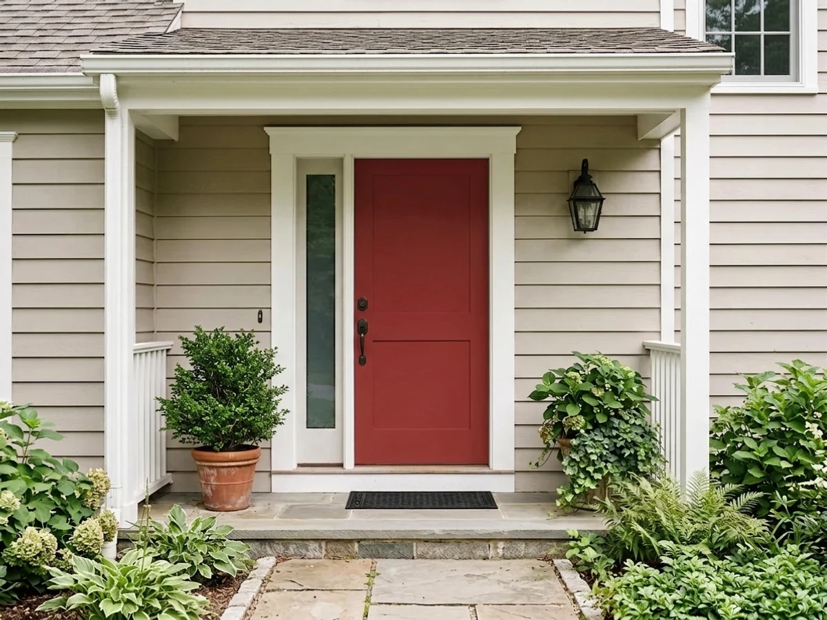
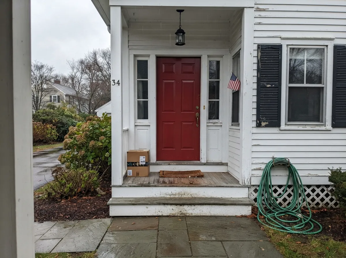
Benjamin Moore lists Caliente among its red front-door colors, and on a white, gray, or red-brick house it is hard to beat. Go satin or high gloss, not flat: gloss reflects UV away and buys you years before the fade shows. Expect to refresh a south- or west-facing red door sooner than any other color on the house.
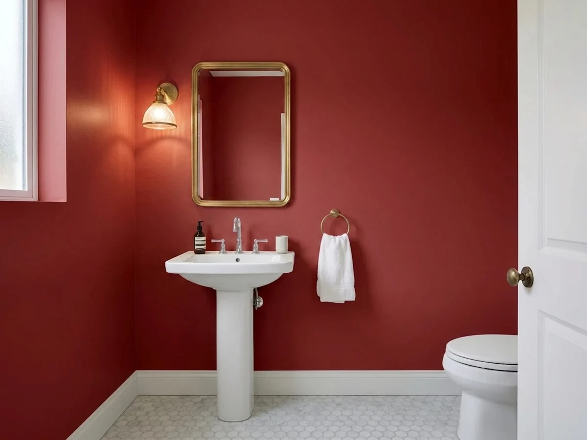
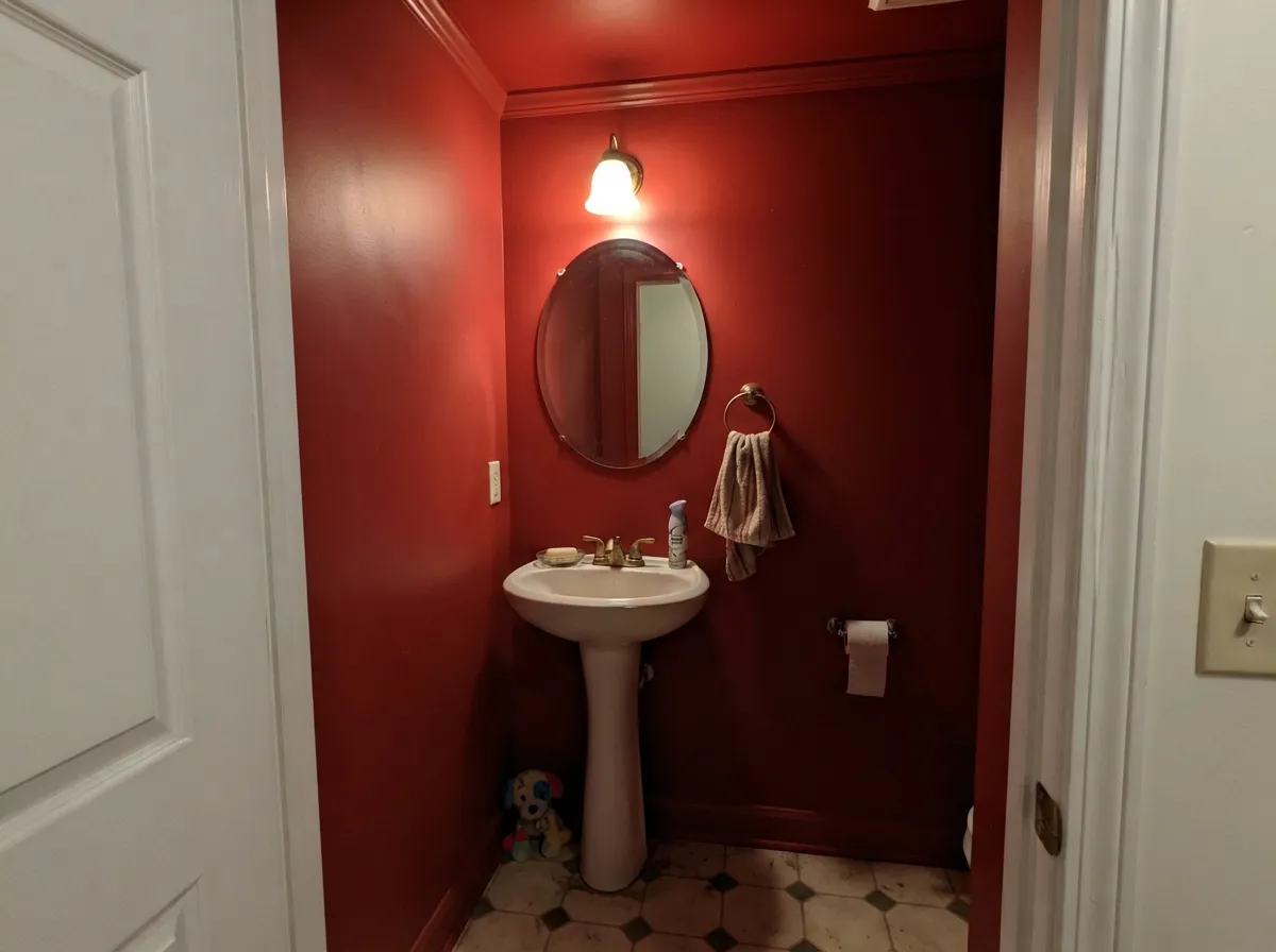
Small windowless rooms are where deep color stops being risky and starts being cheap drama. Walls, trim and ceiling all Caliente in satin, one warm bulb, a brass faucet and a mirror — the room reads lacquered and intentional instead of dark. Nobody spends twenty minutes in a powder room, so the intensity never wears out its welcome.
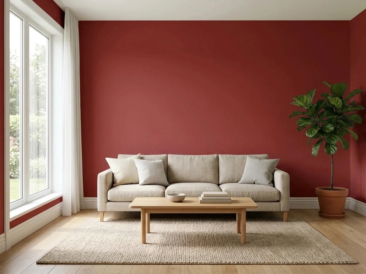
A single Caliente wall behind a sofa or a fireplace works when the other three are a warm neutral, not a cool gray — Swiss Coffee, Shaker Beige and Revere Pewter all hand off cleanly. Full four-wall red in a living room is a real commitment and only pays in rooms with good lamps and dark wood; in a bright open plan it will shout across the whole floor.
A red island under soft-white cabinets and cream walls is one of the oldest good ideas in kitchens, and Caliente is a better version of it than the burgundies that used to fill the role. Satin cabinet enamel, brass or black pulls. A full kitchen of red cabinets is a different, much braver project.
This is the honest limit. Red is stimulating, LRV 9 makes a bedroom cave-like, and it is the single hardest color to paint over when you tire of it. Same for hallways and open main floors: Caliente is a room color and a door color, never a house color.
Your Light Is the Risk
2700K bulbs and candles are what this red was built for — the walls go velvety and deep, and the room feels warm rather than hot. This is the light to judge it in.
Cool gray daylight drains the glow and leaves a heavy, dried-brick darkness in the corners. At LRV 9 there is no light to reflect back — a north room without lamps makes it look somber, not rich.
Direct midday sun makes it noticeably brighter and hotter than the chip, and low west sun at golden hour flares the orange side hard for an hour. East rooms get the opposite: bright and clear in the morning, deep and quiet by afternoon.
At 2700K it is rich and inviting. Under 4000K or daylight LEDs it turns raw and slightly cold-crimson, the way a red wall looks in an office corridor. If your fixtures are cool white, swap bulbs before you blame the paint.
Most complaints about Caliente are a light mismatch. Upload a photo of your actual room and see it on your walls — then ask for the same wall in north light or evening lamps before you buy a single sample.
Need It From Another Brand?
Any paint counter can custom-tint Benjamin Moore AF-290 directly. If you would rather stay in one brand's own deck, these are the closest stock matches, measured as ΔE2000. Under 2 is a difference you will not see on the wall.
| Brand | Closest color | ΔE | LRV | |
|---|---|---|---|---|
| Sherwin-Williams | Classy RedSW 2913 · Sherwin-Williams | 2.3 | 7 | Color page → |
| Behr | New BrickS-H-200 · Behr | 0.8 | 7 | Color page → |
| Valspar | Wine CaskT513 · Valspar | 2.6 | 7.3 | Color page → |
| Dutch Boy | Double Decker205-7DB · Dutch Boy | 1.9 | 8 | Color page → |
| HGTV Home by Sherwin-Williams | Remington RedHGSW 1061 · HGTV Home by Sherwin-Williams | 4.3 | 7 | Color page → |
| Hirshfield's | Wild Rose0066 · Hirshfield's | 4.5 | 10 | Color page → |
Similar Benjamin Moore Colors
The nearest shades to Caliente within Benjamin Moore's own range, ranked by perceptual color distance — useful when you want the same look a touch lighter, darker, or warmer.
WCAG 2.1: AA is 4.5 : 1 for normal text, 3 : 1 for large text, AAA is 7 : 1.
Caliente vs the Colors You're Also Considering
Every Caliente sample board has the same rivals on it. The numbers show the real lightness gap — then it comes down to which risk you would rather live with.
Pick this when you want the red to look vivid and deliberate rather than weathered.
Benjamin Moore HC-184 · LRV 11Cottage RedPick this for the softer, dustier barn red — less glow, more history, easier on farmhouse exteriors.
Pick this when the room needs the color to still read clearly as red in ordinary light.
Behr MQ1-15 · LRV 8RumorsPick this if you want oxblood — the same depth with the brightness taken out, more library than dining room.
Caliente Coordinating Colors
The rule with a saturated red is that everything around it should be quiet and warm. Warm whites, creams, warm greiges and near-blacks all sit comfortably beside Caliente; cool grays, icy whites and anything green do not. These are the partners that keep showing up in rooms that actually work:
The Color of the Year Nobody Copied
Benjamin Moore named Caliente its Color of the Year for 2018 and launched it with a party at the Guggenheim — a deliberate provocation in the middle of the gray decade, when every competing forecast was another soft neutral. It did not start a red trend. Nobody's open plan went red in 2018, and the gray-to-greige march carried on without pausing.
What happened instead is more interesting, and it is the reason the color is still worth reviewing eight years later: Caliente quietly became the default answer to two specific questions. What red for a front door, and what red for a dining room. Benjamin Moore still lists it in its red front-door collection, and it is the red that shows up when designers want a dining room to feel like a restaurant. A Color of the Year that fails as a trend and survives as a standard has essentially passed the only test that matters.
Caliente Outside: Doors, Fade and the Sheen Decision
Exteriors are where this color earns its reputation and where it costs you the most maintenance. Red is the fastest-fading family on a house — the pigment chemistry simply gives up under UV sooner than blues, greens or neutrals do, and the tell is a gradual drift toward orange-brown rather than a wash-out. On a fully exposed south- or west-facing door with a hardware-store product, that can start showing in two or three years.
Two decisions buy you most of the life back. First, sheen: high gloss and satin reflect sunlight off the surface, while flat and low-lustre soak it up, and gloss also happens to be the right look on a paneled front door. Second, product: a genuine exterior door-and-trim enamel with real UV package beats generic exterior wall paint by years. Beyond that, geography does the rest — a covered porch or a north-facing entry will hold Caliente far longer than a bare west-facing slab, and a metal door in full afternoon sun is the hardest case of all.
On the house itself, the safest companions are the obvious ones: warm white or gray siding, a near-black frame, and no green anywhere in the trim. Red brick works too, but sample against the actual brick — some brick runs orange enough to swallow the door instead of setting it off.
Three Ready Palettes Built on Caliente
A color is never alone on the wall. These are complete combinations in the 60-30-10 pattern, with the reason each one holds together. Every one opens in the visualizer.
White Dove is the trim decision that makes this work — a warm white takes the red's bounce gracefully, where a cold bright white would look grubby beside it. Shaker Beige next door keeps the handoff warm, so the dining room reads as the loud room in a warm house rather than a red box glued to a gray one.
Try this palette in your roomThe oldest reliable entry scheme there is: warm white body, one near-black frame, red as the only bright note. Wrought Iron is softer than a true black, so the shutters recede and the door keeps all the attention. Gloss on the door is doing double duty here — it looks right and it slows the fade.
Try this palette in your roomTwo soft warm whites at slightly different depths keep the kitchen quiet so the island can be the single event. Swiss Coffee on the walls is creamier than the cabinets, which stops the white-on-white flatness — and both of them meet Caliente's warmth halfway instead of fighting it. Brass or matte black pulls, butcher block or a warm-veined counter.
Try this palette in your roomCaliente FAQ
Is Caliente orange-red or blue-red?
Warm, with a faint orange lean — but only a faint one. It is not a rusty, earthy red like a barn color, and it is not a cool crimson either. That middle position is why it works on so many houses and in so many rooms: it reads as plain, confident red rather than as a specific era's red.
How many coats does Caliente need?
Plan on a gray-tinted primer plus two finish coats, and budget for a third on doors and trim. Red pigment covers worse than any other family, and the streaky pink second coat that scares people is completely normal. Priming gray is not optional advice — it is the difference between three coats and five.
Is Caliente too dark for a small dining room?
No — small is where it behaves best. At LRV 9 a big bright room fights it, while a small room lets the color wrap around you and read like a jewel box. What matters far more than square footage is the lighting: warm lamps at eye level, not one cool ceiling fixture.
What trim white goes with Caliente?
A warm white. White Dove is the default and Swiss Coffee if you want it creamier; both absorb the red bounce gracefully. A crisp cool white like Chantilly Lace makes the contrast sharper and more modern, but it also picks up a pink cast on the shadowed side of every casing — sample it in the actual room before committing.
Will a red front door fade?
Faster than any other door color — red pigments break down under UV quicker than blues, greens or neutrals, and the first sign is a slight shift toward orange-brown. You can push that out significantly: use a real exterior door product, choose satin or high gloss over flat, and understand that a shaded or north-facing entry will hold its color for years longer than a fully exposed south or west one.
Will red walls hurt resale?
Honestly, yes, if you paint them the month before listing — buyers read strong color as work they will have to do, and red is the hardest color to cover. If you are living in the house, that is a different question: paint the dining room red and enjoy it, then prime it out with a gray-tinted primer when the sign goes up.
Have you painted with Caliente?
Rate it — one tap helps the next reader decide.
Ask a Question