Hale Navy
America's default navy, reviewed honestly: the rooms where it turns black, the reason it can flash gray instead of blue, and what to pick instead.

Jessica has spec'd whites and neutrals for more than 300 rooms and keeps a sample wall of painted drawdowns in her studio. Every color review is checked against real reader rooms in the comments and re-tested when a formula changes. About the testing process →
- 1Anchors Aweigh3
- 2Hale Navy8
- 3Waterloo13
- 4Charcoal Blue19
The Fast Verdict
Hale Navy is the navy everyone else gets measured against, and it deserves that. The heavy dose of gray keeps it calm, so it sits next to almost any white without shouting.
But at LRV 8 it is genuinely dark, and that is where the bad reviews come from: give it real light and it reads navy, starve it and it reads black. On cabinets, an island, or a front door it is close to a sure thing.
Kitchen lowers and islands with light counters · front doors on white, gray, or brick · built-ins and a fireplace wall · a bright south-facing office or dining room
Your room faces north and is small · you want people to see blue, not near-black · you are hand-brushing cabinets with rough prep · the surface bakes in direct sun all day
- Reads as a neutral — pairs with nearly any white without a fight
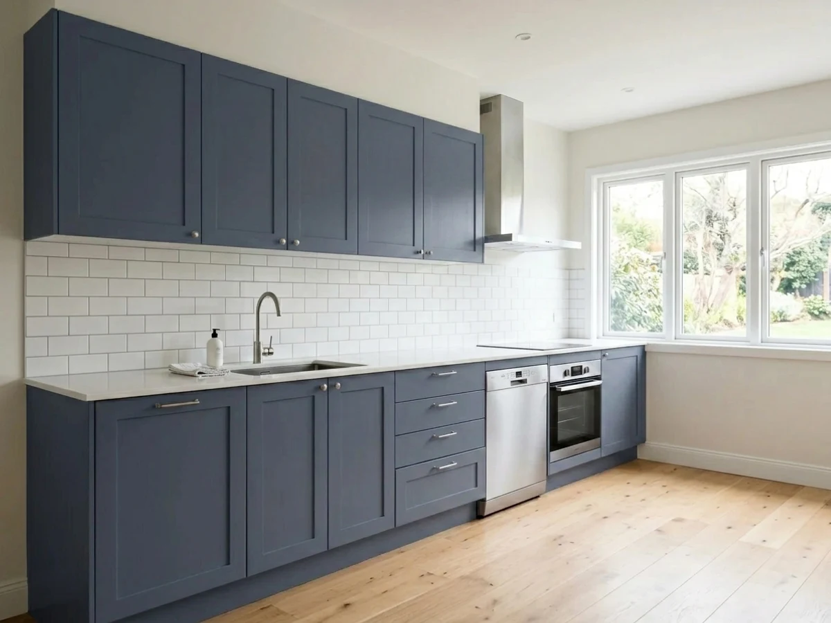
- The proven cabinet and island navy; hides everyday scuffs better than black
- Gray content keeps it calm instead of electric primary blue
- Excellent front door and full-exterior color with white trim
- Warm woods, brass, and matte black all sit comfortably against it
- At LRV 8 it reads near-black in dim rooms and after dark
- Can look gray rather than blue if you expected a saturated navy
- Shows brush marks, roller texture, and sheen differences — dark paint hides nothing
- Fades faster than light colors on sun-blasted doors and south walls
What Color Is Hale Navy, Really?
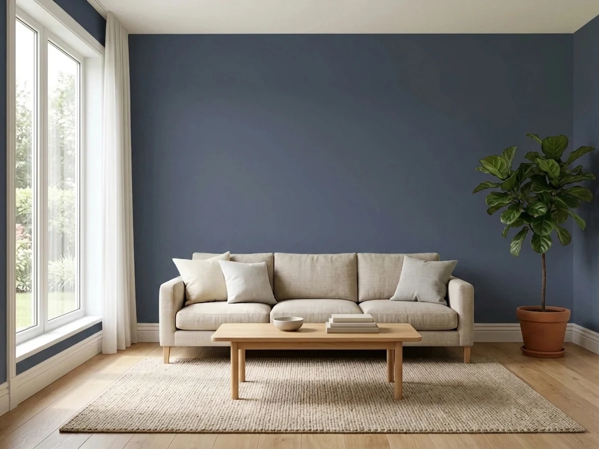
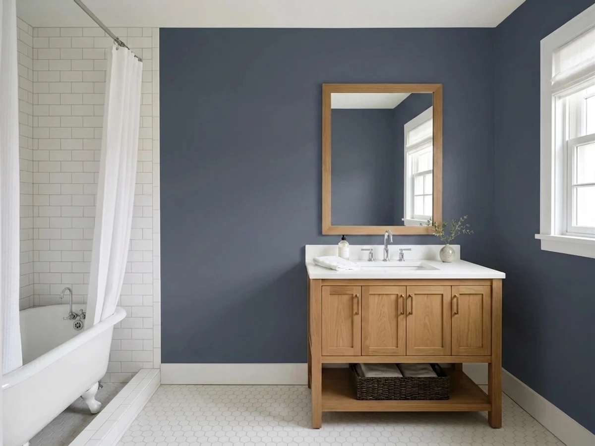
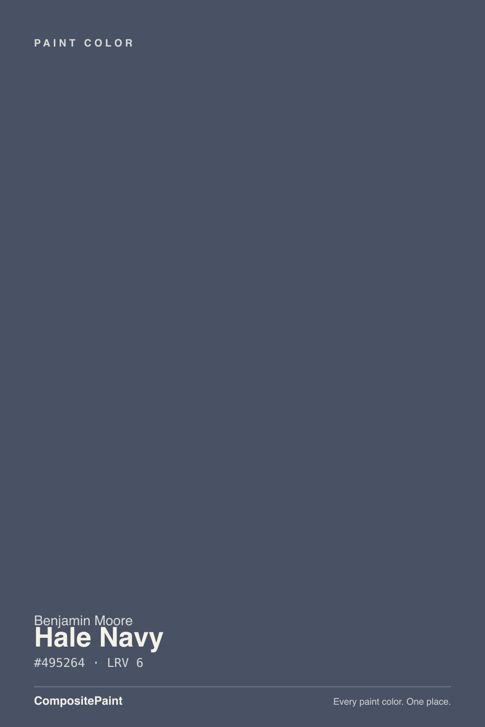
A dark blue with a heavy pour of charcoal in it — that is the whole color in one sentence. Most navies on the fan deck are built on a clean blue pigment that stays obviously blue no matter where you put it. Hale Navy is knocked back with gray, so the blue only steps forward when light lands on it directly. Stand a Hale Navy sample next to a true black like Onyx 2133-10 and the blue is unmistakable. Stand it alone on a wall across the room and most people will call it charcoal. Both reactions are correct, and which one you get depends almost entirely on where the color sits relative to your windows and lamps.
At LRV 8 it hands back only a few percent of the light that hits it. Practically, that means the wall contributes nothing to the brightness of the room — every bit of light you have has to come from the windows and the fixtures, and the corners farthest from both will go flat and dark. This is also why paper samples lie: a two-inch chip is floated in a sea of white paper that bounces light back into it, so it looks like a rich blue in your hand and like a shadow once it covers a wall. Paint a large sample board, lean it where the actual surface will be, and look at it at 9 a.m., 4 p.m., and after dinner.
Undertone in one line: a cool navy softened with charcoal gray — it will tip faintly violet before it ever tips green, and it never goes teal or royal.
Where It Shines
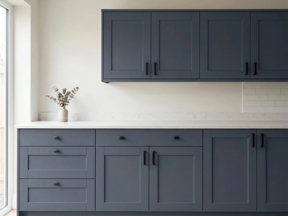
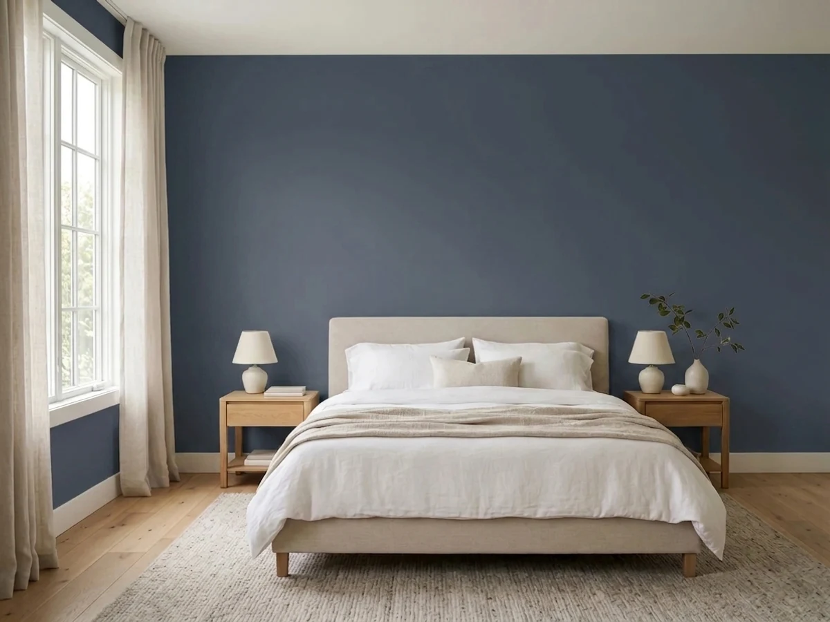
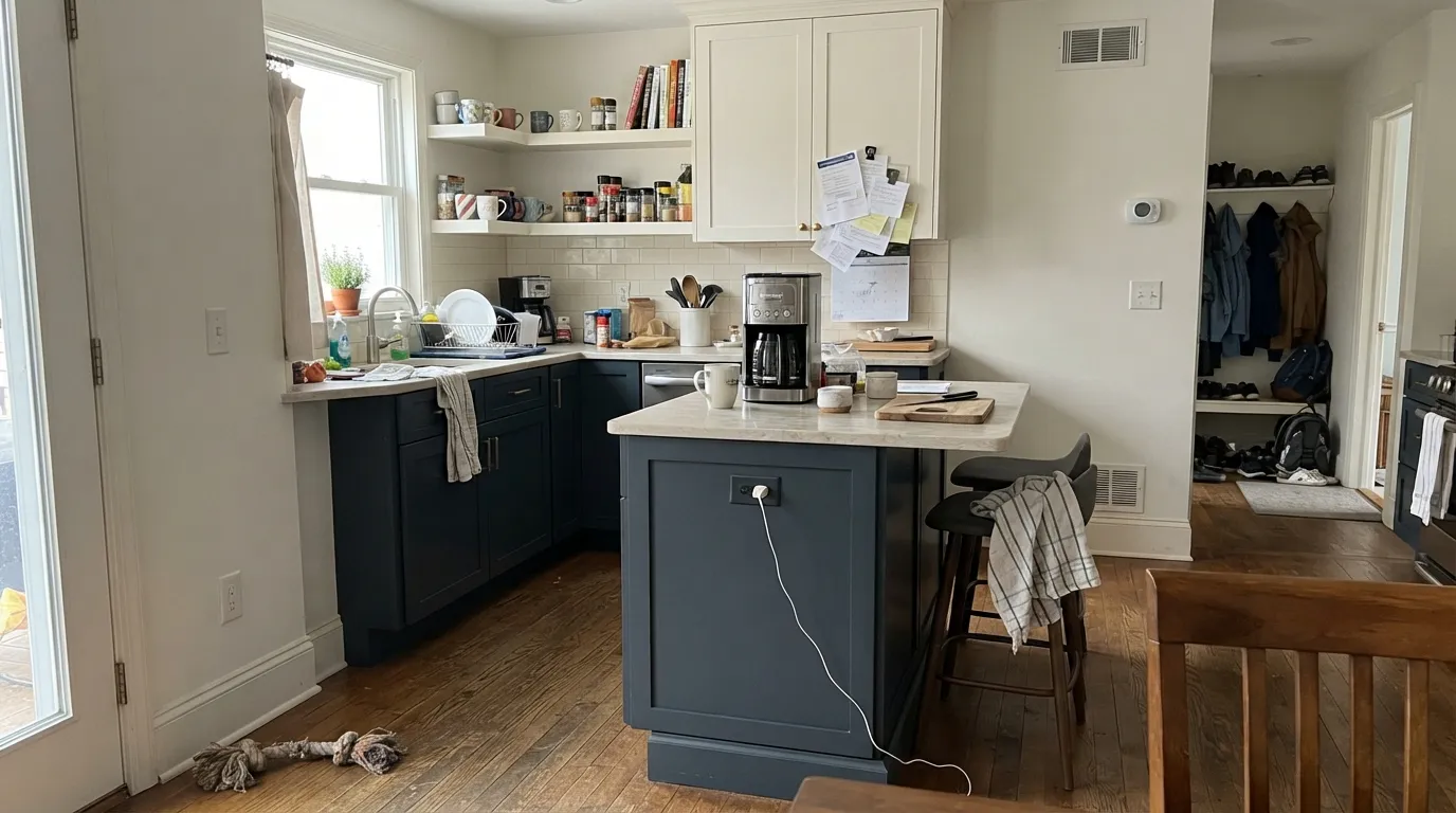
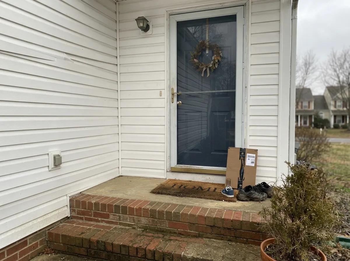
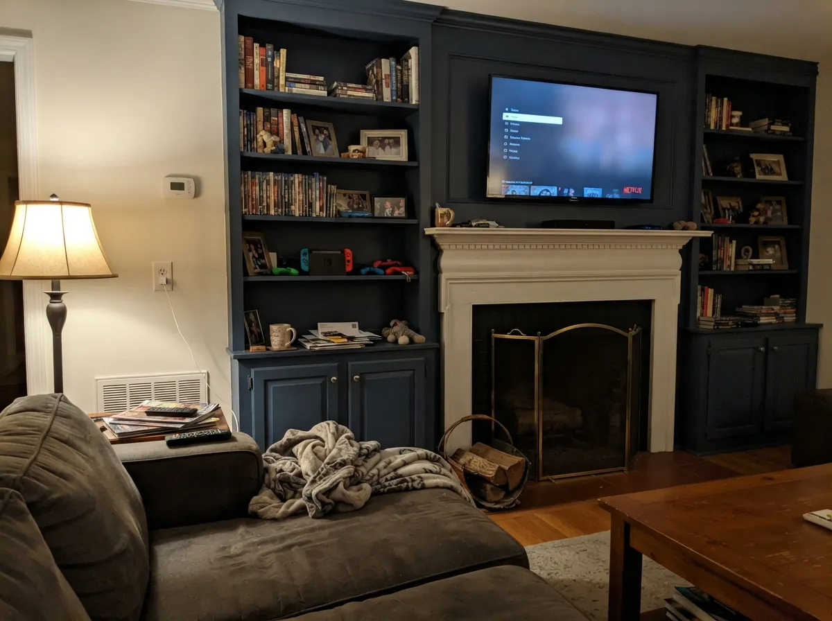
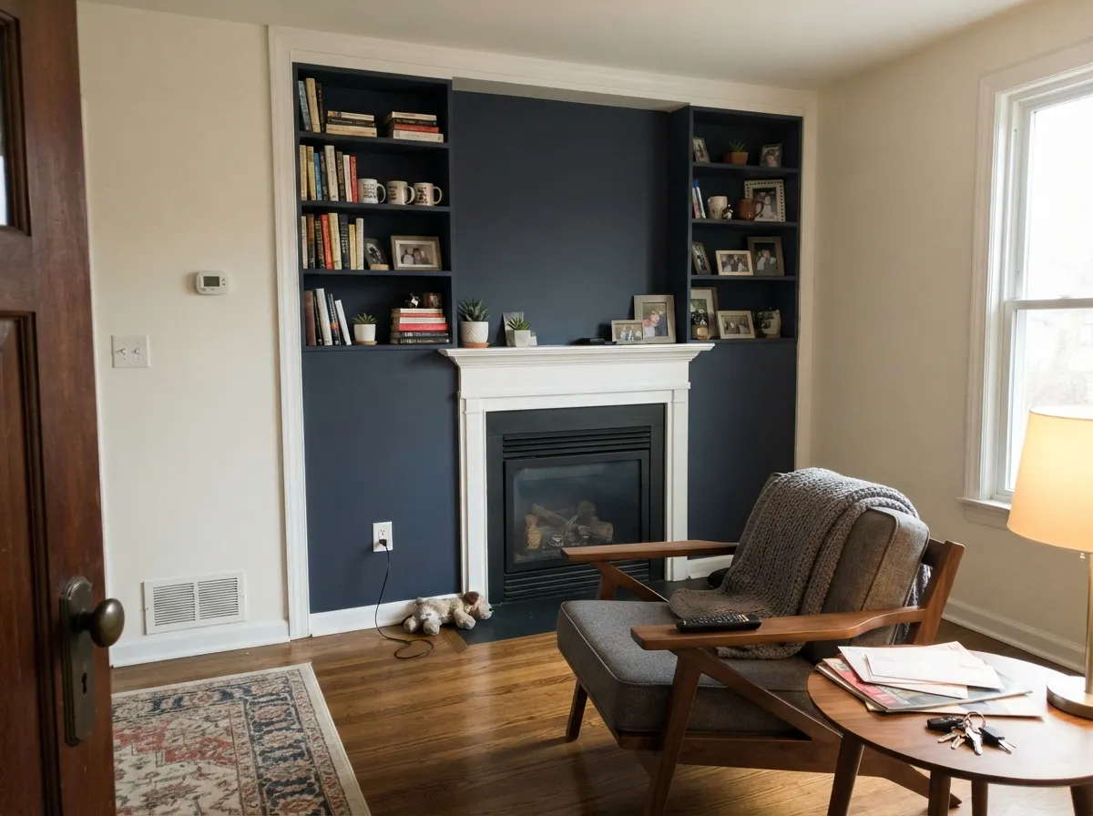
Hale Navy is at its best when it has something light to push against and enough daylight to keep the blue awake. That means kitchen lowers and islands under light counters, built-ins framing a fireplace, a front door on a white or brick house, and a bright south-facing office or dining room. In the photos below, watch how much window light is in the frame — that is the difference between navy and near-black.
Where It Fails
The complaints about Hale Navy are remarkably consistent, and almost all of them trace back to two things: not enough light, or the wrong expectation. If your room matches one of these, a second coat will not save it.
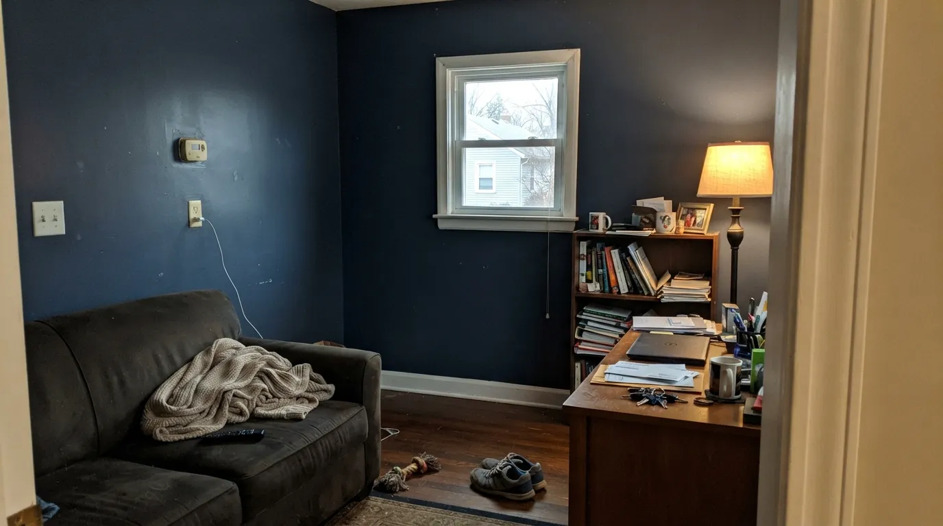
This is the number one regret story. People describe a north-facing study or bedroom where Hale Navy went "dull and almost black," then added lamps, then repainted a few years later. At LRV 8 there is simply not enough reflected light left for the blue to show. Go a step lighter: Newburyport Blue HC-155 at LRV 9, or Van Deusen Blue HC-156 at LRV 11 if you want the blue unmistakable.
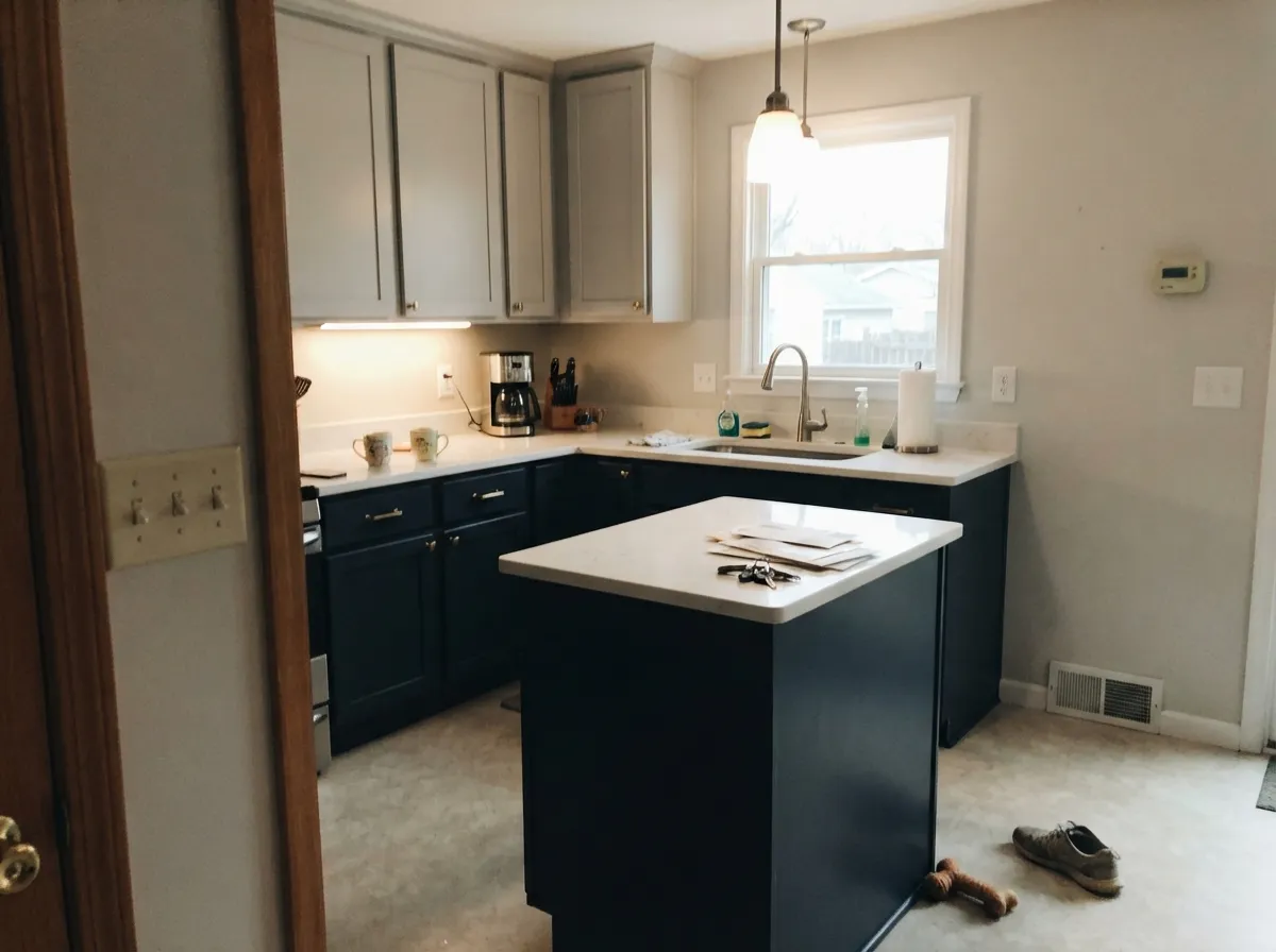
A very common post: someone loves Hale Navy cabinets in a lit showroom, puts it in their own kitchen, and it looks nothing like the photo. Showrooms and staged pictures are flooded with light; your kitchen is not. Sample it on a real cabinet door in your own room, at night too, before you commit the whole run.
The gray in Hale Navy is 16 percent saturation doing its job — calm, but readers who wanted drama say their island "looks gray, not blue," or that it flashes gray under bright light. That is the color working as designed. If you want ink and saturation, use Benjamin Moore Gentleman's Gray 2062-20, or Sherwin-Williams Naval SW 6244 at LRV 4.
Room by Room
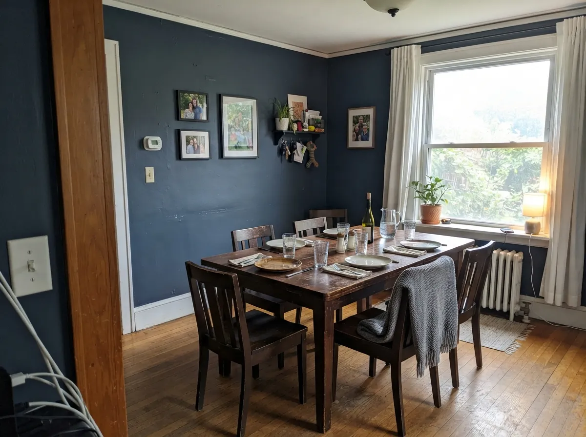
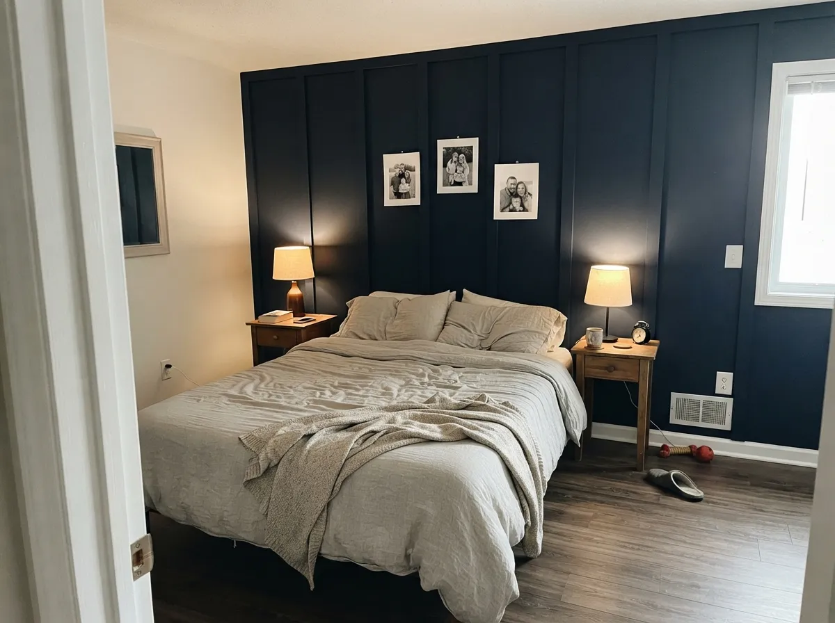
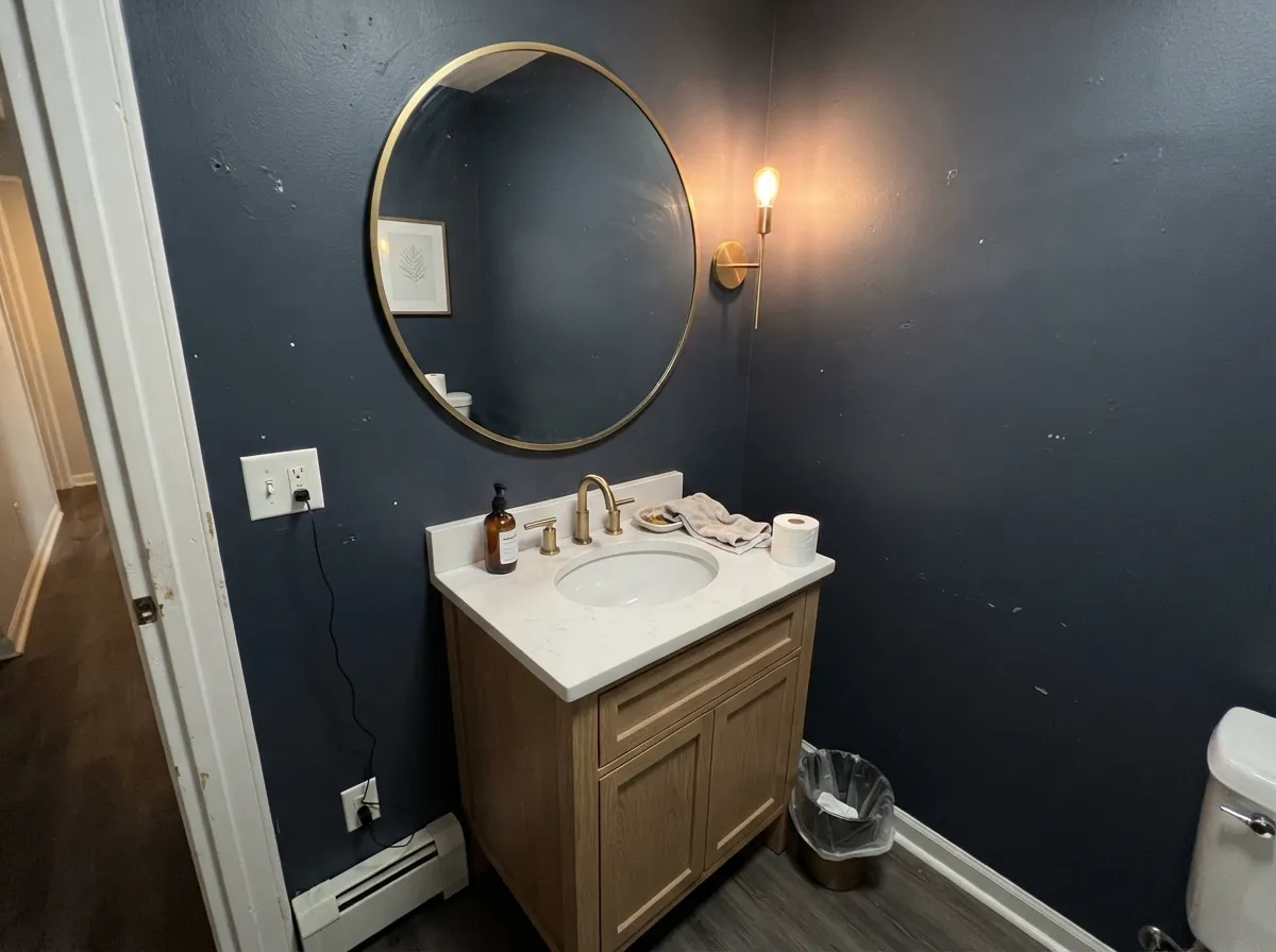
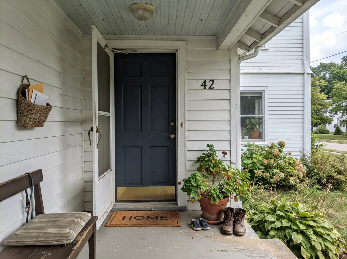
Your Light Is the Risk
Steady warm daylight lifts it into a real, readable navy most of the day.
Cool gray light drains it toward slate, then near-black by late afternoon.
2700K lamps blacken it. 3000–3500K keeps the navy legible. Bulbs matter here.
It will close the space in. Great in a powder room or den, wrong in a family bath.
Most complaints about Hale Navy are a light mismatch. Upload a photo of your actual room and see it on your walls — then ask for the same wall in north light or evening lamps before you buy a single sample.
Need It From Another Brand?
Any paint counter can custom-tint Benjamin Moore HC-154 directly. If you would rather stay in one brand's own deck, these are the closest stock matches, measured as ΔE2000. Under 2 is a difference you will not see on the wall.
| Brand | Closest color | ΔE | LRV | |
|---|---|---|---|---|
| Sherwin-Williams | Sea MarinerSW 9640 · Sherwin-Williams | 0.6 | 7 | Color page → |
| Behr | Dark NightPPF-58 · Behr | 1.3 | 7 | Color page → |
| Valspar | Rogue Blue5009-2 · Valspar | 1.5 | 7.2 | Color page → |
| PPG / Glidden | CavalryPPG1041-7 · PPG / Glidden | 2.3 | 7 | Color page → |
| Glidden | CavalryPPG1041-7 · Glidden | 2.1 | 7 | Color page → |
| Dutch Boy | Navigation432-7DB · Dutch Boy | 3.1 | 7 | Color page → |
Similar Benjamin Moore Colors
The nearest shades to Hale Navy within Benjamin Moore's own range, ranked by perceptual color distance — useful when you want the same look a touch lighter, darker, or warmer.
WCAG 2.1: AA is 4.5 : 1 for normal text, 3 : 1 for large text, AAA is 7 : 1.
Hale Navy vs the Colors You're Also Considering
Every Hale Navy sample board has the same rivals on it. The numbers show the real lightness gap — then it comes down to which risk you would rather live with.
Pick this when the room has good light and you want the calmer, grayer navy.
Benjamin Moore HC-155 · LRV 7Newburyport BluePick this for dim or north-facing rooms — LRV 9 keeps reading blue where Hale Navy blacks out.
Side-by-side comparison →Pick this for cabinets you will live with for a decade — quieter, easier to pair.
Sherwin-Williams SW 6244 · LRV 4NavalPick this for a moody statement wall; LRV 4 and more saturated, so it reads inkier.
Side-by-side comparison →Within Benjamin Moore, the closest sibling is Newburyport Blue HC-155, LRV 9. It is a step lighter and reads slightly more blue on the wall, so it suits rooms where Hale Navy tips too far toward black, like a north-facing office. Van Deusen Blue HC-156, LRV 11, is lighter still and clearly blue in most light; choose it when you want people to see navy walls, not near-black ones.
The most common cross-brand question is Sherwin-Williams Naval SW 6244, LRV 4. Naval is darker and more saturated, so it looks inkier and more dramatic, while Hale Navy is grayer and calmer. Naval favors a moody statement wall; Hale Navy favors cabinets you will live with for a decade.
Farrow and Ball Hague Blue No. 30 shares the same LRV of 6 but leans green-blue, almost teal in daylight. If your metals are brass and your look is English, Hague Blue fits; for a straight American navy, stay with Hale Navy.
Hale Navy Coordinating Colors
Because the gray does so much of the work here, Hale Navy is unusually easy to build around — it does not force the rest of the palette warm or cool the way a saturated blue does. The reliable structure is one clean or soft white for the trim, one warm neutral for the walls or adjoining rooms, and nothing else competing for attention. These are the partners that keep showing up in kitchens and dining rooms that actually work:
Hale Navy on Exteriors and Front Doors
Outside is where this color gets the light it needs. Full sun is the one condition that reliably pulls the blue forward, so a navy that can look like shadow indoors reads as an actual color on siding, shutters, and doors. Before you commit, look at what you cannot change: the roof, the brick or stone, and any existing masonry. Hale Navy sits well against red brick because the brick carries its own cool gray, and it is comfortable with charcoal and weathered-wood roofs. What it fights is warm orange-brown stone and terracotta roof tile — the blue turns those materials louder, not calmer.
The role you give it matters as much as the color. On shutters and a door over light siding, it is quiet and traditional. On the full body of the house with white trim, it becomes the statement and the trim does the balancing. The one thing to avoid is pairing it with another mid-tone cool gray on the same elevation, which flattens the whole facade — keep the second color clearly lighter.
Priming, Coats, and a Clean Finish
Saturated dark colors go on patchy, and Hale Navy is no exception. Over white walls or white cabinets, prime with a gray-tinted primer first — the tint carries most of the coverage so the finish coats are doing color work instead of hiding work. Skip it and you are usually looking at three coats and a blotchy first pass that makes you doubt the color before it has had a chance.
Application shows on a color this dark in a way it never does on an off-white. Roller stipple, brush marks, holidays, and lap lines all announce themselves, so keep a wet edge, work in manageable sections, and use a quality roller cover rather than whatever is in the garage. On cabinets and doors, spraying gives the best result by a wide margin; if you are brushing, a fine foam roller for the flats and a good synthetic brush for the profiles is the next best thing.
One more thing worth knowing before you start: touch-ups on dark paint rarely disappear. A dab six months later will flash a slightly different sheen even with the same can, so plan to cut and roll a full wall or a full cabinet face rather than spot-fixing, and keep enough paint to do that.
Three Ready Palettes Built on Hale Navy
A color is never alone on the wall. These are complete combinations in the 60-30-10 pattern, with the reason each one holds together. Every one opens in the visualizer.
Navy takes the bottom third of the room where scuffs happen, White Dove keeps the eye level light so the kitchen never feels heavy, and Edgecomb Gray warms the walls so the gray in Hale Navy does not turn the room cold. It is soft contrast rather than nautical, which is why this trio has outlasted the trend.
Try this palette in your roomChantilly Lace at LRV 92 is the maximum-contrast white, and that hard bright line is what keeps navy walls looking sharp instead of murky in a room you mostly use after dark. Revere Pewter next door is the step-down that lets the dining room read as a deliberate dark box rather than a sudden hole in the floor plan.
Try this palette in your roomFull sun is the one condition that reliably shows Hale Navy's blue, so it earns the 60 percent share outside in a way it rarely does indoors, and soft White Dove trim keeps the contrast classic instead of stark. Palladian Blue overhead is the pale blue-green cousin of the siding — same family, no competition, and it makes the porch feel lit.
Try this palette in your roomHale Navy FAQ
Is Hale Navy warm or cool?
Cool, but the gray in it keeps it from feeling cold or icy the way a clean blue does. It behaves closer to a dark neutral than to a blue, which is why it sits happily next to warm woods and creamy whites without a fight. If it pushes anywhere off-blue, it pushes very slightly violet, never green.
Does Hale Navy look black?
In direct daylight, no — it reads clearly navy. Six or eight feet back from the window, or after the sun goes down, most rooms will show you a very dark charcoal-blue that a guest would probably call black. The honest way to test it is to put your sample board next to a true black and next to a mid-blue at the same time; if you still like it in the middle position, you will like it on the wall.
Is Hale Navy a good front door color?
It is one of the safest dark door colors there is, because it gives you drama without the hard graphic edge black leaves on a traditional house. It works over white, gray, greige, and red brick, and it reads intentional on everything from a 1920s bungalow to new construction. Use an exterior semi-gloss so the door sheds dirt and the panel profiles catch light.
Hale Navy or Cyberspace for cabinets?
Cyberspace SW 7076 is the grayer of the two — it lands closer to a blue-charcoal and is the better pick if you want the cabinets to read as a dark neutral first. Hale Navy holds noticeably more blue in daylight, so it looks more like a color and less like a shadow. In a kitchen with limited natural light, Hale Navy is the one that will still show blue at the sink.
What white goes with Hale Navy?
Chantilly Lace OC-65 if you want the trim line to snap — it is the brightest, cleanest option and it makes the navy look crisp and modern. White Dove OC-17 if you want the whole thing softer and more traditional; its warmth takes the hard edge off. Either works, so pick based on the rest of the room: warm floors and brass point to White Dove, cool stone and black metal point to Chantilly Lace.
What hardware and metals look best with it?
Brass is the crowd favorite, and unlacquered or aged brass is better than bright polished — the warmth is what stops the navy from feeling cold. Polished nickel and chrome also work because of the gray in the color; they read tailored rather than clashing. Matte black is the one to think twice about on cabinets: against a color this dark, black pulls disappear and the whole run turns into one heavy mass unless something else in the room provides contrast.
Will Hale Navy fade outside?
Faster than a light color, yes — that is true of every dark exterior paint, and south and west exposures take the worst of it. A door or wall in full afternoon sun will look tired sooner than the shaded sides of the same house. Use a premium exterior line with UV protection, and expect a refresh coat on the sunniest surfaces before the rest of the house needs one.
Have you painted with Hale Navy?
Rate it — one tap helps the next reader decide.
Ask a Question