Alabaster
The white behind a decade of HGTV kitchens, reviewed honestly: where the warmth glows, the rooms where it turns green, and what to buy instead.

Jessica has spec'd whites and neutrals for more than 300 rooms and keeps a sample wall of painted drawdowns in her studio. Every color review is checked against real reader rooms in the comments and re-tested when a formula changes. About the testing process →
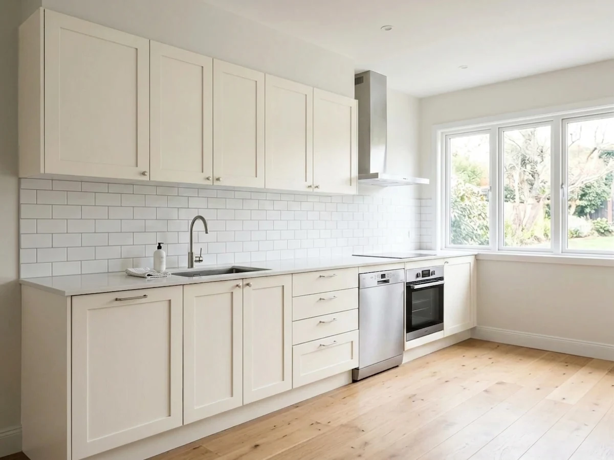
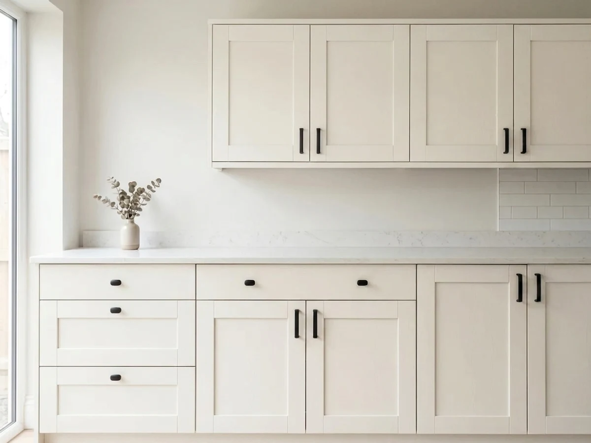
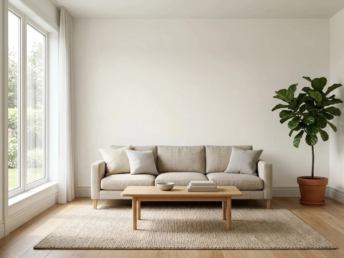
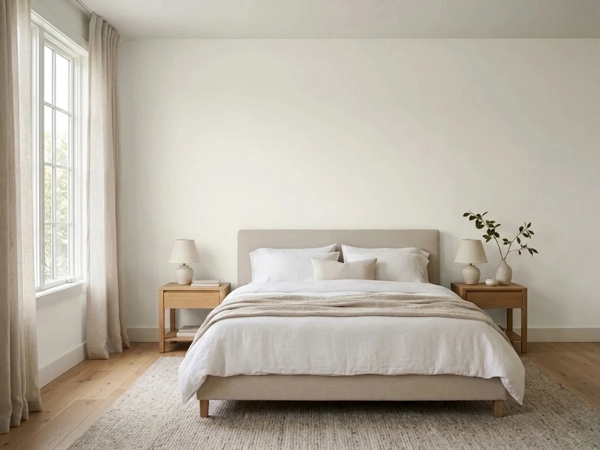
- 1First Star69
- 2Classic Gray74
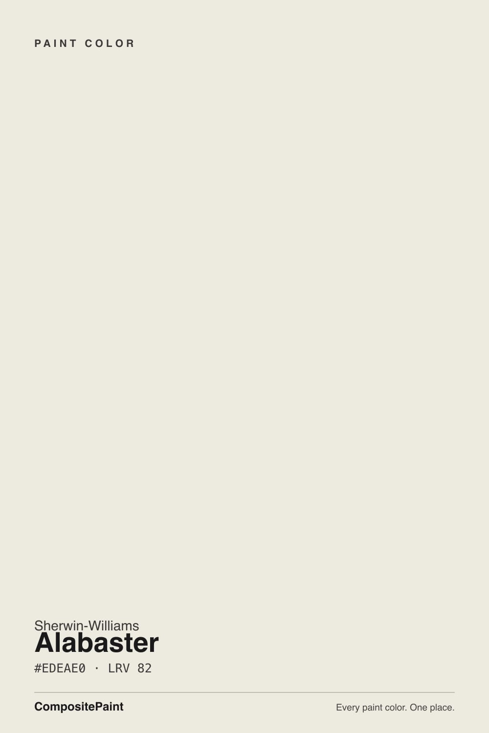
- 3Alabaster82
- 4Chantilly Lace91
- 5Ultra Pure White97
The Fast Verdict
Alabaster is the warm white that made Sherwin-Williams famous, and on cabinets and trim it earns every bit of that. At LRV 82 it stays bright, and the yellow in it is gentle enough that most people just call it white.
The catch is that the warmth is real, and the color reacts to whatever sits next to it. Give it daylight and warm finishes and it glows; give it cool grey light or stark white tile and it goes dingy.
Kitchen and bath cabinets · trim and interior doors · south and east rooms · houses with oak, brass, or cream-toned stone
Your room faces north and is dim · your tile, quartz, or appliances are stark white · your floors are cool grey · you want a crisp modern gallery white
- Warm but still reads as white in most rooms — LRV 82 keeps it bright
- The go-to cabinet white: makes stock cabinets look custom, not builder-grade
- Hides small wall and millwork flaws better than a stark white
- Flatters oak, walnut, brass, and cream-toned stone
- Walls, trim, and ceiling all in Alabaster gives a calm, seamless room
- Goes flat and slightly green-grey in dim north light
- Reads dingy next to stark white tile, quartz, or appliances
- Fights cool grey floors and grey marble
- Color-matched at another store it usually comes out yellower — buy the real Sherwin-Williams can
What Color Is Alabaster, Really?
A warm off-white built on a yellow-beige base, with a small amount of grey mixed back in to keep the yellow from going buttery. That grey is the reason Alabaster became a default instead of a cream: it takes the edge off the warmth so the wall reads "soft white" rather than "antique." The trade-off is that the grey is not a pure grey — there is a faint green thread running through it, and it stays invisible only while the yellow is doing its job. Cancel the yellow and the green half of the mix is what you are left looking at.
At LRV 82 it bounces back most of the light in the room, so it behaves like a white in daily use — but it is not a bright white, and the gap shows the moment a truly bright one is in frame. Extra White SW 7006 sits at 86 and High Reflective White SW 7757 at 93; next to either, Alabaster suddenly has visible body and looks like a color rather than a blank. On its own wall, with nothing brighter nearby, your eye adapts within a minute and simply calls it white. That is the whole reason it photographs so well and why it has been Sherwin-Williams' most-specified white for a decade.
Undertone in one line: warm yellow-beige, softened by a grey that leans very slightly green — never pink, never blue.
Where It Shines
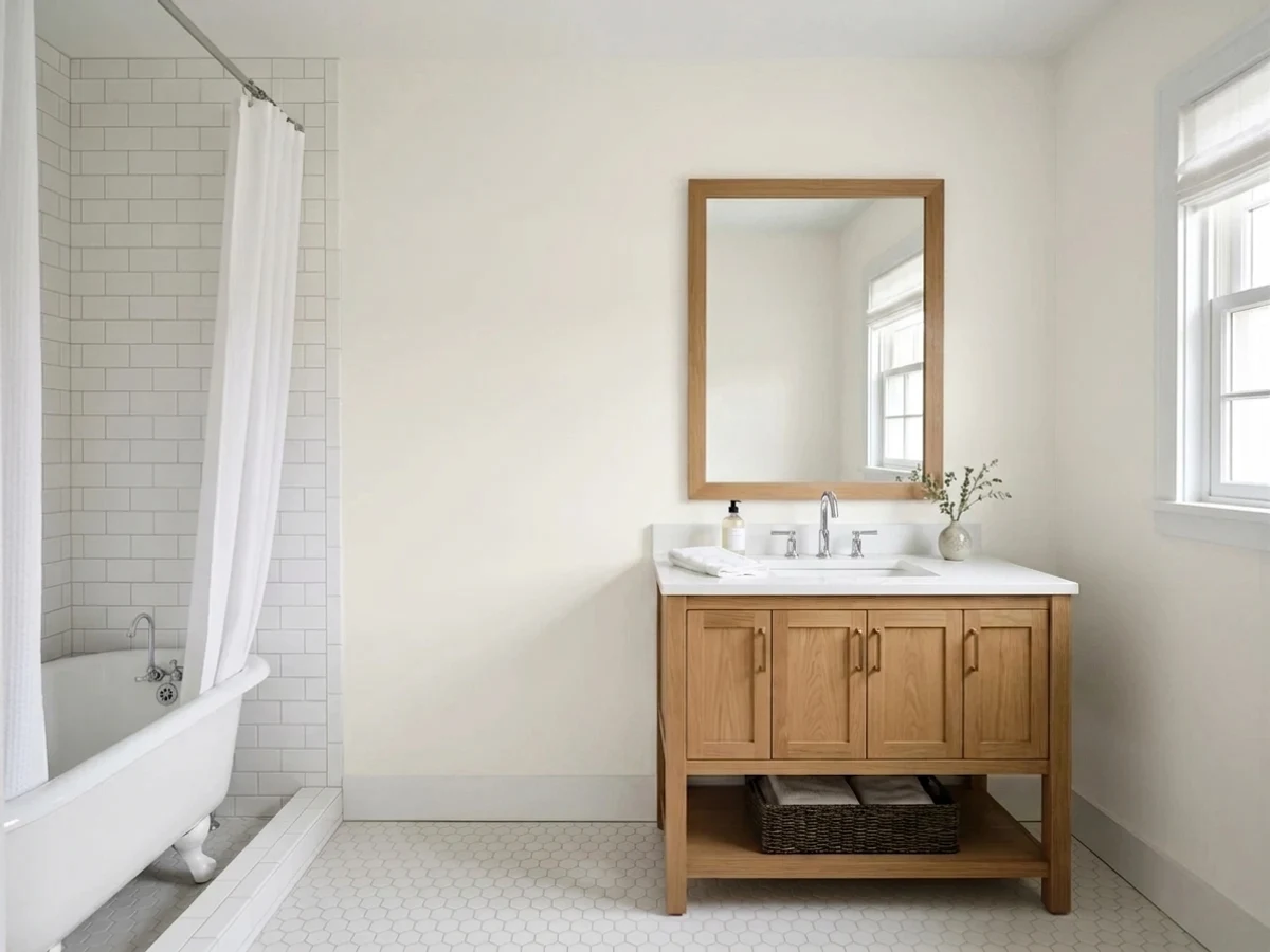
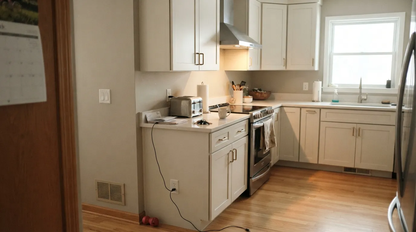
Alabaster is at its best on cabinets and millwork in rooms that get south or east sun, where the soft yellow warms up and stock doors start looking custom. Put it next to oak, walnut, brass, or cream-toned stone and the whole room settles; the photos below are the rooms where that happens.
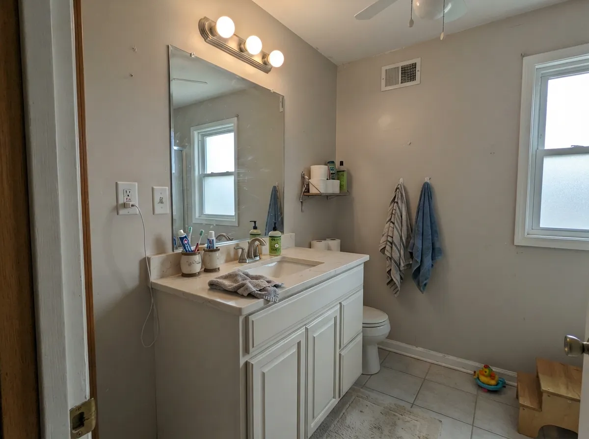
Where It Fails
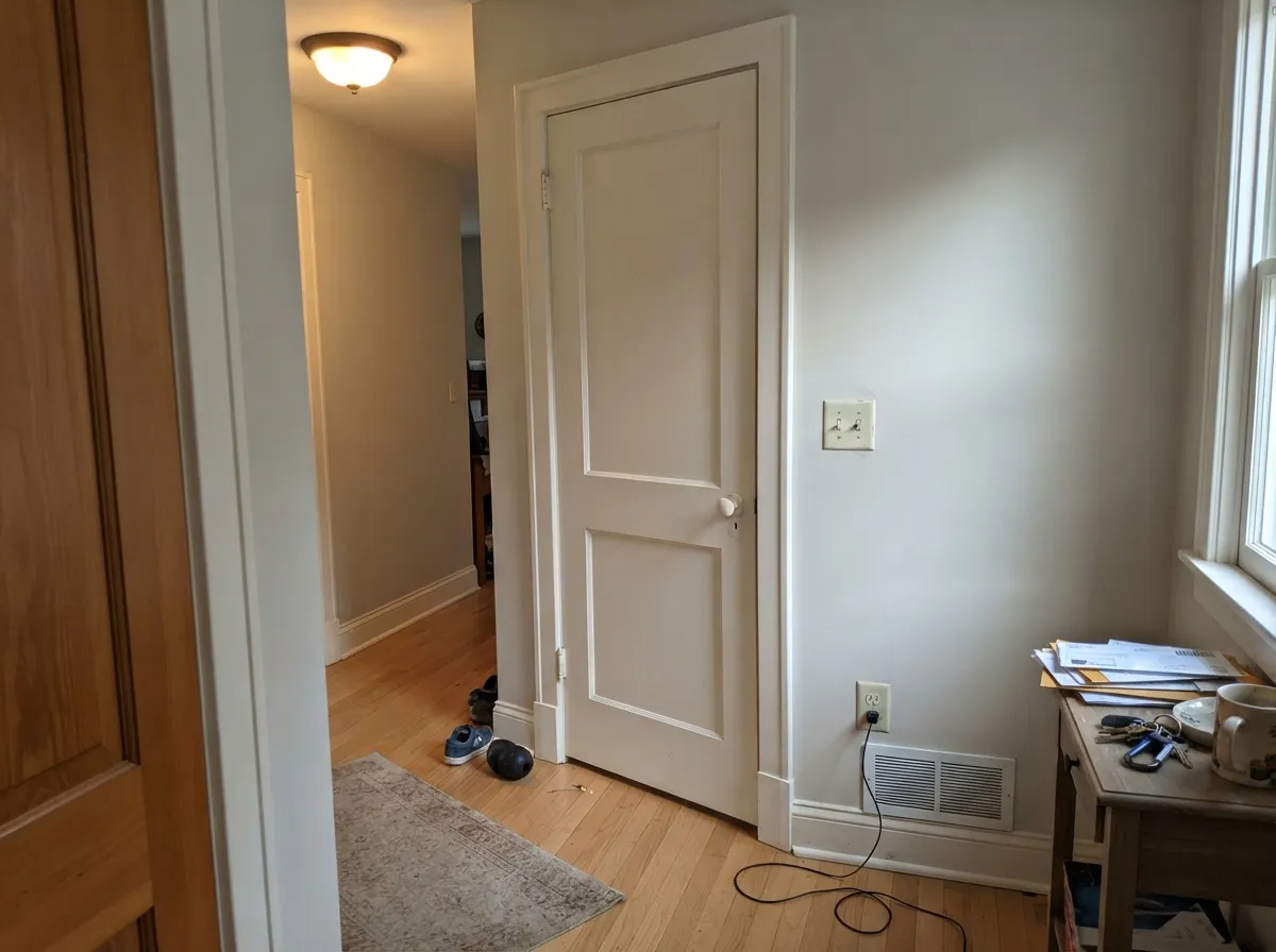
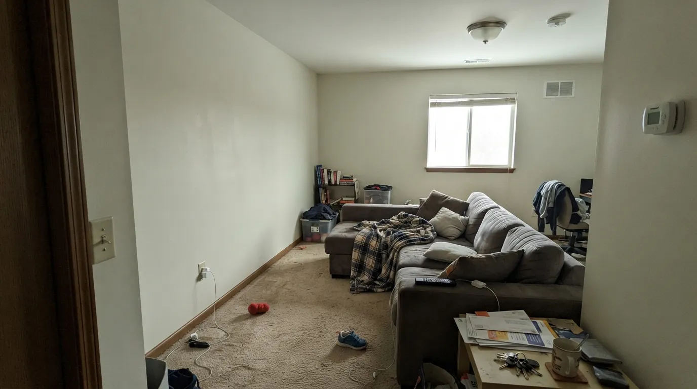
Almost every bad Alabaster story comes down to one thing: the yellow in it has nowhere to hide. Three situations expose it, and you can spot all three before you buy a single gallon.
North light is cool and grey. It cancels the yellow and leaves the soft green-grey underneath, so the wall goes flat. One Houzz poster painted a bonus room, called the result "pale yellow green," and was sure the store had mixed it wrong. It was the light. In that room pick Pure White SW 7005 if you want it to stay white, or Greek Villa SW 7551 if you want warmth that keeps glowing.
Alabaster looks white right up until something truly white sits beside it. Bright subway tile, cool quartz, a white fridge, or new vinyl windows all win the comparison, and the paint suddenly reads dirty. Match the temperature instead: Pure White SW 7005 on the walls, or keep Alabaster and choose cream-toned stone and tile.
Grey LVP and Carrara-type stone sit at the opposite temperature, and that contrast drags Alabaster toward dirty yellow. Warm the floor with wood tones and rugs, or switch to a white with no yellow to clash — Snowbound SW 7004 leans faintly taupe, and Chantilly Lace 2121-70 stays clean and cold.
Room by Room
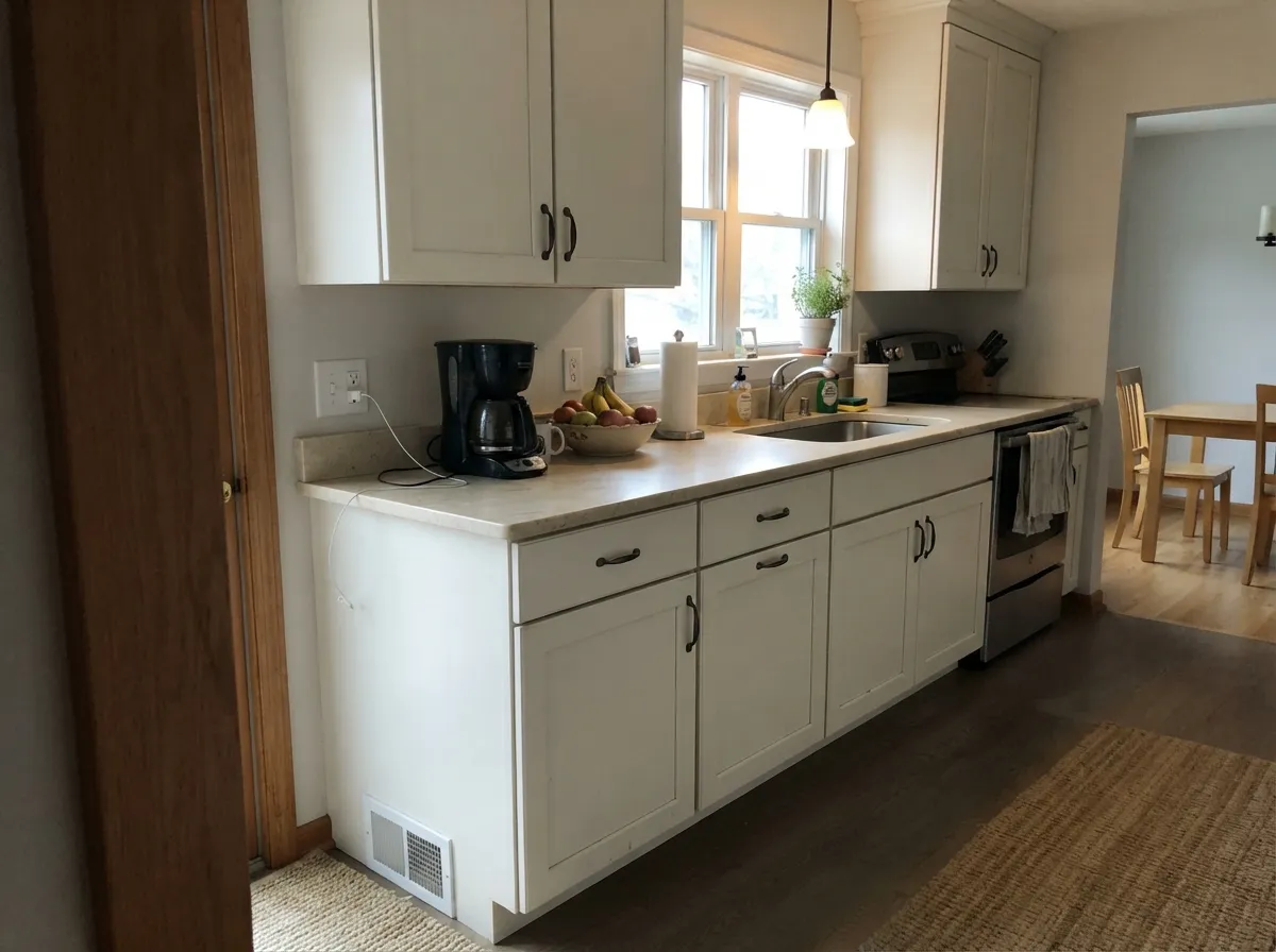
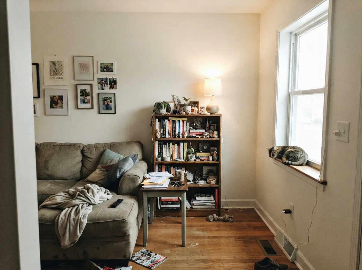
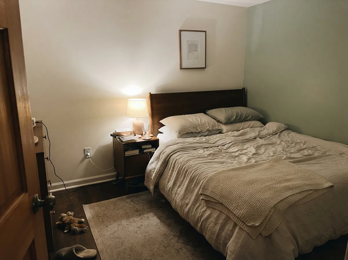
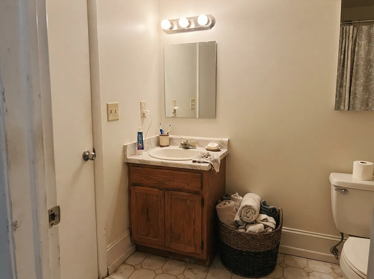
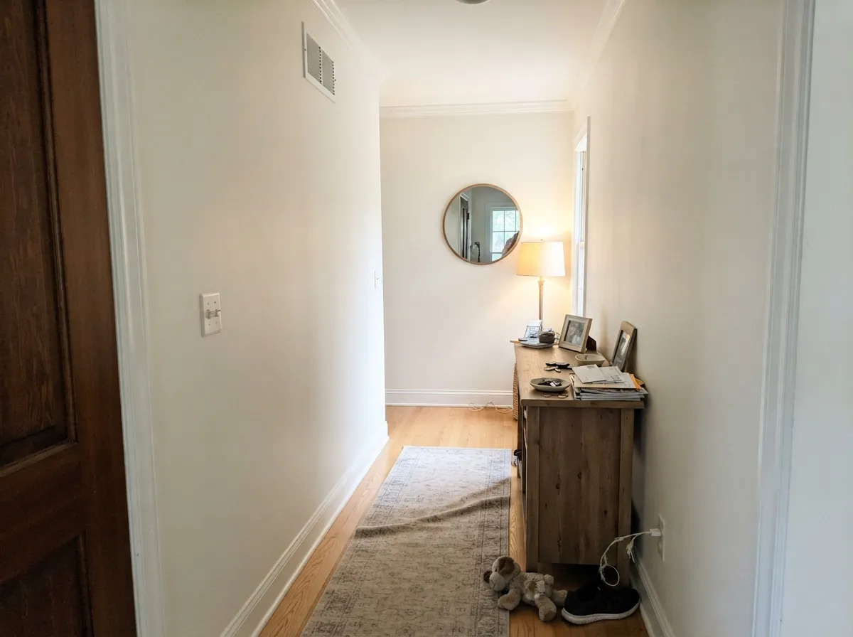
Your Light Is the Risk
The cream comes forward and the room feels sunlit even on grey days. Late sun pushes it slightly buttery.
Cool daylight cancels the yellow and the green-grey base shows. This is where people repaint.
2700K lamps make it cozy cream. 4000K keeps it crisp. Change the bulbs before you change the paint.
At LRV 82 a powder room or hallway still reads bright, and the warmth feels cozy instead of cave-like.
Most complaints about Alabaster are a light mismatch. Upload a photo of your actual room and see it on your walls — then ask for the same wall in north light or evening lamps before you buy a single sample.
Need It From Another Brand?
Any paint counter can custom-tint Sherwin-Williams SW 7008 directly. If you would rather stay in one brand's own deck, these are the closest stock matches, measured as ΔE2000. Under 2 is a difference you will not see on the wall.
| Brand | Closest color | ΔE | LRV | |
|---|---|---|---|---|
| Behr | First SnowDC-006 · Behr | 0.9 | 82 | Color page → |
| Benjamin Moore | Dune White968 · Benjamin Moore | 0.5 | 80 | Color page → |
| Valspar | Paramount White7006-22 · Valspar | 0.6 | 82.4 | Color page → |
| PPG / Glidden | Macaroon CreamPPG15-05 · PPG / Glidden | 0.9 | 82 | Color page → |
| Glidden | Pacific Mist51YY 83/060 · Glidden | 1.4 | 83 | Color page → |
| Dutch Boy | Swan White024W · Dutch Boy | 0.0 | 82 | Color page → |
Similar Sherwin-Williams Colors
The nearest shades to Alabaster within Sherwin-Williams's own range, ranked by perceptual color distance — useful when you want the same look a touch lighter, darker, or warmer.
WCAG 2.1: AA is 4.5 : 1 for normal text, 3 : 1 for large text, AAA is 7 : 1.
Alabaster vs the Colors You're Also Considering
Every Alabaster sample board has the same rivals on it. The numbers show the real lightness gap — then it comes down to which risk you would rather live with.
Pick this for warmth, and for cabinets that should look soft rather than clinical.
Sherwin-Williams SW 7005 · LRV 84Pure WhitePick this for a cleaner modern white, or as crisp trim over Alabaster walls.
Side-by-side comparison →Pick this when strong sun would push Greek Villa's cream too far toward yellow.
Sherwin-Williams SW 7551 · LRV 84Greek VillaPick this for dim or north rooms — the extra cream keeps glowing where Alabaster dulls.
Side-by-side comparison →Pure White SW 7005 at LRV 84 is the crisp cousin. It has far less yellow, so it looks cleaner and more neutral. Choose Pure White when you want a modern, less creamy white, or use it as trim over Alabaster walls. Alabaster wins when you want warmth and softness.
Snowbound SW 7004 at LRV 83 sits between them. It reads slightly cooler and grayer than Alabaster, with a hint of taupe instead of yellow. In a north room Snowbound can feel a bit sterile where Alabaster stays inviting.
Greek Villa SW 7551 at LRV 84 is the warmer, creamier option. It pushes further toward soft cream than Alabaster does, which is great for a cozy, traditional feel but can look too yellow in bright southern light. Sample all three side by side, because at this lightness the differences are subtle until they are on your wall.
Alabaster Coordinating Colors
The rule with Alabaster is to keep its partners on the warm side of neutral. Anything with a blue or violet base sits at the opposite temperature and makes the paint look yellowed by comparison, while warm greiges, muted greens, and soft earth tones let it read as a clean white. These are the partners that come up again and again in real Sherwin-Williams schemes:
One note on Repose Gray: it is the coolest color on this list and the only one that needs a sample. It works because the greige base still has warmth in it, but in a north room it can tip cool enough to expose Alabaster's yellow. If that happens, step over to Shoji White or Natural Choice and the problem disappears.
Alabaster on Exteriors
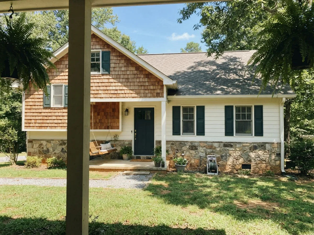
Outside, Alabaster behaves better than its creamy indoor reputation suggests. Open daylight is many times stronger than any lamp, so the yellow gets diluted and the facade reads as a clean, slightly soft white rather than a cream. That is why it turned into the standard body color for farmhouse and transitional exteriors, and why it works equally on lap siding, painted brick, and stucco.
The thing to plan for is that one house shows you several versions of the color at once. The sunny south and west elevations read brightest and cleanest; the shaded north side and anything under a deep porch or roof overhang will read a full step creamier and slightly duller. That is normal and nobody notices it from the curb, but it does mean you should walk a large sample around all four sides of the house before you commit, not just tape it by the front door. Full-blast desert or coastal sun is the one climate where Alabaster can look flatly bright — in that case a color with a lower LRV, like Shoji White SW 7042, gives you the same warmth with less glare.
For trim, shutters, and doors the pairing does most of the work. A dark frame is what keeps the body reading crisp rather than soft, and the three below cover the range from sharp modern contrast to something warmer and more traditional. What to avoid is cool blue-grey trim, which puts a cold color right against a warm one and makes the siding look yellow by comparison. Roof and stone matter too: a warm brown or black roof and cream-toned stone flatter it, while a blue-grey roof will fight it for the life of the paint job.
Painting Cabinets Alabaster: Product, Prep, and Yellowing
Cabinets are where this color earns its reputation, but the finish decides whether it looks custom or homemade. Use a cabinet-grade waterborne enamel — Emerald Urethane Trim Enamel is the Sherwin-Williams answer — and expect two thin coats with a full cure before the doors get handled hard. Sprayed, the surface is glass-smooth and the warmth reads even; brushed, Alabaster is forgiving of small marks in a way a bright white never is, because the softness hides texture instead of spotlighting it. Prep is not optional on kitchen doors: degrease with a strong cleaner, scuff-sand, and use a bonding primer, or the film will chip at the edges within a year no matter how good the paint is.
The yellowing question comes up constantly, and the answer depends entirely on what you put in the can. Modern waterborne enamels hold their color; traditional oil-based enamels amber over time, and they do it fastest in rooms that stay dark, so an oil finish in a north kitchen or the inside of a closed pantry will drift warmer than the day you sprayed it. Alabaster already sits on a yellow base, which means any ambering shows up sooner than it would on a cool white. If you want it to stay exactly where it started, stay waterborne.
It is worth knowing which materials flatter it. Natural white oak, honey oak, walnut, butcher block, and warm-toned stone all meet Alabaster halfway and make the whole kitchen settle; unlacquered and aged brass in particular look expensive against it, which is a large part of why the color took over. Two-tone kitchens work well when the lower cabinets go deep and warm — Pewter Green SW 6208 or Urbane Bronze SW 7048 are the reliable choices — because a dark warm base makes the Alabaster uppers read cleaner and brighter than they do on their own.
Three Ready Palettes Built on Alabaster
A color is never alone on the wall. These are complete combinations in the 60-30-10 pattern, with the reason each one holds together. Every one opens in the visualizer.
One color at two sheens removes every contrast line, so hallways and small rooms read bigger and nothing has to be matched. Naval supplies the single dark note the scheme needs, and its cool depth keeps the warm white from tipping into cream.
Try this palette in your roomAccessible Beige shares Alabaster's warm base, so the wall-to-cabinet handoff is a soft step down in brightness rather than a clash of temperatures. Urbane Bronze grounds the island and loves brass hardware, which keeps the whole room on the warm side where Alabaster looks best.
Try this palette in your roomEvergreen Fog is muted and slightly grey-green, so it reads restful next to Alabaster instead of decorated, and it borrows the same warmth rather than fighting it. Agreeable Gray next door bridges the two at a mid LRV, which keeps the transition between rooms from looking like a mistake.
Try this palette in your roomAlabaster FAQ
Is Alabaster warm or cool?
Warm, without question — the base is yellow-beige, not grey. Hold a true white chip against it and the warmth jumps out immediately; look at a whole wall of it with nothing brighter in the room and your eye reads plain white. What it never does is drift pink or blue, which is why it plays well with brass, oak, and cream stone.
Does Alabaster look yellow?
It can, and there are three usual causes: 2700K bulbs, late afternoon sun from the south or west, and sheer surface area — walls, ceiling, and trim all in Alabaster in a sunny room turns the whole box cream. Tinted low-E window glass is the sneaky one; a blue-green tint on the glass shifts the light and people blame the paint. Swap to 3000K or 3500K bulbs and look again before you decide the color is wrong.
Alabaster or White Dove for cabinets?
Alabaster is the creamier of the two; White Dove is greyer and carries a faint pink that Alabaster does not have. The practical tiebreaker is the rest of the room: if your existing trim and windows are staying a standard builder white, White Dove blends into them with less argument, while Alabaster is the better pick when the whole room is going one warm white. Sprayed in satin on doors the visual gap is about half a step — small enough that brand availability at your paint counter is a legitimate way to decide.
What trim color goes with Alabaster walls?
Alabaster itself in semi-gloss is the safest answer and the one most designers use — same color, different sheen, no seam to get wrong. If you want the trim brighter, Pure White SW 7005 is the one step up that still reads intentional. Do not reach past it to Extra White SW 7006 or High Reflective White SW 7757; that jump is big enough that the walls start looking dirty instead of warm.
How many coats does it take?
Two, over any existing light color. One coat is where most of the "it looks blotchy and yellow" complaints come from — thin white over an old white shows every roller lap and reads uneven until the second coat evens it out. Going over anything dark or saturated, prime first with a grey-tinted primer rather than paying for a third and fourth finish coat.
Does Alabaster go with Agreeable Gray?
Yes, and it is the most common pairing in the Sherwin-Williams deck for good reason: both sit on the same warm base, so there is no temperature clash where wall meets trim. The LRV gap is roughly 22 points, which is enough separation to see the millwork clearly without a hard, chopped line. If Agreeable Gray still feels a touch cool against it in your light, Accessible Beige SW 7036 is the warmer swap.
Does it work on exteriors?
It is one of the most-used exterior whites in the country, and it holds up on siding, painted brick, and stucco alike. Outdoors it reads cleaner and less creamy than it does inside, because open daylight is far stronger than anything a lamp puts out. The exterior section below covers how the shaded sides of the house behave and which trim colors to put with it.
Have you painted with Alabaster?
Rate it — one tap helps the next reader decide.
Ask a Question