Cyberspace
The dark blue-gray everyone puts on islands and office walls, reviewed honestly: where it holds its blue, where it just turns black, and what to pick instead.

Jessica has spec'd whites and neutrals for more than 300 rooms and keeps a sample wall of painted drawdowns in her studio. Every color review is checked against real reader rooms in the comments and re-tested when a formula changes. About the testing process →
- 1Cyberspace6
- 2Pewter Green12
- 3Retreat21
The Fast Verdict
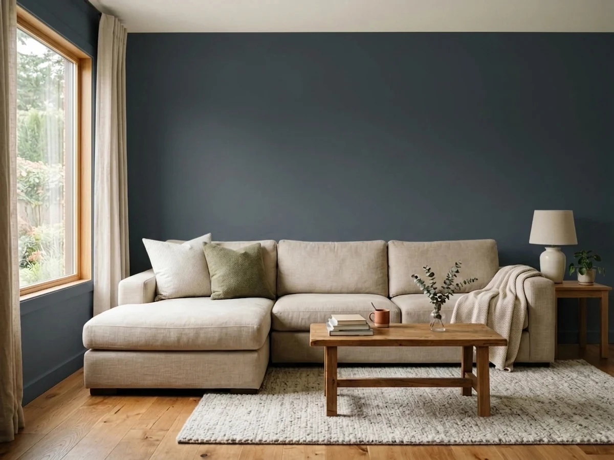
Cyberspace is what people choose when black feels harsh and navy feels loud. There is real blue in it, but gray keeps that blue on a short leash, so the color only shows its hand when daylight or good lamps reach it. On cabinets, islands and offices with a window it is close to perfect. In a dim room, or in the hands of someone who actually wanted navy, it is the most common disappointment in the deck.
Home offices and libraries meant to feel enclosed · kitchen islands and lower cabinets · powder rooms painted wall-to-ceiling · exteriors with wide white trim
The room is dim and you truly want navy · your trim and cabinets are cream · it is the only bright room you have · the wall faces hard afternoon sun
- Dark and dramatic without the hardness of a true black
- The gray keeps the blue from dating the way a bold navy does
- Excellent on islands, lowers and built-ins with warm counters
- Wall, trim and ceiling in one color makes small rooms look designed
- Works indoors and out, on doors, shutters and full facades
- Reads plain black in dim rooms — the blue needs light to show
- Not saturated enough for anyone who actually wants navy
- Fights cream and warm white trim
- Fades faster than mid-tones on sunny exterior walls
What Color Is Cyberspace, Really?
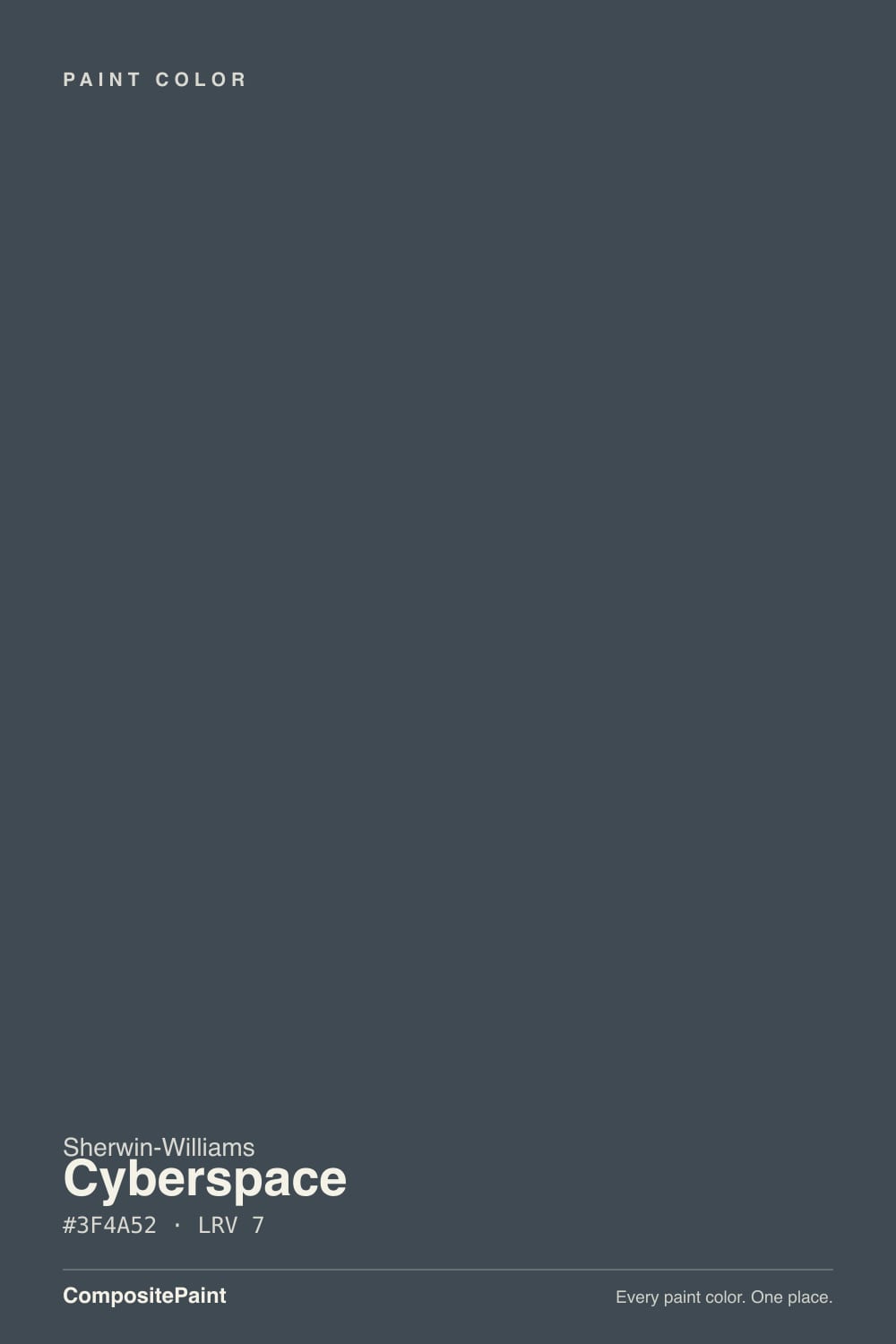
A charcoal with blue inside it — and the word doing the work is "inside." The hue direction is genuinely blue, the blue of an overcast sky rather than a royal or a teal, but there is so much gray mixed in that the color spends most of its life reading as a very dark gray. On a two-inch chip almost nobody sees blue. On a whole wall, with daylight on it, the blue steps out. That gap between the chip and the wall is where nearly every surprise with this color starts.
Its LRV is 7, which means about seven percent of the light hitting the wall comes back at you. A white ceiling gives back more than ten times that. So a room in Cyberspace does not get brighter — it gets quieter and smaller, and it runs on lamps and windows instead of bounce. Depth is not what separates it from the other near-blacks either: Iron Ore SW 7069 sits at LRV 6, one point away. The difference between them is temperature, not darkness.
Undertone in one line: gray-dulled blue — never teal, never purple, and never a true navy. If your sample looks flat black, that is your light level, not a bad can.
Where It Shines
Give it a window and something warm nearby and it does exactly what people hope for: weight without hardness. Offices, libraries and islands are where it earns its reputation, because those are rooms you want to feel contained rather than open.

Where It Fails
The bad stories about this color are remarkably consistent, and all three are predictable before you buy a gallon. None of them are a paint defect — but if your room matches one, no second coat will save it.
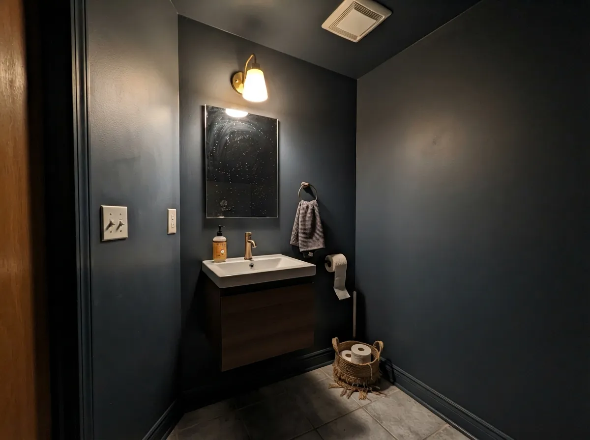
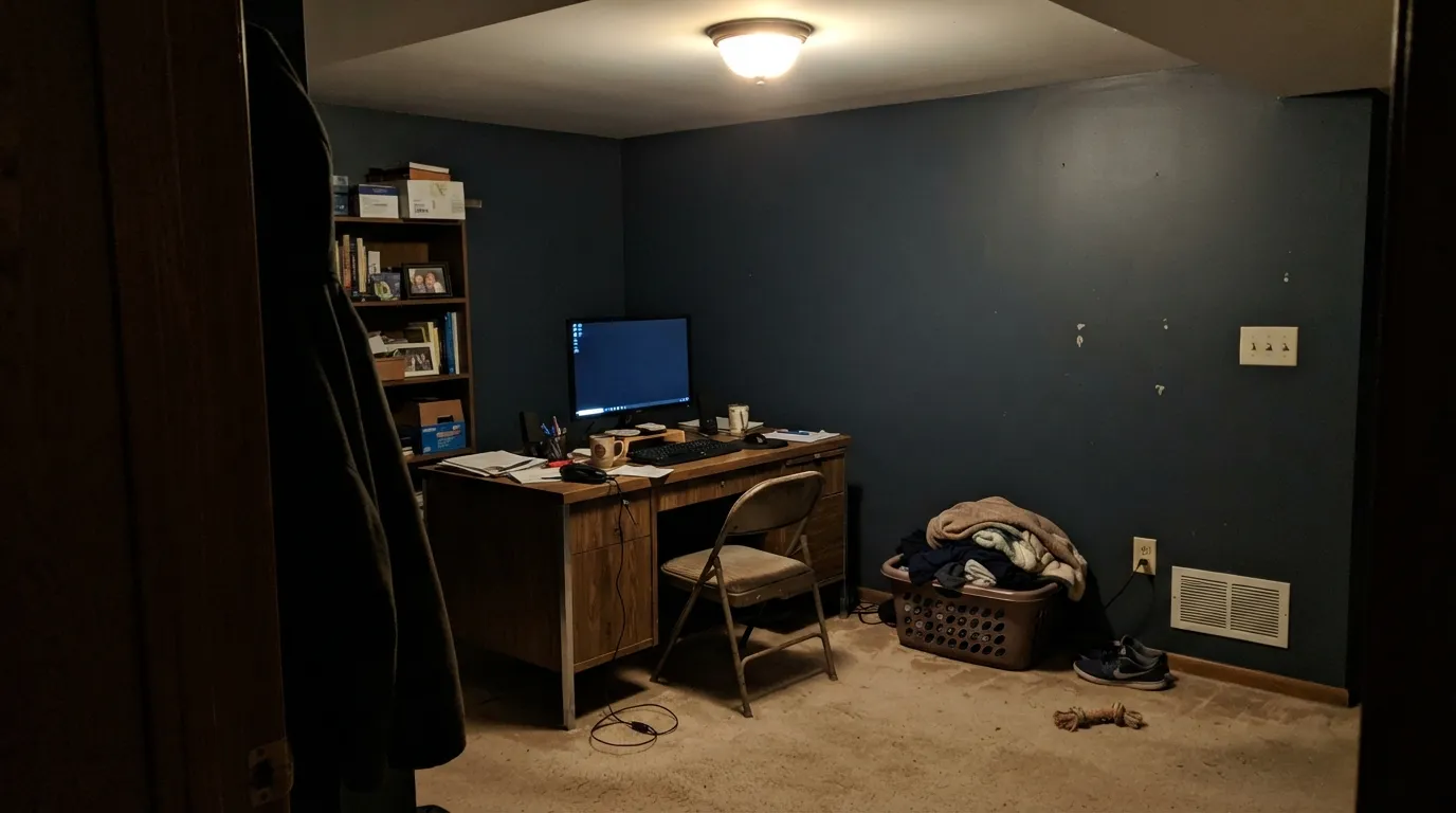
This is the number one complaint: "I wanted blue and got black." At LRV 6 there is almost no reflected light to carry the hue, and the gray in the mix swallows what is left. Basements, interior offices and windowless powder rooms all do this. If you want the blue to survive low light, go more saturated with Naval SW 6244; if you want to keep the softness, step lighter to Slate Tile SW 7624.
Against creamy whites the cool blue comes forward and pushes the trim toward yellow, so the woodwork starts looking dingy next to the walls. It is a pairing mistake, not a color flaw. Either switch the trim to a clean white like Pure White SW 7005, or keep the cream and use a warm near-black instead — Iron Ore SW 7069.
Very dark exteriors take a beating from afternoon sun: the surface runs hot and the color fades sooner than a mid-tone on the same house. It holds up best on shaded and north elevations. For a sun-hammered facade, drop to a mid-depth charcoal like Peppercorn SW 7674 and save Cyberspace for the door and shutters.
Room by Room
Eggshell on walls, and run the trim and built-ins in the same color so the room reads as one deep volume instead of a dark box with white edges. Brass hardware and walnut shelves keep the blue from turning cold. Add lamps at two heights — one ceiling fixture is not enough here.
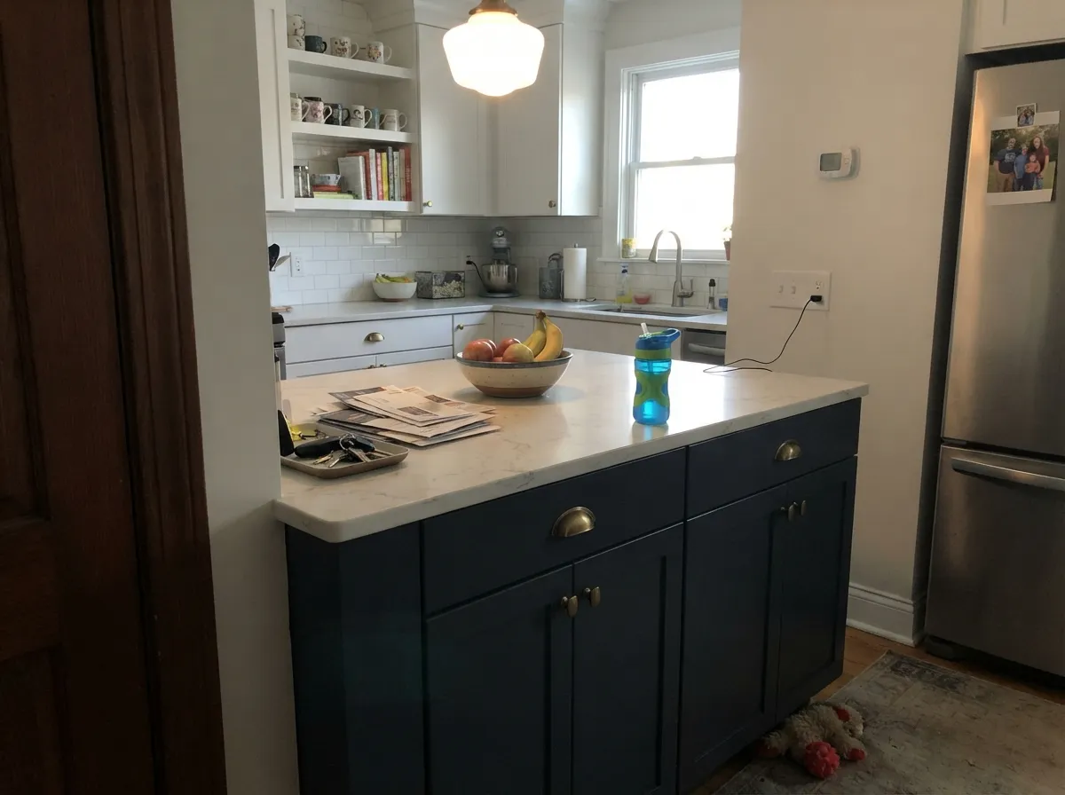
This is the safest way to use it. Satin on the island, Pure White SW 7005 or Alabaster SW 7008 on the perimeter cabinets, and a warm counter to hold the blue in balance. Expect fingerprints along the drawer edges; dark satin shows them.
Small windowless rooms are the one place where reading near-black is a feature. Walls, trim and ceiling in Cyberspace, with a warm bulb and a big mirror. Do not fight it with white trim — the contrast just makes the room look smaller.
It works beautifully behind a bed with warm 2700K lamps and linen bedding, and badly as a whole-room color in a bedroom you also get dressed in. Eggshell, and keep the ceiling lighter if the room has one small window.
Low reflectance is the point in a screen room, and the blue keeps it from looking like a flat black cube. Use a flat or matte sheen so the screen glow does not bounce off the walls. Iron Ore SW 7069 on the screen wall is a common pairing.
As a body color it looks modern against wide Extra White SW 7006 trim, and as a door or shutter color it works on almost any light siding. Satin, not flat, and check the elevation first — full afternoon sun shortens its life. Full pairings in the exterior section below.
Your Light Is the Risk
Cool daylight brings the blue right out. Gorgeous — add warm lamps so it does not feel cold.
Warm sun cancels part of the blue and it settles into a deep slate charcoal.
2700K lamps make it cozy and near-black. 4000K LEDs push it blue and clinical.
With no daylight the hue disappears and you are simply living with black.
Most complaints about Cyberspace are a light mismatch. Upload a photo of your actual room and see it on your walls — then ask for the same wall in north light or evening lamps before you buy a single sample.
Need It From Another Brand?
Any paint counter can custom-tint Sherwin-Williams SW 7076 directly. If you would rather stay in one brand's own deck, these are the closest stock matches, measured as ΔE2000. Under 2 is a difference you will not see on the wall.
| Brand | Closest color | ΔE | LRV | |
|---|---|---|---|---|
| Behr | Winter CoatHDC-WR14-4 · Behr | 1.0 | 7 | Color page → |
| Benjamin Moore | Black Horizon2132-30 · Benjamin Moore | 0.0 | 8 | Color page → |
| Valspar | Muskeg Grey4005-2C · Valspar | 1.9 | 6.5 | Color page → |
| PPG / Glidden | Black ForestPPG1012-7 · PPG / Glidden | 2.5 | 7 | Color page → |
| Glidden | Black ForestPPG1012-7 · Glidden | 2.5 | 7 | Color page → |
| Dutch Boy | Anchored Blue434-7DB · Dutch Boy | 0.0 | 6 | Color page → |
Similar Sherwin-Williams Colors
The nearest shades to Cyberspace within Sherwin-Williams's own range, ranked by perceptual color distance — useful when you want the same look a touch lighter, darker, or warmer.
WCAG 2.1: AA is 4.5 : 1 for normal text, 3 : 1 for large text, AAA is 7 : 1.
Cyberspace vs the Colors You're Also Considering
Every Cyberspace sample board has the same rivals on it. The numbers show the real lightness gap — then it comes down to which risk you would rather live with.
Pick this for a dark that still has a color in it.
Sherwin-Williams SW 7069 · LRV 6Iron OrePick this when the room is full of oak and cream trim.
Side-by-side comparison →Pick this for restraint — a dark that whispers blue.
Sherwin-Williams SW 6244 · LRV 4NavalPick this if you want obvious navy that survives low light.
Iron Ore SW 7069 at LRV 6 is the usual alternative. Its hex #41464B is a warmer, more neutral charcoal, while Cyberspace at #3F4A52 keeps a clear blue lean. In practice Iron Ore behaves like a soft black in almost any light, and Cyberspace shows its blue whenever daylight is cool. Pick Iron Ore for a neutral dark, Cyberspace for a dark with a color in it.
Within the brand, Sea Serpent SW 7615 at LRV 7 sits almost on top of it with a slightly greener cast, and Sea Mariner SW 9640 at LRV 7 leans a hair more violet.
Across brands, Benjamin Moore Blue Note 2129-30 at deltaE 0.69 and Dutch Boy Navigation 432-7DB at 0.84 are effectively the same color. Valspar Night View 4007-4C, Farrow and Ball Hague Blue No. 30, and Behr Orion Gray N510-6 all fall between deltaE 1.18 and 1.61, which is visually identical in normal room light. PPG Black Forest PPG1012-7 at 2.28 is very close, so sample first.
Cyberspace Coordinating Colors
The rule with this color is to keep the whites clean and the warmth in the materials. Cool, crisp whites hold their own against it; creamy whites yellow next to it. Warmth belongs in the oak, the brass and the counters, or in one deliberate warm accent — not in the trim.
These are the partners that keep showing up in rooms that actually work:
Cyberspace on Cabinets and Islands
Cabinets are where this color is easiest to live with, and the reason is physical: a cabinet door stands vertical, close to the room's light sources, and gets hit from more angles than a wall does. The blue reads clearly there even in kitchens where the same color would look black on the walls. It is also broken up by hardware, counters and reflections, so the darkness never becomes a whole room.
The pairing that makes it look expensive is warm counters with cool cabinets — honed quartz with warm veining, butcher block, or a warm-toned quartzite. Brass and aged bronze pulls warm it further; polished chrome and cool gray tile pull the whole kitchen toward cold, which is the most common way a Cyberspace kitchen ends up feeling unfriendly.
One practical warning: order a satin cabinet enamel, not a semi-gloss. Dark semi-gloss mirrors every ceiling light and shows sanding marks under the sheen, and touch-ups on a dark satin blend far better than on a dark gloss.
Cyberspace on Exteriors
Outside, the blue is far more obvious than it ever is indoors, because open sky is cool light and there is a lot of it. A facade that looked like a safe charcoal on the chip can read distinctly blue in the driveway, so buy a quart and paint a two-foot square on the real siding before you commit to the whole house.
Two things decide whether it works. First, trim width: dark bodies need generous white trim to look modern rather than heavy, and a clean white beats a cream every time next to this color. Second, exposure. Very dark exteriors absorb heat and fade sooner, and a wall that takes full afternoon sun will look tired years before the shaded elevation does. On a sun-facing house, use it on the door, the shutters or the garage and put a mid-depth charcoal on the body.
Three Ready Palettes Built on Cyberspace
A color is never alone on the wall. These are complete combinations in the 60-30-10 pattern, with the reason each one holds together. Every one opens in the visualizer.
Running the walls and woodwork in one dark color removes the contrast lines that make a small office feel chopped up, and the white ceiling keeps a little light in the room. The terracotta door is the warm opposite of a cool blue, so one small dose does more than a whole accent wall.
Try this palette in your roomThe dark base and clean white uppers give the 60-30 split, and the greige wall is the piece most people skip — it warms the room enough that the blue stops reading cold. Brass pulls and a warm quartz finish the logic.
Try this palette in your roomWide crisp white trim is what stops a dark body from looking heavy, and the cooler white suits the blue better than any cream would. The copper-red door is the single warm note that keeps the facade from reading all-cold.
Try this palette in your roomCyberspace FAQ
Will Cyberspace look black on my walls?
In a room with a decent window, no — the blue shows clearly, especially in cool north daylight. In a basement, an interior room or a hallway with no daylight, yes, it will look black most of the time. Tape a large sample on the actual wall and look at it at night with your own lamps on before you decide.
Is Cyberspace a navy?
No, and this is the biggest reason people are disappointed. The hue leans blue, but there is enough gray in it that it behaves like a charcoal that happens to be cool. If you want people to walk in and say "navy," use Naval SW 6244 or Hale Navy HC-154 instead.
Is it good for kitchen cabinets?
It is one of the best uses for it. Islands, lowers and pantry doors carry the depth well, and the blue reads more clearly on a vertical cabinet face than on a big wall. Use a satin cabinet enamel, and keep a small touch-up jar — dark satin shows knuckle marks near the handles.
Can I use White Dove or Alabaster trim with it?
You can, but it is the pairing that goes wrong most often. Those creamy whites sit on the warm side and the cool blue drags them toward yellow, so the trim can look dirty. Pure White SW 7005 or Extra White SW 7006 keeps the edges clean; if the cream trim is staying, switch the dark to Iron Ore SW 7069.
How many coats does it take?
Two over a gray-tinted primer, three if you go straight over white drywall or an old light color. Deep bases carry a lot of colorant and cover unevenly on the first pass. Prime tinted and you will save a full coat of expensive paint.
Does it show wall imperfections?
More than a mid-tone does. Dark colors throw every drywall seam, patch and roller lap into relief when light rakes across the wall. Use a flat or eggshell sheen, not satin, on walls, and have the drywall skim-coated if it is already rough.
Is it too dark for a small bathroom?
Small is not the problem — dark plus half-hearted is. A powder room painted wall-to-ceiling in Cyberspace with a warm bulb and a large mirror looks intentional and expensive. The same room with white trim, a white ceiling and one dim fixture just looks like a closet.
Have you painted with Cyberspace?
Rate it — one tap helps the next reader decide.
Ask a Question