Roycroft Copper Red
The Arts & Crafts copper-red everyone finds while hunting for a historic front-door color, reviewed honestly: where it glows coppery, the light that turns it near-black, and what to pair it with.

Jessica has spec'd whites and neutrals for more than 300 rooms and keeps a sample wall of painted drawdowns in her studio. Every color review is checked against real reader rooms in the comments and re-tested when a formula changes. About the testing process →
- 1Redwood0
- 2Roycroft Copper Red7
- 3Million Dollar Red13
- 4Cinnamon Slate19
The Fast Verdict
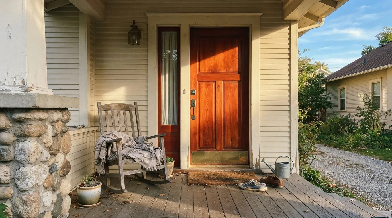
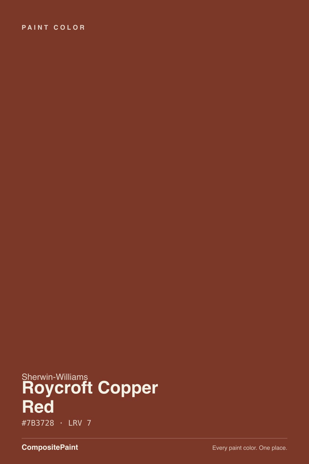
Roycroft Copper Red is the color most Craftsman-bungalow owners land on while hunting for that historic red door. It is not a bright barn red or a candy-apple red — it is a dense, coppery brick-brown, dark enough at LRV 7 to look almost black-brown in shade and genuinely glowing when real sun hits it. In a stock photo taken on an overcast day it can look like plain dark brown; step onto the same porch at four in the afternoon and the copper comes forward. Buy it knowing which version of the color your porch actually gets.
Craftsman and bungalow front doors · shutters and siding trim bands · dens, libraries, and studies with real daylight or warm lamps · anyone restoring an Arts & Crafts-era house
You want a true bright red, not a red-brown · your porch or door stays in shade most of the day · you are painting a small, window-poor room head-to-toe · you need a safe, universally resellable color
- A real Arts & Crafts historic color, not an invented trend shade
- Genuinely glows copper-red in direct sun — one of the most photographed Craftsman door colors
- Dark enough (LRV 7) to hold its color and not wash out in bright light
- Reads expensive and grounded against cream, stone, or sage green
- Works as a small, low-cost commitment: a door or shutters, not the whole house
- Goes flat, near-black brown in shade or overcast light
- Not a true red — disappoints buyers expecting barn red or fire-engine red
- A poor choice for a whole dim interior room
- As a full exterior body color it is a heavy, heat-absorbing commitment
What Color Is Roycroft Copper Red, Really?
The name is not marketing — Roycroft was a real Arts & Crafts community, founded in 1895 by Elbert Hubbard in East Aurora, New York, built around handmade furniture, leather, and metalwork in the honest-materials style of the movement. Sherwin-Williams built a small Historic Color Collection around it, and Roycroft Copper Red sits alongside Roycroft Bottle Green and Roycroft Pewter as the collection's answer to the deep, earthy reds found on original Roycroft leather bindings and copper hardware.
At LRV 7 this is a genuinely dark, dense color — it absorbs most of the light that hits it rather than reflecting it back. That is exactly what makes it read as rich, saturated copper in strong light and exactly what makes it disappear into near-black-brown the moment the light drops. It behaves less like a paint color and more like a stained leather or an old copper kettle: full of color when the light catches it, quiet and dark when it does not.
Undertone in one line: brown and copper first, red second — never a clean fire-engine or barn red. Sherwin-Williams' own site files it under "orange" paint colors online even though it reads as a deep red-brown on the wall; that classification quirk is a fair warning that this is a warm, earthy red, not a saturated primary one. If you want true red with no brown in it, this is the wrong color before you even open the can.
Where It Shines
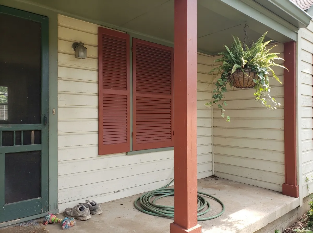
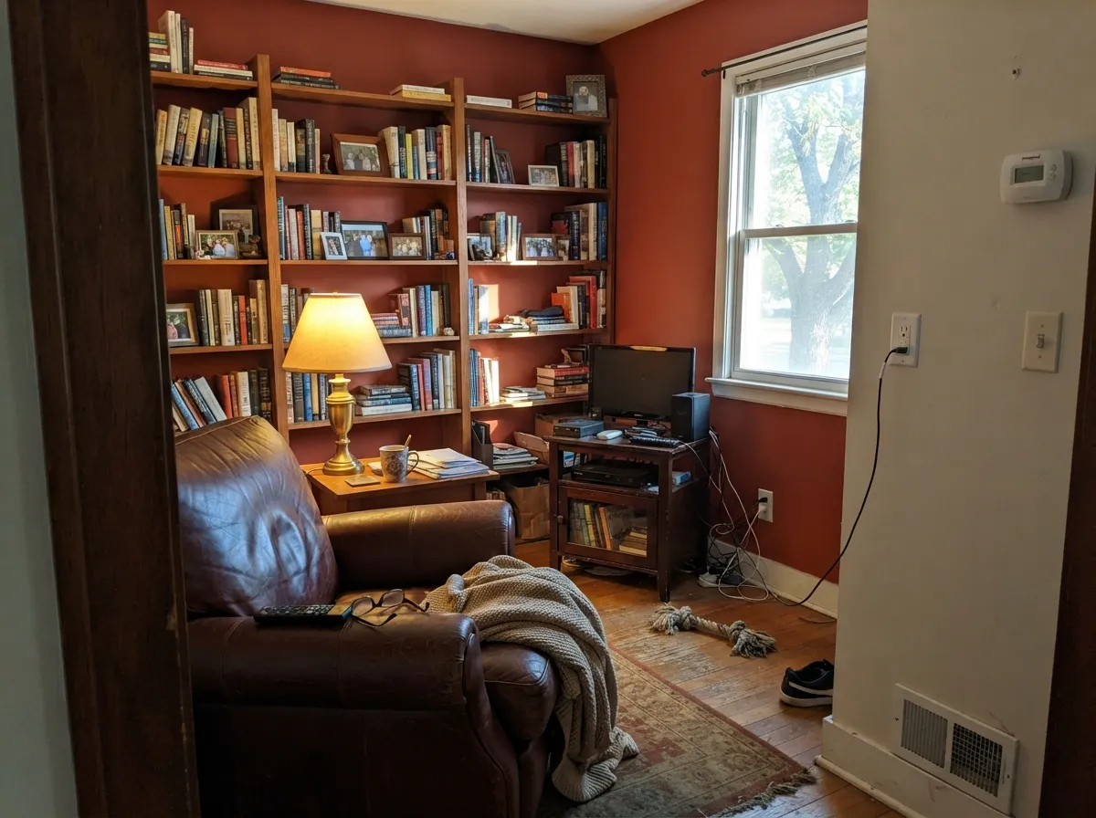
Full sun is where this color earns its name. On a south- or west-facing front door, on shingle bands, on shutters against a cream or stone-colored body, the copper genuinely glows — it is the single most-photographed color choice on Craftsman-restoration accounts for exactly that reason. Sherwin-Williams' own Craftsman exterior palette pairs it as the body or door color against a stone-toned trim and sage-green accents, and that historic three-color formula is still the safest way to use it. Indoors, real daylight or a warm lamp does the same job on a den or library accent wall: the red comes forward instead of reading as plain dark brown.
Where It Fails
Almost every disappointed review of Roycroft Copper Red comes from one of three mismatches, and all three are predictable before the first coat goes on. None of them are the paint failing — they are the color being asked to do a job it was never built for.
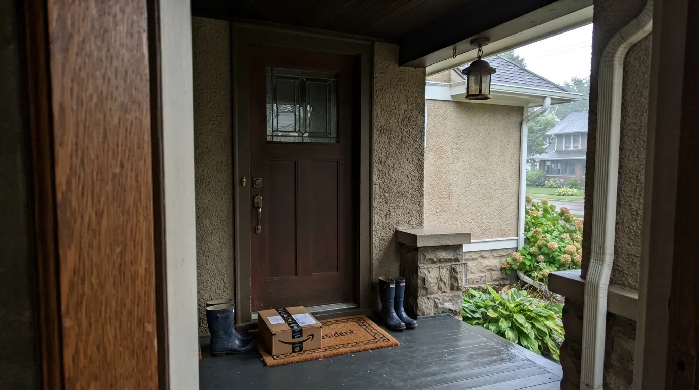
Without direct sun the copper never shows up — the door or shutters read as a flat, muddy dark brown, and owners write it off as "boring" or "just brown." The color did not fail; the light did. If your porch is shaded most of the day, budget for a bright porch light and warm bulbs, or pick a color that does not need full sun to read as intended.
The most common letdown is expecting a barn red or a lipstick red and getting a coppery red-brown instead. Roycroft Copper Red is an earth tone with red in it, not a red with earth in it. If you want unmistakable red at every hour, look at a brighter, higher-chroma red instead of a Historic Colors pick.
LRV 7 swallows light. In a windowless powder room or a small bedroom with one small window, four full walls of this color can feel like painting inside a cave rather than a den. It is built for accents and rooms with real daylight or a lamp doing the work, not for a whole dim box.
Room by Room
This is the color's home base. Semi-gloss on a door in real daylight is where the copper reads clearest, especially against a lighter cream or stone-colored house. Test the sample at the actual time of day your porch gets the most sun before committing.
Used on shutters, a shingle band, or a porch-post base, it does the historic Craftsman job of adding a grounded dark note without covering the whole facade. Satin holds up to weather better than a flat body coat.
This is where the "studies" reputation comes from: a book-lined room with a reading lamp and some afternoon light turns genuinely warm and copper-toned. Skip it in a room that only gets cool overhead LEDs.
A small, brightly lit powder room with a warm sconce can carry it as a jewel-box accent. A powder room lit only by a single cool overhead bulb will read as a dark, flat brown box instead.
As a full body color it is a serious, dark commitment: more heat absorption in strong sun, more visible fading over time, and a color that needs the whole facade in direct light to read as intended. Historically it was used as an accent — door, shutters, a shingle band — not the whole house, and that is still the safer bet.
Four full walls at LRV 7 is a heavy, dark-room commitment for spaces meant to be lived in during the day. Reserve it for one accent wall with real light, or for trim and doors rather than the field color.
Your Light Is the Risk
Full afternoon or south/west sun is where the copper genuinely comes forward — the color reads exactly like its name.
Without direct light it collapses into a flat, muddy dark brown. Test on the actual shaded wall or door before you commit.
Warm and vivid at the sun hours, quieter and browner the rest of the day. Expect it to change more than a lighter color would.
2700K warm bulbs keep the copper and red alive after dark. Cool white LEDs flatten it toward plain brown — swap the bulb before you swap the paint.
Most complaints about Roycroft Copper Red are a light mismatch. Upload a photo of your actual room and see it on your walls — then ask for the same wall in north light or evening lamps before you buy a single sample.
Need It From Another Brand?
Any paint counter can custom-tint Sherwin-Williams SW 2839 directly. If you would rather stay in one brand's own deck, these are the closest stock matches, measured as ΔE2000. Under 2 is a difference you will not see on the wall.
| Brand | Closest color | ΔE | LRV | |
|---|---|---|---|---|
| Behr | Red PepperPPU2-02 · Behr | 4.8 | 8 | Color page → |
| Benjamin Moore | Brick Red2084-10 · Benjamin Moore | 2.6 | 7 | Color page → |
| Valspar | Smoked Paprika8002-12G · Valspar | 2.4 | 8 | Color page → |
| Glidden | Warm MahoganyPPG1060-7 · Glidden | 4.0 | 8 | Color page → |
| Dutch Boy | Red Farmhouse305-7DB · Dutch Boy | 3.2 | 7 | Color page → |
| HGTV Home by Sherwin-Williams | FireweedHGSW 2061 · HGTV Home by Sherwin-Williams | 3.2 | 7 | Color page → |
Similar Sherwin-Williams Colors
The nearest shades to Roycroft Copper Red within Sherwin-Williams's own range, ranked by perceptual color distance — useful when you want the same look a touch lighter, darker, or warmer.
WCAG 2.1: AA is 4.5 : 1 for normal text, 3 : 1 for large text, AAA is 7 : 1.
Roycroft Copper Red vs the Colors You're Also Considering
Every Roycroft Copper Red sample board has the same rivals on it. The numbers show the real lightness gap — then it comes down to which risk you would rather live with.
Pick this for depth and drama — Roycroft Copper Red is darker and more saturated, the better pick for a door that needs to hold its own against a light-colored house.
Sherwin-Williams SW 2803 · LRV 14Rookwood Terra CottaPick this if you want the brighter, more visibly orange-red terracotta cousin from the same Historic Colors story — it reads as colored even on an overcast day.
Pick this for the warmth — the copper undertone keeps Roycroft Copper Red from reading as heavy or somber the way a straight brick red can.
Sherwin-Williams SW 7585 · LRV 5Sun Dried TomatoPick this for a darker, more purple-brick red with almost none of the visible copper or orange.
Pick this for actual color — Taupe reads as plain brown from across the yard, while Roycroft Copper Red reads as red-brown even from the sidewalk.
Benjamin Moore 2110-10 · LRV 8TaupePick this if you want the same deep, grounded weight with none of the red — a true brown for buyers who find Roycroft too colorful.
Roycroft Copper Red Coordinating Colors
The rule for coordinating with Roycroft Copper Red is the same one Sherwin-Williams built into its own Craftsman palette: light stone or cream bodies, muted sage greens, and black or bronze hardware. Keep it away from bright whites and cool grays, which flatten its warmth instead of framing it.
The Real Roycroft: The Arts and Crafts Story Behind the Name
Roycroft was not invented for a paint chip. It was a real community of craftspeople founded in 1895 in East Aurora, New York, by Elbert Hubbard, built around handmade furniture, leather goods, and copper and metal work in the honest-materials spirit of the Arts and Crafts movement. Sherwin-Williams built a small Historic Color Collection around that legacy, and Roycroft Copper Red sits in it alongside Roycroft Bottle Green and Roycroft Pewter — three colors meant to echo the earthy, handmade palette of the original workshops.
That history is why the color reads the way it does: it was never meant to be a clean, modern red. It was meant to look like tooled leather and aged copper, materials that only show their real color when light catches them at an angle — which is exactly how this paint behaves on a wall or a door.
Roycroft Copper Red With Stone, Brick, and Wood
Because it was built to echo natural materials, this color is at its best next to real ones. River-stone porch piers, a brick chimney, cedar shingles, and oak millwork all sit comfortably beside it — the paint reads as one more natural material rather than a coat of color laid over the house.
The one material to watch is anything already orange-leaning, like unstained golden pine trim: two warm oranges next to each other can compete instead of complementing. Weathered gray wood, painted white trim, or a darker stone all give Roycroft Copper Red the contrast it needs to read as intentional rather than accidental.
Three Ready Palettes Built on Roycroft Copper Red
A color is never alone on the wall. These are complete combinations in the 60-30-10 pattern, with the reason each one holds together. Every one opens in the visualizer.
This is close to Sherwin-Williams' own Craftsman Design exterior formula: a light stone-toned body, a sage green in the porch details, and the copper-red carrying the door. Historically accurate and genuinely easy to live with.
Try this palette in your roomOne deep red-brown wall against warm White Dove trim reads like a real reading room, not a theme room. Taupe on the built-ins keeps the wood tones from fighting the wall — both are earth tones at nearly the same depth.
Try this palette in your roomA creamy Dover White body keeps the house from reading heavy, black shutters and fixtures add a crisp modern edge, and the copper-red door becomes the one thing every visitor remembers about the house.
Try this palette in your roomRoycroft Copper Red FAQ
Is Roycroft Copper Red actually red, or more of a brown?
Both, honestly. It is a deep, saturated red-brown with a visible copper undertone — closer to old leather or a weathered copper kettle than to a barn red or a fire-engine red. Sherwin-Williams even files it under "orange" paint colors on its own site, which is a fair hint that this is an earthy red, not a bright primary one.
What does an LRV of 7 mean for this color?
LRV 7 means the paint reflects only about 7 percent of the light that hits it — genuinely dark. In strong direct light that depth reads as rich, saturated copper-red; in shade or on an overcast day it reads as a flat, near-black brown. Sample it on the actual wall or door at the time of day it gets the most light.
Can I use Roycroft Copper Red on my whole house exterior?
You can, but it is a heavy commitment: more heat absorption in strong sun and a color that only reads correctly with the whole facade catching direct light. It was historically used as an accent color — a door, shutters, a shingle band — and that is still the more forgiving way to use it.
What trim and accent colors pair with Roycroft Copper Red?
Cream or stone-toned body colors, muted sage greens, black or bronze hardware, and natural wood or stone all pair well — it is the same formula Sherwin-Williams uses in its own Craftsman exterior palette. Keep bright whites and cool grays out of the mix; they fight the color's warmth.
Can Roycroft Copper Red be used indoors?
Yes, best as an accent wall or on trim and doors in a den, library, or study that gets real daylight or a warm lamp. Painting a small, poorly lit room in it wall to wall will feel dark and closed-in rather than cozy.
Is Roycroft Copper Red historically accurate for a Craftsman or Arts and Crafts home?
Yes. It is part of Sherwin-Williams' Historic Color Collection and takes its name from the real Roycroft community, an Arts and Crafts colony founded in 1895 in East Aurora, New York, by Elbert Hubbard. It sits alongside other named Roycroft colors like Bottle Green and Pewter in the same collection.
Have you painted with Roycroft Copper Red?
Rate it — one tap helps the next reader decide.
Ask a Question