Dover White
The old-house cream that half of America has on its trim, reviewed honestly: where it still looks right, and the exact rooms where people end up calling it yellow.

Jessica has spec'd whites and neutrals for more than 300 rooms and keeps a sample wall of painted drawdowns in her studio. Every color review is checked against real reader rooms in the comments and re-tested when a formula changes. About the testing process →
- 1Agreeable Gray60
- 2Pale Oak69
- 3Dover White83
- 4Moonlit Beach88
- 5Crème Fraiche93
The Fast Verdict
Dover White is a real cream, not a warm-ish white, and that is the whole story. In an older house with stained wood, oak floors and north light, it looks settled and correct in a way no crisp white manages. Put it next to a bright white bathtub, white appliances or cool gray flooring and the same paint reads yellow — that is where almost every regret post comes from. Buy it on purpose, or do not buy it.
North-facing rooms that need warmth · traditional trim and millwork beside stained wood · shaker cabinets in an older kitchen · rooms with oak floors, rattan and aged brass
Your tub, tile or appliances are bright white · your floors are cool gray or gray-washed · the room takes hard afternoon sun · you want a clean modern look
- Real warmth, not a hint — fixes cold north-facing rooms
- The best-looking white next to stained doors, oak and aged brass
- Reads aged and settled on cabinets instead of brand new
- Hides scuffs and handprints better than any bright white
- Excellent exterior body or trim color with brick, stone and cedar
- Reads clearly yellow next to white tubs, tile and appliances
- Cool gray walls or gray floors make it look dingy
- Hard afternoon sun pushes it toward light tan
- Can look dated in a modern high-contrast room
What Color Is Dover White, Really?
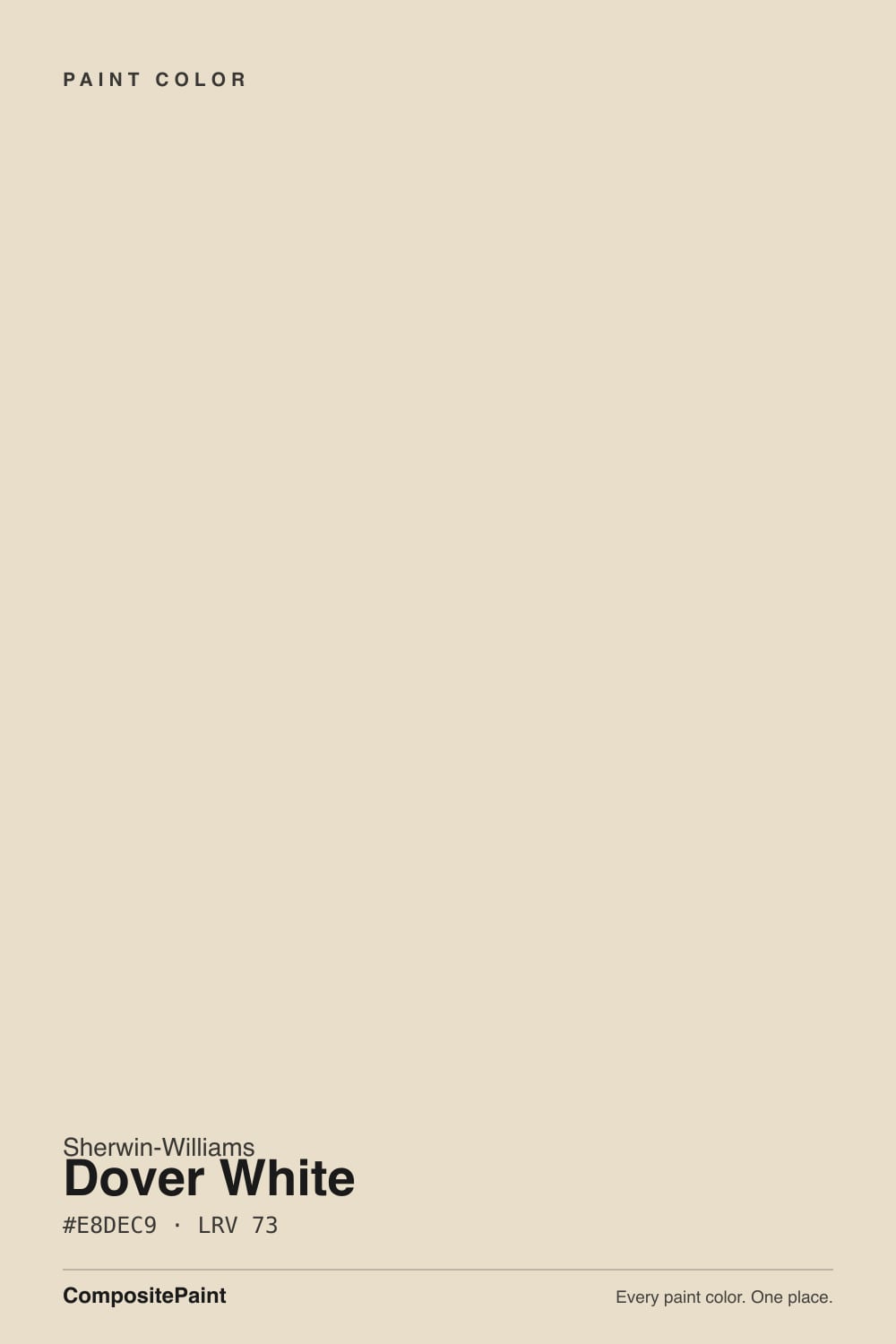
This is the color people mean when they say "antique white" without knowing the name. At LRV 83 it is bright, but the warmth in it is not a trace — it is the point. On a wall it behaves like a very pale, very soft tan that your eye agrees to call white as long as nothing truly white is sitting next to it. That last clause is the entire review.
The useful comparison is Alabaster SW 7008 at LRV 82. Alabaster is the warm white people default to now; Dover White is nine points darker and noticeably creamier, so where Alabaster still reads "white with a soft edge," Dover White reads "cream." Against Pure White SW 7005 at LRV 84 the gap is obvious across a room. That extra body is why Dover White flatters old plaster, honey oak and stained doors better than either of them — and why it loses badly to a white bathtub.
Undertone in one line: warm gold with a soft orange edge, no gray to mute it, no pink and no green. If it looks dingy, that is a bright white nearby stealing the win, not the paint failing.
Where It Shines
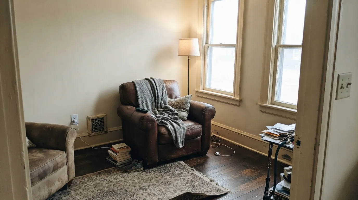
Its best rooms are the ones a modern white makes feel cold. North-facing living rooms, traditional millwork next to stained doors, and shaker cabinets in a kitchen with oak floors are where Dover White stops looking like a paint decision and starts looking like the house always came that way.
Where It Fails
The complaints about Dover White are remarkably consistent, and they are almost never about coverage or durability. Three situations produce nearly all of them, and you can predict every one before you open a can.
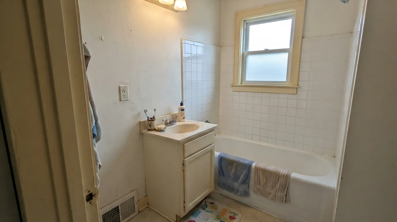
White tubs, white toilets, white subway tile and white appliances are all near-neutral factory whites. Dover White beside them does not look creamy, it looks dirty, and people describe the trim as the thing that went wrong when it is really the contrast. Use Alabaster SW 7008 in any room where a white fixture is fixed in place.
This is the top regret story: fresh Dover White cabinets over honey or red oak flooring, under 2700K cans, and the doors read frankly yellow. Nothing is defective — the floor, the bulbs and the paint are all pushing the same direction at once. Westhighland White SW 7566 gives the same soft, aged feel with far less gold.
Pairing gray walls with Dover White trim is the request people struggle with most, because cool grays sit opposite it on the wheel and drag the yellow forward. Repose Gray SW 7015 and anything bluer will do it. If the trim is staying Dover White, put Accessible Beige SW 7036 or Agreeable Gray SW 7029 on the walls instead.
Room by Room
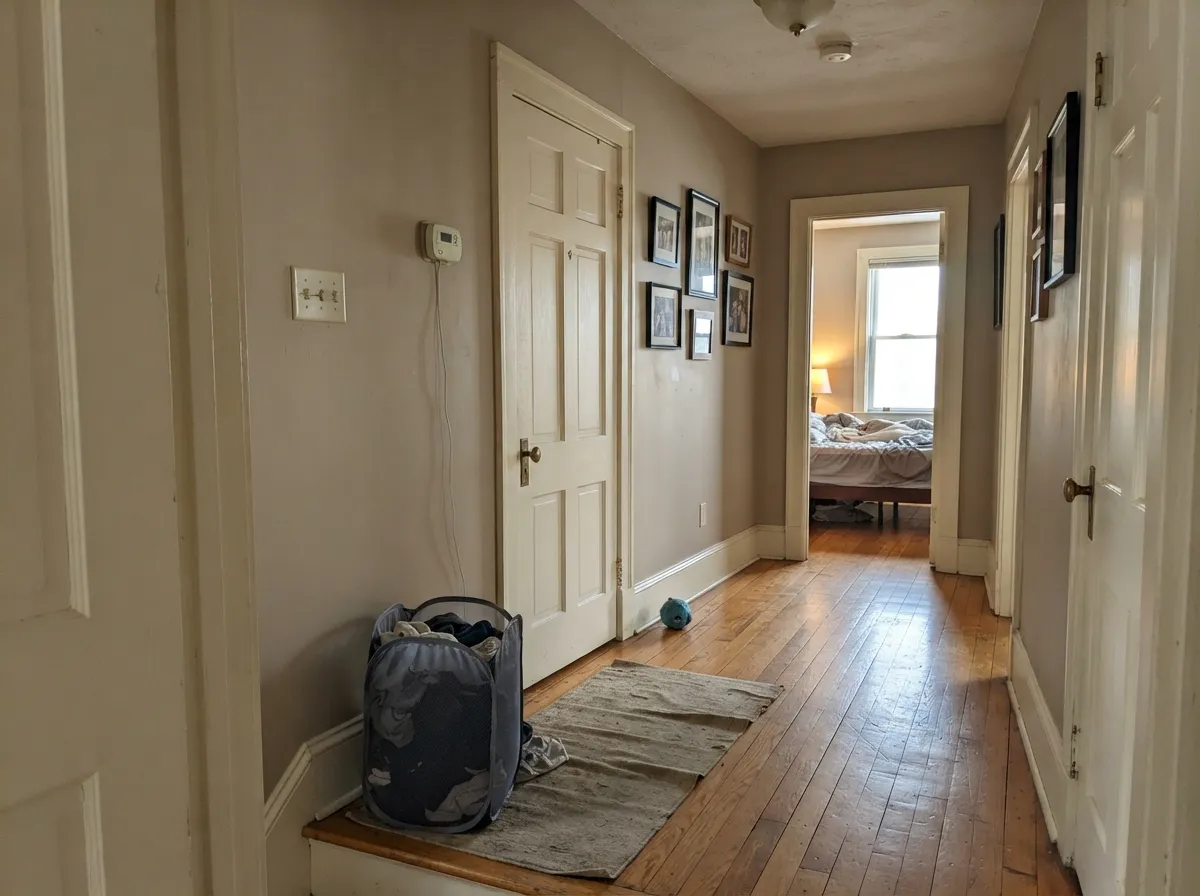
This is where Dover White has thirty years of history, and it still earns it beside stained doors, oak stair parts and heavy old casing. Semi-gloss. Keep the wall color warm — Accessible Beige SW 7036 or Kilim Beige SW 6106 — because a cool gray wall will make the trim look yellow overnight.
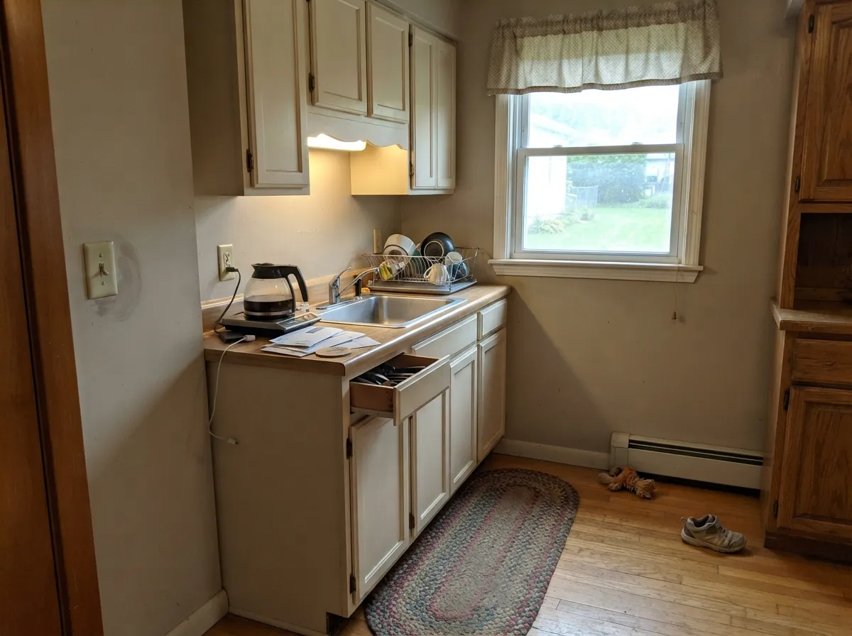
On inset and shaker doors in an older kitchen it reads settled rather than freshly installed, and it forgives handprints better than a bright white. Satin. But check your floor and your bulbs first: warm oak plus 2700K cans is exactly the stack that turns it yellow.
Cool flat north daylight tames the gold and leaves a comfortable off-white, which is the version most people fall in love with. Eggshell. Pair with Iron Ore SW 7069 on interior doors if the room needs one hard note.
Under 2700K lamps it gets genuinely cozy at night; under 3500K it stays neutral. Eggshell. If the bedroom also has cool gray carpet or gray LVP, sample a big board against the floor before you commit.
Almost every bathroom has a white tub, white toilet or white tile that Dover White cannot win against. It works only when the fixtures are bone or the vanity is stained wood. Otherwise use Alabaster SW 7008.
Full sun reads it brighter and it sits naturally with brick, stone and cedar in a way cool whites never do. It supplies no contrast on its own, so give it Urbane Bronze SW 7048 shutters or a Naval SW 6244 door.
Your Light Is the Risk
Cool flat daylight cancels the gold and leaves a soft, comfortable off-white. Its best room.
Strong warm sun brings the saturation forward. By late afternoon it can read light tan.
2700K lamps push it to cream and cozy; 3500K holds it neutral. Swap bulbs, not paint.
Warm cans firing straight down on cabinet doors is where the yellow complaints start.
Most complaints about Dover White are a light mismatch. Upload a photo of your actual room and see it on your walls — then ask for the same wall in north light or evening lamps before you buy a single sample.
Need It From Another Brand?
Any paint counter can custom-tint Sherwin-Williams SW 6385 directly. If you would rather stay in one brand's own deck, these are the closest stock matches, measured as ΔE2000. Under 2 is a difference you will not see on the wall.
| Brand | Closest color | ΔE | LRV | |
|---|---|---|---|---|
| Behr | Coastal BeigePPU7-13 · Behr | 0.8 | 82 | Color page → |
| Benjamin Moore | Collector's ItemAF-45 · Benjamin Moore | 0.5 | 81 | Color page → |
| Valspar | Shell White7007-12 · Valspar | 1.2 | 82 | Color page → |
| PPG / Glidden | Ivory TowerPPG1103-1 · PPG / Glidden | 0.8 | 82 | Color page → |
| Glidden | Ivory TowerPPG1103-1 · Glidden | 0.8 | 82 | Color page → |
| Dutch Boy | Shelled White008W · Dutch Boy | 0.6 | 82 | Color page → |
Similar Sherwin-Williams Colors
The nearest shades to Dover White within Sherwin-Williams's own range, ranked by perceptual color distance — useful when you want the same look a touch lighter, darker, or warmer.
WCAG 2.1: AA is 4.5 : 1 for normal text, 3 : 1 for large text, AAA is 7 : 1.
Dover White vs the Colors You're Also Considering
Every Dover White sample board has the same rivals on it. The numbers show the real lightness gap — then it comes down to which risk you would rather live with.
Pick this for actual cream, and a house full of stained wood.
Sherwin-Williams SW 7008 · LRV 82AlabasterPick this for warmth that no one will ever call yellow.
Pick this when the older, creamier look is exactly what you want.
Sherwin-Williams SW 7566 · LRV 80Westhighland WhitePick this for the middle ground people keep asking for — warm, less gold.
Polar Bear SW 7564 (#E8DFCA, LRV 74) is the nearest neighbor in the same deck and is genuinely hard to separate from Dover White on a wall. Navajo White SW 6126 (#E9DCC6, LRV 72) and Antique White SW 6119 (#E8DCC6, LRV 72) are both slightly darker with a little more gold, so they feel heavier in a dim room.
Across brands the field is tight. Benjamin Moore Natural Wicker 950 (LRV 72) differs by 0.49 and Glidden Heavy Cream PPG1098-2 (LRV 73) by 0.76, which is effectively a match. Behr Castle Ridge PWN-41 (LRV 74) at 0.96, PPG Navajo White 1101-2 (LRV 73) at 1.01, and Valspar Courtyard Tan 7002-13 (LRV 74.5) at 1.12 are visually identical in normal room light.
Further out, Clare No Filter PNT100-LT-19 (LRV 72) at 3.31 is very close but worth sampling first, and C2 Skance C2-882 (LRV 74) at 4.56 is close but visibly different side by side.
Dover White Coordinating Colors
The rule with Dover White is stricter than with most whites: everything near it has to be warm, or the warmth turns into a flaw. Warm greiges, tan neutrals, deep navies, muted greens and warm woods all make it look intentional. Cool grays, blue-grays, bright factory whites and gray-washed floors all make it look dingy.
These are the partners that keep coming up in real kitchens and real trim jobs, and every one of them sits on the warm side of the line.
Dover White on Cabinets and Trim
This is the use Dover White is famous for and also the use people most often regret, so it deserves a straight answer. On inset and shaker doors in an older kitchen it looks like the cabinets have been there for decades — softer, quieter and less clinical than a bright white, and much better at hiding the knuckle marks that collect around handles. On heavy old casing and stained six-panel doors it is arguably the best warm white Sherwin-Williams makes.
The regret comes from stacking warmth. Honey or red oak floors, 2700K recessed cans and Dover White doors all push in the same direction, and the finished kitchen reads plainly yellow even though the color chip looked fine. The fix is not more coats. It is either changing one of the other two variables — cooler bulbs at 3500K, or a warm greige wall like Accessible Beige SW 7036 behind the cabinets to give the eye a warmer reference — or picking a less saturated warm white in the first place.
One more thing worth checking before you spray: painting the trim Dover White and the cabinets a brighter white is a combination people try and almost always dislike, because the brighter white wins and the trim looks unwashed. Keep cabinets and trim the same color, or make the trim the brighter of the two.
Dover White Next to White Fixtures and Gray Floors
Every bad Dover White story is really a contrast story, and there are only two contrasts that matter. The first is a factory white you cannot repaint: a tub, a toilet, a white farmhouse sink, white subway tile, a white refrigerator. Those are near-neutral whites, and Dover White next to them stops looking creamy and starts looking soiled. There is no coat count or sheen that fixes it, which is why so many people say they wish they had known before the trim went on.
The second is cool gray flooring. Gray LVP, gray-washed oak and cool gray carpet all sit on the opposite side of the wheel, and they pull Dover White's gold straight to the surface. A warm rug and brass hardware can rescue a room that is borderline, but if the whole floor is gray you are fighting the paint for the life of the house.
The test takes ten minutes. Tape a large sample board to the wall right where it meets the tub, the tile or the floor, then look at it once in daylight and once at night with your own bulbs on. If it looks yellow in that exact spot, it will look yellow forever. Switch to Alabaster SW 7008 and move on.
Three Ready Palettes Built on Dover White
A color is never alone on the wall. These are complete combinations in the 60-30-10 pattern, with the reason each one holds together. Every one opens in the visualizer.
Polar Bear is a hair brighter but stays in the same warm family, so the trim reads clean without turning the walls yellow the way a blue-based white would. Iron Ore doors supply the single dark note the scheme needs, since Dover White creates no contrast on its own.
Try this palette in your roomAccessible Beige shares Dover White's warm base, so the wall behind the cabinets calms the gold instead of exposing it — this is the fix people are handed when their new cabinets read too yellow. A Naval island gives the room its dark anchor and gets along with brass and unlacquered hardware.
Try this palette in your roomOutside, Dover White is the 60 percent field and needs a dark frame to keep it from washing out in full sun, which is exactly what Urbane Bronze does on shutters and trim. The copper-red door is the 10 percent accent, and it stays on the warm side so nothing fights the body color.
Try this palette in your roomDover White FAQ
Is Dover White too yellow?
It is genuinely yellow-gold, so the honest answer is: it depends entirely on what sits next to it. Alone on a wall in north light it reads as a soft cream most people like. Beside a white bathtub, white appliances or gray flooring it will look yellow, and no second coat changes that.
Dover White or Alabaster for kitchen cabinets?
Alabaster SW 7008 is the safer pick for most kitchens today — it is nine LRV points brighter and far less gold, so it survives white farmhouse sinks and stainless appliances. Choose Dover White when the kitchen has stained wood, honey oak floors or an older house you want the cabinets to match. If you are unsure, you want Alabaster.
What gray walls go with Dover White trim?
Skip true grays. Cool grays like Repose Gray SW 7015 sit opposite Dover White's warmth and pull the yellow forward, which is the most common pairing failure with this color. Use a warm greige instead — Agreeable Gray SW 7029 or Accessible Beige SW 7036 — and the trim goes back to reading like a soft white.
Will Dover White clash with a white bathtub or white tile?
Yes, almost always. Standard tubs, toilets and subway tile are near-neutral whites, and Dover White beside them looks yellowed rather than creamy. If the fixtures are staying, use Alabaster SW 7008 or Pure White SW 7005 on the trim and vanity instead.
Is Dover White dated?
In a modern room with gray floors and black metal, yes — it will look like it came with the house. In a traditional or older home with wood trim, stone and brass it is not dated at all, it is correct. Judge it against your fixed finishes, not against a trend.
Can I paint walls and trim both Dover White?
Yes, and it is one of the best ways to use it. Eggshell on the walls and semi-gloss on the trim gives you separation without a color line, which is a real advantage in old plaster where nothing is straight. Just keep the ceiling in the same color, flat, or it will announce the difference.
What countertop works with Dover White cabinets?
Warm quartz or granite with cream, tan or gold flecks, and soapstone or honed black for contrast. Avoid bright white quartz and cool gray-veined marble — both make the cabinets look yellow, which is the same trap as the white bathtub. Butcher block and warm stone are the easiest wins.
Have you painted with Dover White?
Rate it — one tap helps the next reader decide.
Ask a Question