Creamy
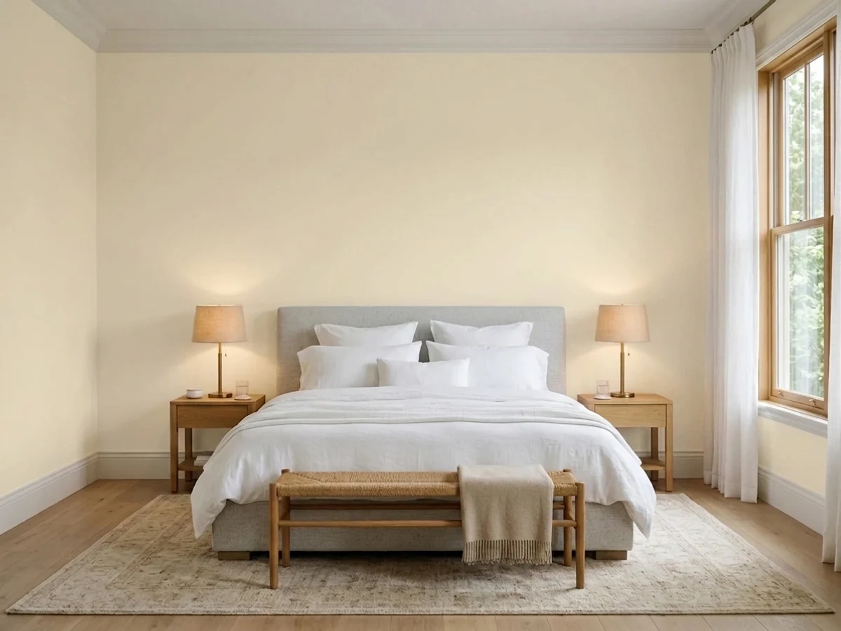
The cream-white that grounds half the farmhouse palettes in the Sherwin-Williams deck, reviewed honestly: the light that flatters it, the light that turns it butter, and what to pick instead.

Jessica has spec'd whites and neutrals for more than 300 rooms and keeps a sample wall of painted drawdowns in her studio. Every color review is checked against real reader rooms in the comments and re-tested when a formula changes. About the testing process →

- 1Agreeable Gray60
- 2Pale Oak69
- 3Creamy81
- 4Moonlit Beach88
- 5Crème Fraiche93
The Fast Verdict
Creamy does exactly what the name says, and that is the whole review. It is not a whisper-warm off-white that could pass for white — it is a cream, and on a big wall in daylight you will see the yellow. In a cool north room, next to warm oak and brass, that is the reason to buy it. In a bright south room, or next to builder-white trim, it is the reason people repaint.
North- and east-facing rooms that feel cold · older homes with golden oak floors and brass · farmhouse and cottage interiors · anyone who finds Alabaster still too white
Your room gets hard south or west afternoon sun · your trim, cabinets or quartz stay a bright white · your counters and floors are cool gray · you want a clean, modern, low-color look
- Genuinely warm — fixes cold north and east rooms that whites make worse
- At LRV 81 it stays light and open, so small rooms do not close in
- Flatters golden oak, honey pine, brass and aged bronze better than any clean white
- Hides scuffs, handprints and touch-ups far better than a bright white
- The reliable anchor for farmhouse, cottage and traditional palettes
- Turns buttery yellow in hard south or west afternoon sun
- Reads dingy next to any brighter white you are keeping
- Goes slightly yellow-green against cool gray quartz, marble and gray floors
- Too warm and too soft to work as trim under most wall colors
What Color Is Creamy, Really?
A warm cream-white with real yellow in it, and the numbers back that up: the hue lands at 43, squarely yellow-gold, at 49 percent saturation. That saturation figure is the honest part. Most popular off-whites keep their warmth at half that strength so they can drift neutral in a bad light; Creamy does not drift. It commits. On a chip the size of your hand it looks like a soft white. On four walls it looks like cream, every time.
At LRV 81 it reflects most of the light in the room, so it stays open and airy — but it is not a bright white, and the comparison that matters is Alabaster (SW 7008) at LRV 82. Same brightness, almost exactly. The difference is not lightness, it is color: Alabaster carries a hint of warmth, Creamy carries a full serving of it. If you sample them side by side and think Alabaster looks gray, you want Creamy. If you think Creamy looks yellow, you want Alabaster. That single test settles most of these decisions.
Undertone in one line: warm yellow-gold, no gray to mute it, no pink and no green. If it looks green on your wall, that is a reflection off a lawn or a golden-oak floor bouncing back — not the paint.
Where It Shines
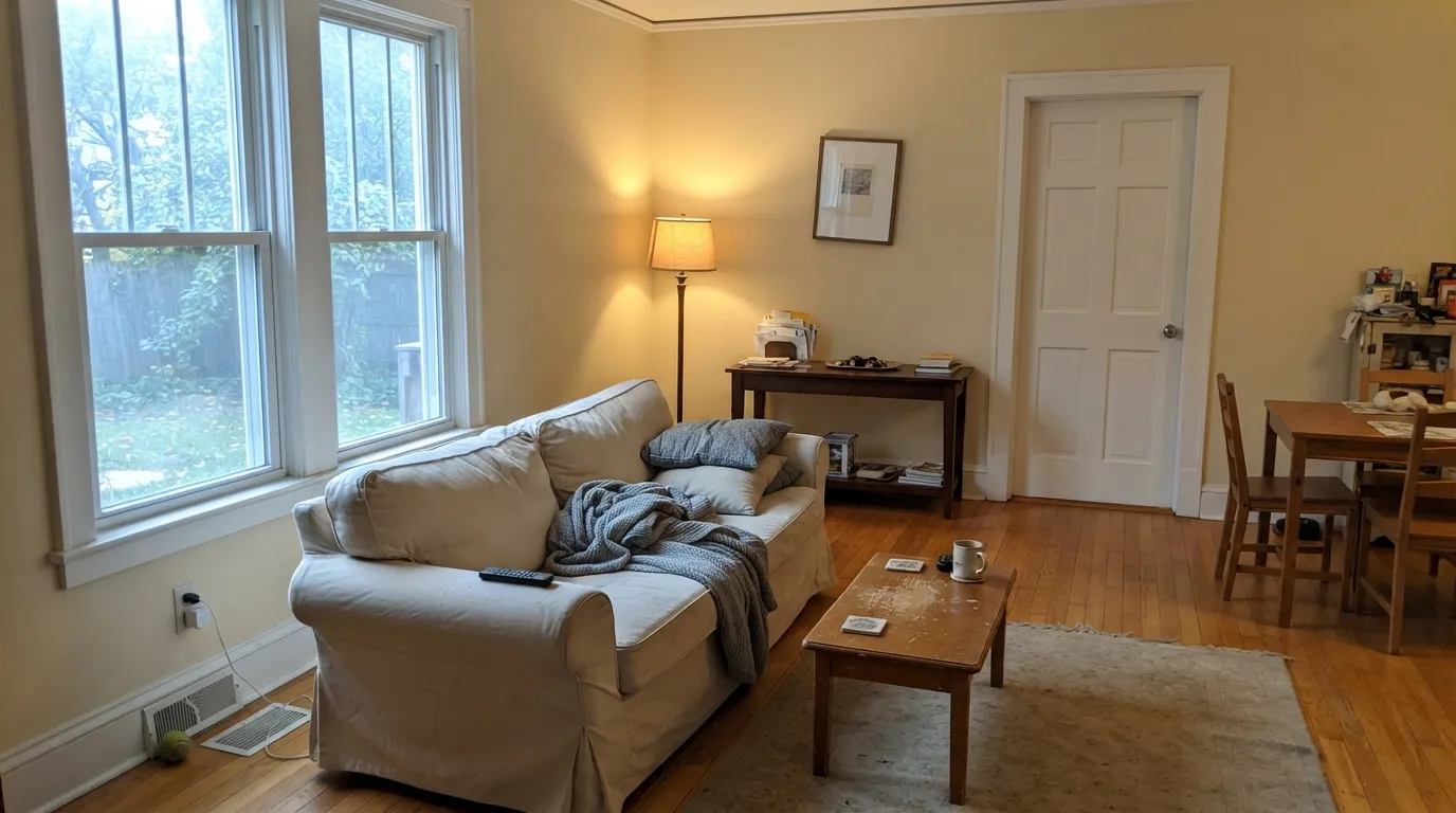
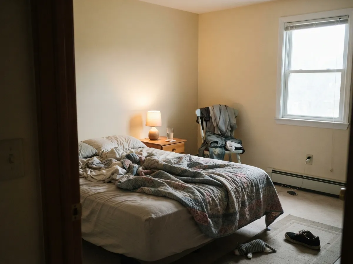
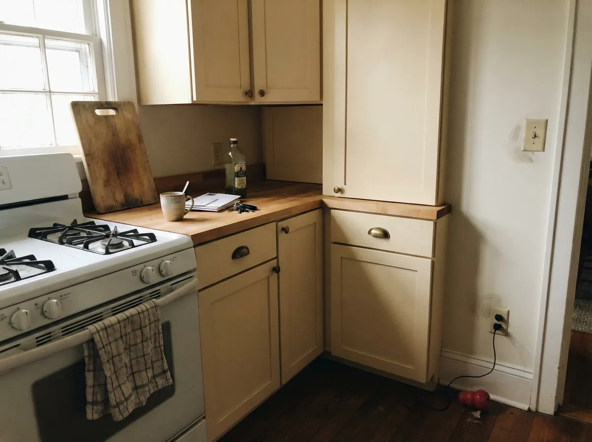
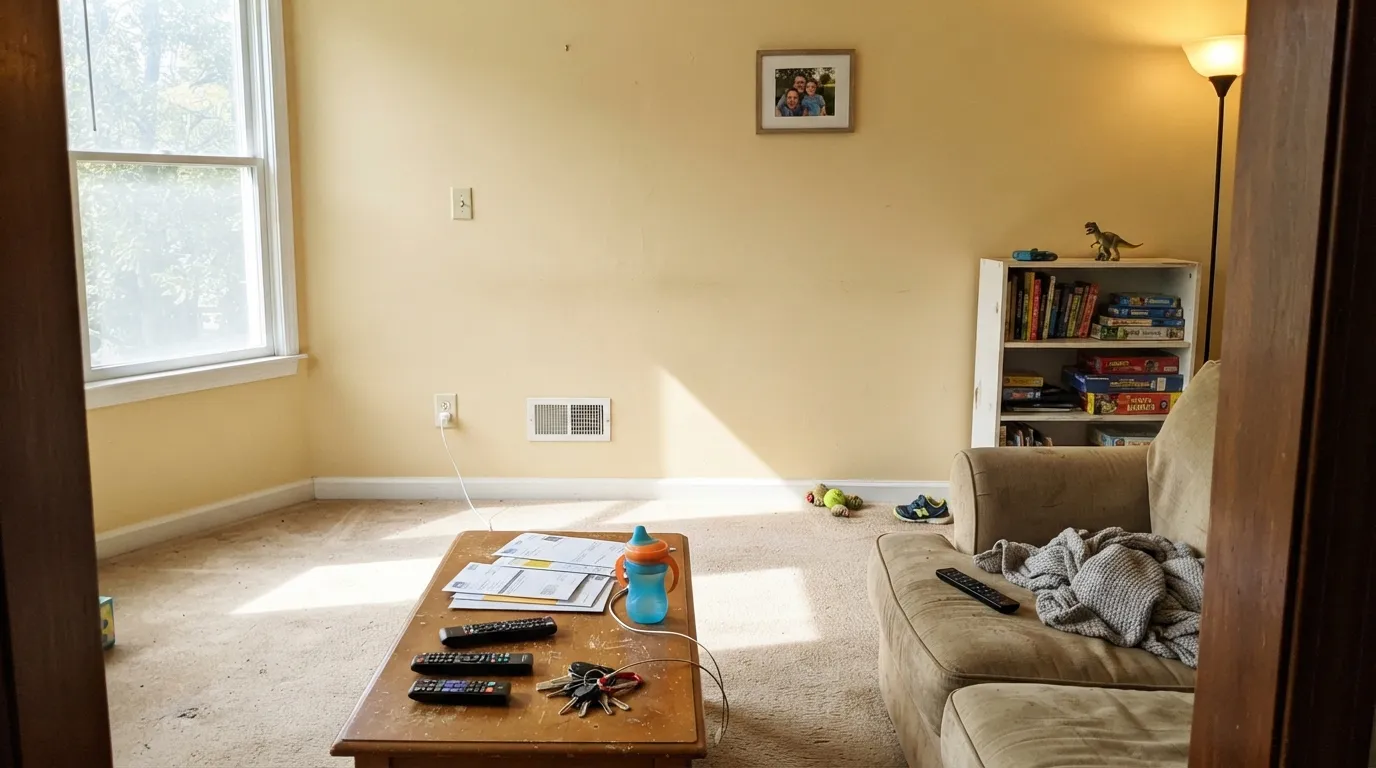
Give it cool light and warm materials and it does something no clean white can: it makes a room feel lived in from the first coat. North-facing rooms are its home turf, because the gray in that light cancels most of the yellow and leaves a soft, mellow cream. Add honey oak floors, brass hardware or aged bronze and it stops reading as a color choice and starts reading as the way the house has always looked.
Where It Fails
The complaints about Creamy are remarkably consistent, and none of them are mysteries. Three situations produce almost every regret story, and you can predict all three before you open the can. If your room matches one, no second coat and no different sheen will save it.
Warm sun plus a color that is already 49 percent saturated yellow equals butter. People describe it as vanilla pudding or 1990s builder cream. It is the single most common Creamy regret. If your best rooms face south or west, use Alabaster (SW 7008) — same brightness, far less yellow to amplify.
Creamy walls against existing builder-white trim, white cabinets or a white quartz counter is a losing fight. The brighter white wins and Creamy reads dingy, like white that needed washing. Either repaint the trim in a soft white, or switch the walls to Greek Villa (SW 7551), which holds its own next to bright white.
Gray quartz, Carrara-type marble and gray-washed LVP sit at the opposite temperature, and they push Creamy from cream toward a faint yellow-green. This is why so many kitchen threads end in a repaint. With cool gray finishes, use Snowbound (SW 7004) — soft, but with a gray base that agrees with the stone.
Room by Room
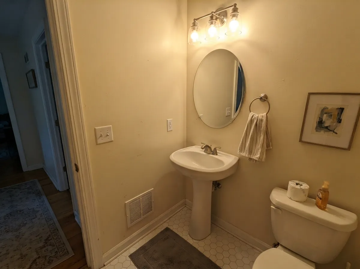
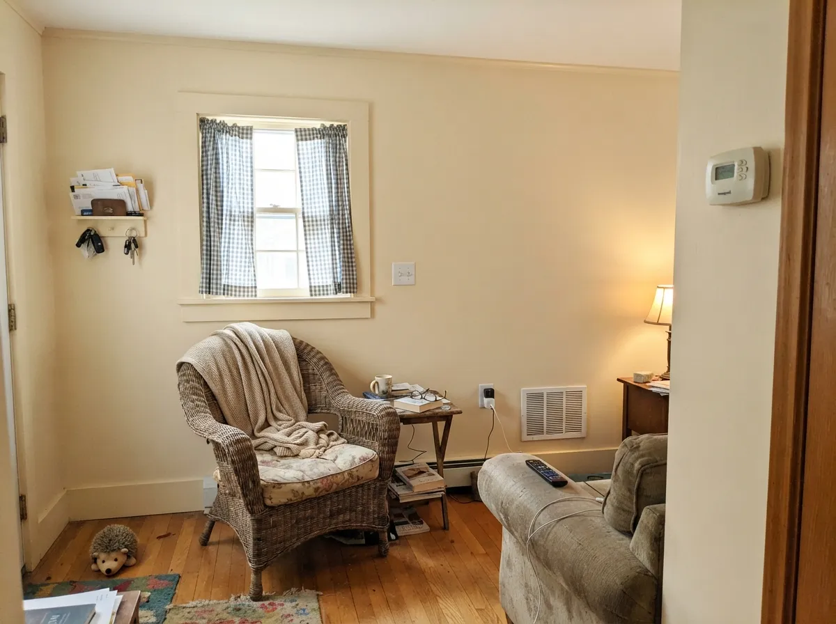
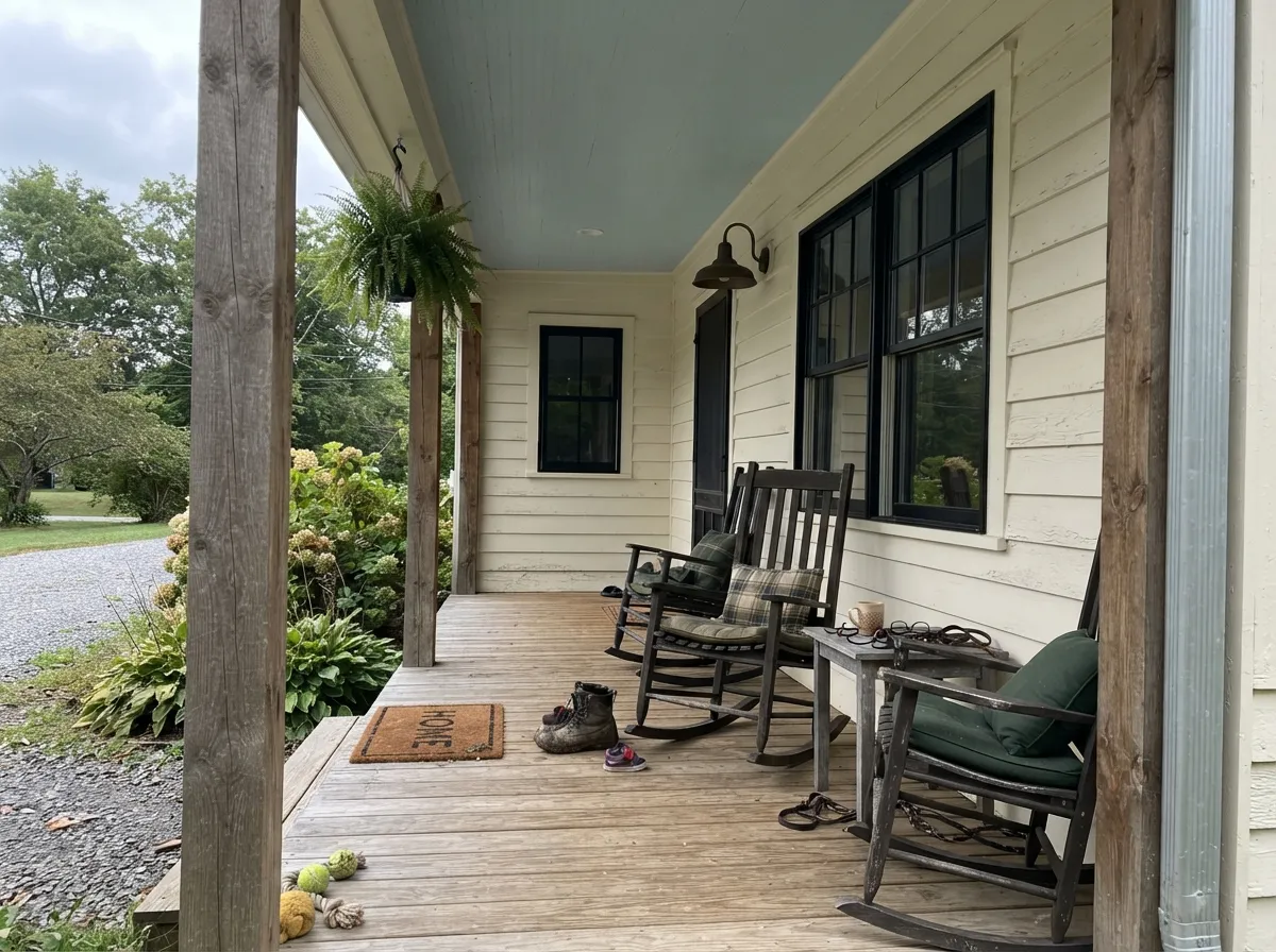
Your Light Is the Risk
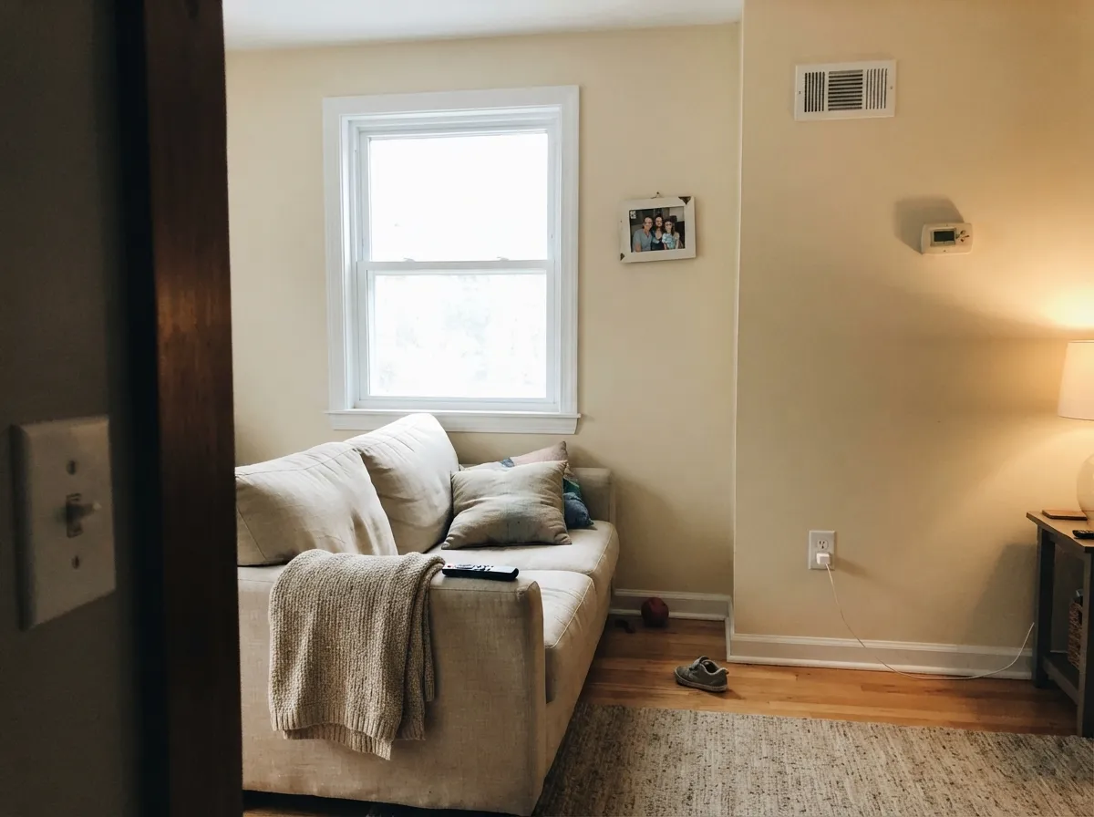
Cool gray daylight cancels most of the yellow. It reads soft, mellow cream — never dingy.
Strong warm sun stacks onto a warm color. Afternoons can read frankly yellow. Sample first.
East is warm at breakfast, calm by noon. West is quiet all morning, golden at sunset.
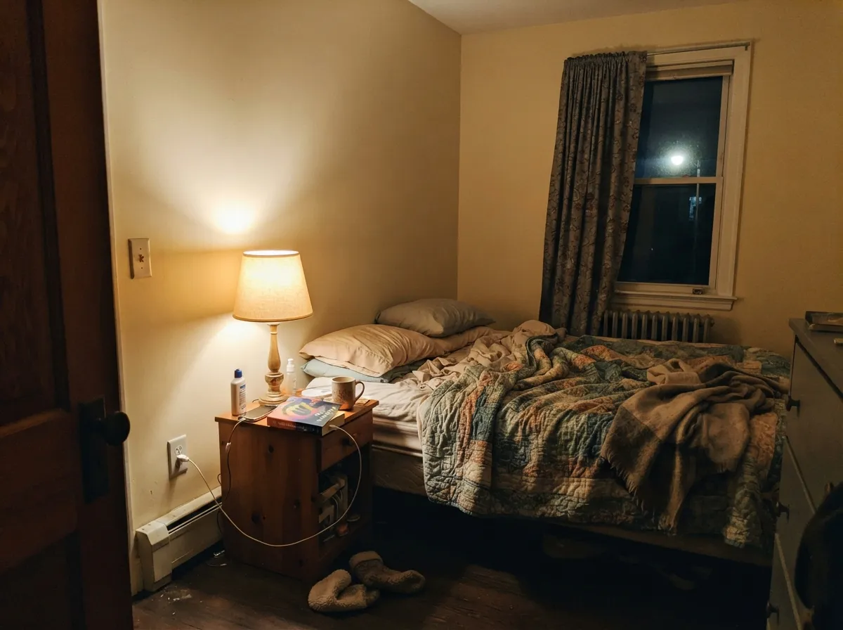
2700K deepens the cream toward gold. Move to 3000K–3500K and it cleans right up.
Most complaints about Creamy are a light mismatch. Upload a photo of your actual room and see it on your walls — then ask for the same wall in north light or evening lamps before you buy a single sample.
Need It From Another Brand?
Any paint counter can custom-tint Sherwin-Williams SW 7012 directly. If you would rather stay in one brand's own deck, these are the closest stock matches, measured as ΔE2000. Under 2 is a difference you will not see on the wall.
| Brand | Closest color | ΔE | LRV | |
|---|---|---|---|---|
| Behr | Mourning DoveOR-W12 · Behr | 0.9 | 81 | Color page → |
| Benjamin Moore | Candle White2164-70 · Benjamin Moore | 2.0 | 79 | Color page → |
| Valspar | Dover White7007-1 · Valspar | 0.5 | 81 | Color page → |
| PPG / Glidden | PurityPPG14-20 · PPG / Glidden | 0.8 | 81 | Color page → |
| Glidden | Sugar SoapPPG1084-1 · Glidden | 0.4 | 81 | Color page → |
| Dutch Boy | Creamed Vanilla018W · Dutch Boy | 0.0 | 81 | Color page → |
Similar Sherwin-Williams Colors
The nearest shades to Creamy within Sherwin-Williams's own range, ranked by perceptual color distance — useful when you want the same look a touch lighter, darker, or warmer.
WCAG 2.1: AA is 4.5 : 1 for normal text, 3 : 1 for large text, AAA is 7 : 1.
Creamy vs the Colors You're Also Considering
Every Creamy sample board has the same rivals on it. The numbers show the real lightness gap — then it comes down to which risk you would rather live with.
Pick this when you want the cream to actually show on the wall.
Sherwin-Williams SW 7008 · LRV 82AlabasterPick this for south light, cabinets, trim, or anywhere yellow is a risk.
Side-by-side comparison →Pick this for real warmth against oak floors and brass.
Sherwin-Williams SW 7551 · LRV 84Greek VillaPick this when bright white trim or cabinets are staying put.
Alabaster (SW 7008), LRV 82, is the closest well-known alternative. It sits almost the same brightness as Creamy but is a soft white with far less yellow, so it reads cleaner and more versatile. Choose Alabaster if you want an off-white that whispers warmth; choose Creamy if you specifically want the cream to show.
Classical White (SW 2829), LRV 76, is a touch deeper and slightly more muted than Creamy. It gives a similar warm-cream feel with a hair more weight on the wall, useful when you want the color to hold its own rather than wash out in bright light.
Vanillin (SW 6371), LRV 78, is close in tone but reads a little more yellow and a little lighter in body than Creamy. If you love Creamy's warmth but find it slightly too golden, compare all three on a poster board before deciding.
Creamy Coordinating Colors
The rule with Creamy is to keep every partner on the warm side and let one deep color do the grounding. It sits happily with warm beiges and greiges, muted greens, navies and warm near-blacks. What it does not want is a cool gray, an icy blue, or a bright white it has to compete with. These are the partners that show up in real Sherwin-Williams farmhouse and traditional palettes again and again:
Creamy on Cabinets and Trim
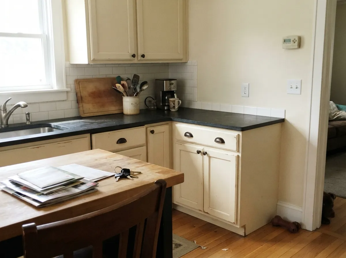
This is the question that fills paint forums, and the honest answer splits in two. On cabinets, Creamy is excellent in exactly one situation: warm finishes around it. Butcher block, soapstone, warm-toned granite, terracotta tile, brass or oil-rubbed bronze pulls, a wood floor with any gold in it. In that kitchen it looks like a color someone chose, not a white someone settled for. Swap the counter for cool gray quartz or white marble and the same cabinets look faintly yellow-green within a week of living with them.
On trim, it is much weaker, and this is where it earns its lost points. Trim works by contrast, and Creamy at LRV 81 is both too warm and not bright enough to give you much against a typical wall color. Under greige or beige walls it nearly disappears; under a cool color it looks dull. The one place it belongs on trim is a whole-room cream scheme in an older or cottage-style house, where the walls, trim and ceiling are all Creamy at different sheens and there is no brighter white anywhere to expose it.
Creamy Outside: Sunny Side vs Shady Side
Creamy is a well-used farmhouse and cottage body color, and it does hold its warmth outdoors where a cheap bright white would glare. But exteriors punish warm colors in a way interiors do not, because you see all four sides of the house in one glance. The north elevation stays a soft, believable cream. The south and west elevations, in full afternoon sun, go noticeably more yellow — often a full step warmer than the sample you approved in the garage. Walk the sample board around the entire house across a full day before you commit; that one hour is the difference between a color you like and a repaint.
The trim decides how the yellow reads. A dark, warm trim — Urbane Bronze (SW 7048) or Iron Ore (SW 7069) on shutters and window frames — frames the cream and makes it look crisp and deliberate. A cool gray-blue trim does the opposite and makes the body look sallow. If the sunny sides worry you after testing, Alabaster (SW 7008) is the standard step-down: the same soft warmth with far less yellow to amplify in direct sun.
Three Ready Palettes Built on Creamy
A color is never alone on the wall. These are complete combinations in the 60-30-10 pattern, with the reason each one holds together. Every one opens in the visualizer.
Pure White at LRV 84 is only three points brighter than Creamy, so the trim line reads clean without making the walls look dirty — the mistake a builder white would cause. Naval supplies the one deep note the scheme needs, and navy sits opposite yellow on the wheel, so it makes the cream look intentional.
Try this palette in your roomAccessible Beige at LRV 58 shares Creamy's warm base and drops it far enough that the cabinets read as the lighter element instead of blending into the wall. Urbane Bronze on the island is the warm near-black that keeps the whole room from floating, and it loves the brass hardware Creamy already flatters.
Try this palette in your roomAlabaster sits one LRV point above Creamy, so trim and ceiling separate by temperature rather than brightness — soft edges instead of hard lines. Evergreen Fog at LRV 30 is a muted, grayed green, and grayed greens are the safest partner for a saturated cream because they absorb the yellow instead of fighting it.
Try this palette in your roomCreamy FAQ
Will Creamy look yellow in a south-facing room?
Often, yes — especially from about two in the afternoon on. South sun is warm light hitting an already warm color, and the yellow stacks. Tape a large sample to the wall that gets the worst of it and look at it at 3 p.m., not at 9 a.m. If it reads butter, go to Alabaster (SW 7008).
Can I use Alabaster as trim with Creamy walls?
It works, but it is subtle to the point of invisible in some light — one LRV point apart means you are separating them by warmth alone, not brightness. That is a deliberate soft look, common in cottages. If you want a trim line you can actually see, use Pure White (SW 7005) instead.
Is Creamy too warm to use on trim?
For most homes, yes. It is warm enough that it barely reads as trim next to a cream or beige wall, and it looks dull and slightly dirty next to a cleaner one. Save it for full cream-on-cream schemes in older or cottage-style houses, and use Pure White (SW 7005) or Extra White (SW 7006) everywhere else.
Does Creamy work with gray quartz counters?
Usually not. Cool gray stone pushes Creamy toward a faint yellow-green, and this is one of the most common kitchen repaint stories with this color. If the counters are staying, use Snowbound (SW 7004) or Alabaster (SW 7008) on the cabinets instead.
I want something between Antique White and Creamy — what is it?
That is a real and common gap: Antique White (SW 6119) is a full tan-beige, Creamy is a light cream, and people want the middle. Casa Blanca (SW 7571) at LRV 76 sits almost exactly there — creamier and heavier than Creamy without the brown of Antique White. Sample it against both.
What ceiling color goes with Creamy walls?
Creamy itself in flat is the safest answer — a bright white ceiling over cream walls draws the eye straight up and makes the walls look yellow by comparison. If you want the ceiling lighter, use Alabaster (SW 7008) in flat, which lifts it slightly without breaking the warmth.
How many coats does Creamy need?
Two over any existing light color. Over a dark or strongly colored wall, prime first — creams have weak hide and you will burn a third and fourth coat trying to cover red, navy or a deep green without primer. On cabinets, use a bonding primer plus two thin coats of a cabinet enamel.
Have you painted with Creamy?
Rate it — one tap helps the next reader decide.
Ask a Question