Agreeable Gray
America's most-painted greige, reviewed honestly: the rooms where it glows, the violet flash nobody warns you about, and what to pick instead.

Jessica has spec'd whites and neutrals for more than 300 rooms and keeps a sample wall of painted drawdowns in her studio. Every color review is checked against real reader rooms in the comments and re-tested when a formula changes. About the testing process →
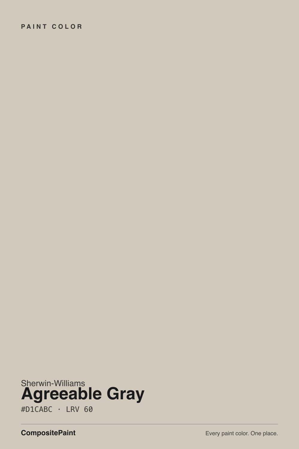
- 1Mindful Gray48
- 2Revere Pewter55
- 3Agreeable Gray60
- 4Pale Oak69
- 5Shoji White74
The Fast Verdict
Agreeable Gray is the default American neutral for a reason: at LRV 60 it is light enough to open a room, warm enough to never feel cold, and quiet enough that nothing in the house fights it.
But it is a chameleon, not a fixed color. In good daylight it is a soft warm greige; in dim or cool light the warmth drops out and a faint violet-gray comes forward, and that is where every bad review starts. Sample it in the darkest corner of the room, not the brightest.
Whole-house flow in rooms with real daylight · open-plan main floors · kitchen and bath cabinets with brass or matte black · anyone who thinks beige is too yellow and gray is too cold
Your room is north-facing and dim · your trim or cabinets are cream · your tile, counters or flooring lean cool violet-gray · you want a wall color with an actual opinion
- Truly whole-house: carries across every room without clashing
- Warm enough to never read cold or blue like a true gray
- LRV 60 brightens a room but still holds shadow and looks dimensional
- Goes with warm wood, brass, matte black, and almost any deep accent color
- Universally stocked and understood — every painter knows it
- Goes flat, drab, and sometimes faintly violet in dim or north light
- Reads dirty next to cream trim or antique-white cabinets
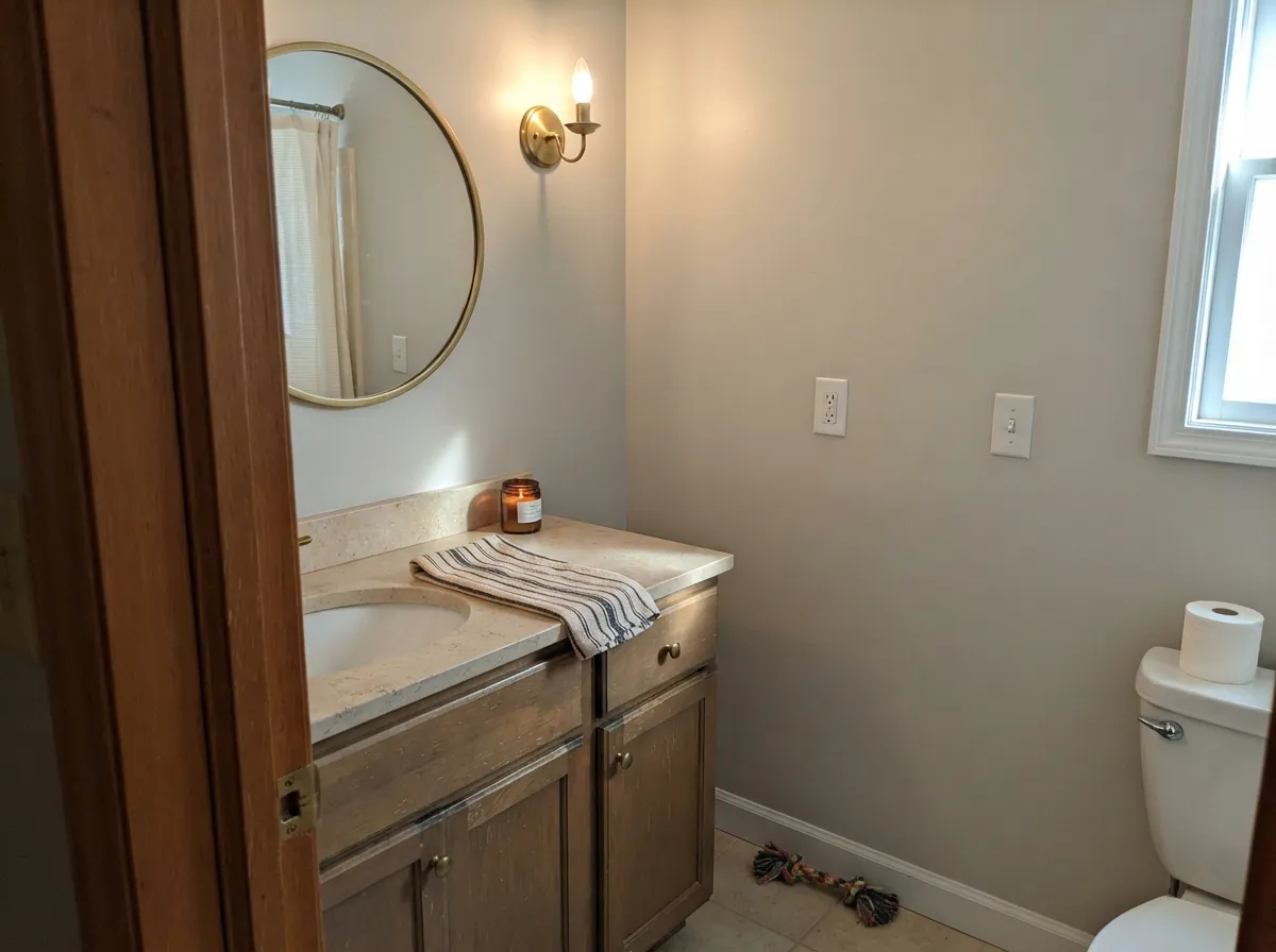
- Flashes green beside cool violet-gray tile, counters, or flooring
- Everywhere — if you want a room that feels chosen, this is not it
What Color Is Agreeable Gray, Really?
A warm gray built on a taupe base, not a beige one — and that distinction explains almost everything about how it behaves. Beige-based neutrals carry yellow, so they stay warm no matter what the light does. Agreeable Gray carries a soft brown-violet instead, which is why it reads gray first and warm second, and why the warmth can switch off when the light turns cool. Sherwin-Williams sells it as the agreeable one because it refuses to commit to an undertone, and that refusal is both the reason it goes on more American walls than almost any other color and the reason a small share of people hate it.
At LRV 60 it reflects a bit more than half the light that lands on it, which puts it in the mid-light band — light enough to open a room, not light enough to act as a bright neutral. The number looks close to Revere Pewter (HC-172) at 56, but on a wall the gap feels bigger than four points because Revere Pewter also carries green and reads a full step heavier and more traditional. Put Agreeable Gray beside a real off-white like Alabaster (SW 7008) at LRV 82 and the comparison is honest: this is a color, not a pale wash, and it will hold visible shadow in corners and behind furniture.
Undertone in one line: warm gray over a taupe base with a whisper of violet — never yellow, and never actually green. The green people report is a reaction to something cool and violet nearby, not something in the can.
Where It Shines
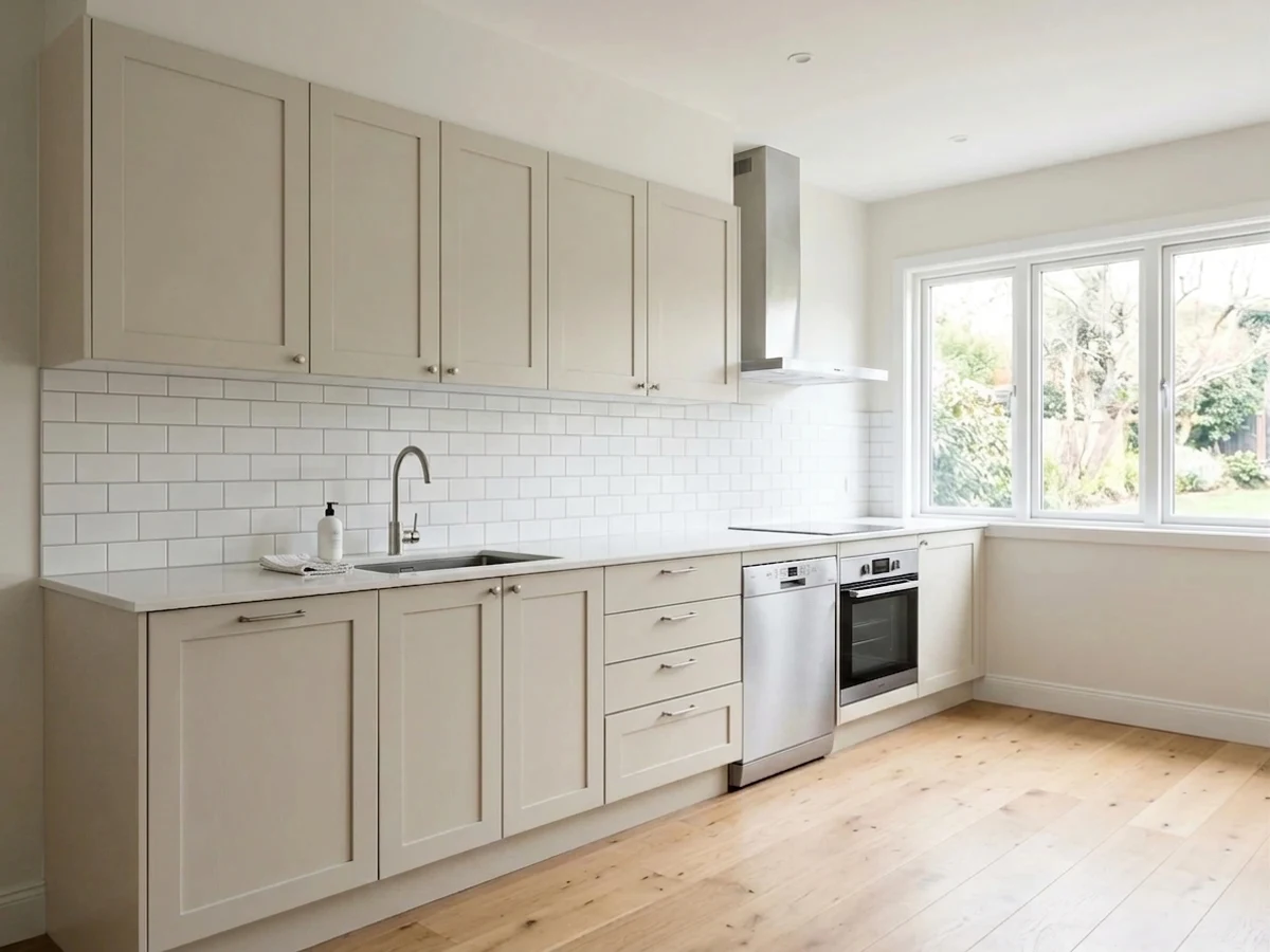
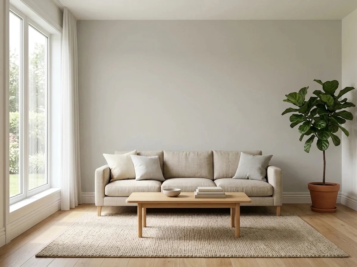
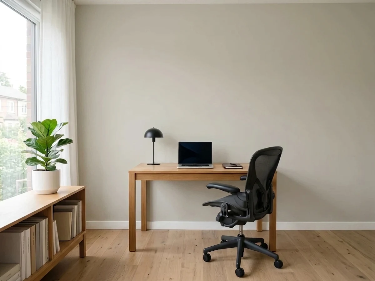
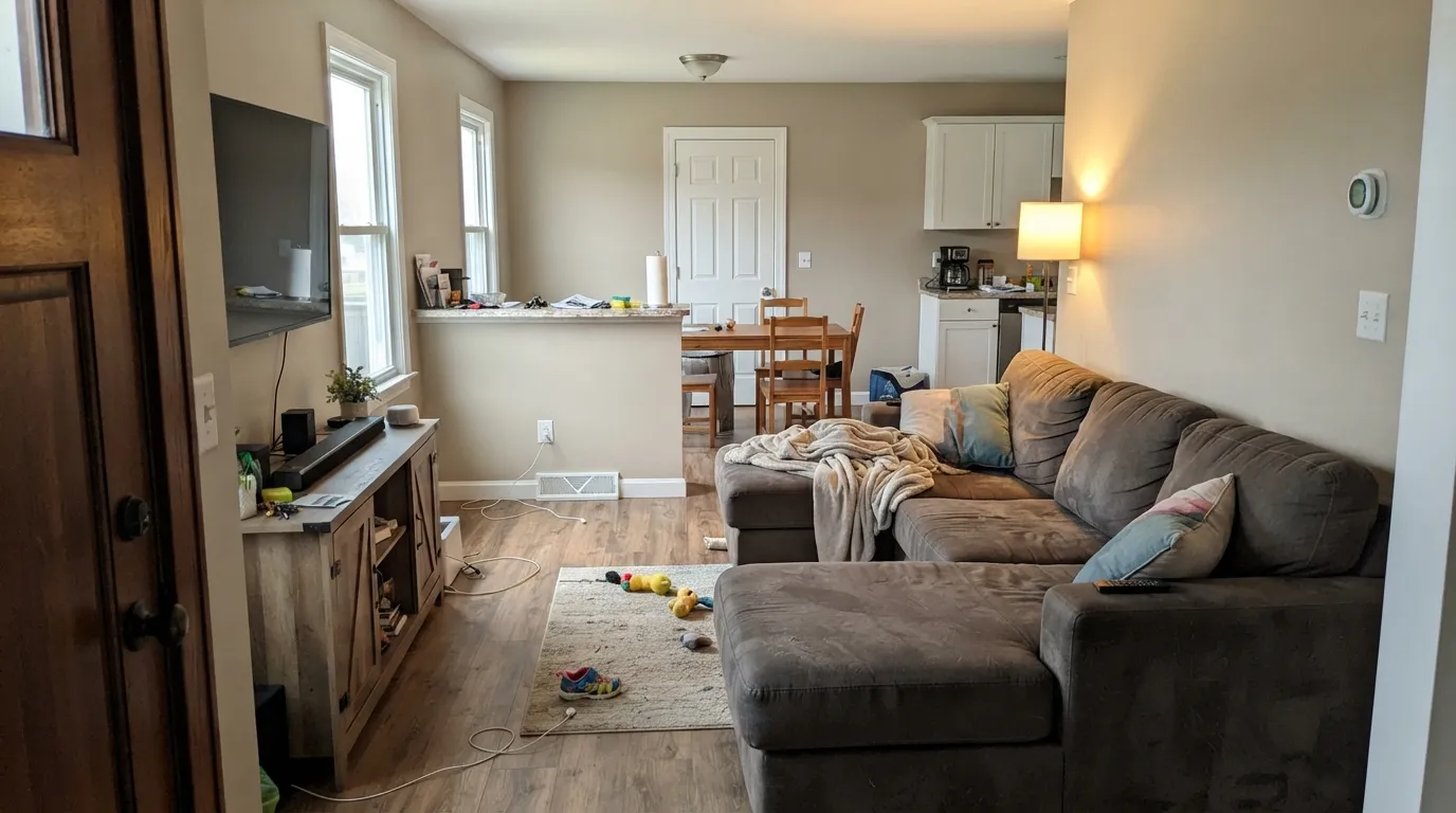
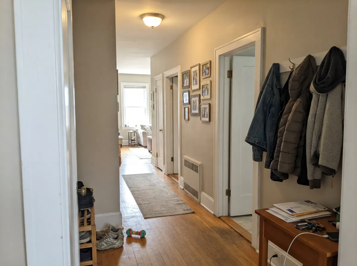
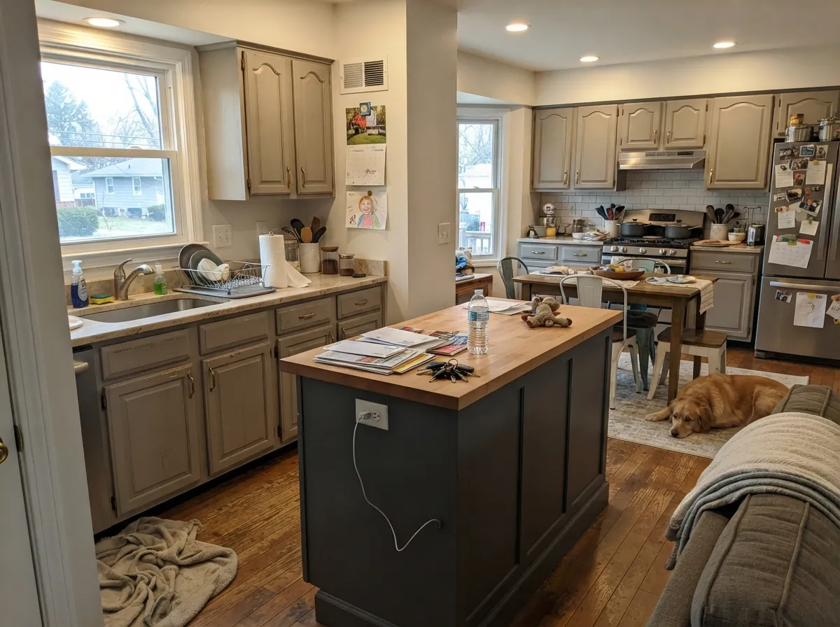
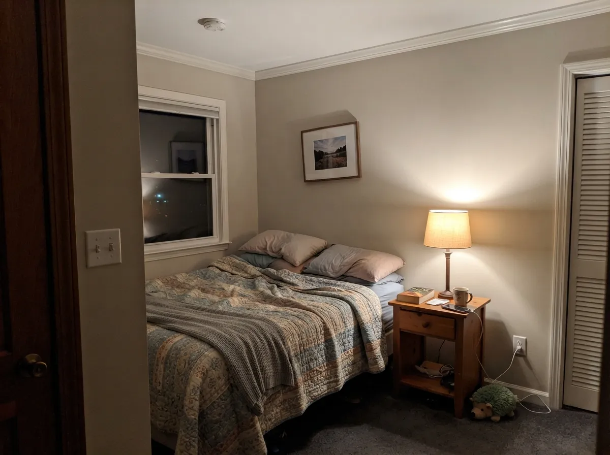
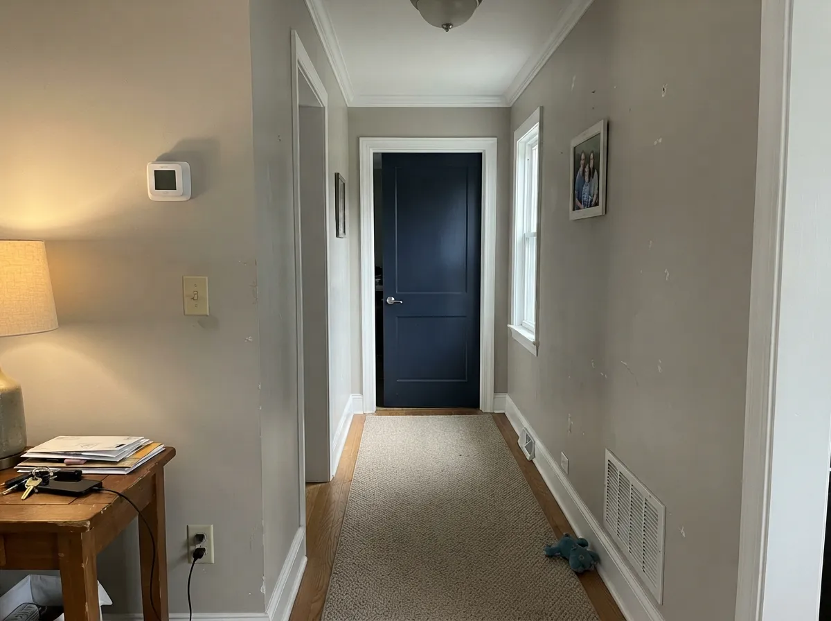
Agreeable Gray is at its best in rooms with real daylight, where LRV 60 keeps everything open and the warm side of the color stays switched on. Look at how it carries from room to room on an open main floor, and how it behaves on cabinets next to brass and matte black — those are the two places it earns its reputation.
Where It Fails
Agreeable Gray almost never fails on its own — it fails in company. Three situations produce nearly every complaint people post, and you can spot all three before you open a can.
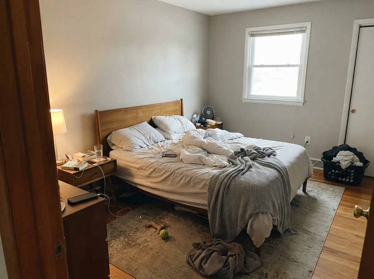
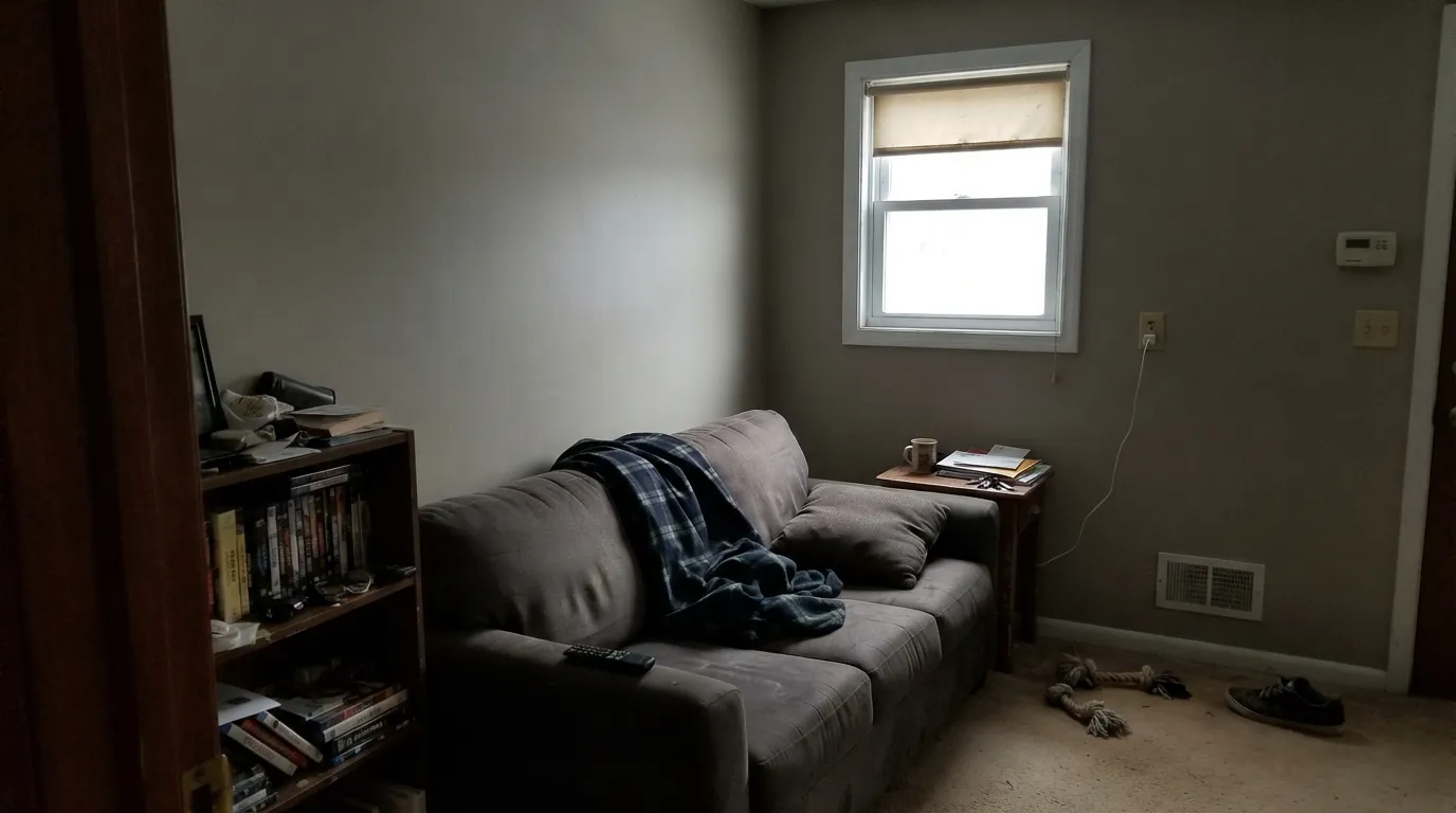
North light is cool and flat, and it takes the warm side of the color away. What is left is a drab gray that people describe as dingy, grim, or muddy — and in the worst rooms a soft violet cast comes up out of it. Designers call this its fleshy side. The paint did not change; the light removed half of it. In a dark north room, go warmer with Accessible Beige (SW 7036), or cleaner with Gossamer Veil (SW 9165), which holds together in low light without the violet flash.
This is the single most common bad pairing. Next to a creamy yellow-based white, Agreeable Gray gets pushed cool and reads blue-gray and dirty, while the cream looks jaundiced. Both colors lose. Use a clean trim white instead — Pure White (SW 7005) is the reliable one. If your cabinets and millwork are staying cream, do not fight it: paint the walls Accessible Beige (SW 7036) and let the whole room agree.
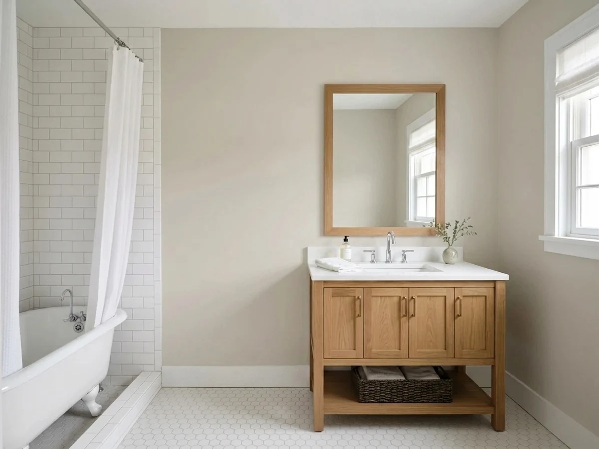
Gray-purple LVP, cool quartz, and blue-gray tile all sit on the opposite side of Agreeable Gray, and beside them the wall flashes green. It is subtle, and then you cannot unsee it. If your fixed finishes are cool, stop trying to warm them up with a greige and use a true light gray — Repose Gray (SW 7015) at LRV 58 matches them instead of arguing with them.
Room by Room
Your Light Is the Risk
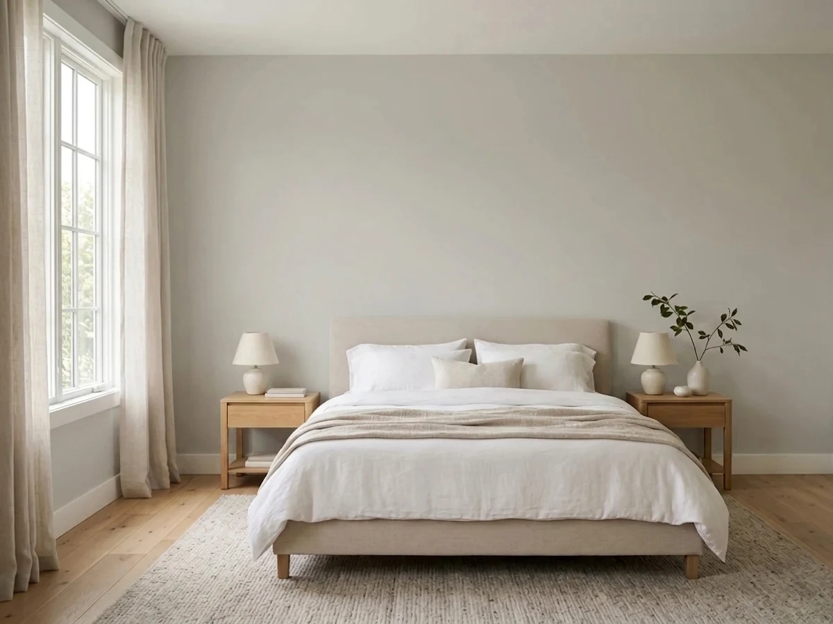
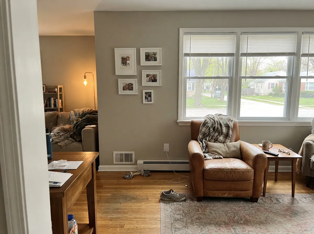
Warms up and looks its softest and lightest. Can wash toward a pale beige at midday — most people love it anyway.
The warmth drains out. Gray, sometimes violet, often just dingy. Sample this room first — or go warmer.
2700K lamps push it cozy and beige. 4000K daylight bulbs pull the gray out and can trigger the violet. Swap bulbs before you repaint.
One color, two rooms, two looks: warm and beige by the south windows, gray and cool in the shaded corner. Fine if you expect it, jarring if you don't.
Most complaints about Agreeable Gray are a light mismatch. Upload a photo of your actual room and see it on your walls — then ask for the same wall in north light or evening lamps before you buy a single sample.
Need It From Another Brand?
Any paint counter can custom-tint Sherwin-Williams SW 7029 directly. If you would rather stay in one brand's own deck, these are the closest stock matches, measured as ΔE2000. Under 2 is a difference you will not see on the wall.
| Brand | Closest color | ΔE | LRV | |
|---|---|---|---|---|
| Behr | Tranquil GrayDC-007 · Behr | 0.8 | 60 | Color page → |
| Benjamin Moore | WishAF-680 · Benjamin Moore | 0.9 | 59 | Color page → |
| Valspar | Heritage Gray7007-24 · Valspar | 0.0 | 60 | Color page → |
| PPG / Glidden | WhiskersPPG1025-3 · PPG / Glidden | 0.5 | 60 | Color page → |
| Glidden | WhiskersPPG1025-3 · Glidden | 0.6 | 61 | Color page → |
| Dutch Boy | Doves Wings443-1DB · Dutch Boy | 0.0 | 60 | Color page → |
Similar Sherwin-Williams Colors
The nearest shades to Agreeable Gray within Sherwin-Williams's own range, ranked by perceptual color distance — useful when you want the same look a touch lighter, darker, or warmer.
WCAG 2.1: AA is 4.5 : 1 for normal text, 3 : 1 for large text, AAA is 7 : 1.
Agreeable Gray vs the Colors You're Also Considering
Every Agreeable Gray sample board has the same rivals on it. The numbers show the real lightness gap — then it comes down to which risk you would rather live with.
Pick this if you want warmth and forgiveness, and your finishes lean warm.
Sherwin-Williams SW 7015 · LRV 58Repose GrayPick this if your tile, counters, or floors are cool — it matches instead of clashing.
Side-by-side comparison →Pick this when you want gray first and beige second — the cooler, more modern read.
Sherwin-Williams SW 7036 · LRV 58Accessible BeigePick this for dim rooms, cream trim, and anyone who wants real cozy warmth.
Side-by-side comparison →Repose Gray (SW 7015, LRV 58) is the most common comparison. It is close in lightness but reads as a truer, slightly cooler gray, where Agreeable Gray shows more warmth. Pick Repose if you want the room to feel a little more gray and modern, and Agreeable if you want it softer and warmer.
Accessible Beige (SW 7036, LRV 58) goes the other direction. It is noticeably beiger and warmer, so it feels cozier and more traditional. Agreeable Gray is the more balanced middle ground between the two.
Against Revere Pewter (HC-172, LRV 56) from Benjamin Moore, another famous greige, Revere is a bit deeper and leans slightly green-gray, while Agreeable stays lighter and warmer without that green pull. Choose Revere for a touch more depth and traditional character, Agreeable for a lighter, more neutral wall.
Agreeable Gray Coordinating Colors
The rule for building around Agreeable Gray is to stay on its warm side and never introduce a cream. Because its base is taupe rather than yellow, it partners cleanly with clean whites, muted greens, deep navies, and warm charcoals — and it turns dingy the moment a yellow-based off-white or a cool violet-gray sits next to it.
These are the colors that actually get specified with it, in the roles they get specified for:
Agreeable Gray With Oak Trim, Cabinets and Floors
This is the question readers ask more than any other, and the answer is genuinely good news. Honey oak, red oak, and builder-grade orange oak all push a yellow-orange note into a room, and most grays sit on the opposite side of that and make the wood look louder and more orange than it really is. Agreeable Gray does not, because its base is a warm taupe-bronze that meets the oak partway. That is why painters keep reaching for it in houses full of oak trim, oak banisters, and oak cabinets that the owner does not want to paint.
There is a limit, though. One greige can handle oak on the floor or oak on the trim, but a room with orange oak floors, orange oak trim, and orange oak cabinets all at once will simply out-vote it, and the walls start to look gray and cold by comparison. In that room go a step warmer, add a large area rug to break up the floor, and keep the bulbs at 3000K so the wood and the wall stay on the same team.
Gray-washed white oak and light engineered floors are a different problem. Those often carry a cool violet cast, and that is the one flooring family that pulls Agreeable Gray in the wrong direction. Tape a big sample flat against the floor before you commit, not just on the wall at eye level.
Agreeable Gray on Exteriors
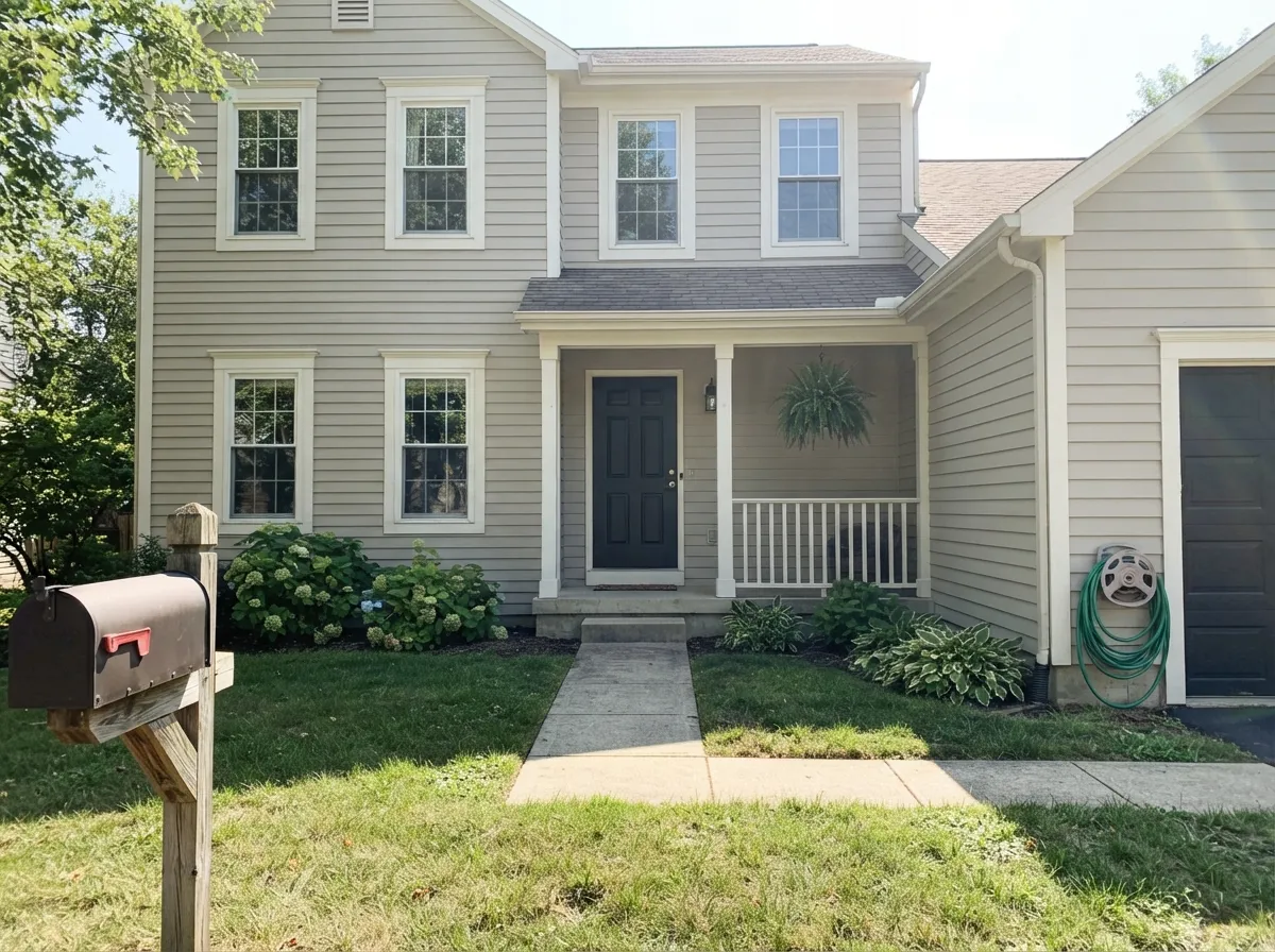
Outside, expect it to read a full step lighter than it ever does indoors. Direct sun flattens depth out of every color, so a mid-tone greige that looked substantial on an interior wall can land closer to a warm off-white on a sunny elevation. That is not a flaw — it is why it works as siding — but it does mean the sample board has to go outside, held vertically against the house, and looked at in the afternoon rather than under the store lights.
The trim is what makes or breaks it. Extra White (SW 7006) or Pure White (SW 7005) give the crisp, modern read most people are after; a dark accent on shutters, the garage, or the front door is what stops a large flat elevation from looking washed out, and Iron Ore (SW 7069) or Naval (SW 6244) are the two that get used most. Skip cool blue-gray accents entirely.
The trap nobody plans for is the roof. A blue-gray or charcoal-blue shingle sits on the cool side of Agreeable Gray and will pull the whole house gray and slightly sour; a brown, weathered-wood, or true black roof lets the warmth stay. Same for cool gray stone veneer. And walk all four sides before you buy — the shaded north elevation will read noticeably grayer and heavier than the sunny front.
Three Ready Palettes Built on Agreeable Gray
A color is never alone on the wall. These are complete combinations in the 60-30-10 pattern, with the reason each one holds together. Every one opens in the visualizer.
Agreeable Gray on every wall is the 60 percent that lets an open floor plan flow, and Pure White is the clean trim white that keeps its warmth honest instead of pushing it blue the way cream does. Tricorn Black is the single 10 percent dark note that stops the whole house from reading washed out.
Try this palette in your roomAlabaster is warm enough to sit above greige cabinets without the jaundiced clash a true cream would cause, so the wall-to-cabinet handoff stays soft. Urbane Bronze grounds the island and shares Agreeable Gray's warm base, which is why brass hardware reads deliberate across all three.
Try this palette in your roomEvergreen Fog is muted and warm-leaning, so it adds one real color note without fighting the greige walls or triggering the green flash a cool finish would. Agreeable Gray stays the 60 percent background, the green takes 30 on built-ins, and Pure White trim keeps a crisp line between them.
Try this palette in your roomAgreeable Gray FAQ
Is Agreeable Gray warm or cool?
Warm, but only by a small margin — call it sixty percent gray, forty percent beige. That balance is what lets it sit in a house with warm wood without ever looking tan. It reads warmest in daylight and drifts toward plain gray once the sun is off the room.
What white should I use on the trim and ceiling?
Pure White (SW 7005) is the standard answer and the one painters default to; Extra White (SW 7006) if you want a crisper, cooler line; Alabaster (SW 7008) if you want the softest, most tonal handoff. Paint the ceiling the same white in flat. If you want a tonal ceiling instead, ask the paint desk to mix Agreeable Gray at 50 percent — but sample it first, because half-strength shifts the color, it does not just lighten it.
Does it work with honey oak trim and orange oak floors?
Yes, and it is one of the few grays that does. Its taupe-bronze base meets the orange in oak partway instead of shoving it, which is exactly what cooler grays fail to do. With very orange 1990s red oak on both the floor and the trim, though, one greige can get outnumbered — see the oak section below.
Is Agreeable Gray outdated in 2026?
No. What dated was cold blue-gray, not greige, and Agreeable Gray is still one of Sherwin-Williams' top-selling interior colors year after year. The fair criticism is not that it looks old, it is that it looks like everyone else's house. If you want the same safety with fewer neighbors, Anew Gray (SW 7030) is the same family with real depth at LRV 47.
How many coats does it take, and do I need primer?
Two coats over any existing light or mid-tone wall. It is a low-pigment color, so it goes on thin and streaky in cheap paint — a bargain gallon will cost you a third coat and any money you saved. Over a dark or saturated wall, use a gray-tinted primer first.
Is there a Benjamin Moore version of Agreeable Gray?
The closest number match in the Benjamin Moore deck is Mocha Cream (995), which is near enough to be hard to tell apart on a wall. In practice, designers reach for Edgecomb Gray (HC-173) when they want it a touch lighter and warmer, or Revere Pewter (HC-172) for more depth. Do not have the counter machine-match the formula into another brand's base — matched greiges drift, and greige is the worst family to gamble on.
Will it fade or yellow over time?
Indoors, no — greige has no fugitive pigment to lose, and it stays put for as long as the sheen holds up. Outdoors on a south or west elevation it will lighten slightly over several years like any mid-tone body color, so use an exterior-grade acrylic and buy an extra quart for touch-ups from the same batch.
Have you painted with Agreeable Gray?
Rate it — one tap helps the next reader decide.
Ask a Question