Sherwin-Williams Agreeable GrayvsSherwin-Williams Repose Gray
The two Sherwin-Williams greiges people swap by accident. Agreeable Gray is the warmer, tanner one; Repose Gray is what you buy when Agreeable reads too beige — and it is the one more likely to turn lavender on you.

Built from our full reviews of both colors — same measured data, same real-room photos. About the testing process →
The Numbers
LRV is essentially equal (60 vs 58) — both reflect light the same.
The Real Difference on a Wall
Put both on the same wall and the difference is obvious for about ten seconds: Agreeable Gray has visible tan in it, Repose Gray reads cleaner and grayer. Then you walk away, come back, and they look like the same paint again. That is the honest situation with these two. On their own, in a finished room, almost nobody can name which one is up. What people do notice is temperature. Agreeable Gray makes oak floors and brass look intentional. Repose Gray makes white quartz and brushed nickel look intentional. Pick the one that agrees with the stuff you are not replacing.
They also behave differently as the day moves. Agreeable Gray in a south room warms up and can wash out to a pale beige by midday — most people like it anyway. Repose Gray in the same room stays balanced longer, then bleaches close to an off-white in hard west afternoon sun. Turn the light cool and both lose their warm half, but they do not lose it the same way. Agreeable Gray goes drab and dingy, with a faint violet you notice mostly in photos. Repose Gray goes flat-out lavender, and in bad north rooms people describe it as baby blue. That is not internet exaggeration; it is the single most repeated complaint about the color.
Next to finishes, the split is clean. With cream trim, cream cabinets, or honey oak, Agreeable Gray is the safer of the two — it still gets pushed a little cool, but Repose Gray turns purple right where it meets the cream, usually in the last two feet before the cabinet run. With cool gray-violet LVP, gray quartz, or blue-gray tile, flip it: Repose Gray sits with them, and Agreeable Gray throws a faint green against them that you cannot unsee once you spot it. Both want a clean trim white rather than a creamy one — Pure White SW 7005 is the default answer for either.
Both are built over violet, so this is a pair-wide risk, not a one-color one. Repose Gray is the one that actually goes lavender or baby blue in a dim north room or under 4000K LEDs; Agreeable Gray's violet is fainter and usually shows up as drab rather than purple, but it will flash green next to cool gray-violet flooring or counters.
What Each Color Really Is
A warm gray built on a taupe base, not a beige one — and that distinction explains almost everything about how it behaves. Beige-based neutrals carry yellow, so they stay warm no matter what the light does. Agreeable Gray carries a soft brown-violet instead, which is why it reads gray first and warm second, and why the warmth can switch off when the light turns cool. Sherwin-Williams sells it as the agreeable one because it refuses to commit to an undertone, and that refusal is both the reason it goes on more American walls than almost any other color and the reason a small share of people hate it.
At LRV 60 it reflects a bit more than half the light that lands on it, which puts it in the mid-light band — light enough to open a room, not light enough to act as a bright neutral. The number looks close to Revere Pewter (HC-172) at 56, but on a wall the gap feels bigger than four points because Revere Pewter also carries green and reads a full step heavier and more traditional. Put Agreeable Gray beside a real off-white like Alabaster (SW 7008) at LRV 82 and the comparison is honest: this is a color, not a pale wash, and it will hold visible shadow in corners and behind furniture.
A light greige built on a violet base. That last part is the whole story. Most warm grays get their softness from yellow or brown pigment; Repose Gray gets a good share of its from a whisper of purple, with a faint green thread underneath it. In warm light the purple reads as "soft" and "not cold," which is exactly the effect people are after. Take the warm light away and the same pigment reads as what it is. Nothing about the mix changes room to room — only what the light lets you see.
At LRV 58 it sits almost exactly where Agreeable Gray does at 60, so the two are not a light-versus-dark decision — they are a temperature decision. Repose leans slightly cool and clean; Agreeable leans slightly tan. That two-point gap also tells you something people miss: 58 is mid-light, not pale. It is a real, visible color on the wall, roughly halfway between a white ceiling and a mid-tone gray sofa, and it will read as gray from across the room rather than disappearing like an off-white.
Specs Side by Side
| Spec | Agreeable Gray | Repose Gray |
|---|---|---|
| Brand | Sherwin-Williams | Sherwin-Williams |
| SKU | SW 7029 | SW 7015 |
| Hex | #D1CBC1 | #CCC9C0 |
| RGB | 209, 203, 193 | 204, 201, 192 |
| LRV | 60 | 58 |
| Undertone | red-orange / warm | red-orange / warm |
| Family | Neutral | Neutral |
How Light Changes Them
Warms up and looks its softest and lightest. Can wash toward a pale beige at midday — most people love it anyway.
The warmth drains out. Gray, sometimes violet, often just dingy. Sample this room first — or go warmer.
2700K lamps push it cozy and beige. 4000K daylight bulbs pull the gray out and can trigger the violet. Swap bulbs before you repaint.
One color, two rooms, two looks: warm and beige by the south windows, gray and cool in the shaded corner. Fine if you expect it, jarring if you don't.
Warm daylight all day keeps the greige balanced and soft. This is the room it was made for.
Cool light kills the warmth and the violet base surfaces. Expect lavender or baby blue. Sample large, or go warmer.
4000K LEDs push it blue-gray and lifeless after dark. Swap to 2700K bulbs before you blame the paint — it usually fixes it outright.
West windows at 4pm bleach it close to an off-white. Fine on a big wall, disappointing if you wanted visible gray.
Both Colors in Real Rooms
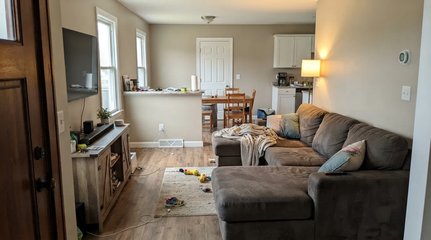
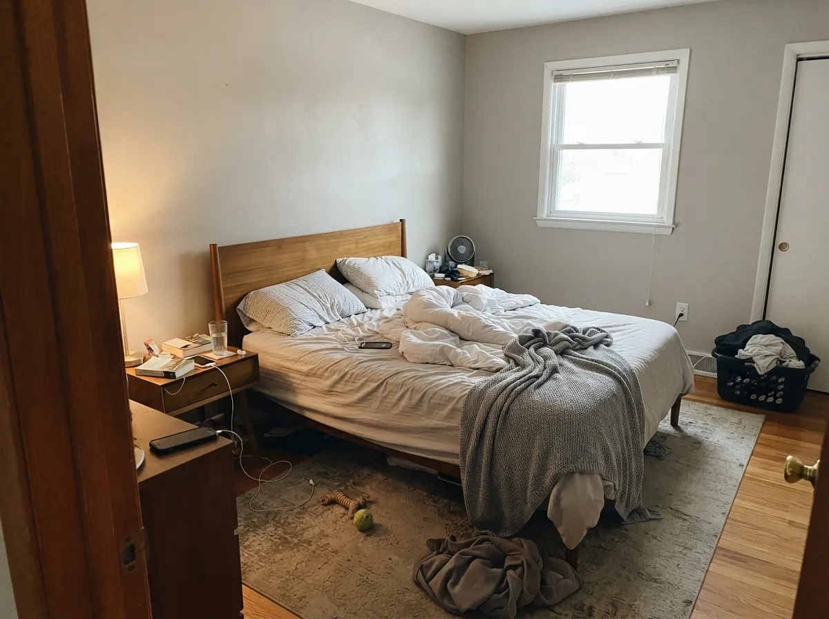
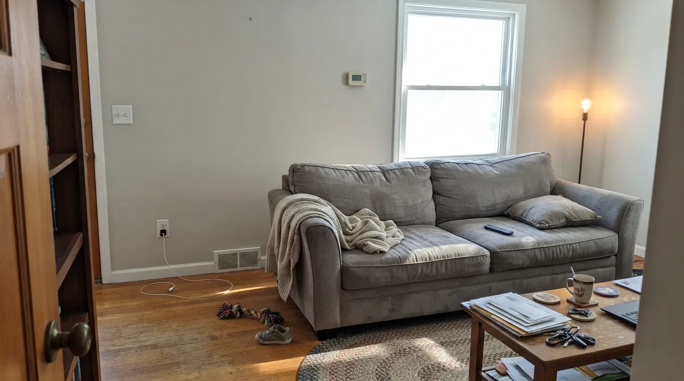
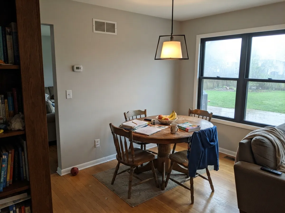
Photos from our full reviews — the same rooms and captions, so you can judge each color where it actually lives, not on a chip.
When to Pick Which
Choose Agreeable Gray if your room has real daylight and your fixed finishes are warm: oak or walnut floors, beige tile, brass, wood cabinets. It is also the safer pick if you are keeping cream trim, because it fights the cream less. And if you want one color for a whole main floor, it shifts a little less dramatically from room to room.
Choose Repose Gray if Agreeable Gray looks too tan to you on the sample board — that is the whole reason this color sells. It is the better match for cool finishes: gray-veined quartz, white marble-look tile, cool gray floors, brushed nickel. Just make sure the room has decent daylight and 2700K to 3000K bulbs before you commit.
No comparison page can see your light. Upload one photo of your room and try both colors on the same walls, seconds apart.
Agreeable Gray vs Repose Gray FAQ
Which one is safer in a north-facing room?
Agreeable Gray, but only by a little. North light strips the warmth from both, and Repose Gray is the one that comes back lavender or baby blue — it is the most common complaint about the color. Agreeable Gray tends to go drab and gray instead of purple. If the room is north-facing and dim, honestly neither is a great answer; Accessible Beige SW 7036 holds its warmth in that light and costs you nothing in brightness.
I have cream cabinets. Which one?
Agreeable Gray, and even then keep expectations low. Repose Gray goes visibly purple where it meets cream or ivory — the walls look fine everywhere except beside the cabinets. Agreeable Gray gets pushed cool and a bit dirty by the same cream, but it does not turn a different color. If the cream cabinets are staying for good, Accessible Beige SW 7036 is the pairing that actually looks planned.
Can I paint kitchen cabinets in either of these?
Both work as cabinet colors in satin, and both look better with brass or matte black hardware than with chrome. Agreeable Gray cabinets read warm and soft, close to a light mushroom. Repose Gray cabinets read more modern and clearly gray. Keep something distinctly whiter in the room — white quartz or a white backsplash — or either one can slide toward dingy.
What trim white goes with each?
Pure White SW 7005 is the safe answer for both, and it is why so many Sherwin-Williams houses look consistent. Avoid a creamy trim white like Alabaster with Repose Gray, because that is the exact pairing that triggers the purple. Alabaster over Agreeable Gray is more forgiving, but it softens the whole room and some people find it muddy.
Why does my sample look nothing like the room next door in the same color?
Because both of these change with light direction more than most neutrals, and open plans have several directions at once. The same gallon can look warm beige by a south window and cool gray in the shaded corner twenty feet away. Test a large sample board and move it around the room over a full day, especially into the darkest corner, before you buy five gallons.
Ask a Question