Room Colors · Bedroom
12 Best Bedroom Paint Colors for 2026
ideas, combinations, and real rooms
12 curated picks from real bedrooms — with the exact colors, honest reasons why, and the combinations that hold the room together.

Former interior stylist who can spot a green undertone from across a room. Jessica writes the color and mood pieces — what to choose, what pairs, and why your "white" looks pink.
The Fast Answer
Don't want to read 12 picks? These four are the safe answers.

Top Picks for the Bedroom
Pick a color family, tap a shade to see the bedroom in it, then try it on your own room.
Bedroom Color Trends 2026 — What's In, What's Out


- Cool gray-on-gray — The 2015 builder look — reads cold and dated now.
- Stark bright white — Warm whites like White Dove replaced it everywhere.
- All-navy rooms — Navy survives as one accent wall; the four-wall version is done.
- Millennial pink walls — Blush moved to bedding and curtains; Setting Plaster is the only wall version aging well.
The 12 Best Bedroom Paint Colors
Every pick below is a real rendered bedroom, not a chip. The lead color first; the swatches are the full scheme in the photo — walls, furniture, textiles, accent.

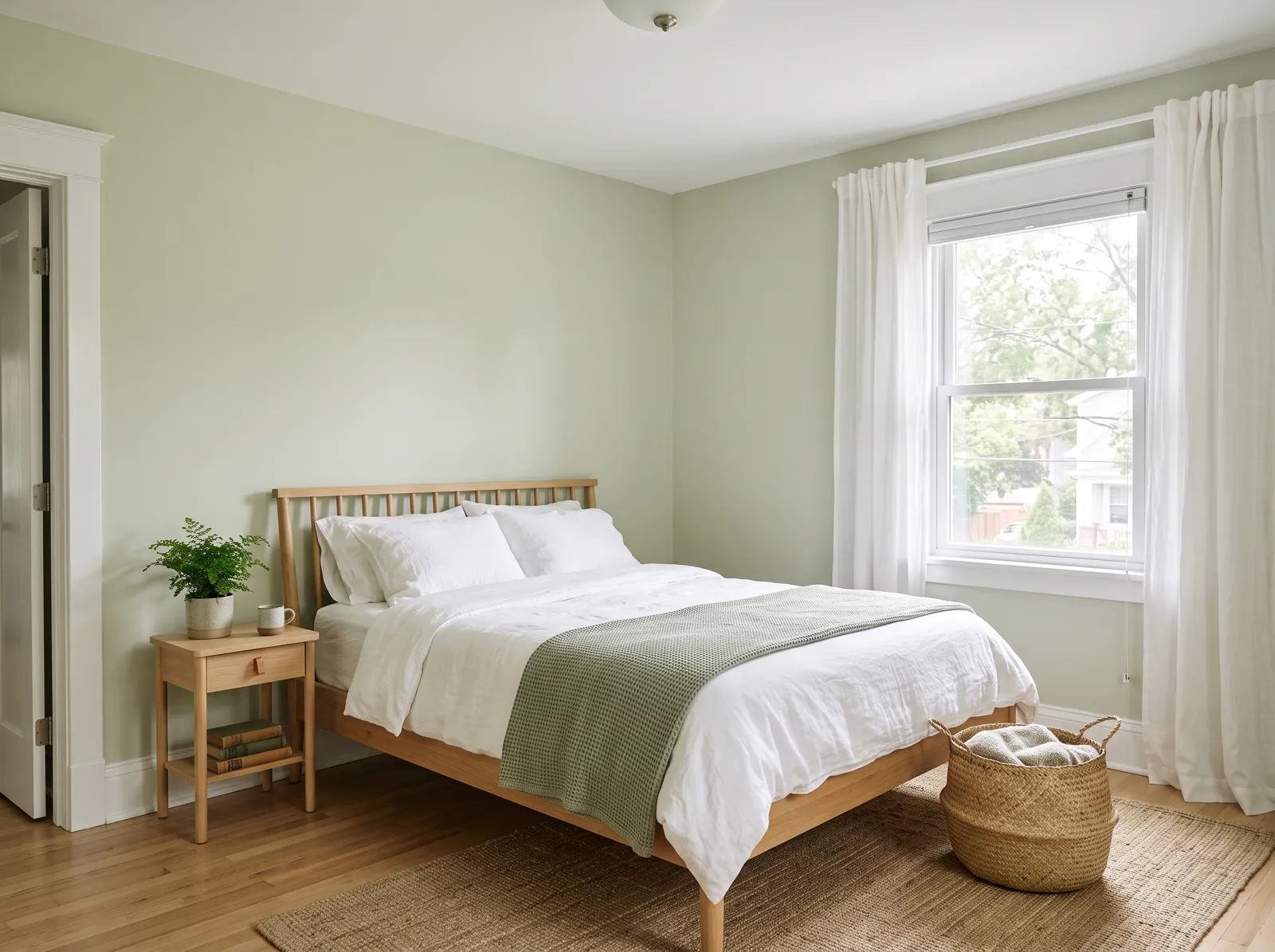
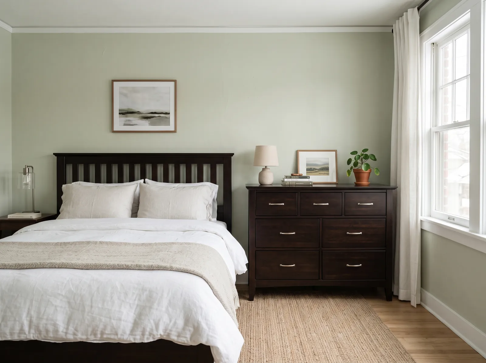
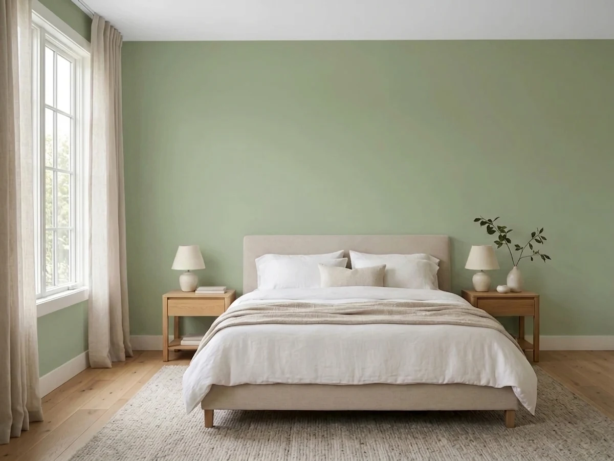
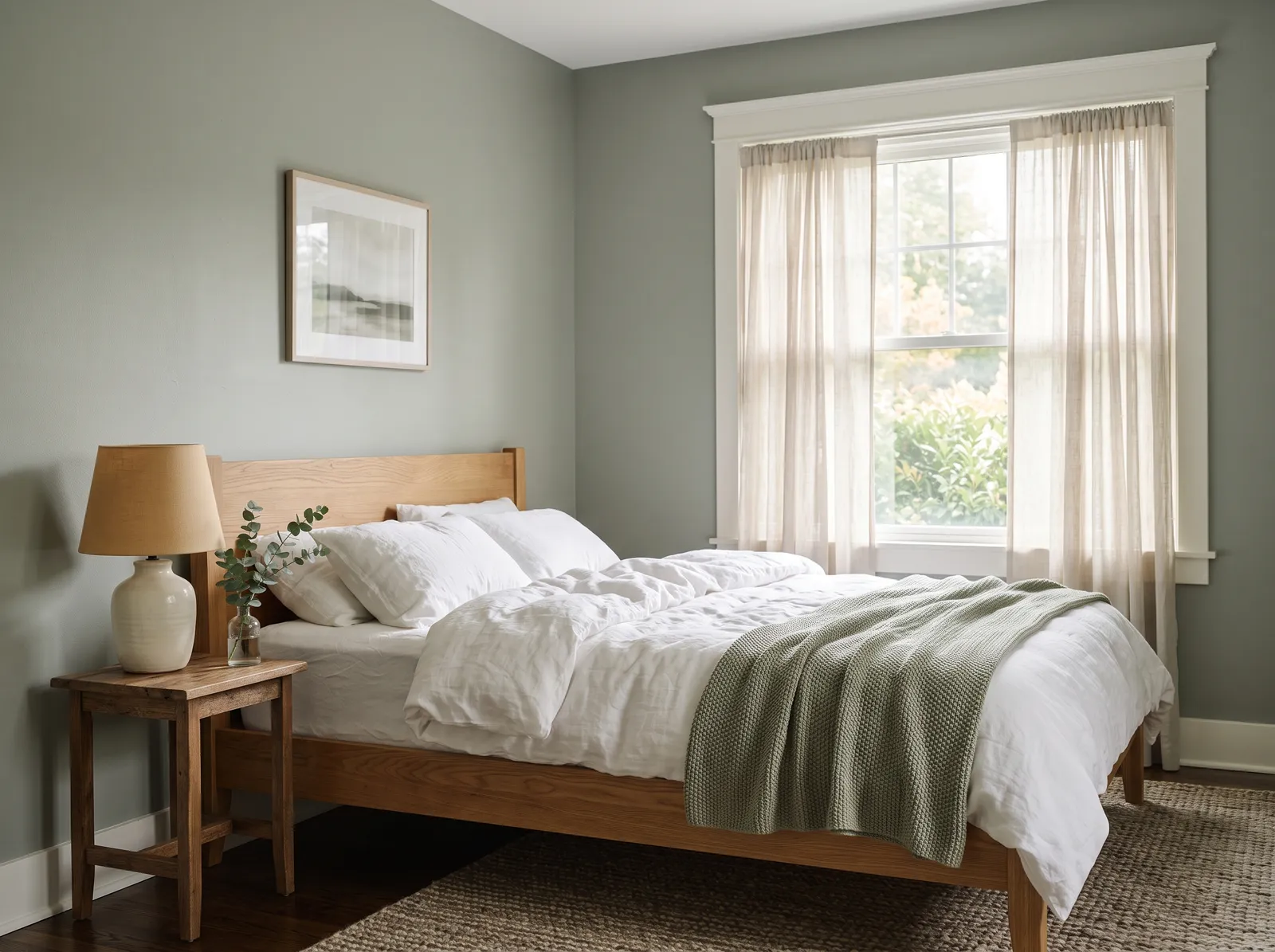
A gentle gray-green that feels like morning light through leaves, quiet, fresh, and easy to wake up to.
Sage is a quiet, earthy gray-green that brings the peace of the outdoors inside. In this bedroom, that soothing sage covers the walls, beautifully framing a warm oak bed frame and matching wooden nightstand. Sheer beige curtains soften the window, while a textured jute rug grounds the space, and a matching green throw blanket rests on crisp white bedding. The entire room feels incredibly calm and snug. This combination works so well because natural wood tones and leafy greens are a match made in heaven. It is perfect for anyone wanting a restful, nature-inspired sanctuary.
SEE BIRCH FOREST ON YOUR WALLS →
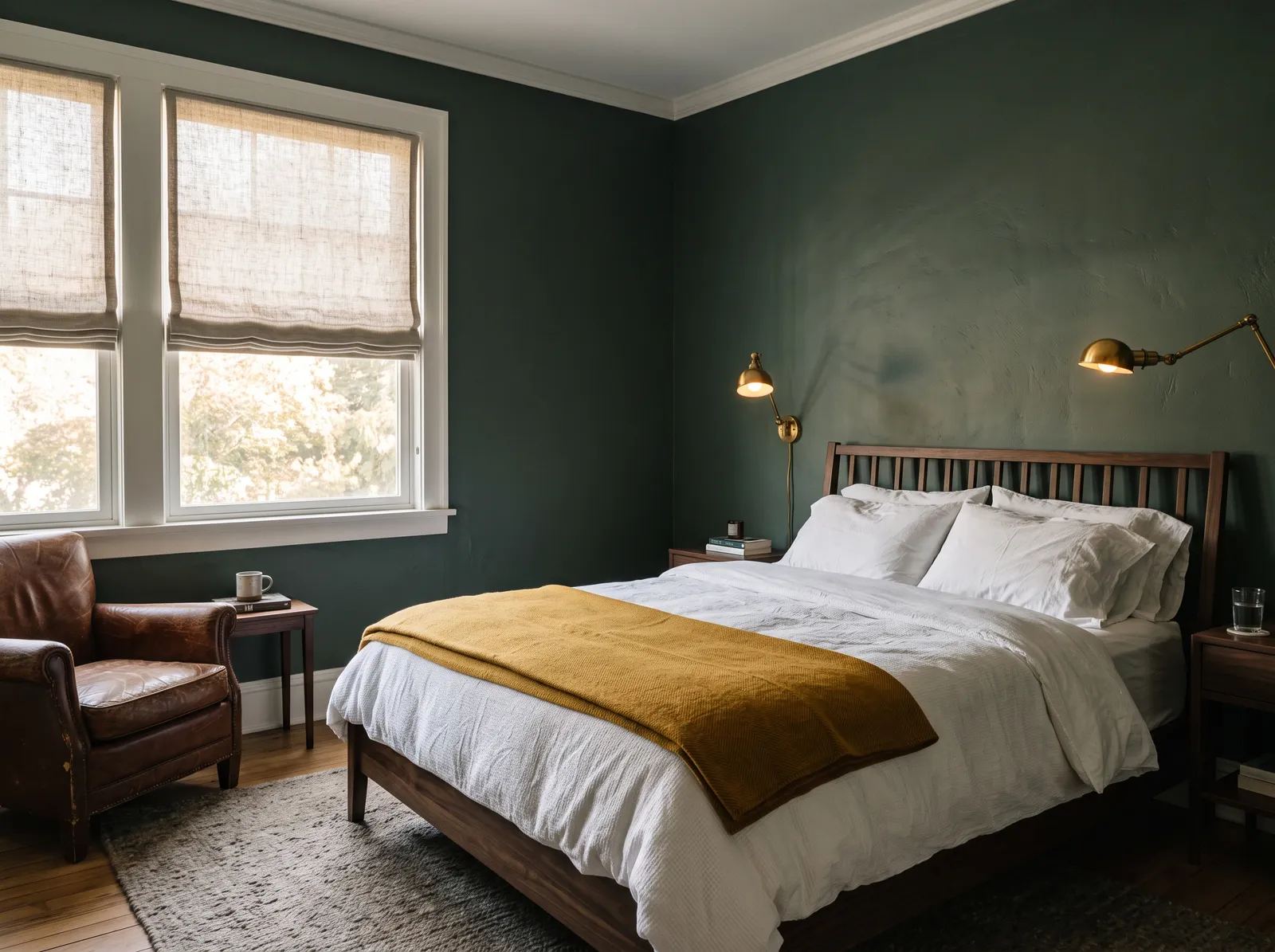
A rich, foggy forest green that wraps the room like a quiet wood and makes the bed feel like a retreat.
Forest green is a deep, moody shade that brings the quiet peace of nature indoors. In this bedroom, that rich green wraps the walls, creating a stunning backdrop for the dark wood bed, a brown leather armchair, and a textured gray rug. The space feels incredibly snug and grounded. The combination works beautifully because the bright mustard yellow throw and warm brass sconces break up the dark tones with a cheerful splash of contrast. It is perfect for anyone who wants a restful, cocoon-like sanctuary to escape to.
SEE CHARGREEN ON YOUR WALLS →
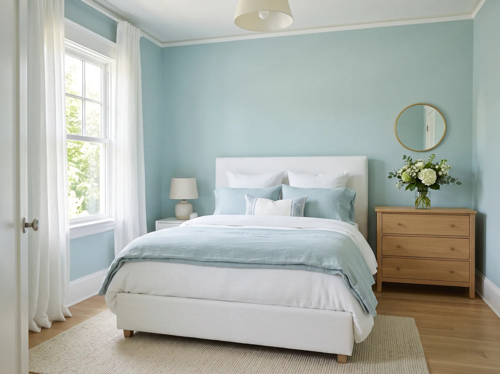
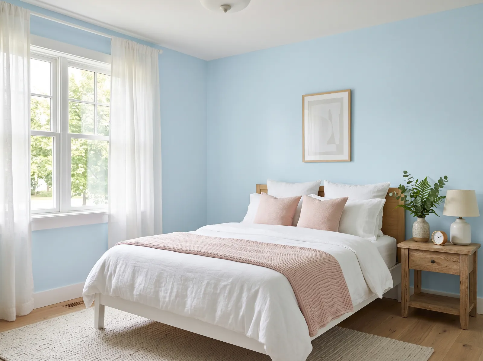
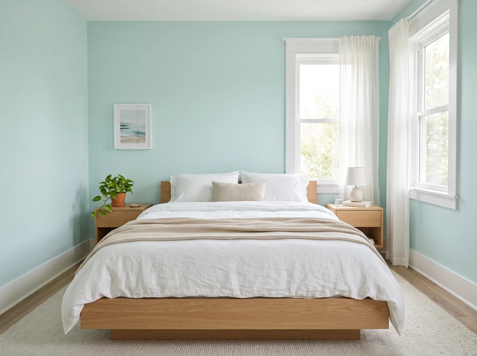
A soft blue with a touch of green, like still water, it makes the whole room feel cool, clean, and restful.
Robin's egg blue is a breezy, refreshing pastel that brings the sky indoors. In this bedroom, that soothing blue covers the walls, beautifully matched with a crisp white upholstered bed, soft white curtains, and dusty blue bedding. A natural wood dresser adds a touch of earthy warmth, while a textured oatmeal rug grounds the space. The entire room feels incredibly calm, airy, and peaceful. This combination works because the cool blues and clean whites are balanced by the warm, organic wood tones. It is perfect for anyone wanting a serene, coastal-inspired sanctuary to unwind in.
SEE REST ASSURED ON YOUR WALLS →
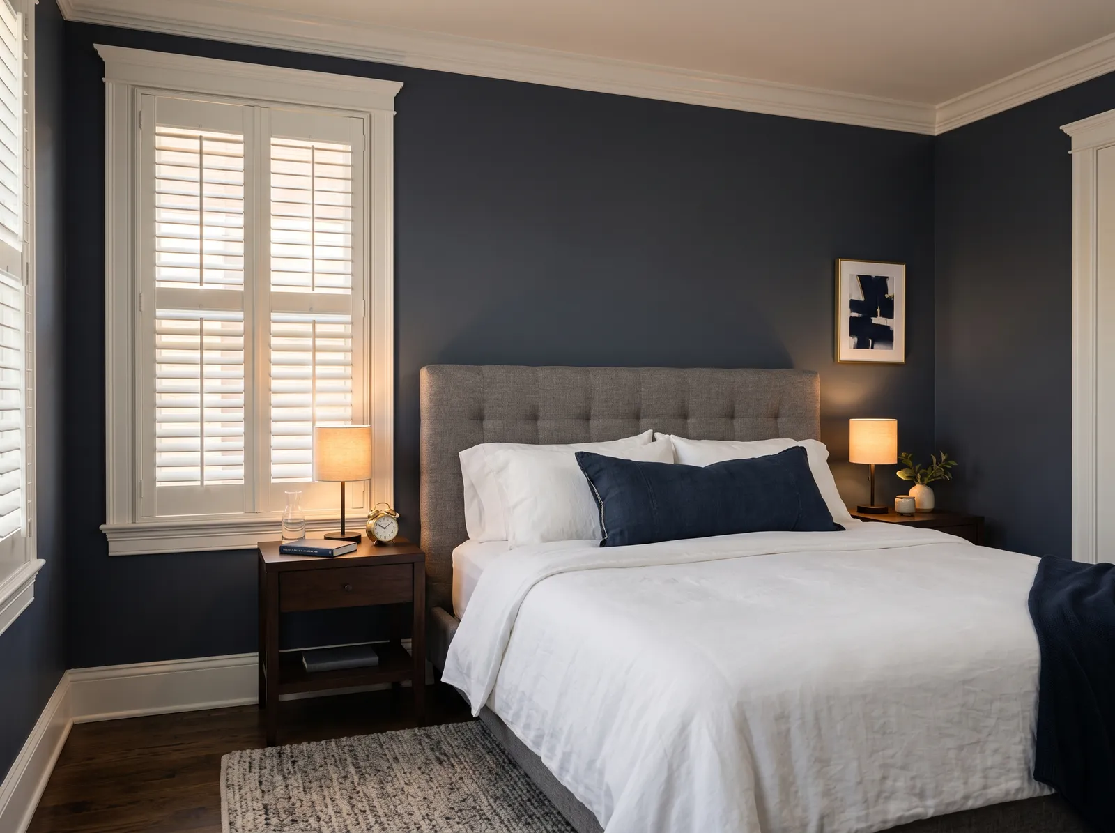
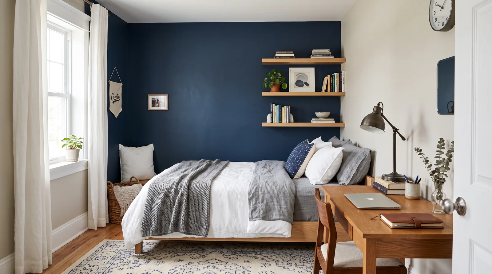
A soft, grayed navy that feels grown-up and snug, perfect when you want the bedroom to feel like a hug.
Navy blue is a deep, moody shade that brings instant drama and sophistication to a bedroom. Here, those dark navy walls wrap the space, paired with a soft gray tufted headboard, dark wood nightstands, and a textured gray rug. The room feels incredibly snug, cozy, and perfect for winding down. This combination works so well because the crisp white bedding and glowing bedside lamps break up the dark backdrop, keeping it from feeling gloomy. It's a gorgeous look if you want a peaceful, cocoon-like sanctuary.
SEE GOTHAM GRAY ON YOUR WALLS →
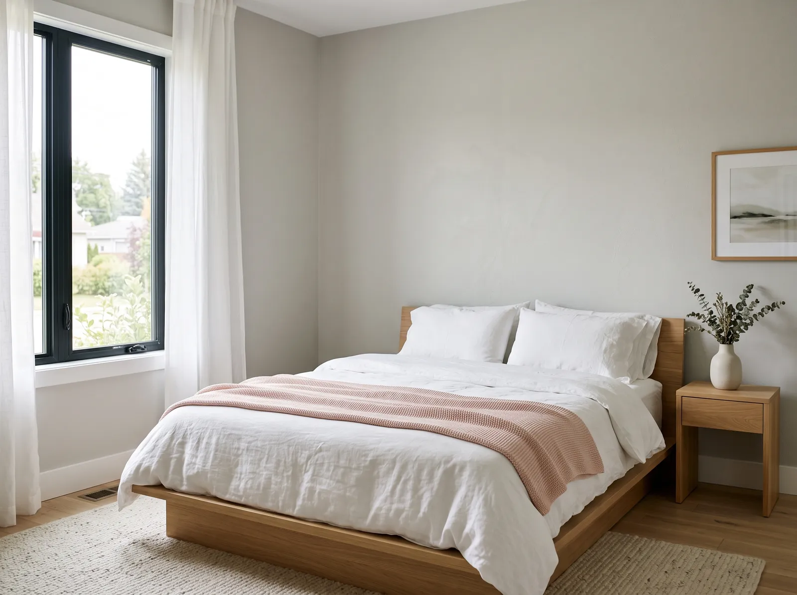
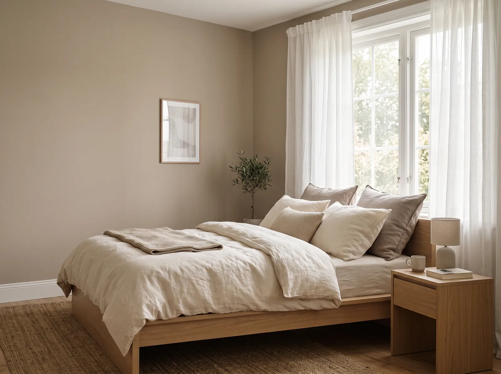
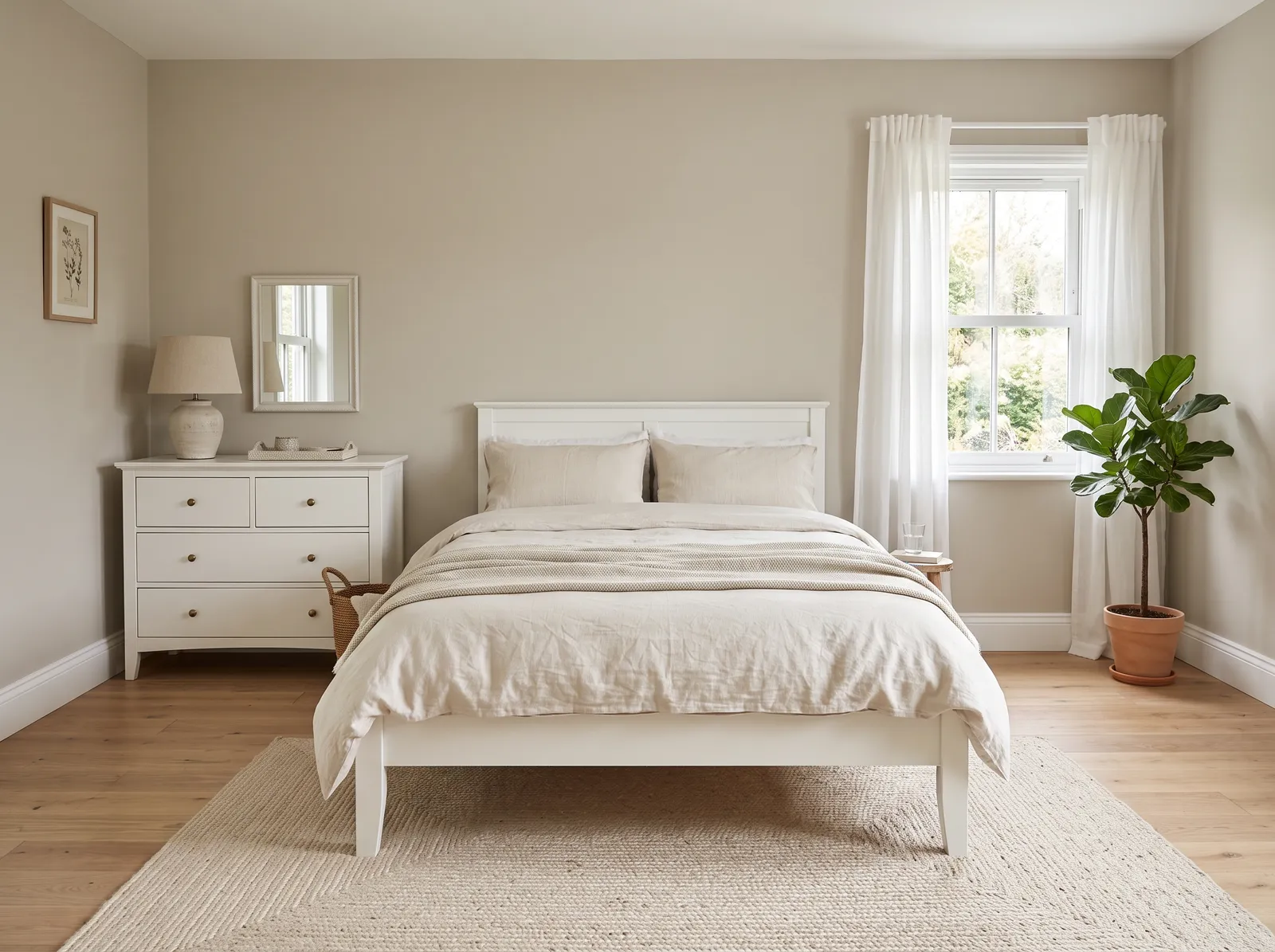
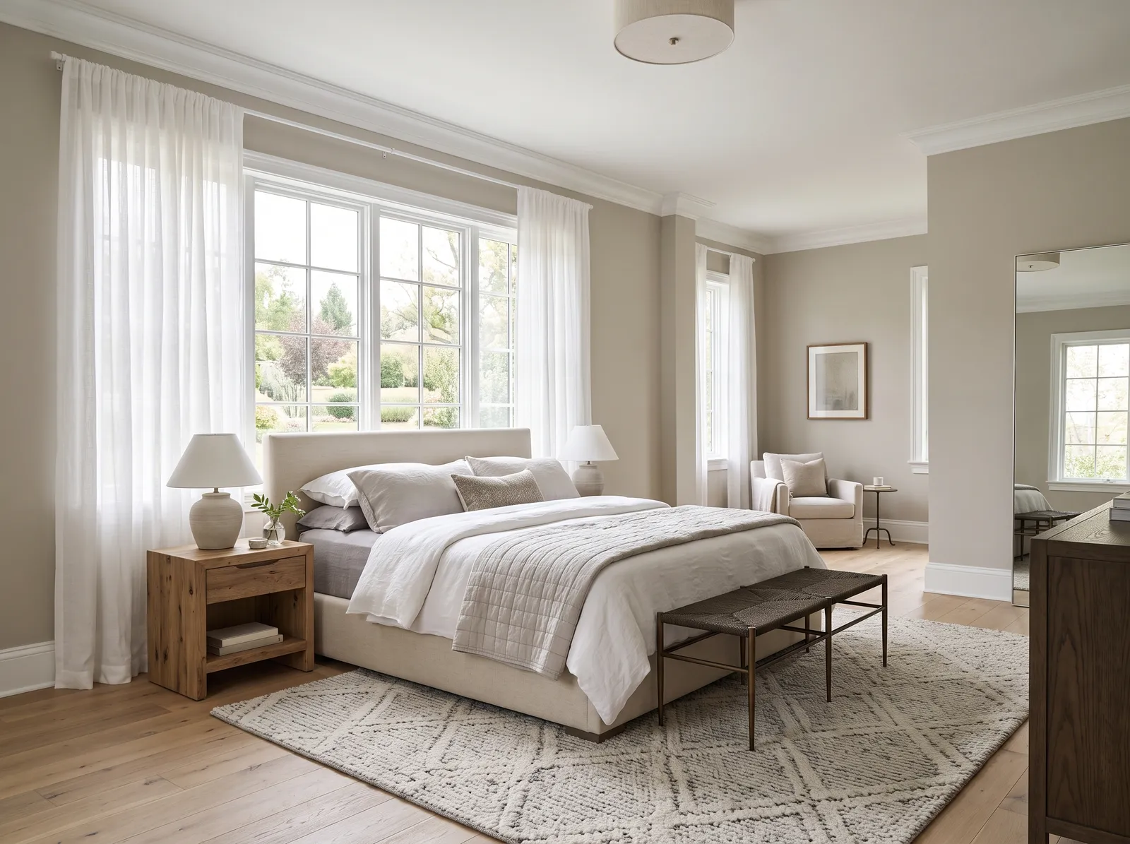
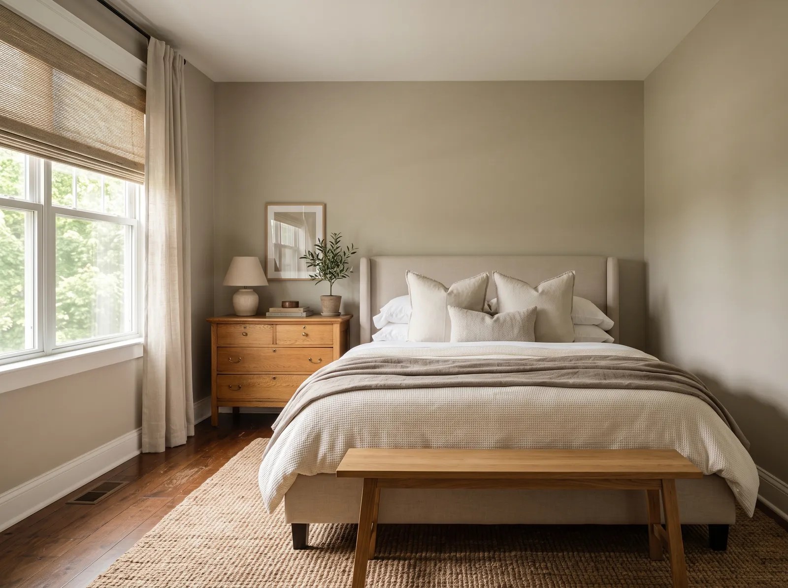
A soft mix of gray and beige that goes with everything and keeps the room feeling warm and put-together.
Taupe is a soothing, earthy gray-brown that brings instant comfort to a space. In this bedroom, that gentle taupe wraps the walls, while a natural oak dresser and matching wooden bench add rich, golden-brown tones. The bed is layered in creamy linen cushions, all sitting on a textured jute rug. The entire room feels incredibly calm, quiet, and snug. This combination works beautifully because layering different shades of beige and natural wood creates depth without any jarring contrast. It is perfect for anyone who wants a peaceful sanctuary.
SEE CHINA CLAY ON YOUR WALLS →
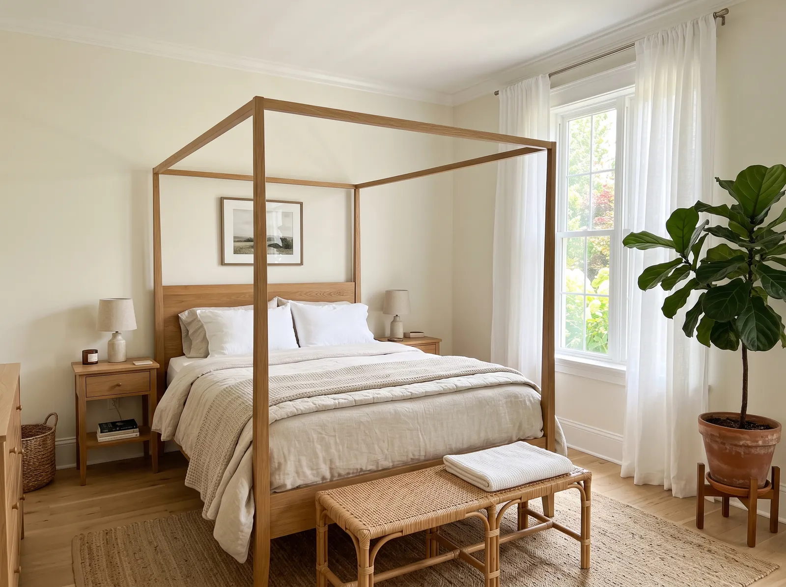
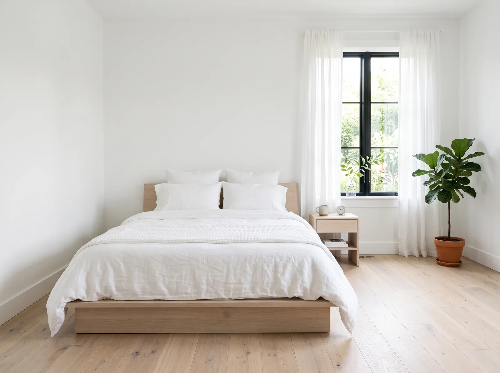
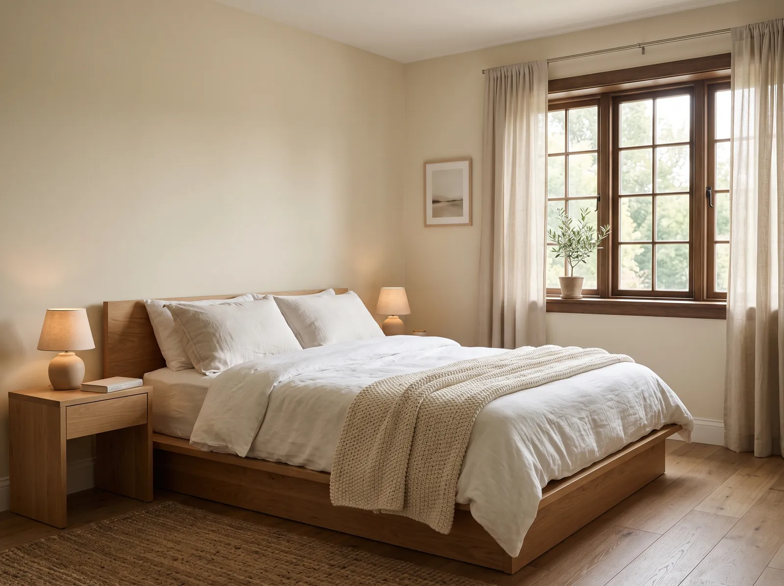
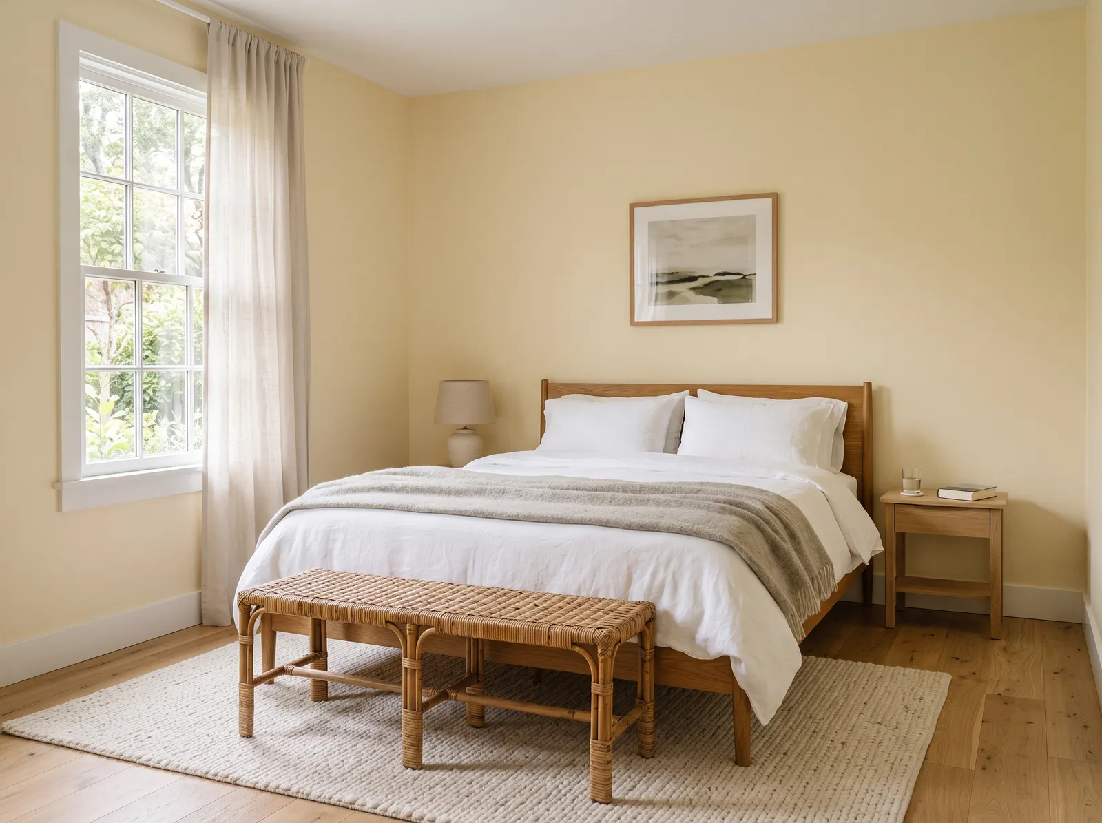
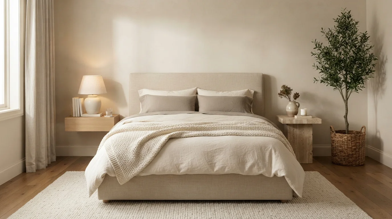
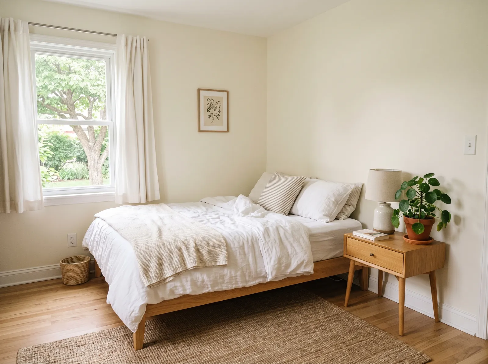
A creamy white with no chill to it, the kind of bright, restful base that lets your bedding and wood do the talking.
Cream is the friendliest base color there is, offering a soft, sunny backdrop that never feels stark. In this bedroom, that creamy hue wraps the walls, matching the airy white curtains and soft beige bedding. Light oak wood defines the canopy bed and woven bench, while a textured jute rug grounds the space. A vibrant green fiddle-leaf fig adds a splash of life in the corner. The entire room feels incredibly calm and restful. This combination works because natural wood and soft neutrals inherently belong together. It is perfect for anyone wanting a peaceful, organic sanctuary.
SEE GREEK VILLA ON YOUR WALLS →
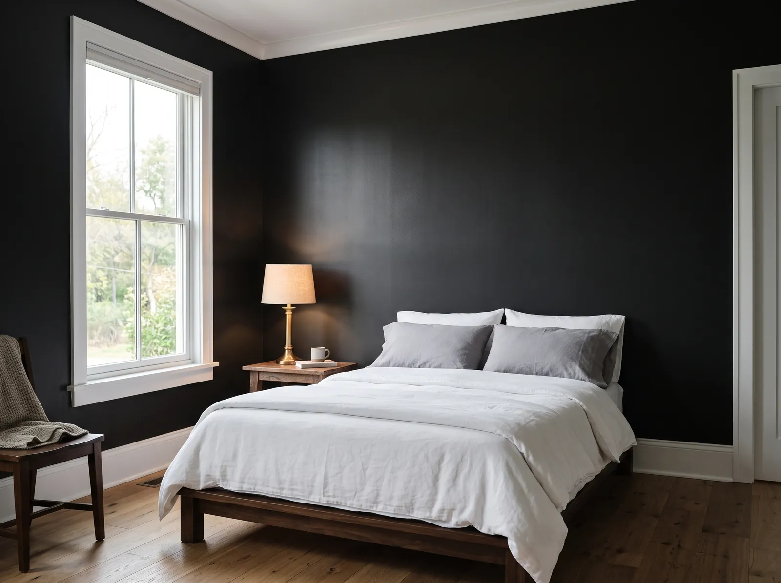
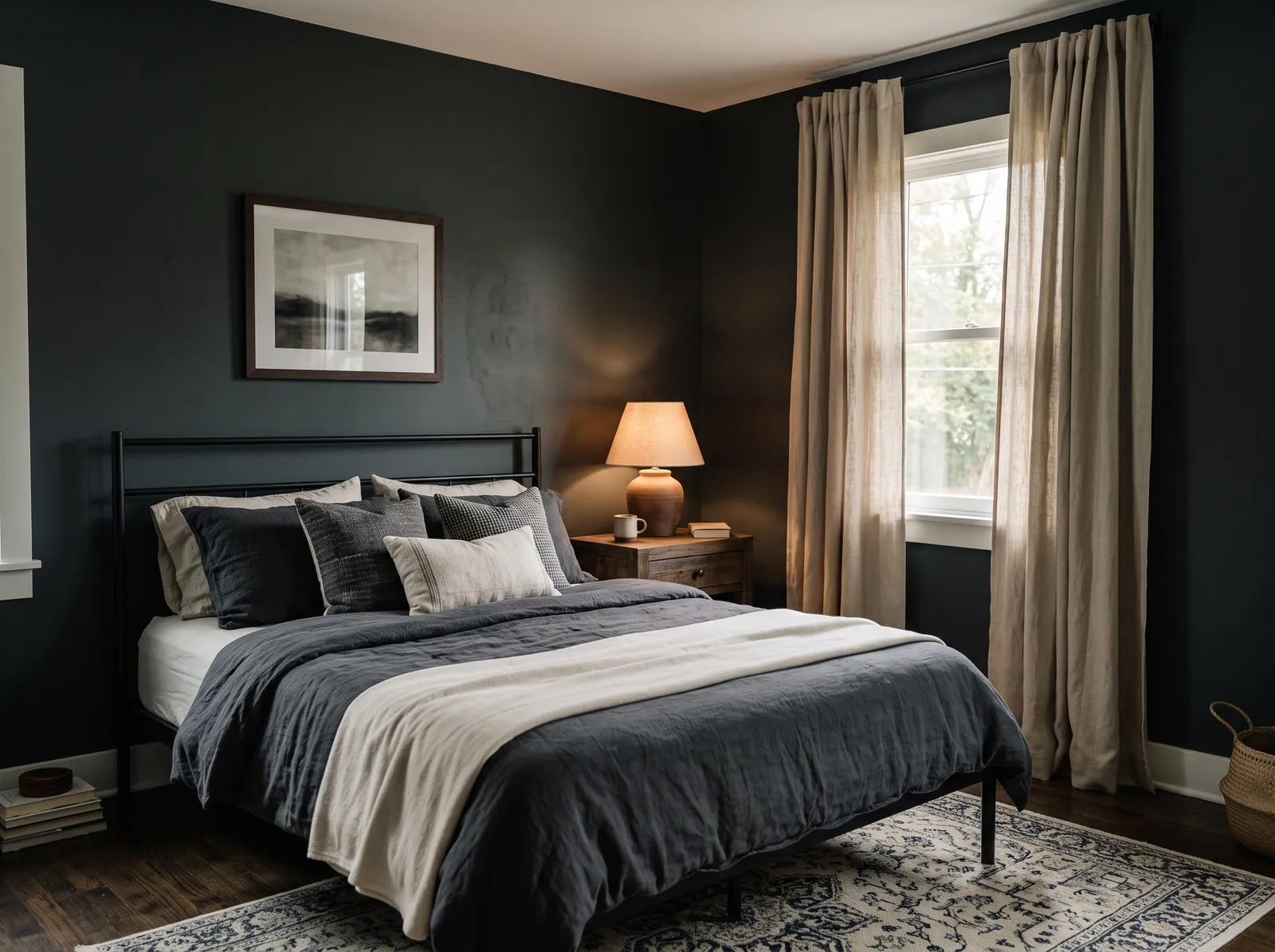
A deep, soft near-black that turns the bedroom into a dim, dreamy cave where sleep comes easy.
Charcoal is a deep, dramatic gray-black that instantly brings a sense of intimacy to a room. In this bedroom, those dark walls wrap the space, paired with a matching slate-gray duvet and dark pillows. Oatmeal-colored linen curtains frame the window, while a warm wooden nightstand and a patterned cream rug soften the floor. The room feels incredibly cozy, snug, and quiet. This combination works beautifully because the light curtains and cream rug break up the darkness, keeping the space from feeling like a cave. It is perfect for anyone who loves a moody, sleep-friendly sanctuary.
SEE BLACKOUT ON YOUR WALLS →
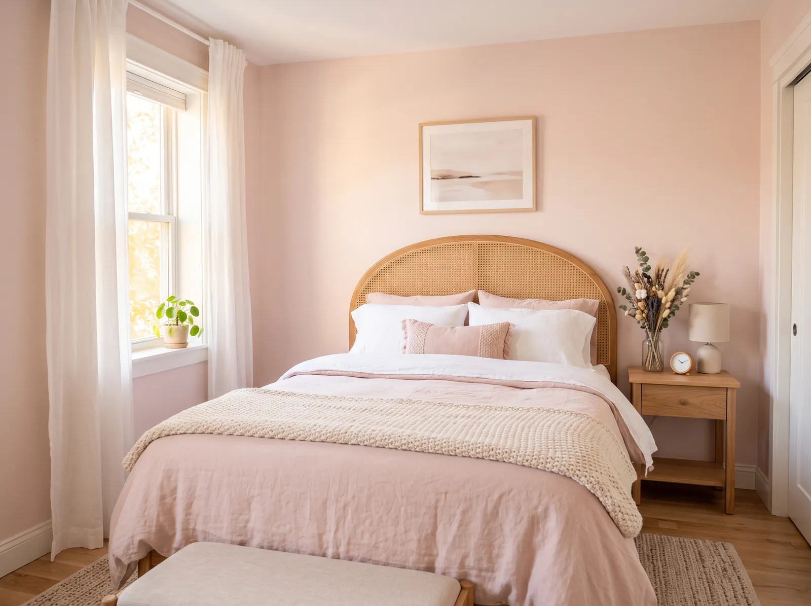
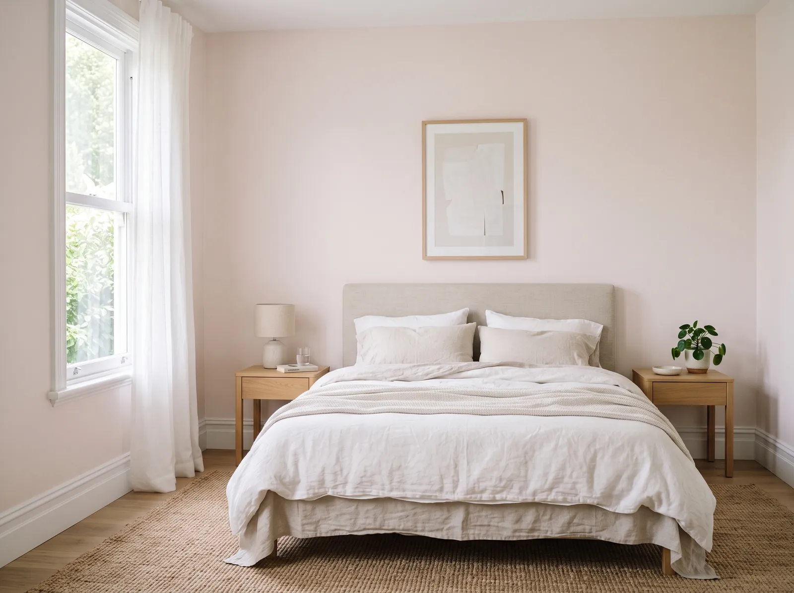
A barely-there pink that warms the room like soft skin in lamplight, gentle, pretty, and never loud.
Blush pink is a sweet, dusty pastel that brings instant warmth to a bedroom. Here, this gentle shade wraps the walls, beautifully complementing the light wood nightstand, woven cane headboard, and textured beige rug. White curtains and crisp linens keep the space feeling airy, while rosy cushions add a touch of depth. The room feels incredibly calm, cozy, and serene. This combination works so well because the natural wood and woven textures ground the soft pink, keeping it sophisticated rather than sugary. It is perfect for anyone wanting a peaceful, dreamy sanctuary.
SEE TAPESTRY BEIGE ON YOUR WALLS →
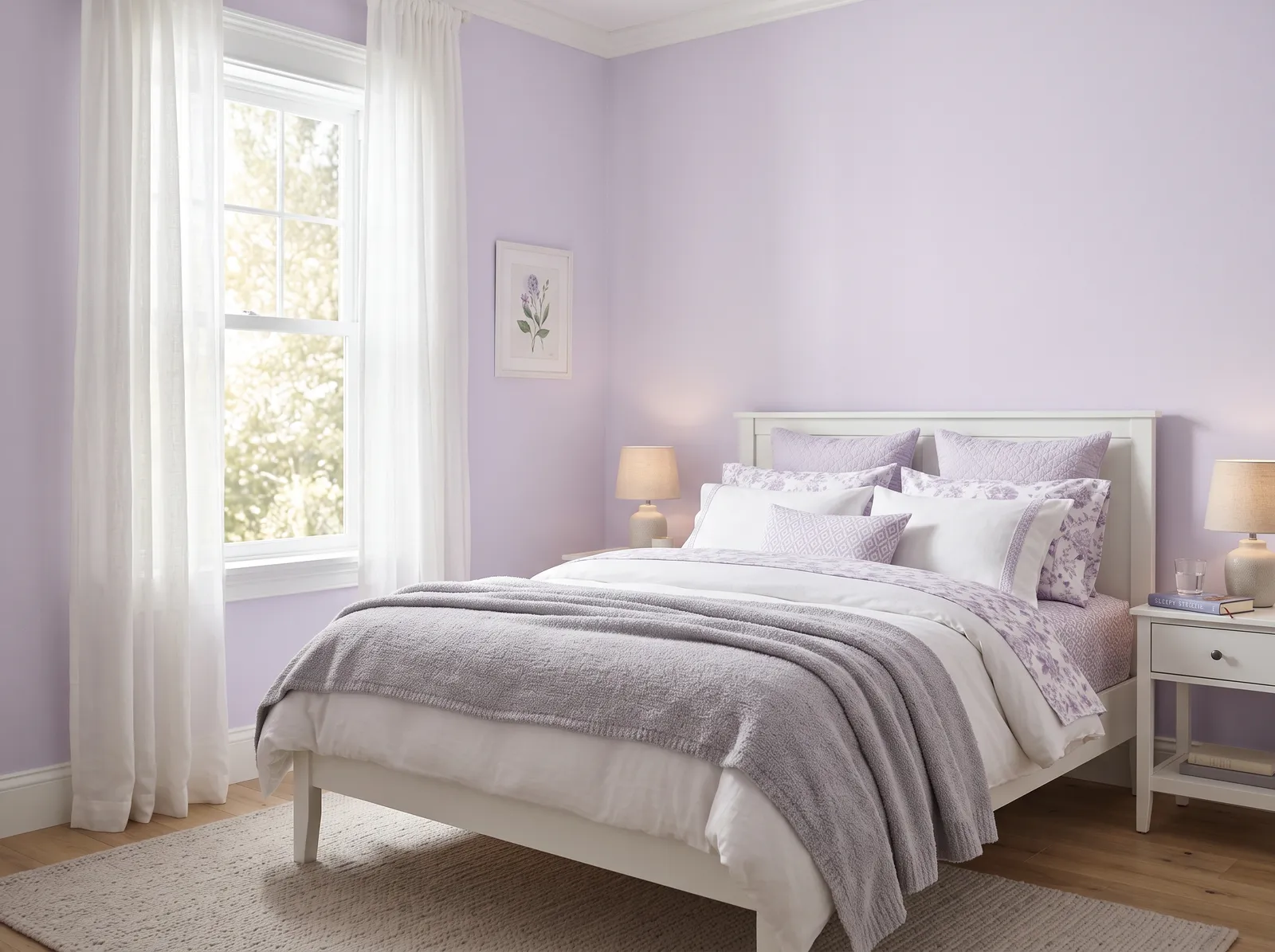
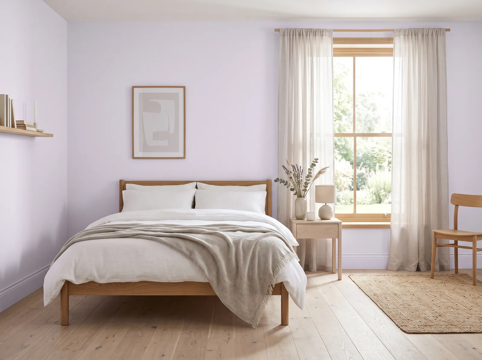
A whisper of lilac that feels calm and a little dreamy, soft enough to read as a pale, restful gray-purple.
Lavender is a soft, dreamy purple that brings a sense of quiet magic to a space. In this bedroom, that gentle lilac shade covers the walls, paired beautifully with a crisp white bed frame, matching white nightstands, and airy white curtains. A textured beige rug grounds the floor, while layers of lavender and grey bedding pile on the comfort. The entire room feels incredibly calm, serene, and restful. This combination works so well because the clean white accents keep the pastel purple from feeling too sugary. It is perfect for anyone wanting a peaceful, feminine retreat.
SEE TINTED IRIS ON YOUR WALLS →
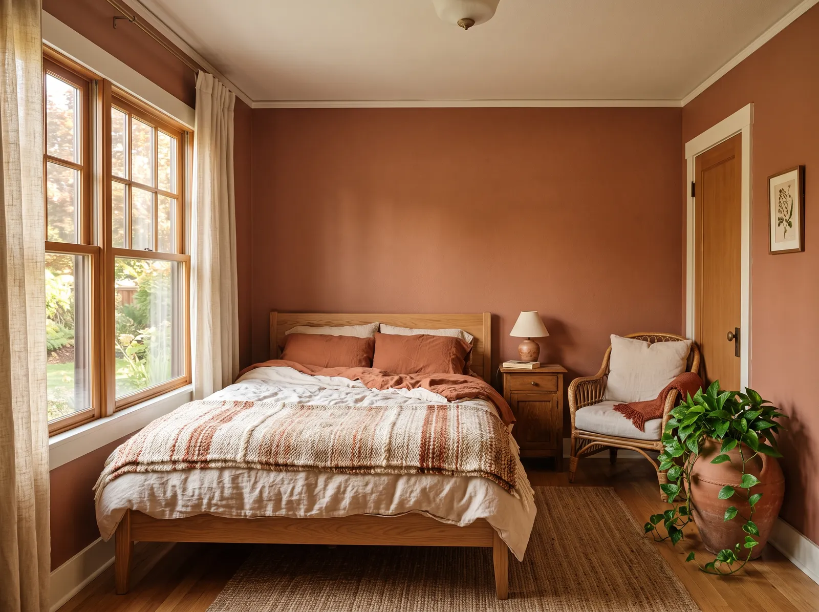
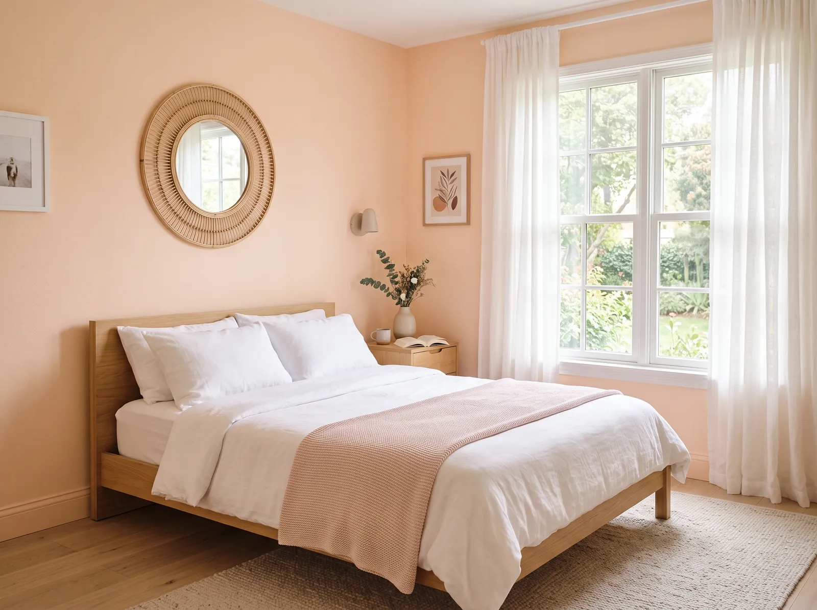
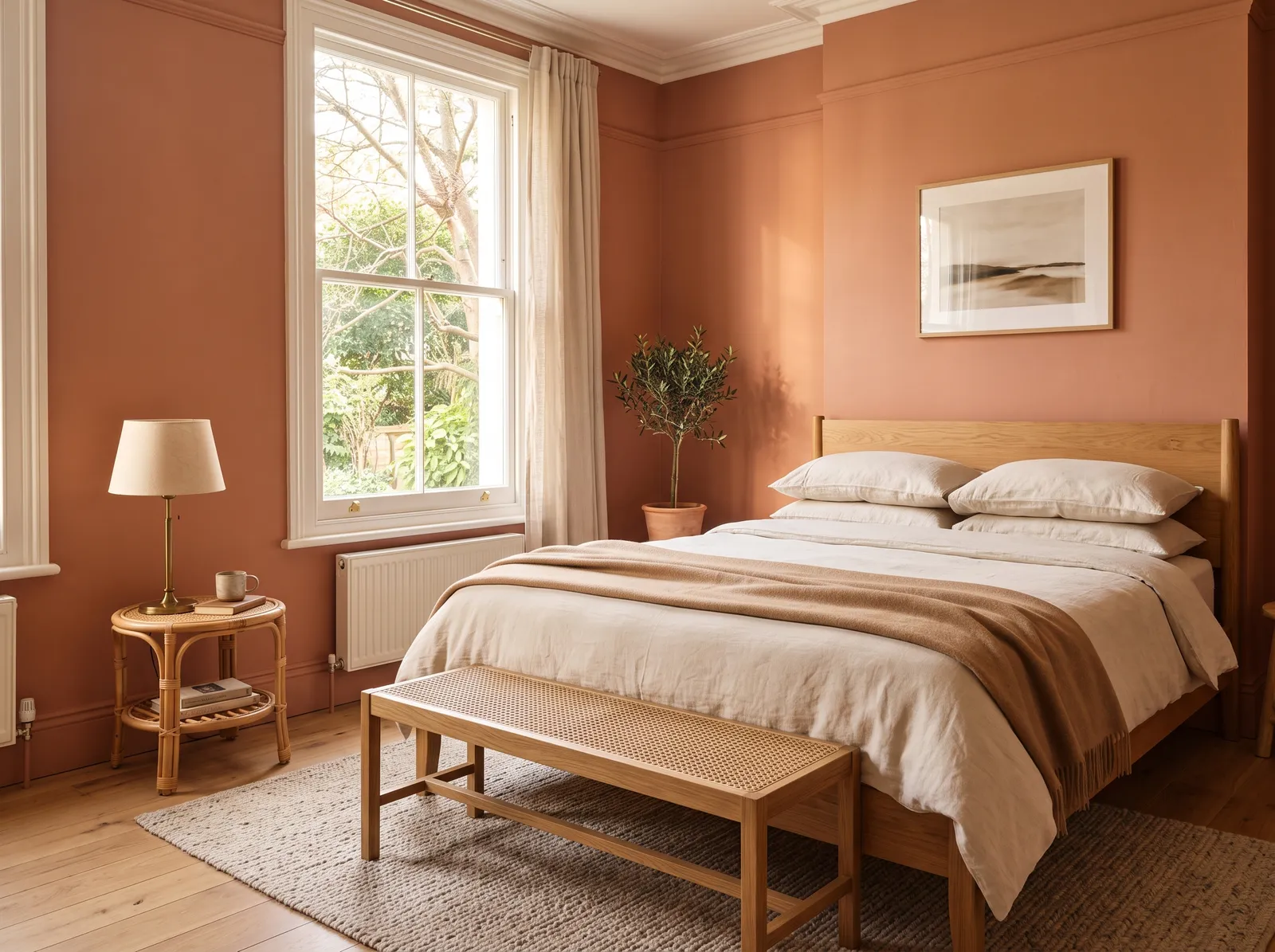
A sun-baked clay color that feels earthy and warm, like a quiet room somewhere sunny and far away.
Terracotta is a rich, earthy clay-orange that instantly grounds a space. Here, it wraps the walls in a comforting embrace, paired with a light wood bed frame, a woven jute rug, and a cozy wicker accent chair. Creamy linen curtains soften the large window, while a leafy green plant adds a splash of life. The entire space feels incredibly snug and peaceful. This combination works beautifully because the natural wood tones and organic textures balance the deep, saturated wall color. It is perfect for anyone who wants their bedroom to feel like a permanent autumn retreat.
SEE SPICED CARROT ON YOUR WALLS →
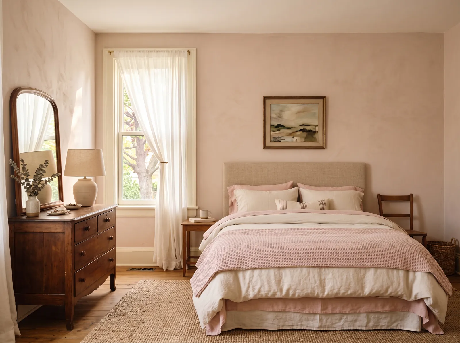
A soft pink-beige plaster tone, a designer favorite that glows warm by day and turns rosy at night.
Dusty blush is a gentle, clay-kissed pink that brings instant warmth without feeling overly sweet. In this bedroom, that soft blush coats the walls, beautifully matching the rose-toned bedding and cushions. A dark wood cabinet adds vintage weight, while a natural jute rug grounds the space in earthy tan, and sheer white curtains let daylight filter in. The entire space feels incredibly serene, cozy, and quiet. This combination works because the deep wood tones keep the pastel pinks from looking childish. It is perfect for anyone wanting a peaceful, romantic sanctuary.
SEE WILD RICE ON YOUR WALLS →
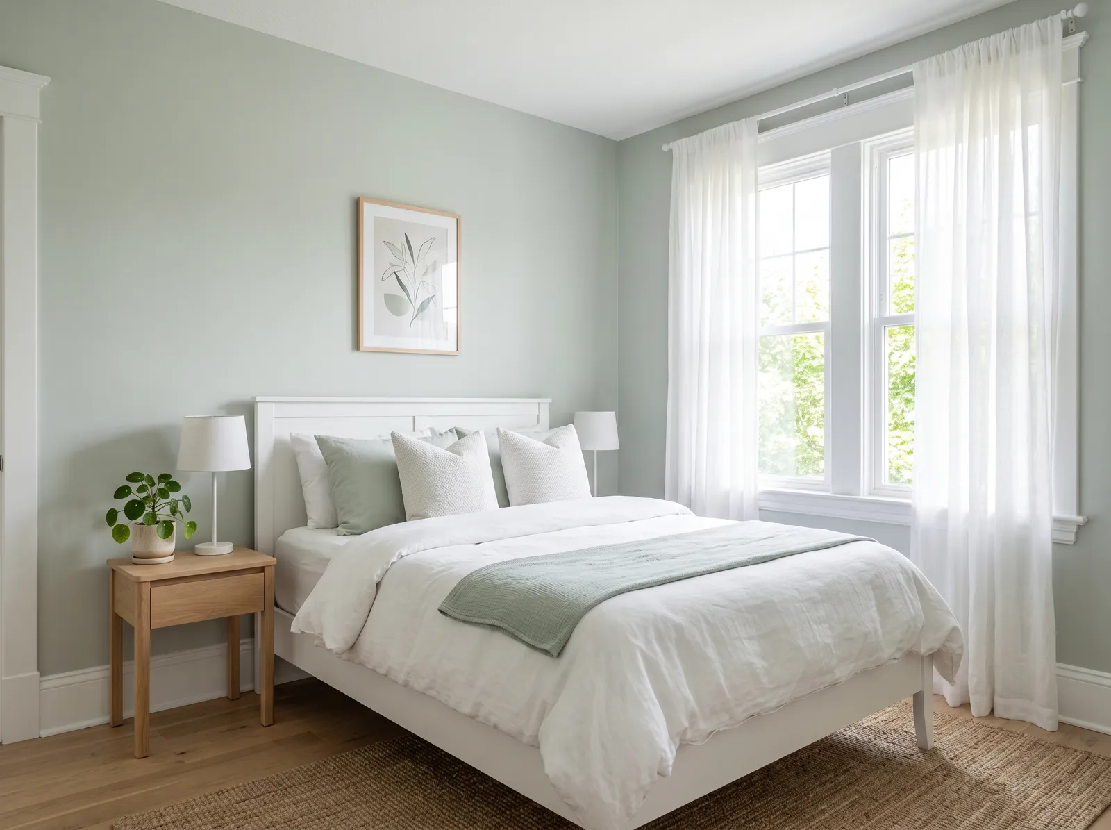
The light, airy green-gray everyone reaches for, fresh as sea air and easy to live with in any light.
Sage green is a quiet, earthy pastel that brings the outdoors inside. In this bedroom, that soothing sage covers the walls, matching the soft green throw blanket and accent pillows. A clean white bed, sheer curtains, and a light oak nightstand keep the space feeling airy, while a textured jute rug anchors the floor in natural brown. The entire room feels incredibly calm and breezy. This combination works so well because the organic wood tones ground the cool, light walls. It is perfect for anyone wanting a peaceful, nature-inspired sanctuary.
SEE SILVERED SAGE ON YOUR WALLS →Bedroom Wall Color Combinations
A wall color never works alone. These are the full schemes from the rooms above — the lead color first, then the supporting colors that make the photo work.
A gentle gray-green that feels like morning light through leaves, quiet, fresh, and easy to wake up to.
TRY THIS PALETTE →A rich, foggy forest green that wraps the room like a quiet wood and makes the bed feel like a retreat.
TRY THIS PALETTE →A soft blue with a touch of green, like still water, it makes the whole room feel cool, clean, and restful.
TRY THIS PALETTE →A soft, grayed navy that feels grown-up and snug, perfect when you want the bedroom to feel like a hug.
TRY THIS PALETTE →The easiest, most reliable move is a soft white trim and ceiling against any of these wall colors. It keeps the room crisp and lets the wall color be the star. With warm colors like Setting Plaster or Revere Pewter, pick a warm white so the trim does not look stark; with cooler Pigeon or Dove Gray, a cleaner white reads well.
Think about what is already in the room. Warm wood floors and brass or bronze fixtures love greens and warm neutrals like Sage and Revere Pewter. Cooler gray or whitewashed floors and nickel or chrome fixtures pair naturally with blues and grays like Pigeon, Dove Gray, and Hale Navy. Match your bedding and curtains to the same warm or cool lane so the whole room agrees.
Bedroom Color Ideas by Color
Set on a color family already? Each page has its own real rooms and picks.


Calming, Cozy, or Moody — Bedroom Colors by Feel
Rooms are a feeling first. Each mood has its own full guide — the chips preview its top picks.
Light or Dark Bedroom Colors?
Go Light (LRV 60+) If…
The room is small, faces north, or has to work at every hour. Light warm colors make it feel bigger and stay calm in evening light — the light you actually live in.
Go Dark (LRV Under 20) If…
You want the cocoon effect and the room has real daylight. Dark works best on one feature wall — or fully color-drenched in a large room with good windows.
Light changes paint more than anything else, so check your window direction first. North-facing bedrooms get cool, flat light all day, which can make cool grays and blues look gray and lifeless. In those rooms, lean warmer. Setting Plaster, Sage, or Revere Pewter will hold their warmth where a cool gray would go dreary.
South and west rooms get strong, warm light, so they can carry cooler colors like Pigeon or Dove Gray without feeling icy. Remember a bedroom is used mostly at night under lamps, and warm bulbs pull every color warmer and darker. Always tape a real sample to the wall and look at it in the morning, midday, and at night under your own lights before you commit.
LRV, or Light Reflectance Value, runs from 0 (black) to 100 (white) and tells you how much light a color bounces back. It is the fastest way to predict whether a color will feel airy or snug before you paint. High-LRV colors like a soft Dove Gray keep a small or dark bedroom feeling open and bright.
For a cozy, enveloping bedroom, drop the LRV. A mid-tone like Revere Pewter or Pigeon settles the room down, and a deep color like Hale Navy goes full cocoon. Just be honest about your windows. A low-LRV color in a dim north room can feel like a cave, so if you want dark and you are short on light, plan for good lamps and lighter trim to balance it.
Your Kind of Bedroom
Every variant has its own full guide with picks tuned to that room.
See It. Love It.
Paint It.
Upload one photo of your bedroom and try every color on this page on your own walls — in your own light, before you buy a drop of paint.

SageBeforeThe Right Finish for Bedroom Walls
Bedrooms are low-traffic and low-moisture, so you do not need a tough, shiny finish here. A flat or matte finish is the most popular choice because it hides wall flaws, soaks up light, and gives that soft, calm look that suits a sleeping room. The trade-off is it is harder to wipe clean, which matters little in a room with no cooking grease or splashes.
If you have kids, pets, or scuff-prone walls, step up to an eggshell for a touch more washability with almost no glare. Save satin and semi-gloss for the trim, doors, and any closet shelving, where the harder surface stands up to hands and handles. Keep the ceiling flat to avoid drawing the eye upward at night.
Common Bedroom Paint Mistakes
The biggest mistake is choosing a color from a tiny chip in the store. Bedroom light is dim and warm at night, and a color that looked perfect under bright store lights can go muddy or cold at home. Always sample on the wall and live with it for a couple of days.
The second mistake is going too cool in a room that needs warmth, leaving it feeling cold and unwelcoming, the opposite of what a bedroom should be. People also reach for shiny finishes that throw glare and show every bump, and they paint dark colors in dim rooms without adding light to carry them. Pick your warm-or-cool lane, keep the finish low-sheen, and test before you buy a full gallon.
Wall area, gallons, and a real price range for the bedroom — walls, trim, and ceiling.
About Bedroom Paint Colors
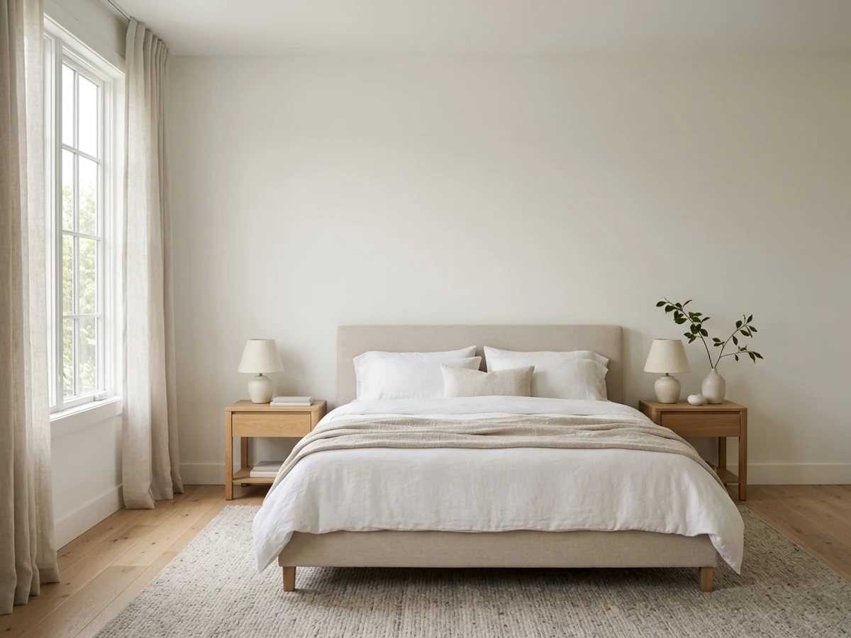
A bedroom is the one room where the color works for you, not your guests. It is the last thing you see at night and the first thing you see in the morning, so it should feel calm and easy to live with. That points most people toward soft, muted colors instead of loud ones.
The best bedroom colors fall into a few quiet families: blues, greens, grays, warm neutrals, and soft pinks. A blue or green leans restful and cool. A warm neutral like Revere Pewter feels cozy and grounded. A muted pink like Setting Plaster adds quiet warmth without going girly. Every color on this page is mixed to order at the store, so once you find a shade you love, it can be matched across brands no matter where you buy your paint.
Below we walk through the best color directions, how your bedroom light should steer the choice, the right finish, how to read LRV, what to pair, and the mistakes that trip people up.
The Questions Everyone Asks
What color should I paint my bedroom?
If you want one answer, start with the safe picks above — Revere Pewter, Hale Navy, Quietude, Back to Nature. They read well in any light and survive furniture changes. Then check the light: strong afternoon sun wants a step cooler, a north-facing room wants a step warmer.
What is the most relaxing paint color for a bedroom?
Soft blues and muted greens are the most relaxing choices because they read as calm and restful. Pigeon is a quiet blue and Sage is a gentle green; both suit sleep without feeling cold. If you prefer warmth, a soft pink like Setting Plaster or a greige like Revere Pewter feels cozy and calming too.
Should a bedroom be light or dark?
It depends on the mood you want and how much light the room gets. Light colors like Dove Gray keep a small or dim room feeling open and airy. A darker color like Hale Navy makes a cozy, cocoon-like space, but it works best where you have good windows and lamps and crisp white trim to balance it.
What sheen should I use in a bedroom?
Flat or matte is the usual pick for bedroom walls. It hides wall flaws, has no glare, and gives a soft, calm look. Step up to eggshell if you want easier cleaning, and save satin or semi-gloss for trim and doors.
What is LRV and why does it matter for a bedroom?
LRV stands for Light Reflectance Value, a 0 to 100 scale of how much light a color bounces back. Higher numbers keep a bedroom bright and open, lower numbers make it cozy and enveloping. Checking LRV helps you predict the feel before you paint, especially in a room with limited natural light.
How do I pick a bedroom color for a north-facing room?
North-facing rooms get cool, flat light, so warm colors hold up best. Setting Plaster, Sage, and Revere Pewter keep their warmth where a cool gray can look dreary. Always tape a sample to the wall and check it morning, midday, and at night under your own lamps.
What color trim goes with a bedroom wall color?
A soft white trim works with almost any bedroom color and keeps the room crisp. Use a warmer white with warm colors like Setting Plaster or Revere Pewter, and a cleaner white with cooler colors like Pigeon or Dove Gray. Match the trim to the warm-or-cool lane of your wall.
Can I get the same bedroom color in a different paint brand?
Yes. Every color shown here is mixed to order at the store using a tinting machine, so a shade you love can be cross-matched between brands. Bring the color name or a sample and your store can match it no matter which brand you buy.
What two-color combination works best in a bedroom?
The reliable pattern is a quiet main color plus one deep accent on a single wall. Keep trim and ceiling in one warm white so the two colors are the only event in the room — the combination cards above show complete schemes from real rooms.
What colors make a bedroom look bigger?
High-LRV, slightly warm colors — LRV 60–75 is the sweet spot. Paint the walls and trim close to the same light color so the corners blur, and keep the ceiling white. Stark cool white actually works against you; it creates hard shadows that show the room's edges.
Is it okay to paint a bedroom dark?
Yes, if you do it on purpose. Dark bedrooms work when the room has real daylight and the darkness is total — walls, trim, even the ceiling — so it reads as a designed cocoon, not a dim room. If you are unsure, start with the headboard wall only; it gives 80% of the effect and repaints in an afternoon.

Ask a Question