Plummett
Farrow & Ball's fishing-lead gray, reviewed honestly: where the green tinge stays architectural, the small rooms that swallow it, and when Down Pipe is still the better call.

Jessica has spec'd whites and neutrals for more than 300 rooms and keeps a sample wall of painted drawdowns in her studio. Every color review is checked against real reader rooms in the comments and re-tested when a formula changes. About the testing process →
- 1Black Fox7
- 2Pewter Green12
- 3Plummett27
- 4Stardew43
- 5Upward57
The Fast Verdict
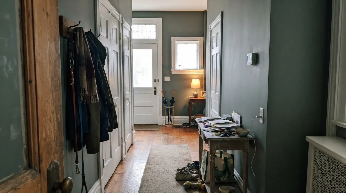
Plummett is the lead gray you can actually live with on four walls: mid-depth, hard-edged, faintly green, industrial without going cave-dark. It is what people reach for when they love Down Pipe on Instagram and then stand in their own hallway. Give it daylight, cool whites, and pale or espresso wood and it looks custom; give it a tiny north room or honey oak and the green comes out swinging.
Halls, stairs, and entries that need architecture · kitchen cabinets in Modern Eggshell · studies and offices with real daylight · anyone who finds Down Pipe too heavy
You want a warm greige · the room is small, north, and lamp-shy · your floors are honey oak · you came for charcoal drama (use Down Pipe)
- Liveable lead gray — industrial body without Down Pipe's weight
- Halls, stairs, and entries look designed, not painted
- Kitchen cabinets in Modern Eggshell hide wear better than pale gray
- Green tinge stays a whisper in balanced daylight
- Color-drenches a daylit study without turning it into a cave
- Intensifies and goes greener in small or north rooms
- Fights honey oak, golden maple, and beige carpet
- Too hard-edged if you wanted F&B greige softness
- Cool LEDs push the olive; warm bulbs are part of the job
What Color Is Plummett, Really?
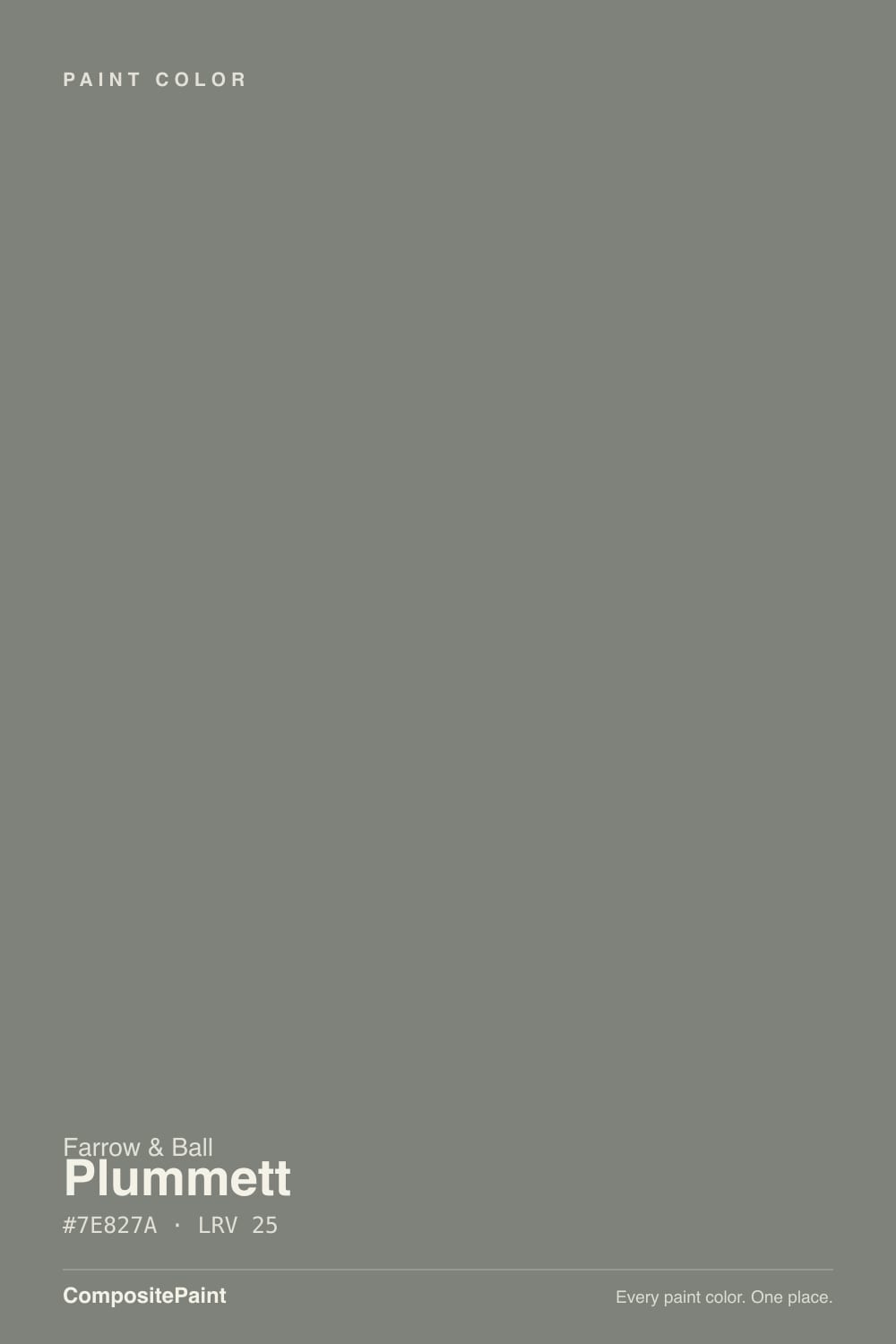
Plummett is named for the lead weights anglers clip to a fishing line, and that is the whole idea: a dense, architectural gray with a slightly industrial edge, not the soft English greige this brand is famous for. Farrow & Ball files it as one of its hard-edged greys, and owners who sample it next to Ammonite or Skimming Stone always notice the drop in softness. The useful sibling is Down Pipe (No. 26, LRV 13), the original gutter-lead gray — bluer, darker, and the one with the reputation. Plummett is the lighter lead: same metal family, a full step up in light, and a green tinge instead of Down Pipe's blue.
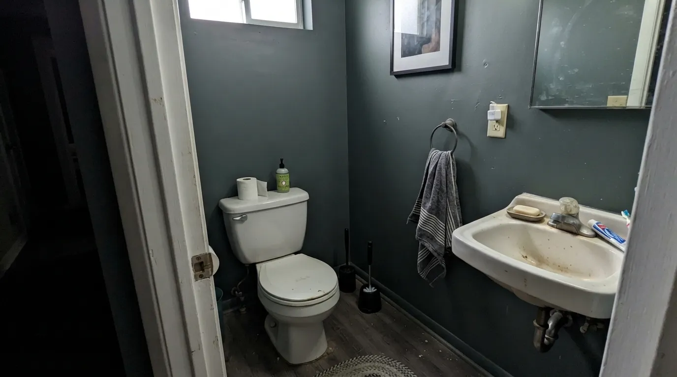
At LRV 27 it is a genuine mid-tone, deep enough to throw a shadow and light enough to run a whole room. That number is why it works where Down Pipe would close a space in. The official warning is the one people actually hit: it intensifies in smaller rooms. A chip that reads as even medium gray on a hall sample board can look a shade deeper and noticeably greener once it wraps a powder room, a windowless study, or a narrow Victorian stair. Use Dark Tones primer. A mid-tone undercoat will ghost through this density.
Undertone in one line: cool gray first, a green tinge second — never the blue in Down Pipe, never violet. If your sample goes olive, the room is pulling green (north light, a lawn outside the window, cool LEDs). If it reads as plain lead, you have balanced daylight. Both versions are the same paint being honest about the room.
Where It Shines
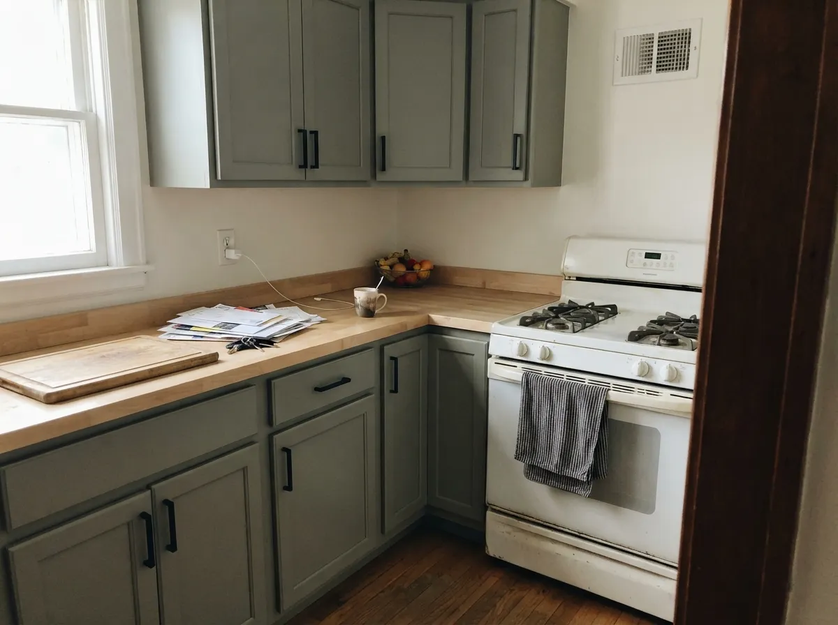
This color is built for architecture, not coziness. In a hall or stair with a decent window it reads as custom millwork gray — hard, even, slightly industrial — and Wevet or Strong White trim keeps the edges crisp without the yellow flash Pointing can add. Its second home is the kitchen cabinet: factory-sprayed in Modern Eggshell it looks like metal without being metal, and it hides the finger marks a paler gray would broadcast. Pair it with pale oak, blackened steel, concrete, unlacquered brass that has actually aged, and linen that is flax not cream.
Where It Fails
Almost every regret story about Plummett follows one of three scripts, and all three are visible on a sample board if you know where to look. None of them are a bad batch — but if your room matches one, this is not your gray, and a bigger sample will only confirm it.
Farrow & Ball says it intensifies in smaller spaces, and that is the number-one surprise in real rooms. Wrap a powder room or a narrow hall and the mid-gray chip drops a shade; the green that was a whisper on the card becomes a faint olive cast on all four walls. If you wanted even lead, you now have something moodier and greener than you bought. Keep it on a hall that borrows light, or step to Pigeon (No. 25, LRV 35) in tight rooms.
Cool green-gray and yellow-orange wood are complements, so they amplify each other: the floor goes pumpkin, the wall goes olive. Builder oak, golden maple, and beige carpet all do this. Plummett wants pale white oak, walnut, espresso, painted floors, or a large rug between it and anything honey. If the oak stays, pick a warmer gray.
On a tiny card it can pass for a serious neutral. On four walls the industrial edge is the point — hard, slightly green, a little urban. If you wanted Farrow & Ball softness (Ammonite or Skimming Stone), Plummett will feel cold and a bit municipal. That is not a lighting problem. That is the color.
Room by Room
This is the job it was mixed for: borrowed light, architectural lines, a gray that makes millwork look intentional. Dead Flat or Estate Emulsion; Wevet or Strong White on trim and doors in Estate Eggshell. It carries a long Victorian hall without the cave of Down Pipe and without the beige of a greige.
Factory-sprayed Plummett in Modern Eggshell is one of the better gray-cabinet calls in this deck: deep enough to hide knuckle marks, light enough that the room still works. Pair with Wevet or Strong White walls, pale oak or concrete-look counters, and aged brass or black hardware. Full kitchens of Plummett walls plus Plummett cabinets can go bunker; keep the walls lighter.
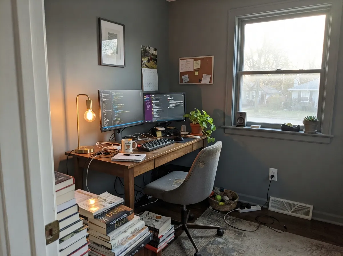
Color-drench a study that actually gets daylight and it reads like a London architect's office — lead walls, darker wood, a single lamp. In a windowless box it goes olive-heavy and slightly institutional. Eggshell for chair-rail scuffs; same color on the trim if you are drenching.
Works in a south- or west-facing living room with pale oak, linen, and black metal. Riskier in open plans that dump into a warm-cream kitchen, and a loss against honey floors. If the adjacent rooms wear Pointing, the temperature gap will show; Strong White or Wevet is the cleaner handoff.
Restful if you already like cool, mid-depth rooms; gloomy if you were hoping for F&B softness. Matte finish, warm 2700K lamps, flax bedding. North bedrooms without lamps are the olive-trap version of this color — skip them.
A front door or shutters on a Wevet, Pointing, or pale-gray house reads as architectural lead, especially in shade. Full-sun siding can flash green from the street and look like faded metal rather than a paint choice. Leave the body paler; put Plummett on the parts that are meant to look like metal.
Your Light Is the Risk
Balanced sun keeps it an even architectural gray; the green stays a whisper. This is the light that makes halls and cabinet runs look custom.
Cool daylight plus enclosure drops it a shade and pulls the olive forward. The chip lied; the room did not. Sample on the darkest wall.
Cooler and more industrial at midday; late sun warms it toward stone-gray for an hour. The shift is real but it does not become greige.
2700K bulbs soften the green and keep it lead-gray after dark. Cool white LEDs (4000K and up) turn it faintly olive and a bit municipal — swap bulbs before you repaint.
Most complaints about Plummett are a light mismatch. Upload a photo of your actual room and see it on your walls — then ask for the same wall in north light or evening lamps before you buy a single sample.
Need It From Another Brand?
Any paint counter can custom-tint Farrow & Ball No. 272 directly. If you would rather stay in one brand's own deck, these are the closest stock matches, measured as ΔE2000. Under 2 is a difference you will not see on the wall.
| Brand | Closest color | ΔE | LRV | |
|---|---|---|---|---|
| Behr | Letter GrayPPU24-20 · Behr | 1.8 | 27 | Color page → |
| Benjamin Moore | Hearthstone1601 · Benjamin Moore | 2.1 | 27 | Color page → |
| Valspar | Four-Wheel GrayV119-2 · Valspar | 2.4 | 26.5 | Color page → |
| PPG / Glidden | Phoenix FossilPPG1009-5 · PPG / Glidden | 1.3 | 28 | Color page → |
| Glidden | Phoenix FossilPPG1009-5 · Glidden | 1.3 | 28 | Color page → |
| Dunn-Edwards | Stieglitz SilverDET612 · Dunn-Edwards | 0.3 | 27 | Color page → |
Similar Farrow & Ball Colors
The nearest shades to Plummett within Farrow & Ball's own range, ranked by perceptual color distance — useful when you want the same look a touch lighter, darker, or warmer.
WCAG 2.1: AA is 4.5 : 1 for normal text, 3 : 1 for large text, AAA is 7 : 1.
Plummett vs the Colors You're Also Considering
Every Plummett sample board has the same rivals on it. The numbers show the real lightness gap — then it comes down to which risk you would rather live with.
Pick this when you love that metal-gray idea and still need to see across the hallway.
Farrow & Ball No. 26 · LRV 13Down PipePick this when you want the original lead-gray drama — darker, bluer, and still lighter than the internet claims, but not a four-wall color in most American rooms.
Pick this when you want gray you can live on, not a near-black that swallows the trim.
Farrow & Ball No. 31 · LRV 7RailingsPick this for joinery, a front door, or a drench that should read blue-black — the blue only shows in real light.
The closest neighbor is Mole's Breath (No. 276, LRV 23). It is a touch darker and warmer, sitting more toward a taupe-gray, while Plummett stays cooler and stonier. If your room has a lot of warm wood and you want the gray to blend in, Mole's Breath is friendlier; if you want the gray to stay crisp and slightly cool, Plummett is the pick.
De Nimes (No. 299, LRV 21) is a clearer blue-gray. Next to it Plummett looks more neutral and less denim, so choose De Nimes when you actually want visible blue, and Plummett when you want the color to read as a quiet gray.
Compared with Down Pipe (No. 26, LRV 11), which the rationale names directly, Plummett is markedly lighter and softer. Down Pipe is a near-charcoal statement; Plummett gives a similar mood with more of the wall staying legible, which is why it is the easier choice for full rooms.
Coordinating Colors
Plummett is cool and slightly green, so the whites have to stay cool or it will look dirty. Wevet is the trim default; Strong White is the wall white when you want a grey-based off-white instead of cream. All White is fine on a ceiling if you want a little more bounce than Wevet, and it still leans warm enough not to go optical-bright.
For darker punctuation, stay in the lead-and-metal family: Down Pipe on a door, Railings on an island or window bars. Studio Green inside bookcases is almost black and keeps the green story without turning the room olive. Skip Skimming Stone as a neighbor — it flashes pink, and pink next to green-gray is a fight.
Plummett vs Down Pipe: The Two Leads
Farrow & Ball has two colors named for lead, and the internet treats them as interchangeable. They are not. Down Pipe (No. 26) is the gutter-and-downspout gray — LRV 13, blue in real light, and lighter than its near-black reputation, but still a dark, dramatic color people put on islands, front doors, and the occasional brave hallway. Plummett (No. 272) is the fishing-weight gray — LRV 27, green-tinged, hard-edged, and the one that can actually run four walls in an ordinary American house.
If you are standing in a store holding both chips, the test is simple: do you still want to see the far end of the hall at 4pm in February? If yes, Plummett. If the room is a powder room, a door, or a kitchen island and you want the original lead drama, Down Pipe. Painting Plummett in a tiny north space will not get you Down Pipe; it will get you a greener, heavier version of Plummett. That is a different problem.
Floors, Metal, and Wood
Pale white oak, whitewashed pine, and painted floors are the easy yes. Walnut and espresso are the expensive yes — the cool gray makes the brown look deliberate. Honey oak, golden maple, orange builder stain, and beige loop carpet are the no: they pull olive out of Plummett and look cheaper against it.
On the metal side it is at home: blackened steel, unlacquered brass that has actually tarnished, concrete counters, soapstone, zinc. Shiny yellow brass and warm gold plumbing will fight the green the same way honey oak does. If the hardware is already gold and staying, sample twice — once next to the metal, once at night under the bulbs you will actually use.
Three Ready Palettes Built on Plummett
A color is never alone on the wall. These are complete combinations in the 60-30-10 pattern, with the reason each one holds together. Every one opens in the visualizer.
Wevet is the coolest white in this deck, so it does not yellow next to Plummett the way Pointing can. Down Pipe on the door keeps the lead-gray family in one house; All White on a porch ceiling stops the exterior from going gloomy.
Try this palette in your roomStrong White's grey-based white is the right wall temperature for industrial cabinets; cream would make Plummett look dirty. Railings on one run (island or hood) adds the blue-black punctuation; Wevet keeps the ceiling from going yellow.
Try this palette in your roomDrench the study in Plummett, then hand off to Ammonite in the hall so the gray does not stop like a painted box. Studio Green inside the shelves is almost black-green and makes the lead walls look intentional; Wevet on the ceiling is the only light left in the room.
Try this palette in your roomPlummett FAQ
is Plummett just a lighter Down Pipe?
Same metal family, not the same paint. Down Pipe (No. 26, LRV 13) is the darker, bluer gutter-lead gray. Plummett (No. 272, LRV 27) sits a full step lighter and leans green instead of blue. If you loved Down Pipe on a door or island and then tried to put it on four walls, Plummett is usually the correction.
does Plummett look green on the wall?
In balanced south or west daylight it reads as even architectural gray with only a whisper of green. North light, a lawn outside the window, small enclosed rooms, and cool LEDs all pull the olive forward. Sample on the darkest wall at night as well as at noon before you commit.
what white should I pair with Plummett?
Wevet (No. 273, LRV 83) is the cleanest trim: it is the coolest, most delicate white Farrow & Ball makes, so it does not yellow next to a green-tinged gray. Strong White (No. 2001, LRV 76) is the better wall white if you find cream boring. Pointing (No. 2003, LRV 86) is warmer and can make Plummett look a little dirty unless the rest of the house is already Pointing.
can I paint a whole room Plummett?
Yes, if the room has real daylight — halls, stairs, and daylit studies are the cases for a four-wall (or color-drench) commit. In a small north room it intensifies and the green gets louder; keep those spaces on Pigeon or a lighter gray, or use Plummett on one run of cabinets instead.
does Plummett work on kitchen cabinets?
That is one of its best jobs. Modern Eggshell in Plummett reads like painted metal, hides fingerprints better than a pale gray, and still leaves the room usable. Keep the walls in Strong White or Wevet so you are not living inside a gray box, and skip it over honey-oak floors.
what sheen should I use?
Dead Flat or Estate Emulsion on walls — the hard gray wants a chalky, architectural finish, not a shine. Estate Eggshell on trim and doors. Modern Eggshell on cabinets so they wipe. Full Gloss is for a front door you want to look like metal, not for the walls.
Have you painted with Plummett?
Rate it — one tap helps the next reader decide.
Ask a Question