Strong White
Farrow & Ball's grey-based signature white, reviewed honestly: where it reads architectural and expensive, the light that flattens it, and what to pick instead.

Jessica has spec'd whites and neutrals for more than 300 rooms and keeps a sample wall of painted drawdowns in her studio. Every color review is checked against real reader rooms in the comments and re-tested when a formula changes. About the testing process →
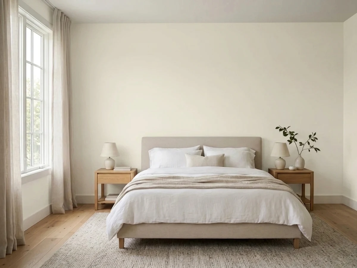
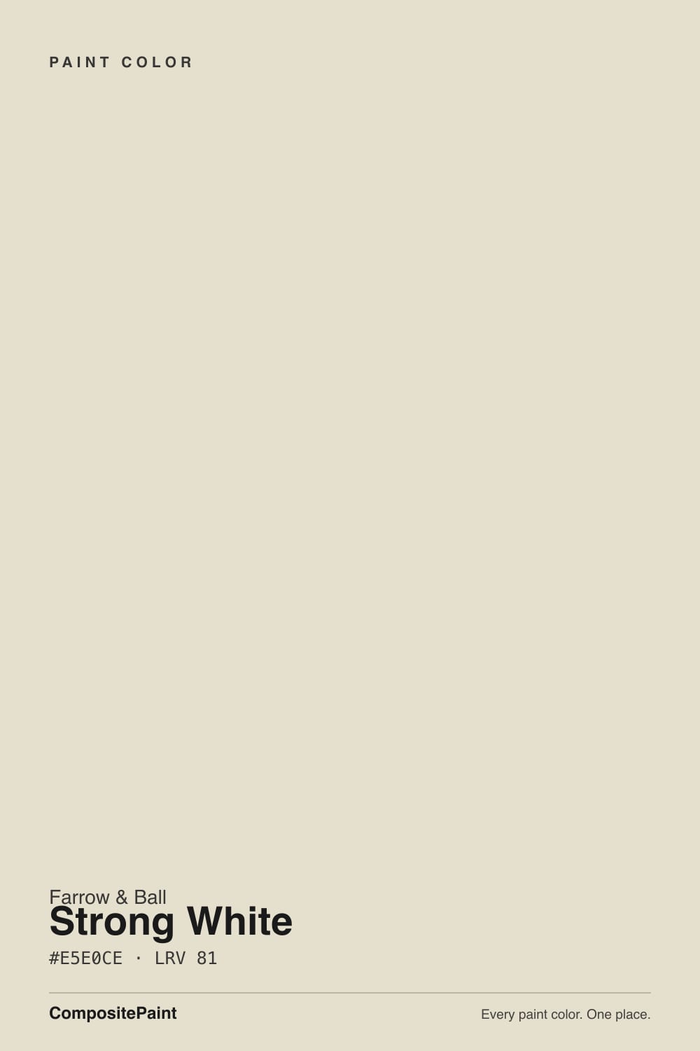
- 1Heirloom Shade63
- 2First Star69
- 3Strong White76
- 4Alabaster82
- 5Chantilly Lace91
The Fast Verdict
Strong White is what happens when a paint company decides "off-white" should mean grey, not cream. It has almost no yellow in it — the base is a cool, stony grey-beige that reads architectural, not soft. Farrow & Ball built a whole coordinating collection around it (Contemporary Neutrals), and interior designers reach for it specifically because it is not another warm builder white. Give it real daylight and it looks considered and expensive; put it in a dim room and it goes flat and grey fast.
Kitchens with stone counters and black or brass hardware · period townhouses that want a modern edge · hallways and entries with plenty of daylight · anyone who has decided warm creamy whites feel dated
Your room is north-facing and dim · you want something soft and cozy, not architectural · your wood tones are orange-toned honey oak · you're not ready to pay Farrow & Ball prices and buy extra coats
- A genuinely cool, grey-based white — not another warm cream
- Reads architectural and expensive against stone, black, and brass
- Part of a coordinated, designer-tested trio (Strong White, All White, Elephant's Breath)
- Works on cool grey stone and marble where warm whites clash
- A real classic on period-home exteriors and joinery, not just interiors
- Goes flat and grey fast in dim, north-facing rooms
- Too cold-blooded for anyone who actually wanted a creamy white
- Fights orange-toned honey oak and warm golden wood
- F&B pricing and coverage: budget an extra coat and primer over dark colors
What Color Is Strong White, Really?
A grey-based white — that is Farrow & Ball's own description, and it is the right one. Most "greige" whites lean warm first and let a little grey mute the yellow; Strong White does the opposite. The pigment base is closer to a pale stone than a cream, so on the wall it reads cool and mineral, almost like unpolished limestone, rather than the soft buttery off-whites (Swiss Coffee, White Dove) that dominate the American market. Farrow & Ball groups it in the Contemporary Neutrals collection alongside All White, Elephant's Breath and Ammonite specifically because it plays the cool, structural role in a scheme.
At LRV 76 it reflects a lot of light, but it is not a bright white — sit it next to its own sibling All White (LRV 84) and Strong White noticeably dims and greys down. That gap is deliberate: All White is F&B's true near-white with almost no undertone, and the brand's own room schemes typically put Strong White on the walls and All White on the trim and ceiling, letting the ceiling lift the room while the wall does the quieter, more textured work.
Undertone in one line: cool grey with a stony, slightly khaki weight to it — never pink, never the yellow-cream of a typical American off-white. If your sample looks flat or dishwater-grey, that is a dim room talking, not a flaw in the paint.
Where It Shines
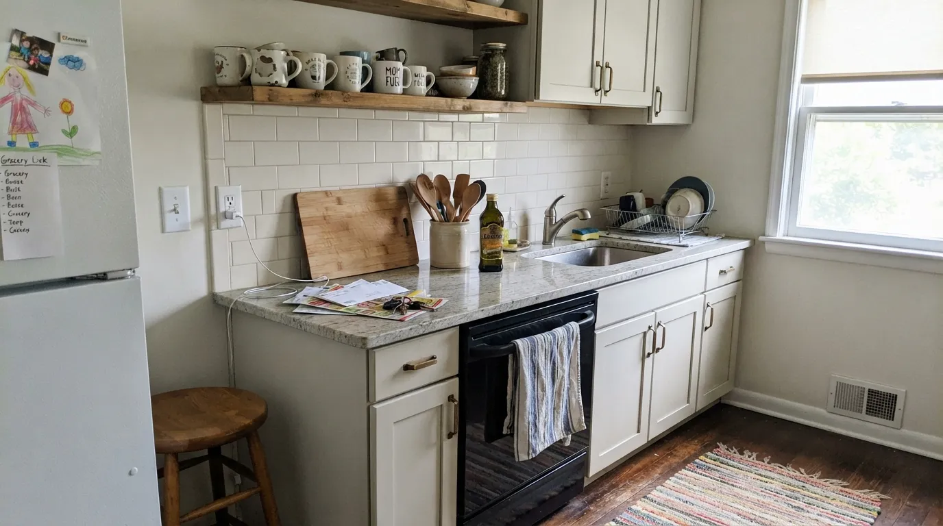
Give it strong daylight, hard materials, and a design intent and it is genuinely striking. Kitchens are its signature room: on Estate Eggshell cabinetry against stone counters, black or unlacquered brass hardware, and a marble or quartz backsplash, it reads custom and current in a way most American whites don't. It is also a favorite for period homes — Georgian and Victorian townhouses in particular — where its cool, slightly grey cast reads modern without fighting the architecture. Farrow & Ball's own coordinated trio (Strong White walls, All White trim and ceiling, a dark door or railings) is a genuinely reliable formula, not just marketing.
Where It Fails
Almost every disappointed review of Strong White comes down to one of three mismatches, and all three are predictable before the tin is opened. None of them are the paint failing — they are the paint being exactly what it is, in a situation that wanted something else.
If the brief in your head was "soft, cozy, a little buttery" — the American off-white category White Dove and Swiss Coffee own — Strong White will feel cold and clinical by comparison. It has almost no warmth to give. Buyers coming from a Pinterest board of creamy farmhouse whites are consistently the ones who feel let down.
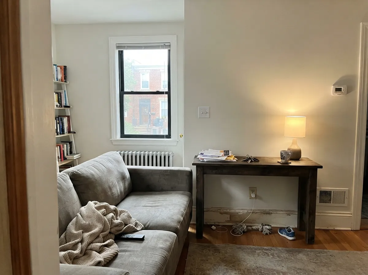
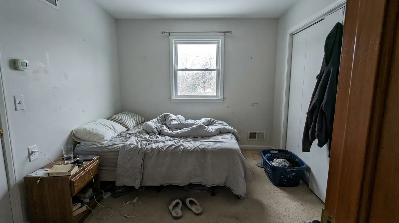
Grey-based whites need light to do their work. Without real daylight, Strong White's cool base takes over completely and the wall reads flat, dull, almost institutional — the same failure pattern every grey-leaning white shares. Add warm 2700K lamps or move up to a warmer neutral if the room stays dim most of the day.
This is not unique to Strong White, but it lands on every buyer: F&B paint costs several times a standard American gallon, Estate Emulsion is thick and can need three coats for full, even coverage over a mid-tone color, and going over anything dark needs a proper grey-tinted primer first. Budget the extra coat and the extra primer step before you start, not after.
Room by Room
Cabinetry, an island, or a full kitchen in Strong White with stone counters and black or brass hardware is the color's signature use. Estate Eggshell for durability; it wipes clean and hides fingerprints better than a brilliant white.
In a bright, south- or east-facing room it reads calm and architectural, especially with black-framed windows or dark furniture. In a dim room, add a warmer accent or plenty of lamps.
It will not give you a cozy, cocooning bedroom the way a cream white does — it gives you a quiet, minimal one. Great for a calm, hotel-like feel; wrong choice if you want warmth.
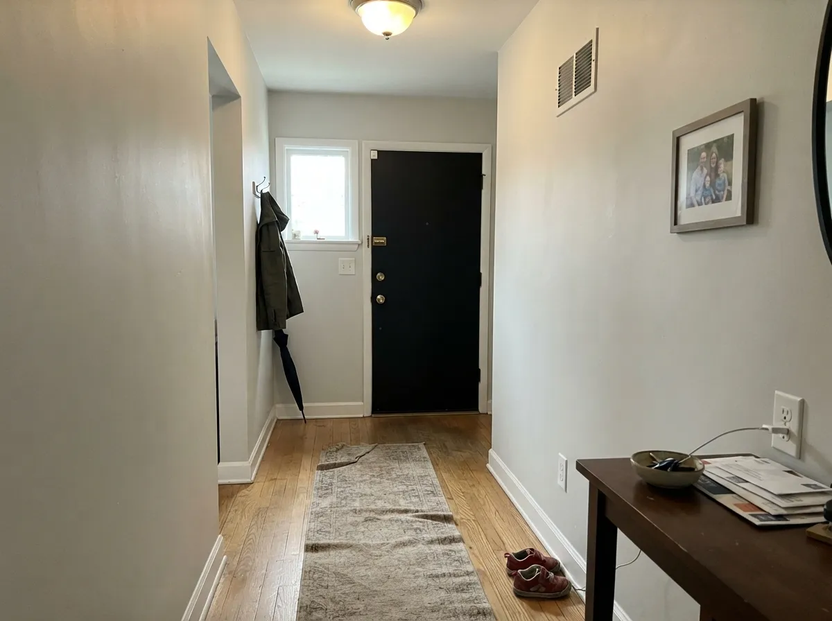
Paired with All White on trim and ceiling, it carries a period entry or hallway beautifully, especially with a dark front door visible from inside.
Where White Dove-style warm whites fight cool grey marble, Strong White agrees with it. Skip it if your vanity or tile leans warm beige or honey.
It is a common exterior choice on period townhouses, especially render or masonry paired with black railings and a dark door. Full sun brightens it; expect it to still read cooler than a standard American exterior white.
Your Light Is the Risk
Strong sun keeps the grey base crisp and stony instead of dull — the color at its most architectural.
Without direct sun the cool base takes over and the wall goes flat, dishwater-grey. Sample before committing in a dark room.
Cooler and greyer in shade, a touch stonier and warmer at midday sun. The shift is subtle, not dramatic like a saturated color.
2700K warm bulbs soften the grey noticeably at night; cool white LEDs push it colder and flatter — pick warm bulbs if you want any coziness after dark.
Most complaints about Strong White are a light mismatch. Upload a photo of your actual room and see it on your walls — then ask for the same wall in north light or evening lamps before you buy a single sample.
Need It From Another Brand?
Any paint counter can custom-tint Farrow & Ball No. 2001 directly. If you would rather stay in one brand's own deck, these are the closest stock matches, measured as ΔE2000. Under 2 is a difference you will not see on the wall.
| Brand | Closest color | ΔE | LRV | |
|---|---|---|---|---|
| Sherwin-Williams | Origami WhiteSW 7636 · Sherwin-Williams | 0.9 | 76 | Color page → |
| Behr | PolishedUL200-11 · Behr | 0.0 | 76 | Color page → |
| Benjamin Moore | Silver Satin856 · Benjamin Moore | 1.2 | 75 | Color page → |
| Valspar | PermafrostV159 · Valspar | 0.5 | 76 | Color page → |
| PPG / Glidden | Arctic CottonPPG1002-2 · PPG / Glidden | 1.3 | 76 | Color page → |
| Glidden | Dusky DawnPPG1005-1 · Glidden | 2.1 | 76 | Color page → |
Similar Farrow & Ball Colors
The nearest shades to Strong White within Farrow & Ball's own range, ranked by perceptual color distance — useful when you want the same look a touch lighter, darker, or warmer.
WCAG 2.1: AA is 4.5 : 1 for normal text, 3 : 1 for large text, AAA is 7 : 1.
Strong White vs the Colors You're Also Considering
Every Strong White sample board has the same rivals on it. The numbers show the real lightness gap — then it comes down to which risk you would rather live with.
Pick this if the whole point is a cool, grey-based white — Alabaster leans warm where Strong White stays cold-blooded.
Sherwin-Williams SW 7008 · LRV 82AlabasterPick this if you want the same near-white depth with real warmth — a much more forgiving pick in a dim room.
Pick this for the lighter, more genuinely white version — Pale Oak reads as a wall color, Strong White as a near-white.
Benjamin Moore OC-20 · LRV 67Pale OakPick this for a deeper, more clearly greige version of the same light-dependent personality.
Pick this for the more distinct, more architectural character — White Heron is quieter and more neutral.
Benjamin Moore OC-57 · LRV 87White HeronPick this for a brighter, gentler in-between white if Strong White's grey feels like too much commitment.
Pick this for the softer, more tonal whole-room look — Extra White is sharper and reads brighter next to it.
Sherwin-Williams SW 7006 · LRV 86Extra WhitePick this for trim and doors under Strong White walls when you want real, crisp contrast instead of the tonal All White handoff.
Slipper Satin No. 2004 (LRV 75) is the closest sibling. It is a little deeper and creamier, so it feels cozier and warmer on the wall. Choose Slipper Satin when you want more softness, and Strong White when you want a lighter, slightly cooler and greyer off-white.
School House White No. 291 (LRV 73) reads deeper still and more openly creamy-yellow. It is a good pick for a snug or a low-light room where you want visible warmth, whereas Strong White stays closer to a true light white.
Ammonite No. 274 (LRV 56) is not really a white at all. It is a warm grey greige and markedly darker, so walls read as a soft color rather than an off-white. Reach for Ammonite when you want the walls to have presence, and Strong White when you want a light, near-white envelope.
Strong White Coordinating Colors
Strong White was built to sit inside Farrow & Ball's Contemporary Neutrals collection, and it shows — it coordinates most naturally with its own family: cooler greys, stony mid-tones, and near-blacks, rather than the warm creams and honey woods that flatter an American off-white. These are the partners that show up again and again in the brand's own schemes and in real rooms:
Strong White vs. All White: Picking Between Farrow & Ball's Two Signature Whites
These two get compared constantly because Farrow & Ball built them to work together, not to compete — but if you're choosing one white for a whole room, the decision comes down to how much grey you actually want. All White is the brand's near-white: brighter (deck LRV 84 versus Strong White's 81), with almost no undertone left to modulate it. It is the safer, more forgiving choice — closer to what most Americans picture when they say "just a plain white."
Strong White is the more opinionated pick. The visible grey base gives it weight and a cooler, more architectural read, which is exactly why designers reach for it on cabinetry and in period homes that want a modern edge. If you're unsure, the brand's own advice is the practical answer: Strong White on the walls where the grey can do its quiet work, All White on the trim and ceiling to keep the room feeling lifted.
Strong White With Wood, Stone and Metal
Cool grey-based whites and cool materials agree with each other, and that is Strong White's strength: white or grey marble, honed quartz, black steel, and unlacquered brass all sit comfortably next to it without a fight. It is one of the few whites that genuinely likes cool grey stone the way most American off-whites do not.
Wood is the pairing to think through first. Pale or grey-washed oak, white oak, and ash keep the room in the same cool family and look intentional. Orange-toned honey oak is the mismatch: the wood's warmth and the paint's cool base pull against each other, and neither side wins. If the floor is staying and it leans golden, a warmer white — or a rug between the two — is the safer call.
Three Ready Palettes Built on Strong White
A color is never alone on the wall. These are complete combinations in the 60-30-10 pattern, with the reason each one holds together. Every one opens in the visualizer.
This is close to Farrow & Ball's own default formula: a grey-based wall, a brighter trim white to lift the room, and one near-black note at the door. The tonal handoff between Strong White and All White is the whole trick — no contrast lines, just depth.
Try this palette in your roomThis trio is straight out of Farrow & Ball's own Contemporary Neutrals playbook: Strong White cabinets keep the room bright and cool, Elephant's Breath adds a warmer mid-tone without breaking the grey family, and near-black hardware or trim gives the eye somewhere to land.
Try this palette in your roomAll three colors share the same cool, grey-based family, so the room stays calm and unified even with three depths in it. Down Pipe on a single trim detail is enough contrast without turning the room dark.
Try this palette in your roomStrong White FAQ
Is strong white warm or cool?
Cool — Farrow & Ball describes it as a grey-based white, and that is the honest read on the wall: a stony, slightly khaki grey with essentially no yellow warmth. If you want a soft, creamy white, this is not it.
What is the difference between strong white and all white?
All White is Farrow & Ball's near-white with almost no undertone to modulate it — brighter and more neutral. Strong White carries a visible grey base and reads more substantial. The brand's own scheme advice pairs the two: Strong White on walls, All White on trim and ceiling.
Is it good for kitchen cabinets?
Yes — it is one of the more popular Farrow & Ball choices for cabinetry, especially with stone counters and black or brass hardware. Use Estate Eggshell, which is built for durability on woodwork.
Does strong white work on exteriors?
Yes — it is a common choice on period-home render and masonry, usually with black railings and a dark front door. It reads cooler outdoors than a standard American exterior white, which is often the point.
How many coats does strong white need?
Plan on two to three coats of Estate Emulsion for even coverage, and prime first if you're painting over a dark or saturated existing color — Farrow & Ball's own White and Light Tones primer is built for exactly this switch.
What trim color goes with strong white walls?
All White is the brand's own answer, and it works: close enough in family to feel tonal, bright enough to lift the room. For real contrast instead of a soft handoff, a crisp cool white like Sherwin-Williams Extra White also reads well against it.
Have you painted with Strong White?
Rate it — one tap helps the next reader decide.
Ask a Question