Elephant's Breath
Farrow & Ball's most name-checked neutral, reviewed honestly: the light that turns it lilac, the light that turns it beige, and what to pick instead.

Jessica has spec'd whites and neutrals for more than 300 rooms and keeps a sample wall of painted drawdowns in her studio. Every color review is checked against real reader rooms in the comments and re-tested when a formula changes. About the testing process →
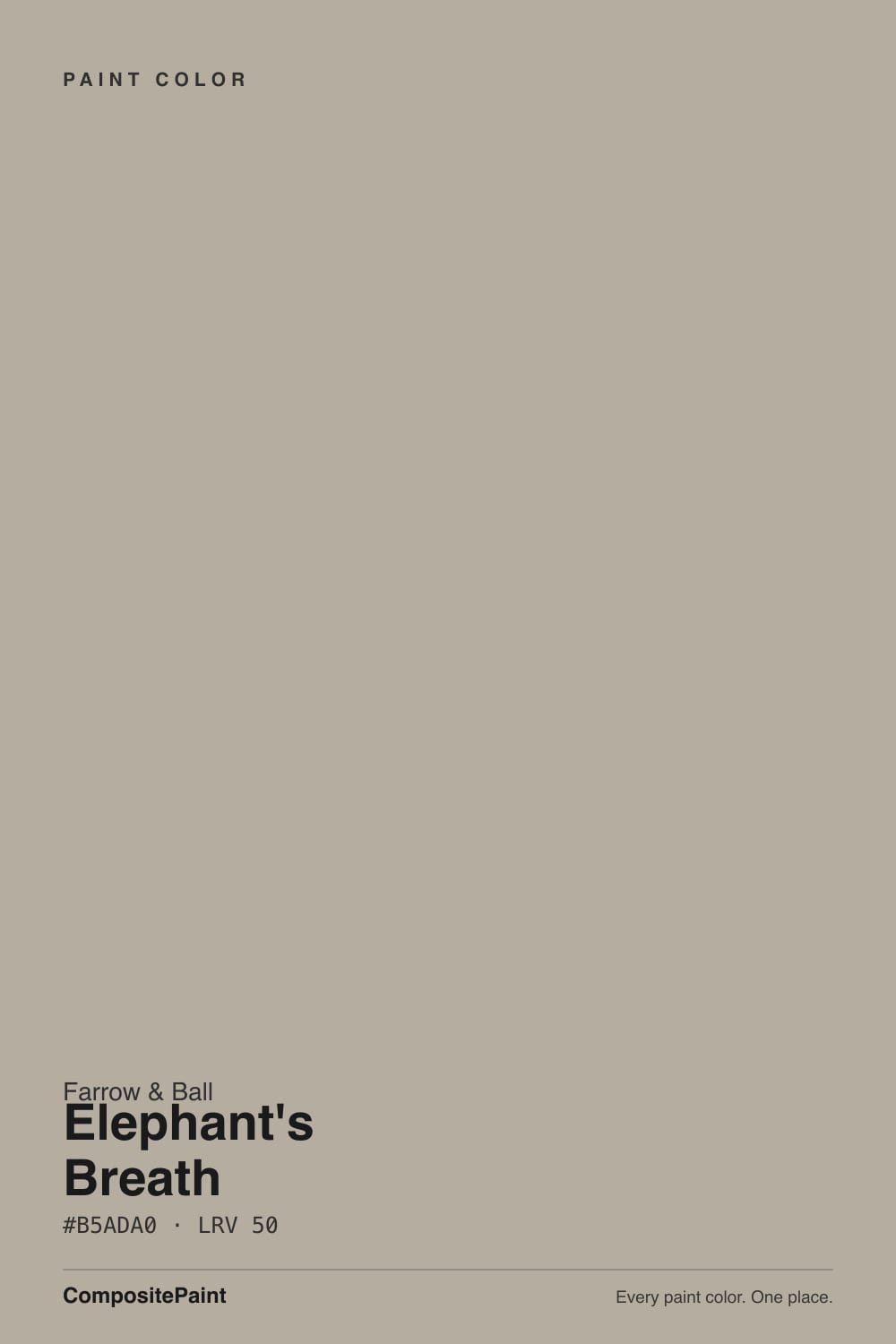
- 1Dorian Gray39
- 2Pashmina44
- 3Elephant's Breath52
- 4Agreeable Gray60
- 5Pale Oak69
The Fast Verdict
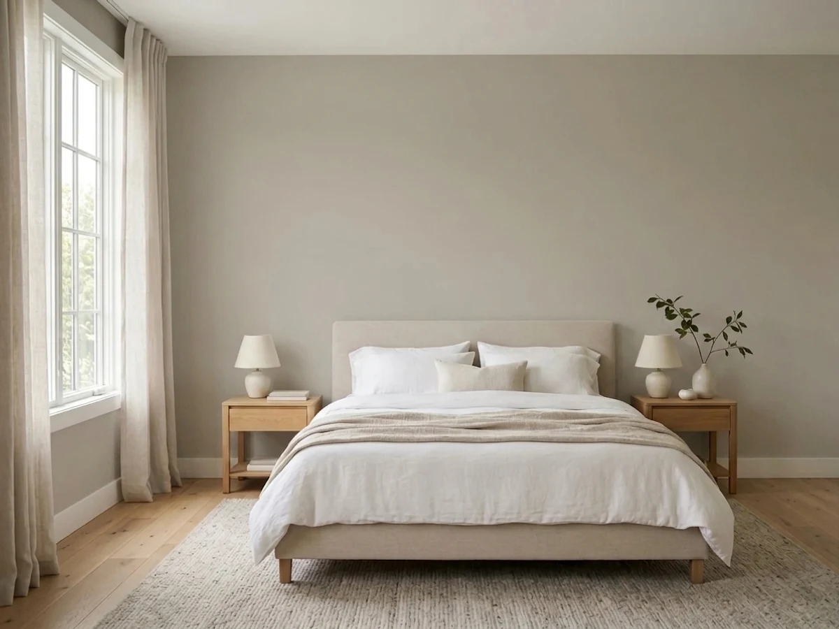
Elephant's Breath is the neutral that made Farrow & Ball's reputation for colors with a personality problem — in the best way. Farrow & Ball's own line is that it reads as 'an uplifting mid grey with a hint of magenta' that turns almost lilac in cooler light; real owners report it swinging just as often toward warm taupe-beige. Both are true. It is not a flat, predictable gray — it is a mid-tone (LRV 52) chameleon that has been a UK design-world staple for decades and has only gotten more famous since.
Living rooms and hallways with real daylight · kitchen cabinets and joinery · front doors · anyone who wants a neutral with a little unpredictability · pairing with warm wood and brass
You want a guaranteed-flat, no-drama gray · your room runs cool LEDs with almost no natural light · this is your first Farrow & Ball color and you hate surprises · budget rules out premium per-gallon pricing
- Genuinely versatile mid-tone neutral, not just another safe greige
- The undertone shift (beige to lilac-grey) reads as character, not a flaw, once you expect it
- One of the most-photographed, most-referenced colors in the F&B catalog — a huge real-room reference library online
- Excellent on kitchen cabinets and front doors, not just walls
- Flatters warm wood and brass the way its whole design pedigree promises
- Undertone is genuinely unpredictable room to room — some owners get beige, some get lilac-grey, and you don't know which until you test
- Premium Farrow & Ball pricing versus mainstream-brand greiges with a similar look
- Can go flat and muddy in a dim room with no warm light source
- Fights cool grey-blue stone and tile instead of complementing it
What Color Is Elephant's Breath, Really?
Farrow & Ball's own copy calls it 'an uplifting mid grey with its hint of magenta' that 'can become almost lilac in the cooler light of west-facing rooms' — official language that is doing real work: this is not a plain warm greige, it carries a genuine pink-violet undercurrent most buyers don't clock until it's on the wall. The name comes from legendary English decorator John Fowler, who coined it, and it sits in F&B's Contemporary Neutrals collection — the shelf built for exactly this: quiet colors with a twist, meant to feel modern layered into a period house and grounded in a new build.
At LRV 52 (Farrow & Ball's own published figure and third-party listings run a touch higher, low-to-mid 50s depending on the source) it sits squarely mid-tone — deeper than a true greige like Cornforth White, lighter and quieter than a full-bodied gray. That depth is exactly why the undertone shows up: pale tints barely register color at all, but a mid-tone has enough pigment mass to let the magenta actually read as magenta once the light cooperates.
Undertone in one line: complex — grey base, magenta-violet lean, taupe-beige lean, and which one wins depends on your room more than most F&B colors admit. Farrow & Ball's own line is that west-facing, cooler light pulls out the lilac; one long-running Houzz thread has an owner testing large sample boards in a north-facing lounge and reporting the opposite — 'more beige than grey.' Both readings are real. This is the single most important thing to know before you buy a sample pot: test big, and test it on your actual walls before you commit a whole room.
Where It Shines
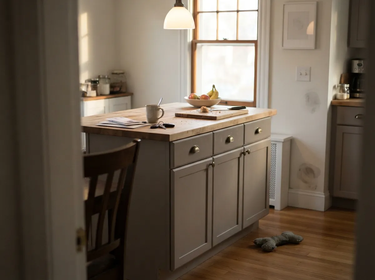
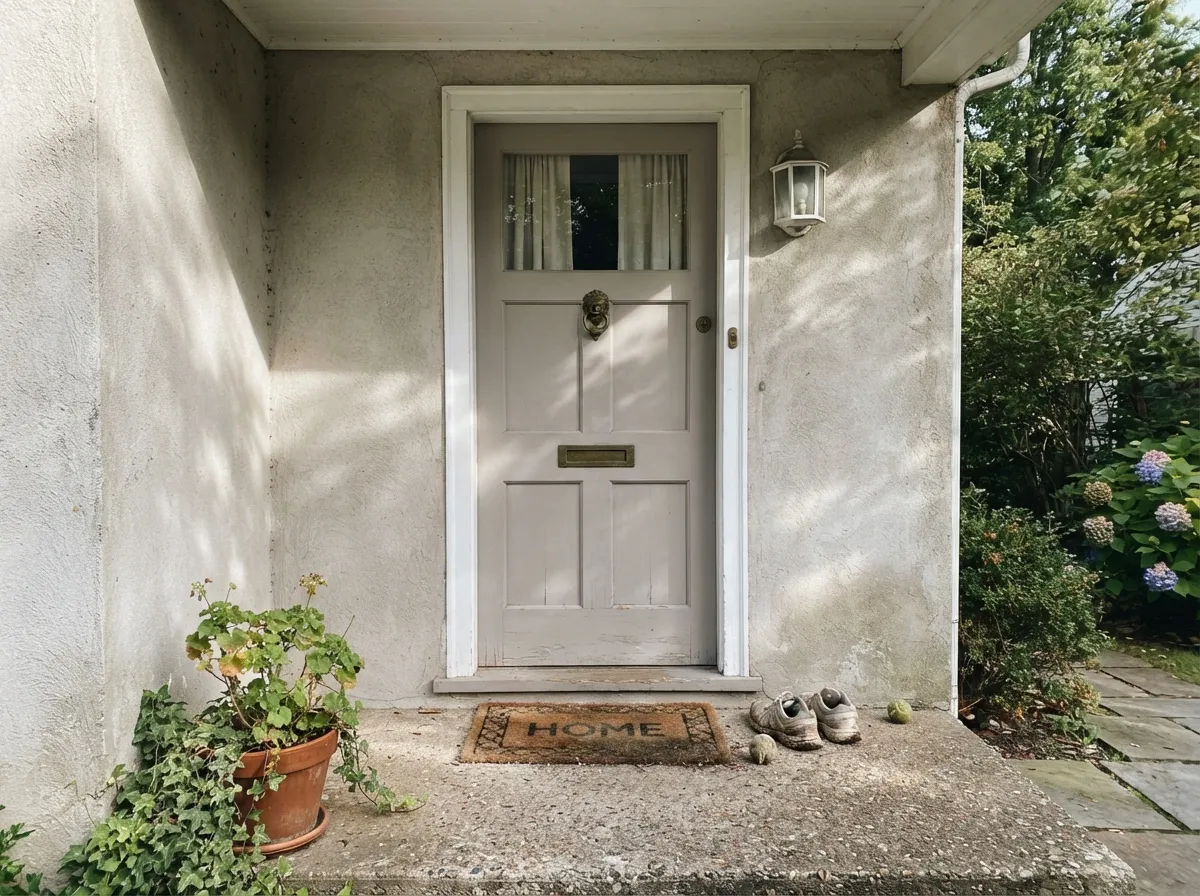
Give it a room with real daylight — south or east is friendliest — and warm materials, and Elephant's Breath is the neutral British interior coverage has been photographing for two decades running. It is the default answer when a designer wants 'a grey that isn't boring': on kitchen cabinets under brass hardware, on a front door against a pale facade, running through a hallway that needs to feel calm but not blank. It reads sophisticated instead of indecisive because the shift itself — beige at noon, faintly lilac at dusk — is the point, not a flaw.
Where It Fails
Nearly every regret story about Elephant's Breath comes down to one of three things, and none of them are really the paint's fault — Farrow & Ball itself is upfront that this color moves. But if you go in expecting a flat, obedient gray, you will be disappointed on all three counts.
Elephant's Breath was never that — it is built to carry a magenta undertone, and depth (LRV 52) is exactly what lets that undertone show up on the wall instead of washing out. If 'gray and nothing but gray' is the brief, look at a true gray like SW Passive or BM Metropolitan instead; this color's entire reputation rests on refusing to sit still.
Without daylight or a warm lamp working in its favor, the mid-tone character can slump toward flat, muddy taupe-gray — the version nobody photographs for a mood board. It needs some light on its side, natural or 2700K, to show the character that made it famous rather than just looking tired.
Its own official description admits the color reads differently by orientation, and real owners confirm it goes both ways — beige in one lounge, lilac-grey in another. Its fame is exactly why people skip the test: buy an A2 or A3 sample board, not a swatch, and look at it morning, midday and evening in your actual room before committing to gallons.
Room by Room
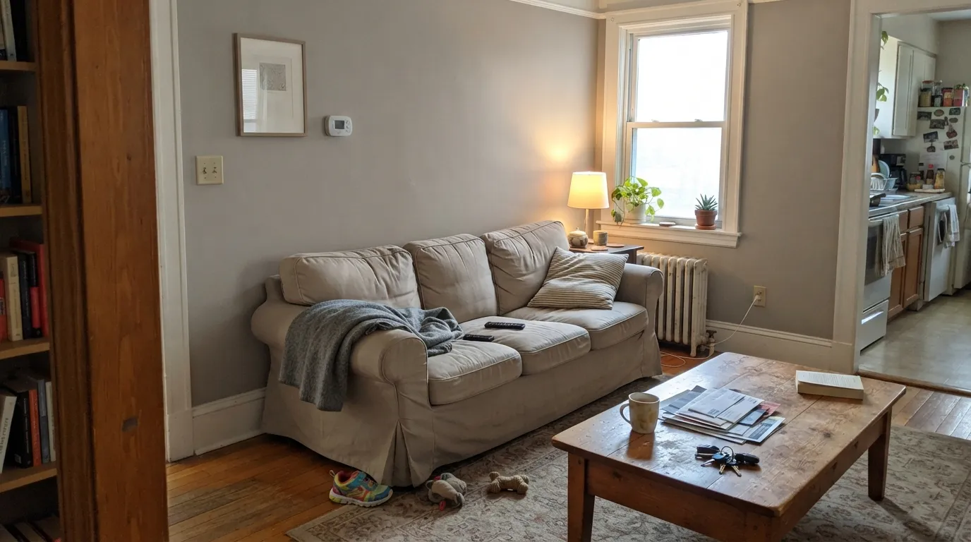
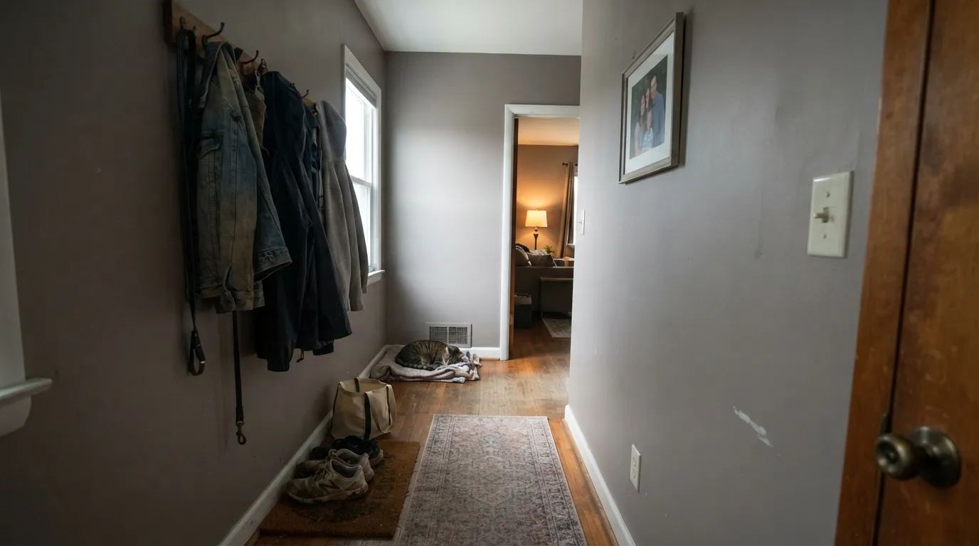
This is the room type Elephant's Breath was made famous in: calm, characterful, and it works with almost any furniture era. With real daylight coming through, it settles into the warm-grey read most buyers picture when they buy the tin.
Modern Eggshell is F&B's toughest interior finish and is rated for cabinets and floors, and Elephant's Breath on cabinetry under brass or unlacquered hardware is one of the most-copied kitchen looks in the brand's catalog. Pair with a warm white like Wevet on the walls so the cabinets carry the color.
In Full Gloss or Exterior Eggshell it reads as a sophisticated alternative to black or navy on a pale house — understated rather than a statement, which is exactly its appeal against louder front-door trends.
Under 2700K lamplight it turns cozier and slightly warmer; skip cool LEDs here or the mid-tone can feel flat rather than restful. Pair with cream or warm-white bedding, not stark white.
Deep enough to feel intentional, neutral enough to hand off to almost any adjoining room color — exactly the job a hallway neutral needs to do.
Warm wood vanities and brass fixtures flatter it the way they do everywhere else. Cool grey or blue-toned tile pulls against the magenta undertone and can make both look muddy — sample against your actual tile first.
Your Light Is the Risk
This is where the color does what people buy it for: a warm, settled mid-grey with just a hint of its magenta undertone. F&B's reputation for this color was built in rooms like this.
Without daylight or a lamp working in its favor, the color slumps toward flat, muddy taupe-gray — the version nobody puts on a mood board. Test before committing a dark room to it.
Farrow & Ball's own line is that cooler, west-facing light pulls it toward lilac; other rooms — reported directly by owners — read noticeably more beige. Expect real movement, not a subtle one.
Warm 2700K bulbs push it toward cozy taupe-grey; cool white LEDs can flatten it and expose a slightly muddy cast. Keep the bulbs warm if you want the color F&B markets.
Most complaints about Elephant's Breath are a light mismatch. Upload a photo of your actual room and see it on your walls — then ask for the same wall in north light or evening lamps before you buy a single sample.
Need It From Another Brand?
Any paint counter can custom-tint Farrow & Ball No. 229 directly. If you would rather stay in one brand's own deck, these are the closest stock matches, measured as ΔE2000. Under 2 is a difference you will not see on the wall.
| Brand | Closest color | ΔE | LRV | |
|---|---|---|---|---|
| Sherwin-Williams | Skyline SteelSW 1015 · Sherwin-Williams | 1.3 | 52 | Color page → |
| Behr | Penthouse ViewT16-06 · Behr | 1.0 | 53 | Color page → |
| Benjamin Moore | Ashen Tan996 · Benjamin Moore | 1.7 | 51 | Color page → |
| Valspar | Feathers of a DoveM111 · Valspar | 3.0 | 53.9 | Color page → |
| PPG / Glidden | AshenPPG1023-3 · PPG / Glidden | 1.0 | 53 | Color page → |
| Glidden | AshenPPG1023-3 · Glidden | 0.9 | 53 | Color page → |
Similar Farrow & Ball Colors
The nearest shades to Elephant's Breath within Farrow & Ball's own range, ranked by perceptual color distance — useful when you want the same look a touch lighter, darker, or warmer.
WCAG 2.1: AA is 4.5 : 1 for normal text, 3 : 1 for large text, AAA is 7 : 1.
Elephant's Breath vs the Colors You're Also Considering
Every Elephant's Breath sample board has the same rivals on it. The numbers show the real lightness gap — then it comes down to which risk you would rather live with.
Pick this for the neutral read Setting Plaster never fully gives you — Elephant's Breath keeps its pink as a mood, not a color name.
Farrow & Ball No. 231 · LRV 56Setting PlasterPick this if you want the pink undertone to be the whole point, not just a flash in certain light — Setting Plaster commits to it.
Pick this when you want enough pigment mass for the undertone to actually register on the wall, not just soften the light.
Farrow & Ball No. 228 · LRV 60Cornforth WhitePick this for a lighter, quieter member of the same F&B core range — same warm-neutral family, less depth, less drama.
Pick this for the design pedigree and the specific mid-grey-with-a-twist look thousands of real rooms are already copying.
Benjamin Moore HC-172 · LRV 56Revere PewterPick this for the familiar American warm greige — reliable, well-documented, without the undertone gamble.
Pick this for the deeper, more clearly pigmented version of the same gamble — Repose Gray is lighter and reads flatter once the flash fades.
Sherwin-Williams SW 7015 · LRV 58Repose GrayPick this if the light-dependent undertone risk sounds familiar and you'd rather pay Sherwin-Williams prices for it — Repose Gray flashes violet in cool light the same way.
The most common comparison is Skimming Stone (No. 241, LRV 65). Skimming Stone is noticeably lighter and airier, closer to a warm off-white, while Elephant's Breath at LRV 50 has real color and depth. Choose Skimming Stone for a soft, light backdrop and Elephant's Breath when you want the walls to read as a definite warm greige.
Against Dove Tale (No. 267, LRV 44) the difference is smaller. Dove Tale is a touch darker and leans slightly more gray-taupe, so it feels a little cooler and more grounded, which makes it good for joinery or a moodier room.
Hardwick White (No. 5, LRV 42) is darker still and greener in feel, more of an olive-gray than a warm greige. If your space runs cool or you want a color that behaves like a soft neutral rather than a green-gray, Elephant's Breath is the safer, warmer pick.
Elephant's Breath Coordinating Colors
The rule for coordinating with Elephant's Breath: warm whites and warm woods let its beige side lead; deep near-blacks and its own pink-leaning cousins let the magenta side show. Cool blue-grays are the one family that consistently fights it. These are the partners that keep showing up in real rooms:
The Story Behind the Name
Elephant's Breath is one of two Farrow & Ball colors most likely to make a first-time buyer laugh out loud reading the paint chip — CNN's history of the brand ran under the headline 'Dead Salmon and Elephant's Breath: How a British paint maker's oddball colors redefined luxury.' Both names trace back to John Fowler, the mid-century English decorator whose eccentric, evocative naming became as much a part of Farrow & Ball's identity as its hand-mixed pigments.
The color itself sits in F&B's Contemporary Neutrals collection — the shelf built for quiet colors with a genuine twist, meant to feel modern layered into a period house and grounded in a new build. That positioning is why it shows up constantly in UK interiors coverage: it does the job of a safe neutral while photographing like it has something to say.
Elephant's Breath With Wood Tones and Metals
Warm materials are this color's best friends. Oak, walnut and rattan all sit comfortably against it because its beige-leaning moments meet them halfway, and brass or unlacquered hardware picks up the warmth in the undertone rather than fighting it.
Cool materials are where to slow down. Grey-toned stone, blue-grey tile and polished chrome all sit at the opposite temperature from the magenta undertone, and in the wrong light the pairing can read muddy rather than sophisticated. If your fixed finishes are cool-toned, sample Elephant's Breath against them specifically before committing — this is the single pairing question that comes up most in real owner threads.
Three Ready Palettes Built on Elephant's Breath
A color is never alone on the wall. These are complete combinations in the 60-30-10 pattern, with the reason each one holds together. Every one opens in the visualizer.
Wevet is F&B's warm off-white workhorse, so the wall-to-cabinet handoff stays soft; Off-Black on an island or door gives the room the one dark anchor point kitchens like this always need. Brass hardware finishes the look.
Try this palette in your roomAll White keeps the trim crisp without going stark, so Elephant's Breath's undertone has room to breathe on the walls; Down Pipe on the front door supplies one deep, blue-leaning note without competing with the magenta undertone inside.
Try this palette in your roomSetting Plaster leans into the same magenta family Elephant's Breath only flashes, so the two read as tonal cousins rather than a color clash; Wevet keeps the trim warm instead of stark, which is what lets the pink undertone stay soft and grown-up rather than candy.
Try this palette in your roomElephant's Breath FAQ
Is Elephant's Breath gray, beige, or pink?
All three, depending on your room. Farrow & Ball's own description calls it 'an uplifting mid grey with a hint of magenta' that turns almost lilac in cooler, west-facing light — but real owners report it reading warm beige in other rooms just as often. That range is genuinely the color's identity, not an inconsistency in the paint. Buy a large sample board and test it on your actual walls before committing.
What is the real LRV of Elephant's Breath?
Our deck lists LRV 52, a solid mid-tone. You'll see other figures online in the low-to-mid 50s depending on the source, which is normal for older, hand-mixed F&B colors that get re-measured by third parties — treat 50 as the reliable working number and always test a physical sample rather than trusting any LRV number to predict how the room will look.
Is Elephant's Breath good for kitchen cabinets?
Yes — it's one of the most-copied cabinet colors in Farrow & Ball's catalog. Use Modern Eggshell, the brand's toughest interior finish, rated for cabinets and floors, and pair with brass or unlacquered hardware to lean into the warm side of the undertone.
Where does the name Elephant's Breath come from?
It was coined by John Fowler, the influential English decorator whose eccentric color names became part of Farrow & Ball's identity — a brand built as much on personality-forward names as on the paints themselves.
What trim white goes with Elephant's Breath?
Wevet or All White — both warm F&B off-whites that keep the trim soft instead of stark, so the wall's undertone doesn't get pushed around by a brighter, cooler white next to it. A stark bright white can make the walls look duller than they are.
Is Farrow & Ball worth the price for a color like this?
That's a real trade-off, not a marketing question — F&B runs well above mainstream brand pricing, and more than one buyer online has said as much even while loving the color. What you're paying for is the specific pigment mix that creates the magenta-to-beige shift; several other brands sell visually close alternatives at a lower price if the exact undertone behavior isn't essential to you.
Have you painted with Elephant's Breath?
Rate it — one tap helps the next reader decide.
Ask a Question