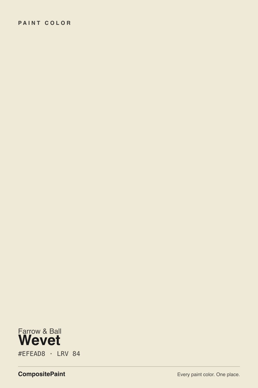
Wevet
Farrow & Ball's most understated white, reviewed honestly: the light it needs to glow, the exact rooms where it goes flat, and what to pick instead.

Jessica has spec'd whites and neutrals for more than 300 rooms and keeps a sample wall of painted drawdowns in her studio. Every color review is checked against real reader rooms in the comments and re-tested when a formula changes. About the testing process →
- 1First Star69
- 2Classic Gray74
- 3Wevet83
- 4Chantilly Lace91
- 5Ultra Pure White97
The Fast Verdict
Wevet is Farrow & Ball's quietest white — a soft, grey-based near-white with just enough of a warm floor to keep it from ever reading icy. In real daylight it is nearly invisible in the best way, the color you pick when you don't want the walls to say anything at all. Take the daylight away and it says even less than that: without a south or east window, Wevet can vanish into a flat, toneless nothing. It rewards a good room and punishes a bad one, more honestly than most whites admit to.
South- or east-facing rooms with real daylight · hallways and open-plan spaces that need a white that won't clash with anything · kitchen cabinets, paired with brass and warm wood · trim and ceilings under a warmer greige wall
Your room is north-facing, windowless, or otherwise dim · you actually want a warm, creamy white · you're set on a stark, bright white for contrast · you want to sample it once online and skip the real swatch
- Genuinely cool, grey-based white — the rare off-white that doesn't lean cream
- Almost no undertone of its own, so it doesn't clash with adjoining rooms
- One of the two go-to Farrow & Ball whites for kitchen cabinets
- Dedicated breathable exterior eggshell for cladding, windows, and joinery
- Subtle enough to read as "no color" rather than a specific, dated white
- Goes flat and toneless without real south or east daylight
- Reads grey and lifeless next to a warmer white in the same house
- So subtle it can look unfinished or primer-like under weak light
- Farrow & Ball pricing and special-order shipping — no big-box sampling
What Color Is Wevet, Really?
Wevet takes its name from an old Dorset dialect word for a spider's web, and Farrow & Ball's color curator Joa Studholme picked it on purpose: the color is meant to be almost invisible, a whisper rather than a statement. It sits at the pale end of the brand's small Relaxed Neutrals family, the lightest of a group that also includes Ammonite and Cornforth White — each one a step deeper and greyer than the last. Where those two have enough body to read as a genuine mid-tone gray, Wevet barely registers as color at all; it behaves more like a soft, breathable version of white than a true off-white.
Farrow & Ball describes it as a cool, grey-based neutral, and every real-room account agrees, with one footnote: there is a faint warm floor under the grey that never pushes forward on its own. That whisper of warmth is why it photographs so differently room to room — more mineral and grey in flat north light, closer to a soft chalky cream once real sun or a warm lamp hits it. At LRV 83 it reflects almost as much light as a true white, but because that reflected light carries a grey cast rather than a yellow one, it reads noticeably cooler on the wall than the popular American off-whites sitting at the same LRV.
The clearest way to see what makes Wevet different is to put it next to Benjamin Moore's Cloud White — two colors with almost the same digital hex value that behave like opposites once painted, because Cloud White leans warm and Wevet leans cool. That is the honest starting point for anyone choosing between a Farrow & Ball white and an American one: the chip on a screen cannot tell you which you actually want. A real sample, on your own wall, in your own light, can.
Where It Shines
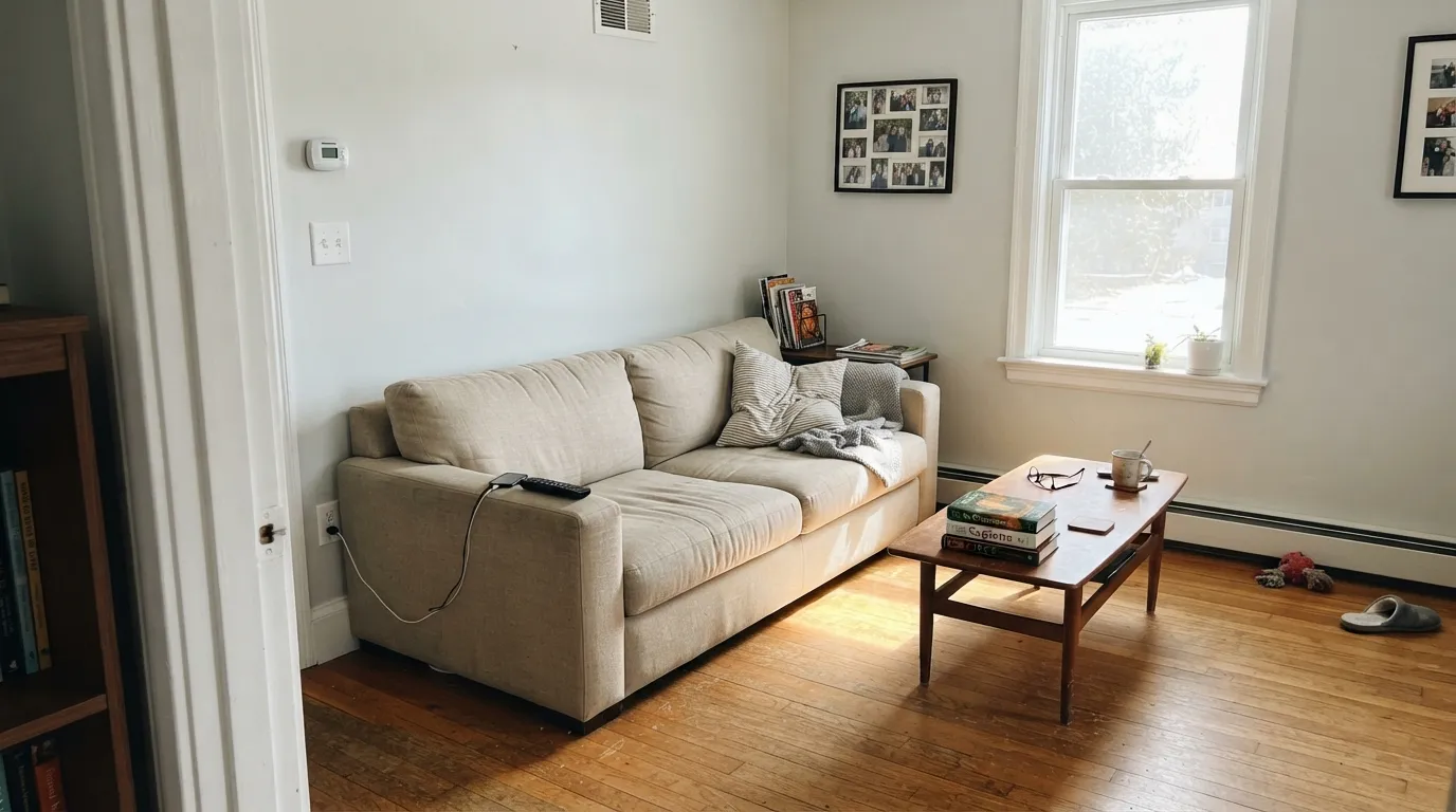
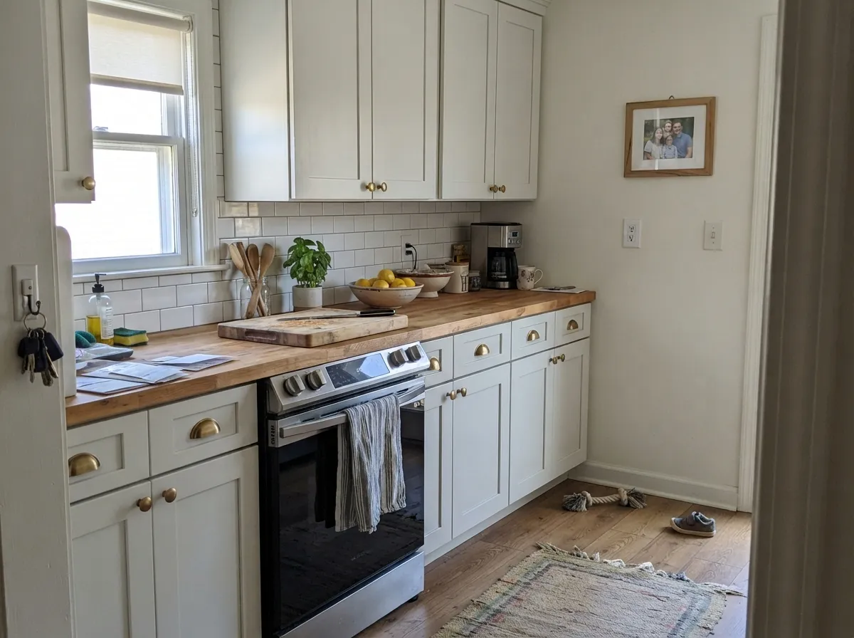
Give Wevet a south- or east-facing room with real daylight and it does exactly what Farrow & Ball promises: a soft, chalky near-white that never tips yellow and never goes stark. It earns its reputation as a whole-hallway or open-plan color because it has almost no undertone of its own to fight with — official F&B guidance is that it can be put next to virtually any other color in the range. Its second home is the kitchen, where it is one of two colors (alongside Strong White) that Farrow & Ball buyers argue about most for cabinets, especially with brass hardware and a stone or butcher-block counter that isn't stark white.
Where It Fails
Almost every disappointed account of Wevet comes back to one of three situations, and Farrow & Ball's own material all but predicts them. None of them are the paint's fault — but if your room matches one, sample bigger before you commit a whole can.
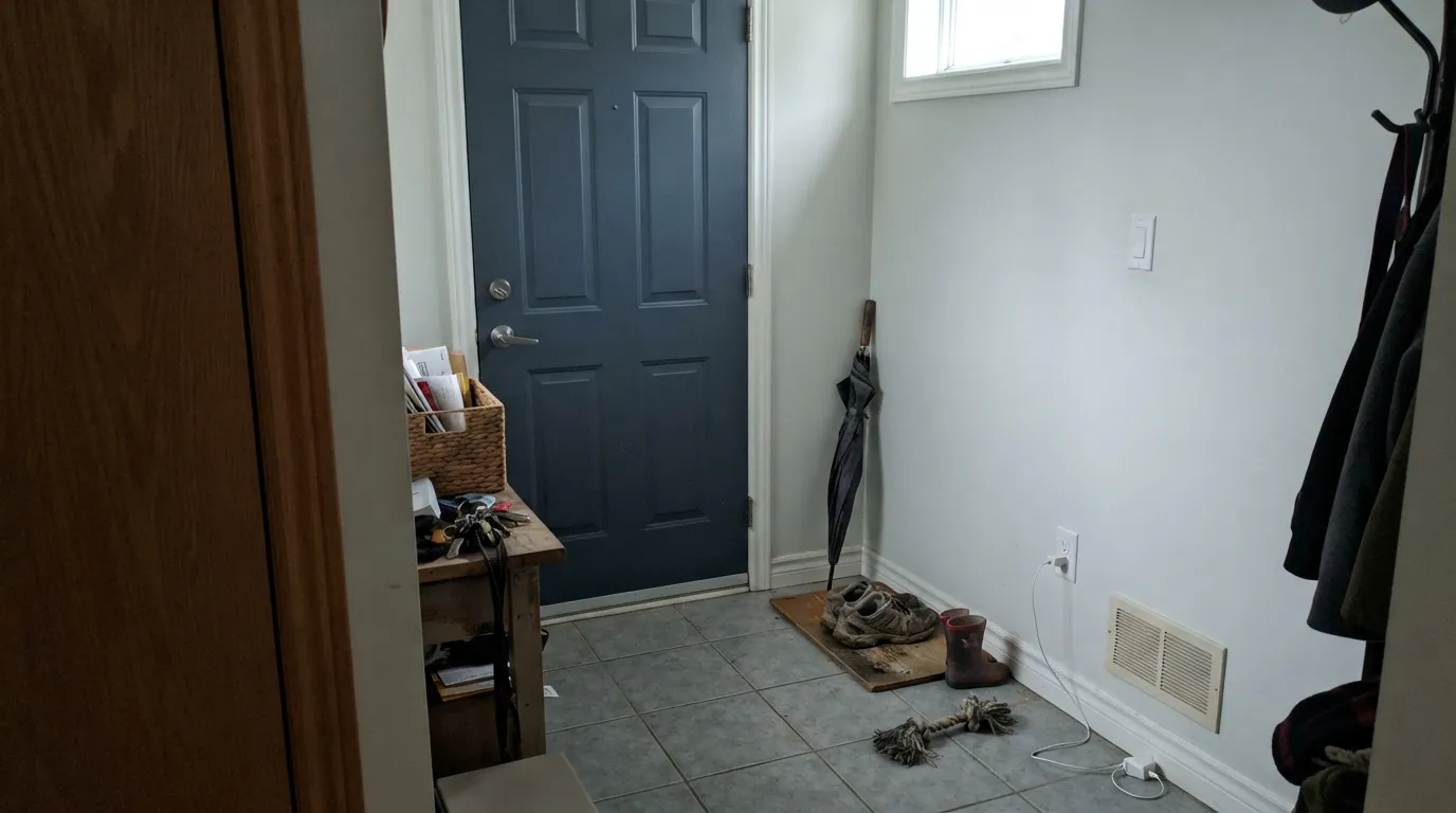
Wevet's whole personality depends on light bouncing warmth back into that whisper-thin grey base. Take the daylight away — a north-facing hallway, a windowless room, cool grey tile underfoot — and owners describe the same result every time: the color goes flat and toneless, neither white nor gray, just washed out. It is one of the few pale F&B whites that genuinely needs a south or east window to look intentional.
Wevet is grey-based, and most popular American off-whites (and several other Farrow & Ball colors) lean warm. Put Wevet next to a creamy trim or an adjoining warm-white room and you get the same clash every off-white review warns about — one side reads dirty by comparison. Keep Wevet on walls, trim, and ceiling together, or commit fully to a genuinely cool partner instead of a warm one.
Wevet and Strong White are the two colors buyers argue about most for cabinets, and people regularly order both as sample pots because the digital chips look almost identical. In person they are not: Wevet is paler and more delicate, and against a bright white counter or under weak kitchen lighting it can read closer to unfinished primer than a considered off-white. Sample both, on the actual doors, before choosing.
Room by Room
In a south- or east-facing room it glows softly all day without tipping yellow or reading stark. Because it carries almost no undertone of its own, it doesn't fight the next room's color — the reason it works so well flowing between an open kitchen, dining area, and living space.
One of the two F&B whites buyers reach for on cabinets, alongside Strong White. Flat Eggshell is scrubbable and tough enough for cabinet doors; brass hardware and butcher block are its best company. Sample both candidates on the actual doors — the two chips look closer than they read on wood.
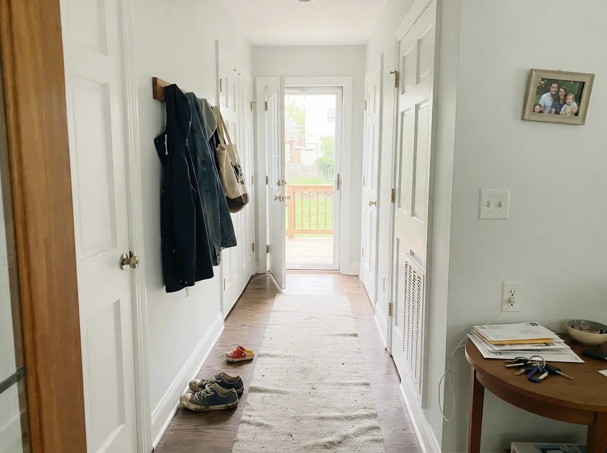
A hallway has to connect rooms that may already be painted in very different colors, and Wevet's lack of strong undertone is exactly what that job needs. It won't clash with a warm bedroom on one side and a cooler bathroom on the other.
Under 2700K bulbs the faint warm floor comes forward and the room turns gently soft rather than clinical. If the bedroom is north-facing and stays dim through the day, treat that as a real limitation, not a paint problem to fix with more coats.
Most trim-white advice defaults to a warm white; Wevet is the case for going cool instead, especially under a warmer greige wall that would otherwise drift toward beige without a crisper, grayer partner.
Farrow & Ball sells a dedicated breathable Exterior Eggshell for it, suited to window frames, cladding, and garden furniture. Full sun reads it brighter and crisper, the way it does with any pale white; deep shade on a house exterior will look as flat as a north-facing interior room.
Your Light Is the Risk
The faint warm floor under the grey comes forward and the wall reads soft and chalky. This is the light Wevet was made for.
No warm daylight to reflect means no warmth at all — the color goes flat, toneless, and washed out. Test first.
Cooler and more mineral at midday, softer and slightly creamier as the light warms toward evening. A gentle shift, not a new color.
2700K lamps pull the whisper of warmth forward into a soft cream-gray. Cool white LEDs flatten it back toward plain gray.
Most complaints about Wevet are a light mismatch. Upload a photo of your actual room and see it on your walls — then ask for the same wall in north light or evening lamps before you buy a single sample.
Need It From Another Brand?
Any paint counter can custom-tint Farrow & Ball No. 273 directly. If you would rather stay in one brand's own deck, these are the closest stock matches, measured as ΔE2000. Under 2 is a difference you will not see on the wall.
| Brand | Closest color | ΔE | LRV | |
|---|---|---|---|---|
| Sherwin-Williams | Natural WhiteSW 9542 · Sherwin-Williams | 0.5 | 83 | Color page → |
| Behr | Celestial GlowPWN-36 · Behr | 1.0 | 83 | Color page → |
| Benjamin Moore | Baby's Breath873 · Benjamin Moore | 2.0 | 82 | Color page → |
| Valspar | Freshwater Pearls8007-6G · Valspar | 0.5 | 83 | Color page → |
| PPG / Glidden | Silver FeatherPPG1002-1 · PPG / Glidden | 1.0 | 83 | Color page → |
| Glidden | Extreme White30GY 83/021 · Glidden | 0.5 | 83 | Color page → |
Similar Farrow & Ball Colors
The nearest shades to Wevet within Farrow & Ball's own range, ranked by perceptual color distance — useful when you want the same look a touch lighter, darker, or warmer.
WCAG 2.1: AA is 4.5 : 1 for normal text, 3 : 1 for large text, AAA is 7 : 1.
Wevet vs the Colors You're Also Considering
Every Wevet sample board has the same rivals on it. The numbers show the real lightness gap — then it comes down to which risk you would rather live with.
Pick this when the cool, grey-based version is specifically what you're after — Cloud White will look yellow next to it.
Benjamin Moore OC-130 · LRV 85Cloud WhitePick this if you actually want warmth — an almost identical hex value, but Cloud White leans warm where Wevet leans cool.
Pick this for the genuine Farrow & Ball chalky depth, if budget and special ordering aren't the deciding factor.
Benjamin Moore OC-151 · LRV 84WhitePick this for a mainstream-priced, big-box-available version of the same quiet, no-opinion white.
White Tie (No. 2002) at LRV 82 is Wevet's closest cousin but noticeably creamier and more yellow. If you want an obvious warm white, White Tie delivers it; if you want warmth that stays quiet, Wevet is the safer pick.
Pointing (No. 2003) shares Wevet's LRV of 84 but leans a hair warmer and softer, with a traditional off-white character. Both are bright, so the choice comes down to whether you want Wevet's slightly cleaner face or Pointing's more classic softness. They also pair well together across walls and trim.
Tallow (No. 203), also LRV 84, is warmer and more golden than Wevet. It suits rooms where you want real cream on the wall, especially in cooler north light. Choose Wevet when you want brightness first and warmth second.
Wevet's Own Family: The Relaxed Neutrals
Wevet is the lightest member of a small Farrow & Ball group built to work together without a decorator: it, Ammonite, and Cornforth White each sit one step deeper and greyer than the last, so buying up or down the family is a low-risk way to add depth in an adjoining room without a jarring handoff.
Beyond that immediate family, two more F&B colors show up constantly in Wevet conversations: Strong White as its kitchen-cabinet rival, and Elephant's Breath as an official pairing recommendation for a slightly deeper, warmer wall next to Wevet trim or ceiling.
Wevet vs. Strong White: The Kitchen Cabinet Debate
This is the single most common Wevet question on Farrow & Ball forums, and it deserves a straight answer: they are not the same color wearing different names, even though the online chips can look identical. Strong White carries a more distinct, contemporary grey undertone — sturdier, more architectural. Wevet is paler and thinner, the more delicate of the two, and it shows scuffs and shadows a little more readily because there is less pigment doing the work.
The practical tiebreaker is light and counters, not personal taste alone: a bright kitchen with real daylight and a warm wood or stone counter can carry Wevet's delicacy; a dimmer kitchen, or one with a very cool white counter, usually looks more finished in Strong White. Order both sample pots and paint the actual cabinet doors — not a wall swatch — before committing to a full kitchen's worth of Flat Eggshell.
Wevet on Trim, Ceilings, and Exteriors
Indoors, Wevet's best supporting role may be trim and ceiling rather than the main wall color. Most trim-white advice on this site defaults to something warm; Wevet is the honest exception, because a genuinely cool, grey-based trim keeps a warm greige wall from drifting toward beige — the opposite problem a warm trim white would cause.
Outside, Farrow & Ball backs Wevet with a dedicated breathable Exterior Eggshell built for window frames, cladding, and garden furniture, and separate finishes exist for railings, gates, and other exterior metal. Full sun reads it brighter and crisper than it does indoors, the way it does with any pale color, but a shaded, north-facing elevation will show the same flat, washed-out quality that dogs it in a dim interior room — walk the house at different times of day with a real sample before painting the whole exterior.
Three Ready Palettes Built on Wevet
A color is never alone on the wall. These are complete combinations in the 60-30-10 pattern, with the reason each one holds together. Every one opens in the visualizer.
Two genuinely cool neutrals rather than one cool and one warm — Stonington Gray is the true gray that never turns greige, so it sits comfortably against Wevet's own grey lean instead of fighting it the way a warm accent color would.
Try this palette in your roomOne cool white top to bottom removes the classic off-white clash — no warmer wall arguing with cooler cabinets — and the navy island supplies the single dark note the scheme needs, plus a natural match for brass hardware.
Try this palette in your roomRepose Gray's warm greige base can drift toward beige without a genuinely cool partner; Wevet's grey lean keeps the trim crisp instead of matching the walls' warmth, and Wrought Iron adds one deliberate dark line at the windows.
Try this palette in your roomWevet FAQ
Is Wevet warm or cool?
Cool — Farrow & Ball calls it a grey-based neutral, and real rooms confirm it. There is a faint warm floor underneath that only shows up under strong daylight or warm lamps; in flat or north light it reads plainly cool, noticeably cooler than most popular American off-whites at the same LRV.
Wevet or Strong White for kitchen cabinets?
Strong White carries a more distinct grey undertone and a slightly harder, more contemporary edge; Wevet is paler and more delicate. Both are argued over constantly on Farrow & Ball forums because the digital chips look almost identical — sample both on the actual cabinet doors, in your kitchen's light, before deciding.
Does Wevet work in a north-facing room?
Honestly, not well without help. Owners consistently report it going flat and toneless without real daylight. If the room is dim year-round, warm lamps can partly rescue it, but a genuinely warm color is the safer choice.
What sheen should I use?
Estate Emulsion (matte) on walls, Flat Eggshell on woodwork, trim, and cabinets — it is scrubbable and tough enough for cabinet doors — and the dedicated Exterior Eggshell outside.
Can I use Wevet outside?
Yes. Farrow & Ball sells a breathable Exterior Eggshell specifically for it, suited to window frames, cladding, and garden joinery. Full sun reads it brighter and crisper, like any pale white; a shaded exterior wall will look as flat as a north-facing interior.
What white trim goes with Wevet walls?
Wevet itself, in Flat Eggshell, keeps the room cohesive and avoids the warm-trim clash entirely. If you want contrast, reach for another cool F&B white like All White rather than a creamy American trim white, which will make Wevet look grey and tired by comparison.
Have you painted with Wevet?
Rate it — one tap helps the next reader decide.
Ask a Question