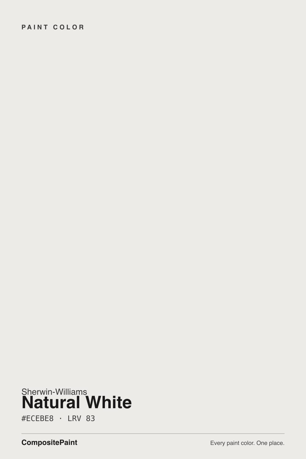
Natural White
SW 9542 · #ECEBE8 · LRV 83 — warm red-orange tone, very light — near-white, broadens small spaces.
- 1First Star69
- 2Classic Gray74
- 3Natural White83
- 4Chantilly Lace91
- 5Ultra Pure White97
What Color Is Natural White, Really?
Natural White (SW 9542) is a soft warm white. Its hex value is #ECEBE8 and its LRV is 83, near the top of the white range, so it reflects a lot of light and reads bright and open on a wall. The hue sits at 45 degrees with only 10 percent saturation, which is a small amount of warmth with a faint red-orange cast underneath. That cast is what keeps it from looking lemony; the warmth reads as softness rather than as cream.
People choose it when a pure white feels too clinical but a cream feels too yellow. At 83 LRV it still does the job a white is supposed to do, brightening a small room and making ceilings feel higher, while the low saturation stops it short of being a color in its own right. It is a quiet default for whole-house walls, trim, and ceilings.
The thing to check is how little separation it has from the whites around it. Against warm oak, brass, and beige it looks white. Against a bright, cool white on the same wall it suddenly looks warm and slightly dirty. If you are keeping existing white trim or cabinets, tape a sample right next to them before you commit, because at this lightness the mismatch shows only when the two are touching.
Natural White is warm, but only just. Saturation is 10 percent at a hue of 45 degrees, which places the warmth on the soft yellow-to-red side rather than in obvious cream territory. The faint red-orange in it is why the color feels gentle instead of buttery; a purely yellow white of the same lightness looks more like custard.
The undertone shows in two situations. First, next to a cooler, blue-based white, where Natural White immediately looks like the warm one. Second, on a large uninterrupted surface such as a ceiling or a full open-plan wall, where the small amount of warmth accumulates and becomes visible.
Against beige, tan, or warm wood it does the opposite and reads as a clean white, because those neighbours are far warmer than it is. If you want to know which way it will go in your room, sample it beside your floor and your existing trim rather than beside another paint chip.
Best Rooms and Uses for Natural White
With an LRV of 83, Natural White is a whole-home color. It works on walls in every room, and it is particularly useful in small bathrooms, hallways, and basements where you need reflected light but do not want the glare of a near-100 white. Bedrooms and living rooms take it easily as a calm backdrop.
It is a solid ceiling color as well. Its slight warmth keeps a ceiling from reading blue-gray in shadow, which is a common problem with cool whites. On trim, doors, and millwork it gives a soft, settled edge rather than a sharp one.
Cabinets are a good fit for the same reason: the small amount of warmth reads as intentional rather than builder-grade and forgives minor surface flaws better than a stark white. Outdoors it works as a light body or trim color, though on a sunlit south elevation expect the warmth to show more than it does inside.
How Lighting Changes Natural White
At LRV 83 Natural White never goes dim; the light source only steers its temperature. North-facing rooms get cool, indirect daylight that cancels most of the warmth, so the color reads as a clean, soft white with just enough body to avoid feeling sterile. That is the situation it handles best.
South and west light do the opposite. Strong afternoon sun brings the warmth forward and can give large walls a faint cream glow, especially late in the day. East rooms look warm in the morning and settle to neutral after noon. Nearby surfaces bounce color too: a green lawn outside a window or a red brick wall will tint it more than the paint's own undertone does.
Bulbs are the deciding factor at night. Warm 2700K lamps push it toward cream, while 3500K to 4000K bulbs hold it crisp and neutral. Check the sample under your own fixtures after dark before you buy a full order.
Most complaints about Natural White are a light mismatch. Upload a photo of your actual room and see it on your walls — then ask for the same wall in north light or evening lamps before you buy a single sample.
Need It From Another Brand?
Any paint counter can custom-tint Sherwin-Williams SW 9542 directly. If you would rather stay in one brand's own deck, these are the closest stock matches, measured as ΔE2000. Under 2 is a difference you will not see on the wall.
| Brand | Closest color | ΔE | LRV | |
|---|---|---|---|---|
| Behr | Celestial GlowPWN-36 · Behr | 1.0 | 83 | Color page → |
| Benjamin Moore | Baby's Breath873 · Benjamin Moore | 1.7 | 82 | Color page → |
| Valspar | Freshwater Pearls8007-6G · Valspar | 0.0 | 83 | Color page → |
| PPG / Glidden | Silver FeatherPPG1002-1 · PPG / Glidden | 1.0 | 83 | Color page → |
| Glidden | Extreme White30GY 83/021 · Glidden | 0.0 | 83 | Color page → |
| Dutch Boy | Crisped White022W · Dutch Boy | 1.9 | 82 | Color page → |
Similar Sherwin-Williams Colors
The nearest shades to Natural White within Sherwin-Williams's own range, ranked by perceptual color distance — useful when you want the same look a touch lighter, darker, or warmer.
WCAG 2.1: AA is 4.5 : 1 for normal text, 3 : 1 for large text, AAA is 7 : 1.
Natural White vs Similar Colors
Inside the same brand the field is tight. Snowbound (SW 7004) at #EDEAE5 shares LRV 83 but carries more gray, so it reads cooler and more taupe-leaning. Gypsum (SW 9543) at LRV 82 is quieter, White Sand (SW 9582) at LRV 84 brighter, and Ceiling Bright White (SW 7007) sits marginally cooler again.
Across brands there are exact matches. Freshwater Pearls (8007-6G) from Valspar and Extreme White (30GY 83/021) from Glidden both share the hex #ECEBE8 and LRV 83 at deltaE 0. Wevet (No. 273) from Farrow & Ball at deltaE 0.52, Angel Kiss (1272) from Diamond Vogel at 0.57, and Classic (PNT100-LT-12) from Clare at 0.67 are indistinguishable in practice.
Celestial Glow (PWN-36) from Behr, Icy White (DEHW10) from Dunn-Edwards, and Panna Cotta (JG-111) from Magnolia Home, at deltaE 1.01 to 1.97, are visually identical in normal room light. Jane (BD-JA) from Backdrop at LRV 86 and deltaE 3.26, and Linen White (285140) from Rust-Oleum at LRV 93 and deltaE 3.61, are close but visibly different side by side, with Linen White clearly the brighter of the two.
Colors That Go With Natural White
The same-brand whites nearest to Natural White are too close to use as contrast. White Sail (SW 9622) at LRV 83, Dashing (SW 9544) at LRV 83, Gypsum (SW 9543) at LRV 82, White Sand (SW 9582) at LRV 84, and Ceiling Bright White (SW 7007) at LRV 83 all sit within two points of it. Pairing any of them with Natural White in the same room produces a difference no one will read as deliberate.
A better approach with an 83 LRV white is to change sheen rather than color: flat or matte on walls and ceilings, satin or semi-gloss on trim and doors, all in Natural White. The light behaves differently on each surface and the trim still reads as trim.
For real contrast, look to mid-tones and darks on cabinets, islands, or doors, and let wood do the warming. Snowbound (SW 7004) at #EDEAE5 and LRV 83 is worth a sample if you want a slightly grayer companion white on an adjoining wall.
Coordinated palette
Generated by hue-rotating #ECEBE8 in HSL space. Pair Natural White with one accent and one neutral — the swatches below are starting points, not final picks.
Natural White FAQ
Is Natural White warm or cool?
It is warm, but gently so. The hue sits at 45 degrees with 10 percent saturation and a faint red-orange cast, which is enough warmth to avoid a clinical look without turning creamy. In cool north light it can read almost neutral, and beside a blue-based white it will clearly look like the warmer of the two.
What LRV is Natural White?
Natural White has an LRV of 83. That is high, meaning it reflects most of the light that hits it and reads clearly as a light white. It brightens small or dark rooms and makes ceilings feel higher, while stopping short of the hard glare a white in the 90s can produce.
Does Natural White work in a dark room?
Yes, this is one of its better uses. At LRV 83 it gives back most of the available light, so a basement, an interior hallway, or a north-facing bathroom will feel noticeably more open. The one thing it cannot do is add color interest, so pair it with wood, texture, or a darker accent so the room does not read flat.
What white trim goes with Natural White?
The simplest answer is Natural White itself, in a higher sheen. Every white near it in the same range, including White Sail (SW 9622) at LRV 83 and White Sand (SW 9582) at LRV 84, is within a point or two, so a second white will not read as contrast. Changing from matte walls to satin or semi-gloss trim gives you the separation instead.
Is Natural White good for cabinets and exteriors?
It suits both. On cabinets the slight warmth looks deliberate and hides small surface flaws better than a stark white does, and it sits well with wood floors and brass or bronze hardware. Outside it works as a light body or trim color, though on a bright south-facing wall its warmth will be more obvious than it is indoors.
How is Natural White different from Snowbound?
Snowbound (SW 7004) is #EDEAE5 against Natural White's #ECEBE8, and both are LRV 83. Snowbound carries a touch more gray, so it reads slightly cooler and more taupe, while Natural White stays a hair warmer and softer. The difference is small enough that you should paint both on the same wall before deciding.
Have you painted with Natural White?
Rate it — one tap helps the next reader decide.
Ask a Question