Snowbound
The designer's default cool-leaning white, reviewed honestly: where it glows, the exact rooms where it turns pink, and what to pick instead.

Jessica has spec'd whites and neutrals for more than 300 rooms and keeps a sample wall of painted drawdowns in her studio. Every color review is checked against real reader rooms in the comments and re-tested when a formula changes. About the testing process →
- 1First Star69
- 2Classic Gray74
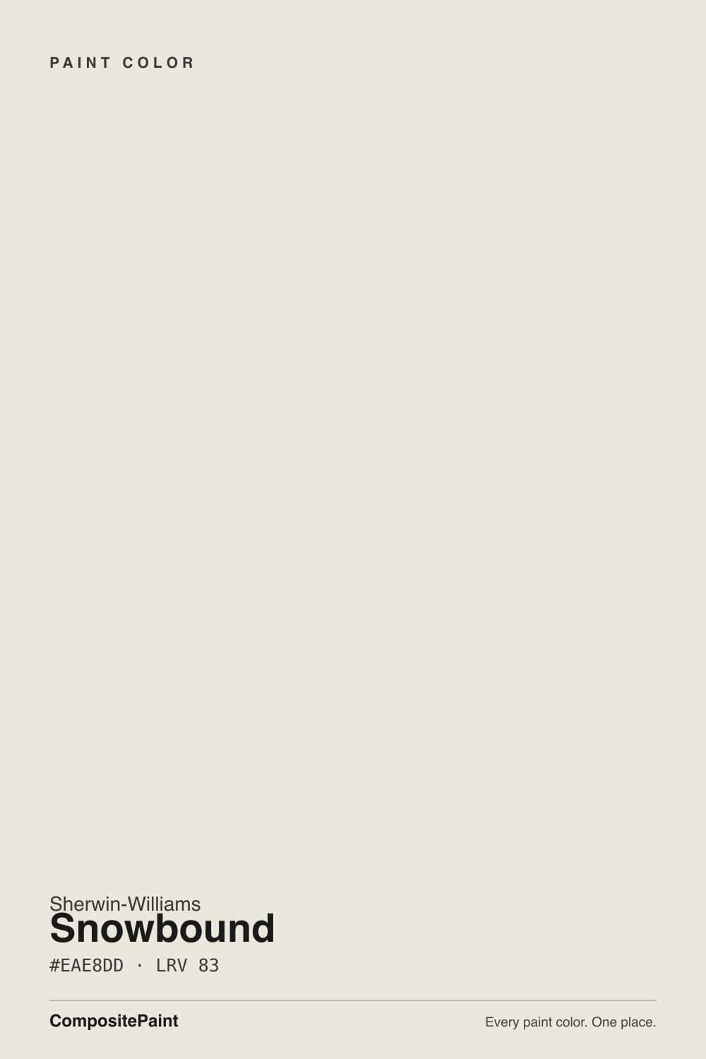
- 3Snowbound83
- 4Chantilly Lace91
- 5Ultra Pure White97
The Fast Verdict
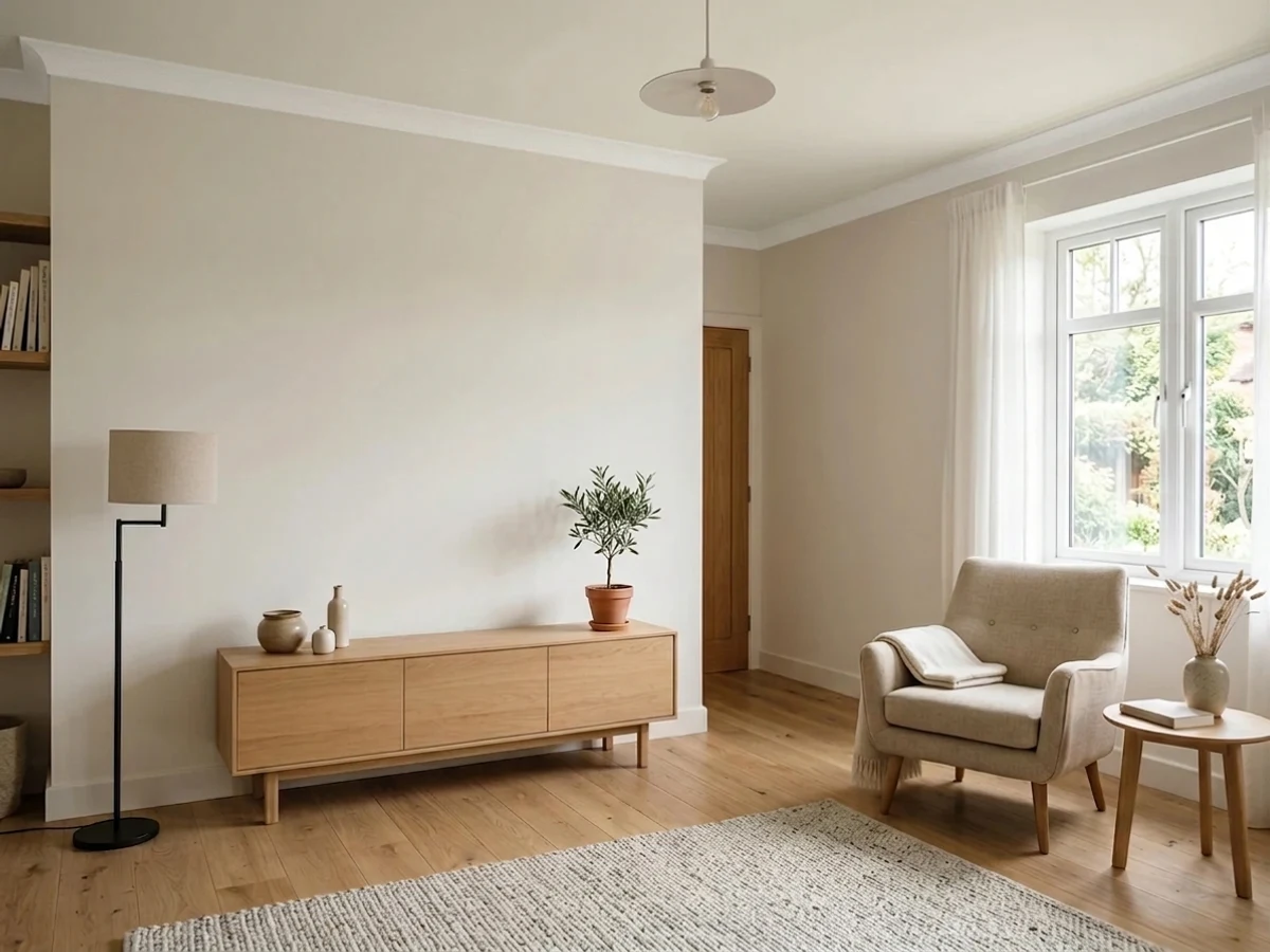
Snowbound is the white designers reach for when a room needs to feel current without feeling cold. It is soft, quiet, and it flatters wood and brass better than any bright builder white.
But it carries a faint pink-violet side that stays hidden in most rooms and comes out swinging in a few — dim north light, warm lamps, pink-leaning floors. Sample it big, or you will be the next person posting "help, my walls are pink."
Rooms with real daylight · trim and doors under greige walls · kitchen cabinets with warm wood and brass · modern-farmhouse and transitional whole-house schemes
Your room is dim and faces north · your floor, tile or carpet leans pink or mauve · your cabinets are already a creamy white · you want a crisp gallery white
- Reads clean and current without going cold or clinical
- High LRV 83 brightens small and low-light rooms
- One of the best cabinet whites for white oak, brass and matte black
- Works on walls and trim in the same house — the sheen does the separating
- Sits perfectly with the SW greige family (Repose Gray, Agreeable Gray)
- Turns pink or mauve under warm lamps and in dim north rooms
- Makes creamier whites next to it look dingy and yellow-green
- Unpredictable outside — the shaded side of a house can read violet
- Too soft for a crisp, high-contrast modern look
What Color Is Snowbound, Really?
A soft off-white built on grayed warmth, not on cream. Most people meet it as "the cool white," and on the wall that is usually how it behaves — clean, quiet, modern. But the base underneath is a gentle greige with a pink-violet lean, and that is the whole story of this color. In a well-lit room the gray flattens the pink and you get a calm, expensive-looking white. In the wrong light the gray drops out and the pink walks forward. Neither reading is a mistake in the can; they are the same paint doing what it was mixed to do.
At LRV 83 it reflects most of the light in the room, but it is not a bright white. Put it beside Extra White (SW 7006) at LRV 86 and Snowbound suddenly shows its body — softer, grayer, slightly hazy. Put it beside Alabaster (SW 7008) at LRV 82 and it flips the other way, reading cleaner and less creamy. That middle position is why it works on walls and trim in the same house: it holds enough color to soften shadows, and enough brightness to still read as white.
Undertone in one line: grayed warmth with a pink-violet edge — never yellow, never blue. If your sample reads flat mauve, that is the pink surfacing in cool or dim light, and it is the one thing to test for.
Where It Shines
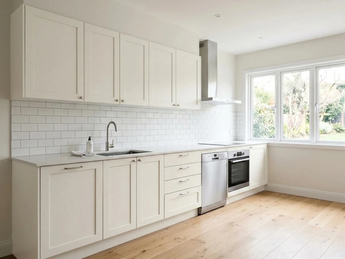
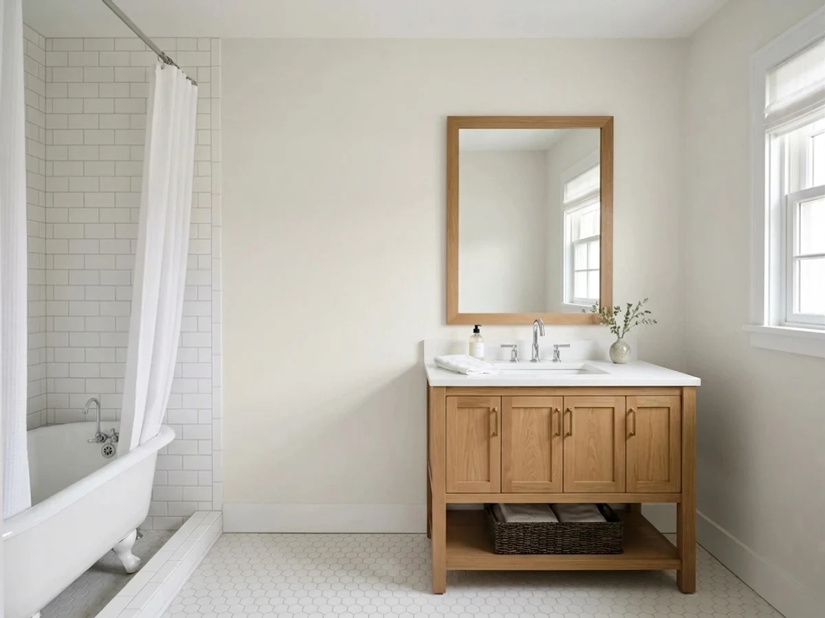
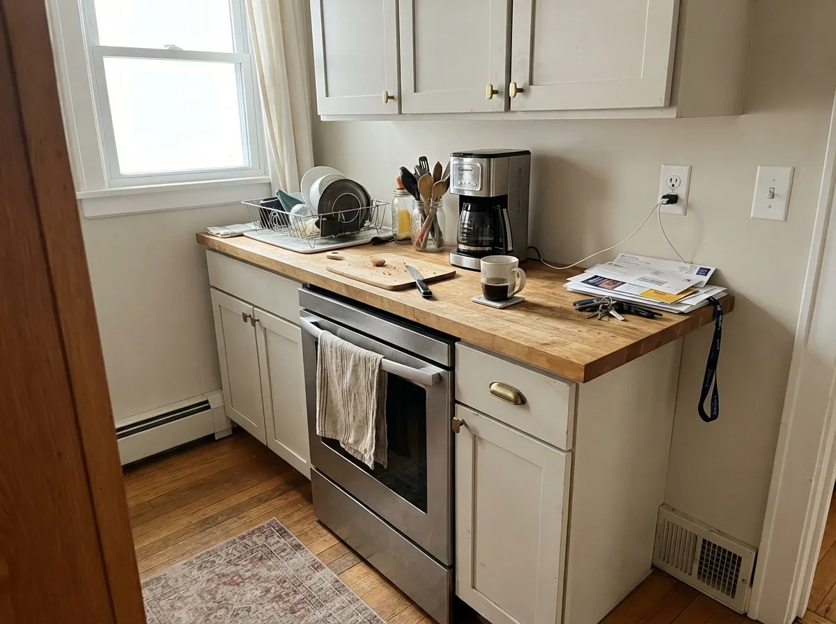
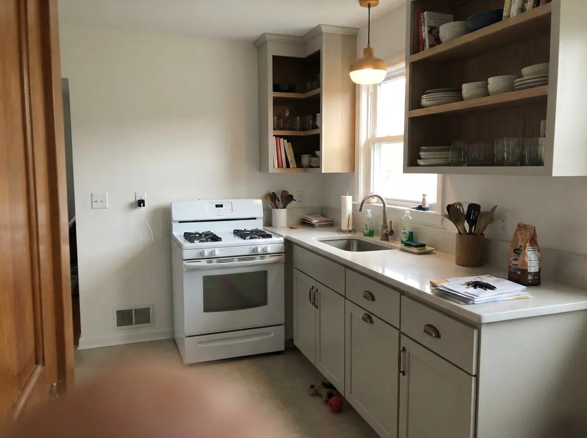
Give it daylight and it is hard to beat. On walls it is bright without glare, on trim and doors it reads as painted woodwork instead of plastic, and on kitchen cabinets it sits beautifully with white oak, walnut, brass and matte black. It is also one of the few whites that carries a whole house without any room looking like a different color.
Where It Fails
Every bad Snowbound story traces back to the same undertone, and all of them are predictable before you open the can. If your room matches one of these three, a second coat will not save it — this is not your white.
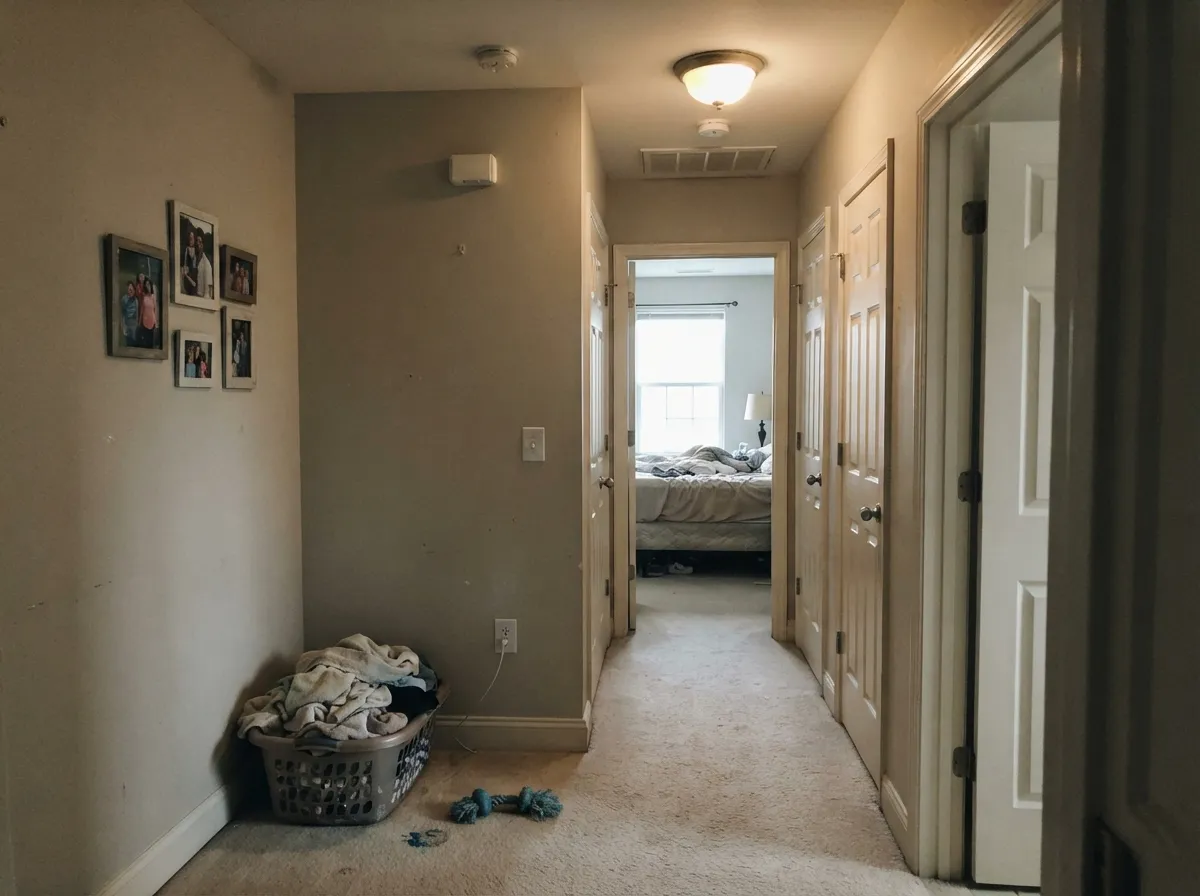
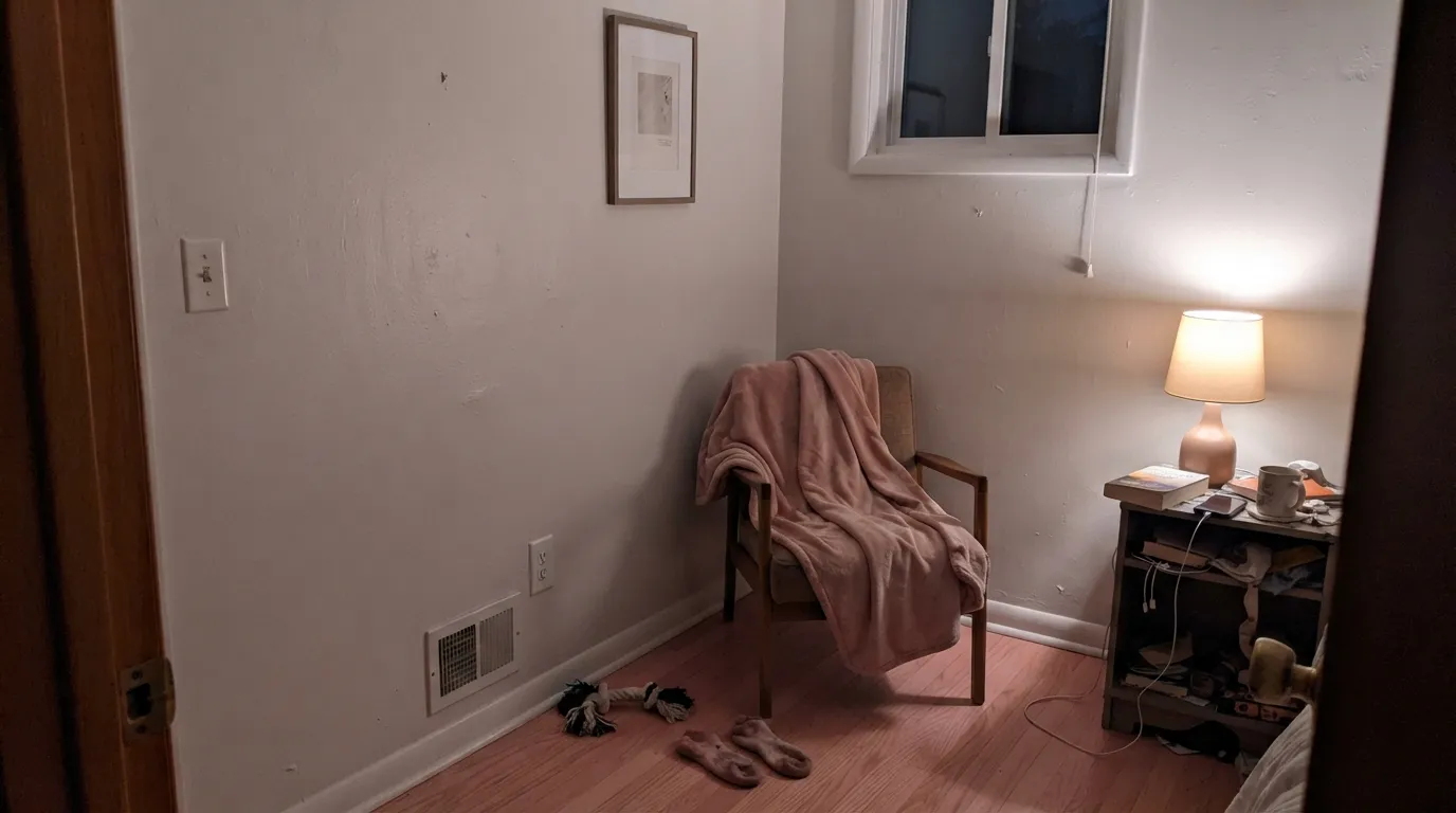
This is the complaint people actually post: painted at 3pm, looked perfect, then the lamps came on and the walls went pink. Warm 2700K light feeds the pink-violet base and there is not enough daylight left to gray it back down. If the room lives at night, use Pure White (SW 7005) instead — same softness, no rosy turn.
Snowbound walls with existing cream or builder-white cabinets is the second-most-common regret. Snowbound reads cool by comparison and drags the cream toward dingy yellow-green. Match the family instead: if your cabinets are creamy, put Alabaster (SW 7008) on the walls and keep Snowbound out of that room.
Cool gray daylight strips the warmth, leaves the violet, and the wall goes flat mauve-gray — the "dingy" reviews. It is worst in rooms with pink-toned oak floors or beige carpet bouncing light up the wall. Go warmer and steadier with Shoji White (SW 7042) or bright and neutral with Extra White (SW 7006).
Room by Room
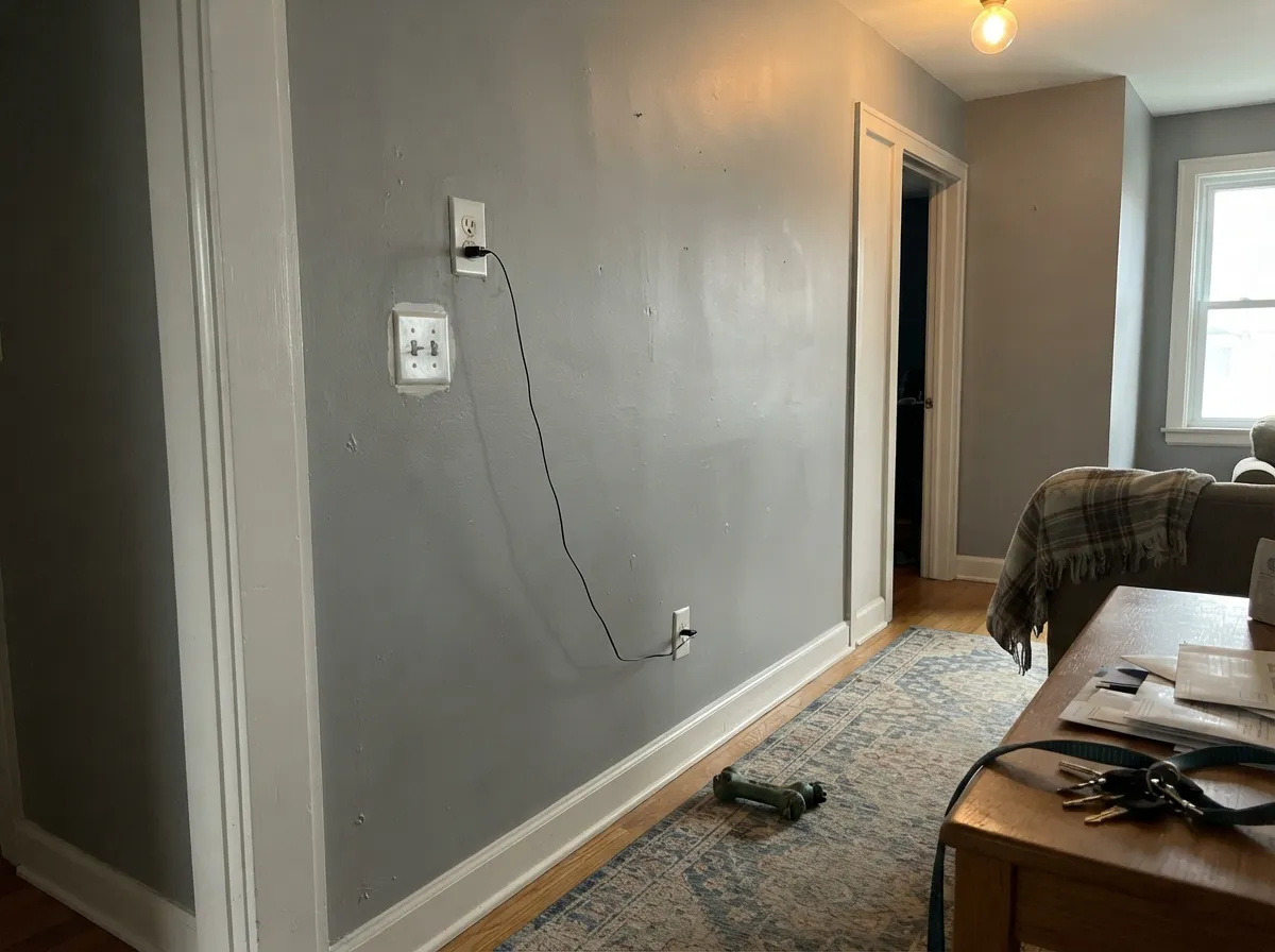
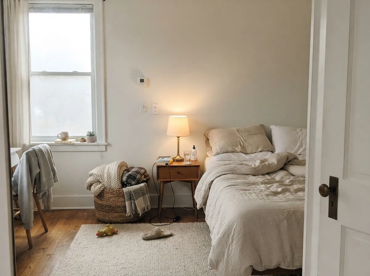
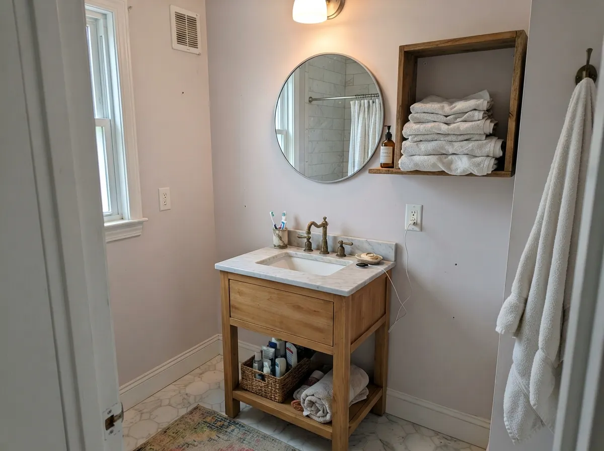
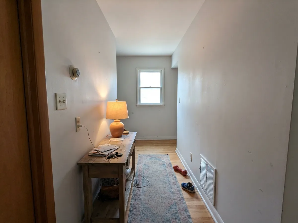
Your Light Is the Risk
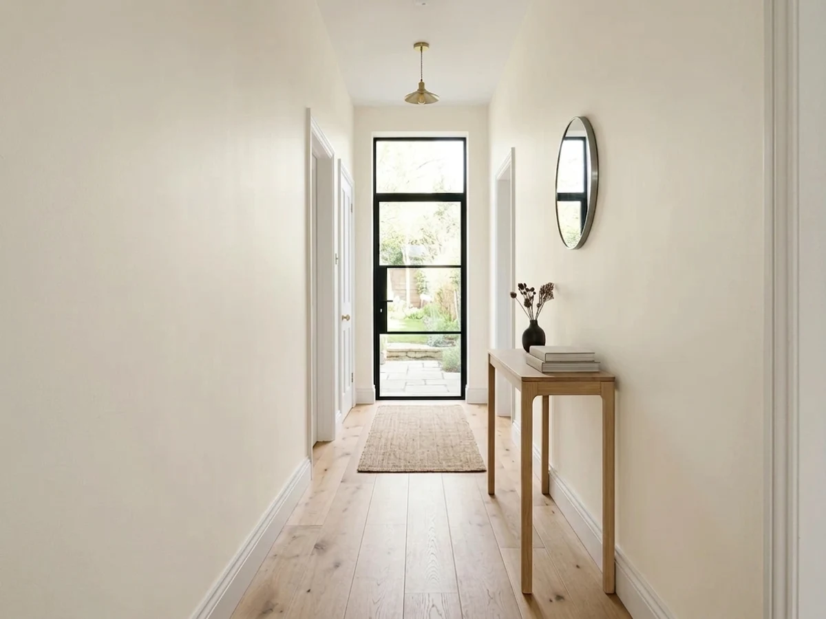
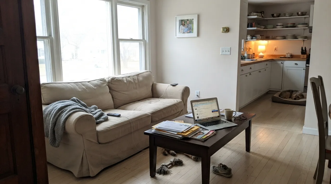
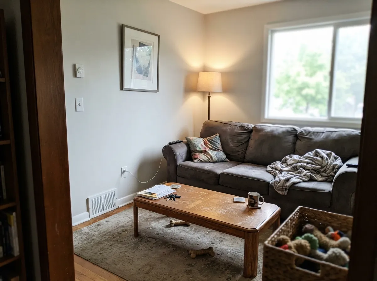
Cool daylight kills the warmth and leaves the violet. Flat, mauve-gray. Test big.
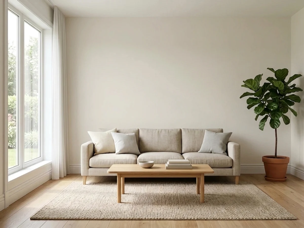
Strong sun grays out the pink and it reads as a soft, clean white all day.
2700K bulbs pull the pink forward. 3000K and a lampshade change fix most of it.
Red oak, beige carpet and terracotta bounce color up the wall. Sample above the floor.
Most complaints about Snowbound are a light mismatch. Upload a photo of your actual room and see it on your walls — then ask for the same wall in north light or evening lamps before you buy a single sample.
Need It From Another Brand?
Any paint counter can custom-tint Sherwin-Williams SW 7004 directly. If you would rather stay in one brand's own deck, these are the closest stock matches, measured as ΔE2000. Under 2 is a difference you will not see on the wall.
| Brand | Closest color | ΔE | LRV | |
|---|---|---|---|---|
| Behr | White52 · Behr | 1.5 | 83 | Color page → |
| Benjamin Moore | Sand Dollar877 · Benjamin Moore | 1.2 | 82 | Color page → |
| Valspar | Pearly GatesV158 · Valspar | 0.8 | 82.1 | Color page → |
| PPG / Glidden | Commercial WhitePPG1025-1 · PPG / Glidden | 0.8 | 83 | Color page → |
| Glidden | Silver FeatherPPG1002-1 · Glidden | 0.6 | 83 | Color page → |
| Dutch Boy | Crisped White022W · Dutch Boy | 1.2 | 82 | Color page → |
Similar Sherwin-Williams Colors
The nearest shades to Snowbound within Sherwin-Williams's own range, ranked by perceptual color distance — useful when you want the same look a touch lighter, darker, or warmer.
WCAG 2.1: AA is 4.5 : 1 for normal text, 3 : 1 for large text, AAA is 7 : 1.
Snowbound vs the Colors You're Also Considering
Every Snowbound sample board has the same rivals on it. The numbers show the real lightness gap — then it comes down to which risk you would rather live with.
Pick this for the cleaner, cooler, more modern white of the two.
Sherwin-Williams SW 7008 · LRV 82AlabasterPick this if your home is warm and traditional, or your cabinets are already creamy.
Side-by-side comparison →Pick this when you want a little more softness and body on a big wall.
Sherwin-Williams SW 7005 · LRV 84Pure WhitePick this for the safer, more predictable version — it never goes rosy at night.
Side-by-side comparison →Snowbound's closest rival is Alabaster (SW 7008), LRV 82, one of the most popular whites Sherwin-Williams makes. They are within a point of each other on LRV, but Alabaster carries more cream and warmth, while Snowbound reads a touch cooler and grayer. If your home has warm wood and gold light and you want it emphasized, choose Alabaster; if you want a cleaner, more neutral white that still is not cold, Snowbound wins.
Against Pure White (SW 7005), LRV 84, the contrast flips. Pure White is crisper and more neutral, so Snowbound looks softer and warmer beside it, which is exactly why Pure White makes good trim under Snowbound walls.
Marshmallow (SW 7001), LRV 82, is another near neighbor, sitting between the two with a gentle, balanced warmth. Sample all of them together, because on a chip these differences are easy to miss and only show on the wall.
Snowbound Coordinating Colors
The rule with Snowbound is to stay in the gray-warm middle. It partners beautifully with the Sherwin-Williams greige family because they all sit on the same base, and it fights anything creamy or yellow, which instantly makes the cream look dirty. Deep, desaturated accents — navy, bronze, muted green — do the heavy lifting when you need contrast. These are the partners worth sampling first:
Snowbound on Exteriors
Outside, Snowbound is the color that most needs a real sample. Its high reflectance keeps a facade bright and its gray base takes the harsh glare off full sun, so the south face of a house usually looks excellent — soft, expensive, not clinical. The problem is that a house has four sides. The shaded elevation gets the same cool light that makes north-facing rooms go mauve, and on an overcast day the two sides of one house can look like two different paints.
Contrast is what saves it. Dark trim pins the color down and forces it to read as white: Iron Ore (SW 7069) or Urbane Bronze (SW 7048) on shutters, gutters and window frames, Naval (SW 6244) on the door. What to avoid outside is a warm cream or tan trim, which turns the siding cold and pink by comparison, and pink-toned brick or flagstone, which will feed the undertone all day long.
Snowbound With Wood Tones and Floors
White oak, rift-sawn oak and walnut are where this color earns its reputation. All three are cool-to-neutral woods, and Snowbound's gray base meets them halfway instead of yellowing against them. Gray-washed floors and light LVP also work, which is unusual for an off-white and a big part of why it shows up in so many new builds.
The floor to be careful with is orange or pink-leaning red oak, the standard in most 1990s and 2000s houses. That floor throws warm light up the wall all day, and it is the fastest way to turn Snowbound rosy in a room that otherwise has good light. Beige and blush carpet does the same thing. Tape a large sample board to the wall right above the floor, look at it at 9am and again at 9pm, and if the bottom half of the board reads pink, move to Pure White (SW 7005) before you buy the paint.
Three Ready Palettes Built on Snowbound
A color is never alone on the wall. These are complete combinations in the 60-30-10 pattern, with the reason each one holds together. Every one opens in the visualizer.
Snowbound and Repose Gray sit on the same grayed base, so the handoff from room to room reads intentional instead of patchy. Naval supplies the single dark note the whole scheme needs, and it loves brass hardware.
Try this palette in your roomAccessible Beige is warm enough to cancel any pink drift in the cabinet color, so the doors stay reading as clean white. Urbane Bronze grounds the room and keeps the whole thing from floating away pale.
Try this palette in your roomPure White trim is one point brighter and more neutral, so the edges stay crisp without making the walls look dirty. Evergreen Fog is the muted green that reads restful, and its gray base is the same one holding Snowbound steady.
Try this palette in your roomSnowbound FAQ
Is Snowbound warm or cool?
It behaves like a cool white but it is built on grayed warmth with a pink-violet lean. Beside a true cream like Creamy (SW 7012) it looks clean and cool. Beside a bright white like Extra White (SW 7006) it looks soft and slightly warm. That middle spot is why it is so widely specified — and why it can surprise you.
Why does my Snowbound look pink?
Because something in the room is feeding its violet base: warm 2700K bulbs, dim north light, or a floor, rug or tile that leans pink. It is the single most reported problem with this color. Try 3000K bulbs and a warmer rug first; if it still reads rosy in daylight, repaint in Pure White (SW 7005).
Snowbound or Alabaster?
Alabaster (SW 7008) is creamier and warmer; Snowbound is cleaner and grayer. Pick Alabaster if your home has honey oak, gold light and traditional finishes you want emphasized. Pick Snowbound for a more modern, crisp look with white oak, brass and black. Do not use both in the same sightline — one always makes the other look wrong.
What trim white goes with Snowbound walls?
Pure White (SW 7005) at LRV 84 is the standard answer: a hair brighter and more neutral, so the trim separates cleanly without shouting. Extra White (SW 7006) works if you want sharper contrast. Snowbound itself in semi-gloss is also fine — the sheen change is enough separation in a small house.
Is Snowbound good for kitchen cabinets?
It is one of its strongest uses. On doors it reads as a soft true white that flatters warm wood, brass and matte black instead of fighting them. Use satin in a urethane-fortified cabinet enamel. The only real warning is lighting: under-cabinet LEDs in a warm color temperature can pull the pink out along the upper doors.
Does Snowbound work on exteriors?
It can, but it is less reliable outside than in. Full sun grays out the pink and the facade looks crisp and soft at once, while the shaded north side of the same house can drift violet in the same afternoon. Paint a two-foot sample on each elevation and look at all of them before you buy five gallons.
Can I use Snowbound and Repose Gray together?
Yes, and it is the most-specified pairing this color has. Repose Gray (SW 7015) at LRV 58 gives you weight on walls or a lower two-tone band while Snowbound handles trim, doors and ceilings. They share the same grayed base, so the contrast reads soft rather than striped.
Have you painted with Snowbound?
Rate it — one tap helps the next reader decide.
Ask a Question