Pure White
Sherwin-Williams' best-selling white, reviewed honestly: why it works on almost everything, the three rooms where readers call it dirty, and what to paint instead.

Jessica has spec'd whites and neutrals for more than 300 rooms and keeps a sample wall of painted drawdowns in her studio. Every color review is checked against real reader rooms in the comments and re-tested when a formula changes. About the testing process →
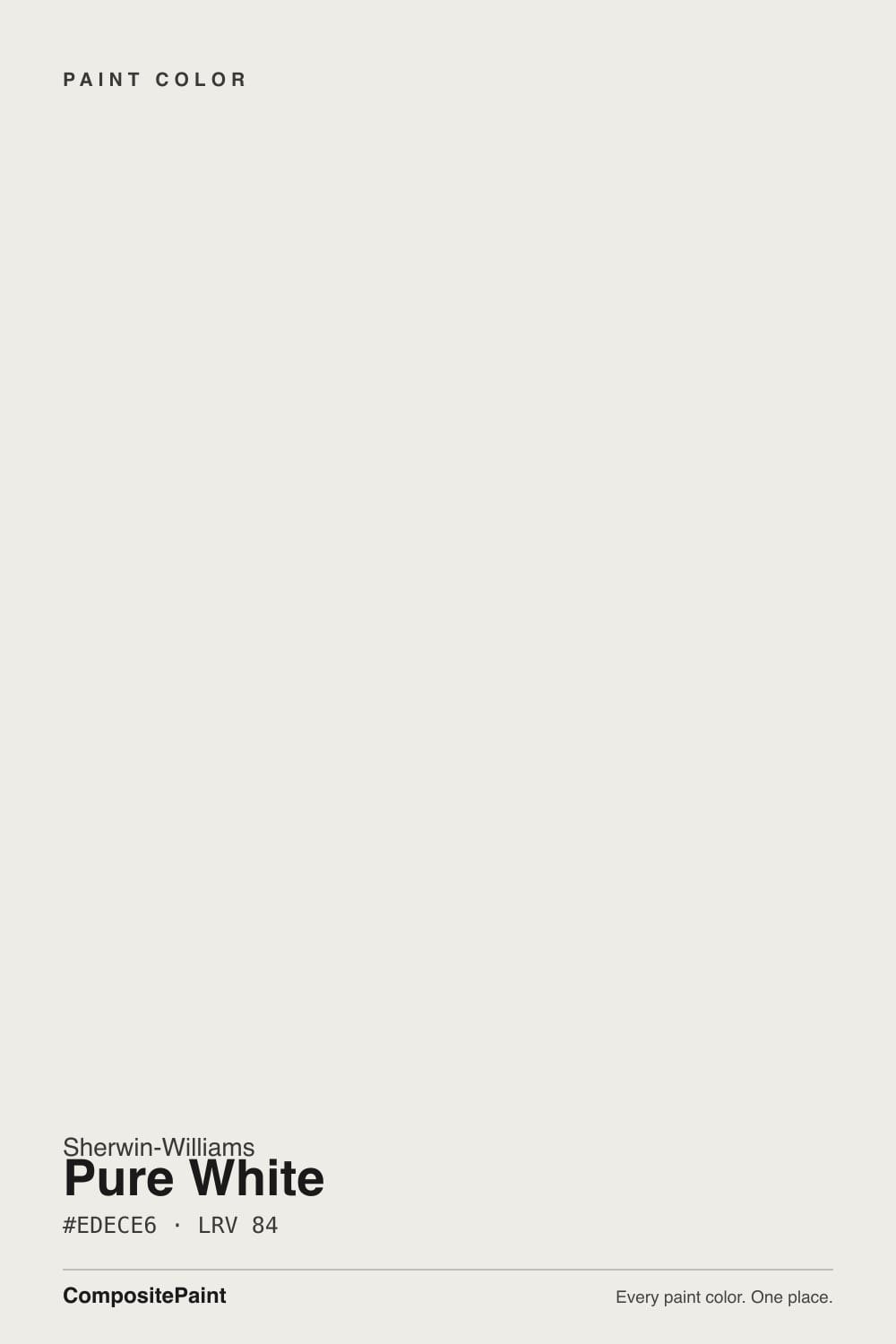
- 1First Star69
- 2Classic Gray74
- 3Pure White84
- 4Chantilly Lace91
- 5Ultra Pure White97
The Fast Verdict
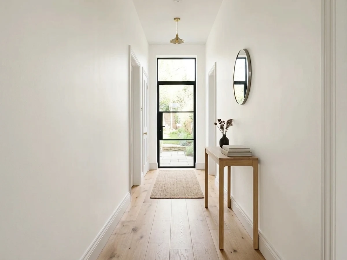
Pure White is the white most painters reach for without asking, and usually they are right. At LRV 84 it is genuinely bright, and the small warm lean keeps it from going clinical, so it flatters oak, brass, and cream instead of fighting them.
The catch is that it is warm enough to lose against a brighter white and cool enough to go flat in dim north light. Pick your trim, ceiling, and stone at the same time and it behaves everywhere.
Trim, doors, and built-ins in a warm home · kitchen and bath cabinets · whole-house walls with decent daylight · warm-white exteriors with black windows
A brighter builder white is staying on trim or ceiling · the room is dim and faces north · your windows have blue-tinted low-E glass · you want a sharp gallery-white look
- Bright at LRV 84 but never clinical — the rare white that is both
- Flatters oak, walnut, brass, and cream without turning yellow
- The most-sprayed cabinet white for a reason: it stays soft, not cold
- Works as walls, trim, and ceiling in one house so nothing clashes
- Every Sherwin-Williams store and painter knows it — easy to match and touch up
- Reads dirty next to any brighter white you keep
- Goes flat, and sometimes blue, in dim north light
- Too soft for a crisp gallery or high-contrast modern look
- So common in new builds that it can feel like the builder default
What Color Is Pure White, Really?
A soft white with the smallest possible drop of warmth in it, and the reason it works is how little of that warmth there is. Most warm whites are built on a yellow oxide base you can see on the chip; Pure White carries a trace of yellow cut with a touch of gray, so on a wall it reads as white first and warm second. Painters describe it as the least warm of the warm whites, and that is exactly right. It is the white you pick when cream would be too much and a cool white would be too cold.
At LRV 84 it puts most of the light back into the room, but it is not a bright white and it does not pretend to be. Stand it next to High Reflective White (LRV 93) and Pure White suddenly shows its body: you can see the color sitting in it. Even Extra White, only two points higher on paper, looks noticeably cleaner and cooler beside it. That small gap is the useful part. On trim it reads as painted woodwork instead of plastic, and on a wall it softens shadows in a way a bright white cannot.
Undertone in one line: barely warm, a trace of yellow held down by gray, with no pink and no green in it. Because it carries so little color of its own, it reflects whatever is around it, so a red brick patio outside the window or a green lawn will show up on the wall. That is the room talking, not the paint.
Where It Shines
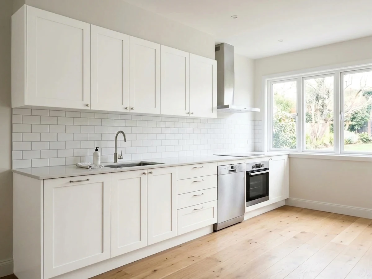
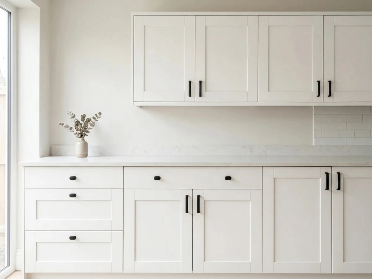
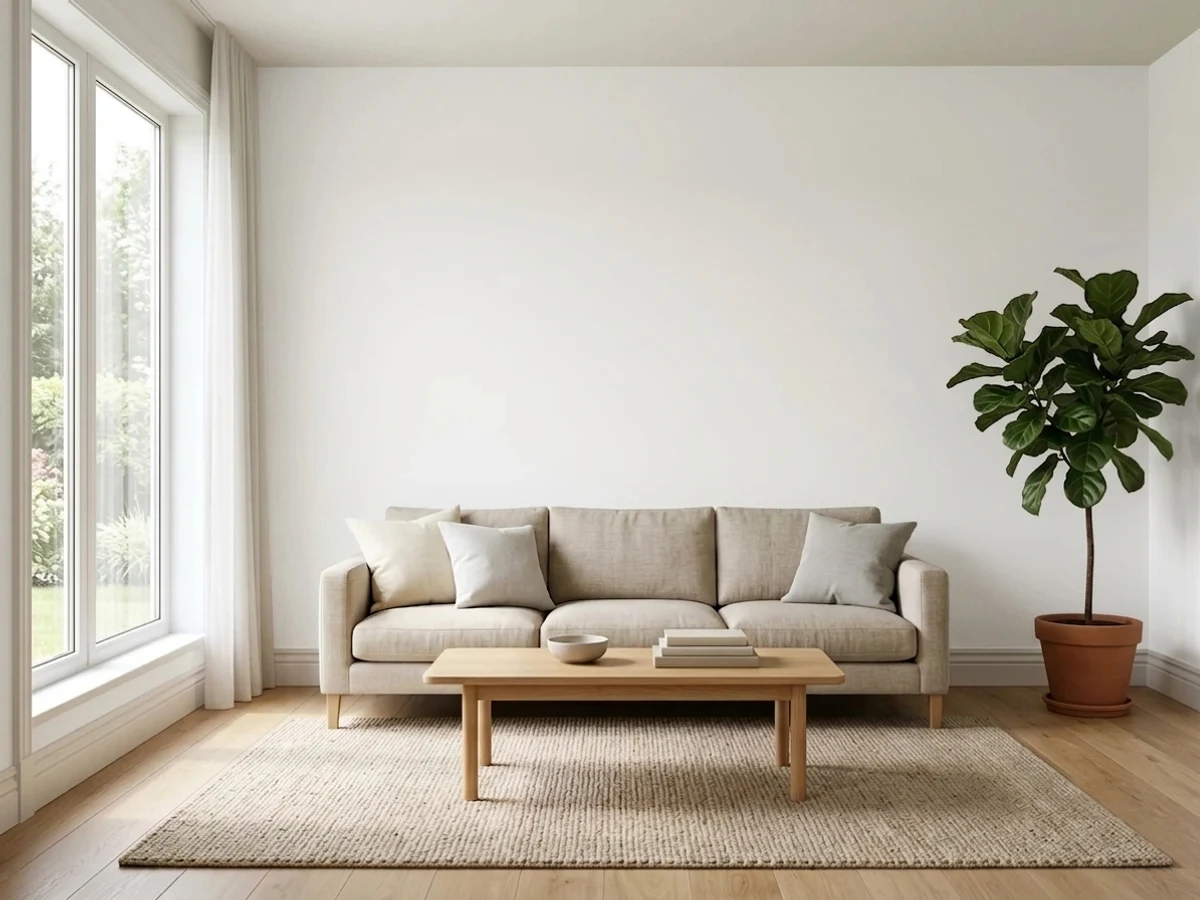
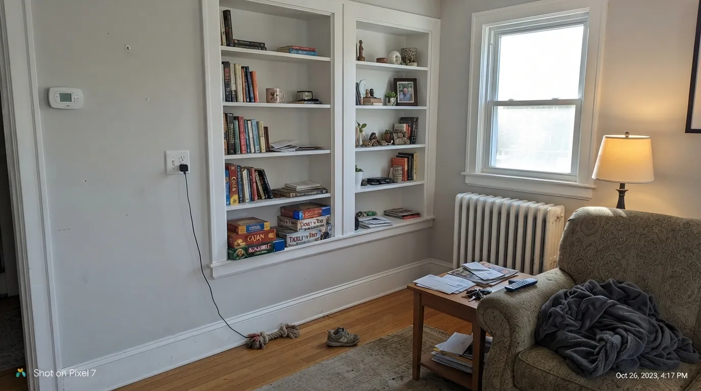
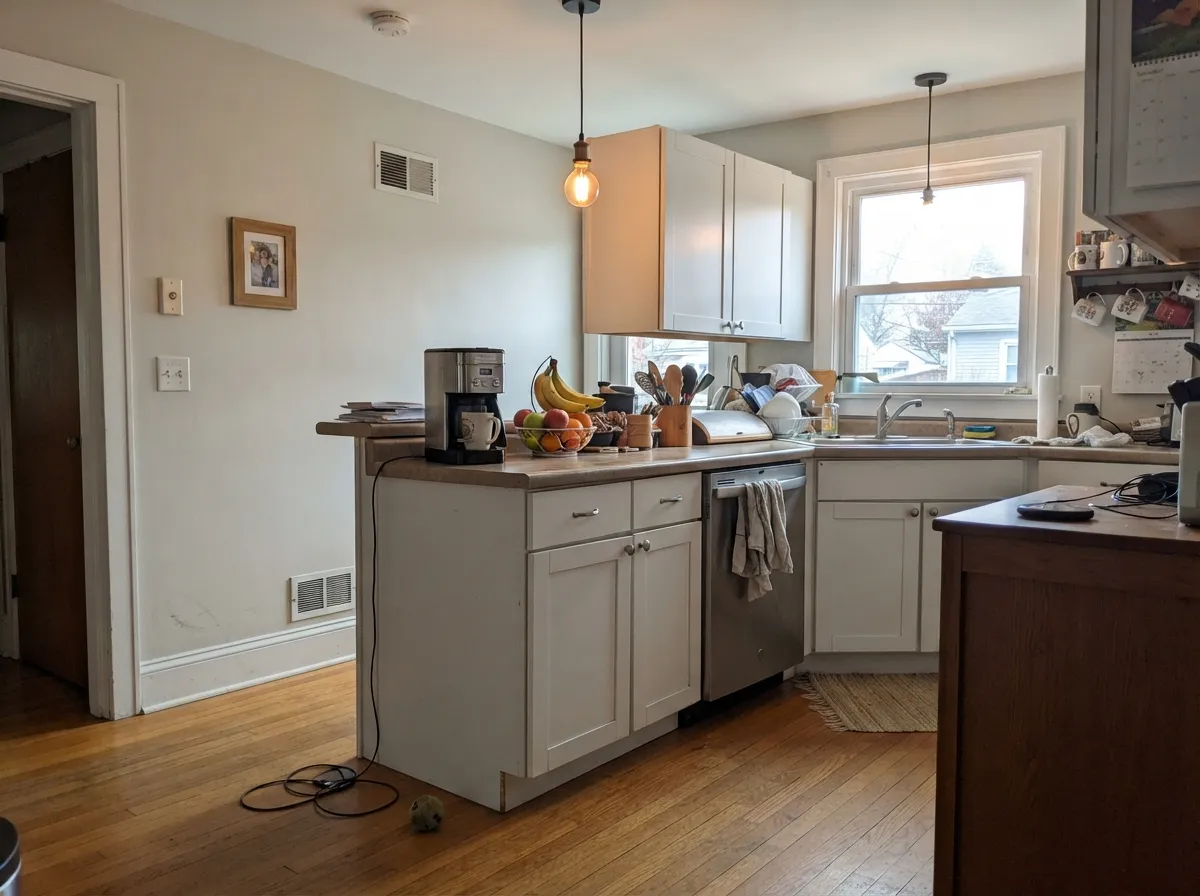
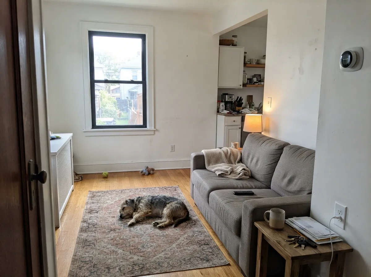
Pure White is at its best where warmth and brightness have to happen at once: sprayed cabinets, trim and doors in a house full of oak and brass, and whole floors of walls with real daylight on them. Look at how it behaves in these rooms against the trim, stone, and windows — that is what decides it, not the chip.
Where It Fails
Pure White gets very few complaints about the paint itself. Almost every bad story is a pairing or a light problem, and all three show up again and again on Houzz and in designer reviews. If your room matches one of these, another white will save you a repaint.
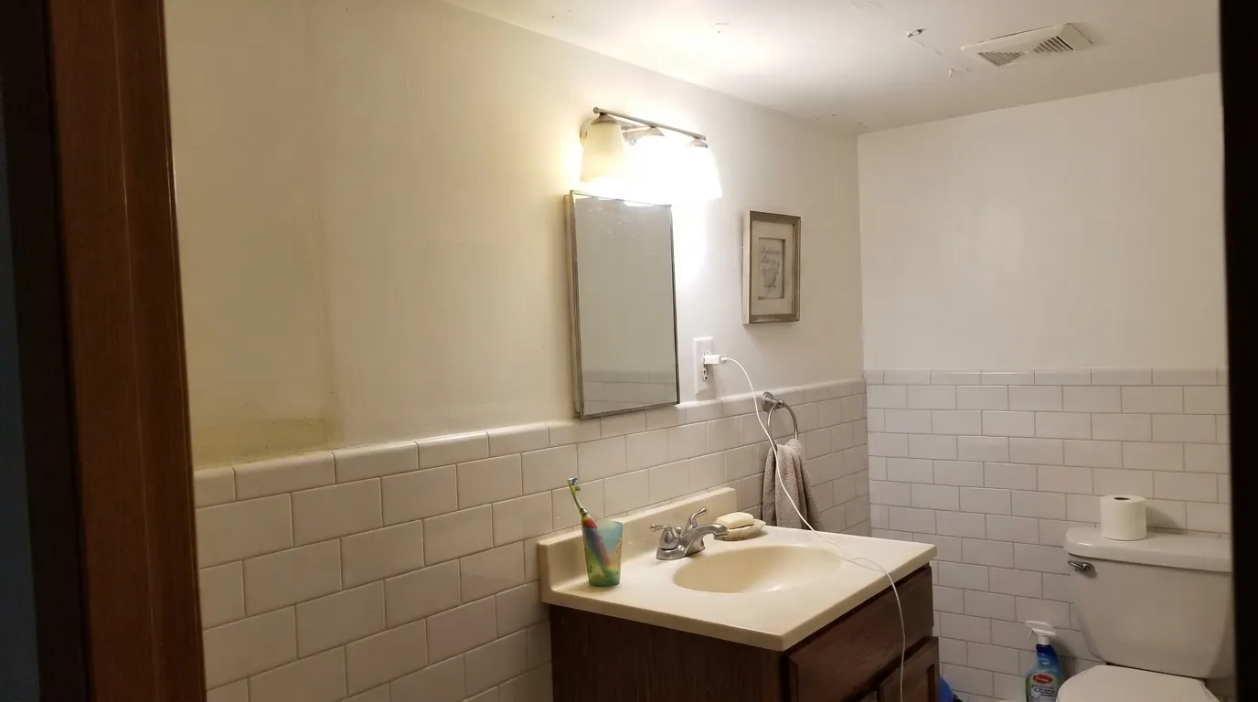
This is the number one complaint: Pure White walls next to existing trim, a builder-white ceiling, or bright white subway tile. Homeowners post that it looks "dingy" or "dirty," and the reason is simple — the two whites are too close to read as different, so the warmer one just looks soiled. Either paint walls, trim, and ceiling all Pure White and let the sheen do the separating, or step to a clearly softer white like Alabaster (SW 7008) so the difference is on purpose.
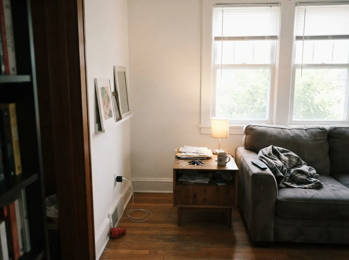
The warm lean is small — about 16 percent saturation — and cool north light eats it. Readers describe north-facing dining rooms where Pure White "looked blue" and living rooms where it went flat and cold. Blue-tinted low-E windows make it worse by casting a cool wash on every wall. In that room use a white with real cream in it, like Alabaster (SW 7008) or Creamy (SW 7012), and keep the bulbs at 2700K.
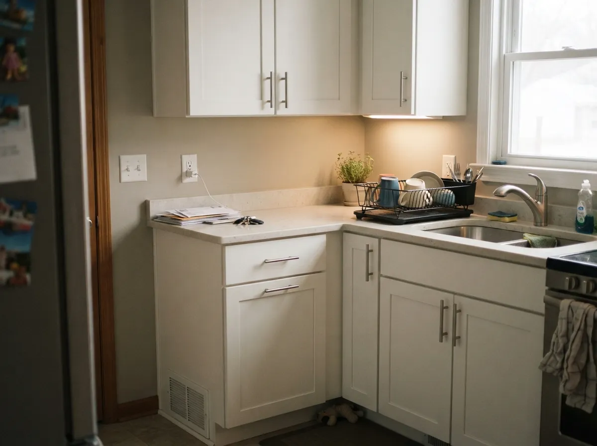
West and south light pushes the yellow forward, and 2700K bulbs finish the job at night. If your counters are cool gray quartz or Carrara-look marble and you wanted a crisp, high-contrast kitchen, Pure White will read soft and slightly creamy against them — not the look you sampled. Go cooler and brighter with Extra White (SW 7006) or High Reflective White (SW 7757).
Room by Room
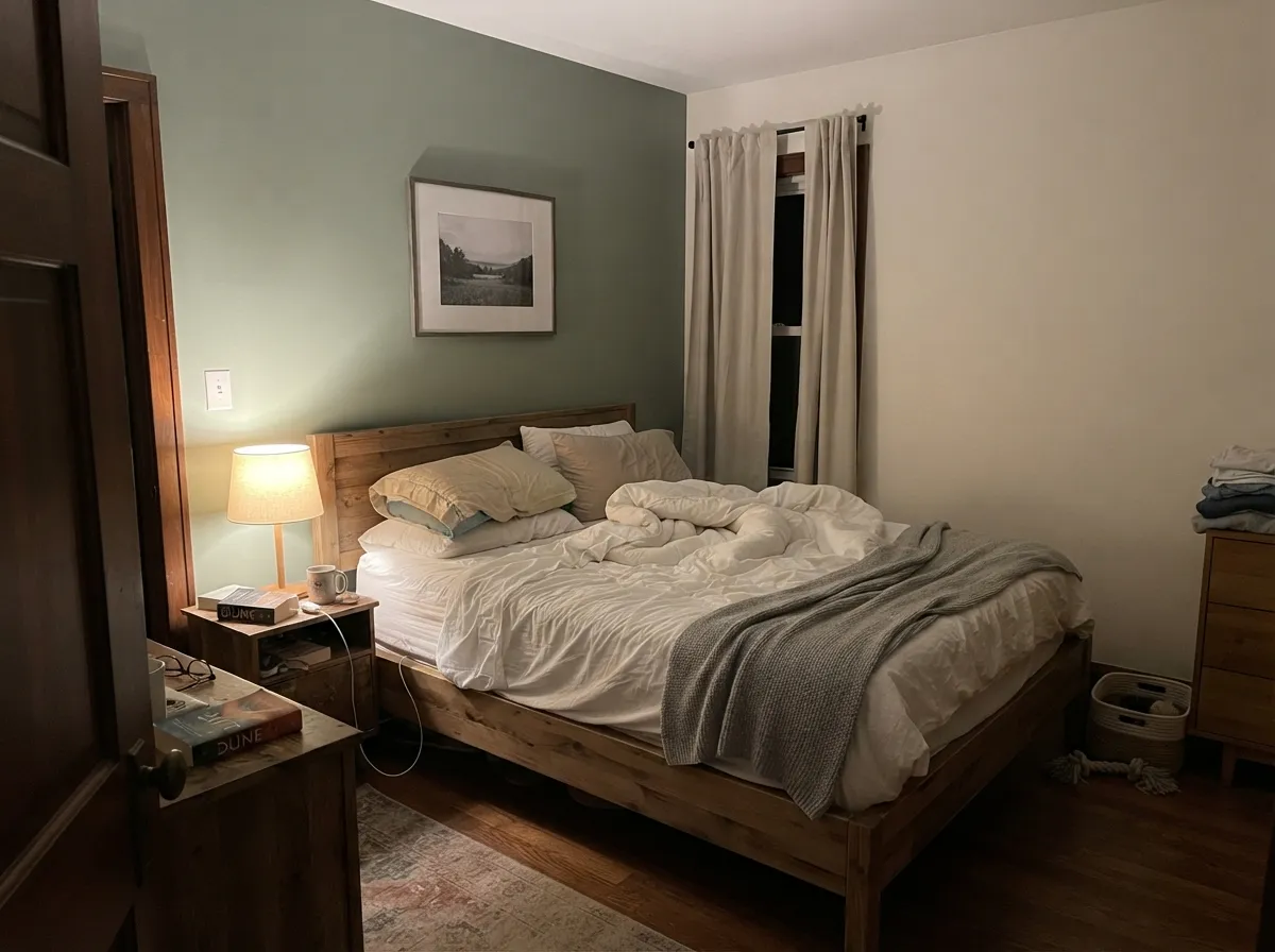
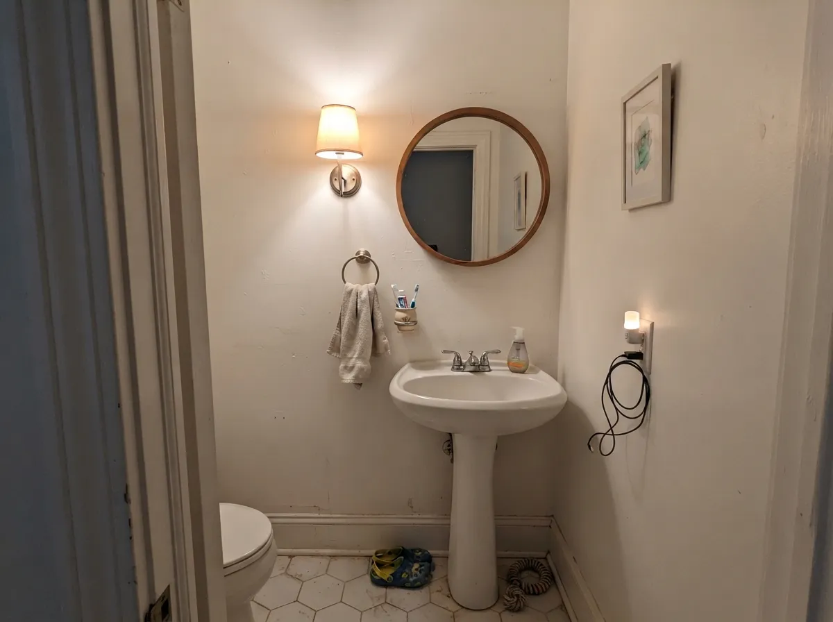
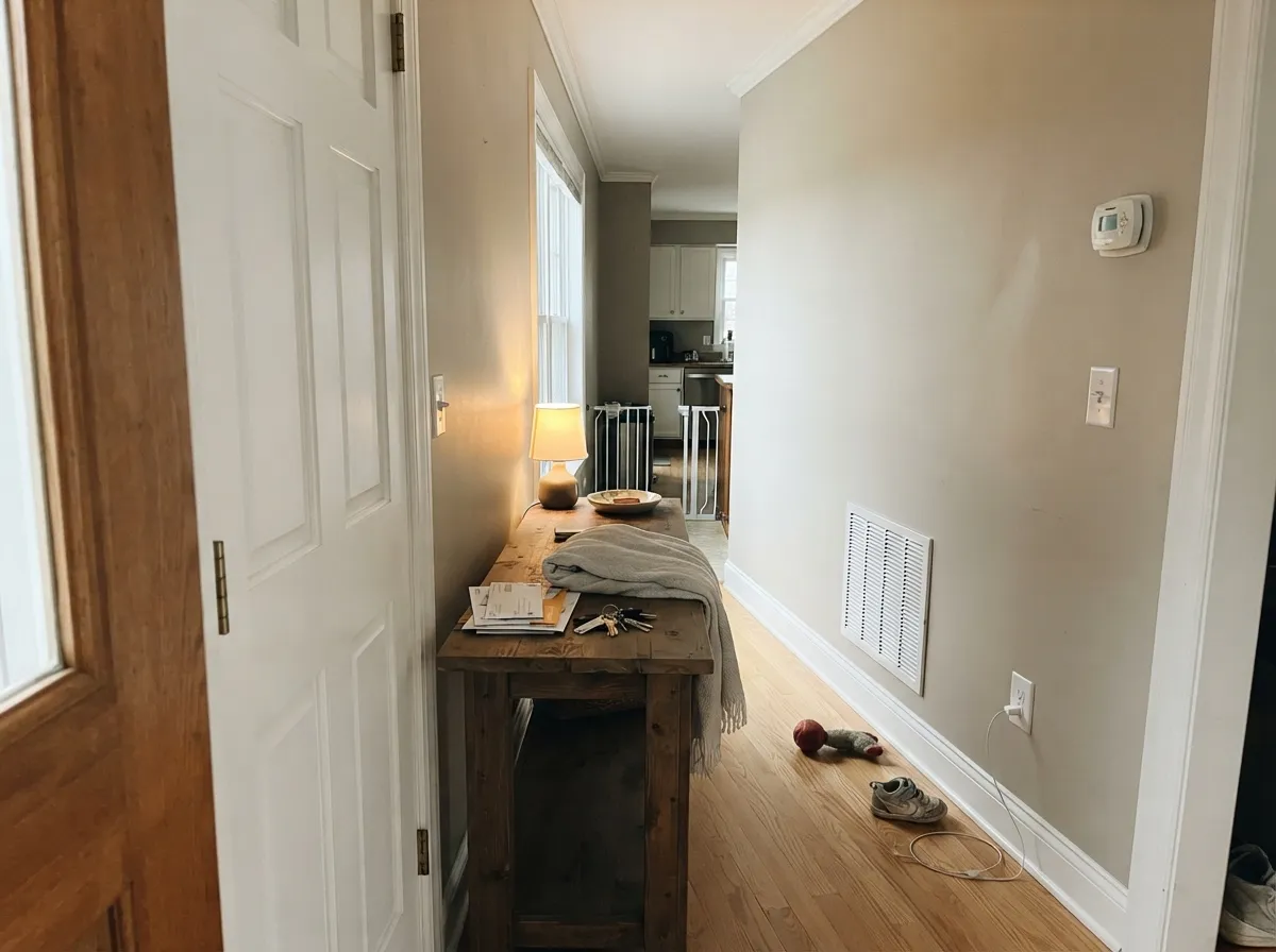
Your Light Is the Risk
Warm sun all day keeps it soft and glowing. It creams up slightly, never yellow.
Cool daylight cancels the small warm lean. It can go flat or faintly blue — sample first.
2700K lamps make it soft cream. 3500–4000K keeps it a true white. Swap bulbs, not paint.
LRV 84 does the work — a powder room or hall still reads bright and open.
Most complaints about Pure White are a light mismatch. Upload a photo of your actual room and see it on your walls — then ask for the same wall in north light or evening lamps before you buy a single sample.
Need It From Another Brand?
Any paint counter can custom-tint Sherwin-Williams SW 7005 directly. If you would rather stay in one brand's own deck, these are the closest stock matches, measured as ΔE2000. Under 2 is a difference you will not see on the wall.
| Brand | Closest color | ΔE | LRV | |
|---|---|---|---|---|
| Behr | Smoky WhiteBWC-13 · Behr | 1.2 | 83 | Color page → |
| Benjamin Moore | Vanilla Milkshake2141-70 · Benjamin Moore | 1.6 | 81 | Color page → |
| Valspar | Cool Gray7006-10 · Valspar | 1.0 | 83.2 | Color page → |
| PPG / Glidden | Commercial WhitePPG1025-1 · PPG / Glidden | 0.5 | 83 | Color page → |
| Glidden | Commercial WhitePPG1025-1 · Glidden | 0.0 | 84 | Color page → |
| Dutch Boy | Pristine Pearl021W · Dutch Boy | 1.5 | 84 | Color page → |
Similar Sherwin-Williams Colors
The nearest shades to Pure White within Sherwin-Williams's own range, ranked by perceptual color distance — useful when you want the same look a touch lighter, darker, or warmer.
WCAG 2.1: AA is 4.5 : 1 for normal text, 3 : 1 for large text, AAA is 7 : 1.
Pure White vs the Colors You're Also Considering
Every Pure White sample board has the same rivals on it. The numbers show the real lightness gap — then it comes down to which risk you would rather live with.
Pick this when you want a warm white that still clearly reads as white.
Sherwin-Williams SW 7008 · LRV 82AlabasterPick this for dim north rooms and when Pure White looks dirty next to your trim.
Side-by-side comparison →Pick this for warmth — Extra White can feel icy on a whole room.
Sherwin-Williams SW 7006 · LRV 86Extra WhitePick this for crisp trim, cool gray stone, and modern high-contrast rooms.
Side-by-side comparison →Alabaster (SW 7008, LRV 82) is the closest comparison people ask about. Alabaster is a touch softer and creamier, with a warmer, more enveloping feel, while Pure White reads slightly cleaner and brighter side by side. If you want a warm white that still says white, Pure White wins; if you want cozy and mellow, Alabaster does.
Snowbound (SW 7004, LRV 83) sits at nearly the same lightness but carries a cooler, grayer edge. Against Snowbound, Pure White looks warmer and a bit softer, so choose Snowbound when you want white that skews neutral-to-cool and Pure White when your palette is warm.
Extra White (SW 7006, LRV 86) is brighter and cooler still. It makes a sharper, more modern trim, whereas Pure White gives a warmer, gentler contrast. In a warm-toned home, Pure White blends; Extra White pops.
Pure White Coordinating Colors
Pure White carries so little color of its own that it partners with almost anything, which is a blessing and the reason people still get it wrong. The rule that matters is contrast: pick a partner that is clearly darker or clearly more colorful, never another near-white. Warm greiges are the safe center, muted greens and blues give it life without fighting the yellow trace, and one deep near-black anchors the whole scheme.
These are the partners that show up over and over in real Sherwin-Williams houses, and they are the ones I would sample first.
Pure White as a Trim and Cabinet White
This is the job it does better than anything else in the deck, and it is why so many painters quote it without asking. On trim it is forgiving: the small warm lean keeps a door casing from looking like white plastic against a warm wall, it carries enough pigment to cover in two coats, and every Sherwin-Williams store can mix a touch-up quart that actually matches years later. Use semi-gloss on trim and doors, in a trim enamel rather than wall paint, so the finish levels out and stops fingerprints.
The one decision that decides whether it looks good is the wall color you put under it. Pure White trim needs a wall with real color in it, or at least real depth. Under greige, sage, navy, or charcoal it looks crisp and intentional. Under another off-white it looks like you ran out of paint. If you want a soft white wall and white trim, use Pure White for both and change only the sheen.
On cabinets the same warmth does something specific: it keeps painted doors from going cold and blue under LED task lighting, which is where crisp whites usually fall apart. Check it against your counters before you spray. With warm quartz, butcher block, and brass it is excellent. With cool gray veined stone it reads slightly creamy, and that is the moment to step to a cooler white instead of talking yourself into it.
Pure White on Exteriors
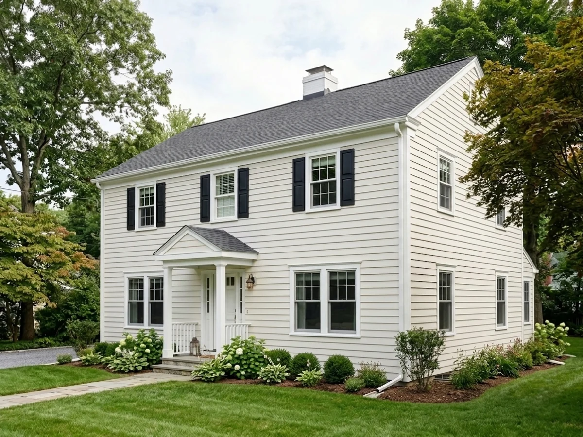
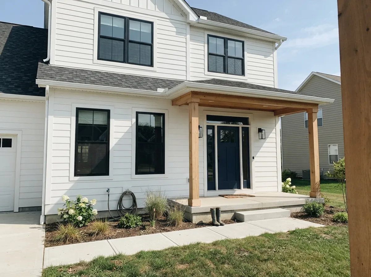
Outside, full sun does most of the thinking for you. Daylight is far stronger than anything indoors, so the warm trace that shows up on an interior wall mostly washes out and the siding reads clean and bright without the blue glare cheap white paints give a facade. It is one of the most-used exterior whites in the Sherwin-Williams line for that reason, and it works on siding, board and batten, and painted brick alike.
Two things to plan for. First, the shaded north elevation and any deep porch will read a full step softer and warmer than the sunny side, so walk the whole house with a large sample before you sign off, not just the front. Second, on big stucco walls in hot, bright climates it can flatten out under midday sun and look a little clinical; if that is your house, a creamier white will hold up better.
The pairing is what makes it look designed. A near-black or warm charcoal on the windows, trim, and shutters gives Pure White the contrast it needs, and a saturated front door carries the color. Avoid a second, brighter white anywhere on the exterior, including the garage door and gutters, for the same reason it fails indoors.
Three Ready Palettes Built on Pure White
A color is never alone on the wall. These are complete combinations in the 60-30-10 pattern, with the reason each one holds together. Every one opens in the visualizer.
The one complaint about Pure White is that it looks dirty beside a brighter white, and using it everywhere at different sheens removes that problem entirely — the separation comes from light bouncing, not from a second color. The navy door gives the scheme its single dark note so the all-white house still has a focal point.
Try this palette in your roomAgreeable Gray sits on the same warm base as Pure White, so the wall-to-cabinet handoff looks intentional instead of like two whites competing. Urbane Bronze is a warm charcoal rather than a cold black, which keeps the anchor in the same temperature family and flatters brass hardware and butcher block.
Try this palette in your roomSea Salt is soft enough that its green-gray never argues with Pure White's yellow lean, so the room gets color without losing the bright, clean read at LRV 84. One black door or black hardware supplies the 10 percent of contrast that stops a pale bathroom from looking washed out.
Try this palette in your roomPure White FAQ
Is Pure White warm or cool?
Warm, but only just. There is a trace of yellow in it, softened with enough gray that it never reads cream, which is why it sits comfortably next to both warm oak and cool quartz. In strong afternoon sun it warms up a little; in cool north light the warmth cancels out and it can look flat rather than white.
Can I do Alabaster walls with Pure White trim?
No, and this is the single most common mistake with this color. The two whites sit in almost the same place on the color wheel but carry different amounts of color, and the gap is not wide enough for your eye to read it as a deliberate contrast, so each one makes the other look gray and soiled. Either use Pure White for both and let the sheen separate them, or pair Pure White trim with a wall color that is clearly a color, not another white.
Is Pure White good for ceilings?
Yes, and it is one of the few tinted whites that does not go dingy overhead. Use flat, and use it on the ceiling whenever the trim is also Pure White so the whole shell reads as one surface. It also covers far better than High Reflective White, which has so little pigment that painters routinely need an extra coat to get an even ceiling out of it.
Pure White or Extra White for trim?
Pure White if the house has wood floors, brass, cream, or any warmth at all; Extra White if your palette is cool gray, marble, and black metal and you want the trim to snap. There is also a practical reason painters lean on Pure White: Extra White can look blue on the fan deck and then come out warmer than expected in cabinet and trim products, while Pure White stays predictable across sheens and lines.
What product should I use on cabinets?
A waterborne urethane cabinet enamel in satin, like Emerald Urethane Trim Enamel, sprayed if you can. Urethane does not oxidize the way old oil enamels did, so Pure White cabinets hold their color instead of ambering over the doors above the range. Two thin coats over a bonding primer, with real cure time before you rehang the doors.
How many coats does it take, and do I need primer?
Two coats over an existing light color, and it covers well because it has more pigment in it than the brighter Sherwin-Williams whites. Over anything dark or saturated, prime first with a gray-tinted primer; going straight to white over navy or red is how a two-coat job turns into four. On raw drywall, prime, then two coats.
What is the closest Benjamin Moore color to Pure White?
There is no true twin, but Oxford White (CC-30) is the nearest neighbor, just cleaner and cooler with less softness in it. Chantilly Lace is much brighter and clearly cool, and Simply White is brighter and clearly yellow, so neither one is a substitute. If your painter works in Benjamin Moore and you want the same feel, look at Oxford White first and sample it against your trim before you commit.
Have you painted with Pure White?
Rate it — one tap helps the next reader decide.
Ask a Question