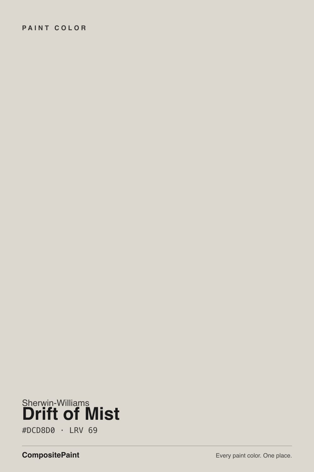
Drift of Mist
The light greige people paint whole houses in, reviewed honestly: where it stays soft and quiet, the rooms where it turns dingy or vanishes into white, and what to buy instead.

Jessica has spec'd whites and neutrals for more than 300 rooms and keeps a sample wall of painted drawdowns in her studio. Every color review is checked against real reader rooms in the comments and re-tested when a formula changes. About the testing process →
- 1Revere Pewter55
- 2Agreeable Gray60
- 3Drift of Mist69
- 4Shoji White74
- 5Dover White83
The Fast Verdict
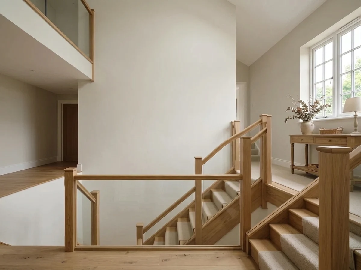
Drift of Mist is the quiet end of greige. At LRV 69 it keeps a room open and never argues with flooring, counters, or the next room over, which is why it ends up on whole main floors. The trade is character: it has so little actual color that bright rooms can flatten it into plain builder white, and dim north rooms can pull a gray-violet or green cast out of it. Sample it big, on two walls, before you buy five gallons.
Open-plan main floors that need one color everywhere · small or dim rooms that still need to feel light · cabinets and built-ins without white glare · anyone who wants warmth without an obvious beige
You want the walls to read as a real color · your room is north-facing and lit by cool LEDs · your tile, counter, or floor already leans green · your trim white is only a step brighter
- Whole-house safe — same scheme from entry to bedrooms
- LRV 69 keeps windowless halls and small baths feeling open
- Warm enough to avoid the cold builder-gray look
- Cabinets and built-ins: almost-white without the glare
- Does not fight white oak, walnut, warm marble, or black hardware
- Washes out to plain white in bright south and west rooms
- Goes flat and dingy in dim north light or under cool LEDs
- Can flicker green next to sage tile or honey oak floors
- Too little color to carry an accent or feature wall
What Color Is Drift of Mist, Really?
On paper it is a warm color. The hue sits at 40 degrees, the beige and gold side of the wheel, and the hex #DCD8D0 puts red first and blue last. But the saturation is only about 15 percent, and that is the part that decides how it behaves. There is barely any pigment in it to hold a position, so the wall takes its temperature from whatever is around it. This is why one person swears it is a warm greige, the next says it went green, and a third says it looked lavender in the hallway. All three are describing the same paint doing what near-neutrals do.
LRV 69 is genuinely light, but it is not white. Next to Pure White SW 7005 at LRV 84 it clearly shows gray and looks like a chosen wall color. Next to Agreeable Gray SW 7029 at LRV 60 it looks like a white, because nine points of reflectance is a visible step. That in-between position is the whole product: light enough for a dim hallway, colored enough that the room does not read unfinished.
Undertone in one line: warm at the base, so weak that light and neighbors get the final vote — expect softly beige in sun, flat gray in shade, and an occasional green or violet flicker in cool light.
Where It Shines
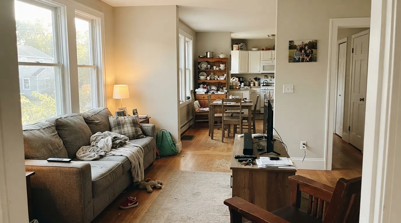
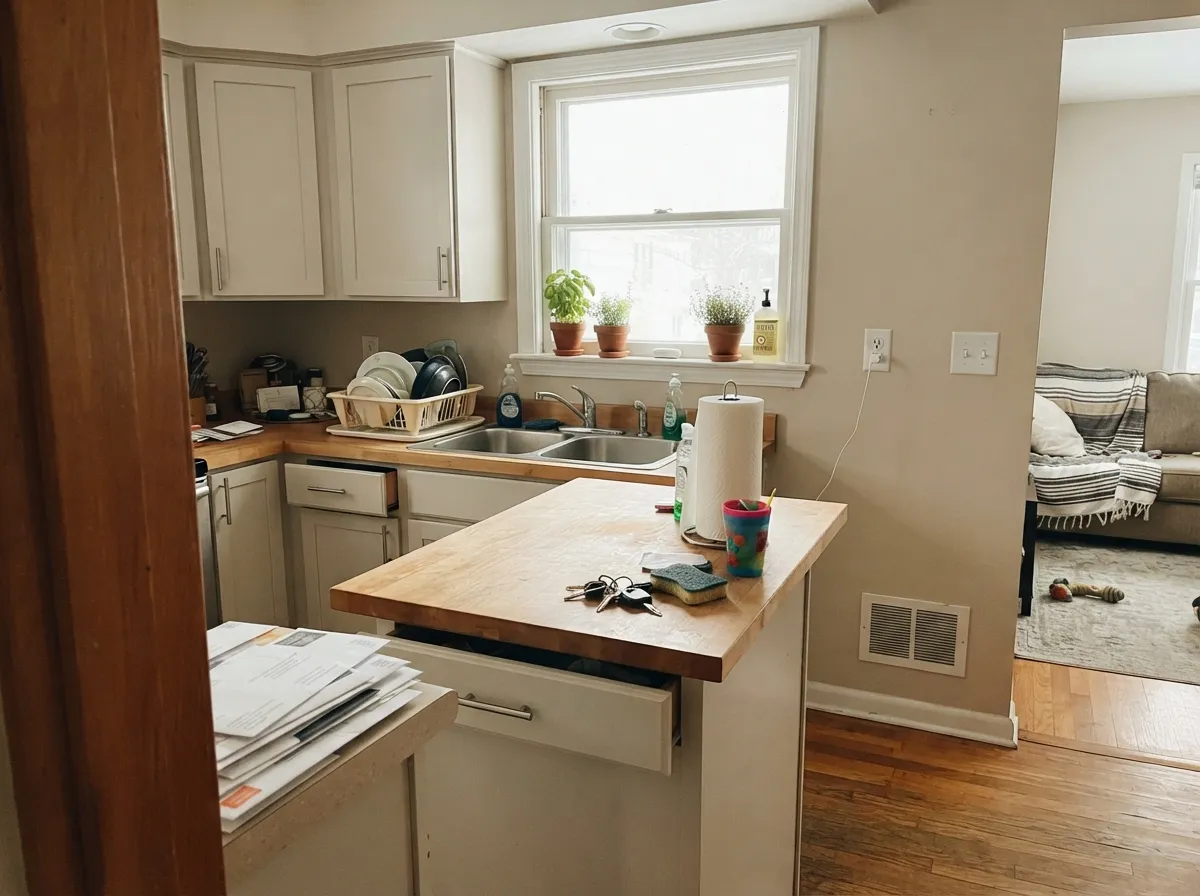
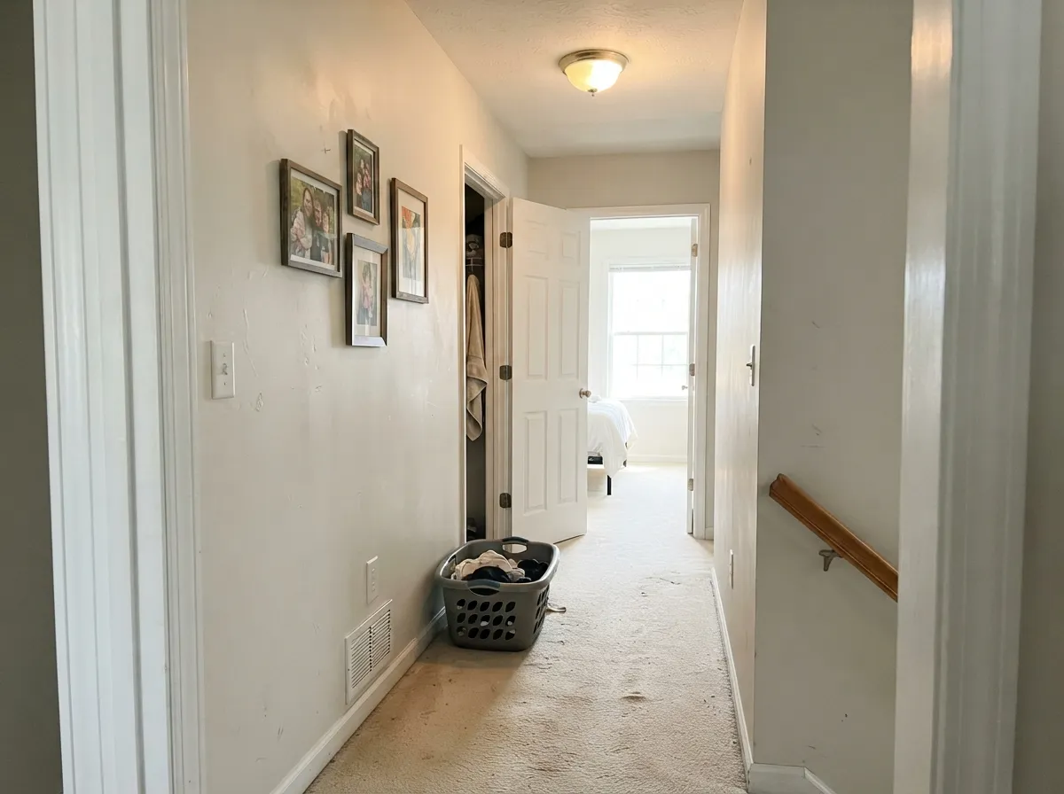
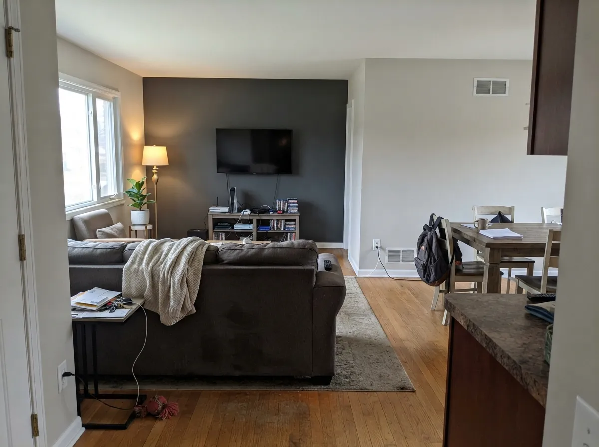
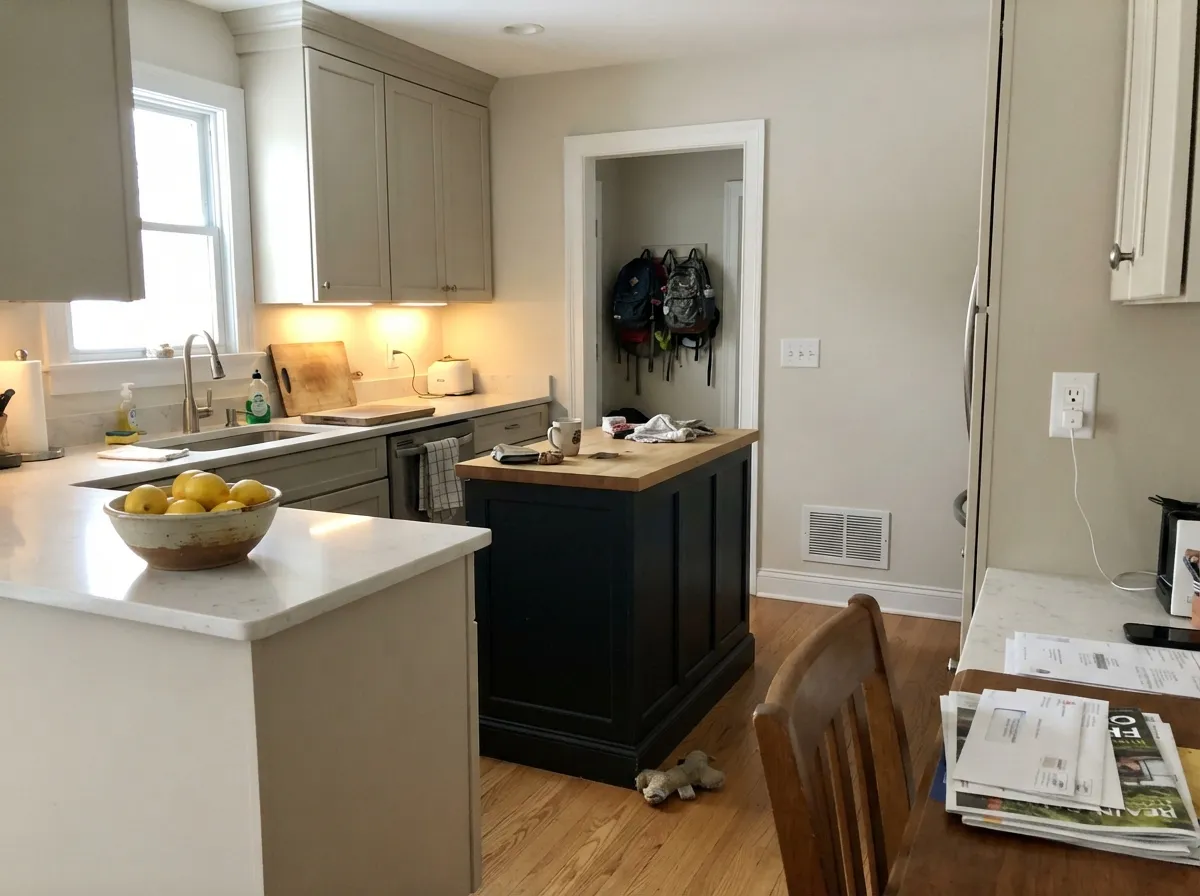
It earns its money on floor plans, not feature walls. One color from the entry through the kitchen, up the stairs, and into the bedrooms, with only the sheen changing — that is what Drift of Mist is built for, and it is where nobody ever complains about it. On cabinets and built-ins it gives the almost-white look without the glare and the fingerprint-showing of a true white.
Where It Fails
The bad stories about this color are consistent, and they are all about the same weakness: there is not enough pigment in it to defend itself. If your room matches one of these three, sample something with more body instead.
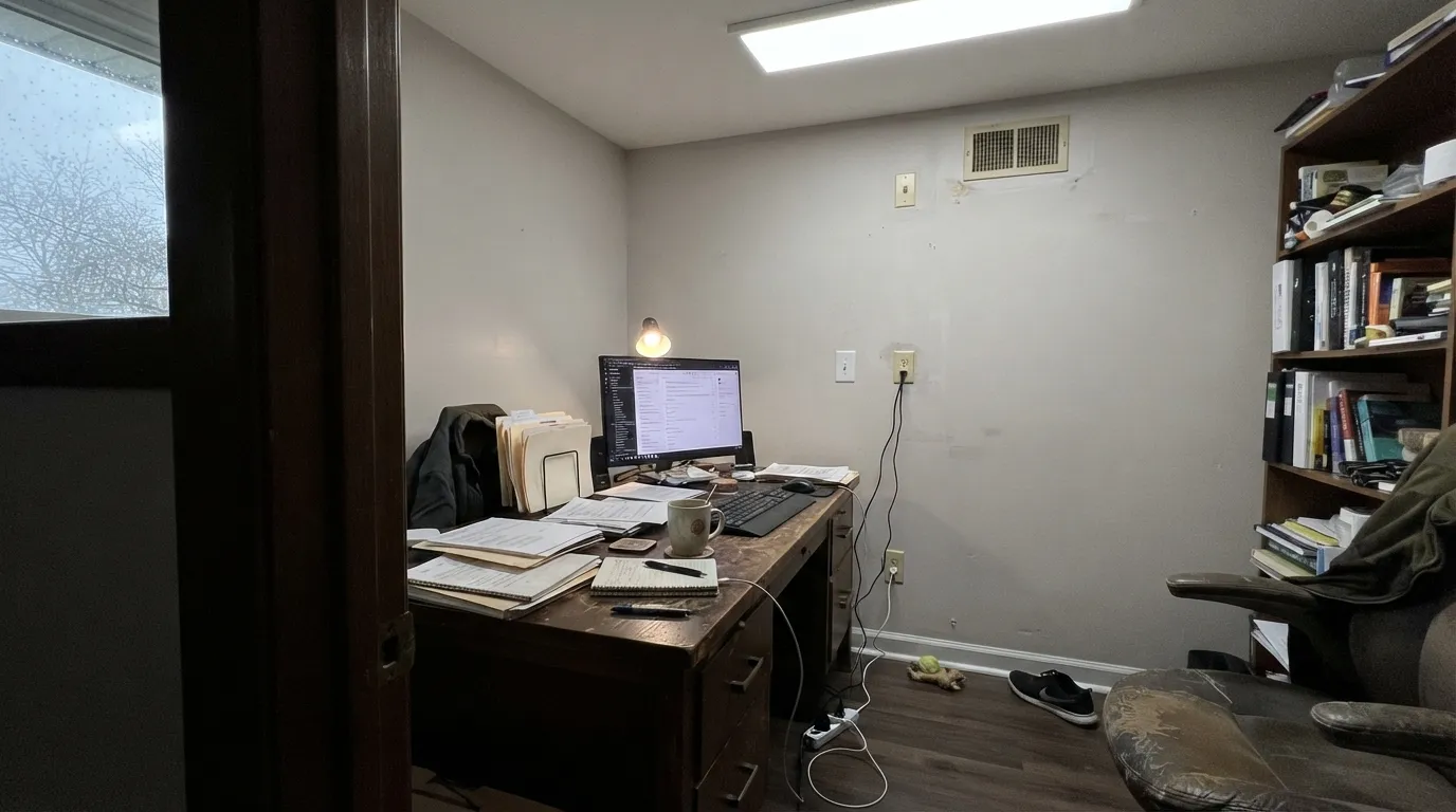
North light is cool and flat, and 4000K LEDs make it worse. Both strip out the small warmth and leave the gray base bare, so the wall goes dingy and can flicker gray-violet in the corners. Warm 2700K bulbs fix most of it. If you cannot change the lighting, use Shoji White SW 7042 (LRV 74), which holds its warmth in shade.
Strong daylight washes the little color it has straight out, and against Pure White SW 7005 trim the walls just read as another white. People finish the job and ask why it looks like nothing was painted. If you want visible color in a bright room, step down to Agreeable Gray SW 7029 (LRV 60) or Gossamer Veil SW 9165 (LRV 62).
Drift of Mist sits close to the green-yellow edge of neutral, and green in the room drags it over the line. Sage-toned backsplash tile, olive-cast granite, and orange-honey oak all do it, and the wall reads faintly olive under overheads. Accessible Beige SW 7036 (LRV 58) takes the same rooms without turning.
Room by Room
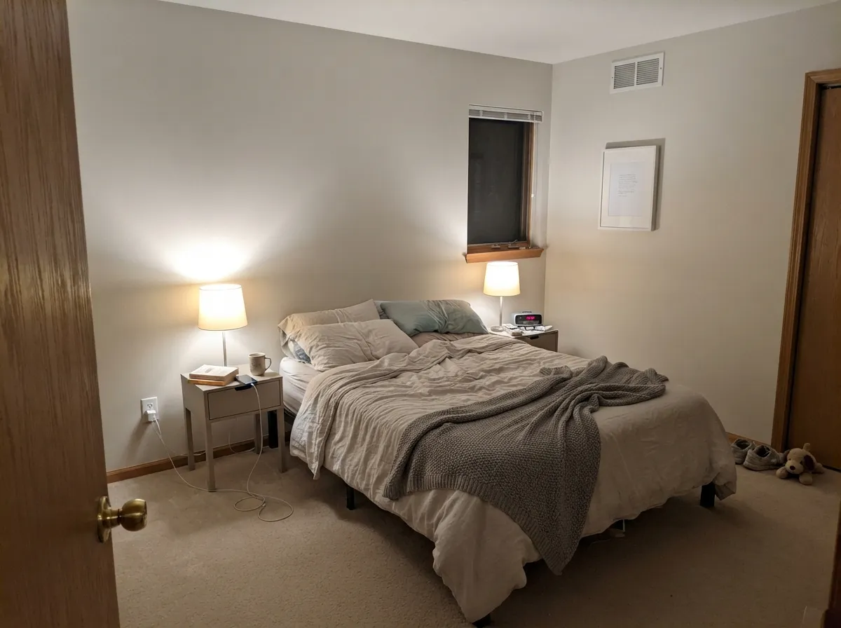
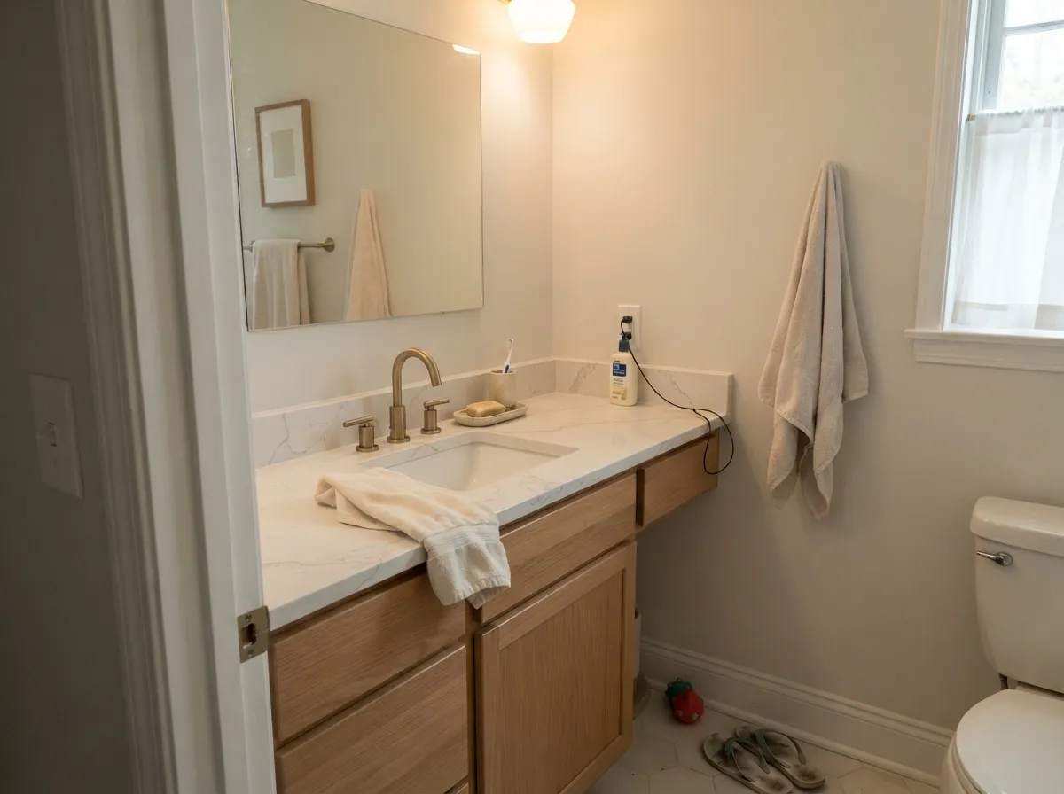
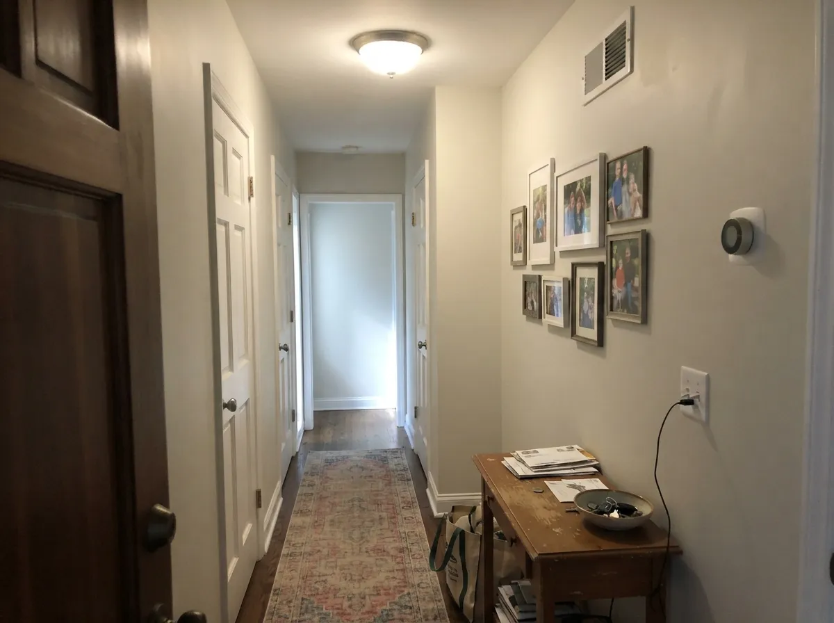
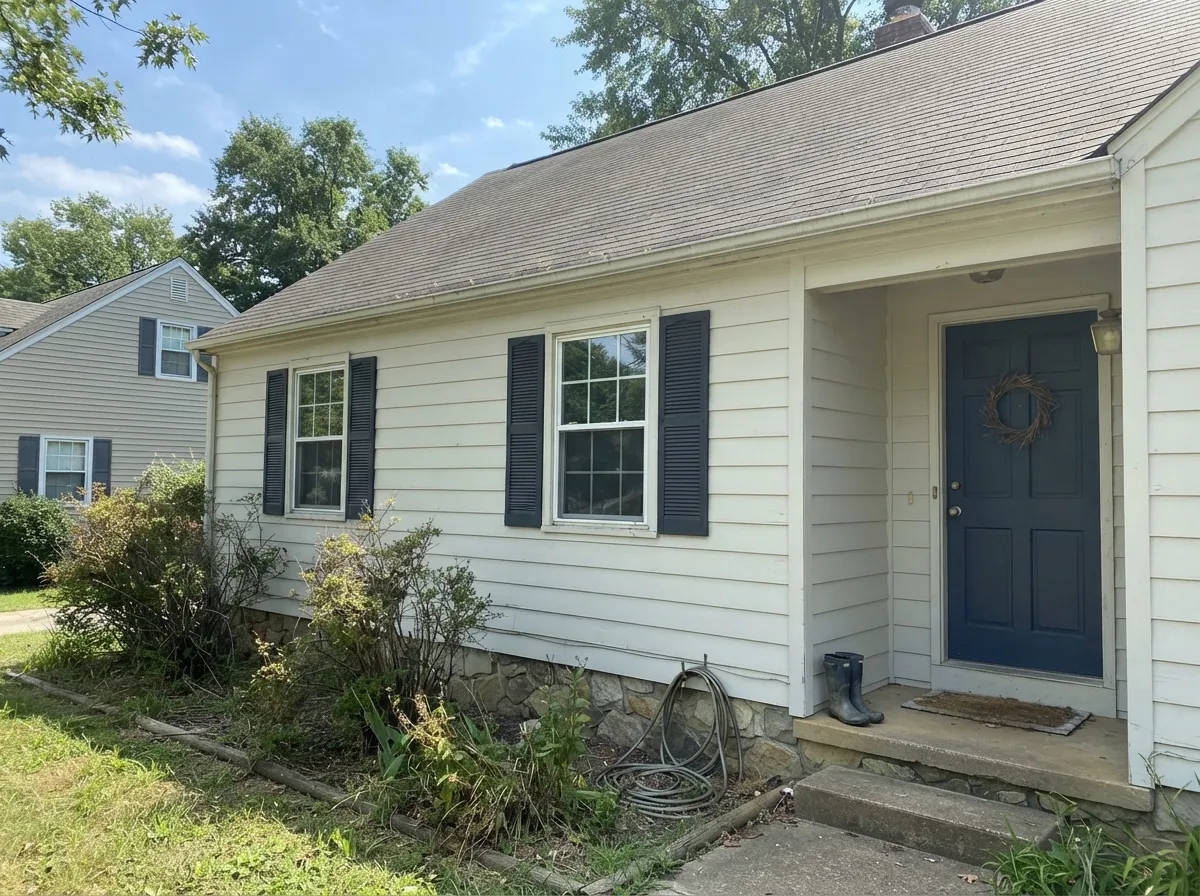
Your Light Is the Risk
The beige comes forward and it looks like a proper warm greige all day.
Cool daylight drains the warmth. Flat gray, sometimes a violet edge in shadow.
Warm and soft at the sun hours, plain gray the rest. Most people never notice.
2700K lamps make it creamy and calm. 4000K LEDs make it look washed and dirty.
Most complaints about Drift of Mist are a light mismatch. Upload a photo of your actual room and see it on your walls — then ask for the same wall in north light or evening lamps before you buy a single sample.
Need It From Another Brand?
Any paint counter can custom-tint Sherwin-Williams SW 9166 directly. If you would rather stay in one brand's own deck, these are the closest stock matches, measured as ΔE2000. Under 2 is a difference you will not see on the wall.
| Brand | Closest color | ΔE | LRV | |
|---|---|---|---|---|
| Behr | Ginger SugarMQ3-18 · Behr | 1.0 | 68 | Color page → |
| Benjamin Moore | Light Pewter1464 · Benjamin Moore | 1.2 | 69 | Color page → |
| Valspar | Slush8005-2A · Valspar | 0.6 | 70 | Color page → |
| PPG / Glidden | Silent SmokePPG1025-2 · PPG / Glidden | 0.8 | 68 | Color page → |
| Glidden | Silent SmokePPG1025-2 · Glidden | 0.5 | 68 | Color page → |
| Dutch Boy | Pearly Gray442-1DB · Dutch Boy | 1.3 | 70 | Color page → |
Similar Sherwin-Williams Colors
The nearest shades to Drift of Mist within Sherwin-Williams's own range, ranked by perceptual color distance — useful when you want the same look a touch lighter, darker, or warmer.
WCAG 2.1: AA is 4.5 : 1 for normal text, 3 : 1 for large text, AAA is 7 : 1.
Drift of Mist vs the Colors You're Also Considering
Every Drift of Mist sample board has the same rivals on it. The numbers show the real lightness gap — then it comes down to which risk you would rather live with.
Pick this when you want the walls light and quiet, not a statement.
Sherwin-Williams SW 7029 · LRV 60Agreeable GrayPick this when you want the walls to actually read as a color.
Side-by-side comparison →Pick this if warm wood floors need a lighter, friendlier partner.
Sherwin-Williams SW 7015 · LRV 58Repose GrayPick this for a cooler, deeper gray with real contrast against white trim.
Agreeable Gray SW 7029 (#D1CABC, LRV 60) is the usual comparison. It is nine points darker with more visible beige, so it reads as a definite greige where Drift of Mist reads as a light gray that happens to be warm. Choose Agreeable Gray when you want the walls to have color, and Drift of Mist when you want them to stay quiet. Inside the deck, Egret White SW 7570 (#DFD9CF, LRV 70) is a touch lighter and warmer, and First Star SW 7646 (#DAD9D4, LRV 69) is flatter and cooler.
Across brands, HGTV Home by Sherwin-Williams Basalt Powder HGSW 2457 shares the identical hex at a difference of 0. Glidden Silent Smoke PPG1025-2 (LRV 68) at 0.54, Valspar Slush 8005-2A (LRV 70) at 0.62, and Behr Ginger Sugar MQ3-18 (LRV 68) at 0.98 are matches. Benjamin Moore Light Pewter 1464 (LRV 69) at 1.20 and Farrow and Ball Ammonite No. 274 (LRV 67) at 1.13 are visually identical in normal room light.
Drift of Mist Coordinating Colors
Because it has so little color of its own, the partners you choose do most of the decorating. The rule is separation: pick a trim white at least twelve points brighter, and pick one genuinely dark accent so the scheme has a floor. Skip anything in the LRV 70s next to it — that is where everything turns to mush. These are the pairings that keep coming back:
Drift of Mist on Cabinets and Trim
This is the use nobody regrets. Sprayed on kitchen cabinets, a laundry room, or a wall of built-ins, Drift of Mist gives the light, calm, almost-white look people actually want from white cabinets, without the flat glare and without broadcasting every fingerprint near the handles. Satin is the right sheen — it wipes clean and it keeps the soft look that gloss would kill.
The mistake is using it on both cabinets and walls at the same value. Give the walls a clear step: Snowbound SW 7004 or Pure White SW 7005 behind Drift of Mist cabinets reads deliberate, while walls in another LRV 69 neutral reads like a mistake. As trim it only works in a monochrome room where the walls are the same color and only the sheen changes — against any wall color darker than about LRV 55 it is too soft to hold the line, and you want Pure White instead.
The Drift of Mist Ladder, Lighter and Darker
Half the people who search this color are really asking for a different rung on the same ladder. If Drift of Mist sampled too gray or too dim on your wall, Shoji White SW 7042 at LRV 74 is the warmer, lighter step, and Egret White SW 7570 at LRV 70 is its near-twin with a touch more cream.
If it sampled too pale — the most common complaint from bright rooms — the same warm-neutral family continues downward. Agreeable Gray SW 7029 at LRV 60 is one clear step, Anew Gray SW 7030 at LRV 47 is a true mid-tone, and Dorian Gray SW 7017 at LRV 39 is the dark end for a study or a bank of lower cabinets. Staying on one ladder is how a whole house holds together: same base, different depth, room to room.
Three Ready Palettes Built on Drift of Mist
A color is never alone on the wall. These are complete combinations in the 60-30-10 pattern, with the reason each one holds together. Every one opens in the visualizer.
Drift of Mist covers the 60 percent, Pure White takes the 30 on trim and doors at fifteen points brighter, so the edges stay crisp instead of blurring. Iron Ore is the 10 percent dark note the scheme needs, or the whole floor reads unfinished.
Try this palette in your roomCabinets are the biggest surface here, so Drift of Mist is the 60 and Snowbound walls sit a clear step brighter behind them, which stops the almost-white kitchen from going flat. Urbane Bronze on the island grounds all that lightness and loves brass or matte black pulls.
Try this palette in your roomSnowbound is a soft white rather than a bright one, so the trim frames the walls without making them look dull by comparison. Oyster Bay is a muted green-blue that meets Drift of Mist on its green-leaning side, so the accent reads restful instead of decorated.
Try this palette in your roomDrift of Mist FAQ
Does Drift of Mist look green?
Sometimes, and this is the complaint that comes up most. It sits close to the green-yellow edge of neutral, so a sage backsplash, olive-cast granite, or honey oak floors can pull it over and the wall reads faintly olive. In a room with none of those, most people see plain warm gray.
Why does mine look purple or lavender?
Cool light. In a north-facing room, or under 4000K LEDs, the warm base disappears and the leftover gray can flicker violet, especially in corners and on shadowed walls. Swap to 2700K bulbs first — that fixes it in most rooms before you repaint anything.
Will it just look white on my walls?
In a bright south or west room with white trim, yes, it can. At LRV 69 there is only fifteen points between it and a standard trim white, and strong sun eats the difference. If you want the color to be visible, drop to Agreeable Gray SW 7029 at LRV 60.
Drift of Mist or Agreeable Gray?
Agreeable Gray is nine points darker with more visible beige, so the walls read as a decision. Drift of Mist stays in the background and keeps dim rooms lighter. Bright house that needs color, pick Agreeable Gray; dim or small house that needs light, pick Drift of Mist.
What trim white goes with it?
Pure White SW 7005 at LRV 84 is the safe answer — fifteen points of separation gives a clean edge without going stark. Snowbound SW 7004 at LRV 83 is the softer version if you want less contrast. Do not use a warm white in the low 70s; the trim and walls will blur and the woodwork will look dirty.
Is it good for kitchen cabinets?
Yes, and it is one of the better uses for it. It gives the almost-white cabinet look with less glare than a true white and hides knuckle marks around the handles. Use a satin urethane cabinet enamel, and check it against the backsplash before you spray the doors.
Does it work with gray LVP or cool gray floors?
It works, but the walls will look warmer and slightly beige against a cool gray floor because the floor pushes them that way. That is usually fine — it stops the room going cold. If you want the walls to stay neutral over gray floors, Repose Gray SW 7015 is the better match.
Have you painted with Drift of Mist?
Rate it — one tap helps the next reader decide.
Ask a Question