Revere Pewter
America's best-selling greige, reviewed honestly: the green flash, the rooms where it turns murky, and whether it really looks dated now.

Jessica has spec'd whites and neutrals for more than 300 rooms and keeps a sample wall of painted drawdowns in her studio. Every color review is checked against real reader rooms in the comments and re-tested when a formula changes. About the testing process →
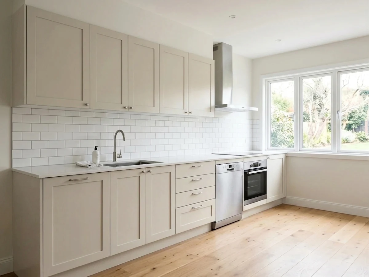
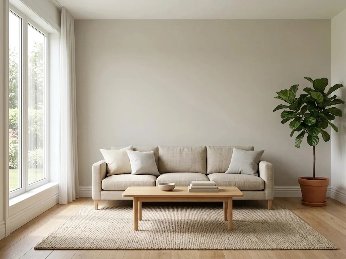
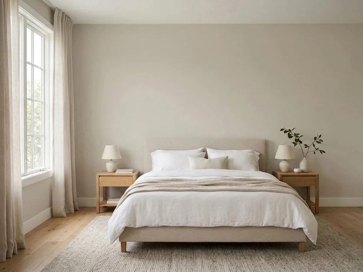
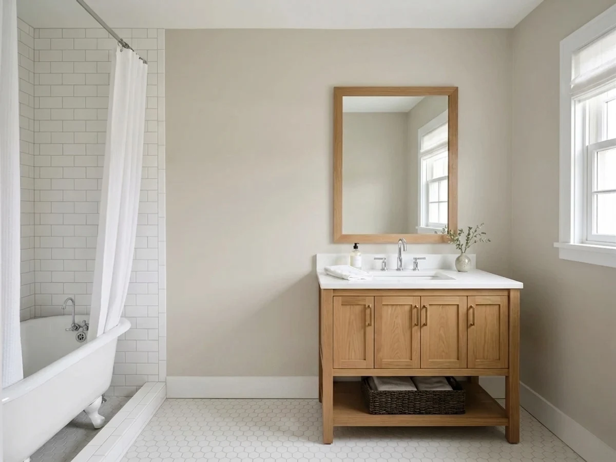
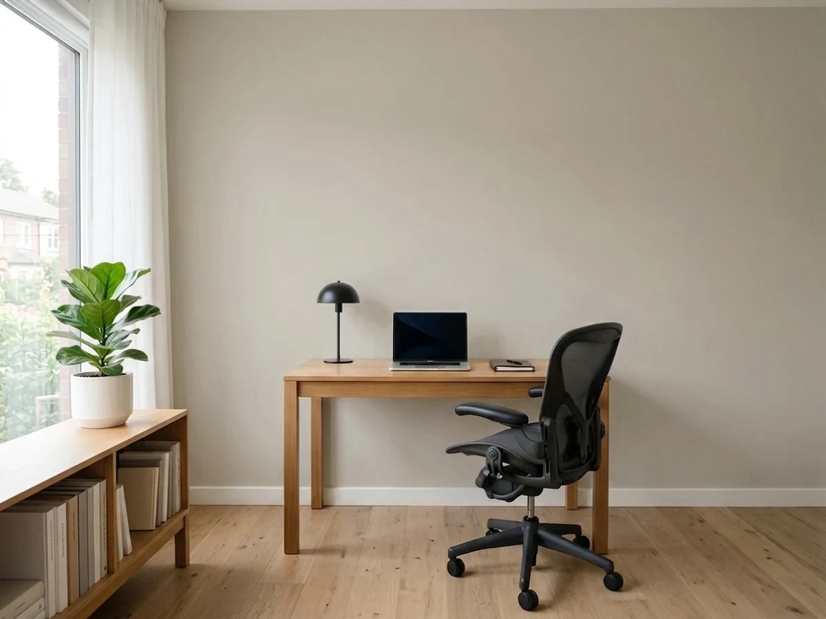
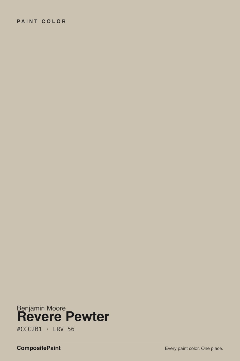
- 1Dorian Gray39
- 2Mindful Gray48
- 3Revere Pewter55
- 4Agreeable Gray60
- 5Pale Oak69
The Fast Verdict
Revere Pewter is the color that taught America the word greige. At LRV 56 it is warm, grounded and mid-tone, and in a room with real daylight it does exactly what people hope: wood floors, brass and white trim all suddenly look chosen.
The catch is that its warmth is thin. Take the daylight away and the soft green comes forward, and the same paint that glows in a south room reads dark and murky in a north one.
Open-plan main floors with good daylight · south and west rooms · kitchen cabinets and islands · homes with oak floors, brass or bronze
Your room faces north and is dim · your floors or tile lean pink · you want a clean modern gray · you are painting a windowless hall or powder room
- Genuinely warm without ever tipping yellow or orange
- Makes oak floors, brass and bronze look chosen instead of inherited
- One color that carries a whole open floor plan without going boring
- Superb on cabinets and islands — the warmth keeps gray from feeling cold
- Every painter and every store already knows it, so matching is easy
- Goes murky and much darker than the chip in dim north light
- Reads slightly green in most rooms — mild, but obvious against pink floors
- In a beige house with beige tile it just becomes more beige
- Too heavy for small windowless rooms and interior hallways
What Color Is Revere Pewter, Really?
A warm mid-tone gray built over beige, with a soft green shadow underneath it. That green is not a defect and it is not a rumor — it is how the color is mixed. Revere Pewter carries almost no red, and red is what keeps a neutral steady when the light changes. Take the red out and the wall has nothing to hold onto, so it borrows: green from the lawn outside the window, gray from a cloudy afternoon, warm khaki from a lamp at night. That borrowing is the whole personality of this color. It is why one homeowner calls it the coziest beige they have ever owned and the neighbor with the same gallon calls it sage.
LRV 55.5 means it bounces back a little over half the light that lands on it — genuinely mid-tone, not a light neutral. That number is the single most misread thing about it. Edgecomb Gray (HC-173) sits at 63 and Agreeable Gray (SW 7029) at 60, and those seven or eight points are not a technicality. Edgecomb whispers on a wall; Revere Pewter states something. Put a sample board of each side by side and Edgecomb looks like a tinted white while Revere Pewter looks like an actual color, with weight and a shadow line in the corners. Most of the "it came out so much darker than I expected" stories are really people expecting a 63 and buying a 55.
Undertone in one line: warm gray-beige over a quiet green base — never pink, never blue. If yours is reading green, look at what is feeding it: a tree outside the window, a 4000K bulb, or a green-flecked granite counter will all pull that base straight to the surface.
Where It Shines
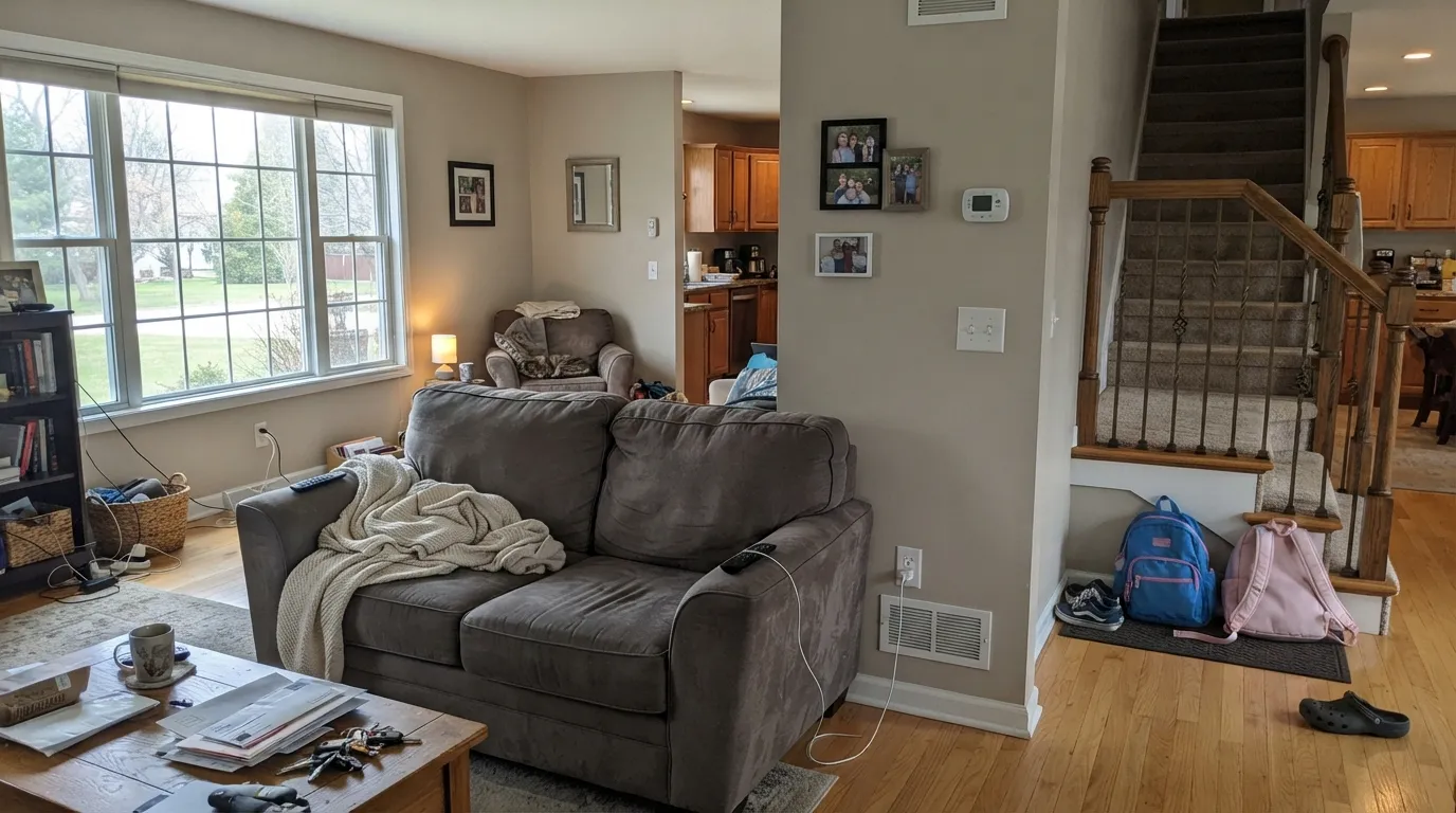
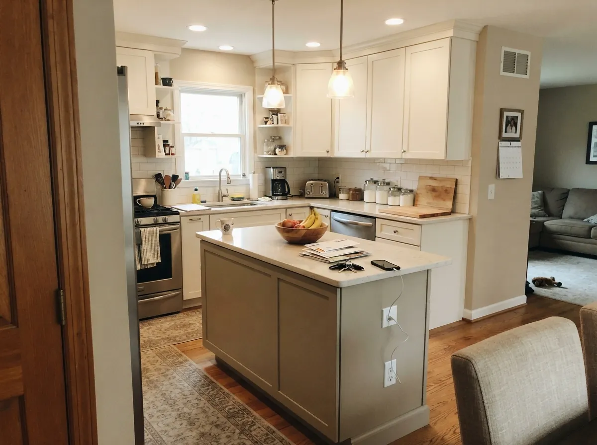
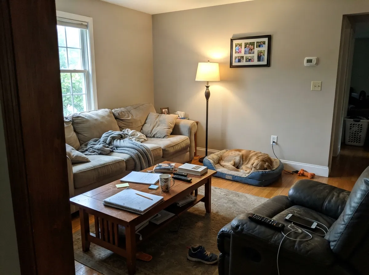
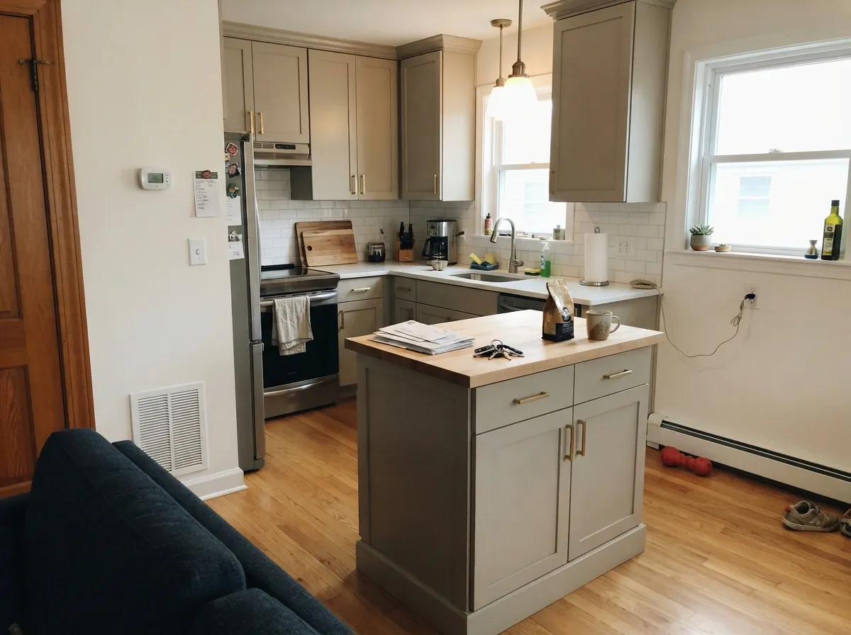
Revere Pewter is at its best on an open main floor with real daylight — south and west rooms, oak floors, brass or bronze hardware, one warm neutral carrying kitchen, dining and living in a single sweep. Look at how it behaves on cabinets and islands too: the warmth keeps a mid-tone gray from ever feeling cold.
Where It Fails
Revere Pewter has millions of happy rooms and a very specific set of unhappy ones. The bad stories online are not random — they repeat, and almost all of them come from the same three setups.
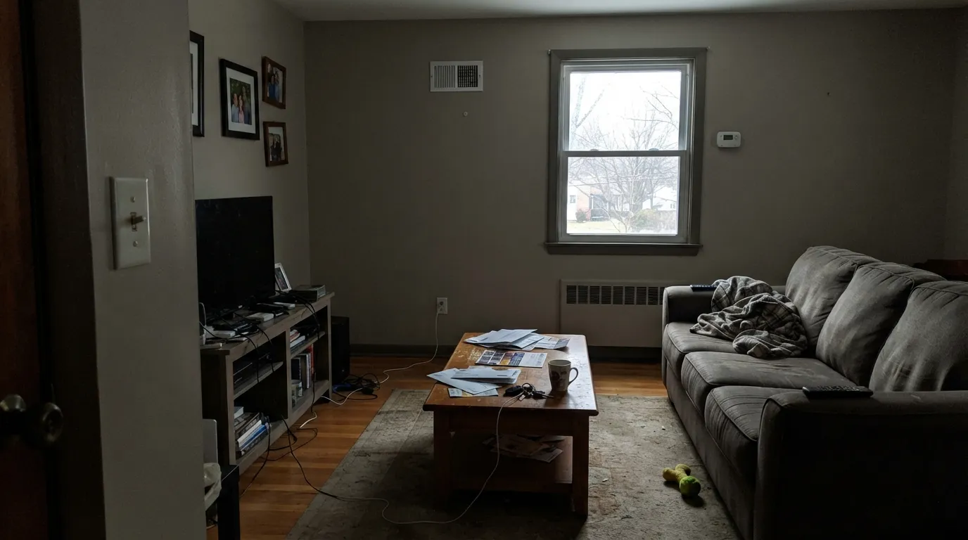
There is not much color in Revere Pewter to hold onto, so cool north light drains the warmth and leaves a heavy gray behind. The line homeowners keep posting is that it came out far darker than the chip, flat and murky. Nothing is wrong with the paint — the room has no light to give it. Go lighter and airier with Edgecomb Gray (HC-173) at LRV 63.
This is the classic clash and the loudest complaint on Houzz. Revere Pewter throws a faint green in most rooms, and green sits opposite red on the color wheel — so pink-toned tile or salmon carpet makes the walls look greener and the floor look pinker. Both end up looking dirty. With pink-leaning floors use Balboa Mist (OC-27); it drifts violet instead of green.
This is where the "it's dated" argument actually comes from. Over every wall of a builder-beige house with beige tile and orange oak trim, Revere Pewter stops reading as greige and just reads as more beige — people call it dusty and bland. It still looks current when it has something to push against: bright trim like Chantilly Lace (OC-65), or moved off the walls onto cabinets with white walls above.
Room by Room
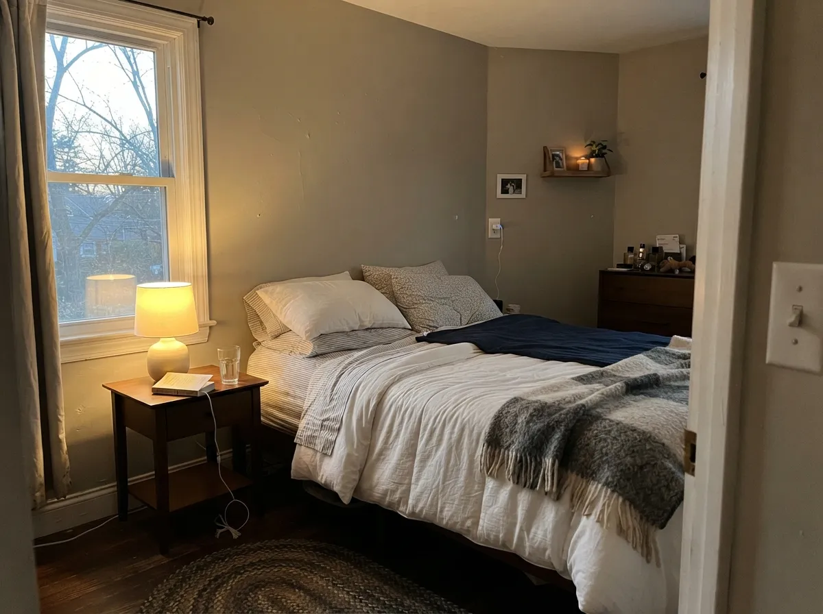
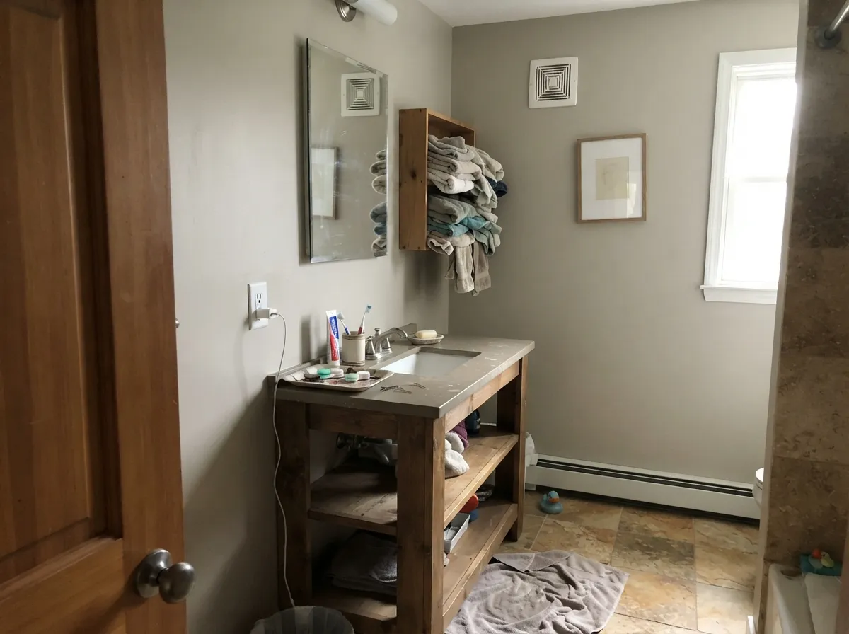
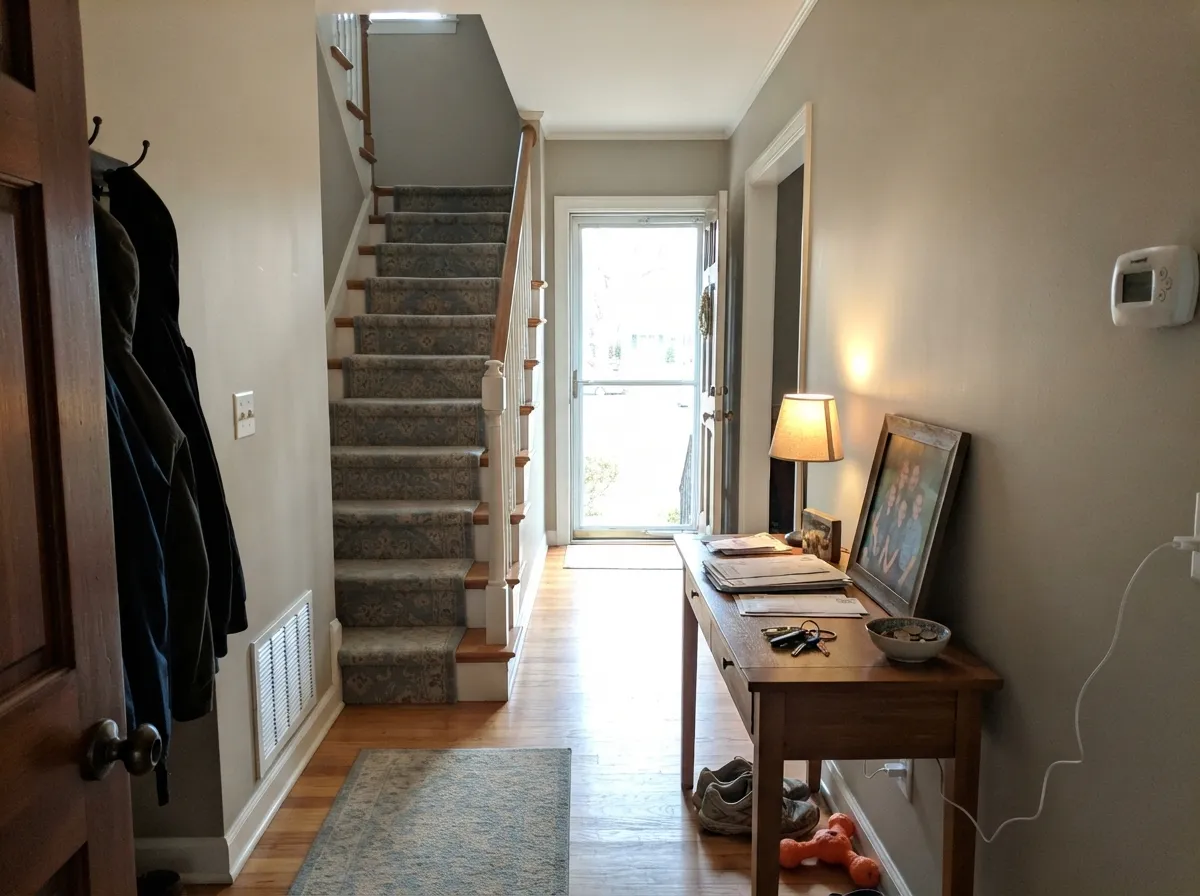

Your Light Is the Risk
Full sun pulls the warm base forward. Cozy and settled, and it holds its color all day.
Cool light strips the warmth and lifts the green. Expect darker and grayer than the chip.
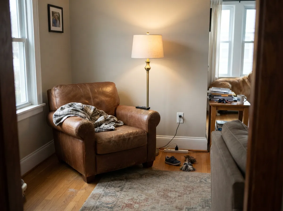
2700K lamps: soft putty warmth. Cool 4000K LEDs: flat gray — change bulbs, not paint.
Powder rooms and interior halls have no daylight to lift LRV 56. It closes in and looks dirty.
Most complaints about Revere Pewter are a light mismatch. Upload a photo of your actual room and see it on your walls — then ask for the same wall in north light or evening lamps before you buy a single sample.
Need It From Another Brand?
Any paint counter can custom-tint Benjamin Moore HC-172 directly. If you would rather stay in one brand's own deck, these are the closest stock matches, measured as ΔE2000. Under 2 is a difference you will not see on the wall.
| Brand | Closest color | ΔE | LRV | |
|---|---|---|---|---|
| Sherwin-Williams | Simple StoneSW 9521 · Sherwin-Williams | 0.9 | 57 | Color page → |
| Behr | Vintage PewterDC-009 · Behr | 1.3 | 56 | Color page → |
| Valspar | Swiss LiveryM204 · Valspar | 1.1 | 55.4 | Color page → |
| PPG / Glidden | Ostrich FeatherPPG14-32 · PPG / Glidden | 1.5 | 57 | Color page → |
| Glidden | Ostrich FeatherPPG14-32 · Glidden | 1.0 | 57 | Color page → |
| Dutch Boy | Centuryed Gray442-2DB · Dutch Boy | 3.3 | 57 | Color page → |
Similar Benjamin Moore Colors
The nearest shades to Revere Pewter within Benjamin Moore's own range, ranked by perceptual color distance — useful when you want the same look a touch lighter, darker, or warmer.
WCAG 2.1: AA is 4.5 : 1 for normal text, 3 : 1 for large text, AAA is 7 : 1.
Revere Pewter vs the Colors You're Also Considering
Every Revere Pewter sample board has the same rivals on it. The numbers show the real lightness gap — then it comes down to which risk you would rather live with.
Pick this when the room has good light and you want real depth on the wall.
Benjamin Moore HC-173 · LRV 63Edgecomb GrayPick this for dim, small or north-facing rooms — same family, seven points brighter.
Side-by-side comparison →Pick this for more warmth and a cozier, more traditional room.
Sherwin-Williams SW 7029 · LRV 60Agreeable GrayPick this for a lighter, cleaner greige that shifts far less room to room.
Side-by-side comparison →The most common comparison is Edgecomb Gray (HC-173), LRV 63. Both are Benjamin Moore greiges, but Edgecomb is noticeably lighter and airier. Revere Pewter reads deeper and more grounded, so choose Edgecomb for darker or smaller rooms and Revere Pewter when you want more presence on the wall.
Against Sherwin-Williams Agreeable Gray (SW 7029), LRV 60, Revere Pewter is warmer and a bit darker. Agreeable Gray is a touch cooler and lighter, which makes it more forgiving in bright, sunny rooms, while Revere Pewter brings more cozy warmth to cooler north light.
Within the brand, Smokey Taupe (983), LRV 55, is a near neighbor at almost the same value but with a rosier, taupe lean. Pick Revere Pewter for the cleaner greige balance and Smokey Taupe if you want more visible warmth.
Revere Pewter Coordinating Colors
Revere Pewter needs a clear white and one dark note. That is the recipe. Left alone with beige tile and beige carpet it flattens out; given a bright trim and something genuinely dark in the room — a navy door, a charcoal island, black window frames — it snaps into focus and reads current instead of tired.
Stay on the warm and green-friendly side of the wheel when you add color. Deep navies, olive greens, bronzes, and warm brass all sit comfortably next to it. What fights it is anything pink, salmon, or lavender, because that green base and those red tones make each other look dirty.
Revere Pewter With Wood, Stone, and Brick
This is the reason people keep coming back to it. Honey oak, golden oak, maple, walnut, and butcher block all look better beside Revere Pewter than beside a cool gray, because the walls meet the wood's warmth partway instead of arguing with it. Fieldstone and gray-brown ledgestone fireplaces are the other easy win — Revere Pewter picks up the mortar tone and the whole wall stops looking like two separate materials stuck together.
The friction is with anything red. Cherry cabinets, pink-toned oak, salmon travertine, and orange 1970s brick all sit opposite that green base, and the result is a wall that looks slightly dirty and a floor that looks slightly pink. It is a real clash, not a subtle one, and no lighting fix repairs it. If your floor or fireplace leans red, sample it against the actual surface for two full days before you commit, and have a backup ready.
One practical trick for stone fireplaces: hold the sample board flat against the stone in daylight and again at night with the lamps on. Stone shifts more between those two conditions than paint does, and a pairing that looks perfect at noon can go muddy at eight in the evening.
Lighter and Darker Than Revere Pewter
If you like the color but the room cannot carry LRV 55, you do not have to leave the family. Edgecomb Gray (HC-173) is the standard step up and keeps almost all of the warmth. For genuinely dim north rooms and windowless halls, Gray Owl (OC-52) is the better move — it is lighter and slightly cooler, and that cool cast actually brightens a dark space where Revere Pewter would only close it in.
Going the other way gives you a whole-house scheme with no guesswork. Chelsea Gray (HC-168) is Revere Pewter with the volume up, excellent on islands, built-ins, and a single feature wall. Amherst Gray (HC-167) is deeper again for a study or a dining room, and Kendall Charcoal (HC-166) is the near-black end of the same run — it is the color most designers put on the shutters when the siding is Revere Pewter.
Three Ready Palettes Built on Revere Pewter
A color is never alone on the wall. These are complete combinations in the 60-30-10 pattern, with the reason each one holds together. Every one opens in the visualizer.
White Dove is warm enough to sit beside Revere Pewter without a hard line, so the wall-to-trim handoff stays soft while still reading brighter than the walls. The navy door gives the scheme its one dark note, which is exactly what keeps a whole floor of greige from going flat.
Try this palette in your roomMoving Revere Pewter off the walls and onto the cabinets is what keeps it looking current — the clean Chantilly Lace above gives it something to push against instead of more beige. Kendall Charcoal is a warm-based dark, so the island anchors the room without introducing a cool gray that would fight the cabinets.
Try this palette in your roomRevere Pewter already throws a faint green, so October Mist turns that hint into something intentional rather than a flaw you keep noticing. White Dove trim holds the two together and stops the pairing from going too soft, and all three settle down under warm bulbs at night.
Try this palette in your roomRevere Pewter FAQ
Is Revere Pewter dated now?
As a whole-house color rolled over every wall of a beige builder home, yes — that look reads 2013 and people feel it instantly. As one room's color, on cabinets, on an island, or on siding, it is not dated at all; it is just a well-made warm neutral. The honest summary is that its job changed. It used to be the answer for the entire house, and now it is the answer for one confident room.
Why does my Revere Pewter look green?
Because there is no red in the mix to push back. Trees or a lawn outside the window bounce green light onto the wall, cool 4000K and 5000K bulbs strengthen it, and green-flecked granite or a sage rug will finish the job. Warm 2700K bulbs and something red or brown in the room — leather, cherry wood, a warm rug — cancel most of it. Test a large board on the wall that faces your biggest window, not the wall next to it.
Revere Pewter or Agreeable Gray with honey oak floors and trim?
Revere Pewter, if you want the oak to look intentional. It has more depth and more brown, so honey and golden oak read like a chosen wood tone instead of a leftover. Agreeable Gray is lighter and flatter next to that much orange and can leave the oak looking louder than the walls. The exception is red-toned oak or pinkish cherry — that is where Revere Pewter's green fights the floor and you should sample both.
What white trim goes with Revere Pewter?
White Dove (OC-17) is the classic answer and the softest — it keeps the whole room warm and traditional. Chantilly Lace (OC-65) is the crisper, more current choice and gives the walls a clean edge that makes them look deliberate rather than dusty; Simply White (OC-117) lands between the two. What to avoid is cream or almond trim: it turns Revere Pewter muddy and makes the whole wall look like it needs washing.
Can I have it lightened to 50 or 75 percent?
Any store will mix it, but understand what you get: a different color, not a lighter version of the same one. Cutting the pigment thins the warmth faster than the gray, so 50 percent often comes back chalky and washed out, and the green can get more obvious rather than less. If Revere Pewter feels too heavy, move up the deck instead — Edgecomb Gray (HC-173) is the color a lightened Revere Pewter is trying to be.
Does it work on exteriors?
It is one of the strongest exterior greiges Benjamin Moore makes, especially on Craftsman, shingle, and stone-front homes. Outdoors it reads lighter and a step cooler than it does inside, so the murky-in-low-light problem mostly disappears. It needs white trim to keep the contrast alive — White Dove or Simply White — and a dark accent like Kendall Charcoal (HC-166) on shutters and the door. Walk your sample around the whole house; the shaded north elevation will look noticeably grayer than the sunny side.
Is it good for kitchen cabinets?
It is one of its best uses, and the place designers still reach for it in 2026. It sits beautifully under brass or bronze hardware and next to quartz with warm gray veining, and the warmth keeps painted gray cabinets from going cold and hospital-like. If the cabinets fade into a light floor, ask the store to mix it 25 percent darker — that is a common fix and it holds the undertone better than lightening does.
Have you painted with Revere Pewter?
Rate it — one tap helps the next reader decide.
Ask a Question