Simply White
The 2016 Color of the Year, reviewed honestly: it is bright and friendly in most rooms, and it really does turn yellow in the two situations people keep posting about.

Jessica has spec'd whites and neutrals for more than 300 rooms and keeps a sample wall of painted drawdowns in her studio. Every color review is checked against real reader rooms in the comments and re-tested when a formula changes. About the testing process →
- 1Classic Gray74
- 2Alabaster82
- 3Simply White90
- 4Ultra Pure White97
The Fast Verdict
Simply White is the bright white that still feels like a home. At LRV 90 it throws light around the room, and the small dose of warmth stops it going cold or clinical — which is why it carried a whole decade of open-plan kitchens.
The catch is that the warmth is yellow, not grey, and strong afternoon sun turns the volume up on it. Get the light and the neighbouring whites right and it is close to perfect; get either wrong and people call it cream.
Bright open-plan spaces where one white runs through everything · north-facing rooms that need warming up · kitchen cabinets with wood, brass, and warm stone · anyone who finds pure white cold
Your room takes hard western afternoon sun · your trim or ceiling stays a brighter white · your kitchen is cool grey quartz and stainless · you want a true gallery white
- LRV 90 — one of the brightest whites Benjamin Moore makes, and it shows in dim rooms
- Warm enough to look welcoming, never as sweet as a true cream
- Genuinely good in north light, where cooler whites go grey and flat
- One white for walls, trim, cabinets, and ceiling across an open plan
- Flatters oak, walnut, brass, and warm stone without fighting them
- Turns visibly yellow in strong western and late afternoon sun
- Reads dirty the moment a brighter white is next to it
- Clashes with cool grey quartz, Carrara-look stone, and lots of stainless
- Painters report it can need extra coats over primer to look even
What Color Is Simply White, Really?
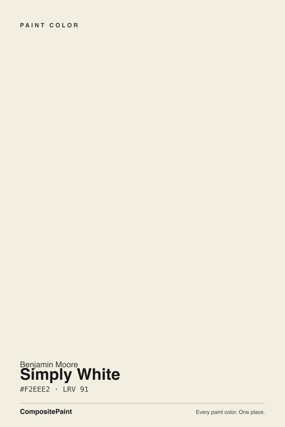
Simply White is a bright white with a real, uncomplicated yellow in it. That is the whole difference between it and the other famous warm whites: colors like White Dove take a creamy base and mute it with a drop of gray, while Simply White leaves the warmth clean and unmuted. The result reads fresh and sunny instead of soft and dusty, and that is exactly why Benjamin Moore made it Color of the Year in 2016 and why it ended up on so many open-plan kitchens for the decade after. If you see it written as 2143-70 rather than OC-117, that is the same paint listed in a second fan deck.
At LRV 90 it is near the top of the Benjamin Moore book for sheer brightness — a hair under Chantilly Lace at 92, and a clear step above White Dove at 85. Those numbers do something you can see. Set Simply White beside White Dove and White Dove suddenly looks like it has body and weight; set it beside Chantilly Lace and Simply White is the one that looks warm. Bright and warm at the same time is a rare combination in a white, and it is the whole reason people keep choosing this one over the safer options.
Undertone in one line: clean warm yellow with no gray holding it back — never pink, never green, never cool. The yellow does not come and go; the light only decides how loud it gets.
Where It Shines
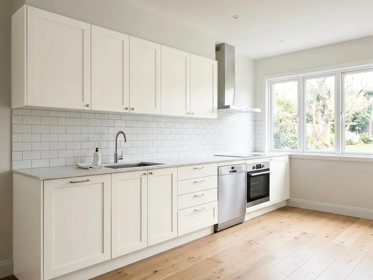
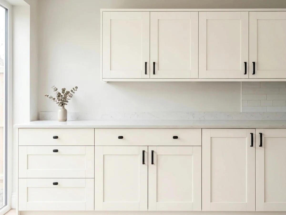
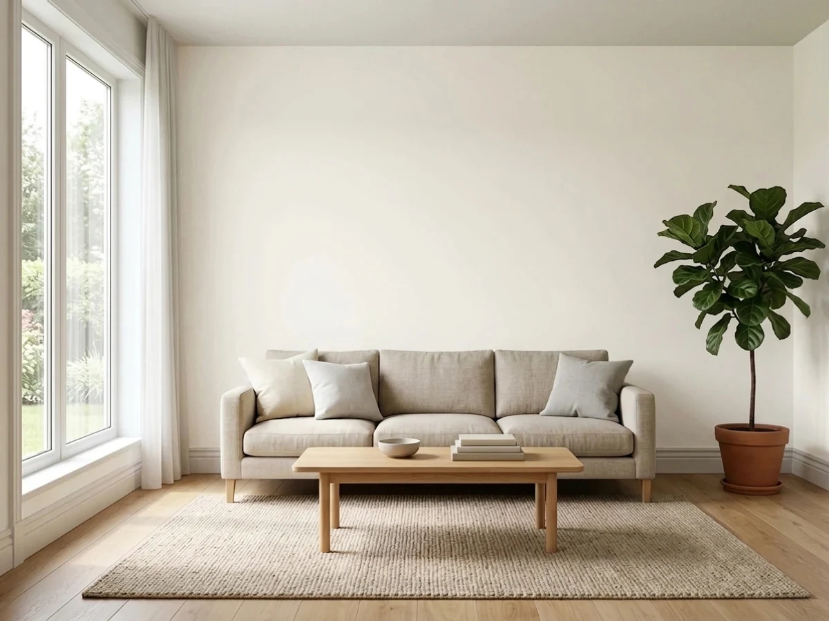
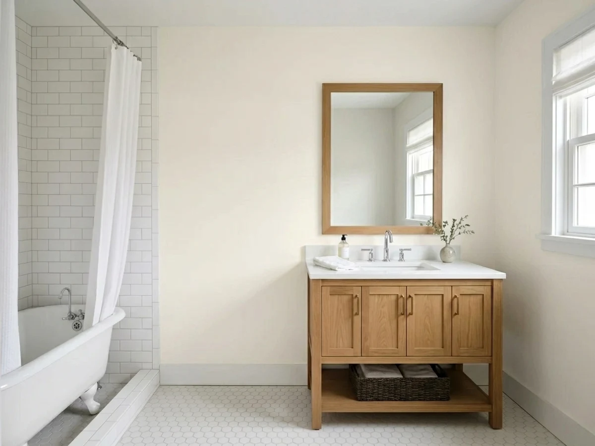
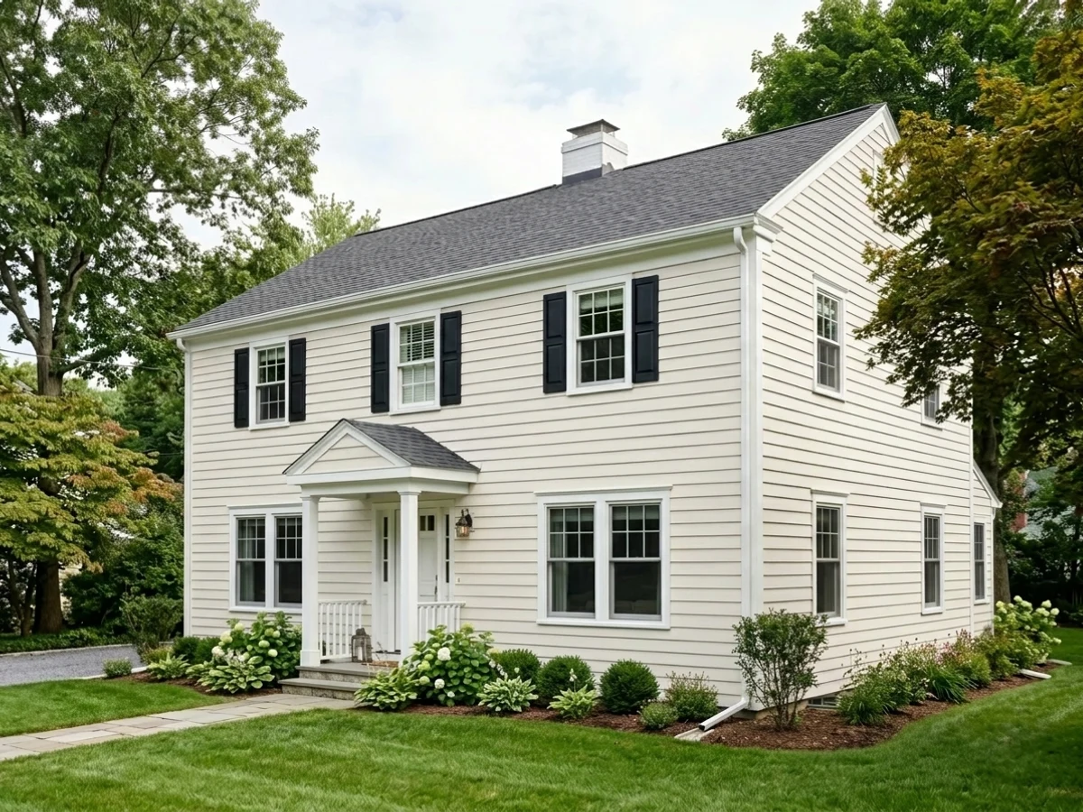
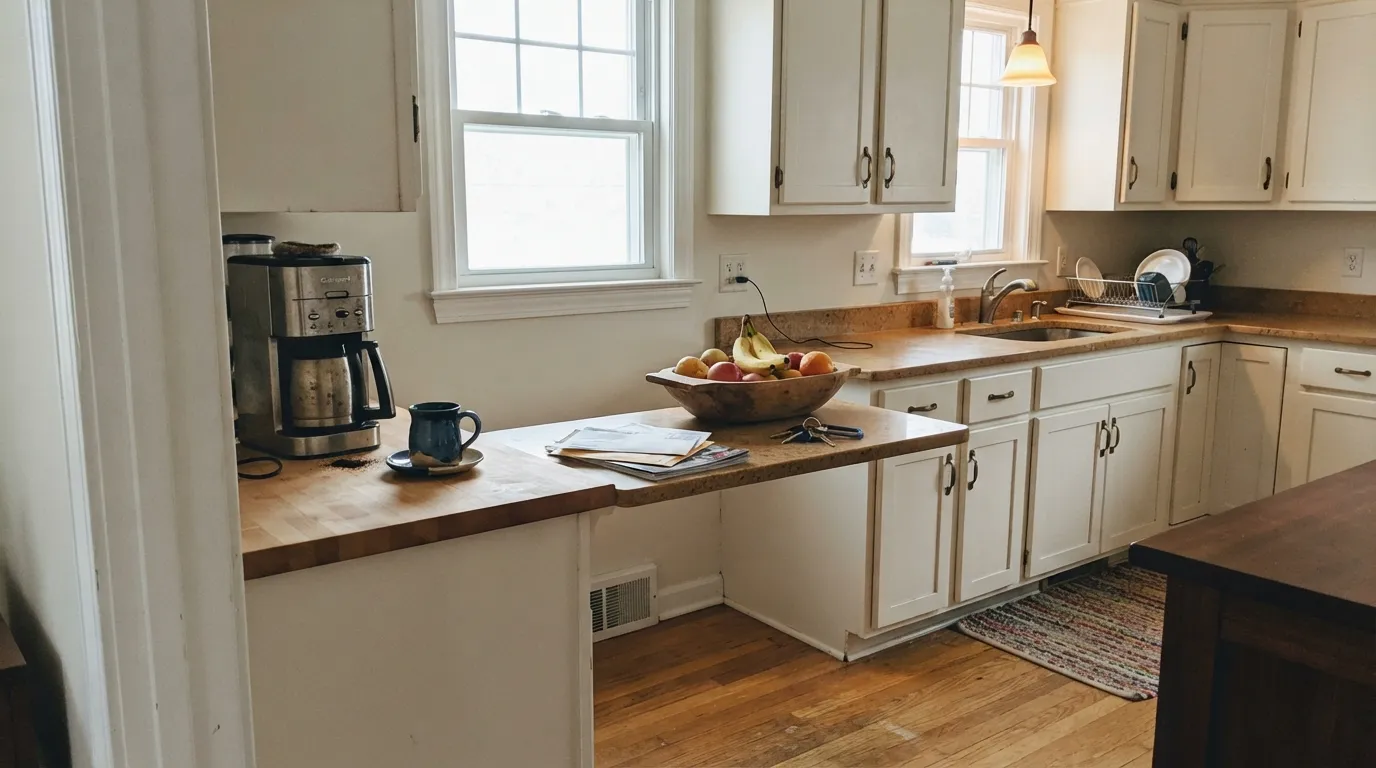
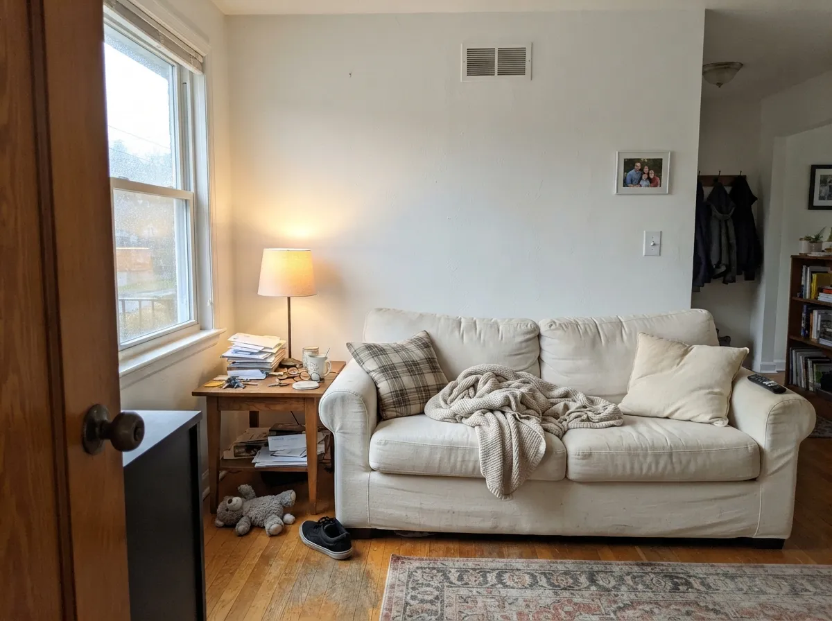
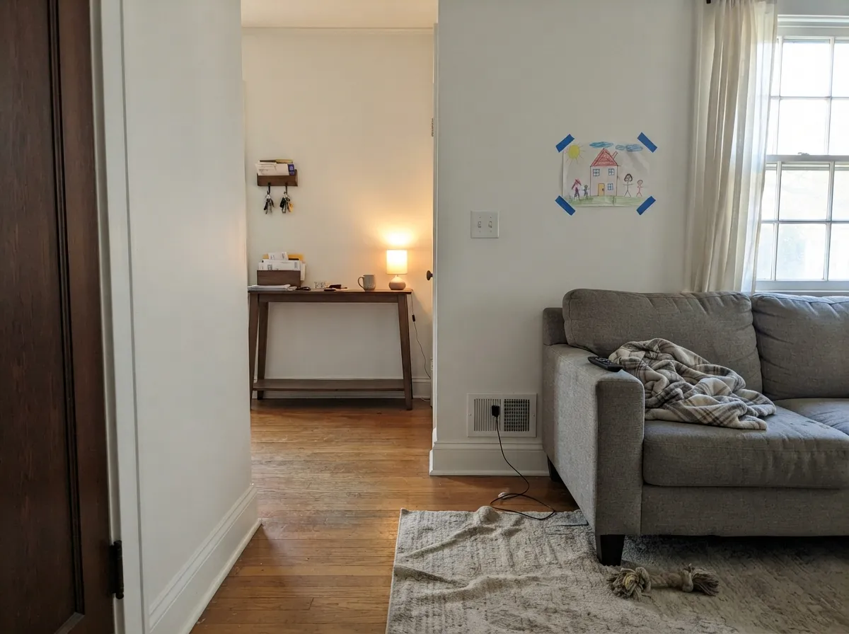
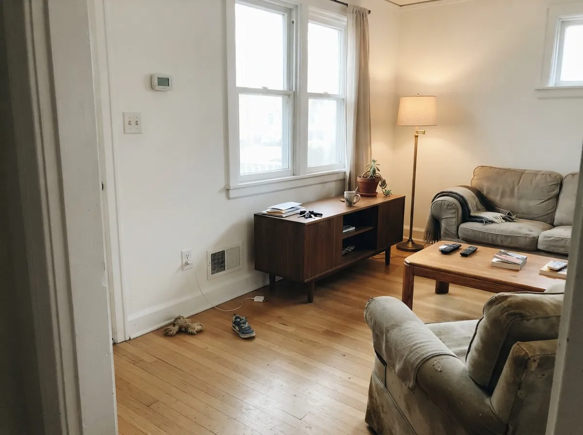
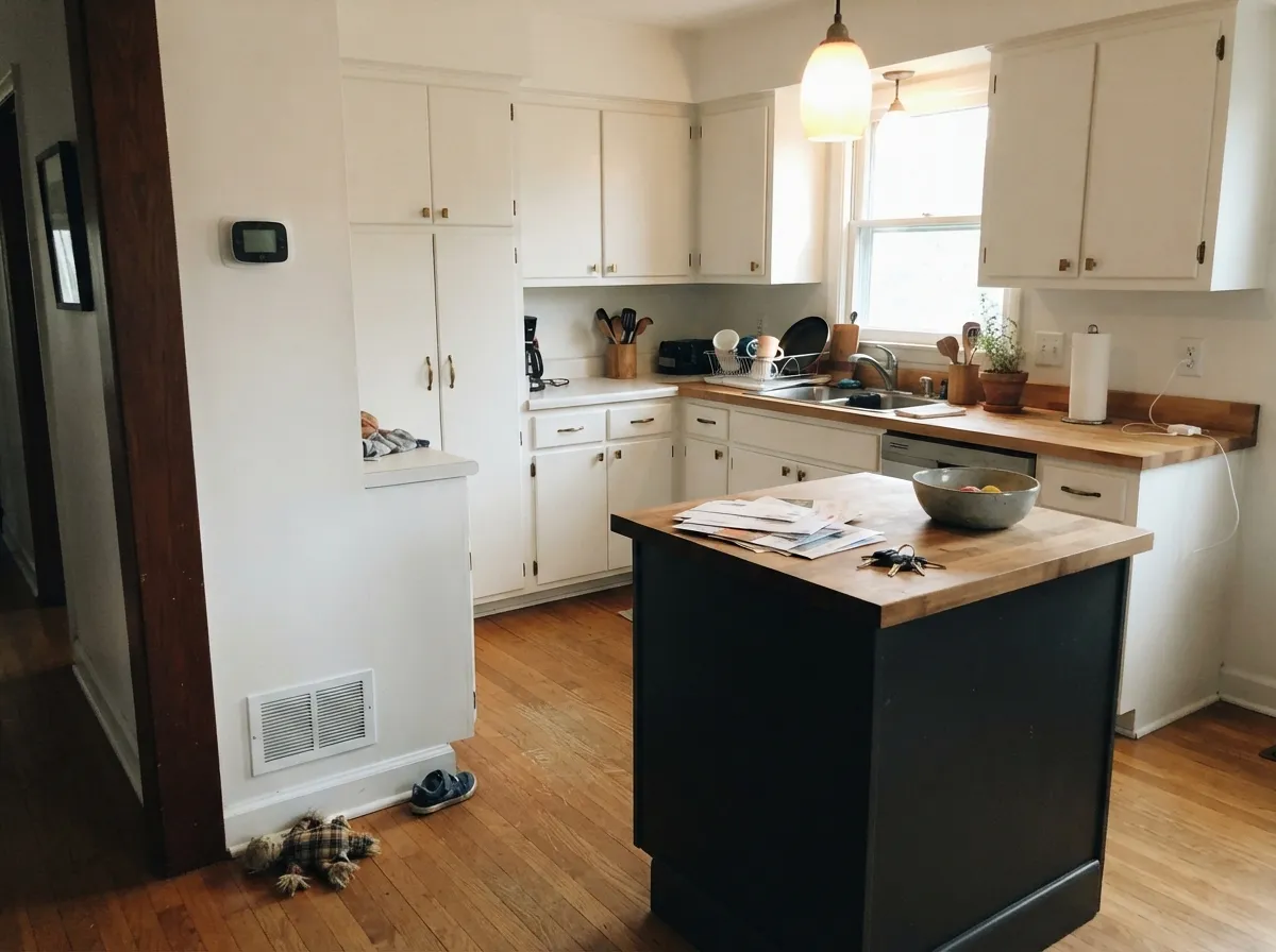
Simply White is at its best in bright open-plan homes where one white has to run from the kitchen through the living room, and in north-facing rooms where its bit of warmth stops the light going grey. Look at how it behaves in these rooms next to wood, brass, and warm stone — and notice that in every good one, nothing whiter is competing with it.
Where It Fails
Simply White has very few bad reviews that are actually about the paint. Almost every complaint online traces back to the same three set-ups — and each one is visible before you buy, if you know to look for it.
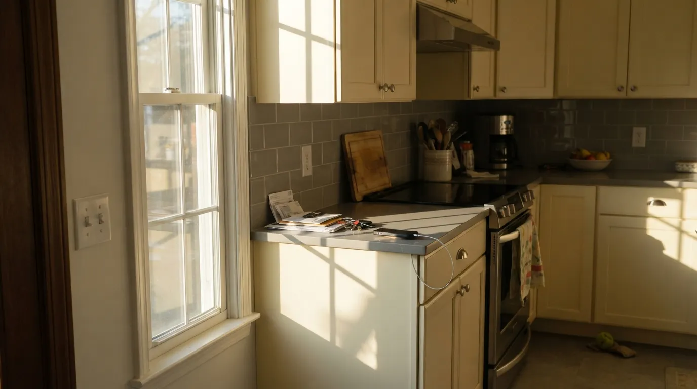
This is the single most common complaint on Houzz: kitchens and bedrooms painted Simply White that owners describe as "creamy and too warm, almost yellow" from about four o'clock. Late western light is warm light, and the yellow already in the paint has nowhere to hide. If your main room faces west, go cleaner — Chantilly Lace (OC-65) holds up in that sun — or drop the walls to a neutral like Classic Gray (OC-23) and keep Simply White for trim only.
Owners repeat a version of the same line: you do not notice the yellow until a whiter white is up against it. Simply White walls with builder-white trim, or Chantilly Lace (OC-65) trim over Simply White walls, is the classic own-goal — the crisper white wins and Simply White reads dirty. Either run Simply White on walls, trim, and ceiling and let the sheen change do the separating, or drop it entirely and paint the whole room Chantilly Lace.
Cool stone and brushed steel sit at the opposite temperature, and they push Simply White cabinets visibly yellow next to them. This is where people who loved the sample end up repainting. With grey-veined quartz or a lot of stainless, use a cooler white on the cabinets: Decorator's White (OC-149) or Chantilly Lace (OC-65).
Room by Room
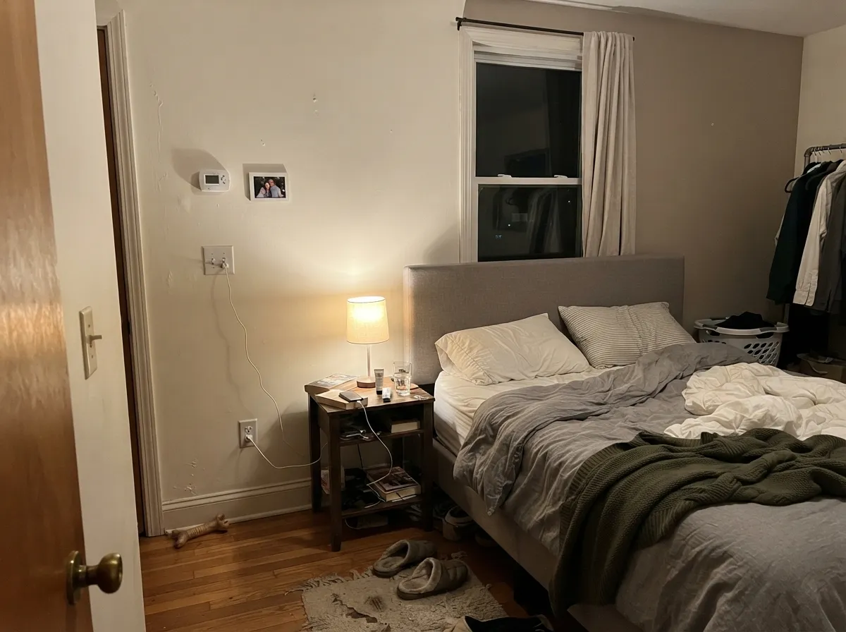
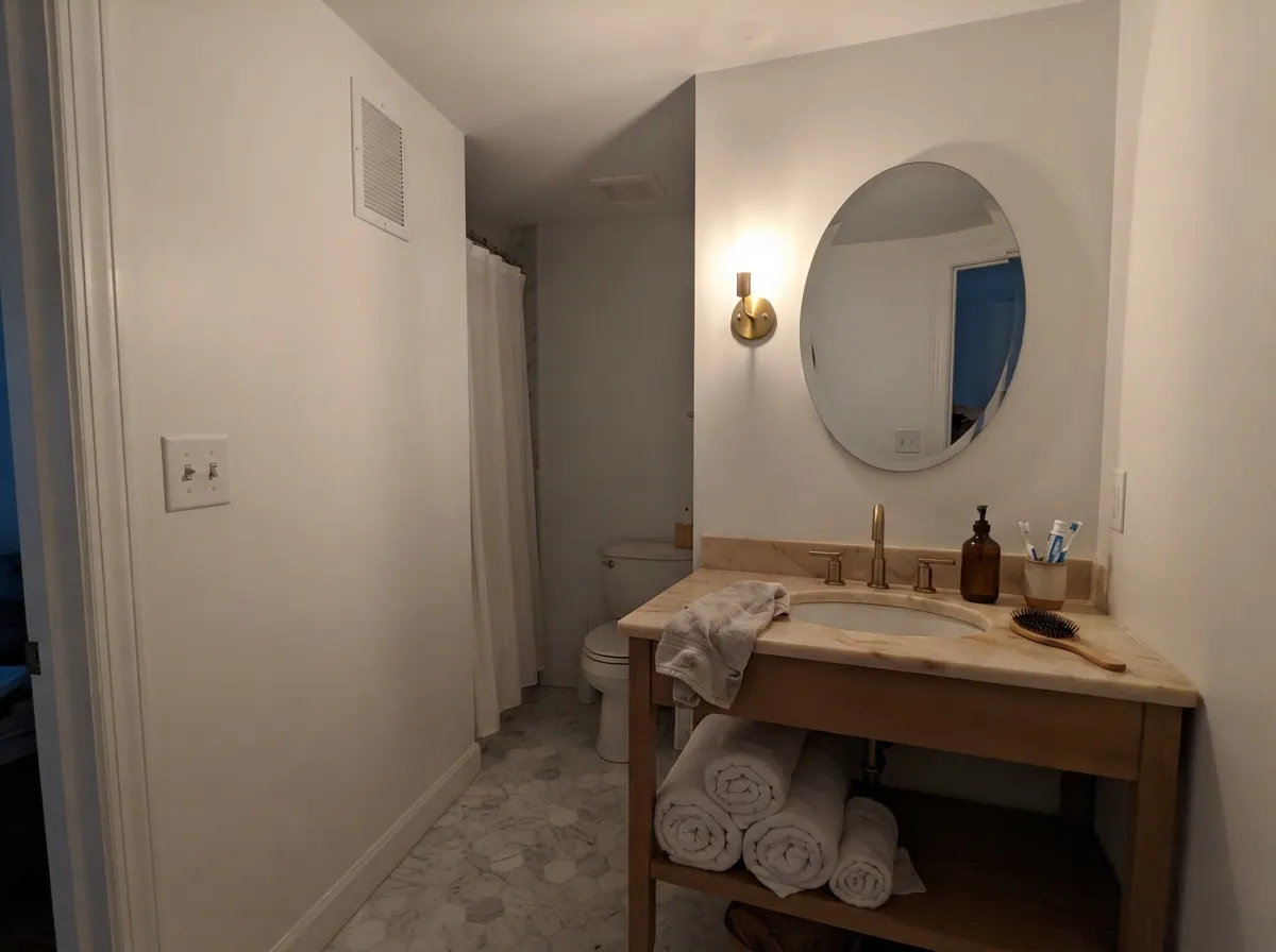
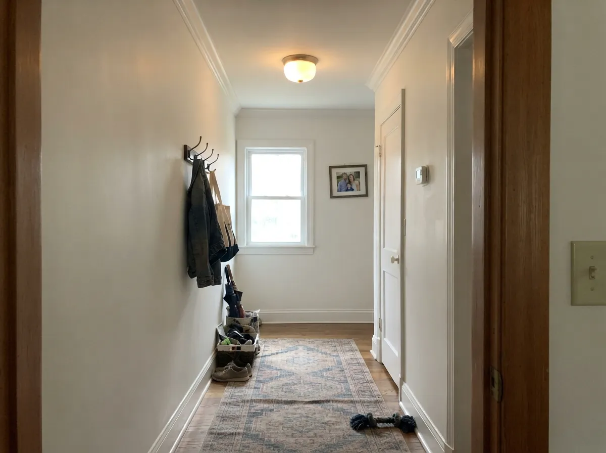
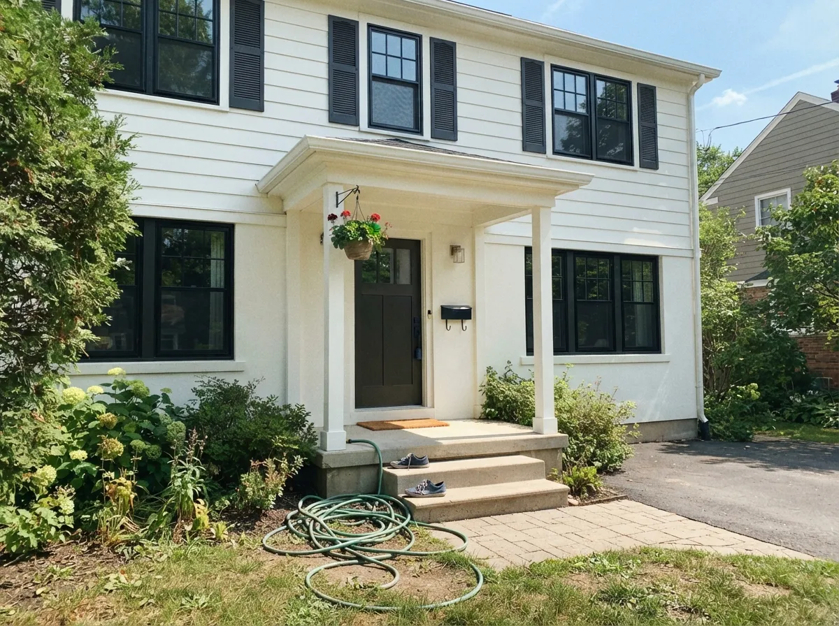
Your Light Is the Risk
Cool grey daylight cancels the yellow and leaves a clean, mellow white. Owners in north rooms rarely see the warmth at all.
Bright all day, but the warm flood pushes it creamier by the hour. Lovely if you wanted cream, annoying if you wanted white.
West-facing rooms after 4pm are where the bad reviews come from. The yellow lands hard. Sample this hour or skip the color.
2700K bulbs deepen the cream; 3500–4000K keeps it crisp and close to true white. Change bulbs before you change paint.
Most complaints about Simply White are a light mismatch. Upload a photo of your actual room and see it on your walls — then ask for the same wall in north light or evening lamps before you buy a single sample.
Need It From Another Brand?
Any paint counter can custom-tint Benjamin Moore 2143-70 directly. If you would rather stay in one brand's own deck, these are the closest stock matches, measured as ΔE2000. Under 2 is a difference you will not see on the wall.
| Brand | Closest color | ΔE | LRV | |
|---|---|---|---|---|
| Sherwin-Williams | High Reflective WhiteSW 7757 · Sherwin-Williams | 1.4 | 93 | Color page → |
| Behr | Swan WingW-F-400 · Behr | 0.7 | 92 | Color page → |
| Valspar | Ewe8007-5A · Valspar | 0.6 | 91 | Color page → |
| PPG / Glidden | Delicate WhitePPG1001-1 · PPG / Glidden | 2.5 | 88 | Color page → |
| Glidden | Crisp Linen White61YY 89/040 · Glidden | 2.8 | 89 | Color page → |
| Dutch Boy | Ultra White002W · Dutch Boy | 1.4 | 91 | Color page → |
Similar Benjamin Moore Colors
The nearest shades to Simply White within Benjamin Moore's own range, ranked by perceptual color distance — useful when you want the same look a touch lighter, darker, or warmer.
WCAG 2.1: AA is 4.5 : 1 for normal text, 3 : 1 for large text, AAA is 7 : 1.
Simply White vs the Colors You're Also Considering
Every Simply White sample board has the same rivals on it. The numbers show the real lightness gap — then it comes down to which risk you would rather live with.
Pick this when you want brightness that still feels warm and lived in.
Benjamin Moore OC-65 · LRV 92Chantilly LacePick this for west sun, cool marble, and crisp modern rooms — no yellow to manage.
Side-by-side comparison →Pick this when the room is dim and you need every bit of light bounce.
Benjamin Moore OC-17 · LRV 85White DovePick this for a softer, calmer white — its grey base keeps it out of yellow.
Side-by-side comparison →Chantilly Lace (OC-65), LRV 92, is the crisp, near-true white. It has far less warmth than Simply White, so it looks cleaner and cooler. Choose Chantilly Lace when you want the brightest, most modern white; choose Simply White when you want that brightness with a softer, warmer feel.
White Dove (OC-17), LRV 85, is a step softer and slightly darker. It is warm and creamy but more muted and less bright than Simply White. In dim rooms White Dove can feel cozy where Simply White still reads light and open.
Cloud White (OC-130), LRV 85, carries a bit more yellow and body than Simply White. It looks a touch creamier on the wall. If your space already runs warm and you want to stay lighter and cleaner, Simply White is the safer pick.
Simply White Coordinating Colors
The rule with Simply White is temperature discipline: everything beside it should be warm or genuinely neutral. Warm greiges, tans, deep navies, and muted greens all read as one deliberate palette. Violet-leaning grays like Balboa Mist, icy blues, and blue-grays are where it starts to look yellow by comparison — so check what a gray is actually built on before you put it in the same room. These are the partners that keep showing up in Simply White houses that work:
Simply White on Cabinets and Trim
This is the work Simply White is built for, and the product matters as much as the color. Use a cabinet and trim enamel rather than wall paint — Advance in satin for doors and drawer fronts, semi-gloss for baseboards and casing — so the film cures hard enough to take fingernails and dish towels. Clean, degloss, and prime; a warm white over shiny old finish is where peeling stories start.
Two problems come up over and over on real cabinet jobs. The first is a sheen mismatch that people mistake for a color mismatch, because the yellow in this color makes every gloss difference look like a temperature difference — keep doors, frames, and boxes in one product and one sheen. The second is touch-up: label a quart with the code and the sheen and keep it, because a can mixed two years later, in a different base, brushed instead of sprayed, will not blend into a wall of Simply White cabinets. For the island or the lower run, a dark anchor is the safest contrast, and both of these hold their own against a bright warm white without going cold.
Simply White With Wood, Stone, and Metal
Wood is where this color earns its reputation. White oak, walnut, cherry, butcher block, and even orange-leaning builder oak all sit comfortably against it, because the warmth in the paint meets the warmth in the wood instead of fighting it. Metals follow the same logic: aged brass, unlacquered brass, and warm bronze look intentional beside Simply White, while a kitchen full of polished chrome and stainless pulls it noticeably yellow.
Stone is the part to test before you commit. Warm-toned quartz, cream limestone, and marble with warm veining are all easy partners. Carrara-look slabs and gray-veined quartz are the well-known clash. The one people never see coming is pink-beige stone and tile — travertine, Tuscan-style floor tile, older pink-toned granite. Their warmth is on the pink side and Simply White's is squarely yellow, so the two go muddy together in a way neither does alone. Tape a large sample directly against the actual slab or tile, in the room, before the cabinets get sprayed.
Three Ready Palettes Built on Simply White
A color is never alone on the wall. These are complete combinations in the 60-30-10 pattern, with the reason each one holds together. Every one opens in the visualizer.
Running one white on walls, trim, and ceiling removes the only thing that makes Simply White look dirty — a brighter white beside it — and the sheen change gives all the separation an open plan needs. Hale Navy on the door supplies the single dark note so the house still has contrast.
Try this palette in your roomEdgecomb Gray is a warm greige, so it sits on the same yellow side as Simply White and the wall-to-cabinet handoff never turns into a white-against-white contest. Black Beauty grounds the room at 10 percent and makes brass hardware and warm wood look intentional rather than accidental.
Try this palette in your roomCool north daylight cancels the yellow in Simply White and leaves a clean mellow white, while Revere Pewter next door keeps the same warm base so the two rooms read as one house. Kendall Charcoal on the joinery is the dark 10 percent that stops a high-LRV room looking washed out.
Try this palette in your roomSimply White FAQ
Should I choose Simply White or White Dove?
Simply White is brighter, and its warmth is a clean yellow. White Dove is softer, and its warmth is grayed down so it almost never announces itself. Choose Simply White when the room needs light thrown around and you want the white to feel cheerful; choose White Dove when you want a white that quietly gets out of the way and never risks reading cream.
Does Simply White actually look yellow?
Yes, and there is no point pretending otherwise. In ordinary daylight most people simply read it as a friendly warm white, but it goes visibly creamy in low light, under warm bulbs, and any time a cleaner white shares the same wall or sightline. The color itself is consistent from house to house — your light and the whites around it are the variables.
Is Simply White a good color for kitchen cabinets?
It is one of the most-used cabinet whites in the country, because it looks clean without going clinical and it makes oak, walnut, butcher block, and brass hardware look deliberate. Spray or roll it in a cabinet-grade enamel in satin rather than a wall paint. Settle your countertop first: warm quartz and warm marble are a good match, cool gray-veined stone is not.
Are OC-117 and 2143-70 the same color?
Same color, two different Benjamin Moore fan decks — the store mixes both to one formula. Painters occasionally insist they are different shades; they are not. Still, put one code on every quote and every can so nothing gets scrambled at the paint counter.
Why do my cabinet doors look yellower than the boxes?
Almost always sheen, not color. A sprayed satin door bounces light differently from a brushed semi-gloss frame, and because Simply White carries a real yellow, that difference shows up as warmth rather than as a subtle change in gloss. Keep every part in the same product and the same sheen, and if the doors came factory-finished, accept that site-painted pieces beside them will never match perfectly.
Does Simply White go with gray walls?
With warm grays, yes — Revere Pewter, Edgecomb Gray, and Accessible Beige sit on the same warm side, and the wall-to-trim handoff looks planned. With violet-based grays like Balboa Mist, or any blue-gray, Simply White reads yellow by comparison. Check the undertone of the gray before you assume the pair works.
How many coats does it take?
Two over an existing light color, and painters regularly need a third over primer or anything strong — it is a lightly tinted white with modest hide. Skimping on the second coat shows up as patchy roller lap near windows, which is the worst place for it. Going over a dark or saturated wall, prime first with a primer tinted toward the finish color instead of stark white.
Have you painted with Simply White?
Rate it — one tap helps the next reader decide.
Ask a Question