High Reflective White
Sherwin-Williams' brightest white, reviewed honestly: the surfaces it was built for, the three-coat problem nobody warns you about, and when to drop to Pure White instead.

Jessica has spec'd whites and neutrals for more than 300 rooms and keeps a sample wall of painted drawdowns in her studio. Every color review is checked against real reader rooms in the comments and re-tested when a formula changes. About the testing process →


- 1Classic Gray74
- 2Alabaster82
- 3High Reflective White93
- 4White100
The Fast Verdict
High Reflective White is the top of the Sherwin-Williams white ladder — LRV 93, no undertone worth naming, nothing brighter in the deck. On trim, ceilings and cabinets next to white stone it does something no softer white can: it reads as actual white instead of "white-ish."
The catch is physical, not aesthetic. There is almost no colorant in the can, so it hides badly, and three coats is the normal number. Buy it for the surfaces that need to be the brightest thing in the room, and budget the extra gallon.
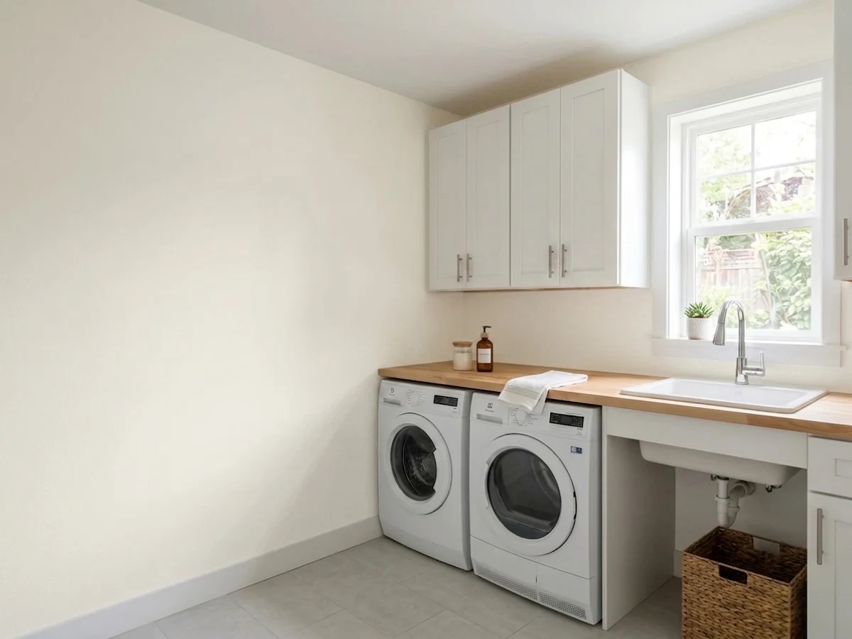
Trim, doors and molding that must read crisp · ceilings that need maximum bounce · cabinets next to white marble or quartz · closets, pantries and laundry rooms with no window
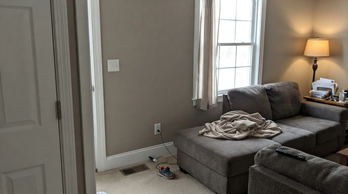
Your house runs on honey oak, beige and cream · you are covering a dark color on a tight budget · you want a soft, forgiving whole-house white · you are painting siding or a garage door
- The brightest white in the SW deck — nothing bounces more light
- No undertone of its own, so it never argues with tile or stone
- Trim and doors read genuinely crisp against any wall color
- Ceilings gain real brightness in dark and low-ceilinged rooms
- The correct white next to white marble, quartz and white tile
- Poor hide — three coats is normal, more over a dark color
- Reads clinical against oak, beige and warm earth tones
- Full sun becomes glare and exposes every drywall flaw
- Borrows color from everything — lawn green, brick pink, LED blue
What Color Is High Reflective White, Really?
The brightest color Sherwin-Williams sells, and it gets there the honest way — by leaving the colorant out. At LRV 93 there is nothing above it in the deck, and that number is not marketing: put a High Reflective White sample card next to any other white in the fan and the others suddenly look like they have something mixed into them, because they do. This is the reference white the rest of the SW whites are measured against.
The brightness gap is bigger than it sounds. Extra White sits at LRV 86 and Pure White at 84 — seven and nine points down — and on a trim board that difference is instantly visible. Cross-brand, its real twins are Benjamin Moore Chantilly Lace and Behr Ultra Pure White, both at LRV 92, and all three share the same personality and the same weakness: brilliant on a finished wall, thin in the can. Painters who dislike High Reflective White are not complaining about the color. They are complaining about coat three.
Undertone in one line: essentially none, with a hair of yellow that only shows against a truly blue-white. That sounds like a feature and it half is — it will not fight your tile or your countertop. But a color with no undertone has nothing of its own to hold onto, so it takes on whatever is nearby: green off a lawn, pink off a brick patio, blue off a cool LED. Read that as "it reports the room back to you," not as "it is neutral everywhere."
Where It Shines
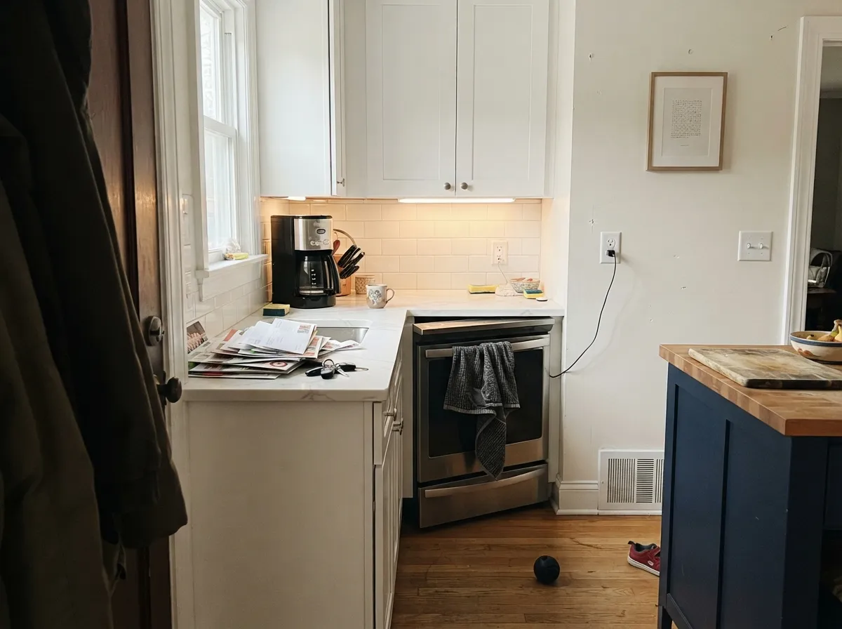
This color earns its keep on the surfaces that are supposed to be the brightest thing you see. Semi-gloss trim and doors against a greige or mid-tone wall give you the crispest line the SW deck can produce. On a ceiling it does real work — LRV 93 bounces light back down into rooms with small windows and low ceilings. And in a kitchen or bath built around white marble, quartz or white subway tile, it is one of the few whites that will not look faintly beige next to the stone.
Where It Fails
The complaints about High Reflective White are unusually consistent, and only one of the three is about how it looks. If your project matches any of them, the honest answer is Pure White or Snowbound — not more coats.
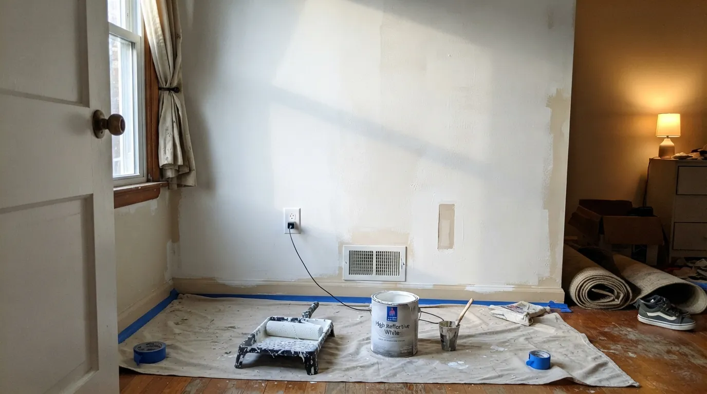
This is the number-one real-world complaint and it comes from painters, not homeowners. There is almost no pigment carrying it, so two coats over a light wall can still look patchy, and three or more is standard over anything with color in it. The fix is a gray-tinted primer first and a realistic gallon count — going over navy or a dark beige with finish coats alone is the expensive way to learn this.
With honey oak floors, oak trim, cream carpet or a Tuscan-era beige tile, LRV 93 does not read fresh — it reads like a hospital corridor, and it makes everything warm next to it look yellower by contrast. This white wants white stone, black metal, pale oak or glass. If the room is full of golden wood, a soft white like Alabaster or Snowbound will look cleaner than the brighter one does.
On a big south-facing wall at midday it stops being a color and becomes a light source; people describe squinting in their own living room. The same reflectivity rakes across every drywall seam, patch and roller lap, so bad prep shows from across the room. Flat sheen on ceilings and careful sanding on walls are not optional here.
Room by Room
Semi-gloss High Reflective White under a greige, sage or navy wall gives you the sharpest contrast line SW offers. It is the correct trim white when the walls are colored and you want the woodwork to pop, not blend.
The one place LRV 93 is unambiguously useful. In rooms with small windows, low ceilings or a basement's worth of shadow, it bounces measurably more light back down than an off-white ceiling. Flat sheen only — anything shinier turns every drywall seam into a highlight.
Excellent against white marble, quartz and white tile, where softer whites read faintly beige and give the game away. Satin urethane-fortified cabinet enamel, and expect an extra coat. Over warm granite with gold flecks, go softer instead.
A small white bath is exactly where this works: white tile, chrome or matte black, and a color that makes the room feel scrubbed rather than dim. Test your bulbs, though — cool LEDs over an all-white bath tip it toward blue-clinical fast.
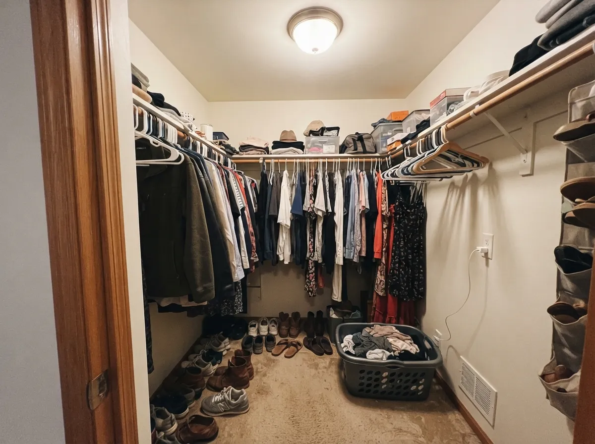
The most underrated recommendation in this review. Windowless rooms live entirely on artificial light, and this white returns nearly all of it. In a walk-in closet it also renders clothing color more honestly than a tinted white does, which is the whole reason you turned the light on.
Four walls of LRV 93 works in a contemporary room with big glass, art and pale wood, where the walls are meant to disappear. In a normal family room with oak floors, a beige sectional and one window, it reads cold and unfinished. That is the most common regret with this color as a wall paint.
Your Light Is the Risk
The one exposure bright whites win. Cool grey daylight leaves it clean and luminous where softer whites go dingy.
Full south sun turns LRV 93 into glare, and the bounce rakes across every seam and roller lap.
It reports whatever the window sees: green off a lawn in the morning, warm gold in the last hour of sun.
2700K lamps push it to ivory and cancel the crispness; 4000K LEDs read hospital-blue. 3000K is the honest middle.
Most complaints about High Reflective White are a light mismatch. Upload a photo of your actual room and see it on your walls — then ask for the same wall in north light or evening lamps before you buy a single sample.
Need It From Another Brand?
Any paint counter can custom-tint Sherwin-Williams SW 7757 directly. If you would rather stay in one brand's own deck, these are the closest stock matches, measured as ΔE2000. Under 2 is a difference you will not see on the wall.
| Brand | Closest color | ΔE | LRV | |
|---|---|---|---|---|
| Behr | Popped CornW-B-200 · Behr | 1.0 | 93 | Color page → |
| Benjamin Moore | Snowfall White2144-70 · Benjamin Moore | 1.6 | 90 | Color page → |
| Valspar | New ReamV148 · Valspar | 0.5 | 91.6 | Color page → |
| PPG / Glidden | Delicate WhitePPG1001-1 · PPG / Glidden | 1.6 | 88 | Color page → |
| Glidden | Delicate WhitePPG1001-1 · Glidden | 1.4 | 88 | Color page → |
| Dutch Boy | Super White001W · Dutch Boy | 0.6 | 92 | Color page → |
Similar Sherwin-Williams Colors
The nearest shades to High Reflective White within Sherwin-Williams's own range, ranked by perceptual color distance — useful when you want the same look a touch lighter, darker, or warmer.
WCAG 2.1: AA is 4.5 : 1 for normal text, 3 : 1 for large text, AAA is 7 : 1.
High Reflective White vs the Colors You're Also Considering
Every High Reflective White sample board has the same rivals on it. The numbers show the real lightness gap — then it comes down to which risk you would rather live with.
Pick this when Extra White still is not the brightest thing in the room and you will pay for the extra coat to get there.
Sherwin-Williams SW 7006 · LRV 86Extra WhitePick this if you want a sharp trim white with real pigment behind it — it covers in two coats and reads cooler and harder-edged.
Pick this when Pure White looks faintly dull beside white marble or white tile and the surface has to out-white the stone.
Sherwin-Williams SW 7005 · LRV 84Pure WhitePick this for almost every whole-house job — it is softer, far easier to roll, and the white most SW painters default to.
Side-by-side comparison →Pure White SW 7005 at LRV 84 and hex #EDECE6 is the usual alternative. It is nine points less reflective and slightly softer, which makes it easier to live with on walls and gentler in bright rooms. Choose High Reflective White when you need maximum brightness or crisp trim against dark walls, and Pure White when you want a clean white that does not shout.
Across brands, Farrow and Ball Wimborne White No. 239 and Backdrop Tabula Rasa BD-TR share the identical hex at deltaE 0, though published LRVs differ at 89 and 92 because brands measure differently. Behr Snowy Egret PWN-50 at deltaE 0.56, Benjamin Moore Capitol White CW-10 at deltaE 0.86, and Valspar Cravat 8007-5C at deltaE 0.89 are all effectively the same color.
Magnolia Home Silos White JG-107 at deltaE 1.89 and Rodda Silk CA002 at deltaE 2.37 are very close, so sample first. Clare Wing It at deltaE 4.02 and Rust-Oleum Chiffon Cream 329598 at deltaE 4.22 are close but visibly different side by side.
High Reflective White Coordinating Colors
Because it has no undertone to protect, this white coordinates more freely than any warm white does — the question is not whether a color goes with it, but whether the room can take the contrast. It is happiest with cool-to-neutral greiges, true blacks and saturated darks, and it needs at least one dark note somewhere or the whole scheme floats. These are the partners that keep showing up in rooms that work:
Why Painters Push Back on This Color
Ask a Sherwin-Williams pro what they think of High Reflective White and you will usually get a sigh before an opinion. The reason is coverage. Hide in a can of paint comes from pigment, and the brightest whites are the ones with the least of it — there is nothing in there to stop light passing through to whatever is underneath. Two coats over an existing white is fine. Two coats over builder beige, over a gray, over anything with color in it, will show a ghost of the old wall in raking light, and the third coat is the one that finally closes it.
None of that makes it a bad paint. It makes it a paint you plan for. Prime first with a gray-tinted primer whenever you are covering something darker; buy roughly one third more paint than the calculator says; roll in one direction and keep a wet edge, because laps show far more on a high-LRV surface than on a mid-tone one. On trim and cabinets, where you are spraying or brushing thin coats anyway, the extra pass costs almost nothing. On 2,000 square feet of wall it is a real line item — which is exactly why so many painters steer whole-house jobs toward Pure White instead.
Ceilings, Closets and the Outside of the House
Indoors, the case for LRV 93 is strongest exactly where nobody looks. On a ceiling it is doing physics, not decorating: light that hits it comes back down instead of being absorbed, which is worth more in a low-ceilinged basement or a room with one small window than any clever wall color would be. Keep it flat. The same logic makes it the quiet best choice for closets, pantries and interior laundry rooms — windowless boxes that run on one fixture, where a tinted white simply eats light you paid for. A walk-in closet in this white also shows clothing color honestly, which a creamy white does not.
Outside, be more careful than the name suggests. It is genuinely good on narrow trim, where it frames colored siding and makes the whole facade look sharper. On large planes it is usually too much: sunlight already lifts any white several steps, so siding, painted brick and garage doors in LRV 93 can turn into glare from the curb, and most exterior designers steer those surfaces toward Pure White or Snowbound instead. If you are set on it, tape a large sample to the wall and look at it at noon, not at 6pm — the color is easy to love in soft evening light and hard to live with at midday.
Three Ready Palettes Built on High Reflective White
A color is never alone on the wall. These are complete combinations in the 60-30-10 pattern, with the reason each one holds together. Every one opens in the visualizer.
This is the scheme High Reflective White was built for: a warm mid-tone wall, the brightest possible woodwork, and one true black to stop the contrast reading accidental. The 33-point LRV gap between wall and trim is what makes the casing edges look drawn rather than blurred.
Try this palette in your roomCabinets brighter than the countertop is the trick here — with white marble or quartz, a softer cabinet white reads dingy against the stone and this one does not. Repose Gray keeps the walls neutral instead of warm, and the navy island gives the eye somewhere to land.
Try this palette in your roomClosets, pantries and interior laundry rooms run on one ceiling fixture, so every point of LRV is real light you get back. Drenching the whole box in one bright white removes shadow lines entirely; the Iron Ore door is what keeps it from feeling like a walk-in refrigerator.
Try this palette in your roomHigh Reflective White FAQ
Is High Reflective White warm or cool?
Neither, in practice. There is a trace of yellow in the formula, which is why it does not read icy the way a blue-white does, but on a wall it is as close to no undertone as a paint gets. What it will do is pick up its surroundings — a green lawn outside, a brick patio, a cool LED strip — so the room decides the temperature more than the paint does.
Why does it take so many coats?
Because hide comes from pigment, and this color has almost none in it. Two coats over an existing light white is usually fine; two coats over beige, gray or any real color will look patchy, and three is the normal count. Prime with a gray-tinted primer when you are covering something dark, and buy the extra gallon before you start rather than mid-job.
Is it too bright for walls?
Often, yes. It works on four walls in a contemporary room with big windows, pale wood and art to break the plane up. In a standard living room with oak floors and warm furniture it reads cold and slightly unfinished, and in full midday sun it glares. If you want a white wall that still feels like a room, Pure White or Snowbound get you most of the brightness with none of the harshness.
High Reflective White or Extra White for trim?
Extra White for most jobs — at LRV 86 it still reads plainly white, it covers in two coats, and it costs less in labor. Choose High Reflective White when the trim has to be the brightest surface in the room, usually because the walls are dark or the room contains white stone that would otherwise out-white the woodwork.
Can I use it on the ceiling?
Yes, and it is one of the best arguments for the color. Use flat sheen, because the reflectivity that makes it useful also makes every seam visible in anything shinier. It is the right call in dark rooms, low-ceilinged rooms and basements. In a warm-toned room where the walls are cream or beige, a softer ceiling white like Snowbound will look more deliberate.
Does it work on exteriors?
On narrow trim, yes — it makes a colored siding pop like nothing else. On big exterior planes, most designers say it is overkill: full sun already lifts a white several steps, so siding, painted brick and garage doors usually look better in a slightly softer white such as Pure White or Snowbound. Walk a large sample around the house at noon before committing anything larger than the trim.
Have you painted with High Reflective White?
Rate it — one tap helps the next reader decide.
Ask a Question