Tricorn Black
The black designers reach for when they want no undertone at all, reviewed honestly: where it earns the hype, the three rooms it ruins, and what to use instead.

Jessica has spec'd whites and neutrals for more than 300 rooms and keeps a sample wall of painted drawdowns in her studio. Every color review is checked against real reader rooms in the comments and re-tested when a formula changes. About the testing process →
- 1Tricorn Black3
- 2Graphite8
The Fast Verdict
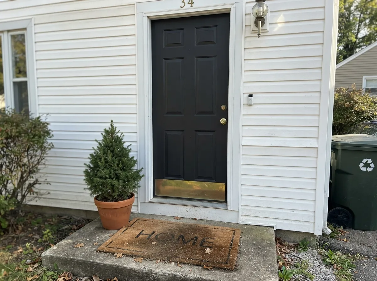
Tricorn Black is the black you pick when you do not want the paint to have an opinion. No brown, no navy, no charcoal softness — it just reads black, which is exactly why it has become the default for front doors, window sash, islands, and interior doors.
The catch is that it is genuinely dark: at LRV 3 it swallows light, shows dust, and punishes bad drywall. Used as contrast it is close to perfect; used to fill a small dim room, it is the color people repaint.
Front doors, shutters and window sash · kitchen islands and cabinet bases · interior doors, trim and built-ins · anyone who wants black with zero color agenda
Your room is small, dim and has one window · your walls are wavy old drywall · black factory windows or appliances sit right next to it · you want a softer near-black that forgives touch-ups
- A genuinely undertone-free black — it never turns brown, navy, or purple
- Holds the same depth from morning to dusk, indoors and out
- Reads clean against any siding color, any wood, any metal finish
- The safest black for exterior sash and trim across a whole house
- Small amounts do a lot: one door changes a whole elevation
- LRV 3 swallows a small or dim room whole
- Shows dust, fingerprints, and lap marks — especially in flat or matte
- Touch-ups flash; you almost always end up recoating the full panel
- Needs a gray-tinted primer and two full coats to look even
What Color Is Tricorn Black, Really?
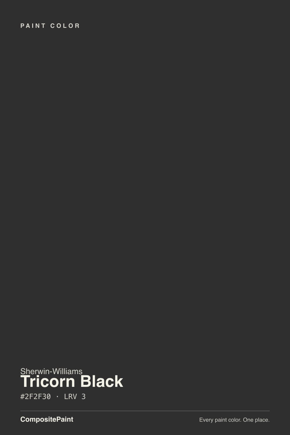
A black with no story. Most "blacks" in a fan deck are really very dark something — a very dark brown, a very dark navy, a very dark green-gray — and they show it the moment sunlight lands on them. Tricorn Black carries almost no color pigment steering it anywhere, so it does not perform in the light. That sounds boring until you have lived with a black door that turns eggplant at 5 p.m. Choosing a color with no undertone is a real design decision, not a lack of one: it means the black stays the frame and lets your siding, counter, or wood do the talking.
At LRV 3 it is about as dark as mixed house paint gets. The useful comparison is Iron Ore (SW 7069) at LRV 6 — on paper a small gap, in a room a big one. Iron Ore reflects roughly twice as much light and reads as charcoal in daylight, softening on siding and on a full wall. Tricorn Black does not soften. It holds the same depth at noon and at dusk, which is the whole point on trim and doors and the whole problem on four walls of a dark room.
Undertone in one line: essentially none, with the faintest cool lean that only shows next to a warmer black. If your sample looks blue, that is cool daylight or an LED bulb; if it looks brown, that is warm bulbs or the wood beside it.
Where It Shines
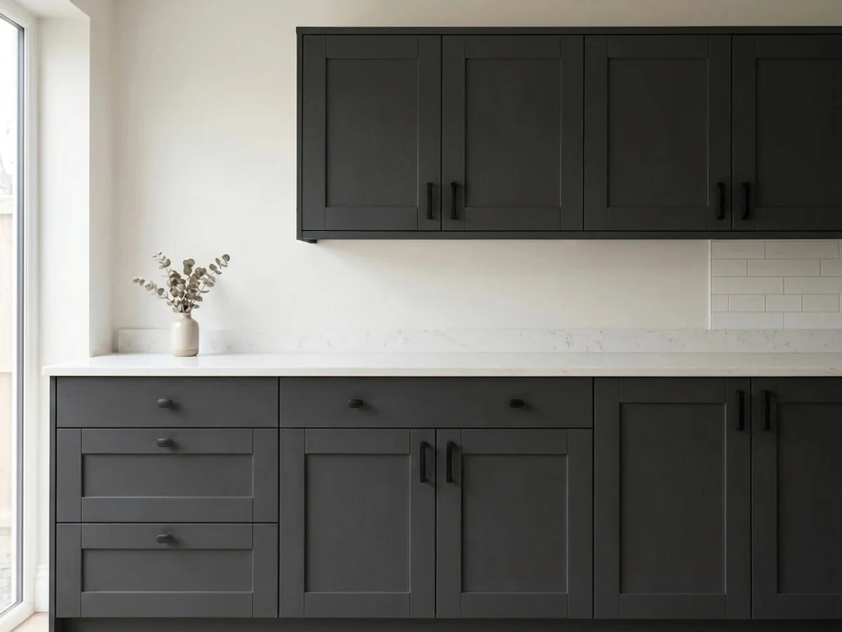
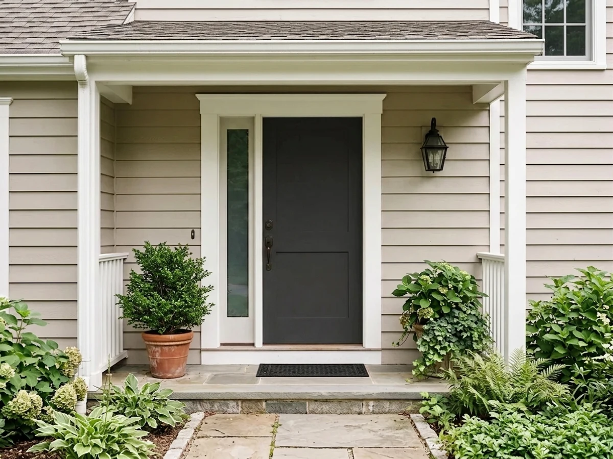
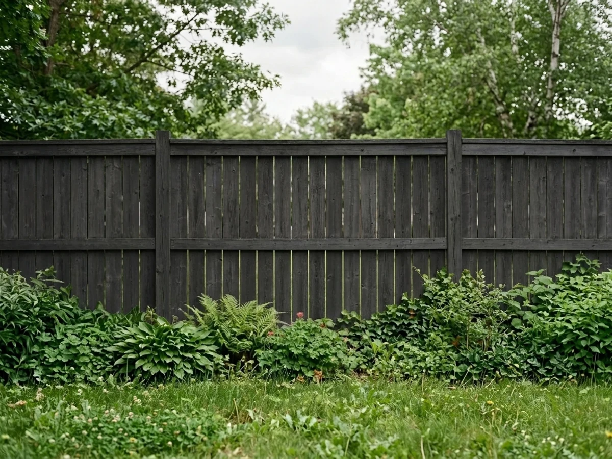
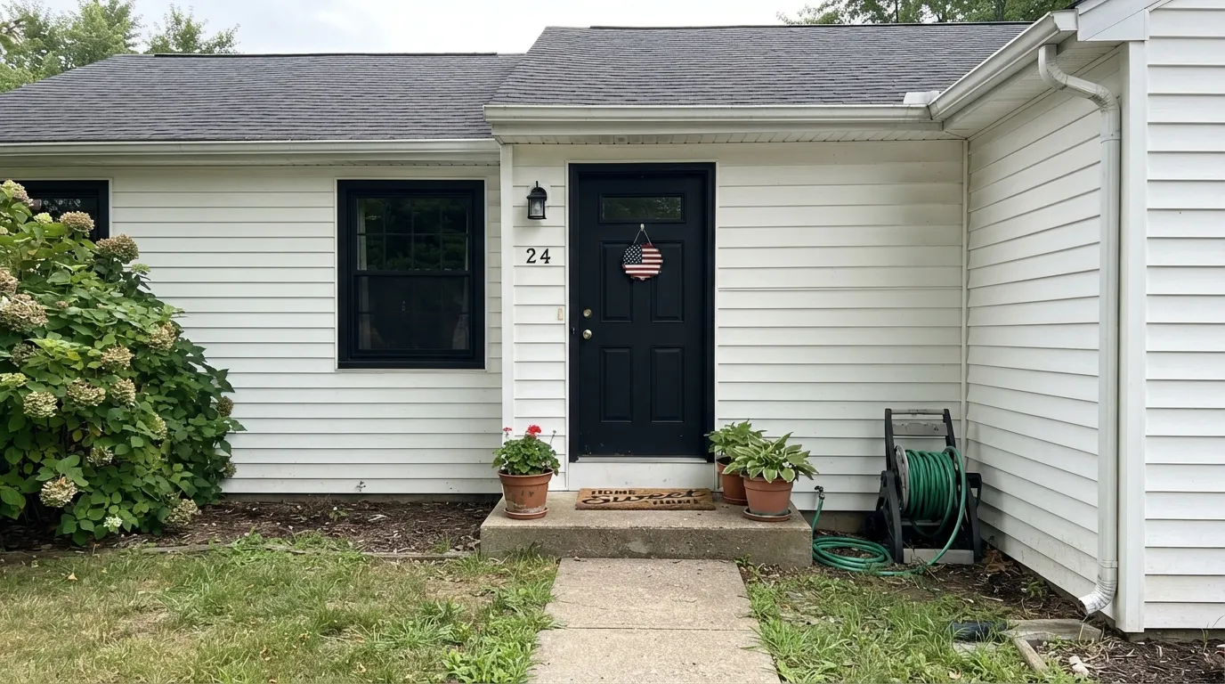
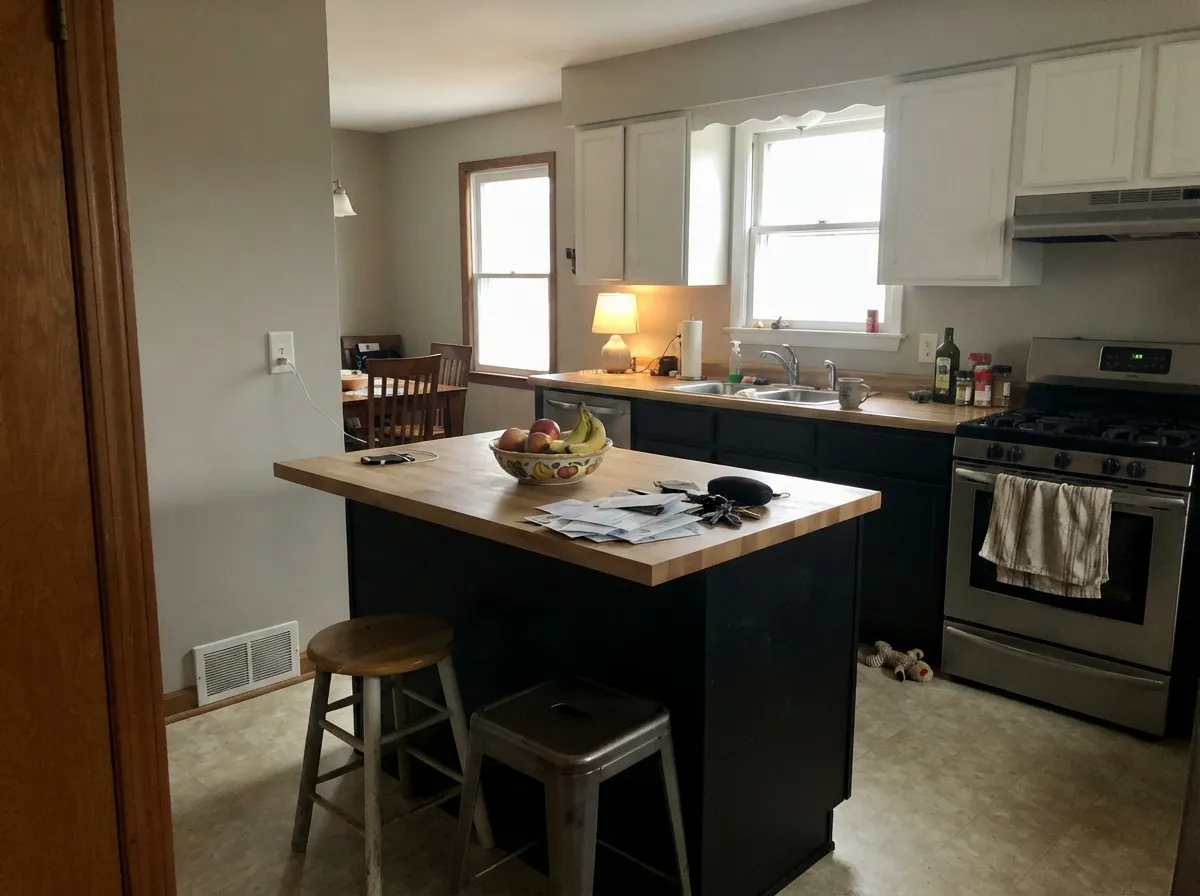
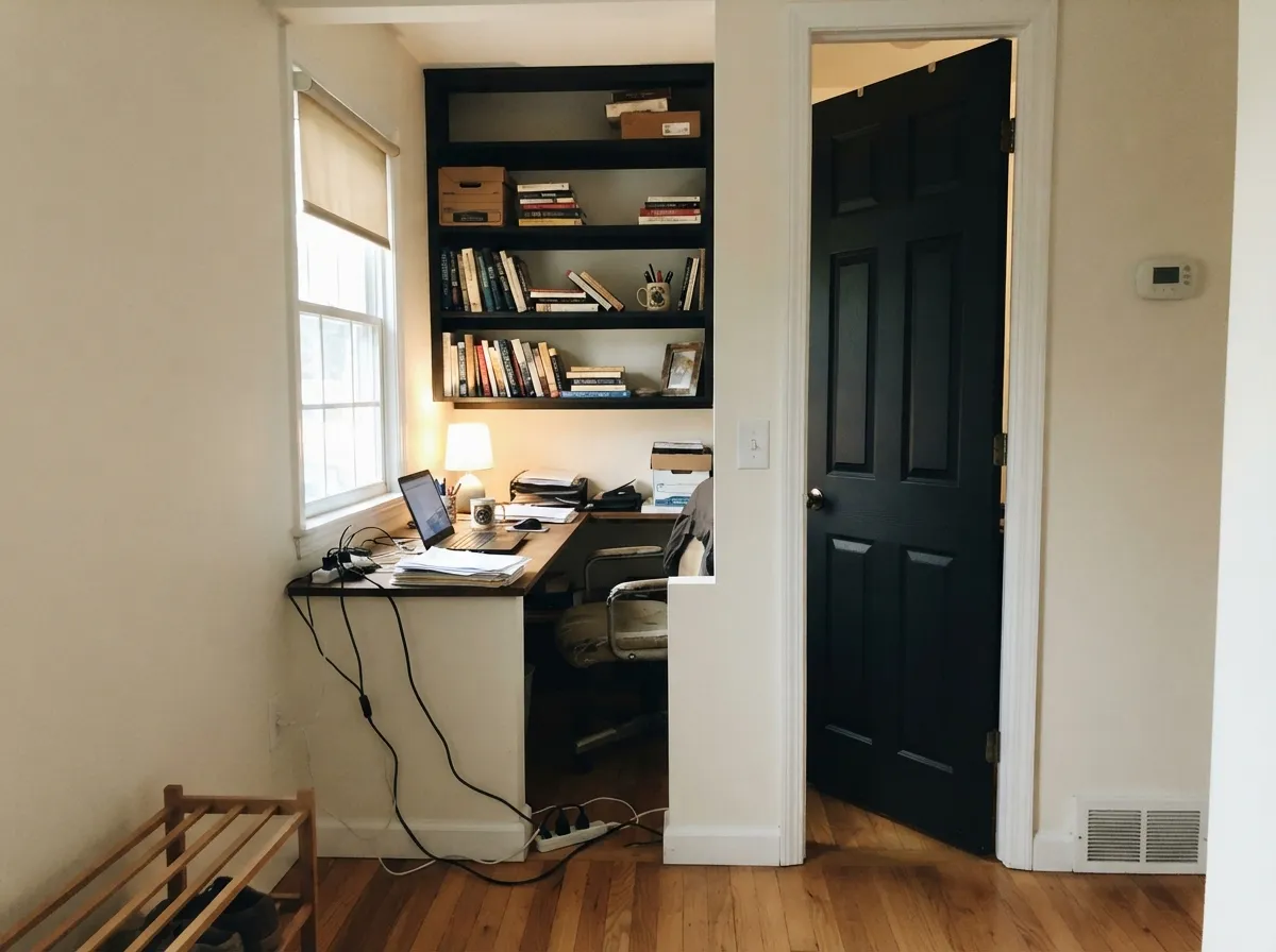
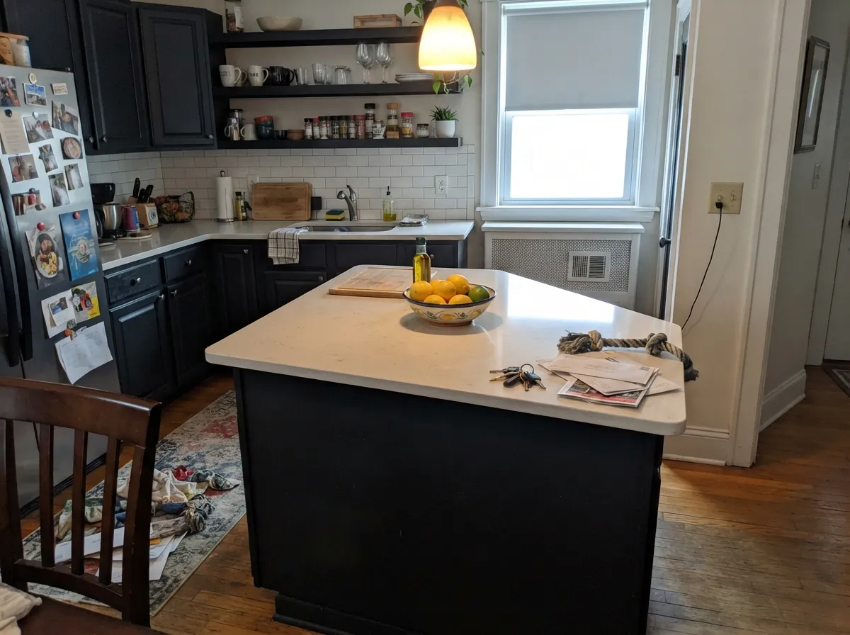
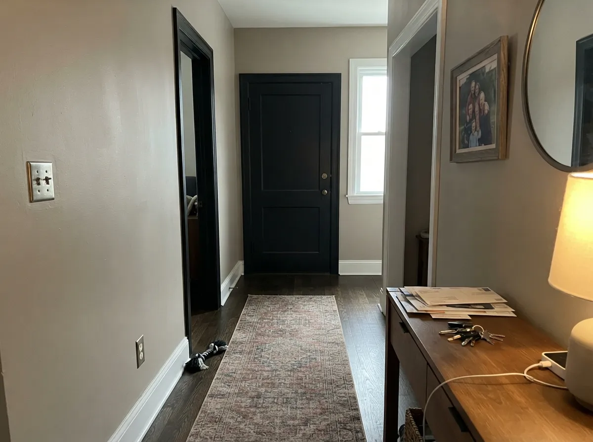
Tricorn Black is at its best when it is the smallest amount of paint in the room. A front door, a window sash, a run of interior doors, an island base — the places where it draws a hard line and everything around it suddenly looks intentional. These are the rooms and elevations where readers almost never regret it.
Where It Fails
The bad stories about Tricorn Black are remarkably consistent, and none of them are about the color being wrong. They are about the color being used at the wrong scale, in the wrong sheen, or on the wrong side of the house. If your project matches one of these three, a softer black will make you happier.
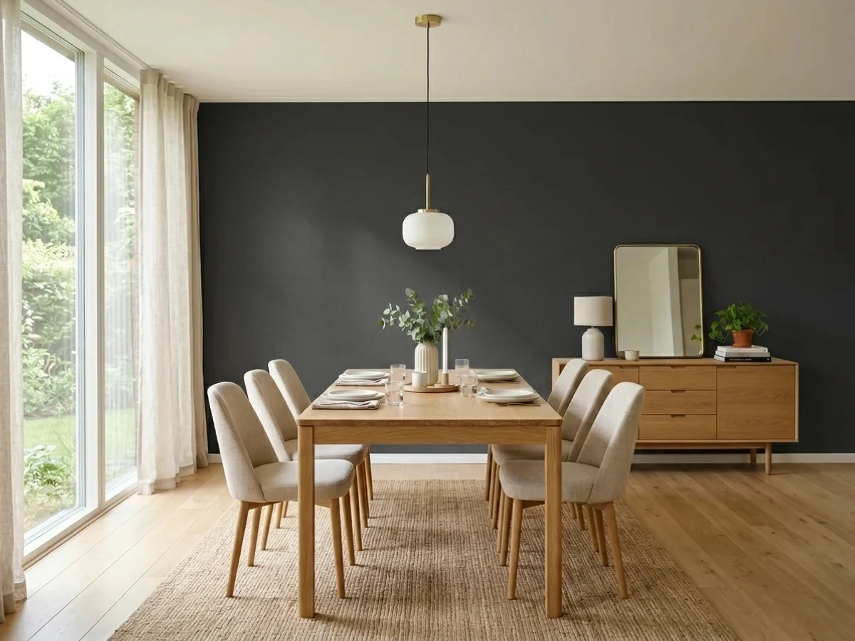
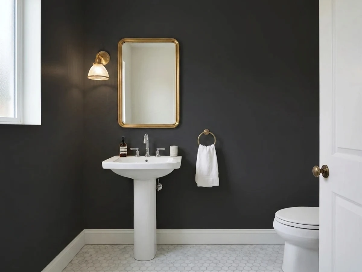
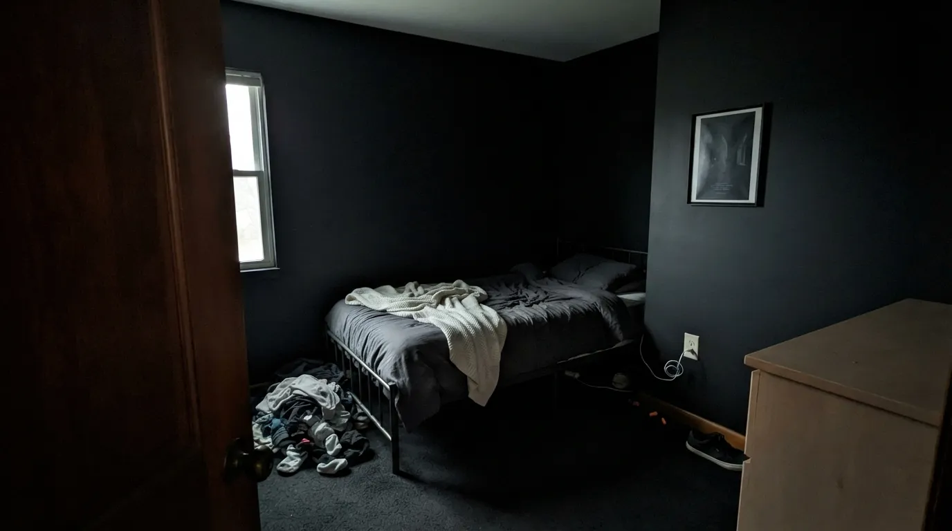
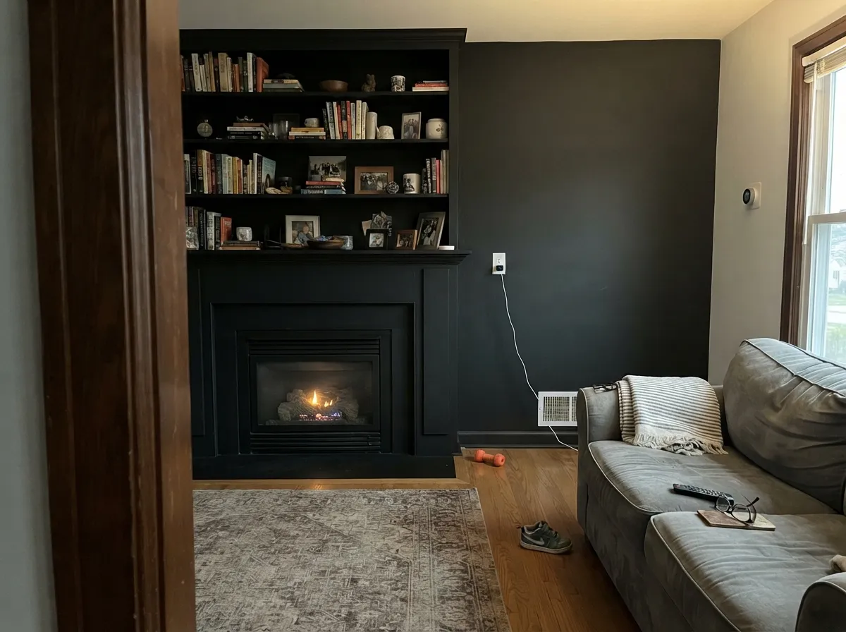
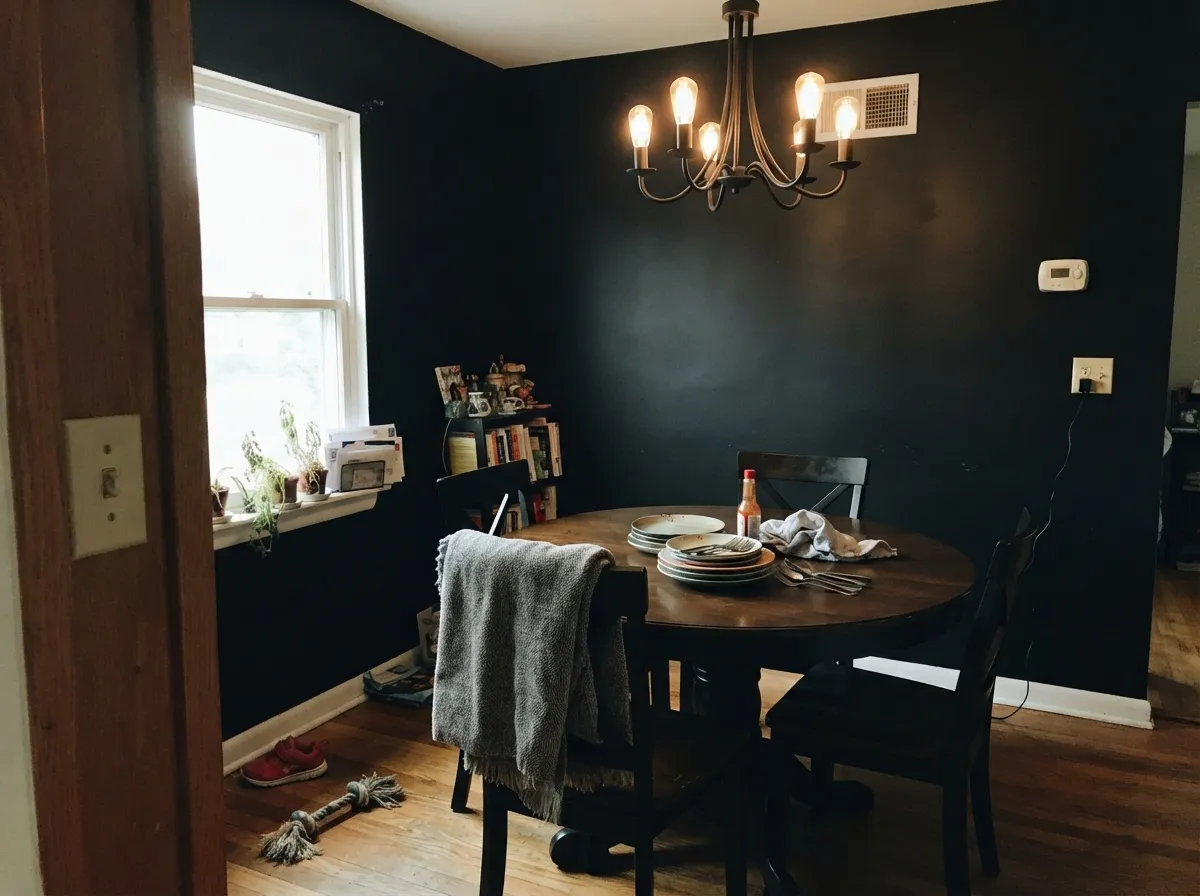
At LRV 3 there is nothing left to bounce. Corners go solid, the ceiling line disappears, and the room stops reading as moody and starts reading as unfinished. Rooms that work in black have lamps, a window, and sheen. If you want dark and cozy with some life left in it, use Iron Ore (SW 7069) or Peppercorn (SW 7674) instead.
Flat and matte black shows every fingerprint, dust film, and roller lap mark, and touch-ups flash a different sheen almost every time. It is the number one complaint on black cabinets and black doors. Go satin on cabinets and semi-gloss on doors, or pick a slightly grayer black like Urbane Bronze (SW 7048) that hides dust better.
Black absorbs nearly all the solar energy that hits it, and the surface gets hot enough to move the door and stress the film — blistering, cracking, and warping follow, and many wood door warranties exclude dark colors for exactly this reason. On a shaded or north entry it is fine. In full sun, use a fiberglass or steel slab, or step to Naval (SW 6244) or Iron Ore (SW 7069).
Room by Room
Your Light Is the Risk
Cool even light makes it look its most velvety and matte. Beautiful on doors, heavy on four walls.
Strong sun lifts the sheen and reveals brush marks and roller texture. Spray or lay off carefully.
Warm 2700K bulbs keep it inky and soft. Away from a lamp it flattens into a solid shape with no depth.
Reads slightly lifted and chalkier over the years, and the surface runs hot. Satin and a quality exterior line matter here.
Most complaints about Tricorn Black are a light mismatch. Upload a photo of your actual room and see it on your walls — then ask for the same wall in north light or evening lamps before you buy a single sample.
Need It From Another Brand?
Any paint counter can custom-tint Sherwin-Williams SW 6258 directly. If you would rather stay in one brand's own deck, these are the closest stock matches, measured as ΔE2000. Under 2 is a difference you will not see on the wall.
| Brand | Closest color | ΔE | LRV | |
|---|---|---|---|---|
| Benjamin Moore | Black2132-10 · Benjamin Moore | 0.6 | 5 | Color page → |
| Valspar | Tomcat8006-12G · Valspar | 0.7 | 3 | Color page → |
| PPG / Glidden | Starless SkyPPG0995-7 · PPG / Glidden | 4.6 | 5 | Color page → |
| Glidden | Onyx Black00NN 05/000 · Glidden | 4.0 | 5 | Color page → |
| Dutch Boy | True Black438-7DB · Dutch Boy | 0.0 | 3 | Color page → |
| HGTV Home by Sherwin-Williams | Tricorn BlackHGSW 1441 · HGTV Home by Sherwin-Williams | 0.0 | 3 | Color page → |
Similar Sherwin-Williams Colors
The nearest shades to Tricorn Black within Sherwin-Williams's own range, ranked by perceptual color distance — useful when you want the same look a touch lighter, darker, or warmer.
WCAG 2.1: AA is 4.5 : 1 for normal text, 3 : 1 for large text, AAA is 7 : 1.
Tricorn Black vs the Colors You're Also Considering
Every Tricorn Black sample board has the same rivals on it. The numbers show the real lightness gap — then it comes down to which risk you would rather live with.
Pick this for a true black that stays black on doors and sash.
Sherwin-Williams SW 7069 · LRV 6Iron OrePick this for siding and full walls — it reads charcoal and forgives more.
Side-by-side comparison →Pick this when you want zero undertone and maximum crispness.
Sherwin-Williams SW 6991 · LRV 3Black MagicPick this when a faint gray-violet softness suits the room better.
Against Caviar (SW 6990), the two are close in depth, both at LRV 3, but Caviar carries a hair more warmth and softness, so it can feel slightly less severe on a big wall. Tricorn Black stays truer and crisper, which is why it wins for hard-edged trim and doors where you want no compromise.
Inkwell (SW 6992), LRV 3, is a near-black that leans noticeably cooler and bluer. Choose Inkwell when you want a black with a subtle navy soul; choose Tricorn Black when you want black to read as black.
Stepping lighter, Iron Ore (SW 7069), LRV 6, is a soft charcoal-black, not a true black. It reads gray in daylight and is more forgiving on full walls and exteriors, while Tricorn Black delivers the deeper, more definitive statement when you want maximum contrast.
Tricorn Black Coordinating Colors
Because Tricorn Black has no undertone, it does not fight anything — which means the coordinating job is easier than with a warm or blue-leaning black. The real decision is how much contrast you want beside it. A bright white sharpens the black; a soft white calms it; a greige lets it become the focal point. These are the partners that come up again and again on real projects:
Tricorn Black on Exteriors
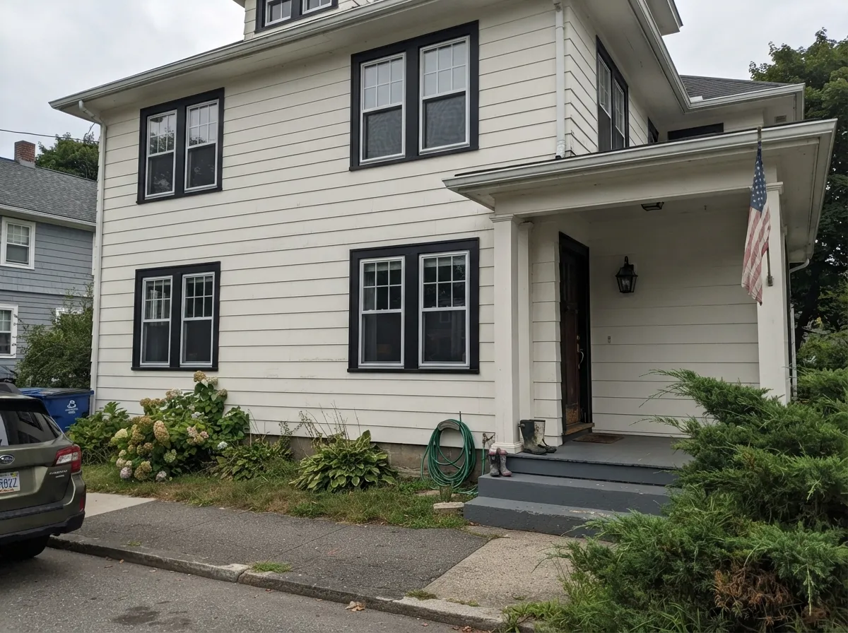
Outside is where this color earns its reputation. Softer blacks and near-blacks drift on a facade — the shaded north wall goes gray, the sunny south wall goes brown or blue, and suddenly your trim does not match itself. Tricorn Black stays put, which is why it is the safe answer for window sash, shutters, and trim running around a whole house.
Two practical notes. Use satin, not flat: flat black on siding grabs pollen and road dust and looks dirty within a season, while satin rinses off. And accept that every black exterior fades a little over the years as UV works on the pigment — a good exterior line slows it down, cheap paint chalks fast. On a full black body color, also plan for heat: south and west walls run hot, caulk joints work harder, and wood doors and shutters in direct sun are the parts that fail first.
Tricorn Black on Cabinets and Built-Ins
Black cabinets live or die on the finish, not the color. Use a urethane-fortified cabinet enamel in satin and spray it if you can — a brushed black door shows every stroke in raking window light, and a matte black door shows every fingerprint within a week. Prime bare or previously painted wood with a gray-tinted bonding primer, then two thin coats rather than one thick one; thick spots on black look deeper and thin spots look washed out, and that difference is visible from across the room.
For layout, black reads best on the bottom: island, base cabinets, a bank of drawers. Uppers in Alabaster (SW 7008) or Pure White (SW 7005) keep the room breathing. Hardware is the other half of the decision — brass and unlacquered brass warm it up, matte black hardware disappears into it, and polished nickel gives the crispest, most modern edge. Whatever you choose, keep a labeled quart for touch-ups and accept that you will recoat a full door rather than dab a chip.
Three Ready Palettes Built on Tricorn Black
A color is never alone on the wall. These are complete combinations in the 60-30-10 pattern, with the reason each one holds together. Every one opens in the visualizer.
Black body with clean white trim is the modern-farmhouse contrast people are actually searching for, and Tricorn Black is the one that holds the line across a whole elevation. The warm bronze door stops the facade from reading as pure graphics and gives wood and brass something to talk to.
Try this palette in your roomBlack on the bottom and soft white on top is the two-tone layout that reads deliberate instead of dated, because the heavy color sits where your eye expects weight. Pewter Green on one door adds the ten percent of color the scheme needs without touching the cabinets.
Try this palette in your roomWarm white trim keeps a black room from feeling like a box by drawing the architecture back in, and Greek Villa is warm enough to look soft rather than surgical against LRV 3. Evergreen Fog on the shelving is the one muted color note that makes the room feel collected instead of styled.
Try this palette in your roomTricorn Black FAQ
Is Tricorn Black really a true black, or does it pull blue?
It is as close to a true black as mixed paint gets — the color reading sits around one percent saturation, so there is almost nothing to pull. The faint lean it has is cool, and it only shows when a warmer black is sitting right beside it. On its own, in any normal room, people just see black.
Tricorn Black or Iron Ore?
Tricorn Black for doors, sash, cabinets, and anywhere you want maximum contrast. Iron Ore (SW 7069) for siding and full walls, where its LRV of 6 reads as charcoal and keeps some daylight. If you cannot decide, the rule of thumb is: small surfaces Tricorn, large surfaces Iron Ore.
What trim white goes with Tricorn Black?
Pure White (SW 7005) for the crispest, most modern line. Alabaster (SW 7008) if your home has warm wood and you want the contrast a shade softer. Avoid a bright blue-white next to it — the black looks fine, but the white starts to look cold and cheap.
How many coats does it take, and do I need a special primer?
Two full finish coats over a gray-tinted primer. White primer under black is the most common DIY mistake and usually costs you a third coat plus blotchy sheen where the film is thin. Ask the store to tint your primer to a mid-gray.
What sheen should a Tricorn Black front door be?
Satin. Gloss looks great for a season, then telegraphs every dent, wave, and dust speck in direct sun. Flat looks beautiful and holds dirt permanently. Satin is the finish that still looks right two years in.
Will Tricorn Black match my black window frames or black appliances?
Almost certainly not exactly. Factory finishes are powder-coated or baked-on and read denser and glossier than any brushed paint. Tricorn Black is the closest common match because it has no undertone to clash, but plan for a slight difference in sheen and depth where they meet.
Can I paint a whole bedroom Tricorn Black?
Only if the room has a real window and lamps you actually turn on. In a dim bedroom the walls stop reading as walls and the room feels smaller and unfinished. Matte hides drywall waves best, but fix any patches first — black shows everything.
Have you painted with Tricorn Black?
Rate it — one tap helps the next reader decide.
Ask a Question