Sea Salt
The internet's favorite spa color, reviewed honestly: the rooms where it turns blue on you, the finishes it fights with, and what to paint instead.

Jessica has spec'd whites and neutrals for more than 300 rooms and keeps a sample wall of painted drawdowns in her studio. Every color review is checked against real reader rooms in the comments and re-tested when a formula changes. About the testing process →
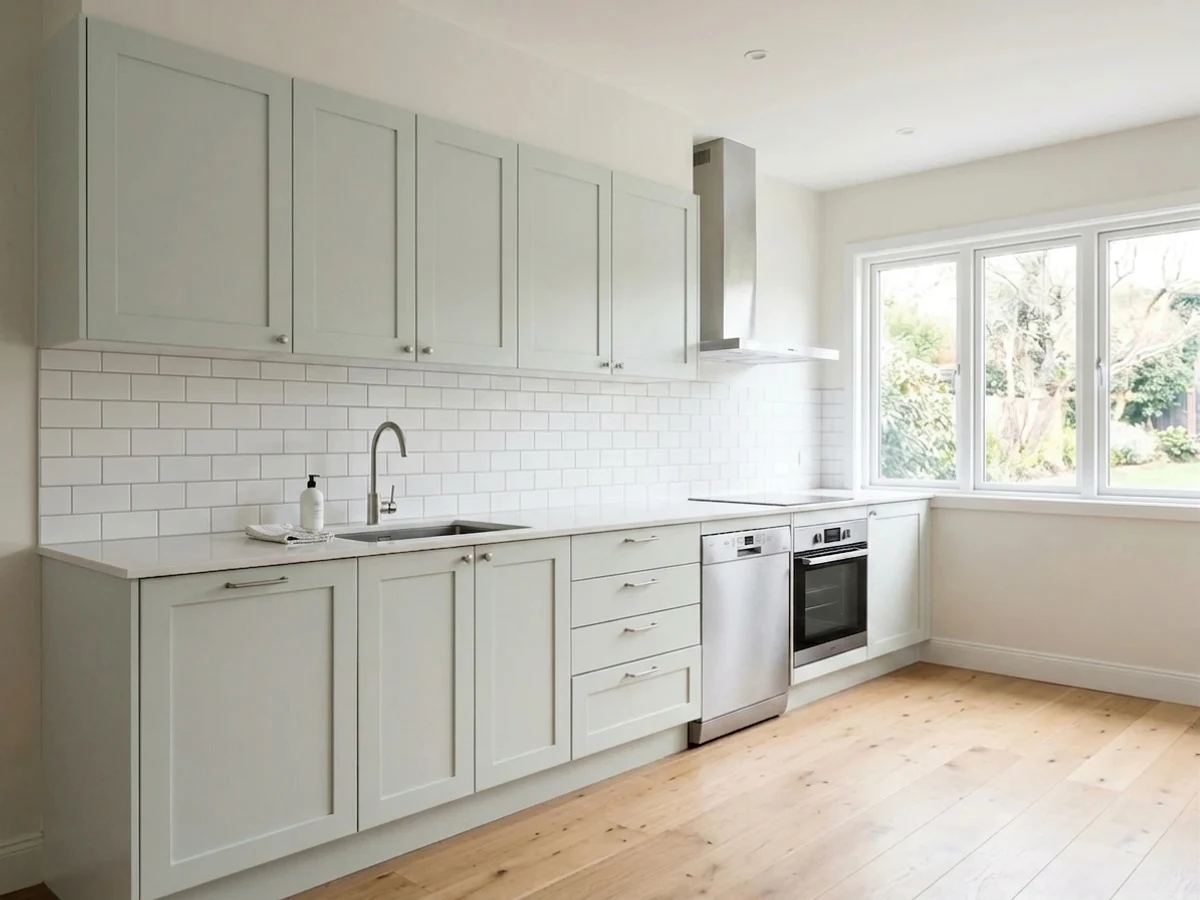
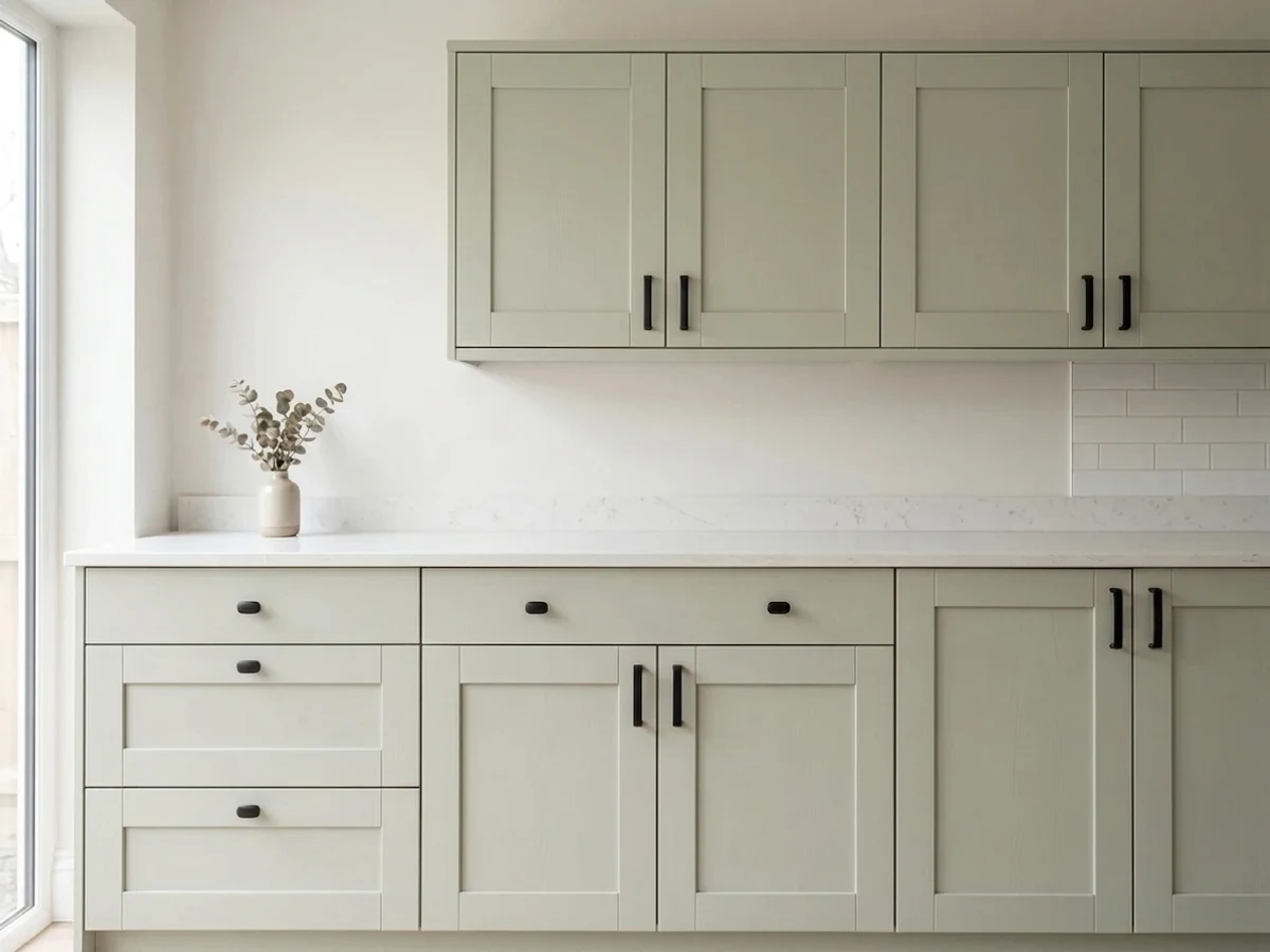
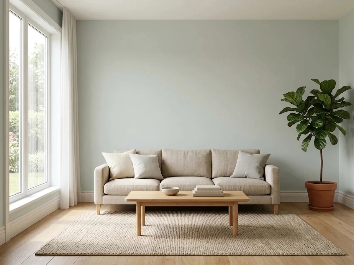
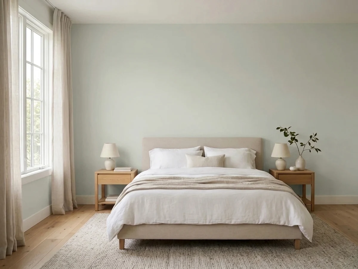
- 1Stardew43
- 2Upward57
- 3Sea Salt63
- 4Wickham Gray68
- 5Spring Thaw83
The Fast Verdict
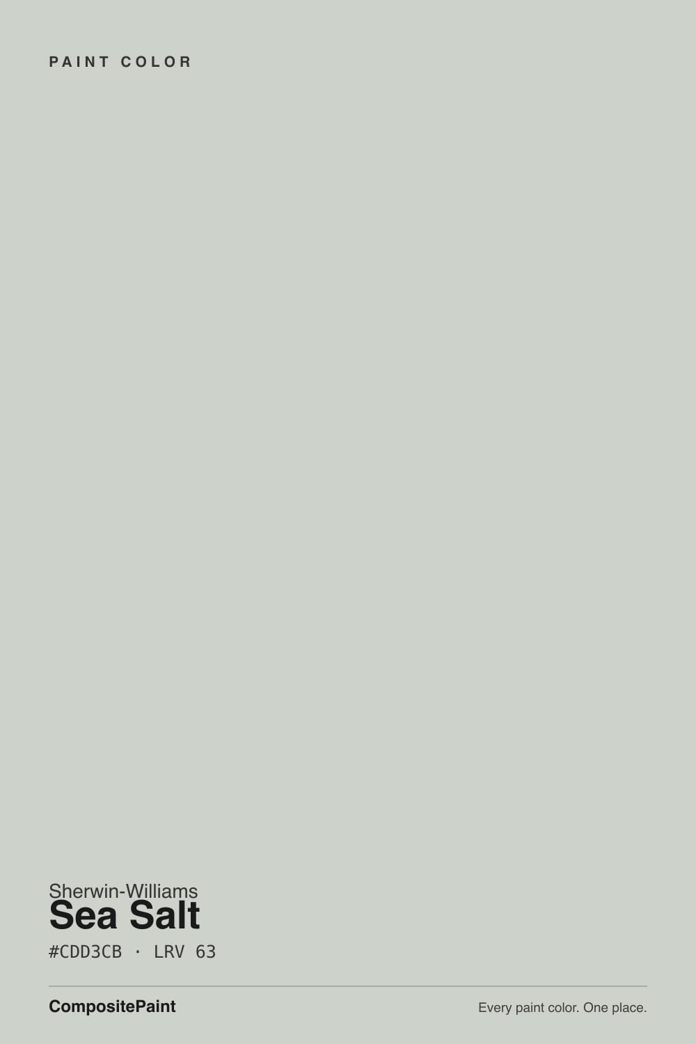
Sea Salt is the calm green-gray that made a decade of spa bathrooms look expensive. At LRV 63 it stays light and airy while still holding real color, and in even daylight it is genuinely lovely.
But it is a chameleon: green, gray, and a little blue sit at almost equal weight, and your room decides which one you get. Sample it big or you may be the next person posting "why is my bathroom blue?"
Bathrooms with clean white tile and trim · bedrooms that need to feel calm · vanities and laundry cabinets · anyone who wants color that still behaves like a neutral
Your room faces north and you want green · you have beige travertine or honey-oak floors · your trim is a warm cream · you want the coastal color to be obvious
- Genuinely restful — color on the wall without ever feeling loud
- At LRV 63 it keeps small bathrooms bright instead of closing them in
- Reads as a neutral, so it works with white, black, brass, and rattan
- Beautiful on bathroom vanities and laundry cabinets
- Forgiving to live with — low saturation means it never fights the room
- Turns blue in north light — the single most common complaint
- Goes muddy and flat in dim rooms and under cool LED bulbs
- Clashes with warm beige tile, travertine, and orange-toned wood
- Washes out badly in full sun, so it is a weak exterior body color
What Color Is Sea Salt, Really?
Sherwin-Williams files Sea Salt under greens, and that is the honest starting point: it is a soft, dusty green that has been grayed almost all the way down. What makes it behave the way it does is the small amount of blue-black in the mix. That colorant is what keeps the green from ever looking minty, and it is also the thing that steps forward the moment the light in the room goes cool. So there are really three hues sitting on the wall at nearly equal strength — green, gray, and a little blue — and the room picks the winner, not the can.
At LRV 63 it reflects a bit more light than Agreeable Gray, the greige most people already have somewhere in the house. That is a useful way to picture it: the same easy brightness everyone likes about a greige, except this one shows real color instead of disappearing. It is light enough to keep a small bathroom feeling open, and soft enough that it never announces itself as "a green room." The catch is that low-saturation colors like this have very little of their own personality to push back with, so whatever your windows and bulbs hand them, they accept.
Undertone in one line: green first, gray second, blue third — and the order rearranges itself with your light. If yours came out blue, the paint is not mistinted and the store did not shake the wrong can. Cool north light and cool bulbs simply moved the third undertone to the front.
Where It Shines
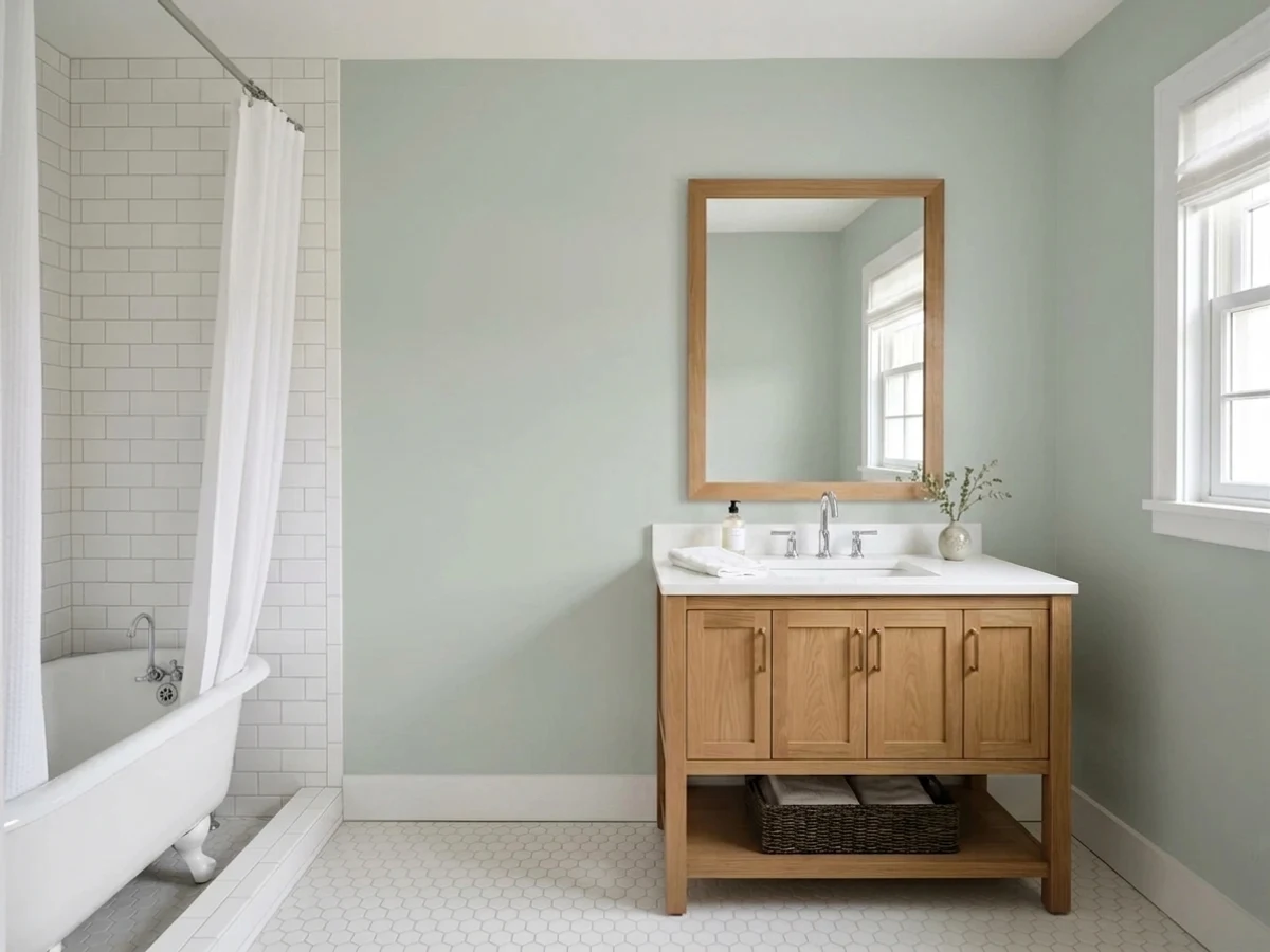
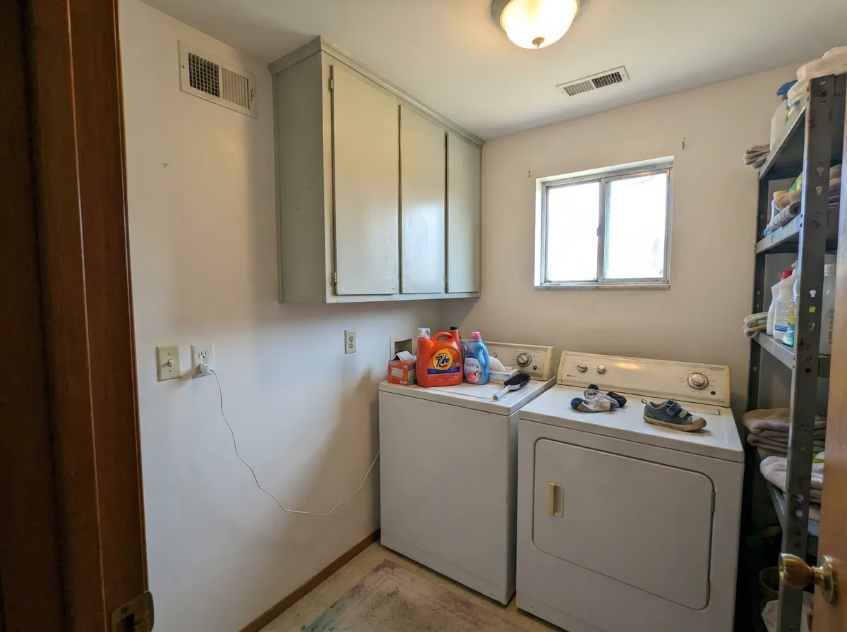
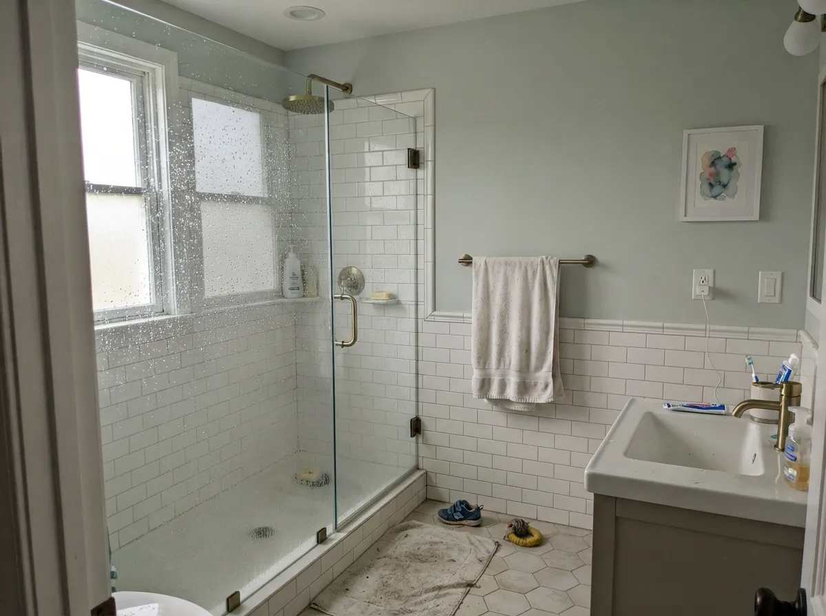
Sea Salt is at its best in a bathroom with clean white tile and crisp white trim, where good daylight keeps the green forward and the whole room reads spa instead of gray. It is just as convincing in bedrooms that need to feel calm and on vanity and laundry cabinets, where LRV 63 gives you real color that still behaves like a neutral.
Where It Fails
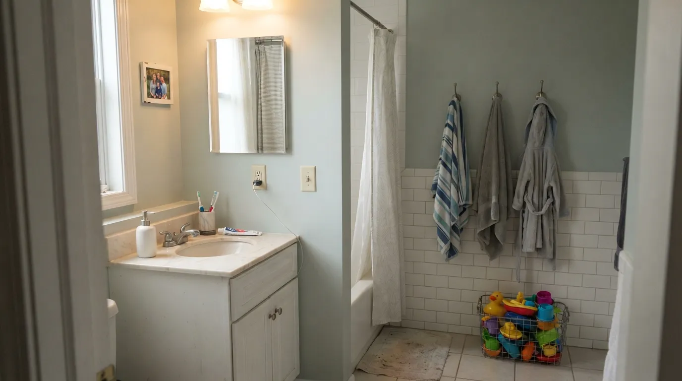
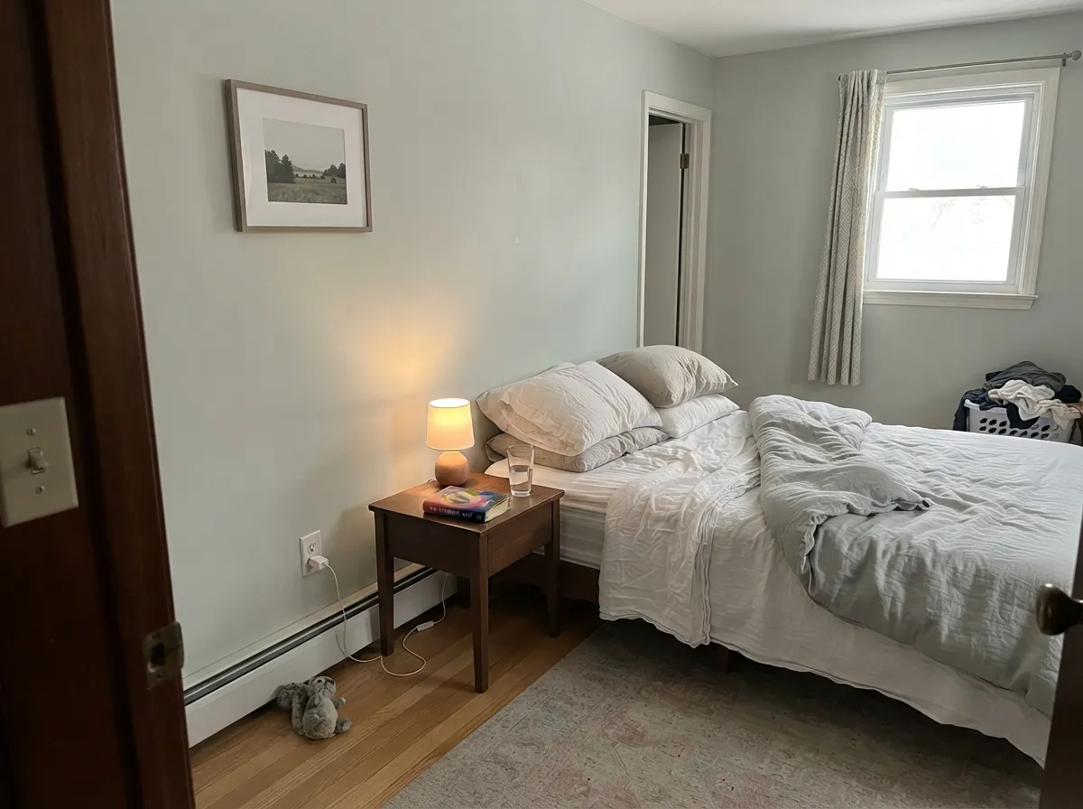
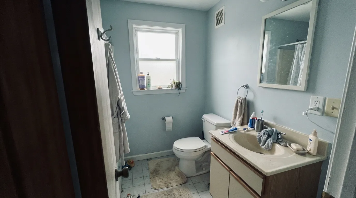
Sea Salt has one of the highest complaint rates of any top-50 color, and almost none of it is about the paint. Three situations produce nearly every bad story, and you can predict all three before you open a can.
This is the famous one. Cool north light kills the green and pulls the blue forward — the most-quoted Houzz post reads "I was so excited to paint my new bathroom Sea Salt, however now that the whole room is done, it looks SO BLUE." If you want a soft green that stays green in cool light, paint Oyster Bay (SW 6206) instead; it commits to the green and does not flip.
Sea Salt is cool and your floor is orange. The green fights the warm wood and the gray goes muddy, and the room ends up looking dated rather than coastal. Reviewers describe the combination as a hot mess. On warm floors and stone go a step deeper and warmer with Comfort Gray (SW 6205), which has enough weight to sit next to orange wood without going dirty.
Sea Salt needs a clean white beside it — against a creamy trim it reads gray and unwashed instead of fresh. Pair it with Pure White (SW 7005) rather than a warm cream. And in a windowless powder room lit by 4000K bulbs, the color drains out entirely and just looks flat. Swap to 2700K lamps first; if it is still lifeless, use Rainwashed (SW 6211), which holds its color in low light.
Room by Room
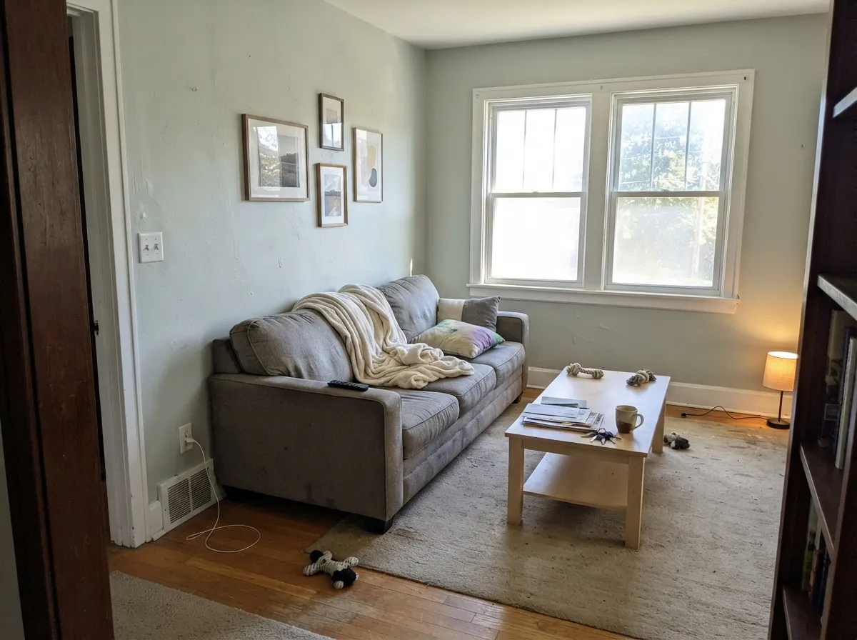
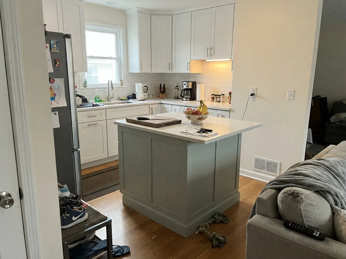
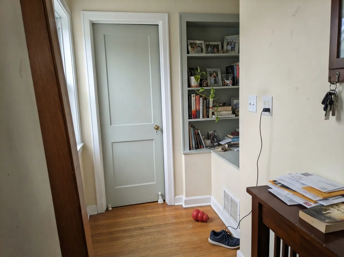
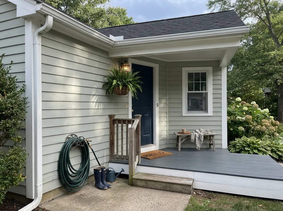
Your Light Is the Risk
Warm strong daylight brings the green forward. This is the spa look people bought it for.
Cool light strips the green and the blue takes over. Sample it here or skip it.
2700K bulbs warm it back to green. Cool 4000K LEDs push it clinical — change bulbs, not paint.
With no daylight the color drains to a plain gray. Readers call it muddy. Pick something deeper.
Most complaints about Sea Salt are a light mismatch. Upload a photo of your actual room and see it on your walls — then ask for the same wall in north light or evening lamps before you buy a single sample.
Need It From Another Brand?
Any paint counter can custom-tint Sherwin-Williams SW 6204 directly. If you would rather stay in one brand's own deck, these are the closest stock matches, measured as ΔE2000. Under 2 is a difference you will not see on the wall.
| Brand | Closest color | ΔE | LRV | |
|---|---|---|---|---|
| Behr | Gazebo GrayPPF-18 · Behr | 3.5 | 63 | Color page → |
| Benjamin Moore | Cool BreezeCSP-665 · Benjamin Moore | 1.3 | 63 | Color page → |
| Valspar | Chilean Sea Bass8004-30C · Valspar | 1.0 | 62 | Color page → |
| PPG / Glidden | Bay Of FundyPPG10-07 · PPG / Glidden | 0.5 | 63 | Color page → |
| Glidden | Bay Of FundyPPG10-07 · Glidden | 0.5 | 63 | Color page → |
| Dutch Boy | White Rapids425-1DB · Dutch Boy | 0.0 | 63 | Color page → |
Similar Sherwin-Williams Colors
The nearest shades to Sea Salt within Sherwin-Williams's own range, ranked by perceptual color distance — useful when you want the same look a touch lighter, darker, or warmer.
WCAG 2.1: AA is 4.5 : 1 for normal text, 3 : 1 for large text, AAA is 7 : 1.
Sea Salt vs the Colors You're Also Considering
Every Sea Salt sample board has the same rivals on it. The numbers show the real lightness gap — then it comes down to which risk you would rather live with.
Pick this when you want the same mood barely-there, and the room already has good light.
Sherwin-Williams SW 6211 · LRV 47RainwashedPick this when you want the coastal color to actually show, and in low-light rooms.
Side-by-side comparison →Pick this for a light, airy room — Comfort Gray is moodier and much deeper.
Sherwin-Williams SW 6205 · LRV 47Comfort GrayPick this with warm wood floors, beige stone, or on cabinets that need weight.
Side-by-side comparison →Sea Salt (LRV 63) is lighter and quieter than its deeper cousins. Rainwashed (SW 6211), LRV 47, is noticeably darker and pushes further into blue-green, so it reads more clearly as color on the wall; choose Rainwashed when you want the coastal effect to be obvious and Sea Salt when you want it barely-there. Comfort Gray (SW 6205), LRV 47, is another darker relative that leans greener and moodier, better for a room that can handle more depth.
Silver Strand (SW 7057), LRV 59, is the closest in lightness but sits a touch grayer and cooler with less green, so it is the safer pick if you want something that behaves more like a plain gray. Among Sherwin-Williams' near-twins, Silverpointe (SW 7653), LRV 64, and Moorstone (SW 9630), LRV 63, are very similar in value but hold slightly less of Sea Salt's green cast, which is worth sampling side by side if the green feels too strong for your light.
Sea Salt Coordinating Colors
The rule with Sea Salt is that its partners have to be either clean or warm — anything cool and muddy in the middle drags it gray. Clean whites keep it fresh, warm greiges and beiges give it something to lean against so the room does not go cold, and a deep anchor stops the whole palette from floating away. Avoid pairing it with a second soft, cool color at a similar depth; that is the combination that ends up looking washed out.
These are the partners that actually get used with it, room after room:
Benjamin Moore Colors Close to Sea Salt
There is no exact Benjamin Moore twin — the decks are built from different colorants — but four colors land close enough that a Benjamin Moore store is a real option instead of asking them to color-match a competitor's chip. Color-matching across brands is where most disappointment comes from: the machine can hit the hex and still miss the way the color moves in light, and with Sea Salt the movement is the whole point.
Gray Cashmere (2138-60) is the nearest in both lightness and character. Healing Aloe (1562) is a step lighter and noticeably greener, which makes it the better choice if you were only ever afraid of the blue. Quiet Moments (1563) goes the other way and commits to the blue side — pick it if the coastal look is what you want and you would rather not gamble. Gray Wisp (1570) is deeper and grayer, closer in feel to Sea Salt on cabinets than on walls.
How to Sample Sea Salt Without a Surprise
A two-inch chip tells you almost nothing about this color, because the surrounding white card makes it look greener than it will ever be on a wall. Get a large sample — a peel-and-stick square, or two coats rolled onto a big piece of white poster board — and make it big enough that the color is what your eye sees, not the edges.
Then move it. Tape it to each wall in turn, including the one directly opposite the window, and look at it three times: mid-morning, late afternoon, and at night with the lamps you actually own. Sea Salt regularly reads soft green at breakfast, blue-gray by dinner, and nearly silver under lamplight, and you want to know that before the trim is taped. Hold the board against your trim and down at the floor too — warm cream trim and orange-toned wood are the two things that turn a good sample into a bad room.
Three Ready Palettes Built on Sea Salt
A color is never alone on the wall. These are complete combinations in the 60-30-10 pattern, with the reason each one holds together. Every one opens in the visualizer.
Pure White is clean rather than creamy, which is exactly what Sea Salt needs beside it to stay fresh instead of looking washed and gray. The bronze vanity supplies the one warm dark note that stops the room from drifting cold.
Try this palette in your roomCabinets carry the color and crisp white walls keep the green readable, so the kitchen looks intentional rather than beige-adjacent. Naval on the island is the deep anchor the palette needs, and both blues share the same cool base so they never argue.
Try this palette in your roomEvergreen Fog is the same muted green family two-and-a-half times deeper, so the built-ins read as depth rather than a second color. If the room feels too cool, run Agreeable Gray (SW 7029) on the adjoining wall to warm the palette without breaking it.
Try this palette in your roomSea Salt FAQ
Is Sea Salt green or blue?
On the chip and in warm daylight it is green — a quiet, gray-softened green. In north light, on an overcast day, or under 4000K bulbs the blue in the formula takes over and the wall can read almost pale aqua. Both versions are the real color; the room decides which one you live with, which is why sampling on your own wall matters more with this color than with almost any other.
What trim white goes with Sea Salt?
Use a clean white, not a cream. Pure White (SW 7005) is the safest partner and keeps Sea Salt looking fresh, while Extra White (SW 7006) gives a crisper, more modern edge in a bathroom or kitchen. Alabaster (SW 7008) is the one warm exception — it nudges Sea Salt toward its greener side and works well in a bedroom with warm lamps. Anything creamier than Alabaster makes the wall look dingy.
Is Sea Salt too cool for a bedroom?
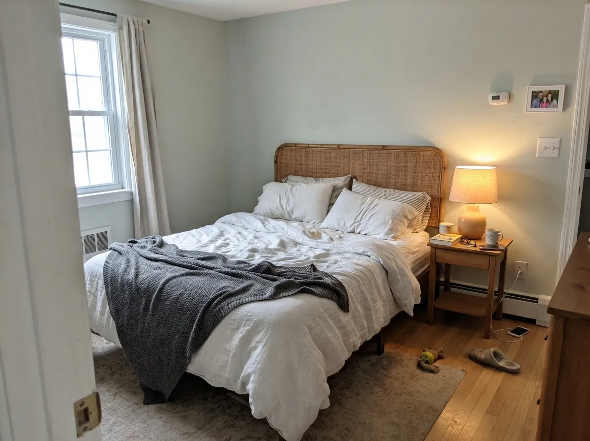
Not if you handle the bulbs. On 2700K lamps it settles into a soft green and feels restful rather than chilly, and it looks especially good with linen, rattan, and light oak. On daylight-temperature LEDs the same wall goes hospital-cool. Change the bulbs before you change the paint.
Does Sea Salt work with gray floors or gray LVP?
Yes, and this is one of its easiest pairings — both are cool, so nothing fights. Watch out for gray flooring with a strong blue cast, because it will pull Sea Salt further toward blue and you lose the green entirely. Warm rugs and wood furniture bring the balance back. The floors that genuinely do not work are the orange ones.
Can I use Sea Salt through a whole open floor plan?
It is light enough to carry a whole floor, but be realistic: it will look like three different colors as you walk from a south window to a north wall. Most people are happier running it in the rooms with good light and putting a warm greige like Agreeable Gray (SW 7029) in the darker connected spaces. The two share a soft, low-saturation character, so the transition reads deliberate.
Can I have Sea Salt mixed lighter or darker?
You can — any Sherwin-Williams store will mix it at 50%, 75%, or 150% strength — but it usually is not the fix people hope for. Weakening it drops the green out first and leaves a pale blue-gray; strengthening it makes it muddier rather than greener. If Sea Salt is too light, Rainwashed (SW 6211) or Comfort Gray (SW 6205) are better answers than a custom percentage; if it is too blue, Oyster Bay (SW 6206) is.
Is Sea Salt still in style?
It is past its peak as the default spa-bathroom color, and a full house of it does read like 2018. Used as one room's color — a bathroom, a bedroom, a vanity, a laundry — with clean white trim and warm metals, it still looks current, mostly because it is so muted that it never dates as hard as a saturated trend color would. The safest modern use is on cabinetry rather than every wall.
Have you painted with Sea Salt?
Rate it — one tap helps the next reader decide.
Ask a Question