Sherwin-Williams Sea SaltvsSherwin-Williams Rainwashed
Why this comparison: SW’s two coastal best-sellers — Rainwashed sits one step bluer and deeper on the same strip. Sea Salt and Rainwashed are very close (ΔE 2.98). The difference shows up most in side-by-side comparison and under specific light.

Built from our full reviews of both colors — same measured data, same real-room photos. About the testing process →
The Numbers
Sea Salt is slightly lighter (LRV 63 vs 59, 4-point delta).
What Each Color Really Is
Sherwin-Williams files Sea Salt under greens, and that is the honest starting point: it is a soft, dusty green that has been grayed almost all the way down. What makes it behave the way it does is the small amount of blue-black in the mix. That colorant is what keeps the green from ever looking minty, and it is also the thing that steps forward the moment the light in the room goes cool. So there are really three hues sitting on the wall at nearly equal strength — green, gray, and a little blue — and the room picks the winner, not the can.
At LRV 63 it reflects a bit more light than Agreeable Gray, the greige most people already have somewhere in the house. That is a useful way to picture it: the same easy brightness everyone likes about a greige, except this one shows real color instead of disappearing. It is light enough to keep a small bathroom feeling open, and soft enough that it never announces itself as "a green room." The catch is that low-saturation colors like this have very little of their own personality to push back with, so whatever your windows and bulbs hand them, they accept.
Rainwashed is built on two pigment directions over a soft gray base: a clear blue and a quieter green, which is why Sherwin-Williams classifies it as a green but almost everyone who owns it describes it as blue-green or seafoam. At RGB 194/205/197 the green channel edges out the blue by a hair, which is the whole story in one number — it is close enough to call it either color, and the room's light decides which one wins on a given afternoon.
At LRV 59 it sits in the medium-light range: bright enough to keep a bathroom or bedroom from feeling closed in, deep enough to read as a real color rather than an off-white with a tint. Put it next to Sea Salt (LRV 63) and Rainwashed reads noticeably more saturated and more blue — Sea Salt is the lighter, greener, more muted cousin. That gap matters because shoppers standing at the fan-deck wall, scanning past the grays and greiges, often grab Rainwashed expecting one more quiet neutral. It is not one. It is a color with a real personality that happens to be well-behaved.
Specs Side by Side
| Spec | Sea Salt | Rainwashed |
|---|---|---|
| Brand | Sherwin-Williams | Sherwin-Williams |
| SKU | SW 6204 | SW 6211 |
| Hex | #CDD2CA | #C2CDC5 |
| RGB | 205, 210, 202 | 194, 205, 197 |
| LRV | 63 | 59 |
| Undertone | green / cool | green / cool |
| Family | Gray | Gray |
How Light Changes Them
Warm strong daylight brings the green forward. This is the spa look people bought it for.
Cool light strips the green and the blue takes over. Sample it here or skip it.
2700K bulbs warm it back to green. Cool 4000K LEDs push it clinical — change bulbs, not paint.
With no daylight the color drains to a plain gray. Readers call it muddy. Pick something deeper.
Real sun brings the green and blue into balance — this is the honest sea-glass color the name promises. Sample here first.
Cool gray daylight drains the green and leaves a flat, slightly dull aqua-gray. Fine if you half-wanted gray; disappointing if you wanted the color.
Warmer light pulls it toward sea-glass green; cooler light pulls it toward aqua-blue-gray. Most owners like the movement — it is part of the appeal.
2700K warm bulbs pull it toward a soft, sage-leaning green. Cool LEDs push it icy and gray — swap the bulbs before you swap the paint.
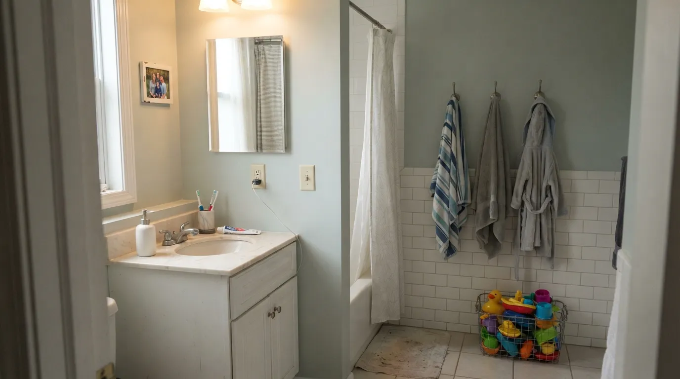
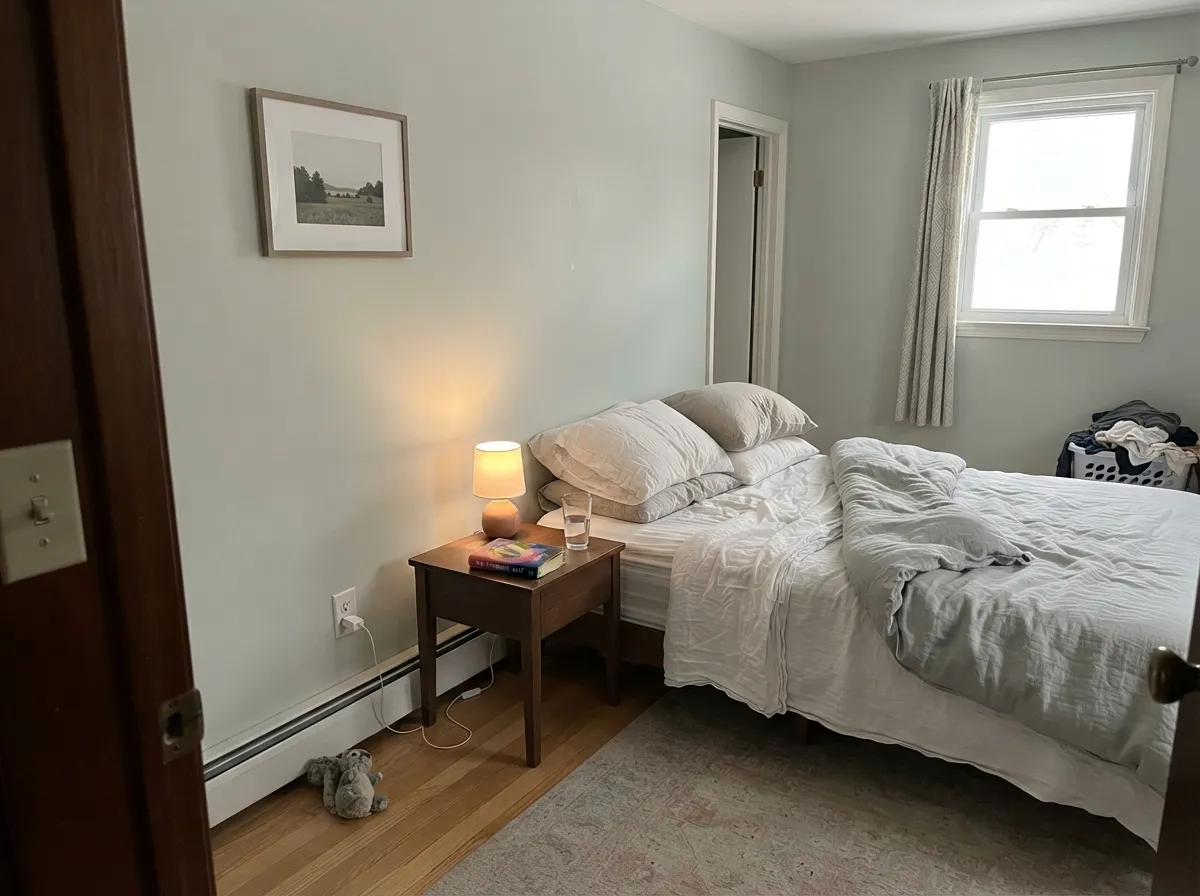
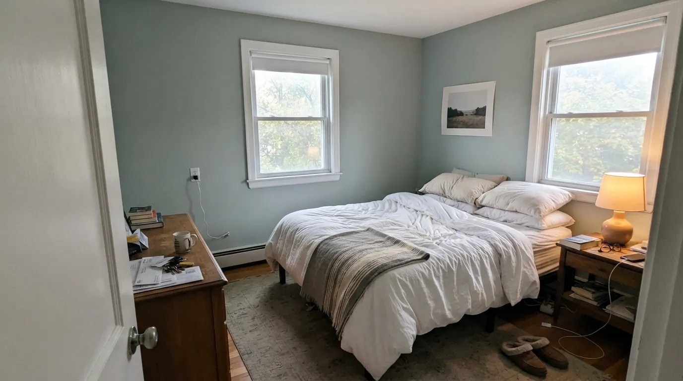
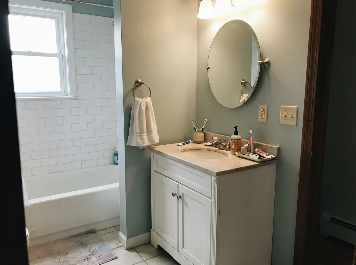
Both Colors in Real Rooms
Photos from our full reviews — the same rooms and captions, so you can judge each color where it actually lives, not on a chip.
When to Pick Which
Bathrooms with clean white tile and trim · bedrooms that need to feel calm · vanities and laundry cabinets · anyone who wants color that still behaves like a neutral
Your room faces north and you want green · you have beige travertine or honey-oak floors · your trim is a warm cream · you want the coastal color to be obvious
Bathrooms with white tile and chrome or nickel · bedrooms with linen bedding and light wood · sunrooms and view rooms with south or west light · a kitchen island or built-in that wants one calm accent
Your room faces north with no lamps · you actually want a plain neutral gray · your fixtures are yellow brass over honey oak and you won't test the combination · you want a color that looks the same at 9am and 9pm
No comparison page can see your light. Upload one photo of your room and try both colors on the same walls, seconds apart.
Sea Salt vs Rainwashed FAQ
Which is lighter, Sea Salt or Rainwashed?
Sea Salt is lighter: LRV 63 vs 59. Sea Salt is slightly lighter (LRV 63 vs 59, 4-point delta).
Which is warmer, Sea Salt or Rainwashed?
They share the same undertone family — both read green / cool. The difference between them is lightness and depth, not temperature.
How similar are Sea Salt and Rainwashed?
Sea Salt and Rainwashed are very close (ΔE 2.98). The difference shows up most in side-by-side comparison and under specific light. The only reliable test is seeing both in your own room and light — a side-by-side on a screen or chip flattens the difference.
Can I use Sea Salt and Rainwashed together in one house?
Not in the same room, and be careful in the same house. At ΔE 2.98 they are so close that two walls in each will read as a tinting mistake, not a design choice. Pick one, or keep them on different floors where they are never seen together.
Ask a Question