Room Colors · Trim
5 Best Trim Paint Colors for 2026
ideas, combinations, and real rooms
5 curated picks from real trims — with the exact colors, honest reasons why, and the combinations that hold the room together.

Former interior stylist who can spot a green undertone from across a room. Jessica writes the color and mood pieces — what to choose, what pairs, and why your "white" looks pink.

Top Picks for the Trim
Pick a color family, tap a shade to see the trim in it, then try it on your own room.
Trim Color Trends 2026 — What's In, What's Out


- Stark Bright White by Default — Blue-leaning builder white next to warm walls reads dingy rather than crisp, and designers now choose the white to match the wall's undertone instead of grabbing the brightest can.
- Black Trim in Every Room — One graphic room still works, but whole-house jet-black trim feels heavy — the trend has softened to charcoal used as a focal point.
- High-Contrast Trim in Small Bathrooms — Designers are dropping contrasting trim in tight bathrooms in favor of a streamlined, single-color look that doesn't chop up a small space.
- Flat Finish on Trim — Matte-everything went too far — trim takes scuffs and hands, and flat paint there can't be wiped clean, so satin and semi-gloss remain the working standard.
The 5 Best Trim Paint Colors
Every pick below is a real rendered trim, not a chip. The lead color first; the swatches are the full scheme in the photo — walls, furniture, textiles, accent.

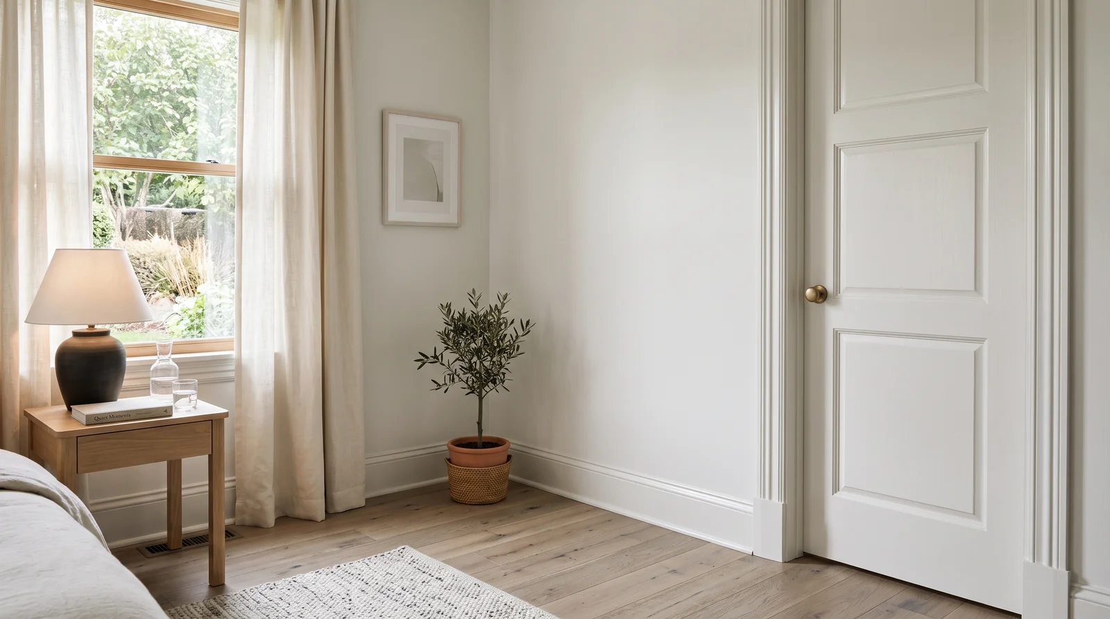
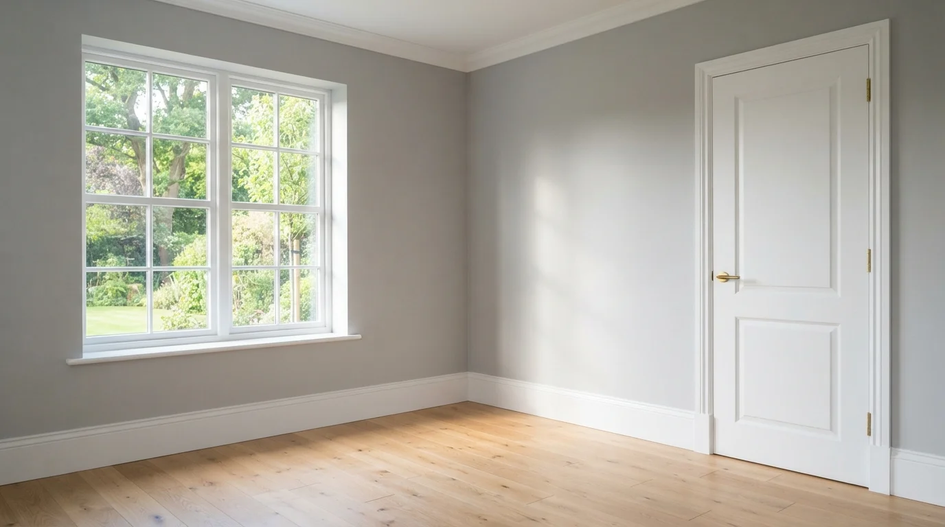
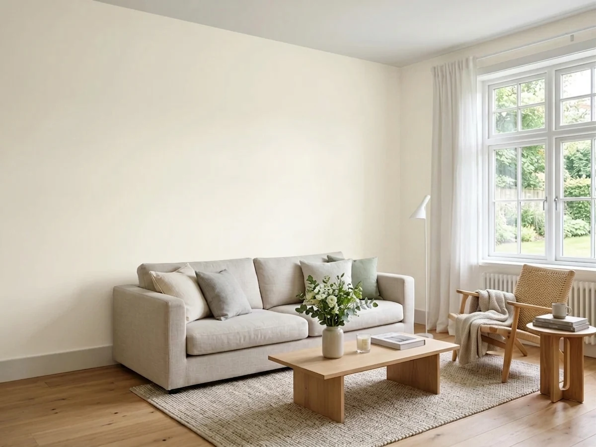
The trim white designers default to — soft, creamy edges that glow in any daylight and never flash blue.
White Dove (LRV 83) has a whisper of gray-green warmth, so it flatters warm wall colors instead of fighting them. Next to Alabaster walls (LRV 82) the contrast is almost nothing — separation comes from the sheen change, satin trim against matte walls, which reads calm and expensive rather than graphic. It pairs with oak floors, linen, and brass without effort. If your walls are a cool gray and White Dove starts to look dingy beside them, step to Chantilly Lace for a cleaner edge.
SEE WHITE DOVE ON YOUR WALLS →
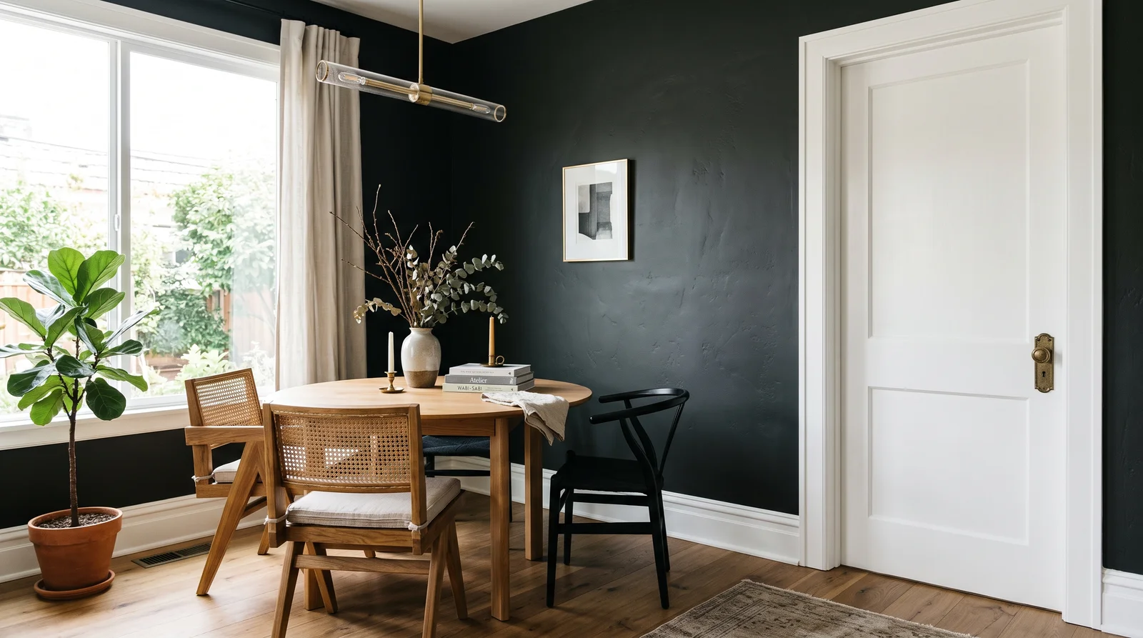
Near-black walls outlined in bright clean white — a gallery-sharp contrast that needs real daylight to earn its drama.
This flips the usual question: the wall goes dark and the trim does the brightening. Chantilly Lace (LRV 91) is the crispest white in the deck, and against Iron Ore walls (LRV 6) every baseboard and casing reads like a drawn line. It works because Chantilly has almost no undertone to clash with the charcoal, and it keeps a dark room from feeling like a cave by tracing light around its edges. In a dim, north-facing room the walls will swallow more light than you expect — test a big swatch first, or soften the edge with White Dove if pure crisp feels clinical.
SEE CHANTILLY LACE ON YOUR WALLS →
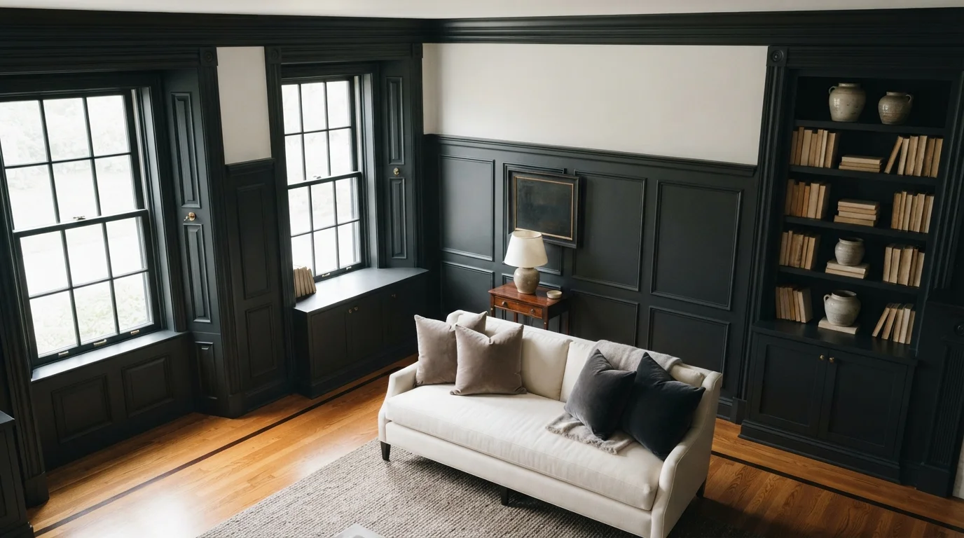
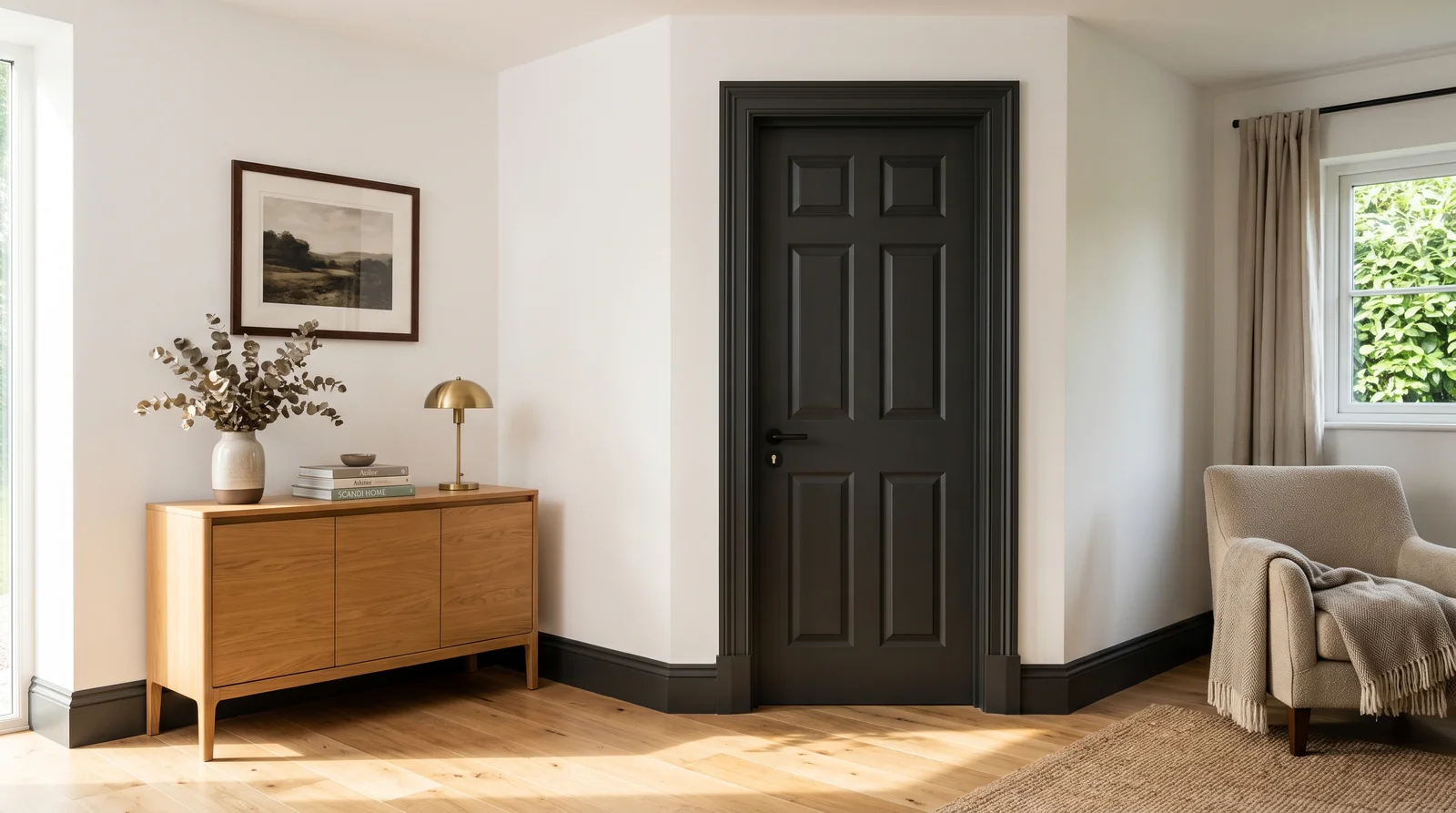
Charcoal-black baseboards, casings, and doors that outline the room like ink — richest in warm afternoon light.
Iron Ore (LRV 6) is the black-trim look without the harshness — it's a deep charcoal that keeps a touch of softness, so dark trim against Pure White walls (LRV 84) feels architectural instead of severe. Carry it across baseboards, door casings, and the doors themselves so it reads as a decision, not an accident. It pairs naturally with light oak floors, black hardware, and anything linen or leather. If you want a harder, more graphic edge, Tricorn Black (LRV 3) is the true-black neighbor; if the room runs warm, Urbane Bronze does the same job in bronze.
SEE IRON ORE ON YOUR WALLS →
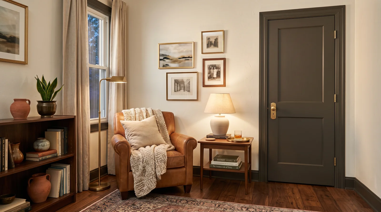
Trim in a deep bronze-brown with the weight of old iron — earthy, warm, and quietly modern as the light goes low.
Urbane Bronze (LRV 8) gives you the dark-trim statement in a warm register — more soil and metal than ink. Against Alabaster walls it reads organic rather than stark, which is why it suits rooms full of wood, leather, and unlacquered brass. It is the pick when black trim feels too cold for your light or your furniture. In a room with very cool daylight the bronze can gray out and lose its warmth; that's when Iron Ore is the better dark.
SEE URBANE BRONZE ON YOUR WALLS →
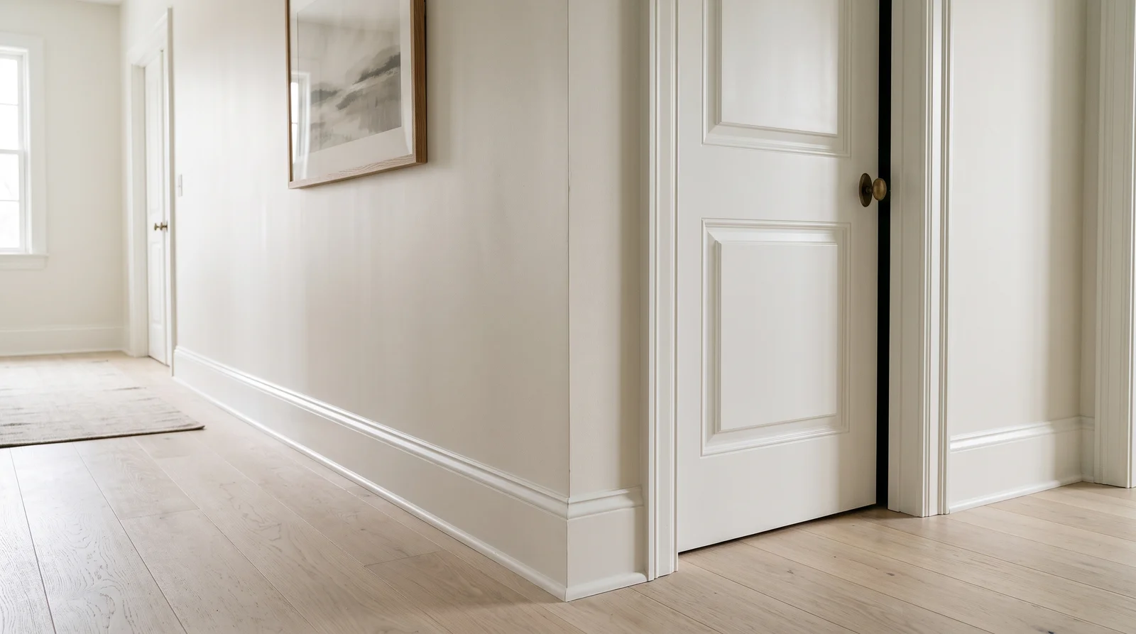
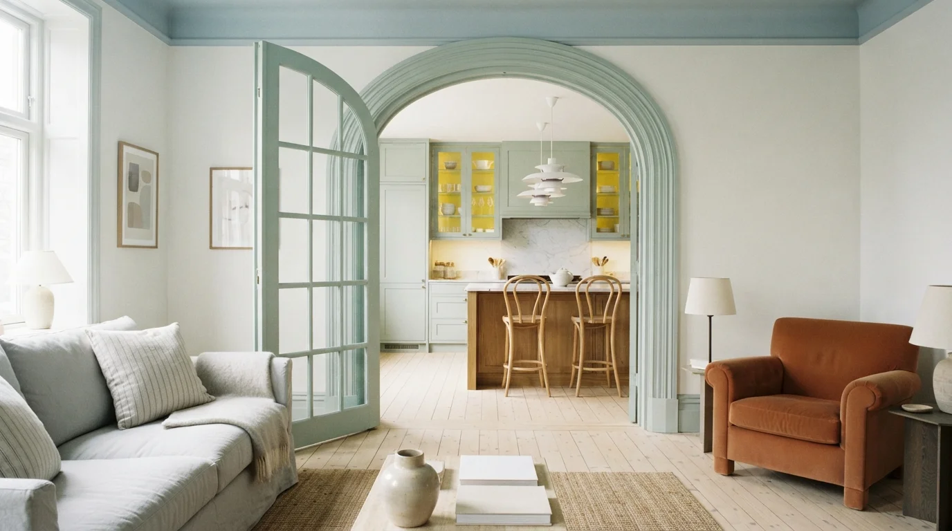
One soft white over walls and trim alike — a seamless, hushed envelope that makes ceilings feel taller.
Painting trim the same color as the walls erases the visual breaks, so the eye travels floor to ceiling without stopping — small rooms and low ceilings gain the most. Snowbound (LRV 83) is a soft white with a faint gray veil, and the trick is finish: matte on the walls, satin or semi-gloss on the trim, so the millwork still catches light as texture rather than contrast. It lets furniture, art, and hardware become the whole story. In cold north light Snowbound can drift gray; run the same drench in Alabaster if you want the envelope warmer.
SEE SNOWBOUND ON YOUR WALLS →Trim Wall Color Combinations
A wall color never works alone. These are the full schemes from the rooms above — the lead color first, then the supporting colors that make the photo work.
The trim white designers default to — soft, creamy edges that glow in any daylight and never flash blue.
TRY THIS PALETTE →Near-black walls outlined in bright clean white — a gallery-sharp contrast that needs real daylight to earn its drama.
TRY THIS PALETTE →Charcoal-black baseboards, casings, and doors that outline the room like ink — richest in warm afternoon light.
TRY THIS PALETTE →Trim in a deep bronze-brown with the weight of old iron — earthy, warm, and quietly modern as the light goes low.
TRY THIS PALETTE →The biggest mistake is using a flat or wall-grade paint on trim. It scuffs fast, shows every fingerprint, and will not wipe clean, so always step up to satin or semi-gloss. The second mistake is matching trim to walls by guessing instead of testing, which is how a white that looked clean in the can ends up reading pink or yellow on the wall.
People also forget that trim and ceiling whites should usually relate to each other. Pairing a cool blue-white trim with a warm cream ceiling makes both look slightly off. Sample on the actual trim, view it in your real light, and pick the white temperature on purpose rather than grabbing the first one labeled white.
Trim Color Ideas by Color
Set on a color family already? Each page has its own real rooms and picks.
Light or Dark Trim Colors?
Go Light (LRV 60+) If…
The room is small, faces north, or has to work at every hour. Light warm colors make it feel bigger and stay calm in evening light — the light you actually live in.
Go Dark (LRV Under 20) If…
You want the cocoon effect and the room has real daylight. Dark works best on one feature wall — or fully color-drenched in a large room with good windows.
Trim shows light differently than walls because it sits at angles and catches glare. North-facing rooms stay cool and a little flat all day, so a warm white like Alabaster keeps the trim from looking gray or dingy. South-facing rooms get strong, warm light, which lets a cooler white like Chantilly Lace stay crisp instead of going yellow.
Check your choice at night under your actual bulbs. Warm bulbs can push a soft white toward cream, and cool bulbs can make a gray trim like Charcoal look almost blue. Tape a sample near a door casing and a window and look at it morning, afternoon, and after dark before you commit.
LRV is just how much light a color bounces back, from near 0 for black to near 100 for the brightest white. For trim, LRV is really about contrast with your walls. A high-LRV white like Chantilly Lace against a medium wall gives you a bright, fresh, high-contrast look that makes rooms feel larger.
Low-LRV trim does the opposite. Tricorn Black or Hunter Green next to pale walls creates a bold outline that grabs attention, while keeping trim close to the wall color makes everything feel calm and seamless. Decide whether you want the trim to stand out or quietly blend, then pick your LRV gap to match.
See It. Love It.
Paint It.
Upload one photo of your trim and try every color on this page on your own walls — in your own light, before you buy a drop of paint.

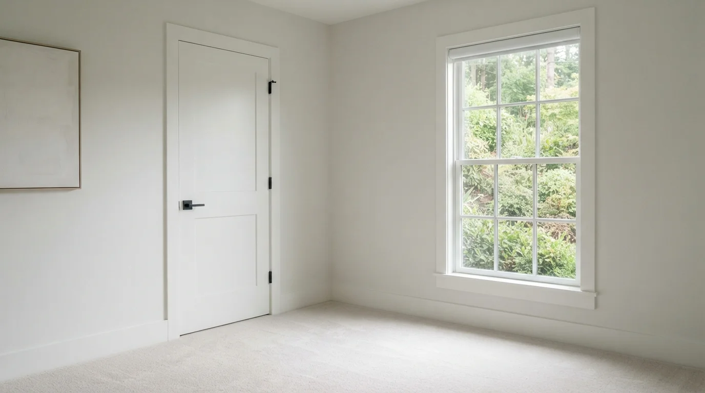
Chantilly LaceBeforeAbout Trim Paint Colors
Trim is the frame around everything else in a room. It runs along the floor, around the doors, over the windows, and up the corners, and your eye follows it whether you notice or not. Get the trim color right and the walls look cleaner, the ceilings look higher, and the whole room feels finished.
Most people reach for white, and white is still the safest, most flexible direction. But trim is also where a confident black, a soft gray, or a deep green can turn an ordinary room into something that looks designed. The trick is matching the trim color to the walls, the light, and the level of contrast you actually want.
Every color shown here is mixed to order at the paint counter, so you are not locked into one brand. If you like a shade like White Dove or Tricorn Black but buy a different brand of paint, the store can cross-match it. Pick the color you love first, then choose where to buy.
The Questions Everyone Asks
What color should I paint my trim?
If you want one answer, start with the safe picks above — White Dove, Alabaster, Chantilly Lace, Tricorn Black. They read well in any light and survive furniture changes. Then check the light: strong afternoon sun wants a step cooler, a north-facing room wants a step warmer.
What is the most popular trim color?
White is by far the most common, with soft whites like White Dove and Alabaster and crisp whites like Chantilly Lace leading the pack. White works with nearly any wall color and keeps a room feeling fresh and finished. Darker trim in black, charcoal, or green is a growing favorite when you want more drama.
Should trim be lighter or darker than the walls?
Either works, it just depends on the mood you want. Trim lighter than the walls, usually white, gives a bright, classic, high-contrast look that most people expect. Trim darker than the walls, like Tricorn Black or Charcoal, frames the room boldly and feels more modern or dramatic.
What sheen is best for trim?
Semi-gloss is the traditional pick because it wipes clean and resists scuffs around doors, baseboards, and handrails. Satin is a good lower-glare alternative if you find semi-gloss too shiny. The key is to make the trim a step shinier than your walls so the edges read crisp and intentional.
Can I match a trim color across different paint brands?
Yes. Every color here is mixed to order at the paint counter, and stores can cross-match a shade like White Dove or Hunter Green into another brand's paint. Pick the color you love first, then buy whichever brand fits your budget or finish needs.
Should the trim and ceiling be the same color?
They don't have to match exactly, but they should belong to the same temperature family so the room feels cohesive. A common, easy approach is to use the same white on both, often the trim white in a flatter sheen on the ceiling. Avoid pairing a cool white trim with a warm cream ceiling, since the mismatch makes both look off.
Does dark trim make a room look smaller?
Not necessarily, but it does change the feel. Dark trim like black or Hunter Green draws a strong outline that makes the room feel more defined and intimate rather than airy. If you want a space to feel larger and brighter, a high-LRV white like Chantilly Lace against medium walls is the better choice.
How do I keep white trim from looking yellow or dingy?
Match the white to your light. In warm, south-facing rooms or under warm bulbs, a cooler white like Chantilly Lace stays crisp, while in cool, north-facing rooms a warm white like Alabaster reads clean instead of gray. Always tape a sample on the actual trim and check it in daylight and at night before committing.
What two-color combination works best in a trim?
The reliable pattern is a quiet main color plus one deep accent on a single wall. Keep trim and ceiling in one warm white so the two colors are the only event in the room — the combination cards above show complete schemes from real rooms.
What colors make a trim look bigger?
High-LRV, slightly warm colors — LRV 60–75 is the sweet spot. Paint the walls and trim close to the same light color so the corners blur, and keep the ceiling white. Stark cool white actually works against you; it creates hard shadows that show the room's edges.

Ask a Question