Room Colors · White Trim
8 Best White Trim Paint Colors for 2026
ideas, combinations, and real rooms
8 curated picks from real white trims — with the exact colors, honest reasons why, and the combinations that hold the room together.

Former interior stylist who can spot a green undertone from across a room. Jessica writes the color and mood pieces — what to choose, what pairs, and why your "white" looks pink.
The Fast Answer
Don't want to read 8 picks? These four are the safe answers.

Top Picks for the White Trim
Tap a shade to see the white trim in it, then try it on your own room.
White Trim Color Trends 2026 — What's In, What's Out


- Stark Cool White Trim — Blue-leaning, high-LRV whites like the old-school 'trim white' defaults are starting to clash with 2026's warmer wall palettes and read cold.
- High-Gloss Trim Everywhere — Glossy trim on every window and door is losing ground to satin finishes that hide dents and fingerprints better in busy rooms.
- Bright White Trim With Warm Walls Ignored — Reflexively using the same stark white trim regardless of the wall's undertone is fading as more homeowners match trim warmth to their walls.
The 8 Best White Trim Paint Colors
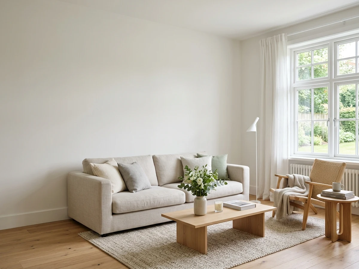
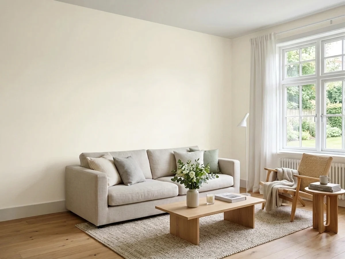
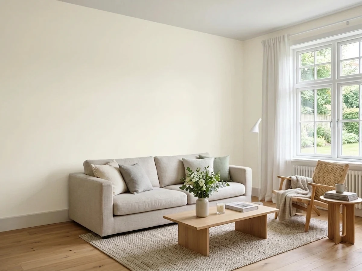
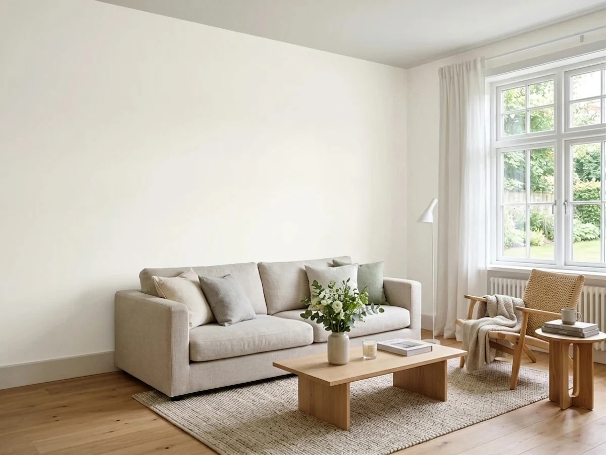
Every pick below is a real rendered white trim, not a chip. The lead color first; the swatches are the full scheme in the photo — walls, furniture, textiles, accent.

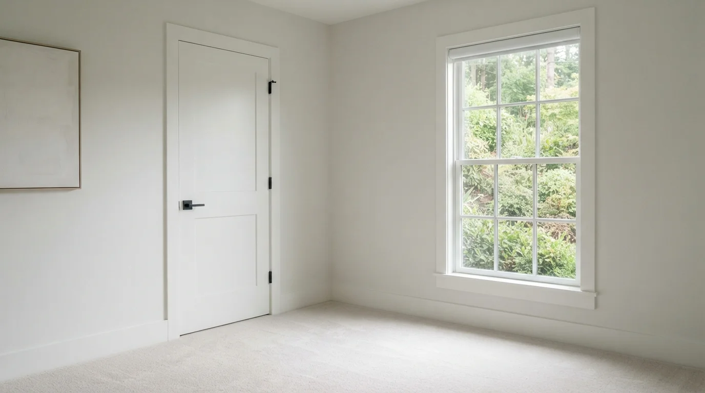
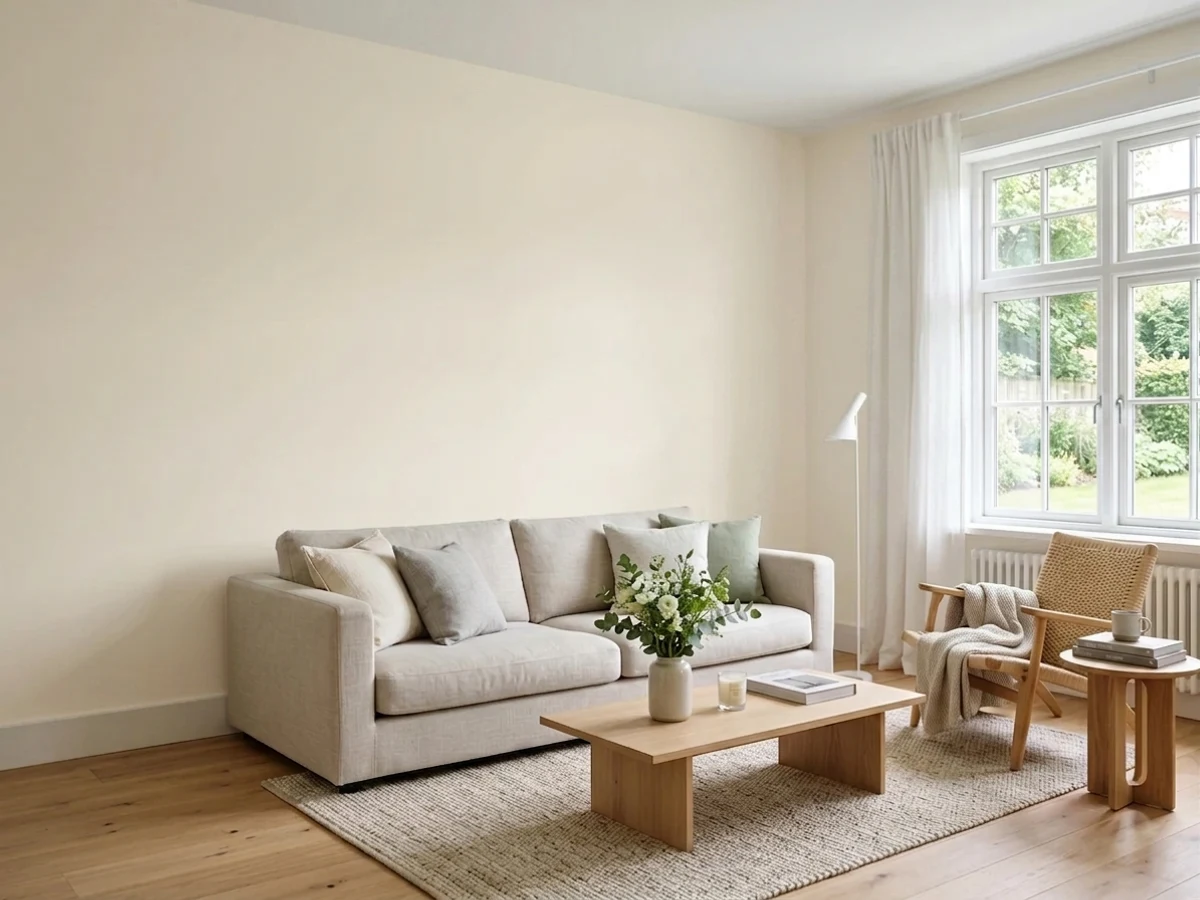
Bright white surfaces frame a tranquil garden view, creating a clean, fresh, and serene retreat.
Soft white is a bright, neutral shade that instantly opens up any interior. In this room, a pale white covers the walls and matching trim, complemented by light carpeting and contrasting black door hardware. The space feels open, peaceful, and delightfully fresh. This simple look works because the all-white backdrop lets the lush green trees through the window steal the show. It is the perfect choice for anyone who loves minimalist simplicity and calm spaces.
SEE LUSTER WHITE ON YOUR WALLS →
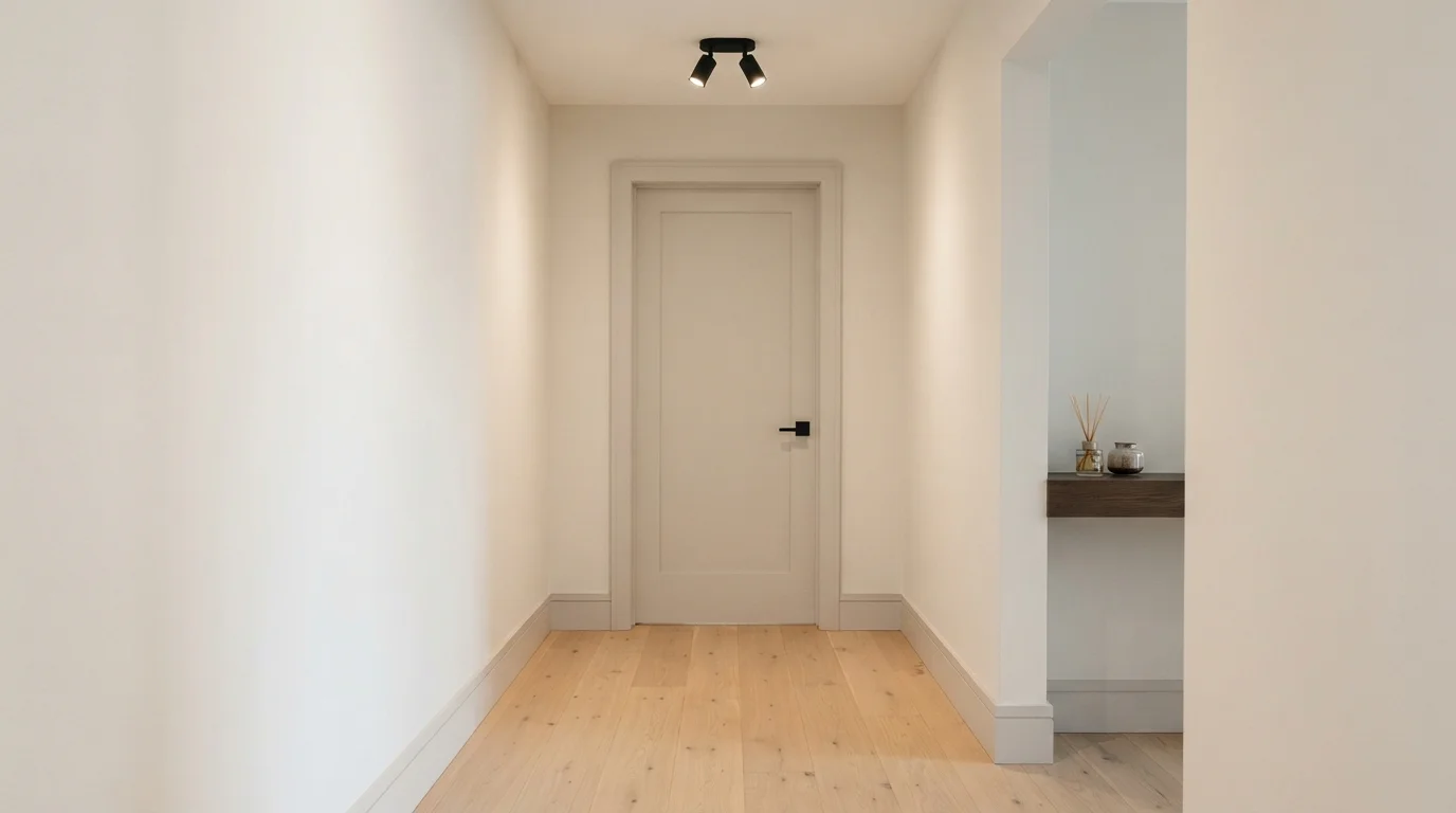
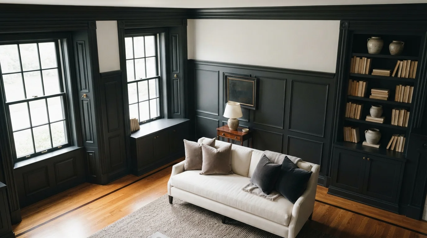
Soft off-white walls paired with muted greige doors and pale oak floors create an effortlessly calm modern space.
Soft warm white is a clean, gentle neutral with a soothing touch of warmth. In this hallway, smooth off-white walls surround a muted greige door, matching trim, and sleek matte black hardware. The space feels quiet, airy, and incredibly peaceful. Sticking to close neutral tones works easily because subtle contrast lets the natural oak flooring add depth without clutter. It is perfect for anyone who loves simple Scandinavian style and calm, uncluttered spaces.
SEE FRENCH CASTLE ON YOUR WALLS →
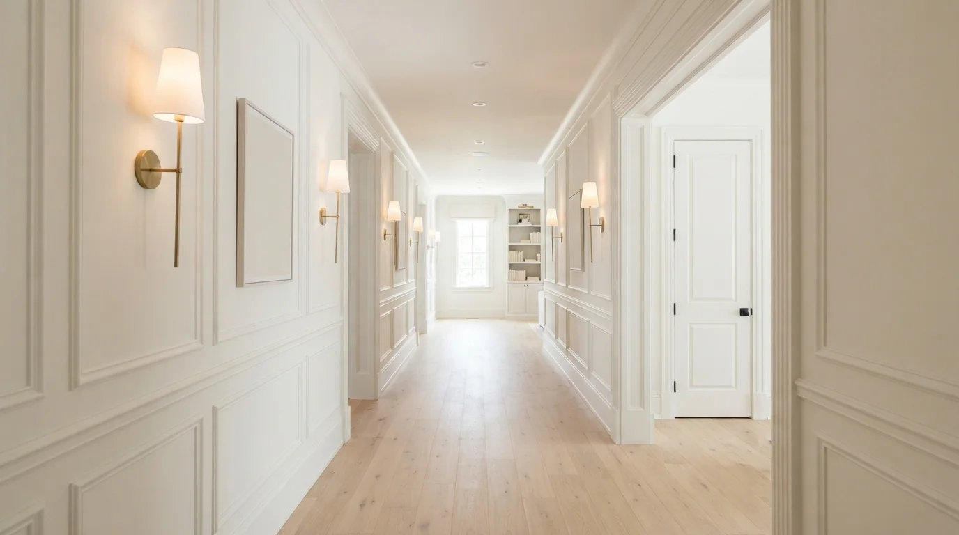
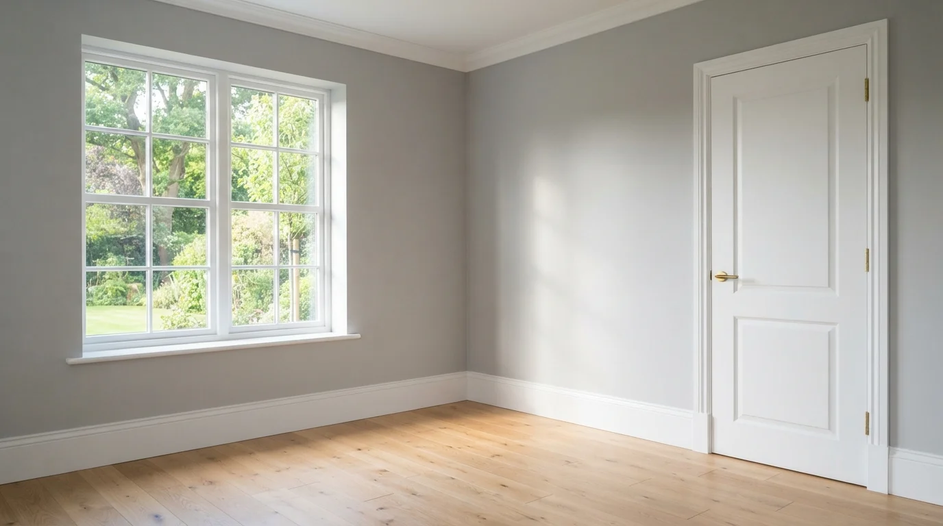
Soft creamy walls and tailored millwork glow under delicate brass sconces over pale oak floors.
Creamy off-white is a soft, gentle neutral with a touch of warmth. Here, the floor-to-ceiling picture frame wall paneling, tall baseboards, and cased doorways are painted in a smooth warm white, balanced by pale blonde oak floors and slender brushed brass sconces. The space feels bright, calm, and quietly upscale. Painting the walls and trim in matching soft tones lets the rich woodwork shine without cluttering the view. It is perfect for anyone wanting a grand, welcoming entryway that never goes out of style.
SEE IT ON YOUR WALLS →
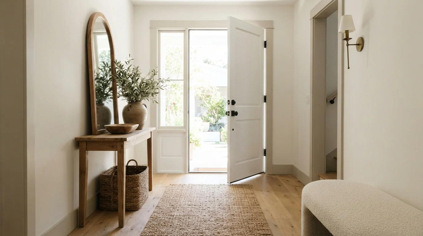
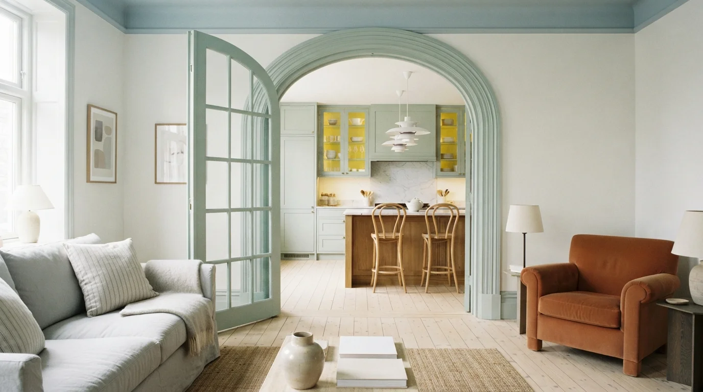
A serene blend of creamy walls, soft sand accents, and earthy textures that creates an instantly calming welcome.
Warm ivory is a soft, gentle off-white with cozy beige depth. In this airy hallway, creamy white wraps the surrounding walls and moldings, while a muted sand taupe highlights the interior panel door. A natural oak console, woven jute runner, rustic pottery, and olive greenery complete the light wood floors. The entire space feels calm, grounded, and naturally bright. This combination works so well because layering warm neutrals with textured wood creates interest without visual clutter. It is perfect for anyone wanting a relaxed, organic modern entry.
SEE SOFT STONES ON YOUR WALLS →


Gives your woodwork a clean, versatile finish that pairs with any wall.
SEE PURE WHITE ON YOUR WALLS →Gives baseboards a warm, velvety softness that feels instantly inviting.
SEE SWISS COFFEE ON YOUR WALLS →White Trim Wall Color Combinations
A wall color never works alone. These are the full schemes from the rooms above — the lead color first, then the supporting colors that make the photo work.
Bright white surfaces frame a tranquil garden view, creating a clean, fresh, and serene retreat.
TRY THIS PALETTE →Soft off-white walls paired with muted greige doors and pale oak floors create an effortlessly calm modern space.
TRY THIS PALETTE →Soft creamy walls and tailored millwork glow under delicate brass sconces over pale oak floors.
TRY THIS PALETTE →A serene blend of creamy walls, soft sand accents, and earthy textures that creates an instantly calming welcome.
TRY THIS PALETTE →For a warm room — beige, greige, or true cream walls, wood floors, wood doors — White Dove is the workhorse pairing; its own slight warmth keeps it from looking chalky next to those tones. Alabaster does the same job when the goal is near-zero contrast, almost matching the wall in warmth so the trim reads as a quiet frame rather than a statement.
For a cooler or more graphic room — gray or blue-gray walls, black hardware, modern doors — Chantilly Lace or Ultra Pure White give the cleanest line, and Ultra White from Valspar does the same at a lower price point if the brand doesn't matter. Pure White is the one to reach for when the wall color isn't locked in yet, since its LRV 84 middle ground and balanced undertone sit comfortably next to both warm and cool walls without needing to be re-picked later. Simply White and Polar Bear both work as a slightly brighter step up from Pure White or White Dove when the room needs the trim to read a shade fresher without going all the way to a stark 92 LRV white.
More Trim Color Ideas
Set on a color family already? Each page has its own real rooms and picks.
Light or Dark White Trim Colors?
Go Light (LRV 60+) If…
The room is small, faces north, or has to work at every hour. Light warm colors make it feel bigger and stay calm in evening light — the light you actually live in.
Go Dark (LRV Under 20) If…
You want the cocoon effect and the room has real daylight. Dark works best on one feature wall — or fully color-drenched in a large room with good windows.
Every color on this page is a white, but they split into two real groups: bright, high-LRV whites at 91–92 (Ultra Pure White, Ultra White, Chantilly Lace, Simply White) and softer, lower-LRV whites at 82–86 (Alabaster, Pure White, White Dove, Polar Bear). The bright group throws the most light and gives the sharpest contrast line against a wall — the right call in a room with plenty of natural light, where the extra brightness reads clean rather than glaring. In a north-facing or low-light room, the same bright white can look flat and slightly gray by late afternoon, which is when a softer white like White Dove or Polar Bear holds its warmth better under artificial light.
The other variable is contrast with the wall color, not just the trim's own LRV. Trim generally wants to sit 2 to 5 LRV points above the wall and on the same side of warm or cool — a stark, cool white like Chantilly Lace next to a warm cream wall can make the wall look yellow by comparison, even if the wall color looked fine on its own. Matching a warm wall to a warm trim white (White Dove or Alabaster) or a cool wall to a cooler trim white (Ultra Pure White or Chantilly Lace) keeps the room's undertone consistent instead of fighting itself in the corners where wall meets molding.
See It. Love It.
Paint It.
Upload one photo of your white trim and try every color on this page on your own walls — in your own light, before you buy a drop of paint.

Chantilly LaceBeforeSheen And Finish For Trim
Trim gets touched, bumped, and wiped down far more than walls, so sheen matters more here than the color itself. Satin is the baseline for most trim — enough sheen to wipe clean and show off the profile of the molding without looking plasticky. Semi-gloss is the harder-wearing choice for doors, high-traffic baseboards, and kids' rooms, and it's worth the extra shine on any trim that gets scuffed by shoes, bags, or furniture.
Whichever white is picked — Ultra Pure White, White Dove, Chantilly Lace, or any of the others — buy it in a dedicated trim-and-door formula (waterborne alkyd or a true enamel) rather than the same wall paint in a higher sheen. Trim enamels level out brush marks and dry to a harder, more washable surface, which matters more on a bright white where every roller stipple or brush stroke shows under raking light from a window or overhead fixture.
The Undertone Mismatch Mistake
The most common trim mistake isn't picking a bad white, it's picking a white that fights the wall's undertone. A warm wall color next to a cool trim white like Chantilly Lace or Ultra Pure White can make the wall look dingy or yellow by comparison, even though neither color is wrong on its own — it's the contrast that reads badly. The fix is to hold the actual trim sample against the actual wall sample in the room's real light before committing, not just compare them on a screen or in a showroom.
A second version of the same mistake is assuming all trim needs to be the brightest white available. LRV 92 whites like Ultra Pure White and Ultra White are dramatic next to a saturated or dark wall color, but next to a pale wall they can look stark and clinical instead of crisp. When the wall is already light, a slightly softer trim white — Pure White or Polar Bear — keeps enough separation to still read as trim without the harsh, hospital-white effect a maximum-brightness white can create in an already-bright room.
Matching Trim To Doors And Cabinets
Interior doors and cabinets that get painted white should generally match the trim, not the wall — a slightly different white on the door versus the surrounding casing shows up as a visible line the moment the light hits it at an angle. If the baseboards and window casings are going in White Dove, the doors and any built-in cabinetry should use the same can, not a close approximation from a different brand or line.
The one exception is when trim and cabinets are meant to read as separate elements on purpose, like a white trim paired with painted cabinetry in a slightly different white for contrast in a kitchen. In that case, pick two whites with a clear enough LRV gap — five points or more, such as Chantilly Lace at 92 against Alabaster at 82 — so the difference reads as intentional layering instead of a mismatched paint job.
About White Trim Paint Colors
White trim is the one paint decision that touches nearly every room in the house, and it's also the one most people rush. The safe, versatile choice is a color like Pure White by Sherwin-Williams (SW 7005), an LRV 84 white that reads clean against almost any wall color without tipping too warm or too cool — it's the trim equivalent of a neutral that never fights with what's next to it. If the goal is the crispest possible line between wall and woodwork, Ultra Pure White by Behr (1850) and Ultra White by Valspar (7006-24) both sit at LRV 92, the ceiling for how bright a white paint goes before it starts reading as a technical, almost blue-white rather than a warm one.
Not every room wants that much snap. Benjamin Moore's White Dove (OC-17, LRV 85) is one of the most specified trim whites in the country because it has just enough warmth to soften into older homes, wood floors, and cream or greige walls instead of standing apart from them. Chantilly Lace (OC-65, LRV 92) is Benjamin Moore's answer to a true bright white — cooler and cleaner than White Dove, it's the pick for modern millwork, black-and-white kitchens, or trim that needs to read crisp under any bulb. Sherwin-Williams' Alabaster (SW 7008, LRV 82) leans the other direction: a soft, creamy white that was built as a wall color but works on trim precisely because it doesn't compete with the warm neutrals it's usually paired against.
Simply White by Benjamin Moore (OC-117, LRV 91) and Polar Bear by Behr (75, LRV 86) round out the practical middle ground — both bright enough to look fresh next to darker or saturated wall colors, both warm enough not to look sterile under yellow-toned bulbs. The real decision on this page isn't which white is objectively best, it's matching the undertone and brightness of the trim to the walls, the light, and the wood tones already in the room.

The Questions Everyone Asks
What color should I paint my white trim?
If you want one answer, start with the safe picks above — White Dove, Swiss Coffee, Alabaster, Pure White. They read well in any light and survive furniture changes. Then check the light: strong afternoon sun wants a step cooler, a north-facing room wants a step warmer.
should trim be the same white as the walls
Not usually. Trim almost always looks better slightly brighter than the wall — about 2 to 5 LRV points higher — so it reads as a frame instead of disappearing into the wall. If the wall is Alabaster (LRV 82), a trim white like White Dove (LRV 85) or Simply White (LRV 91) gives just enough separation. Painting both the exact same white can work in a minimalist all-white room, but it removes the visual definition trim is usually there to add.
what sheen should i use for white trim
Satin is the standard choice for most trim — enough shine to wipe clean without looking plastic. Semi-gloss holds up better on doors and high-traffic baseboards that get kicked, bumped, or wiped down often. Whatever white is chosen, buy it in a trim-specific enamel or waterborne alkyd rather than standard wall paint, since those formulas level out brush marks and dry to a harder, more washable finish.
why does my white trim look yellow
Usually it's the undertone clashing with the wall or the light bulbs, not the paint failing. A warm trim white can look yellow next to a stark cool wall color, and warm 2700K bulbs amplify any yellow undertone in a white paint at night. If the goal is a white that stays neutral under most lighting, Pure White by Sherwin-Williams or Ultra Pure White by Behr are less prone to reading yellow than warmer options like White Dove.
what is the best white for trim if walls are gray
A cooler, brighter white keeps the pairing clean — Chantilly Lace (LRV 92) or Ultra Pure White (LRV 92) both stay crisp next to gray or blue-gray walls without warming them up unintentionally. Avoid a warm white like White Dove or Alabaster here, since a warm undertone next to a cool gray wall can make the trim look slightly dingy or off-white by comparison instead of clean.
how many coats of white paint does trim need
Two coats minimum over primed trim, and most bright whites like Ultra Pure White or Chantilly Lace need the full two coats to cover evenly and avoid a slightly translucent, patchy look in raking light. If the trim is a big color change — dark stain or a deep color underneath — a stain-blocking primer first keeps the white from yellowing or showing bleed-through over time.
What two-color combination works best in a white trim?
The reliable pattern is a quiet main color plus one deep accent on a single wall. Keep trim and ceiling in one warm white so the two colors are the only event in the room — the combination cards above show complete schemes from real rooms.
What colors make a white trim look bigger?
High-LRV, slightly warm colors — LRV 60–75 is the sweet spot. Paint the walls and trim close to the same light color so the corners blur, and keep the ceiling white. Stark cool white actually works against you; it creates hard shadows that show the room's edges.


Ask a Question