Room Colors · Gray Trim
8 Best Gray Trim Paint Colors for 2026
ideas, combinations, and real rooms
8 curated picks from real gray trims — with the exact colors, honest reasons why, and the combinations that hold the room together.

Former interior stylist who can spot a green undertone from across a room. Jessica writes the color and mood pieces — what to choose, what pairs, and why your "white" looks pink.
The Fast Answer
Don't want to read 8 picks? These four are the safe answers.

Top Picks for the Gray Trim
Tap a shade to see the gray trim in it, then try it on your own room.
You'll love how softly this light shade frames your walls without feeling harsh.
Gray Trim Color Trends 2026 — What's In, What's Out


- Cool Blue-Gray Trim — Icy, blue-leaning gray trim is fading as homeowners move toward warmer grays that read more like taupe than steel.
- Matching Gray Trim And Gray Walls — Painting trim and walls the same flat gray is starting to feel monotone next to 2026's preference for warm contrast between trim and wall.
- Silvery Light Gray Trim — Very light, silvery gray trim is losing ground to deeper, warmer grays that give a room more visual weight and definition.
The 8 Best Gray Trim Paint Colors
Every pick below is a real rendered gray trim, not a chip. The lead color first; the swatches are the full scheme in the photo — walls, furniture, textiles, accent.

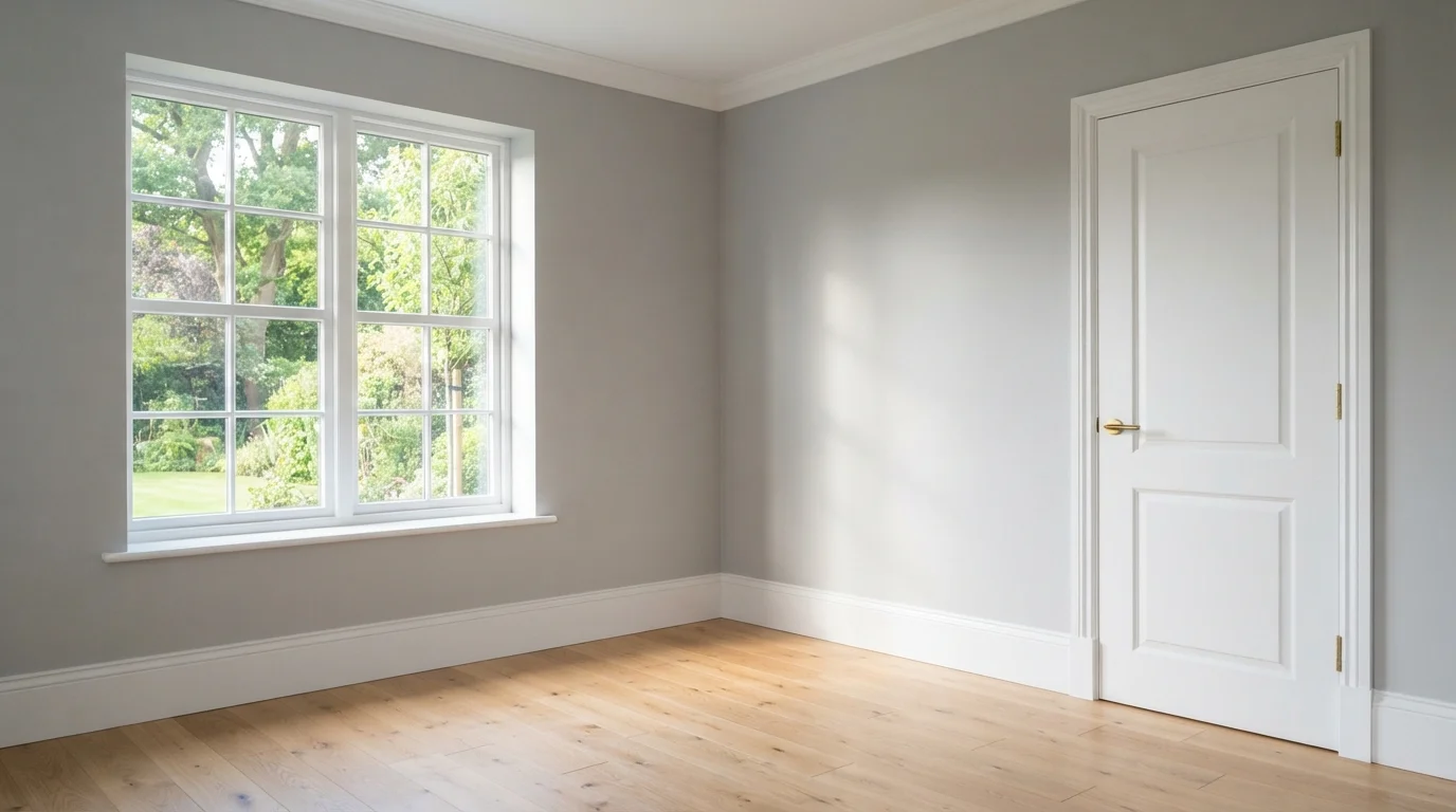
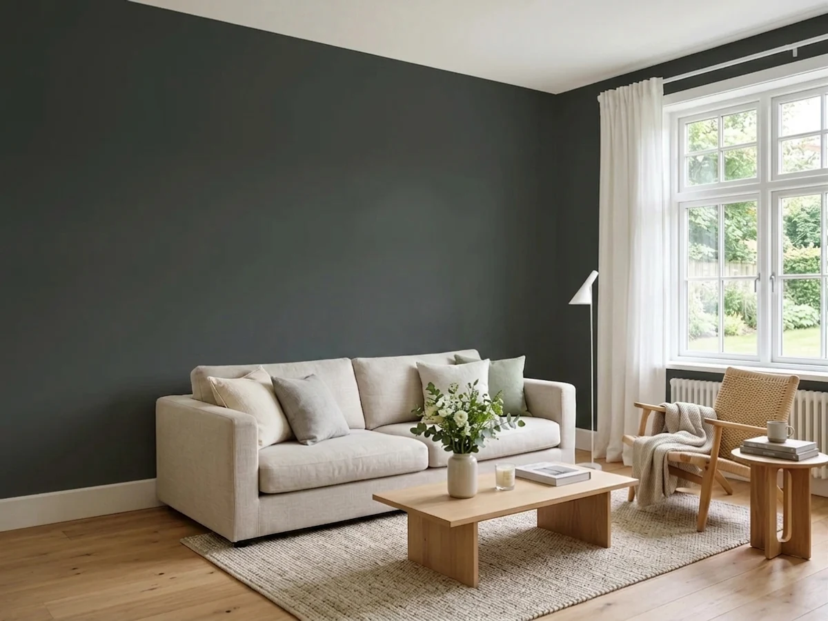
Gentle gray walls paired with crisp white trim create an airy, tranquil space washed in bright natural sunlight.
Soft gray is a calm, neutral shade with a light touch of cool elegance. In this space, the walls wear gentle gray, while the baseboards, crown molding, and paneled door shine in crisp white. The entire room feels fresh, quiet, and effortlessly open. This pairing works because the bright white trim creates sharp definition that makes the soft wall color pop without feeling heavy. It is a fantastic choice for anyone who loves a clean, versatile backdrop that easily adapts to any decorating style.
SEE IT ON YOUR WALLS →
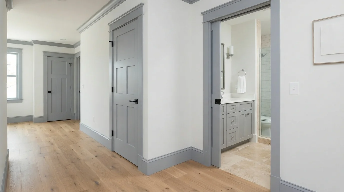
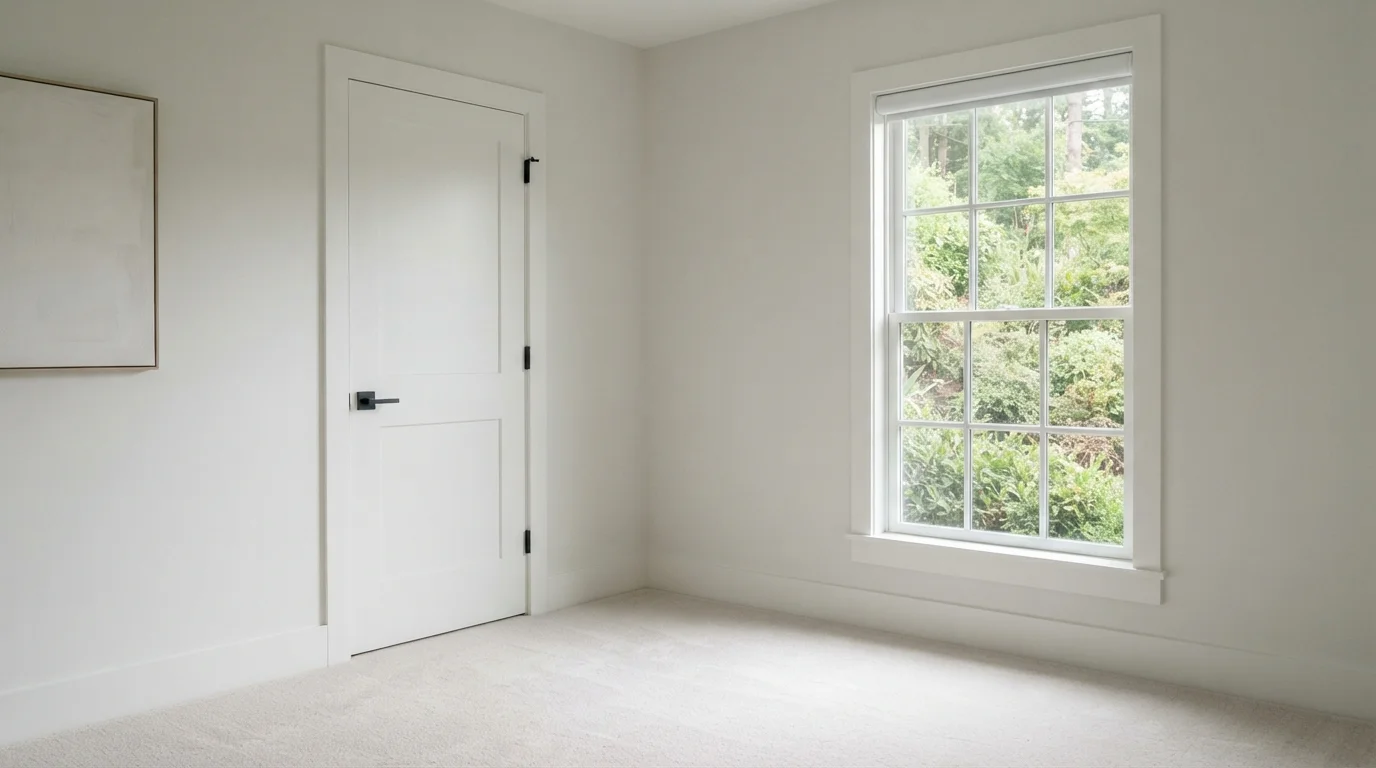
Cool slate-gray trim frames soft white walls to create a crisp, tailored look filled with calm structure.
Slate gray is a balanced, cool neutral with gentle stony depth. In this home, that crisp gray defines every door frame, baseboard, and panel door, setting off the soft off-white walls. The space feels orderly, calm, and neatly tailored. Outlining the doorways with a darker tone makes simple architectural shapes pop without stealing any brightness from the room. It is a fantastic option for anyone wanting a modern transitional home with subtle architectural punch.
SEE SILVER SPRING ON YOUR WALLS →
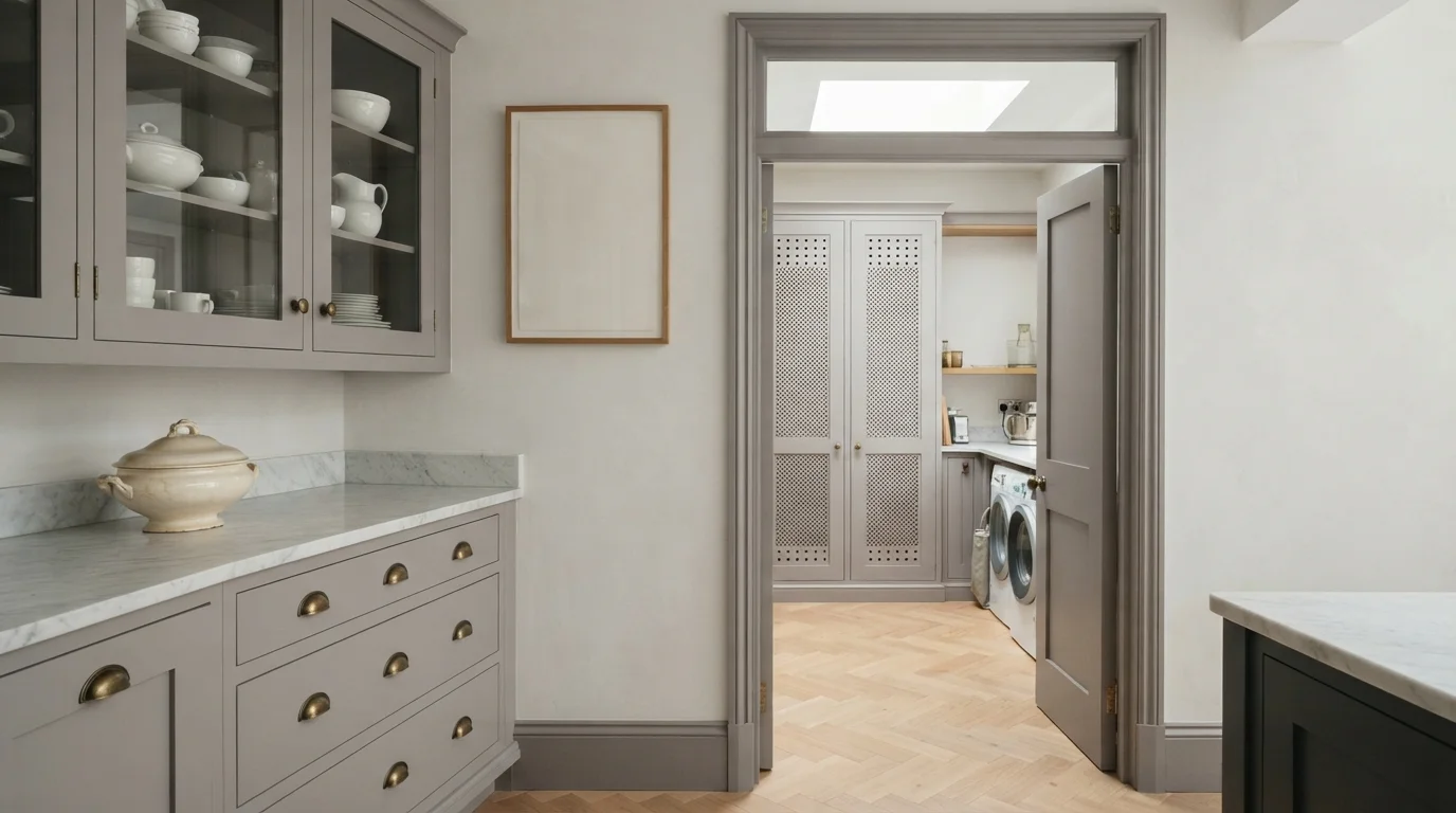
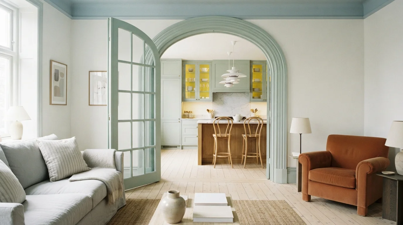
Gentle dove grey cabinetry paired with warm herringbone oak floors creates an airy, understatedly elegant pantry space.
Soft dove grey is a quiet, neutral shade that blends grey with a whisper of warm taupe. In this space, the shaker cabinetry and tall door frame wear that soothing grey, while the walls stay crisp and bright in off-white. The overall look feels peaceful, tailored, and wonderfully organized. It works so well because the pale stone surfaces and honey wood floors keep the grey from feeling cold. This look is perfect for anyone wanting a classic English country kitchen feel that never goes out of style.
SEE URBAN LIFT ON YOUR WALLS →
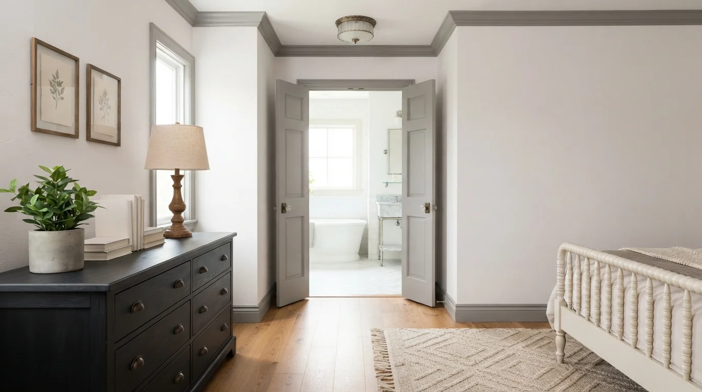
Warm gray painted trim and classic panel doors frame bright white walls and golden oak floors for an elegant, peaceful bedroom.
Soft greige is a gentle, warm gray that brings quiet elegance to classic woodwork. Here, the crown molding, baseboards, and tall double doors are painted in muted gray, framing crisp off-white walls. A black dresser and turned wood lamp anchor the corner, while a textured tan rug softens the hardwood floors. The room feels grounded, airy, and deeply calming. The contrast works because the soft gray outline adds architectural character without darkening the room. It is perfect for anyone wanting a tailored, timeless take on neutral style.
SEE PEWTER CAST ON YOUR WALLS →
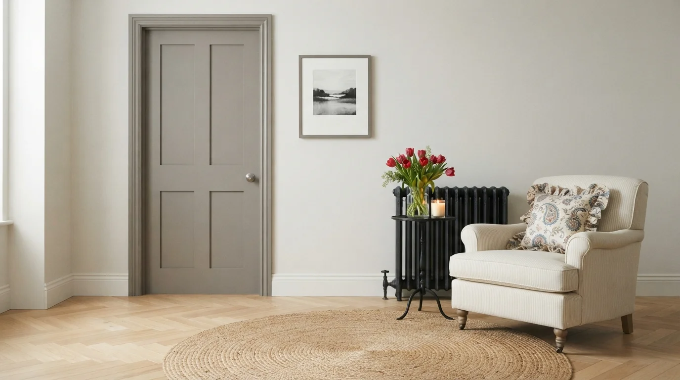
Soft taupe trim framing warm cream walls brings quiet heritage charm and a peaceful feel to any relaxed corner.
Mushroom taupe is a soft, earthy mix of gray and beige. In this cozy corner, muted taupe coats the classic paneled door, baseboards, and frame against creamy off-white walls, paired with a pinstriped chair, natural jute rug, and bright red tulips. The space feels snug, grounded, and deeply serene. This combination works because the deeper trim grounds the airy walls without feeling heavy or dark. It is perfect for anyone who loves timeless traditional style with an understated modern twist.
SEE DORIAN GRAY ON YOUR WALLS →
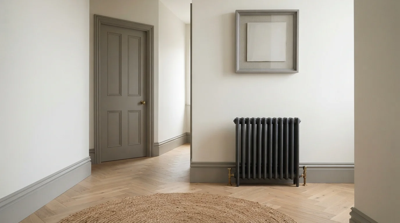
Soft taupe trim frames creamy walls and warm herringbone floors for an understated, timelessly elegant look.
Greige is a gentle blend of warm beige and quiet grey. In this space, the paneled interior door, wide casing, and tall baseboards wear this earthy tone against creamy off-white walls, grounded by light oak herringbone floors and a textured jute rug. The room feels calm, tidy, and subtly upscale. Highlighting the woodwork with a slightly deeper shade brings out classic architectural details while keeping the room airy. It is a fantastic choice for anyone loving traditional style with a clean, understated feel.
SEE PROMISING GRAY ON YOUR WALLS →
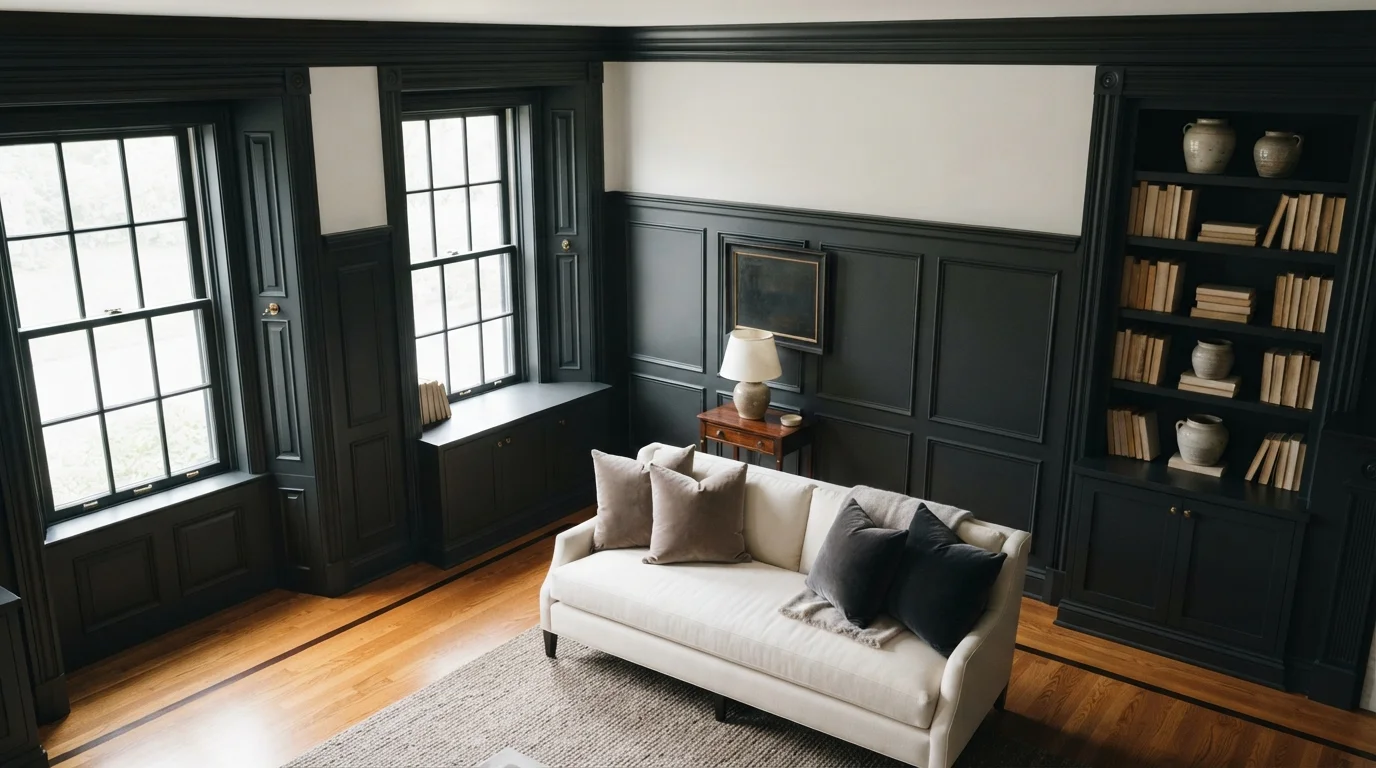
Create a bold, dramatic outline around your doors that feels chic and grounded.
SEE PEPPERCORN ON YOUR WALLS →
Gray Trim Wall Color Combinations
A wall color never works alone. These are the full schemes from the rooms above — the lead color first, then the supporting colors that make the photo work.
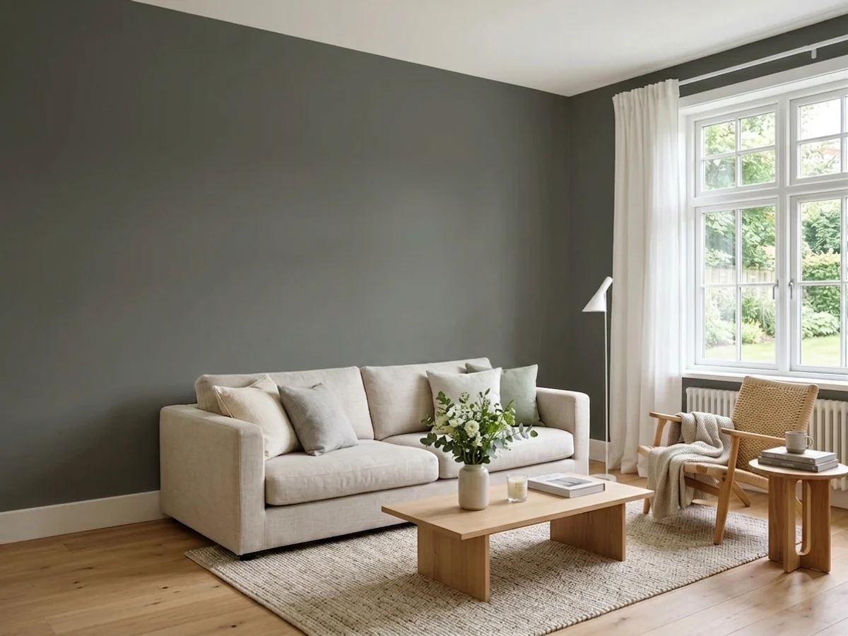
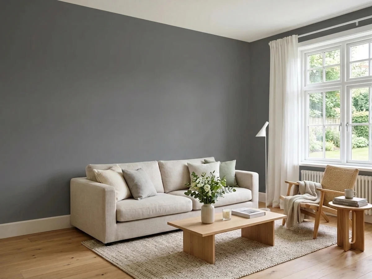
Gentle gray walls paired with crisp white trim create an airy, tranquil space washed in bright natural sunlight.
TRY THIS PALETTE →Cool slate-gray trim frames soft white walls to create a crisp, tailored look filled with calm structure.
TRY THIS PALETTE →Gentle dove grey cabinetry paired with warm herringbone oak floors creates an airy, understatedly elegant pantry space.
TRY THIS PALETTE →Warm gray painted trim and classic panel doors frame bright white walls and golden oak floors for an elegant, peaceful bedroom.
TRY THIS PALETTE →Pair the palest picks with your boldest wall colors and save the darkest picks for walls that need help standing out. Fast As The Wind (LRV 59) works as a quiet stand-in for white trim next to a deep or saturated wall color, since it won't compete for attention the way a true white sometimes does against warm hues. Rustic Taupe does the same job but with more warmth, so it's the better match next to greige, warm white, or soft green walls where a cool gray trim would look out of place.
On the dark end, Peppercorn, Thunderous, and Benjamin Moore Gray are all built to frame light walls, think soft white, pale blue, or a barely-there gray, since the contrast is what makes the doors and casings pop. Silhouette leans a touch warmer and cozier than Peppercorn, so it reads better against warm neutrals than cool ones. Fired Bronze is the one pick made to sit next to natural wood floors, doors, or stair rails rather than painted walls; its warm undertone keeps it from clashing with honey or walnut tones the way a colder charcoal like Cracked Pepper can. Cracked Pepper itself is the highest-contrast option here and pairs best with walls that are already light and simple, since it will read as a bold outline on almost anything darker than a soft neutral.
More Trim Color Ideas
Set on a color family already? Each page has its own real rooms and picks.
Light or Dark Gray Trim Colors?
Go Light (LRV 60+) If…
The room is small, faces north, or has to work at every hour. Light warm colors make it feel bigger and stay calm in evening light — the light you actually live in.
Go Dark (LRV Under 20) If…
You want the cocoon effect and the room has real daylight. Dark works best on one feature wall — or fully color-drenched in a large room with good windows.
Trim is almost always meant to contrast with the wall, so the light-versus-dark decision is really about how much contrast you want. A pale option like Fast As The Wind (LRV 59) or Rustic Taupe (LRV 36) reads as a soft edge, close enough in value to most light walls that it frames the room without shouting, which is the safer call in a room with low ceilings or limited natural light since it keeps the perimeter from feeling heavy. Anything under an LRV of about 15, Peppercorn, Silhouette, Thunderous, or a deep charcoal like Cracked Pepper, creates real contrast against light walls and will visually thicken the trim, doors, and window casings, which reads as intentional and architectural in a room with decent light and simple, clean moldings.
The risk with dark trim isn't the color, it's the room. In a small or dim space with ornate or fussy millwork, a near-black gray can make the trim feel like it's closing in, so save Peppercorn or Silhouette for rooms with at least a few hours of direct light or simple trim profiles that can carry the weight. If you're not sure which way to go, Benjamin Moore Gray at LRV 12 is the middle ground: dark enough to define the opening, light enough that it won't dominate a smaller room.
See It. Love It.
Paint It.
Upload one photo of your gray trim and try every color on this page on your own walls — in your own light, before you buy a drop of paint.

Repose GrayBeforeSheen and Finish for Trim
Semi-gloss is the traditional trim sheen because it wipes clean and holds up to hands, door swings, and the occasional kick from a vacuum, but it also reflects the most light, which means every brush mark, drip, or old wood grain shows through more on a semi-gloss finish than on a flatter one. Satin is the more forgiving choice for gray trim specifically: it still separates cleanly from a matte or eggshell wall color, but it disguises minor imperfections in older trim better than semi-gloss does.
Darker picks like Peppercorn or Cracked Pepper are the ones where sheen choice matters most, since a high-gloss finish on a near-black color will show every flaw under window light. If your trim is original wood with dents or old paint layers, go satin. If it's newer, smooth MDF trim, semi-gloss is fine and will hold up better to cleaning.
Placement: Where Gray Trim Works Best
Gray trim earns its keep most around doors and windows, where the contrast actually has a job to do, framing an opening rather than just outlining a flat wall. Baseboards can go a shade lighter than door and window casings if you want the floor line to feel less heavy, especially with a dark pick like Silhouette or Thunderous, which can make a room feel like it's shrinking if it wraps every surface at full strength.
Crown molding is the one spot to think twice about a dark gray. Painting crown the same deep tone as your door casings pulls the eye up and can make ceilings feel lower, so many rooms look better with a lighter pick like Fast As The Wind or Rustic Taupe at the ceiling line, saving the darker colors for the trim you actually want to notice.
Mistakes to Avoid
The most common mistake is picking a gray trim color without checking it against the wall color in the room's actual light, not on a screen or in the store. A gray with a green or blue undertone, like Thunderous, can look muddy next to a warm wall color it wasn't tested with, while a warm gray like Rustic Taupe can look flat next to a cool blue or true white wall.
The second mistake is going too dark in a room that can't support it. A near-black trim color like Cracked Pepper or Silhouette needs either strong natural light or wall colors light enough to create real contrast; put it in a dim room with mid-tone walls and the trim just disappears into the shadows instead of framing anything. When in doubt, test a sample board of the actual pick next to your wall color and move it around the room at different times of day before committing to a full gallon.
About Gray Trim Paint Colors
Gray trim works because it does something white trim can't: it reads as a deliberate design choice instead of a default. Sherwin-Williams Peppercorn (SW 7674, LRV 11) traces every door and window opening in a near-black charcoal that makes the wall color behind it look intentional, not just "unpainted." On the opposite end, Behr Fast As The Wind (PPU26-17, LRV 59) gives you nearly the same crisp edge as white trim but with a whisper of cool gray in it, so it stops fighting with warm-toned walls the way stark white often does.
The middle of the range is where most rooms actually land. Benjamin Moore Gray (2121-10, LRV 12) is the classic mid-gray pick for a clean, sharp outline that doesn't try too hard, while Behr Rustic Taupe (N200-4, LRV 36) softens that same idea into something warmer and less graphic, good for a room where you want the trim to define the space without drawing the eye to it. Sherwin-Williams Thunderous (SW 6201, LRV 15) sits between the two, dark enough to ground a room but with a hint of green-gray that reads differently than a true charcoal.
What all of these share is that they're not neutral filler, they change how the room's actual wall color performs. Benjamin Moore Silhouette (AF-655, LRV 10) and Behr Cracked Pepper both push toward near-black and will make pale walls glow by contrast, while Dunn-Edwards Fired Bronze goes the opposite direction, a warm gray-brown that reads more like a stain color and is built to sit next to real wood, not fight it.
The Questions Everyone Asks
What color should I paint my gray trim?
If you want one answer, start with the safe picks above — Peppercorn, Wrought Iron, Architectural White, Silver Spring. They read well in any light and survive furniture changes. Then check the light: strong afternoon sun wants a step cooler, a north-facing room wants a step warmer.
should trim be lighter or darker than the walls?
Either works, but the point is contrast, not a fixed rule. Most rooms use trim darker than the wall, like Sherwin-Williams Peppercorn (LRV 11) against a pale wall, because dark trim frames the opening and reads as intentional. Lighter trim, such as Behr Fast As The Wind (LRV 59), works when the wall color is already bold and you want the trim to stay quiet instead of adding a second focal point.
is gray trim outdated?
No, gray trim is still one of the most common alternatives to plain white trim, especially as designers push back against stark white reading too cold or clinical next to warm wall colors. A warmer gray like Behr Rustic Taupe or Dunn-Edwards Fired Bronze avoids the coldness some people associate with older gray trends, while a classic mid-gray like Benjamin Moore Gray (2121-10) stays close to timeless white-trim proportions.
what color trim goes with white walls?
White walls can carry almost any gray trim, since the contrast is built in either way. A soft pick like Fast As The Wind keeps things quiet and modern, while a deep pick like Sherwin-Williams Thunderous or Benjamin Moore Silhouette (AF-655) creates a bold, defined outline around doors and windows. Choose based on how much visual weight you want at the edges of the room, not the wall color itself.
what sheen should trim be painted?
Semi-gloss is the standard because it cleans easily and holds up to daily contact around doors and handles, but it also shows more imperfections and brush marks, especially in a dark color. Satin is more forgiving on older or less-than-perfect wood trim and still contrasts cleanly against a matte wall finish, which is why many painters default to satin for gray trim unless the surface is already smooth.
can trim be the same color as the walls?
Yes, painting trim and walls the same color in different sheens, like a matte wall paired with a satin or semi-gloss trim in the same shade, is a current alternative to contrast trim, and it makes a room feel larger by removing the visual break at the edges. It works best with simple trim profiles; ornate millwork tends to disappear when it's not set apart by color, which is where a contrast pick like Peppercorn or Cracked Pepper still has an advantage.
What two-color combination works best in a gray trim?
The reliable pattern is a quiet main color plus one deep accent on a single wall. Keep trim and ceiling in one warm white so the two colors are the only event in the room — the combination cards above show complete schemes from real rooms.
What colors make a gray trim look bigger?
High-LRV, slightly warm colors — LRV 60–75 is the sweet spot. Paint the walls and trim close to the same light color so the corners blur, and keep the ceiling white. Stark cool white actually works against you; it creates hard shadows that show the room's edges.

Ask a Question