Gray
The charcoal that measures dead neutral on paper and still surprises people on the wall — where it works, where it turns violet, and what to order instead.

Jessica has spec'd whites and neutrals for more than 300 rooms and keeps a sample wall of painted drawdowns in her studio. Every color review is checked against real reader rooms in the comments and re-tested when a formula changes. About the testing process →
The Fast Verdict
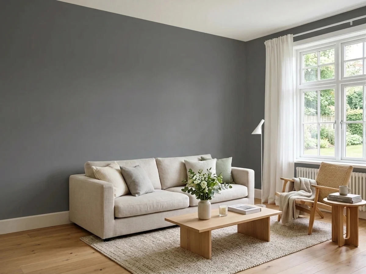
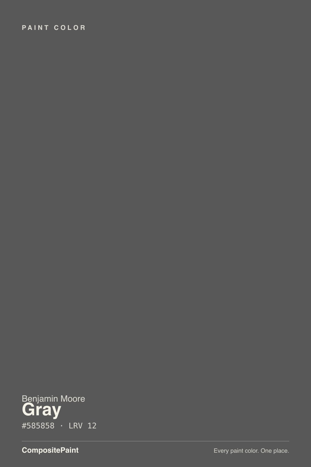
Gray 2121-10 is the rare charcoal with no undertone in the can — red, green, and blue all sit at the same value, so nothing is pulling it warm or cool. On a wall it behaves like a soft black that stays clean instead of going brown or steel-blue. The honest catch is that at LRV 12 it has almost no color of its own, so it borrows: in cool north light and against warm brick, plenty of people see a faint violet-blue that is not on the chip. And never order it by name — say the number 2121-10 or you will get the wrong can.
Studies, dens and media rooms where dark is the point · kitchen islands and built-ins · interior doors and panelling · dark exteriors with white trim
The room is dim, small and north-facing · you need the walls to feel light · your brick or stone is strongly red-orange · you want a warm, cozy charcoal
- Zero saturation — no blue, green, or brown base to manage
- Will not clash with existing counters, tile, or wood floors
- Reads as a clean soft black rather than a muddy near-black
- Excellent on cabinets, islands, doors and built-ins in satin
- One of the safest dark exterior body colors with white trim
- Picks up a violet-blue cast in cool north light
- At LRV 12 it goes near-black in dim or windowless rooms
- Flat sheen makes the wall look like a void instead of a finish
- The name alone gets you the wrong can — you must give 2121-10
What Color Is Gray, Really?
On paper this is as neutral as a paint color gets. The hex is #585858, which means red, green, and blue sit at exactly the same value and the saturation reads zero. Almost nothing else on a deck does that — most charcoals are built on a blue, green, or violet base that only shows up once there are four walls of it. Gray has no base. That is the whole reason people pick it: it will not fight a countertop, a tile, or a wood floor, because it has no opinion to fight with. The honest footnote is that a color with nothing in it also has nothing to defend itself with. At LRV 12 there is barely any color to see, so the wall shows you whatever the room hands it, and in cool daylight a lot of people read a faint violet-blue that is genuinely not in the paint.
LRV 12 means about twelve percent of the light that hits the wall comes back. Put it next to Chelsea Gray HC-168 at LRV 23 and the gap is obvious: Chelsea Gray is a dark gray you still read as gray across the room, while Gray reads as a soft black anywhere the light does not land directly. It is not quite black — Wrought Iron 2124-10 sits at LRV 8 and is a real step darker — but it is much closer to black than most people expect from a chip.
Undertone in one line: none in the can, borrowed on the wall — clean charcoal in sun, faintly violet-blue in cool north light.
Where It Shines
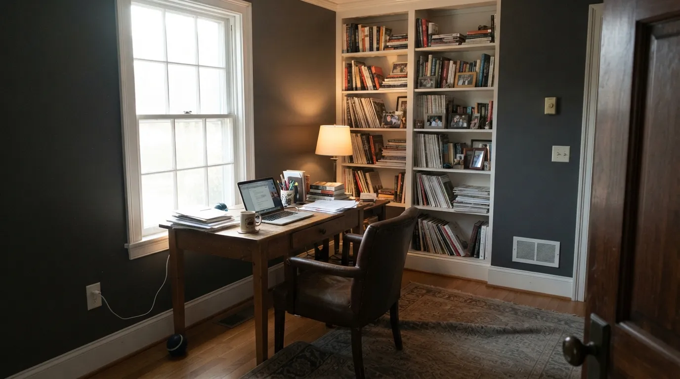
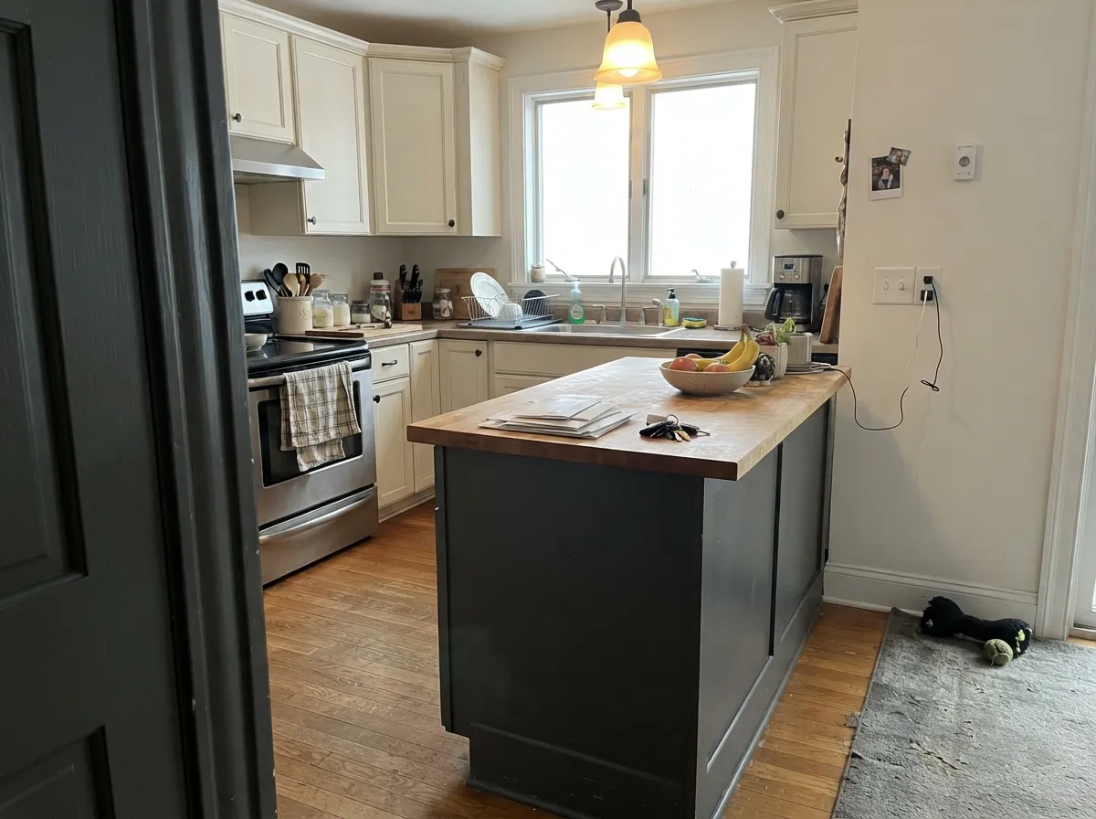
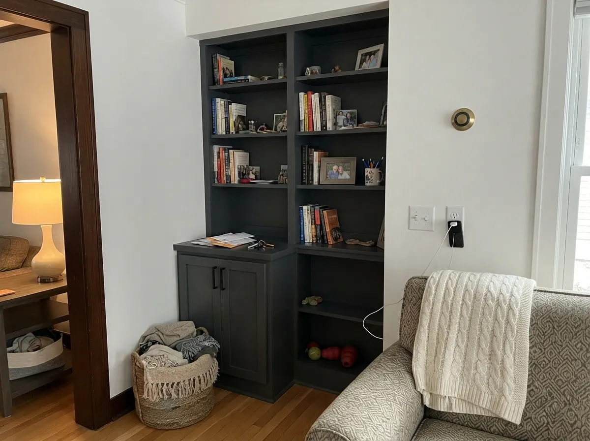
Give it a room where dark is the intention and it is excellent. Studies, dens, media rooms, kitchen islands, built-ins and interior doors all take it well, because at zero saturation it never clashes with the wood, stone, or wall color sitting next to it.
Where It Fails
The bad stories about this color are consistent and all three are predictable from the numbers. If your room matches one, an extra coat will not save it — a different charcoal will.
North light is cool and blue, and a wall with zero color of its own simply reflects it back. That is where the "why does my gray look purple" complaints come from — the chip is neutral, the room is not. If you want a charcoal that stays put in that light, use Kendall Charcoal HC-166, which has enough warm green in it to resist the shift.
At LRV 12 there is nothing to reflect, and a flat sheen kills the last bit of surface interest, so the wall stops looking like a finish and starts looking like a hole. Eggshell or satin plus lamps aimed at the walls fixes most of it. If the room has to feel like a room and not a cave, drop back to Chelsea Gray HC-168 at LRV 21.
Warm masonry pushes a neutral charcoal the opposite way, and the violet-blue cast that is barely visible indoors becomes obvious across a whole facade. Against strong red-orange brick or a brown-toned roof, go warmer with Iron Mountain 2134-30 instead.

Room by Room
The darkness is the point here, and a small room with good task lighting turns into a proper cocoon. Eggshell on the walls, same color on the trim in semi-gloss so the room reads as one solid box. Brass or aged bronze hardware keeps it from going cold.
Low reflectance is a feature when there is a screen on the wall. Use a flat or matte sheen here, the one place flat is right, and put the light on the ceiling or in lamps rather than on the walls.
Satin or semi-gloss so the surface has some life and wipes clean. Under White Dove OC-17 perimeter cabinets it is a classic two-tone kitchen, and with warm quartz or butcher block the violet risk disappears entirely.
One dark wall behind the headboard gives depth without dropping the whole room to LRV 12. Keep the other three walls light — Balboa Mist OC-27 or Pale Oak OC-20 both sit comfortably against it. Whole-room charcoal in a north bedroom is where regret lives.
This is where having no undertone pays. Semi-gloss doors and panelling in Gray will not clash with whatever wall color is beside them, warm or cool. Built-in bookcases in Gray with Chantilly Lace 2121-70 walls is a clean, high-contrast look.
One of the safer dark body colors, low-lustre, with white trim and a black roof. Check it against your brick and stone first — gray brick, cool stone and a charcoal roof are ideal; red-orange brick is the situation to avoid. Expect gradual fading in full sun like any dark exterior.
Your Light Is the Risk
Direct sun gives it enough light to read as a real charcoal, with visible variation across the wall.
Cool blue daylight is all it has to reflect, so it darkens and can tip faintly violet. Sample here first.
Basements, powder rooms, interior hallways: with no daylight it stops being gray and simply reads black.
2700K lamps add a faint brown warmth and soften it. 4000K LEDs keep it hard and cold — change bulbs, not paint.
Most complaints about Gray are a light mismatch. Upload a photo of your actual room and see it on your walls — then ask for the same wall in north light or evening lamps before you buy a single sample.
Need It From Another Brand?
Any paint counter can custom-tint Benjamin Moore 2121-10 directly. If you would rather stay in one brand's own deck, these are the closest stock matches, measured as ΔE2000. Under 2 is a difference you will not see on the wall.
| Brand | Closest color | ΔE | LRV | |
|---|---|---|---|---|
| Sherwin-Williams | PeppercornSW 7674 · Sherwin-Williams | 0.0 | 10 | Color page → |
| Behr | Shadow MountainPPU24-22 · Behr | 0.0 | 10 | Color page → |
| Valspar | Sable Evening5006-2C · Valspar | 3.8 | 9.9 | Color page → |
| PPG / Glidden | Black WidowPPG0997-7 · PPG / Glidden | 2.0 | 10 | Color page → |
| Glidden | Black WidowPPG0997-7 · Glidden | 1.5 | 10 | Color page → |
| Dutch Boy | Ship's Anchor437-6DB · Dutch Boy | 0.0 | 10 | Color page → |
Similar Benjamin Moore Colors
The nearest shades to Gray within Benjamin Moore's own range, ranked by perceptual color distance — useful when you want the same look a touch lighter, darker, or warmer.
WCAG 2.1: AA is 4.5 : 1 for normal text, 3 : 1 for large text, AAA is 7 : 1.
Gray vs the Colors You're Also Considering
Every Gray sample board has the same rivals on it. The numbers show the real lightness gap — then it comes down to which risk you would rather live with.
Pick this when you want the charcoal to stay perfectly neutral against everything already in the room.
Benjamin Moore HC-166 · LRV 13Kendall CharcoalPick this for a warmer, slightly green charcoal that holds its color in north light.
Pick this if you want charcoal that still reads as gray, not as black.
Benjamin Moore 2124-10 · LRV 6Wrought IronPick this for a true soft black on a front door, shutters, or a moody dining room.
Inside the brand, Temptation 1609 at LRV 11 and hex #54585C is the blue-leaning alternative, and Ashwood Moss 1484 at LRV 10 and #565851 leans green. Iron Mountain 2134-30 at LRV 9 and #575553 is darker and slightly warmer. Flint AF-560 shares the LRV of 12 at #565C5E but carries a cool blue-green cast. Gray 2121-10 is the one with nothing in it.
Across brands the matches are unusually exact. Sherwin-Williams Peppercorn SW 7674, Behr Shadow Mountain PPU24-22, Dutch Boy Ship's Anchor 437-6DB, and HGTV Home by Sherwin-Williams Peppercorn HGSW 1491 all sit at hex #585858 with a deltaE of 0, which makes them the same color on paper. Their LRVs are listed at 10 rather than 12, so expect a hair more depth in practice.
Rodda Iron CA207 at 1.01 and Glidden Black Widow PPG0997-7 at 1.5 are visually identical in normal room light. Valspar Sable Evening 5006-2C at 3.79 is close but visibly different side by side.
Gray Coordinating Colors
Because Gray has no undertone of its own, coordinating with it is less about matching and more about deciding which direction you want the room to lean. Pair it with warm neutrals and it warms up; pair it with cool whites and it sharpens. These are the partners that come up again and again:
Gray on Exteriors
Outside is where this color is easiest to love and easiest to get wrong, and the deciding factor is not the paint — it is the masonry. Against gray brick, cool stone, or a black or charcoal roof, a neutral charcoal body is one of the most reliable dark exteriors you can pick. It does not pull brown the way many dark grays do in afternoon sun, and it holds its character from the street all day.
Against strong red or orange brick it is a different story. Warm masonry pushes a neutral charcoal toward violet-blue, and what reads as a barely-there cast on an interior wall becomes obvious across a whole elevation. Walk a large sample around all four sides of the house before you commit, and look at it in the late afternoon when the light is warmest. If the brick wins, Iron Mountain 2134-30 gives you the same depth with enough warmth to sit next to it.
Trim choice matters more outside than in. A clean cool white like Distant Gray OC-68 keeps the whole facade crisp; a creamy white next to a neutral charcoal can look faintly yellowed in full sun.
Gray on Cabinets, Islands and Built-Ins
Millwork is where the missing undertone stops being a liability and becomes the reason to buy. A painted island or a run of built-ins sits directly against countertops, backsplash tile, hardware and flooring you already own, and a charcoal with a blue or green base will argue with at least one of them. This one does not. It is the low-risk answer when the rest of the kitchen is already decided.
Sheen carries the whole job here. Satin is the default for cabinets and islands; semi-gloss on built-ins and interior doors gives the surface enough life that it reads as furniture rather than as a dark rectangle. Flat is a mistake on millwork at this depth — it swallows the profile of the doors and shows every fingerprint. Use a urethane-fortified cabinet enamel, not wall paint, and expect to sand and prime properly, because a dark color over a light factory finish shows every shortcut.
Three Ready Palettes Built on Gray
A color is never alone on the wall. These are complete combinations in the 60-30-10 pattern, with the reason each one holds together. Every one opens in the visualizer.
Chantilly Lace is on the same 2121 strip, so the trim and the walls are literally the same family and the contrast reads deliberate rather than accidental. The warm straw inside the shelves is the ten percent that stops the room from going cold.
Try this palette in your roomWarm greige walls and creamy white cabinets carry most of the room, so the charcoal island is the single dark note instead of the whole mood. Surrounding it with warmth is also the simplest insurance against the violet lean.
Try this palette in your roomA cool, clean white trim keeps the siding crisp where a creamy white would look yellowed against it. The red door is the one warm move that keeps a charcoal house from reading as a shadow from the street.
Try this palette in your roomGray FAQ
Is Gray 2121-10 blue or purple?
Not in the can — the hex is #585858 with zero saturation, so there is no hue in it at all. What people are seeing is reflection: at LRV 12 the wall has no color of its own, so cool north daylight and blue sky through a window read back as a faint violet-blue. In a south room or under warm bulbs the same wall looks like a clean charcoal.
Is it basically black?
Close, but not quite. At LRV 12 it reads as a soft black in shadow and as a true charcoal where light lands directly. Wrought Iron 2124-10 is the actual near-black in the deck. What separates Gray from a black is that it stays clean instead of picking up the brown or blue most near-blacks carry.
Do I really have to give the code at the store?
Yes, every time. Say "2121-10," not "Gray" — Benjamin Moore has dozens of colors with gray in the name and the word alone is not enough for the counter to find it. This is the single most common ordering mistake with this color.
Gray 2121-10 or Kendall Charcoal?
Kendall Charcoal HC-166 is warmer, slightly green, and three LRV points lighter at 15, so it holds its color better in cool light and feels cozier. Gray is the one to pick when you need the charcoal to stay out of the way of a countertop or floor you already own. In a north-facing room, Kendall Charcoal is the safer bet.
What white trim goes with it?
At LRV 12 the contrast is so large that almost any white works, which is one of the real advantages here. Chantilly Lace 2121-70 is the sharpest match and sits on the same color strip. If the room already has warm wood, White Dove OC-17 softens the edge without looking dirty.
Can I use it on kitchen cabinets?
Yes, and it is one of its best uses. Order it in a urethane-fortified cabinet paint in satin or semi-gloss so the surface has some sheen and wipes clean. It works best on an island or the lower run with lighter uppers — full charcoal cabinets in a small kitchen get heavy fast.
Will it work in a small or windowless room?
In a small room with good lighting, yes — the darkness reads as deliberate. In a windowless room it stops being a color and simply reads black. If you go ahead anyway, use eggshell rather than flat and put in wall-washing lamps, not one ceiling fixture.
Have you painted with Gray?
Rate it — one tap helps the next reader decide.
Ask a Question