Golden Straw
The muted honey-wheat yellow that reads like a warm neutral until it's next to white trim, reviewed honestly: where it glows gold, the room that flattens it, and what to pick instead.

Jessica has spec'd whites and neutrals for more than 300 rooms and keeps a sample wall of painted drawdowns in her studio. Every color review is checked against real reader rooms in the comments and re-tested when a formula changes. About the testing process →
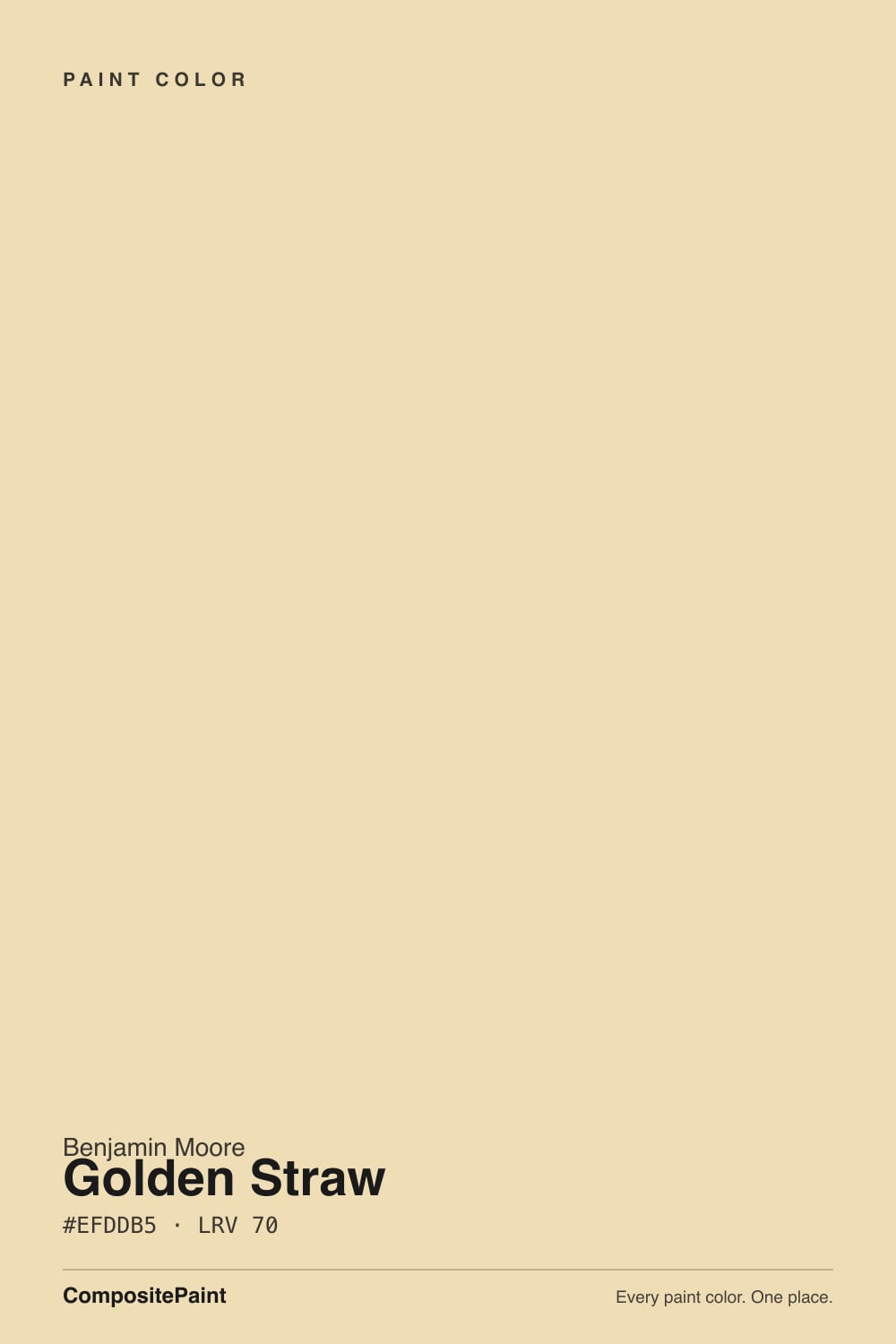
- 1Honey Tea52
- 2Jackfruit62
- 3Golden Straw70
- 4Lemon Chiffon79
- 5Frittata86
The Fast Verdict
Golden Straw is the easiest way into yellow for someone who isn't sure they want yellow. It's built on cream and peach, not a citrus base, so on the wall it reads as a warm, honeyed neutral first and "yellow" second — closer to a wheat field than a lemon. Give it real daylight, warm wood and brass, and it glows without ever tipping into nursery territory. Give it a dim north room and it does the opposite of what you'd expect from a warm color: it goes flatter and more insistently yellow, not calmer.
Sunny kitchens and dining rooms · farmhouse and Colonial homes with warm wood trim · entryways and mudrooms that want a welcome without a bright accent wall · anyone who wants a little gold without committing to a true yellow
Your room faces north and stays dim · you want a true, colorless beige · your counters or floors are cool gray · you're chasing a bright, citrus-lemon yellow look
- Warm honey-wheat with a peach-cream base that reads like a rich neutral, not a committed "yellow accent wall"
- Light enough at LRV 70 to run a whole room, not just one wall
- Flatters oak, walnut, brass and other warm wood tones
- Sold across BM's full line — Regal Select interior and exterior, Advance, Ben — so cabinets, trim and siding can all match
- A gentler, less committed way into yellow than deeper golds like Hawthorne Yellow
- Goes flatter and more insistently yellow-muddy in a dim, north-facing room instead of calming down
- Reads dingy next to a stark, cool-leaning white trim
- Fights cool gray countertops, floors, and brushed-nickel hardware
- No Historical Collection pedigree — far less design-blog documentation than Hawthorne Yellow, so there is less real-world proof to lean on
What Color Is Golden Straw, Really?
Golden Straw is a plain numbered strip color out of Benjamin Moore's huge Color Preview collection — not a Historical Collection headliner like Hawthorne Yellow, which carries its own HC prefix and a design pedigree. That missing pedigree is actually the point: this was mixed to be a workhorse honey-wheat, closer to a warm beige with a gold accent than a color built to announce itself. Benjamin Moore's own copy calls out "subtle notes of cream and peach," and on the wall that peach lean is exactly what keeps it out of butter or lemon territory — it sits in the harvest-wheat, summertime-field part of the yellow family, not the citrus part.
At LRV 70 it carries almost identical reflectance to Hawthorne Yellow (LRV 71), but the two do not read the same on a wall. Golden Straw is visibly less saturated — diluted enough that from across a room, most people call it a warm beige and only clock the gold up close or beside a true neutral. That is its real advantage over deeper golds: it commits to less, so it is far easier to live with if you are not certain you actually want "yellow" on four walls.
Undertone in one line: peach and cream first, straw-gold second — never green, never a clean lemon. If your sample looks flatter and beiger than "gold" promised, that is the peach doing its job in low light; give it real sun and the gold comes forward.
Where It Shines
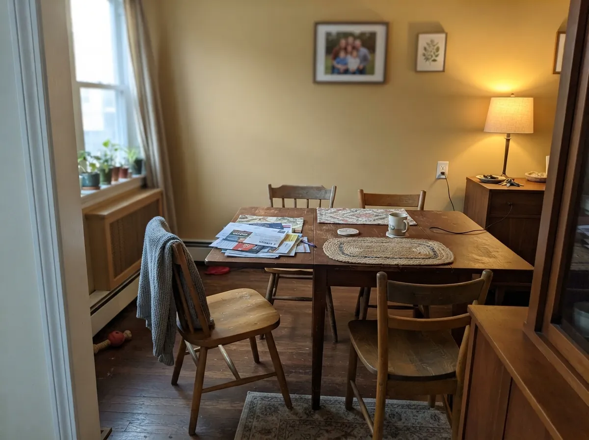
Real daylight is what turns Golden Straw from "a beige with a hint of something" into an honest gold. Benjamin Moore itself points it at kitchens, dining rooms and sunlit living spaces, and that is exactly where reviewers land it — a whole-room color for farmhouse and Colonial interiors with warm wood trim, oak floors and brass hardware. It is light enough at LRV 70 to run walls, cabinets and trim without going dark or heavy, and warm enough that it never needs a bright accent wall to do the work; the whole room can wear it.

Where It Fails
Almost every regret story about Golden Straw comes from one of three predictable mismatches — a room with no real light, a trim color fighting it, or hardware that runs cool. None of them are the paint's fault, but if your room matches one, sample big before you commit.
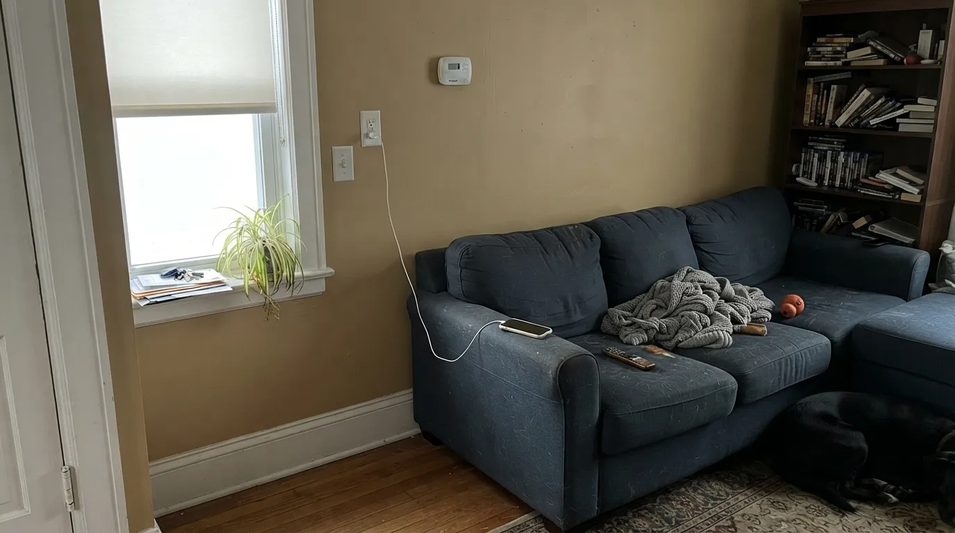
Golden Straw is often recommended as a warm fix for cold north rooms, but real owners report the opposite result: without real sun the peach undertone can't lift the color, and what's left reads flatter and, contrary to expectation, more insistently yellow rather than calmer. One owner described an identical situation — a dark, north-facing living room — as looking "way too yellow." Sample a large board on the actual wall before painting the whole room.
Pair it with an icy, blue-leaning white like Chantilly Lace and the peach undertone suddenly reads muddy by contrast — the same pairing mistake that trips up every warm color next to a cool one. Keep the trim warm (White Dove, Swiss Coffee) or go in knowing the contrast is deliberate.
Cool gray quartz, gray-washed floors and brushed-nickel-heavy kitchens fight Golden Straw's warmth the way they fight every honey-toned yellow: the counters read sallow, the walls read muddier. This color wants warm wood and brass, not cool stone and chrome.
Room by Room
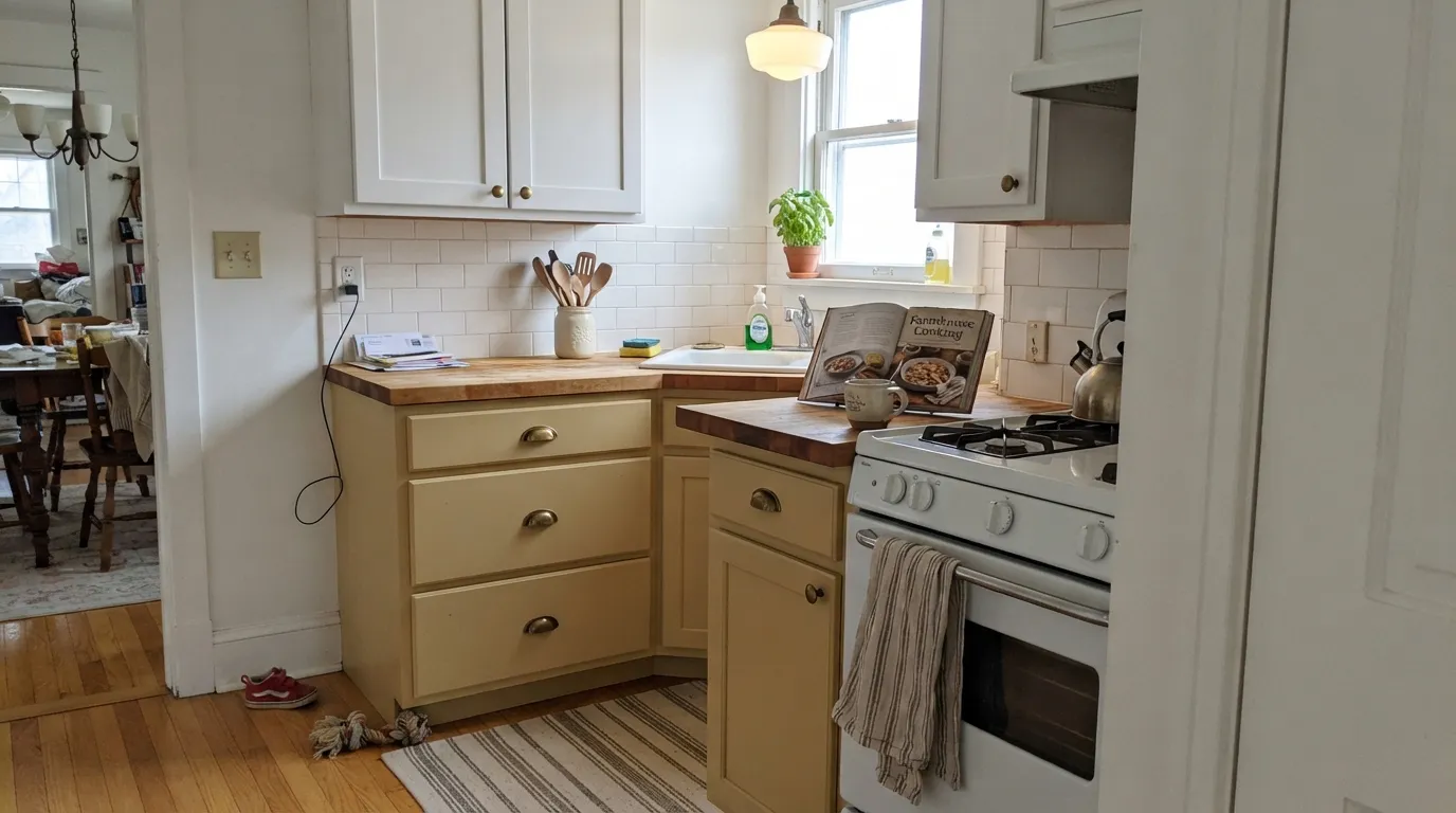
On cabinets or walls, Golden Straw flatters oak, walnut, butcher block and brass the way a good greige never can. Satin on cabinets wipes clean; eggshell on walls keeps the finish soft under overhead light.
Warm and inviting under evening light, especially with cream linens and walnut furniture. It reads sophisticated rather than themed once the room is set with real furniture, not just a swatch.
In a bright, south- or west-facing room it is a genuinely happy neutral-gold. In a dim north room it is the one place this color disappoints — see the fails section above.
At LRV 70 it hides scuffs and boot-season grime better than a pale white, and the peach warmth reads as a deliberate welcome rather than a bright accent-wall stunt.
A small, well-lit powder room takes the full-strength color well; it reads golden and custom rather than overwhelming the way it might across four large walls.
Benjamin Moore sells it in Regal Select Exterior, and it works on farmhouse and cottage cladding paired with dark trim or shutters. It has not built the exterior track record Hawthorne Yellow has, so sample the actual siding before committing a whole house.
Your Light Is the Risk
Full sun brings the gold forward and mutes the peach into a rich honey. This is Golden Straw at its most convincing.
Cool north daylight can't lift the peach undertone. The color goes flatter and more insistently yellow-muddy, not calmer — the opposite of what you'd expect from a "warm" color.
Golden and warm at the sun hours, quieter and creamier at midday. Expect real movement through the day, not a static color.
2700K bulbs push it toward a rich honey-gold. Cool white LEDs flatten it toward a dull beige — keep the bulbs warm.
Most complaints about Golden Straw are a light mismatch. Upload a photo of your actual room and see it on your walls — then ask for the same wall in north light or evening lamps before you buy a single sample.
Need It From Another Brand?
Any paint counter can custom-tint Benjamin Moore 2152-50 directly. If you would rather stay in one brand's own deck, these are the closest stock matches, measured as ΔE2000. Under 2 is a difference you will not see on the wall.
| Brand | Closest color | ΔE | LRV | |
|---|---|---|---|---|
| Sherwin-Williams | HoneypotSW 9663 · Sherwin-Williams | 2.1 | 75 | Color page → |
| Behr | CallaPPU6-12 · Behr | 0.6 | 75 | Color page → |
| Valspar | Subtle GlowV055-1 · Valspar | 0.6 | 74.3 | Color page → |
| PPG / Glidden | Limitless1091-3 · PPG / Glidden | 1.1 | 74 | Color page → |
| Glidden | LimitlessPPG1091-3 · Glidden | 1.1 | 74 | Color page → |
| Dutch Boy | Tater Chip221-2DB · Dutch Boy | 3.0 | 74 | Color page → |
Similar Benjamin Moore Colors
The nearest shades to Golden Straw within Benjamin Moore's own range, ranked by perceptual color distance — useful when you want the same look a touch lighter, darker, or warmer.
WCAG 2.1: AA is 4.5 : 1 for normal text, 3 : 1 for large text, AAA is 7 : 1.
Golden Straw vs the Colors You're Also Considering
Every Golden Straw sample board has the same rivals on it. The numbers show the real lightness gap — then it comes down to which risk you would rather live with.
Pick this for the quieter, more neutral-reading version — easier to live with if you're not sure you want "yellow."
Benjamin Moore HC-4 · LRV 71Hawthorne YellowPick this if you want more presence — Hawthorne is the deeper, more confidently mustard-gold version of the same idea.
Pick this for the warmer, more golden-wheat lean — Banana Cream can read chalkier in the same light.
Benjamin Moore 275 · LRV 71Banana CreamPick this for a cooler, paler yellow that leans a touch more butter than peach.
Golden Straw Coordinating Colors
The rule for coordinating with Golden Straw is the same as for any warm yellow: stay on the warm side of the fence for whites, and reach for its true complement — blue — when you want real contrast. It pairs beautifully with warm woods, brass, cream trim and one grounding dark note. These are the partners that keep showing up in rooms that work:
Golden Straw vs. Hawthorne Yellow: Picking the Right BM Gold
Benjamin Moore's deck has two honey-golds sitting almost on top of each other in LRV: Golden Straw at 70 and Hawthorne Yellow at 71. The reflectance is nearly identical; the saturation is not. Hawthorne Yellow carries the Historical Collection's HC prefix and a design-world track record — it's the yellow interior designers name-drop. Golden Straw is a plain numbered strip color from the much larger Color Preview collection, with a far smaller footprint of design-blog coverage and real-room photos to lean on.
That trade-off cuts both ways. Hawthorne Yellow is the safer bet if you want proof it works — more rooms, more before-and-afters, more confidence it will behave the way you expect. Golden Straw is the safer bet if your actual worry is committing to too much yellow: it is quieter on the wall than Hawthorne, easier to mistake for a warm beige, and easier to walk back with a coat of White Dove if it doesn't work out.
Golden Straw With Wood Tones and Floors
This color was built to sit next to warm wood. Oak, walnut, butcher block and cedar all meet Golden Straw's peach-cream warmth halfway, and honey-toned oak floors — which fight cooler whites and grays — actually look intentional next to it instead of accidental.
The pairing that needs a sample first is anything cool: gray-washed floors, cool gray quartz counters, brushed-nickel fixtures. None of them are a hard no, but all three pull against the color's warmth and can leave both the floor and the wall looking slightly off. Warm metals — brass, bronze, matte black — are the easy, reliable choice.
Three Ready Palettes Built on Golden Straw
A color is never alone on the wall. These are complete combinations in the 60-30-10 pattern, with the reason each one holds together. Every one opens in the visualizer.
Navy is gold's real complement on the color wheel, so the island reads as genuine contrast rather than clutter; White Dove keeps the rest of the room soft and warm so the cabinets never feel like a bright accent wall.
Try this palette in your roomCream trim keeps the wheat-gold from tipping toward citrus, and the leather-brown wainscot grounds a color that can otherwise feel like it's floating on its own.
Try this palette in your roomA true-neutral hallway lets a small golden entry or powder room feel like a deliberate reveal instead of a mismatch, and Wrought Iron gives the whole approach one grounding dark note.
Try this palette in your roomGolden Straw FAQ
Is Golden Straw a yellow or a neutral?
Technically a yellow — Benjamin Moore files it in the yellow family — but its peach-cream base is diluted enough that most people read it as a warm beige from across a room and only notice the gold up close or beside a true white. That's its main appeal over a stronger yellow.
What's the difference between Golden Straw and Hawthorne Yellow?
Both sit at nearly the same LRV (70 vs 71), but Golden Straw is visibly less saturated — a quieter, more diluted wheat next to Hawthorne's more confident mustard-gold. Hawthorne also carries Benjamin Moore's Historical Collection pedigree; Golden Straw is a plain numbered strip color with a lower profile and less design-blog documentation.
What trim goes with Golden Straw walls?
A warm white — White Dove or Swiss Coffee. A stark, cool-leaning white like Chantilly Lace makes the walls look dingy by contrast; keep the trim on the same warm side of the fence.
Does it work in a north-facing room?
Proceed carefully. Without real daylight the peach undertone can't lift the color, and it tends to go flatter and more yellow-muddy rather than calmer — the opposite of what a "warm color fixes cold rooms" assumption predicts. Sample a large board on the actual wall before committing.
Is Golden Straw good for kitchen cabinets?
Yes, especially with warm wood floors, butcher block and brass hardware. It struggles next to cool gray quartz and brushed nickel — the same pairing mistake that trips up most warm yellows in a kitchen.
Does Golden Straw work on exteriors?
Yes — Benjamin Moore sells it in Regal Select Exterior, and it suits farmhouse and cottage cladding paired with dark trim or shutters. It doesn't have the exterior track record of a color like Hawthorne Yellow, so sample the actual siding in real sun before painting the whole house.
Have you painted with Golden Straw?
Rate it — one tap helps the next reader decide.
Ask a Question