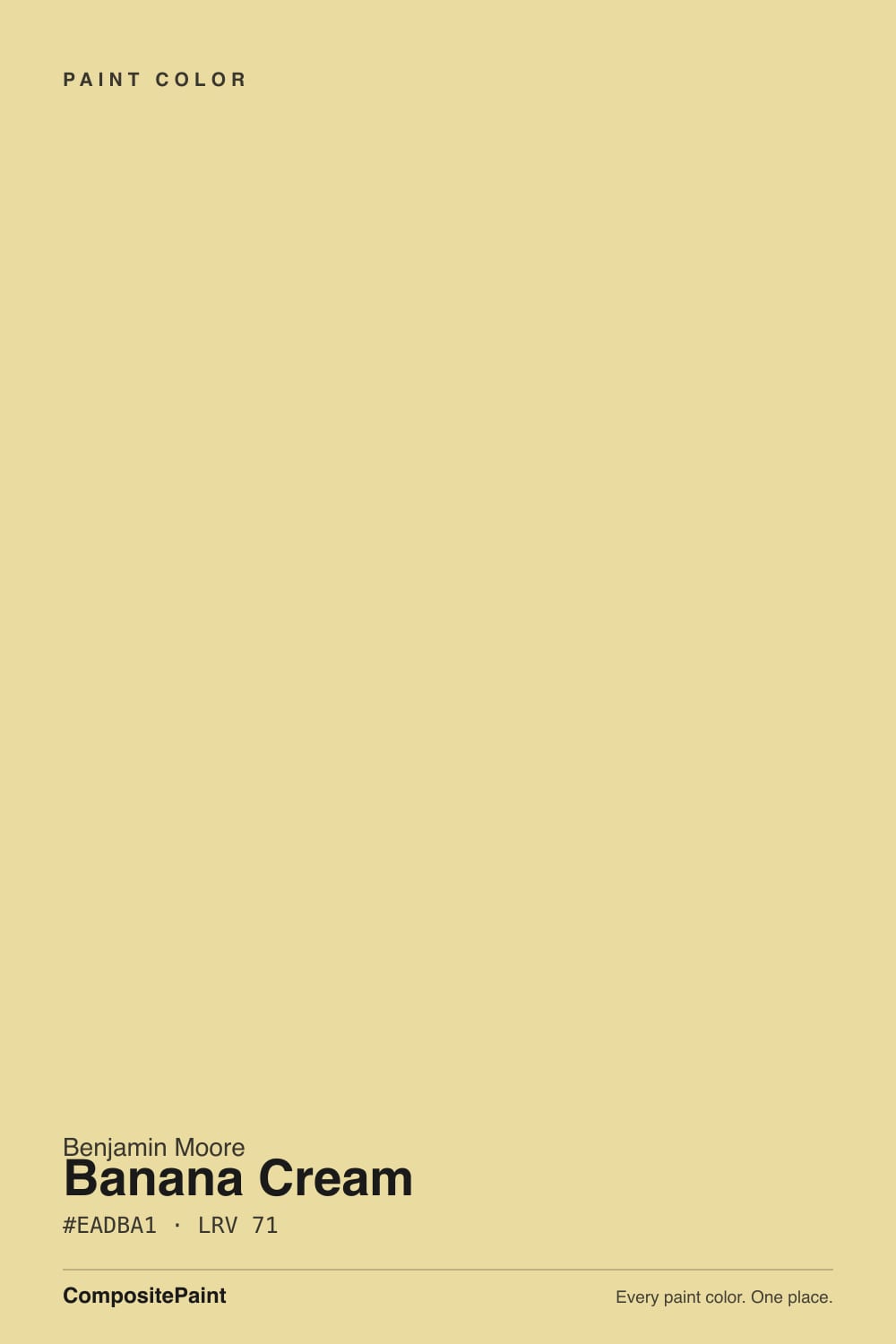
Banana Cream
The soft yellow people buy expecting a cream, reviewed honestly: where it glows, the exact light that turns it green, and what to pick instead.

Jessica has spec'd whites and neutrals for more than 300 rooms and keeps a sample wall of painted drawdowns in her studio. Every color review is checked against real reader rooms in the comments and re-tested when a formula changes. About the testing process →
- 1Honey Tea52
- 2Jackfruit62
- 3Banana Cream71
- 4Lemon Chiffon79
- 5Frittata86
The Fast Verdict
Banana Cream is a real yellow with the volume turned down. There is gray mixed into it, and that gray is what keeps it from going neon on four walls the way most fan-deck yellows do. In morning light it is genuinely lovely — a clean, soft sun-yellow that makes a windowless laundry room feel like it has a window. Two things will spoil it: a 5000K LED shop light, which drags it toward green, and buying it expecting an off-white cream. It is not a cream. It is yellow, and everyone who walks in will call it yellow.
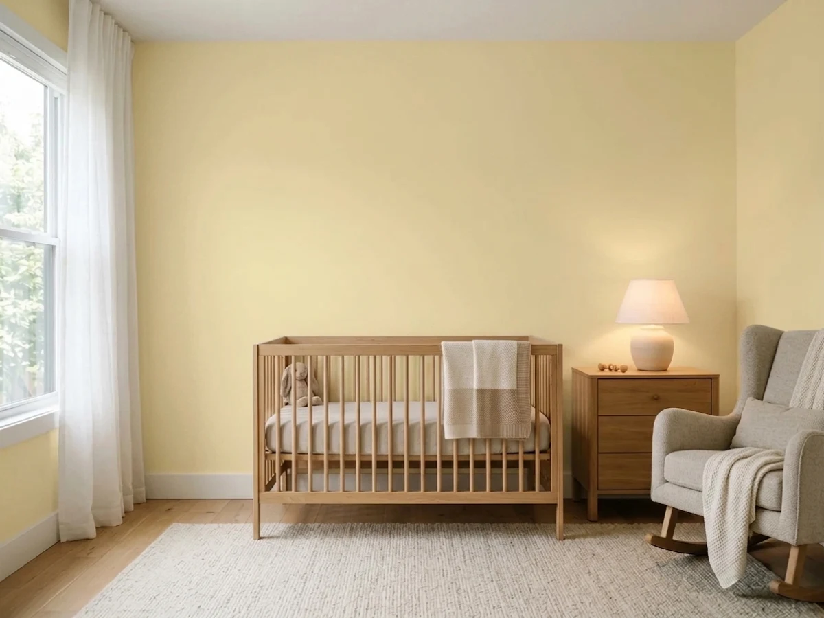
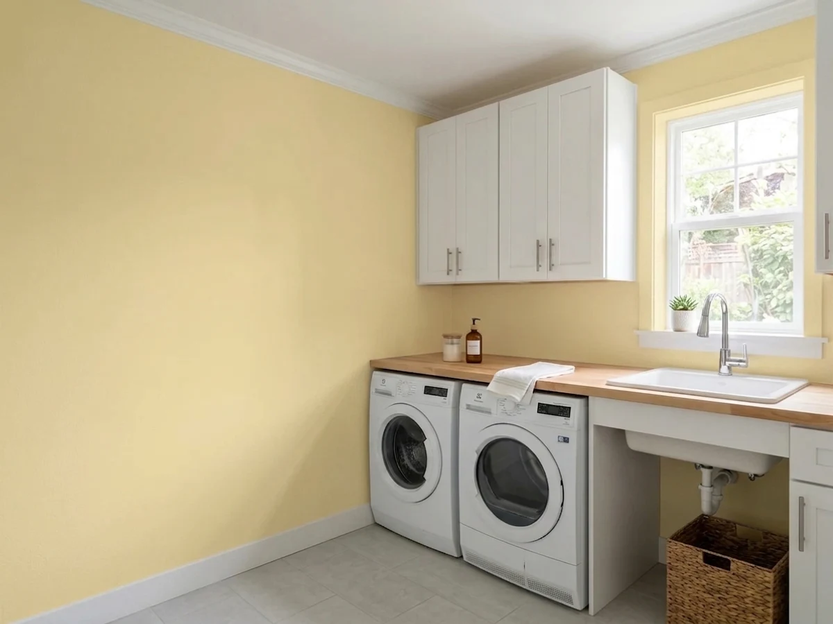
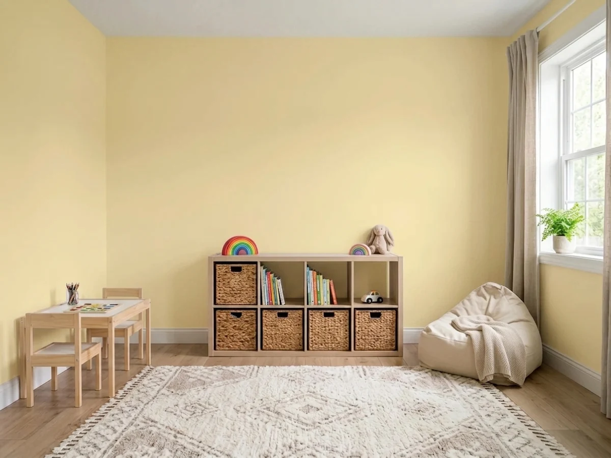
Laundry rooms and mudrooms that need daylight they do not have · kitchen walls above white cabinets · nurseries, kids' rooms and playrooms · breakfast nooks and dining rooms lit by warm bulbs
Your only light is a 5000K shop LED · your cabinets or floors are honey oak · you actually wanted a cream off-white · the room already takes blazing south sun all afternoon
- Real yellow cheer without the highlighter glare
- Makes windowless laundry rooms and mudrooms feel daylit
- Grayed enough to sit next to white cabinets without shouting
- Easy nursery and playroom color that nobody outgrows in a year
- A decades-old Classics color, not a trend that will date
- Named like a cream, behaves like a yellow — the top complaint
- Cool 5000K LEDs drag it toward olive green
- Disappears into honey oak, golden beige and orange-stained trim
- Bounces yellow onto white ceilings and trim in strong sun
What Color Is Banana Cream, Really?
A light yellow with gray worked into it — and the gray is the entire reason this color survived in the deck for decades while the pure yellows next to it got repainted. Benjamin Moore files it in the Classics collection, which is the tell: it predates every butter-yellow trend cycle it has ridden. Strip the gray out and you get the crayon yellows on the same fan page, the ones that look charming on a chip and turn a room into a highlighter. Banana Cream keeps the cheerfulness and drops most of the glare.
At LRV 71 it is light, and light matters more than usual here — a yellow this reflective bounces its own color onto everything nearby. White ceilings pick up a faint warm cast, white trim looks slightly creamier, and in strong sun the whole room takes on a golden glow. That is a feature in a dim laundry room and a problem in a bright south-facing one. LRV 71 also means it is not white territory, no matter what the name promises: it sits closer to Hawthorne Yellow (LRV 71) than to any cream in the deck.
Undertone in one line: yellow with a faint green lean, and no orange in it at all. If your sample reads gold or honey, that is warm bulbs or afternoon sun doing it. If it reads pea-soup or chartreuse, that is a cool low-quality LED — the single most common thing that goes wrong with this color, and the cheapest to fix.
Where It Shines
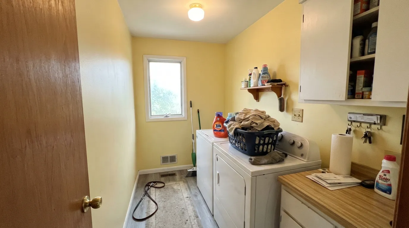
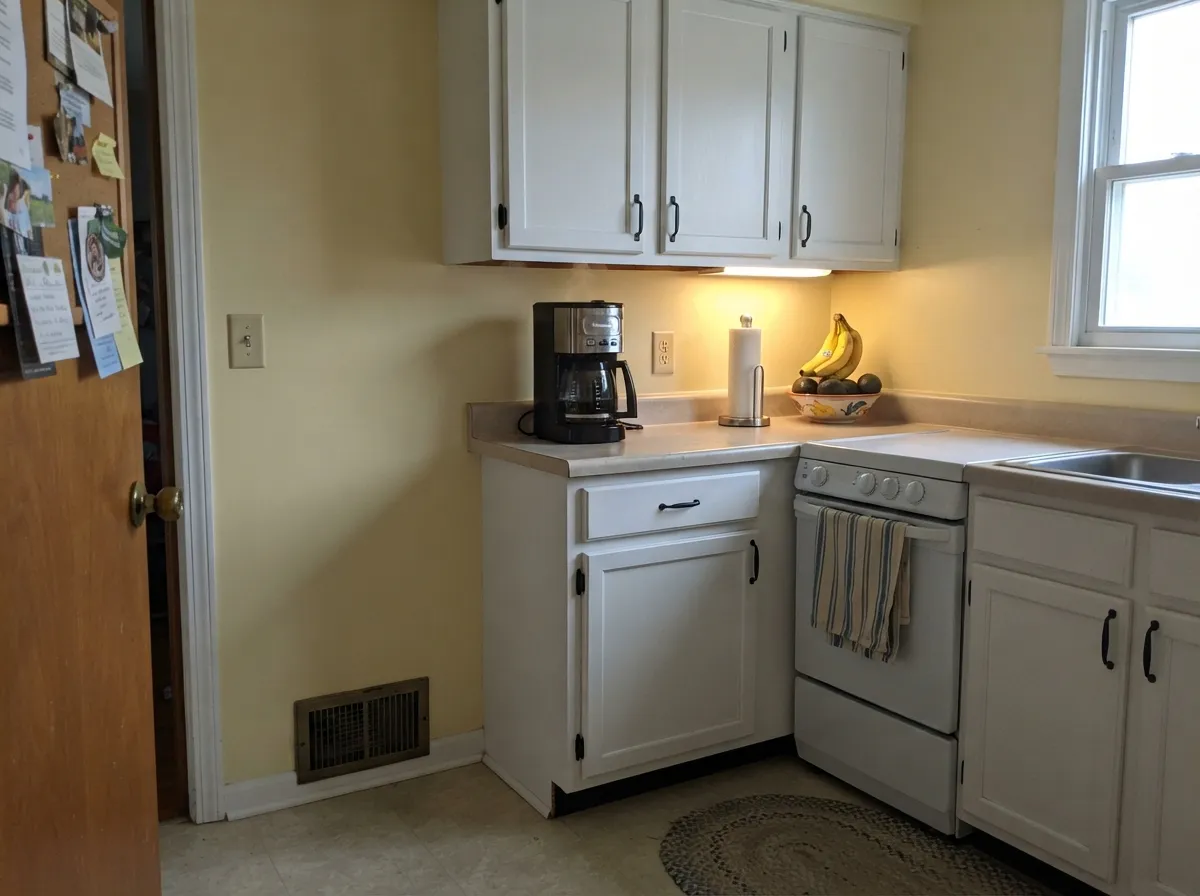
This color earns its keep in the rooms nobody photographs. A laundry room with one small window, a mudroom at the back of the house, a windowless hall closet turned into a folding station — Banana Cream gives those rooms the daylight they were built without, and the gray in it keeps the effect warm instead of loud. Its second home is anywhere a family actually gathers: kitchen walls above white cabinets, a breakfast nook, a playroom. Give it warm bulbs, white or off-white trim, and one deep color to push against — navy, dark green, black hardware — and it stops reading as a color choice and starts reading as sunshine.
Where It Fails
The complaints about Banana Cream are remarkably consistent, and every one of them is predictable before you open the can. None are the paint's fault. But if your room fits one of these, this is the wrong yellow, and a bigger sample will only tell you sooner.
The name does a lot of damage. Buyers read "cream" and picture a warm off-white, then paint four walls and get a room that is unmistakably yellow — because yellow multiplies at scale more than any other family. A two-inch chip shows you the color; 400 square feet shows you the color plus every bounce of it off the ceiling. If you wanted an off-white with a hint of sun, you wanted BM Cream or a warm white, not this.
This is the laundry-room and basement failure, and it is the reason for most of the bad photos. Yellow with a faint green lean has nothing to hold onto under a 5000K bulb: the cool light cancels the warmth and what survives reads olive, or what readers politely call pea soup. Cheap high-Kelvin LEDs with poor color rendering are the worst offenders. Fix the bulbs before you fix the paint — 2700K to 3000K and a decent CRI rating puts the yellow right back.
Golden oak cabinets, orange-stained trim, yellow-beige tile — all of it sits in the same warm-yellow lane as this paint, and the room flattens into one tan smear with no edges. The walls do not read cheerful, they read dated. Banana Cream needs contrast to work: white or off-white cabinets, white oak, walnut, gray floors, black hardware. With honey oak staying put, pick a soft green or blue and let the wood be the warm thing in the room.
Room by Room
The classic use, and the one it is genuinely good at. Laundry rooms are small, often windowless, and full of white appliances that make a gray wall look institutional; a soft yellow makes the same room feel bright at 7am. Satin sheen so splashes wipe off. The one non-negotiable: warm bulbs. A cool overhead LED is exactly what turns this color green.
Same logic, more abuse. These rooms take wet coats, boots and dog traffic, so run satin on the walls and semi-gloss on the bench and hooks. Yellow hides the dust that shows on a dark wall and reads welcoming at the door people actually use.
Yellow kitchen walls above white or off-white cabinets is a durable look, not a trend. What does not work is yellow walls plus wood-toned cabinets in the same warm family. Keep the cabinets white, add one dark note — a navy island, black hardware — and the yellow stops competing and starts glowing.
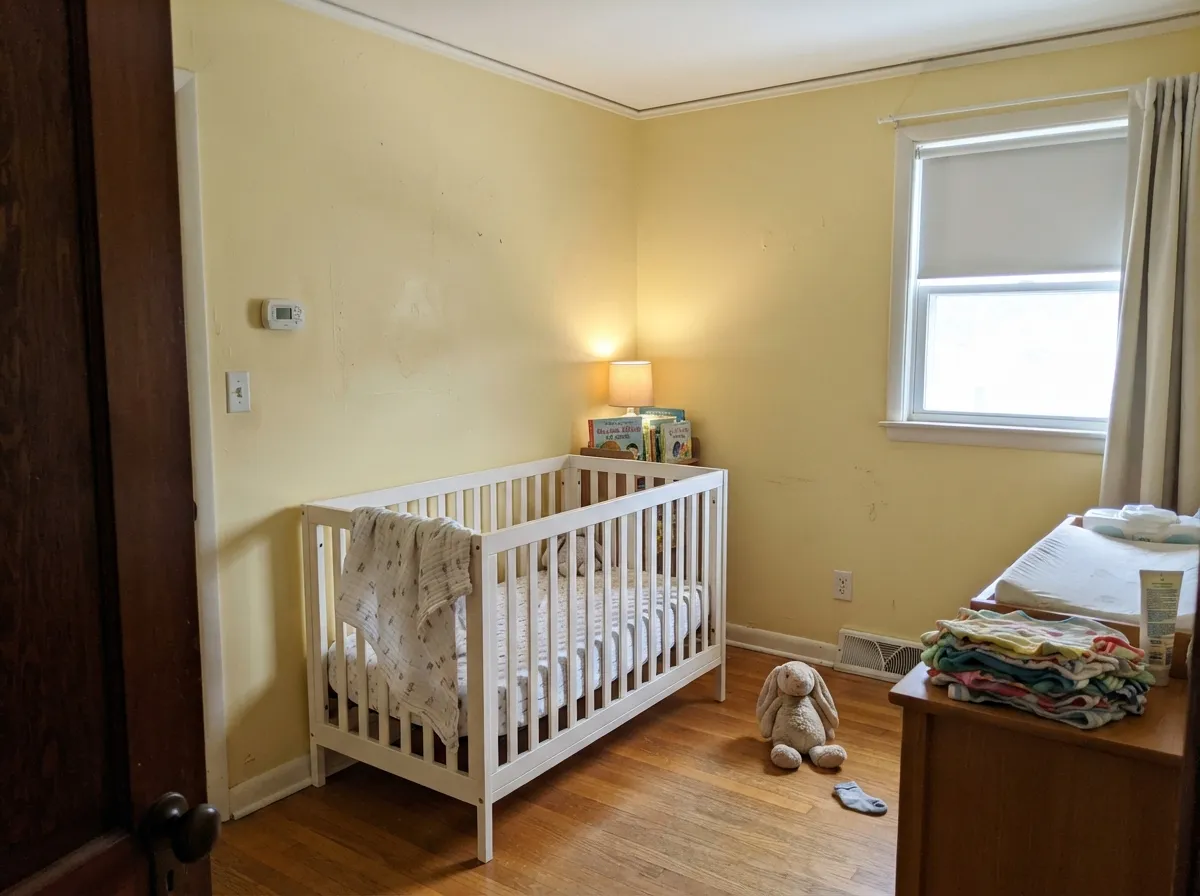
Probably the easiest yellow in the deck for a child's room: cheerful without the hyperactive edge of a saturated yellow, and neutral enough that nobody has to decide anything before the baby arrives. Eggshell for wipeability. Pair with a soft blue-green rather than another warm color.
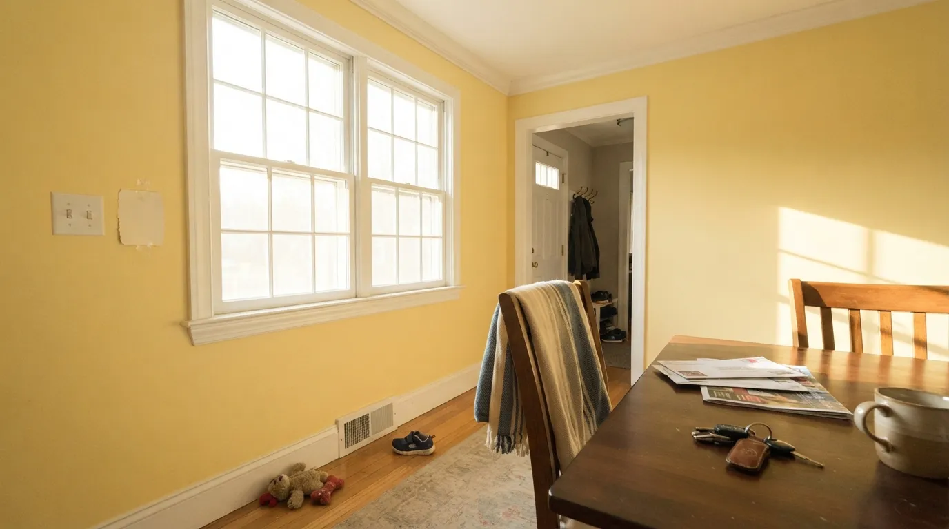
Under 2700K bulbs and a real chandelier it turns golden and flattering at dinner, which is the whole argument for a yellow dining room. Under recessed cool cans it goes flat and slightly green. This room lives or dies by its fixtures, not its paint.
Benjamin Moore does not recommend this one outdoors and that is the right call. Full sun pushes it toward a bleached, institutional yellow and there is no gray in the world that survives midday sun at that LRV. For a yellow house exterior, start with a deeper historic gold instead.
Your Light Is the Risk
Clean, soft and genuinely sunny — the version of this color people fall for. Morning light in a kitchen or laundry is where it is at its best.
Blazing south or west sun saturates it into full banana and bounces yellow onto the ceiling and trim. In a bright room, go a step paler.
Cool north daylight mutes it to a soft grayed straw — one of the few colors that gives a north room warmth back rather than losing to it. It then deepens toward gold as the sun swings west.
2700K bulbs turn it honey-warm and cozy. Cool 4000K-plus LEDs, especially cheap low-CRI ones, drain the warmth and leave a greenish cast. Bulbs are part of this paint job.
Most complaints about Banana Cream are a light mismatch. Upload a photo of your actual room and see it on your walls — then ask for the same wall in north light or evening lamps before you buy a single sample.
Need It From Another Brand?
Any paint counter can custom-tint Benjamin Moore 275 directly. If you would rather stay in one brand's own deck, these are the closest stock matches, measured as ΔE2000. Under 2 is a difference you will not see on the wall.
| Brand | Closest color | ΔE | LRV | |
|---|---|---|---|---|
| Sherwin-Williams | Butter UpSW 6681 · Sherwin-Williams | 3.3 | 74 | Color page → |
| Behr | FlourishP330-3A · Behr | 1.3 | 71 | Color page → |
| Valspar | Tomatillo8001-26C · Valspar | 1.6 | 71 | Color page → |
| PPG / Glidden | DemeterPPG1107-4 · PPG / Glidden | 0.7 | 70 | Color page → |
| Glidden | DemeterPPG1107-4 · Glidden | 1.0 | 70 | Color page → |
| Dutch Boy | Trinket Gold120-2DB · Dutch Boy | 2.6 | 71 | Color page → |
Similar Benjamin Moore Colors
The nearest shades to Banana Cream within Benjamin Moore's own range, ranked by perceptual color distance — useful when you want the same look a touch lighter, darker, or warmer.
WCAG 2.1: AA is 4.5 : 1 for normal text, 3 : 1 for large text, AAA is 7 : 1.
Banana Cream vs the Colors You're Also Considering
Every Banana Cream sample board has the same rivals on it. The numbers show the real lightness gap — then it comes down to which risk you would rather live with.
Pick this when you want the yellow cleaner and less golden, especially against white cabinets.
Benjamin Moore HC-4 · LRV 71Hawthorne YellowPick this for the historic, goldier version — same lightness at LRV 71, but noticeably warmer and more traditional.
Pick this when you want a yellow that still holds its color all the way around the room.
Sherwin-Williams SW 6686 · LRV 79Lemon ChiffonPick this for a lighter, cheerier yellow that is happiest on one wall rather than four.
Banana Cream Coordinating Colors
The rule for coordinating with a soft yellow is contrast, not company. Anything else warm and yellow-based will blend into it and flatten the room; what it needs is a soft warm white to frame it, one deep color to push against, and a cool-leaning green or blue to keep the scheme from going one-note. These are the partners that keep showing up in rooms that work:
The Butter-Yellow Revival, and Why an Old Classic Beat the New Ones
Yellow spent the entire gray decade sitting untouched in the fan deck. Then butter yellow arrived as the softest warm trend in years, every brand cut a version of it, and suddenly a family nobody had asked for since the early 2000s was back on kitchen walls. Behr's Butter Yellow is the pale, whisper-quiet take on it — so light it nearly reads as a white. Banana Cream is what people reach for when that turns out to be too subtle to see.
Here is why the old Classics color holds up better than most of the new ones: it was never designed to be a trend. It carries enough gray to read as a settled, lived-in yellow rather than a fashionable one, and it has been mixed continuously for decades, which means it does not carry the timestamp a 2025-launch color does. If the butter moment passes, a grayed yellow in a laundry room or a nursery ages the way a warm neutral does — quietly.
Banana Cream With Wood Tones, Floors and Appliances
The floor and the cabinets decide this one, not the paint chip. White oak, pale unstained wood and gray LVP — the standard laundry and mudroom floor — are excellent, because the cool floor gives the yellow something to sit against. Walnut and espresso are the best of all: dark brown makes the yellow look deliberate and expensive rather than default. Cream carpet is fine, gray carpet is fine, and white tile is fine.
The genuine no is golden: honey oak cabinets, orange-stained trim and yellow-beige tile all live in the same lane as this color, so the contrast collapses and the room reads dated rather than sunny. No number of coats fixes it, because nothing is wrong with the paint — there is simply no edge anywhere in the room. Put in a large rug, repaint the cabinets, or choose a soft green instead.
Appliances and metals are the easy part. White appliances, stainless and black all sit comfortably against it; black hardware and matte black fixtures give the crisp outline the color likes best, and brass leans it warmer and more traditional. Polished chrome reads clean and neutral next to it, which is exactly what a laundry room wants.
Three Ready Palettes Built on Banana Cream
A color is never alone on the wall. These are complete combinations in the 60-30-10 pattern, with the reason each one holds together. Every one opens in the visualizer.
Soft yellow and navy is the pairing that never gets old, and a laundry room is small enough to take the contrast without tiring anyone out. White Dove is the right white here because it is warm — a bright builder white next to yellow makes the walls look slightly dirty, and this one meets the yellow halfway instead.
Try this palette in your roomCloud White cabinets keep the yellow from having to carry the whole room, and Pewter Green on an island is doing exactly what that color is best at — deep, muted green on cabinetry rather than on four dim walls. Green sits close enough to yellow to feel related and dark enough to give the eye somewhere to rest.
Try this palette in your roomSwiss Coffee is soft enough that the trim never cuts a hard white line against the yellow, which matters in a room meant to feel gentle. Palladian Blue is the cooling partner — it leans green, and that green is what makes it read as a companion to the yellow rather than a contradiction.
Try this palette in your roomBanana Cream FAQ
Is Banana Cream too yellow for a whole room?
In a small room, no — a laundry room, mudroom, powder-sized space or nook takes it easily. In a large, bright, south-facing room, probably yes: at LRV 71 it bounces its own color around, and four big sunlit walls turn the whole room golden. The honest test is a large sample board propped against the wall you actually worry about, checked at 4pm.
What trim white goes with Banana Cream?
A soft warm white. White Dove and Swiss Coffee both work, and both keep the edge between wall and trim gentle. A stark bright white makes the yellow look heavier and slightly dingy by comparison, which is the same mistake people make pairing bright trim with warm walls anywhere else in the house. Semi-gloss on the trim, eggshell or satin on the walls.
Will it look green in my laundry room?
Only if your bulbs make it. Yellow with a faint green lean has no defense against a 5000K LED with poor color rendering — the warmth gets cancelled and olive is what is left. Swap to 2700K or 3000K bulbs with a decent CRI and the color comes back immediately. Test the bulb before you blame the paint.
Is Banana Cream good for a nursery?
It is one of the better choices. It is cheerful without the wired edge of a saturated yellow, it works for any baby, and it is soft enough that it will still look right when the crib becomes a bed. Use eggshell so wall wipes do not burnish the finish, and pair it with a soft blue-green rather than another warm color.
Banana Cream or Hawthorne Yellow?
They sit at the same lightness — both LRV 71 in our deck — so the choice is temperature, not brightness. Hawthorne Yellow is the goldier, more historic one; it looks at home in older houses and with warm wood. Banana Cream is the cleaner, slightly greener yellow, and it does better against white cabinets and cool gray floors. Sample both side by side, because on a chip they look far more alike than they do on a wall.
Does it work with honey oak cabinets?
This is its worst pairing. Golden oak and this yellow sit in the same warm lane, so the room loses all contrast and reads as one flat tan wash — the exact look people repaint to escape. If the oak is staying, a soft sage or a muted blue gives you the contrast the room needs. Banana Cream wants white cabinets, white oak, walnut or gray floors around it.
Have you painted with Banana Cream?
Rate it — one tap helps the next reader decide.
Ask a Question