Honey Tea
A honey-gold amber reviewed honestly: the rooms where it glows like the drink it's named for, the exact light that turns it dull, and what to pick instead.

Jessica has spec'd whites and neutrals for more than 300 rooms and keeps a sample wall of painted drawdowns in her studio. Every color review is checked against real reader rooms in the comments and re-tested when a formula changes. About the testing process →
- 1Peristyle Brass30
- 2Chilled Wine41
- 3Honey Tea52
- 4Jackfruit62
- 5Lemon Chiffon79
The Fast Verdict
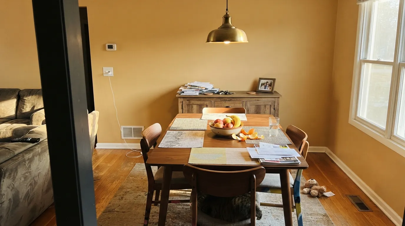
Honey Tea is a genuine amber-gold, not a beige wearing a cute name — a soft ochre undertone that sits closer to tea-stained wood than to butter yellow. At LRV 52 it is a real mid-depth color: it holds its warmth in daylight and turns richer, almost glowing, under an evening lamp. It is not a whole-house neutral. It is a dining room, a den, an island — a color you choose on purpose, in a room built to use it.
Dining rooms and living rooms with real daylight · a kitchen island or lower cabinets under white walls · home offices and dens meant for evening use · a front door on a light-colored house
Your floors, trim and cabinets are already honey oak · the room runs on cool white LEDs with little daylight · you want a true beige with no visible yellow · you're building a cool, modern gray palette
- A genuine warm honey-gold — reads as real color, not a flat beige
- Turns rich and glowing under evening lamp light
- Deep enough (LRV 52) to hold its color in daylight instead of washing out
- Flatters walnut, brass, leather and warm wood furniture
- Works as a single-surface color (island, door, accent wall) without a whole-room commitment
- Reads flat and dated next to wall-to-wall honey oak floors and trim
- Cool white LEDs push it toward dull mustard instead of honey
- Not a true beige — buyers expecting "just a warm neutral" get visible yellow
- A bigger commitment as a full exterior color than most Behr golds
What Color Is Honey Tea, Really?
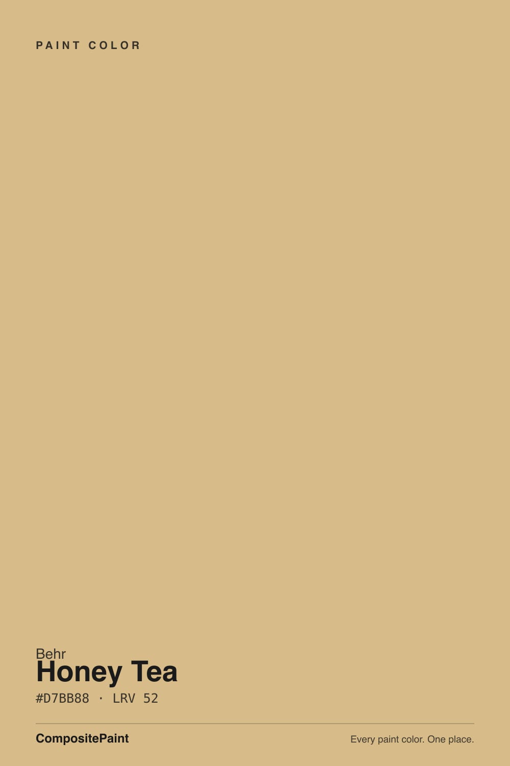
A warm amber-gold with a soft ochre undertone — the kind of color that reads as tea steeped a shade too long, not lemonade. Behr files it in its yellow family, and on the wall that classification is honest: this is not a beige with a warm cast, it is a color with beige's manners. The undertone stays amber and earthy rather than lemon-bright, which is what keeps it from feeling like a kids'-room yellow even at real depth.
At LRV 52 it sits at genuine mid-tone — noticeably deeper than the pale butter and lemon-chiffon shades in Behr's own yellow lineup, and far short of a pastel wash. That depth is the whole personality: a paler gold like Benjamin Moore's Hawthorne Yellow (LRV 71) can wash out in a bright room, but Honey Tea holds its color at midday and then deepens further once the sun drops and a lamp takes over. It is close in both hex and LRV to Farrow & Ball's Hay (LRV 50) — proof this exact depth of amber has a following well beyond one brand's paint deck.
Undertone in one line: amber and soft ochre, always warm, never leaning pink or green. If a sample looks dull or brownish-olive on the wall, that is cool daylight or a cool-white bulb draining it — not a flaw in the paint.
Where It Shines
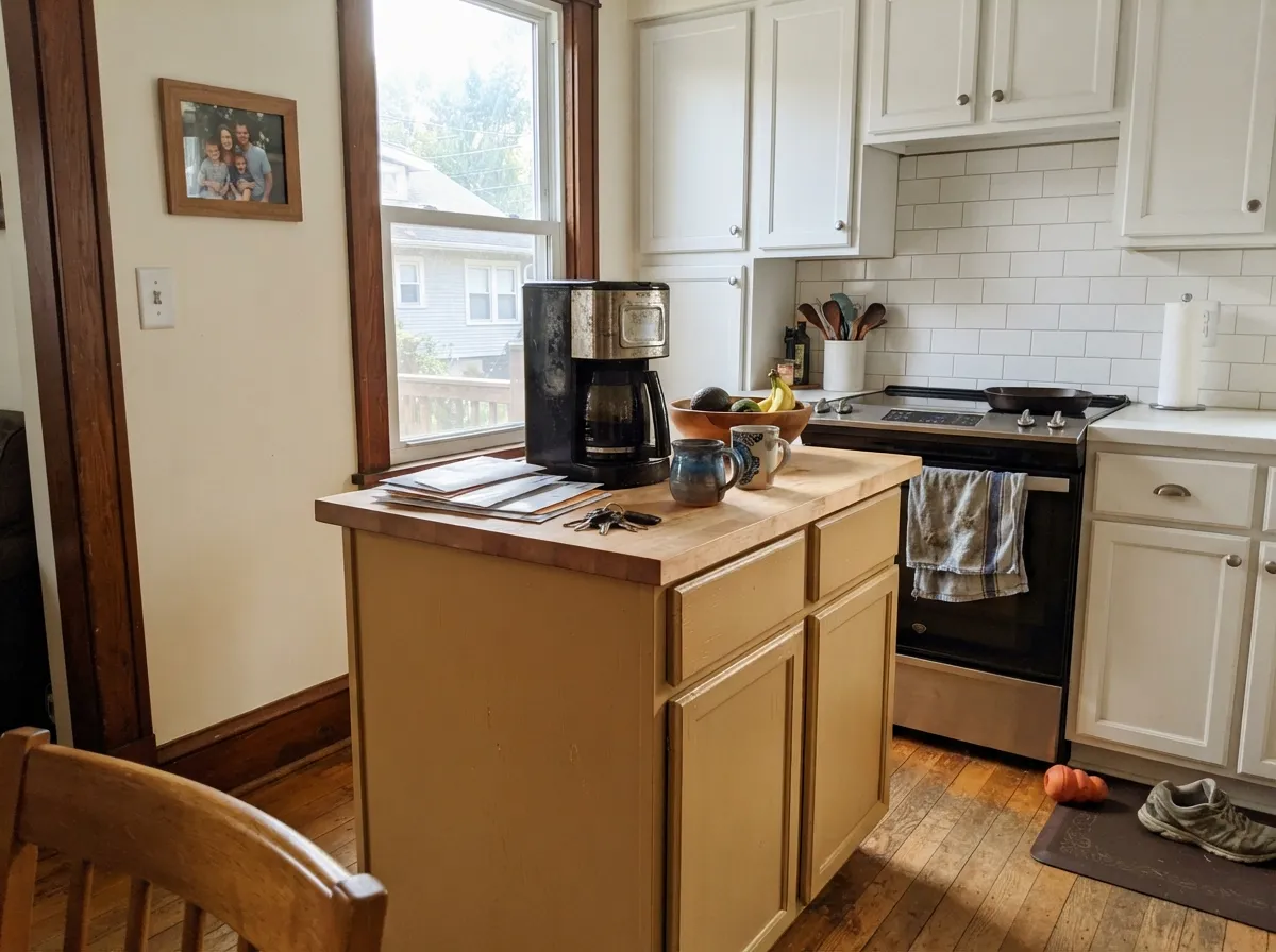
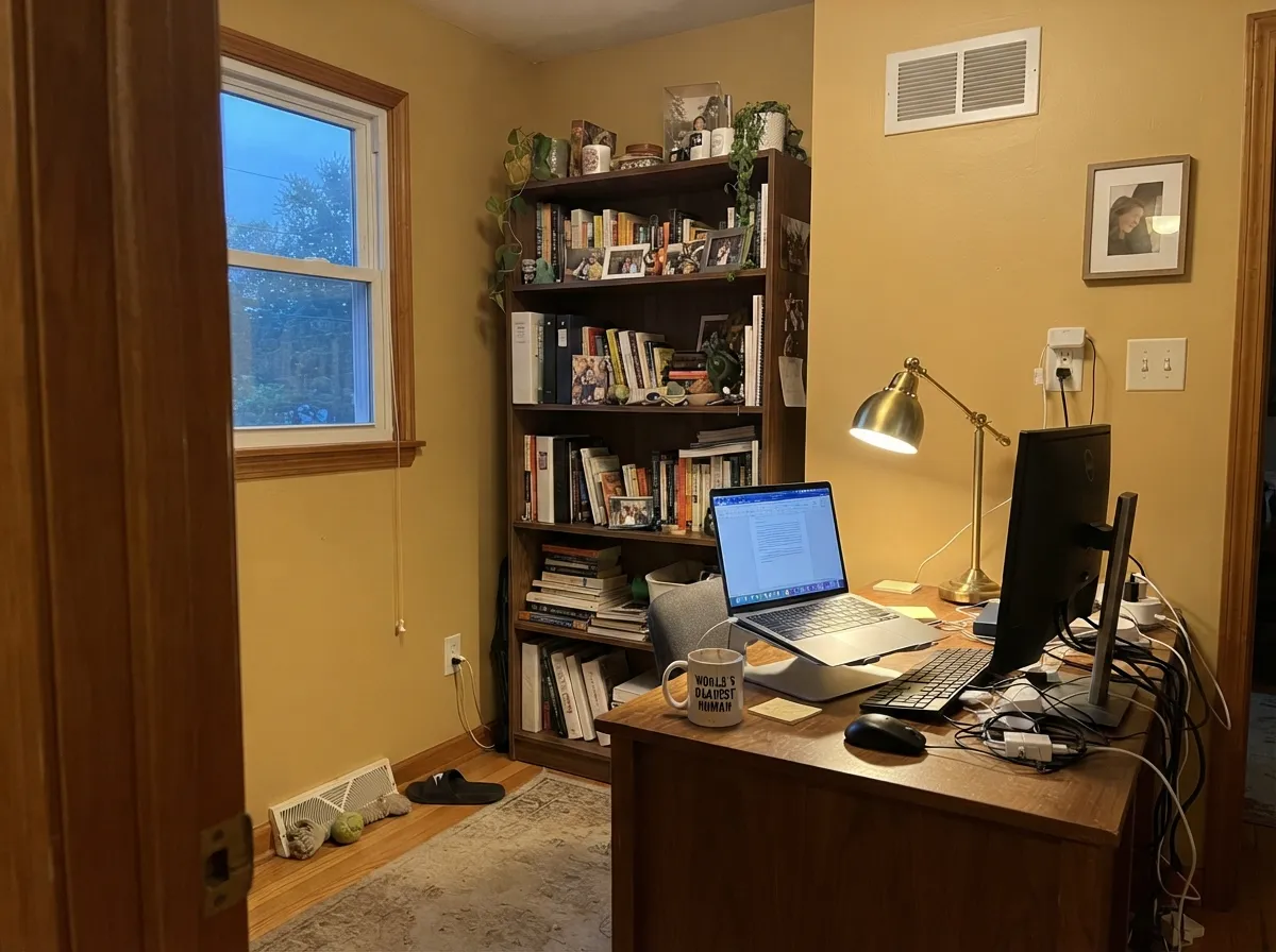
Give it real daylight or a warm lamp and wood furniture, and Honey Tea earns its name. It is at its best in a room meant to be used after the sun goes down — a dining room with a wood table and a chandelier, a den with a leather chair and a reading lamp — where the amber deepens instead of flattening. It also does excellent work in doses: an island or a run of lower cabinets under white walls gets the honey warmth without asking the whole kitchen to commit to a saturated gold.
Where It Fails
Almost every disappointing Honey Tea story comes from one of three predictable mismatches — a wood floor, a bulb, or a cold-toned neighbor. None of them are the paint's fault, but if your room matches one of these, sample big before you commit to four walls.
Golden-orange oak floors, oak trim and oak cabinets already carry this exact undertone. Add Honey Tea walls and the room stops reading as "warm and layered" and starts reading as one flat golden-brown box with no contrast to rest the eye on. Break it up with a white or charcoal trim line, or save the color for a room without wall-to-wall honey wood.
Cool-temperature bulbs strip the amber out of golds like this one and leave a flat, slightly muddy mustard-olive behind — the same complaint that shows up on Behr's other yellows in dim rooms. The fix costs a few dollars: swap to 2700K bulbs before deciding the color doesn't work.
A bright, blue-white trim or a cool gray countertop makes Honey Tea look dingier by comparison instead of warmer — the two temperatures argue rather than pair. Warm it up with a cream trim (Behr Swiss Coffee) or a warm stone, not a cold one.
Room by Room
Wood table, brass or bronze fixtures, an evening chandelier: this is the room the color was built for. Eggshell finish so candlelight and lamp glow catch it softly instead of flatly.
South- or west-facing rooms keep it honest and golden all day. In a dim north room it needs warm lamps doing real work, not just decoration.
Under white or Behr Swiss Coffee walls and uppers, a Honey Tea island reads custom and warm without tipping the kitchen into a dated all-gold look. Satin cabinet enamel, and keep the hardware black or brushed nickel rather than polished gold to avoid a 1990s echo.
Under 2700K lamps it turns genuinely cozy at night. Best as a single accent wall behind the bed rather than all four walls, paired with cream or white bedding — beige bedding reads muddy against it.
Low, warm light flatters it, and it pairs naturally with walnut shelving, leather chairs and brass lamp light — the traditional-study look this color leans toward on its own.
On a white, cream or light gray exterior, an amber-gold door reads warm and welcoming without looking like a trend color. As a full exterior color it is a much bigger and riskier bet — the depth that flatters one door can overwhelm an entire facade.
Your Light Is the Risk
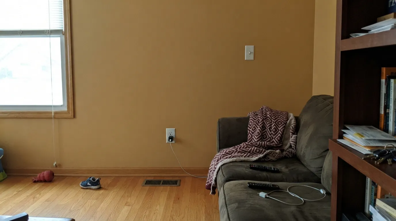
Real sun keeps the amber honest all day — the color reads exactly as warm and golden as the chip promises.
Cool, flat daylight drains the amber and leaves a dull, slightly olive mustard behind. Sample on the actual wall before committing.
Cooler and quieter in morning light, it warms steadily through the day and glows by late afternoon sun.
Warm bulbs deepen it toward true honey-amber at night. Cool white LEDs flatten it toward mustard — swap the bulbs, not the paint, if that happens.
Most complaints about Honey Tea are a light mismatch. Upload a photo of your actual room and see it on your walls — then ask for the same wall in north light or evening lamps before you buy a single sample.
Need It From Another Brand?
Any paint counter can custom-tint Behr MQ2-18 directly. If you would rather stay in one brand's own deck, these are the closest stock matches, measured as ΔE2000. Under 2 is a difference you will not see on the wall.
| Brand | Closest color | ΔE | LRV | |
|---|---|---|---|---|
| Sherwin-Williams | Independent GoldSW 6401 · Sherwin-Williams | 1.9 | 51 | Color page → |
| Benjamin Moore | HoneymoonAF-345 · Benjamin Moore | 0.7 | 51 | Color page → |
| Valspar | Cashmere WrapM160 · Valspar | 1.6 | 50.6 | Color page → |
| PPG / Glidden | HummusPPG16-10 · PPG / Glidden | 0.5 | 52 | Color page → |
| Glidden | HummusPPG16-10 · Glidden | 0.7 | 52 | Color page → |
| Dutch Boy | Winsome Ecru220-4DB · Dutch Boy | 1.4 | 54 | Color page → |
Similar Behr Colors
The nearest shades to Honey Tea within Behr's own range, ranked by perceptual color distance — useful when you want the same look a touch lighter, darker, or warmer.
WCAG 2.1: AA is 4.5 : 1 for normal text, 3 : 1 for large text, AAA is 7 : 1.
Honey Tea vs the Colors You're Also Considering
Every Honey Tea sample board has the same rivals on it. The numbers show the real lightness gap — then it comes down to which risk you would rather live with.
Pick this if you're staying inside a Home Depot budget and sheen lineup — Honey Tea gets you the same golden neutral without a specialty order.
Farrow & Ball No. 37 · LRV 50HayPick this if you want almost the identical honey-gold from a heritage British line — Hay sits at nearly the same depth and undertone.
Pick this if that sounds like exactly the dated look you're trying to avoid — Honey Tea is the same warmth, dialed back a notch.
Pratt & Lambert 16-7 · LRV 60Tuscan SunPick this if Honey Tea still feels too safe — Tuscan Sun pushes the same amber further into full Tuscan-kitchen territory.
Against its Behr neighbors, the differences are small enough that sampling matters more than reading numbers. Mineral Yellow BXC-34 shares LRV 52 and a hex of #D6BB8A, which is a difference you will not see on a wall. Desert Camel 320F-4 at LRV 51 has slightly more green in it, so it reads a shade calmer. Pebble Path 330F-4 at LRV 55 is lighter and less saturated, a better choice if the gold feels like too much.
Cross-brand, PPG and Glidden Hummus PPG16-10 sits at deltaE 0.54 and Benjamin Moore Honeymoon AF-345 at 0.68, both close enough to call a match. Dunn-Edwards Buckskin DE6158 at deltaE 1.27 and Valspar Cashmere Wrap M160 at 1.58 are visually identical in normal room light. Sherwin-Williams Independent Gold SW 6401 at deltaE 1.94 and Farrow and Ball Straw No. 52 at 2.01 are very close, but sample first. Magnolia Home Cottage Feel JG-40 at deltaE 4.04 is close but visibly different side by side.
Honey Tea Coordinating Colors
The rule for coordinating with Honey Tea is temperature discipline: stay warm on the trim and neutrals, and use near-blacks or deep greens rather than cool grays to add contrast. These are the partners that keep the amber reading intentional instead of dated:
Where Honey Tea Sits in Behr's Yellow Family
Behr's yellow deck splits cleanly into pale butter-and-lemon shades built for a whole room — Butter Up, Friendly Yellow, Lemon Lily — and a smaller set of deeper, earthier golds meant for a wall or two: Jackfruit, and this one. Honey Tea is the plainest-spoken of that second group. It doesn't lean peach like Jackfruit or go full amber-orange like a Tuscan gold; it sits at a genuine mid-depth amber that reads as tea more than as candy.
That restraint is also why it has never had a viral moment or a Color of the Year push — it is a steady, unglamorous seller, not a trend color. The honest pitch is not "the next big thing," it's "a real gold that behaves, if you give it the right room."
Honey Tea With Wood Tones and Floors
This decision lives at the floor. Walnut, espresso and other dark, cool-leaning woods are Honey Tea's best friends — the contrast in depth and undertone keeps both the floor and the wall looking deliberate. White oak and pale, low-yellow floors are safe as well; they simply stay quiet next to the color.
The one real conflict is honey oak — the classic 1990s builder floor with the same golden-orange base as this paint. Wall and floor end up speaking the same color with no contrast between them, and the room reads flat rather than rich. If honey oak is staying, keep Honey Tea to a door, an island or one accent wall and let a white or gray-white handle the rest of the room.
Three Ready Palettes Built on Honey Tea
A color is never alone on the wall. These are complete combinations in the 60-30-10 pattern, with the reason each one holds together. Every one opens in the visualizer.
The near-black grounds the honey-gold so it reads as a deliberate color choice, not builder-beige gone wrong. Swiss Coffee keeps the trim warm rather than stark, so nothing fights the amber on the walls.
Try this palette in your roomThis lets Honey Tea do its best job — one surface, not four — while the white keeps the room bright and the near-black hardware keeps the look current instead of reading like a 1990s honey-oak kitchen.
Try this palette in your roomLeather-and-walnut warmth for a room meant to be used after dark. The near-black trim and the deep green keep the space from reading like a single golden box, and both partners only get better once the lamps come on.
Try this palette in your roomHoney Tea FAQ
Is Honey Tea a yellow or a beige?
Yellow, honestly. Behr files it in its own yellow family, and on the wall the amber undertone is visible, not just implied. If you're hoping for "warm neutral with zero yellow," look at a true beige like Behr's Even Better Beige instead.
Does Honey Tea work with honey oak floors?
Carefully. Both share the same golden-orange base, so a full room of honey oak plus Honey Tea walls tends to look flat and monochrome rather than intentional. It works better as an accent — an island, a door, one wall — with a lighter or cooler surface doing the rest of the room.
What trim white goes with Honey Tea?
A warm off-white, not a stark bright one. Behr's own Swiss Coffee is the natural match — a cool, blue-white trim makes the walls look dingy by comparison instead of warmer.
Is Honey Tea too dated for a kitchen?
Not if you keep it to one surface. A full kitchen of gold-toned everything can read like the 1990s; a Honey Tea island or lower cabinets under white walls, with black or brushed-nickel hardware, reads current and warm instead.
How does Honey Tea look in a north-facing room?
Duller than the chip. Cool, indirect daylight drains the amber and leaves a flatter, slightly olive tone behind. It is not unusable in a north room, but it needs warm 2700K lamps doing real work, not just sitting there for decoration.
Can I use Honey Tea on a front door?
Yes, and it is one of its strongest single-surface jobs — an amber-gold door on a white, cream or light gray house reads warm and welcoming without looking trendy. Painting an entire exterior in it is a much bigger commitment; sample it on the actual door and siding before deciding to go further.
Have you painted with Honey Tea?
Rate it — one tap helps the next reader decide.
Ask a Question