Even Better Beige
Behr's modern beige, reviewed honestly: the rooms where it feels expensive, the west wall where it turns peachy, and what to buy instead.

Jessica has spec'd whites and neutrals for more than 300 rooms and keeps a sample wall of painted drawdowns in her studio. Every color review is checked against real reader rooms in the comments and re-tested when a formula changes. About the testing process →
- 1Mindful Gray48
- 2Revere Pewter55
- 3Even Better Beige60
- 4Pale Oak69
- 5Shoji White74
The Fast Verdict
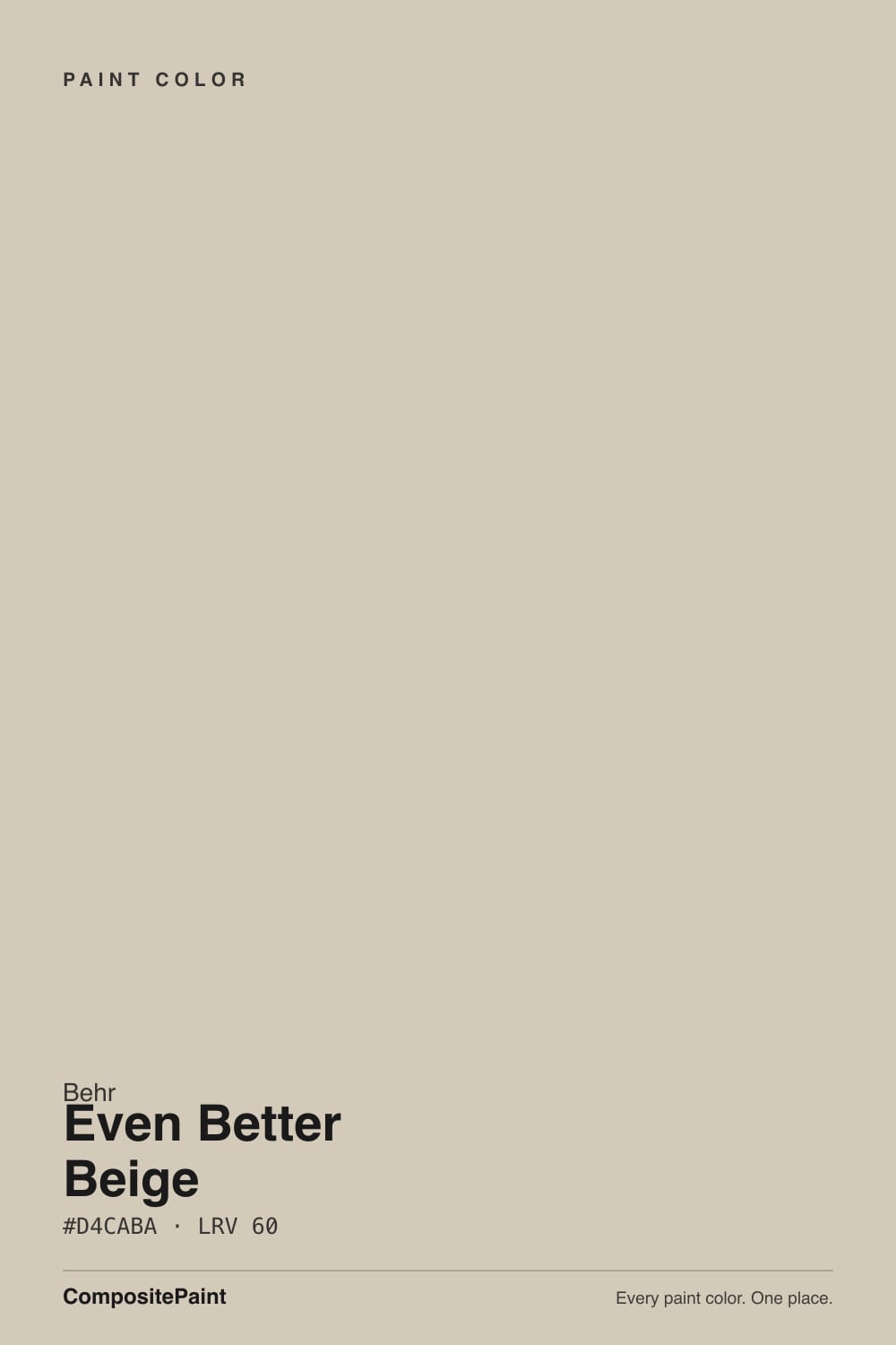
Even Better Beige is what people are actually asking for when they say "warm, but not gray and not yellow." It is a true sand beige at LRV 60, light enough for a whole floor, with enough pigment that walls never look washed out.
The catch is the red-orange base: in strong afternoon sun on a big wall it can tip peachy, and next to cool gray flooring the pink side shows up fast. Sample two opposite walls and you will know in a day whether it is your color.
Open-plan walls over warm oak floors · bedrooms that need calm instead of gray · traditional and craftsman exteriors · anyone who wants beige without the yellow
Your floors are cool gray LVP or gray-washed wood · one huge wall takes full west sun · your trim is a soft cream white · you want a crisp modern gray-and-white look
- A real beige with no yellow-gold cast — the thing people actually want when they say "warm neutral"
- LRV 60 runs a whole open floor without one room reading darker
- Blends with red and honey oak instead of amplifying the orange
- Hides scuffs in halls and on cabinets better than an off-white does
- Widely stocked at Home Depot, so touch-up and re-orders are easy years later
- Tips peachy on a large wall in direct afternoon sun
- Shows its pink side against cool gray floors, blue-gray tile, and stainless
- Goes flat and putty-ish in a dim north room with no lamps on
- Blurs into cream trim whites — you are locked into a clean bright white
What Color Is Even Better Beige, Really?
A genuine beige, not a greige wearing a beige name tag. The hue sits at 37 degrees, which is the sand and tan zone, and saturation is 23 percent — enough color to read as something. What matters for most people is what it avoids: the mustard-gold cast that made 2005 beige look dated. This one is built on the red-orange side of warm, so it reads like unbleached linen or wet sand rather than butter. That also means the risk here is pink, not yellow.
At LRV 60 it lands exactly where the two most-searched neutrals in America live. Sherwin-Williams Agreeable Gray SW 7029 is also LRV 60, and Accessible Beige SW 7036 is 58 — so all three reflect roughly the same light and none of them will make a room feel darker. The difference is temperature, not brightness. Put Even Better Beige next to Agreeable Gray and the Behr color is clearly the warmer, sandier one; put it next to Accessible Beige and it is a touch cleaner and less gray-green.
Undertone in one line: warm red-orange sand — never yellow, never green, but it can show pink when the light or the floor pushes it.
Where It Shines
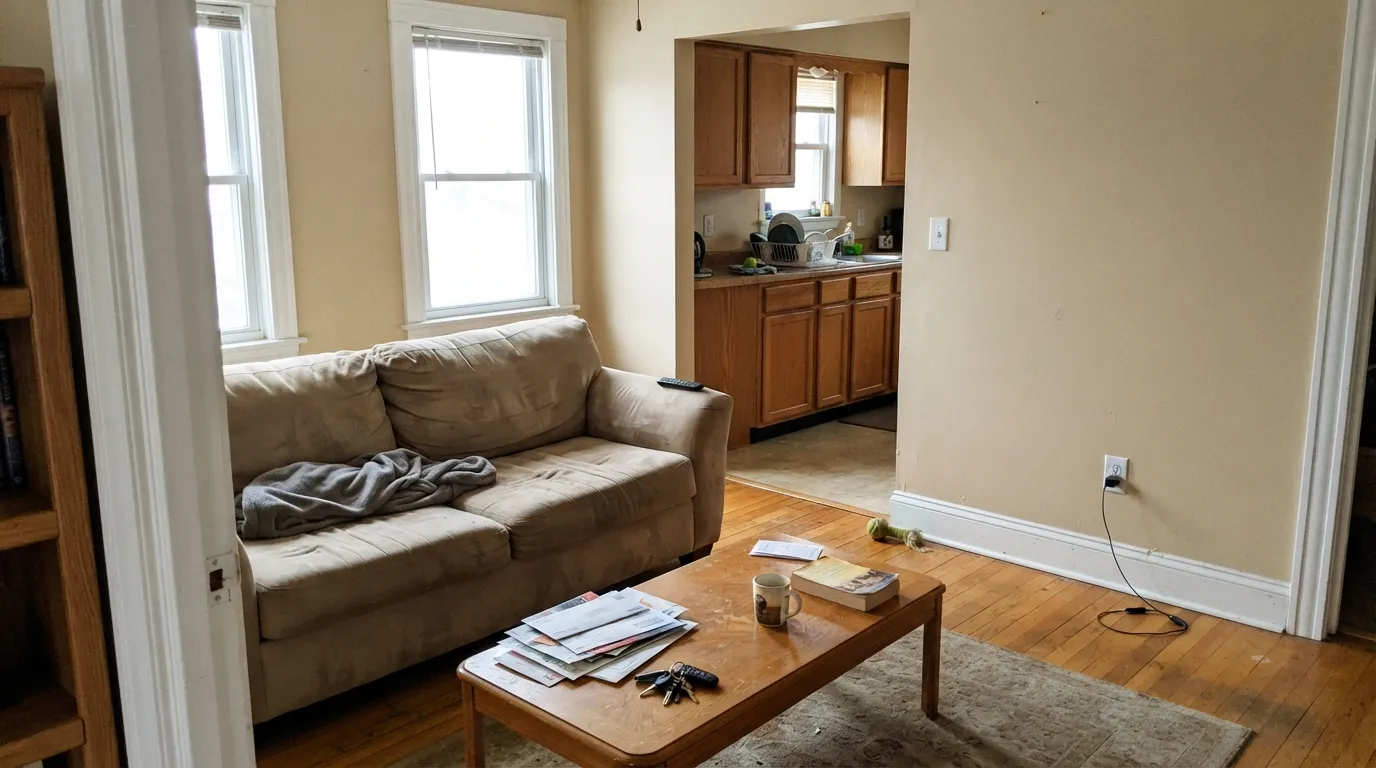
It is at its best doing quiet work across a whole floor: living room, hall, bedroom, all one color, with oak underfoot and a clean white on the trim. Give it side light rather than a full-on sun blast and it reads soft and expensive instead of sweet.
Where It Fails
The unhappy stories about this color are all the same three situations, and every one of them is predictable from a sample board. If your room matches one, another coat will not save it.
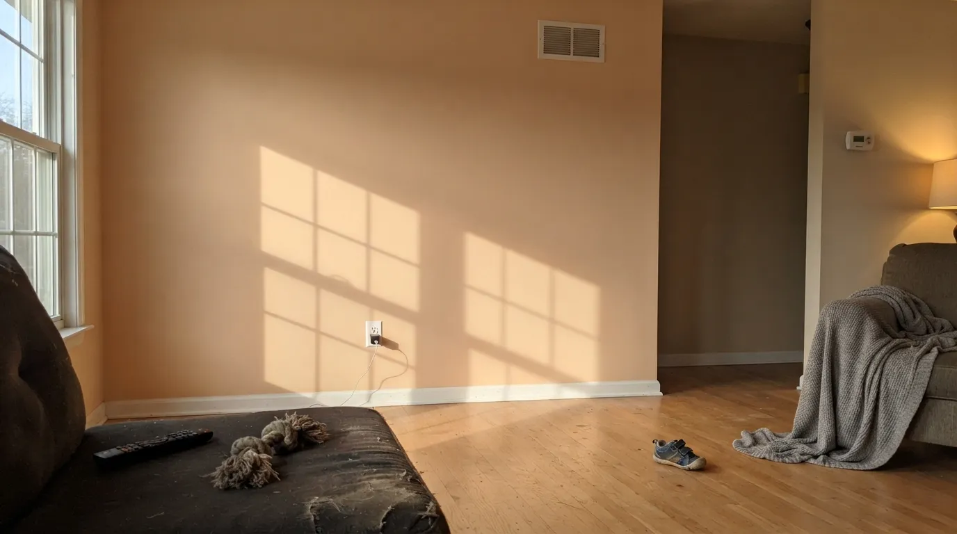
Late sun is orange, and it stacks on top of a hue that is already at 37 degrees. On a large uninterrupted wall that reads peachy tan for two hours a day — people describe it as "suddenly looks like a nursery." If that wall is your main view, use Behr Tranquil Gray DC-007 instead: same LRV 60, same brightness, cooler read.
Gray LVP, blue-gray tile, and a run of stainless all sit at the opposite temperature, and they push the pink-tan side of the beige straight forward. The walls stop looking neutral and start looking like a mismatch. With cool floors, go to Sherwin-Williams Agreeable Gray SW 7029 — same value, gray enough to agree with them.
This is the most common self-inflicted mistake. Put it beside a soft cream like Behr Swiss Coffee 12 or Benjamin Moore White Dove OC-17 and the two blur together, so the trim looks yellowed and the walls look dirty. A beige this warm needs a clean, bright trim white: Behr Ultra Pure White PPU18-06 or Behr Polar Bear 75.
Room by Room
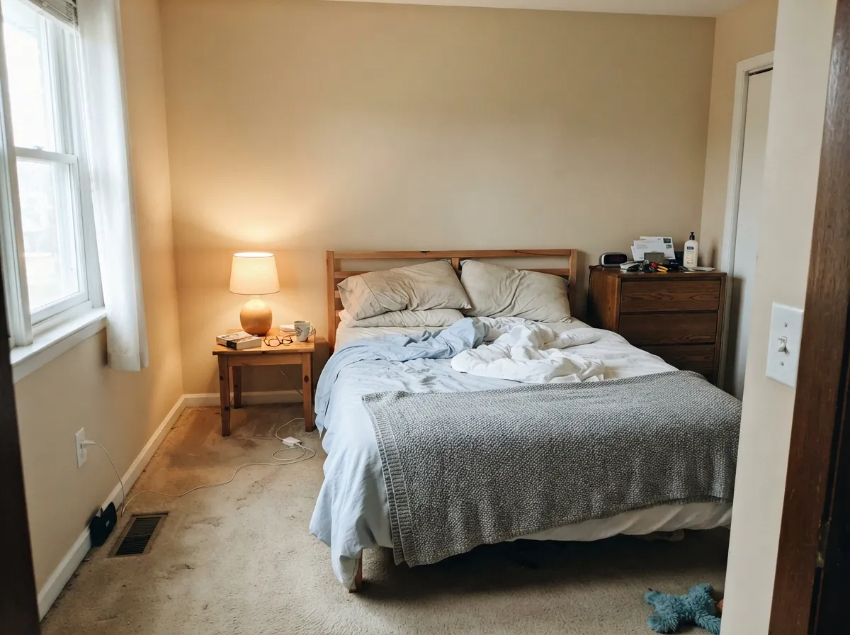
With side light it is the calm backdrop that makes wood furniture look deliberate rather than orange. Eggshell on walls, Behr Ultra Pure White PPU18-06 in semi-gloss on trim. Check the wall that gets afternoon sun before you commit the whole room.
LRV 60 is high enough that no room in the run feels darker than the next, which is the whole point of one color across a floor. It handles a north kitchen and a south living room without looking like two different colors — restrained on one end, warmer on the other. This is where it earns its money.
The warmth reads restful, not stimulating, and it hides the shadows that flat gray walls exaggerate. Under 2700K bulbs it gets noticeably richer at night; if that tips too far, 3000K bulbs pull it back. Behr Blank Canvas DC-003 on the ceiling keeps the whole room soft.
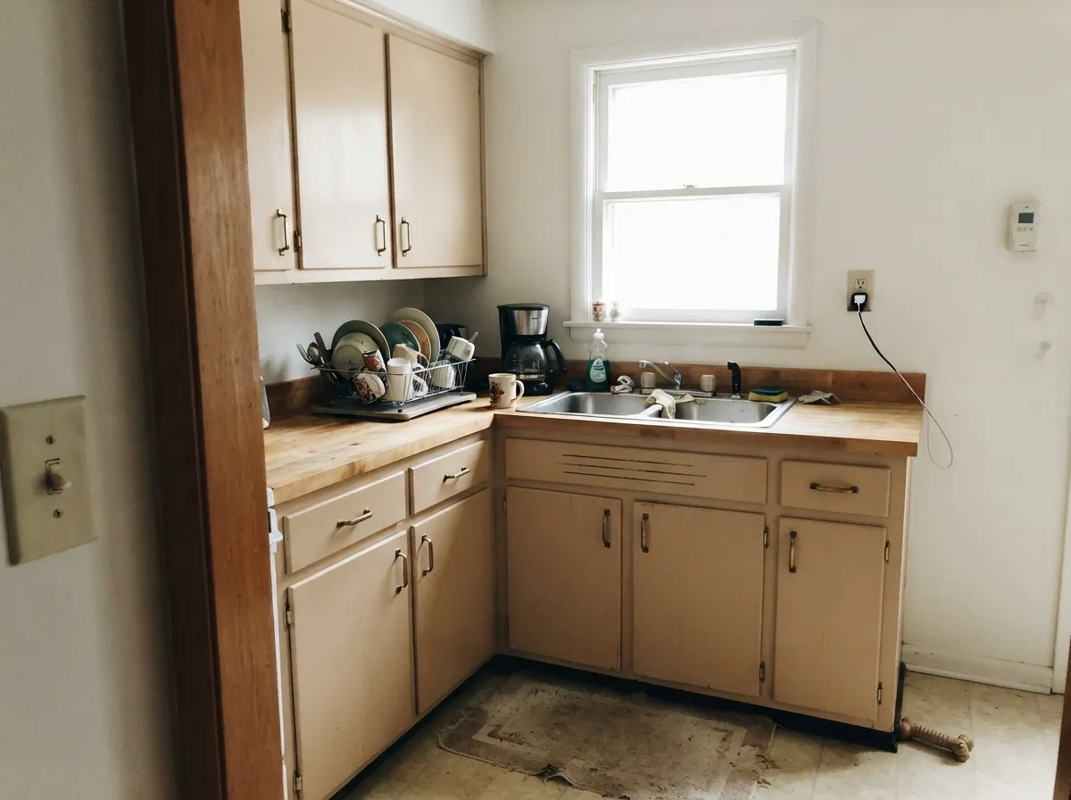
On cabinets at LRV 60 it reads as a soft neutral, not a statement, and it wipes clean better than a bright white around handles. It works with butcher block, warm quartz, and brass; it fights gray-veined marble and chrome. Use a satin cabinet enamel, not wall paint.
It hides scuffs and bag marks far better than an off-white, and hallways rarely get the direct sun that causes the peach problem. Eggshell holds up to wiping. White doors in semi-gloss give the contrast the space needs.
In full sun it lightens and settles into a soft stone-adjacent body color that sits naturally with brick, stone, and cedar. Pair it with white or cream trim and a dark door — Behr Cracked Pepper PPU18-01 works. It is the wrong choice on a modern charcoal-and-glass scheme.
Your Light Is the Risk
Side light warms it without cooking it. Softest, most expensive-looking version of this color.
Strong midday sun amplifies the red-orange base. Big walls can read peachy tan.
Cool daylight mutes the warmth to a grayed sand. Not cold — just plainer than the chip.
2700K bulbs make it rich, sometimes too rich. 3000–3500K keeps it neutral after dark.
Most complaints about Even Better Beige are a light mismatch. Upload a photo of your actual room and see it on your walls — then ask for the same wall in north light or evening lamps before you buy a single sample.
Need It From Another Brand?
Any paint counter can custom-tint Behr DC-010 directly. If you would rather stay in one brand's own deck, these are the closest stock matches, measured as ΔE2000. Under 2 is a difference you will not see on the wall.
| Brand | Closest color | ΔE | LRV | |
|---|---|---|---|---|
| Sherwin-Williams | SymmetrySW 9601 · Sherwin-Williams | 1.4 | 61 | Color page → |
| Benjamin Moore | Bleached GrayES-78 · Benjamin Moore | 0.4 | 60 | Color page → |
| Valspar | Bay Sands5008-1B · Valspar | 2.3 | 59.8 | Color page → |
| PPG / Glidden | In The BuffPPG1019-2 · PPG / Glidden | 1.8 | 61 | Color page → |
| Glidden | River Birch Beige45YY 58/094 · Glidden | 1.7 | 58 | Color page → |
| Dutch Boy | Sandstone Tint441-2DB · Dutch Boy | 0.5 | 59 | Color page → |
Similar Behr Colors
The nearest shades to Even Better Beige within Behr's own range, ranked by perceptual color distance — useful when you want the same look a touch lighter, darker, or warmer.
WCAG 2.1: AA is 4.5 : 1 for normal text, 3 : 1 for large text, AAA is 7 : 1.
Even Better Beige vs the Colors You're Also Considering
Every Even Better Beige sample board has the same rivals on it. The numbers show the real lightness gap — then it comes down to which risk you would rather live with.
Pick this for a cleaner, sandier beige you can buy at Home Depot.
Sherwin-Williams SW 7036 · LRV 58Accessible BeigePick this if you want more gray in the mix and a slightly deeper wall.
Pick this when the room has warm wood and gray would look cold.
Sherwin-Williams SW 7029 · LRV 60Agreeable GrayPick this with cool gray floors, blue-gray tile, or a stainless kitchen.
Benjamin Moore Bleached Gray ES-78 at deltaE 0.43, with the same LRV of 60, is a true match. Dutch Boy Sandstone Tint 441-2DB at deltaE 0.53 and Magnolia Home Plaster JG-156 at deltaE 0.89 are also close enough to swap without any visible change on a wall.
A step out, Dunn-Edwards Go Quietly DEBN29 at deltaE 1.03 and Sherwin-Williams Symmetry SW 9601 at deltaE 1.37 are visually identical in normal room light, with Symmetry sitting one point brighter at LRV 61. Glidden River Birch Beige 45YY 58/094 at deltaE 1.71 falls in the same band, though its LRV of 58 makes it marginally deeper.
Farrow and Ball Turret White No. G2 at deltaE 2.28 and Valspar Bay Sands 5008-1B at deltaE 2.34 are very close and worth sampling first, since both read slightly different in undertone. Portola Paints High Cliff at deltaE 4.87 is close but visibly different side by side, reading noticeably cooler and pinker despite matching at LRV 60.
Even Better Beige Coordinating Colors
The rule with this beige is to partner it with things that are either clearly warmer or clearly cooler — never almost the same. Anything within a few points of its warmth turns into mud beside it, which is why cream trim fails and a bright white works. For accents, gray-greens and near-blacks are the safest bets, because both sit far enough away to keep the beige looking intentional.
These are the partners that hold up in a real house, room to room:
Even Better Beige on Cabinets
Beige cabinets are back, and this is one of the colors people are actually using for it — usually in a small kitchen where all-white felt cold and a dark color felt heavy. At LRV 60 it does something white cannot: it hides the grease shadow and knuckle marks around the handles, which in a busy kitchen is the difference between wiping monthly and wiping weekly.
The scheme decides whether it works. Warm counters — butcher block, honey quartz, tumbled travertine — and it reads like an old European kitchen. Cool gray marble, a blue-gray subway backsplash, or a wall of stainless, and the cabinets look pink and slightly off. Hardware follows the same rule: unlacquered brass and black both work, chrome does not.
One practical warning: do not use wall paint. Use a dedicated cabinet enamel in satin, degrease and scuff-sand first, and let each coat cure the full time on the can. A beige this light shows every chipped edge, so the prep matters more than it would with a dark color.
Even Better Beige With Wood Tones and Floors
This is the question that decides the whole thing. Red oak, honey oak, hickory, and any orange-leaning builder floor all sit comfortably with it, because the wall meets the floor at the same temperature instead of arguing with it. If you have hated your orange floors under gray walls, this is the color that stops them from screaming. The trade-off is that the room gets quiet — floor and wall blend, so bring contrast in with the trim, a dark door, or a rug.
Cool gray LVP and gray-washed wood are the real problem. Against them the beige looks pink and slightly dirty, and no lamp fixes it. If your floors are gray and you still want warmth, step across to Sherwin-Williams Agreeable Gray SW 7029 or Behr Silver Drop 790C-2 rather than trying to make this one behave.
Walnut and dark stained floors are the easy middle ground: the value gap does the work, so the undertone question stops mattering. Hold a two-foot sample board flat on the actual floor for a full day before you buy gallons — the vertical wall and the horizontal floor read differently, and this is a color where that gap is wide.
Three Ready Palettes Built on Even Better Beige
A color is never alone on the wall. These are complete combinations in the 60-30-10 pattern, with the reason each one holds together. Every one opens in the visualizer.
The beige carries every wall at 60 percent, the bright white keeps the trim line crisp instead of muddy, and the near-black door supplies the one dark note the scheme needs. A 30-plus point value gap between wall and trim is what stops a warm neutral from looking dingy.
Try this palette in your roomBlank Canvas is a warm white from the same Behr collection, so the wall-to-cabinet handoff is seamless instead of a temperature jump. Urbane Bronze grounds the room at 10 percent and is warm enough that it never argues with the beige the way a cool charcoal would.
Try this palette in your roomEvergreen Fog is a grayed green, and gray-green is the classic partner for a red-orange beige because they sit opposite each other and cancel the pink risk. One accent wall at 10 percent is enough — the beige should still run the room.
Try this palette in your roomEven Better Beige FAQ
Is Even Better Beige the Behr version of Accessible Beige?
It is the closest easy answer, and it is the swap people at the paint counter make most. Accessible Beige SW 7036 sits at LRV 58 with more gray in it; Even Better Beige is LRV 60 and reads a little cleaner and sandier. They are not identical, so if you have Accessible Beige elsewhere in the house, do not assume the two will meet invisibly at a doorway.
Does Even Better Beige look pink?
It can, in two situations. The base hue is red-orange, so direct afternoon sun on a large wall pushes it toward peachy tan, and cool gray flooring makes the pink side jump forward by contrast. With warm oak floors and side light it stays a plain sand beige. Tape a big sample to the wall you worry about, not the wall you like.
Even Better Beige or Agreeable Gray?
Match the color to your floors. If you have red oak, honey oak, or any warm wood, Even Better Beige blends and Agreeable Gray can look chalky beside it. If you have gray LVP, gray-washed wood, or cool tile, flip it — Agreeable Gray SW 7029 agrees with them and the beige will fight. Both are LRV 60, so the room brightness is the same either way.
What trim white actually works with it?
A clean bright one. Behr Ultra Pure White PPU18-06 or Behr Polar Bear 75 give a hard, crisp trim line against warm walls. Skip creamy whites like Swiss Coffee 12 or Benjamin Moore White Dove OC-17 here — they sit too close in temperature and the trim ends up looking yellowed rather than white.
Is it good for kitchen cabinets?
In a warm kitchen, yes. It hides handprints better than a bright white and flatters butcher block, brass, and warm quartz. It does not work with gray-veined marble, blue-gray backsplash, or a chrome-heavy kitchen. Buy it in a cabinet enamel in satin — wall paint on cabinets will chip at the door edges within a year.
Will it look dated like old builder beige?
Not the same way. The beiges people regret were built on yellow-gold, which is what read as mustard under lamp light. This one is on the red-orange side, so it stays closer to sand and linen. It can still look dated if you surround it with polished brass, heavy tan furniture, and cream trim — the color is fine, the whole scheme is what ages.
Which Behr line should I buy it in?
Marquee for walls if you are covering an old dark color, because the one-coat coverage is real and saves you a gallon. Premium Plus Ultra is enough for a repaint over an existing light neutral and costs less. For cabinets and trim, use Behr Cabinet and Trim Enamel or Urethane Alkyd — the wall products stay soft and mark up.
Have you painted with Even Better Beige?
Rate it — one tap helps the next reader decide.
Ask a Question