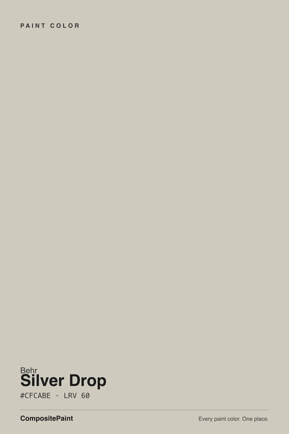
Silver Drop
Behr's most popular light warm greige, reviewed honestly: the green-and-blue flashes that make owners call it "indecisive," and how it really stacks up against SW Agreeable Gray and SW Repose Gray.

Jessica has spec'd whites and neutrals for more than 300 rooms and keeps a sample wall of painted drawdowns in her studio. Every color review is checked against real reader rooms in the comments and re-tested when a formula changes. About the testing process →
- 1Revere Pewter55
- 2Agreeable Gray60
- 3Silver Drop70
- 4Pearly White77
- 5Dover White83
The Fast Verdict
Silver Drop is Behr's answer to the Agreeable Gray phenomenon — a light warm greige built to work with almost anything.
The catch is right there in the design-blog nickname: "the color that can't decide what it is." In warm afternoon light it settles into a soft greige. In cool morning light it can flash silvery, even faintly green or blue. Behr's own site files it as a yellow-toned gray, and that description undersells how much it actually moves.
North- or west-facing rooms that need warmth · white cabinets, trim and doors · exterior siding with warm wood accents · anyone who wants Agreeable Gray's popularity in a lighter, more silvery shade
You need one steady color regardless of the hour · your trim white is already picked and can't change · you're pairing with cool white marble or chrome fixtures · you want Repose Gray's dependable taupe-gray read instead
- Chameleon versatility — genuinely works with more palettes than a fixed-undertone gray does
- One of Behr's most-used semi-gloss enamel colors for cabinets, doors and trim — durable, wipeable
- At LRV 70 it sits in the same forgiving depth band as SW Agreeable Gray and Repose Gray
- Warms up a cold north-facing room without tipping into full beige
- Reliable exterior siding color that pairs easily with natural wood accents
- The chameleon quality cuts both ways — trim-color pairing is genuinely tricky, not a myth
- East-facing rooms and cool morning light can pull a green or blue-green cast
- Behr's own "yellow-toned gray" label undersells how cool it can look in the wrong light
- Less documented in real rooms online than Agreeable Gray or Repose Gray, so fewer references before you commit
What Color Is Silver Drop, Really?
Silver Drop is one of Behr's best-known light neutrals — a pale greige that has anchored countless whole-house repaints since it launched, and it still shows up on "best light gray" round-ups next to Sherwin-Williams Agreeable Gray and Repose Gray. Behr's own color page files it under yellow-toned grays, which is the official story. The unofficial story, told across dozens of blogger reviews and owner photo dumps, is messier: the same wall reads silvery-cool in one shot and warm beige-greige in the next, sometimes within the same room at different times of day.
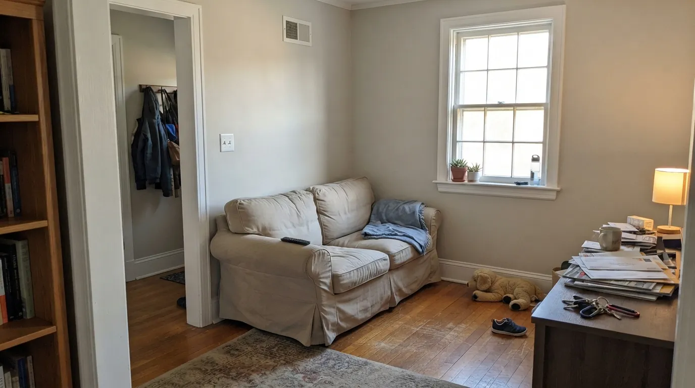
At LRV 70 it sits in almost the exact same depth band as Agreeable Gray (LRV 70) and Repose Gray (LRV 58) — genuinely mid-toned, not a whisper-light off-white. That depth is why the undertone shows up so clearly: pale-pale grays can hide a shifting undertone in their own brightness, but a color with real body at LRV 70 has enough saturation for green, blue, or beige to actually register on the wall. One design blog summed up the reputation bluntly: Silver Drop "can't decide what color it is," oscillating between silvery-gray and warm beige depending on the light and the trim it's next to.
Undertone in one line: warm-leaning gray at its core, but genuinely unstable — green and blue-green flashes in cool light, beige and yellow warmth in golden light. If your sample looks like a completely different color in the bathroom than it did in the living room, that is not a mistake — that is Silver Drop being Silver Drop.
Where It Shines
Give it west or north exposure and steady artificial light, and the chameleon settles down: it reads as a calm, adaptable warm gray that goes with nearly any trim white, wood tone, or metal finish. It has become one of Behr's most-used colors for semi-gloss enamel on cabinets, doors and trim precisely because it never fights a wall color, and its high enough LRV keeps a full exterior facade from looking heavy. Owners who paint it in a single steady-light room tend to love it without reservation.
Where It Fails
Nearly every mixed review of Silver Drop traces back to one of three scripts, and all three show up again and again in Home Depot reviews and design-blog comments. None of them mean the paint is defective — they mean the color is doing exactly what a genuine chameleon does.
Silver Drop's whole identity is that it changes. Reviewers who expected "light gray, done" instead got a wall that looks different in the morning than at night, and different again next to a different trim white. If predictability matters more than personality, this is the wrong pick — Agreeable Gray is the steadier version of the same idea.
Blue-toned morning light pulls a green or blue-green cast out of Silver Drop that reads as "off" to anyone expecting a simple neutral gray. This is the exact complaint behind the "can't decide what color it is" reputation — the paint didn't change, the light did.
Because Silver Drop swings warm and cool, the trim white you pick genuinely changes how the wall reads: a cool white pushes it warmer by contrast, a warm cream white pulls out its blue side. Picking trim first and hoping the wall follows is the most common regret story.
Room by Room
In west or north light with lamps in the evening, it is a calm, adaptable backdrop for wood furniture and darker accent walls. Eggshell finish; test a large sample through a full day before committing to an open-plan space.
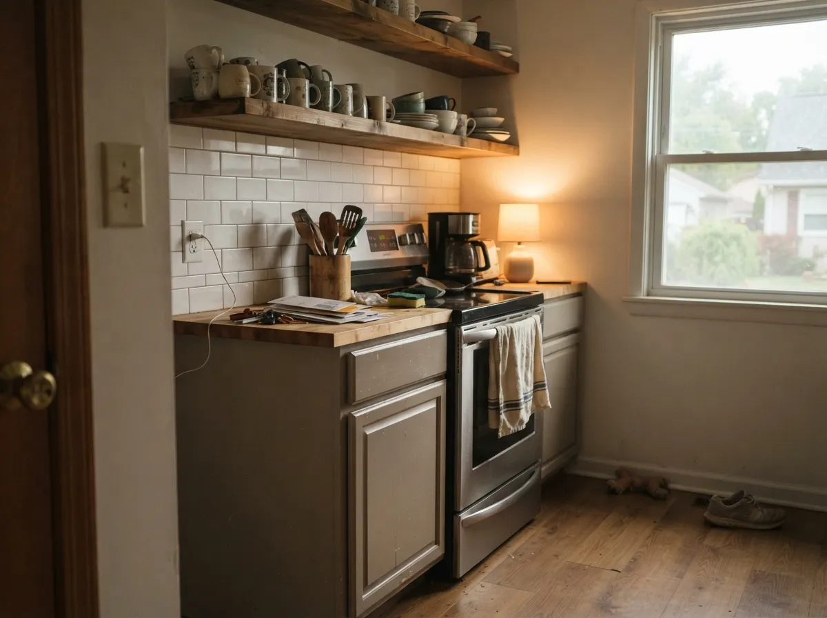
Semi-gloss Silver Drop on cabinets, paired with white subway tile or granite, is one of the most-repeated pairings in owner photos. It wipes clean, hides fingerprints better than a stark white, and reads soft rather than sterile.
Under 2700K lamps the beige side comes forward and the room settles into a plain, restful warm gray. Skip cool LED bulbs here — they are what trigger the green-flash complaints.
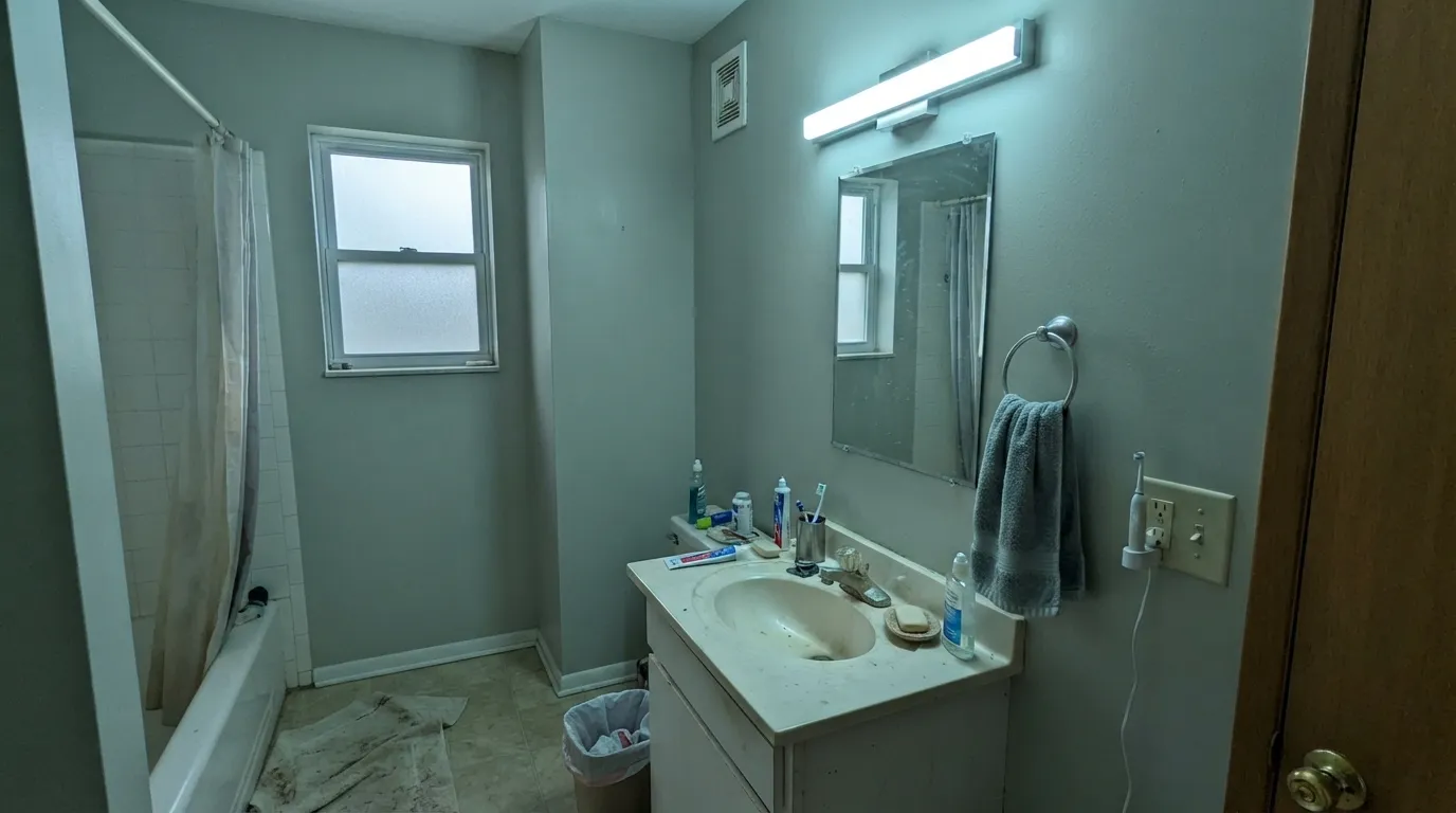
Small windows, cool LED vanity bulbs and reflective tile are the exact conditions that expose Silver Drop's cooler side. It can work beautifully with warm brass and wood vanities, but this is the room most likely to surprise you.
Behr sells Silver Drop heavily as a cabinet, door and trim enamel, and it looks genuinely expensive against the right wall color. Just don't lock in the wall color's white before testing Silver Drop trim against it — see the fails section above.
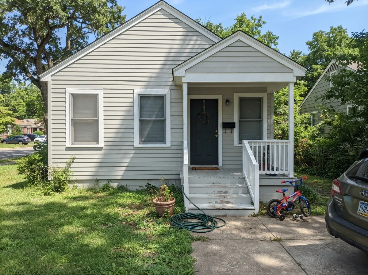
Its LRV 70 depth and warm-neutral base make it a popular siding color, especially with natural wood front doors and window frames, which resonate with its warm side instead of fighting it. Full sun tends to settle the color rather than destabilize it, unlike interior cool light.
Your Light Is the Risk
Warm afternoon sun settles it into a steady warm greige — the color's calmest, most predictable read.
Blue-tinted morning light pulls out a green-blue cast — the exact behavior behind the "can't decide what color it is" reputation.
Strong midday sun pushes it warmer and more beige, softening the silvery edge. Sample here to see its friendliest face.
Cool LEDs exaggerate the silvery-green side; 2700K bulbs calm it into a plain, warm greige at night.
Most complaints about Silver Drop are a light mismatch. Upload a photo of your actual room and see it on your walls — then ask for the same wall in north light or evening lamps before you buy a single sample.
Need It From Another Brand?
Any paint counter can custom-tint Behr 790C-2 directly. If you would rather stay in one brand's own deck, these are the closest stock matches, measured as ΔE2000. Under 2 is a difference you will not see on the wall.
| Brand | Closest color | ΔE | LRV | |
|---|---|---|---|---|
| Sherwin-Williams | Oat MilkSW 9501 · Sherwin-Williams | 0.9 | 70 | Color page → |
| Benjamin Moore | Athena858 · Benjamin Moore | 0.5 | 69 | Color page → |
| Valspar | Glass Pebble8004-26A · Valspar | 0.4 | 70 | Color page → |
| PPG / Glidden | In The CloudPPG0999-1 · PPG / Glidden | 0.9 | 71 | Color page → |
| Glidden | CocoonPPG1027-1 · Glidden | 1.7 | 71 | Color page → |
| Dutch Boy | Pearly Gray442-1DB · Dutch Boy | 2.8 | 70 | Color page → |
Similar Behr Colors
The nearest shades to Silver Drop within Behr's own range, ranked by perceptual color distance — useful when you want the same look a touch lighter, darker, or warmer.
WCAG 2.1: AA is 4.5 : 1 for normal text, 3 : 1 for large text, AAA is 7 : 1.
Silver Drop vs the Colors You're Also Considering
Every Silver Drop sample board has the same rivals on it. The numbers show the real lightness gap — then it comes down to which risk you would rather live with.
Pick this if you want Silver Drop's lighter-feeling, more silvery, light-shifting personality instead of one fixed warm greige.
Sherwin-Williams SW 7029 · LRV 60Agreeable GrayPick this if you want the steadier, more consistently warm greige — Agreeable Gray settles into one mood and stays there in almost any light.
Side-by-side comparison →Pick this if you want more warmth to show up when the light is kind, and don't mind it moving around.
Sherwin-Williams SW 7015 · LRV 58Repose GrayPick this for a cooler, more taupe-consistent gray that reads nearly the same from room to room.
Behr Tranquil Gray (DC-007), also LRV 60, is nearly the same color on paper. In practice it sits a touch grayer and calmer; if your fixed finishes run cool, Tranquil Gray is the safer match, while Silver Drop suits rooms with warm wood and warm bulbs. Porch Swing Beige (PPF-21), again LRV 60, tips slightly further toward beige, so it is the pick when you want the walls to read warm on purpose rather than neutral.
The cross-brand comparison people search most is Sherwin-Williams Agreeable Gray (SW 7029), LRV 60. The two are close in both lightness and character; Agreeable Gray leans a hair more beige in side-by-side samples, while Silver Drop keeps a touch more gray in cool light. If your painter works in Behr, there is no practical reason to color-match across brands here; sample both only if you are already deciding between the two lines.
Silver Drop Coordinating Colors
Because Silver Drop swings between silvery-cool and warm-beige, the safest coordinating colors are ones that don't fight either direction: crisp but not icy whites, warm woods, and a near-black anchor to keep the palette from feeling undecided along with the wall. These are the partners that show up again and again in owner photos:
The Chameleon Reputation: Why It Can't Decide What Color It Is
"Can't decide what color it is" is a real nickname design blogs have given Silver Drop, and it is more literal than most paint-blog hyperbole. Behr's official color page files it as a yellow-toned gray in the gray family — one clean answer. Owner photo galleries tell a messier story: the same wall reads silvery-gray in one room and warm greige in the next, sometimes changing again by evening.
This is not unique to Behr — Sherwin-Williams Agreeable Gray and Repose Gray both have well-documented undertone shifts of their own, which is exactly why they're the natural comparison points for Silver Drop. What sets Silver Drop apart is how openly its own fan base talks about the instability: it is sold and loved specifically as a color with atmosphere, not as a flat, predictable neutral. Buy it expecting movement, and the reputation becomes a feature instead of a complaint.
Silver Drop With Wood Tones and Floors
Warm wood is Silver Drop's best partner. Oak, walnut and other honey-to-brown tones meet its warm side halfway, which is why so many kitchen photos pair it with butcher block or reclaimed wood beams — the pairing pulls the color toward its calmer, greige-leaning mood.
Cool, gray-washed or very pale floors are the pairing to test first. They sit at the same temperature as Silver Drop's cooler side, and together they can tip the whole room toward the silvery-green read that shows up in the complaint threads. A warm rug or a wood console table is usually enough to settle it back down.
Three Ready Palettes Built on Silver Drop
A color is never alone on the wall. These are complete combinations in the 60-30-10 pattern, with the reason each one holds together. Every one opens in the visualizer.
A near-white trim keeps the walls reading light instead of murky, and the near-black accent gives the eye a fixed point of reference so the chameleon shifting reads as depth rather than confusion.
Try this palette in your roomThis is the pairing that shows up most in owner kitchen photos — a creamy wall keeps the cabinets from looking cold, and the charcoal island grounds the room so the greige cabinets read intentional, not undecided.
Try this palette in your roomFull sun settles Silver Drop's color-shifting more than interior light does, so the exterior use is one of its safest jobs. Crisp white trim and a near-black door give the modern-farmhouse contrast the color was practically made for.
Try this palette in your roomSilver Drop FAQ
Is Silver Drop warm or cool?
Both, depending on the room — that is its defining trait. Behr's own site calls it a yellow-toned gray, and in warm afternoon light it does read as a soft warm greige. In cool morning light, especially east-facing rooms, it can flash silvery, even faintly green or blue. If you need one fixed answer, sample it at both times of day before you commit.
Why does my Silver Drop look green?
Cool, blue-toned light — north or east exposure, cloudy days, cool LED bulbs — is what pulls a green or blue-green cast out of the wall. It is the same undertone-shift behavior that makes Sherwin-Williams Agreeable Gray and Repose Gray famous for surprising owners; Silver Drop just does it a little more visibly because it has real depth at LRV 70. Warm 2700K bulbs and afternoon sun push it back toward greige.
Silver Drop vs. Agreeable Gray — which should I pick?
They sit at the same depth (both LRV 70) and solve the same problem, but Agreeable Gray is the more dependable, steadily-warm choice — it settles into one mood and holds it. Silver Drop is lighter-feeling and more changeable; pick it if you like the idea of a wall that has a little atmosphere to it, and pick Agreeable Gray if you want zero surprises.
What trim white goes with Silver Drop walls?
Test before you decide — the trim color you choose changes how the wall reads. A cool, crisp white (like Sherwin-Williams Pure White) tends to make Silver Drop look warmer by contrast; a warm cream white can pull out its blue side instead. Semi-gloss on the trim, eggshell or matte on the walls.
Is Silver Drop good for kitchen cabinets?
Yes — it is one of Behr's most-photographed cabinet colors, usually in semi-gloss enamel, paired with white subway tile or granite. It wipes clean and softens the kitchen without going full white. Warm wood floors and brass hardware are its best company; very cool-toned counters can pull it toward the green side.
Does Silver Drop work on exterior siding?
Yes, and it is arguably a safer bet outside than inside — full daylight settles the color-shifting rather than amplifying it, and its LRV 70 depth reads as a genuine warm gray on a facade. Pair it with crisp white trim and a dark door or shutters for the classic modern-farmhouse look, and lean into natural wood accents rather than cool metals.
Have you painted with Silver Drop?
Rate it — one tap helps the next reader decide.
Ask a Question