Campfire Ash
The pale sage-ash white nobody searches for by name, reviewed honestly: where the green whispers just right, the light that flattens it, and what to pick instead.

Jessica has spec'd whites and neutrals for more than 300 rooms and keeps a sample wall of painted drawdowns in her studio. Every color review is checked against real reader rooms in the comments and re-tested when a formula changes. About the testing process →
- 1Revere Pewter55
- 2Agreeable Gray60
- 3Campfire Ash69
- 4Shoji White74
- 5Dover White83
The Fast Verdict
Campfire Ash is a quiet, hard-to-classify neutral: not quite gray, not quite beige, with just enough cool green underneath to keep it from reading as another plain builder white. It has no Color of the Year moment and no viral room behind it — Behr files it under Neutral and mostly sells it as a cabinet-and-trim color at Home Depot. Give it real daylight, white oak, and black hardware and it looks deliberate; put it in a dim north room and it flattens into a slightly muddy gray.
Whole-house walls in a room with real daylight · white oak or driftwood-toned floors · black, bronze, or brushed-nickel hardware · anyone who wants a white with a whisper of green instead of another beige
You want a true, bright white · your room is dim and north-facing · your floors are honey oak or golden pine · you're chasing a color your friends will recognize by name
- A quiet, hard-to-classify neutral — not quite gray, not quite beige, with a whisper of cool green
- Agrees with black, bronze, and brushed-nickel hardware
- LRV 76 keeps rooms bright while still adding a whisper of color
- Reads calm and current, not loudly 'sage-green trend'
- An honest, inexpensive way to test a cool-toned whole-house white before committing to anything bolder
- No Color of the Year status or viral room to point to — you're testing this one blind
- The green undertone reads dingy next to a true bright white
- Fights honey oak, golden pine, and other orange-leaning wood
- Goes flat and slightly muddy in dim north light or under cool LEDs
What Color Is Campfire Ash, Really?
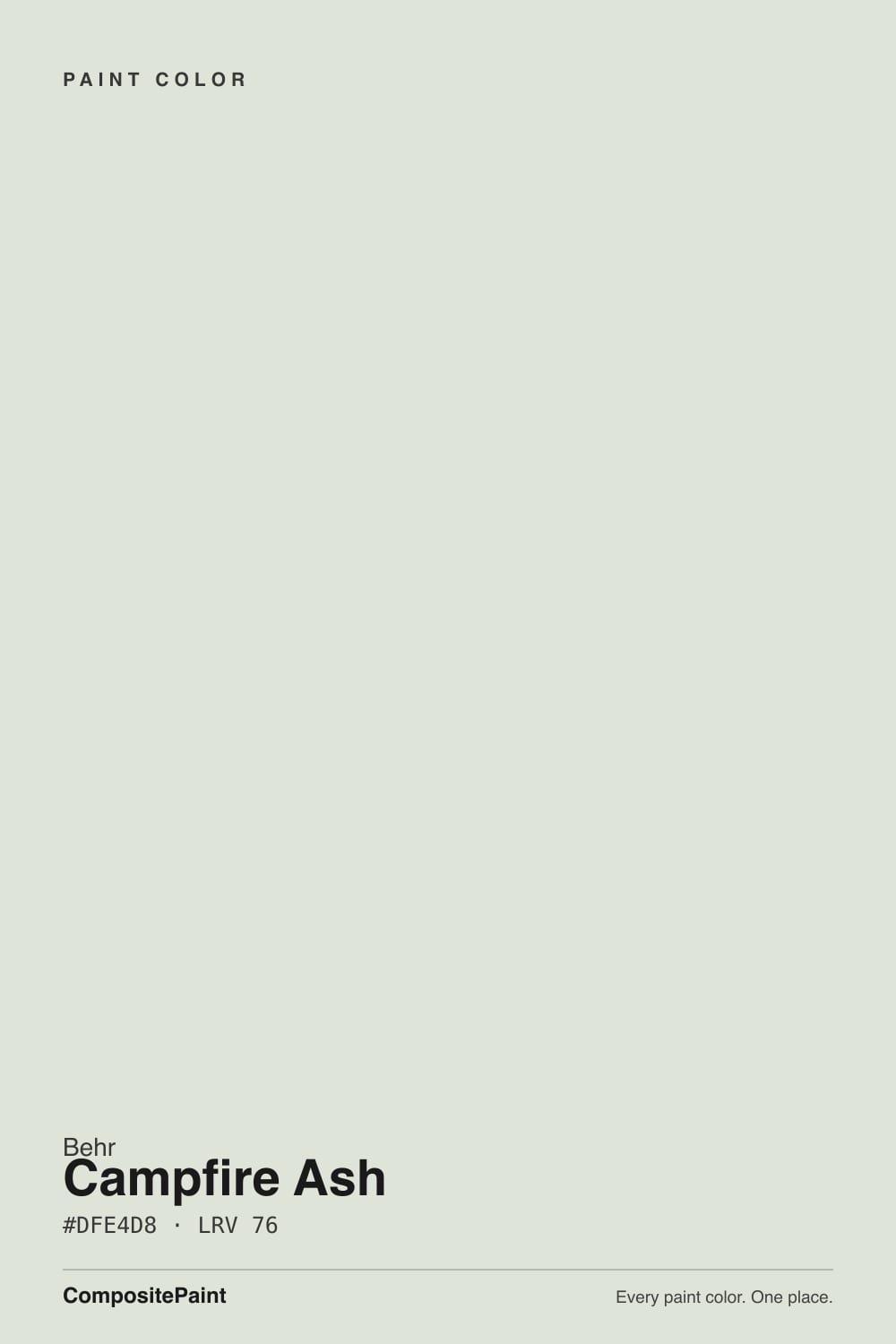
Campfire Ash is a pale, quiet near-white that is genuinely hard to pin down — and that turns out to be the honest story. Behr's own site catalogs it under the Neutral color family, not Green, and independent color-matching tools don't even agree with each other about it: different sites report its LRV anywhere from the high 60s to the mid 80s and describe it as everything from a "warm dusty gray" to a "cool light gray." Our own swatch data, pulled straight from Behr's official color file, puts it at hex #DFE4D8 and LRV 76 — the green channel sits just a few points above red and about a dozen above blue, enough to read as a faint cool cast next to a true white, and easy to miss on its own.
At LRV 76 it sits in the same soft-white bracket as Benjamin Moore Paper White (LRV 74) — bright enough to read as a normal wall white in most rooms, not deep enough to read as a bold 'color.' Behr also sells Campfire Ash in its dedicated Cabinet, Door & Trim satin enamel line, which says more about its real job than any marketing copy would: this is a color people actually use to repaint cabinets and trim, not a color built for a statement wall. Held next to a true white like Oxford White, Campfire Ash shows its hand immediately — cooler, quieter, with that faint gray-green pulling it away from plain.
Undertone in one line: a faint cool green-gray riding on a fairly neutral base — never yellow, never pink. If your sample reads as flat, institutional gray, that is a dim room or a cool bulb pulling what little color it has out of it; if it reads more beige, that is warm bulbs or afternoon sun pulling out the neutral gray underneath instead. Both are the same paint being honest about the room.
Where It Shines
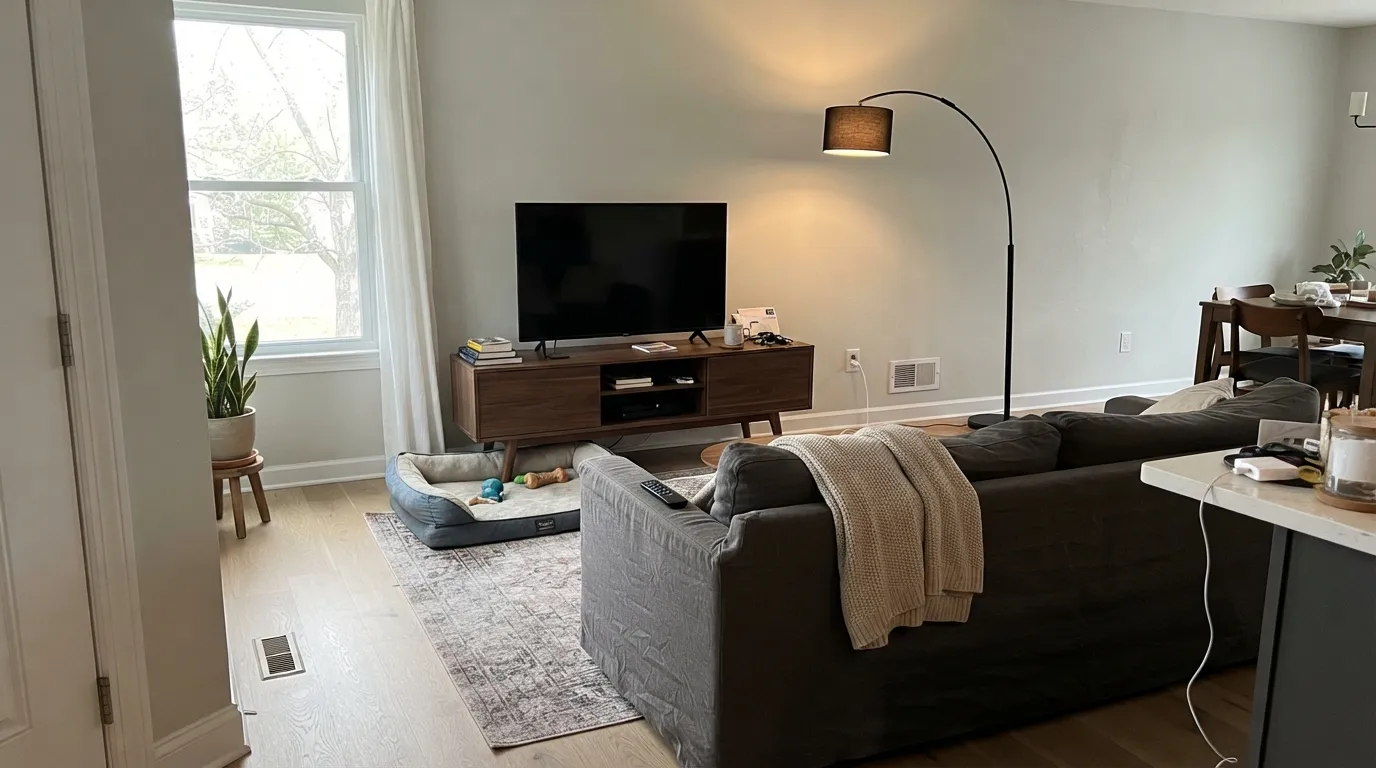
Give it real daylight and it earns its keep as one of the more interesting 'plain' whites in any deck — a wall color that reads calm and current without chasing a trend name. It is at its best across a whole floor with white oak or driftwood-toned wood, where the cool green agrees with the wood instead of fighting it, and next to black or bronze hardware, where the quiet color reads deliberate rather than accidental.
Where It Fails
Almost every disappointed review of a color like this comes from one of three situations, and all three are predictable before the first coat. None of them are the paint's fault — but if your room matches one, this is not your white, and a bigger sample will only confirm it.
Set it next to a bright trim white or a white appliance and the sage shows immediately — readers who wanted "plain white" call it dingy or dirty. It isn't dirty; it's doing exactly what a grayed green does next to a true white. If bright and clean is the goal, this is the wrong chip.
Warm, orange-leaning wood pulls against a cool green wall, and the fight runs both ways: the floor reads more orange, the wall reads more gray. White oak, driftwood, and walnut all get along with it; builder-grade honey oak does not.
Cool light and low light both drain the little color it has, and what's left reads flat, slightly muddy gray — the "institutional" complaint. Warm bulbs and any south or east light bring the sage back; a dim north room with cool LEDs is the worst-case combination.
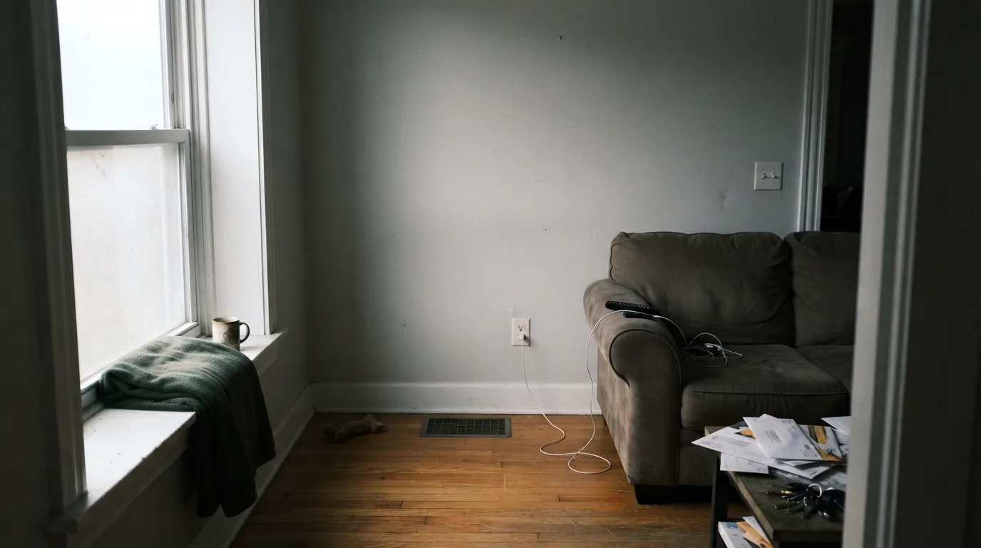
Room by Room
In a room with real light it's a calm, current wall color that doesn't read as any particular trend. Pairs best with black or bronze fixtures and white oak or walnut furniture.
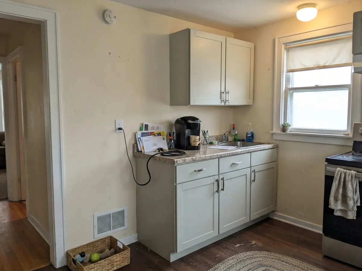
On cabinets it reads as a sophisticated cool-white instead of another sage-green cliché — pair it with a warm wall color like Swiss Coffee so the kitchen doesn't go entirely cool.
It's too pale to read as a 'mood' color, which is the point: a quiet, cool-neutral backdrop under warm 2700K lamps. If you want visible drama, look at a deeper sage instead.
It agrees with white oak, matte black fixtures and brushed nickel. Skip it with warm, brass-heavy traditional bathrooms — the cool green undercuts the warmth those fixtures are going for.
As a trim white it needs real daylight to read clean; in dim rooms it can look slightly gray next to the walls instead of crisp.
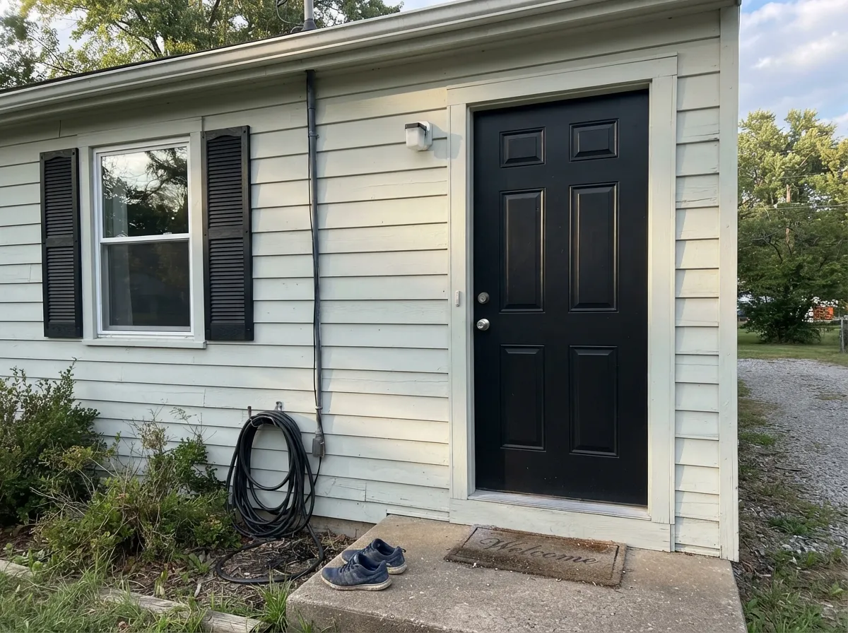
Paired with black shutters and a black door it reads like a quieter, greener cousin of the popular white-and-black exterior look — a legitimate option for anyone who wants that look without picking the same color as three houses on the block.
Your Light Is the Risk
Real daylight keeps the sage reading clean and cool without going flat — the color's most honest, most flattering light.
Cool, low light drains what little color it has and leaves a flat, slightly muddy gray. Test before committing a whole room.
Cooler and clearly green at midday, quieter and closer to plain white as the light fades toward evening.
Warm 2700K bulbs soften the green into a gentler off-white; cool LEDs push it toward flat gray — bulbs make a bigger difference here than on most whites.
Most complaints about Campfire Ash are a light mismatch. Upload a photo of your actual room and see it on your walls — then ask for the same wall in north light or evening lamps before you buy a single sample.
Need It From Another Brand?
Any paint counter can custom-tint Behr N320-1 directly. If you would rather stay in one brand's own deck, these are the closest stock matches, measured as ΔE2000. Under 2 is a difference you will not see on the wall.
| Brand | Closest color | ΔE | LRV | |
|---|---|---|---|---|
| Sherwin-Williams | Egret WhiteSW 7570 · Sherwin-Williams | 1.3 | 70 | Color page → |
| Benjamin Moore | Athena858 · Benjamin Moore | 0.0 | 69 | Color page → |
| Valspar | Glass Pebble8004-26A · Valspar | 0.8 | 70 | Color page → |
| PPG / Glidden | CocoonPPG1027-1 · PPG / Glidden | 1.7 | 70 | Color page → |
| Glidden | Whitecliff Beige30YY 69/048 · Glidden | 2.4 | 69 | Color page → |
| Dutch Boy | Pearly Gray442-1DB · Dutch Boy | 2.5 | 70 | Color page → |
Similar Behr Colors
The nearest shades to Campfire Ash within Behr's own range, ranked by perceptual color distance — useful when you want the same look a touch lighter, darker, or warmer.
WCAG 2.1: AA is 4.5 : 1 for normal text, 3 : 1 for large text, AAA is 7 : 1.
Campfire Ash vs the Colors You're Also Considering
Every Campfire Ash sample board has the same rivals on it. The numbers show the real lightness gap — then it comes down to which risk you would rather live with.
Pick this if you want the green to read a touch more and the gray to read a touch less.
Benjamin Moore 1590 · LRV 74Paper WhitePick this for a nearly identical cool grayed-white with more name recognition in the BM deck.
Pick this for a paler wash you can put on every wall in the house, not just an accent.
Sherwin-Williams SW 6204 · LRV 63Sea SaltPick this for the famous, more saturated version of this same cool sage-green mood — Sea Salt is a whole shade deeper.
Within Behr, Silver Drop 790C-2 at #DDE3D7 and LRV 75 is a shade deeper, Silver Ash GR-W11 at #DFE6D8 and LRV 77 is a touch lighter and greener, and Glacier Valley HDC-NT-24 at #E3E3DA and LRV 76 trades some green for a warmer, grayer feel. Seagull Gray N360-1 at #DDE6DD leans slightly cooler. Across brands, Valspar New Baby Smell T657 at LRV 77.7 has a deltaE of 0.44 and is the same color in practice, and Glidden Touch of Lime PPG1124-1 at LRV 77 sits at 0.9. Sherwin-Williams Greening SW 6448 at LRV 76 and deltaE 1.22 and Benjamin Moore Silken Pine 2144-50 at LRV 74 and deltaE 1.41 are visually identical in normal room light. Clare Flow State PNT100-LT-72 at deltaE 2.59 is very close, so sample it first, while Dutch Boy Moon Pie 406-1DB at deltaE 4.74 is close but visibly different side by side.
Campfire Ash Coordinating Colors
The rule for coordinating with Campfire Ash: keep it cool. It agrees with true whites, black and bronze metals, white oak and driftwood — and it argues with warm golden wood, brass-heavy traditional schemes, and anything yellow. These are the partners that actually work with it:
An Honest, Unfamous Color — And What That Means
Campfire Ash doesn't have a Color of the Year story, a celebrity home, or a viral Reddit thread — nothing in the research turns up a famous room painted in it. What does turn up is more useful: Behr catalogs it under its Neutral family, not Green, and sells it in a dedicated Satin Enamel Cabinet, Door & Trim formulation — real evidence that its actual job, in real houses, is cabinets and trim rather than statement walls. Independent color-matching sites don't even agree with each other about its exact LRV or hex, which says less about the paint and more about how subtle and hard to categorize its undertone really is.
That obscurity isn't a defect. Most paint colors that exist do their job quietly, with no marketing behind them, and this is a solidly built one: a genuine, testable cool-neutral at a useful LRV, sold at Home Depot for the price of a sample pot. If you want a color your friends will recognize by name, this isn't it. If you want a quiet cabinet-and-trim color with a little more personality than plain white, it's a real option.
Campfire Ash With Wood Tones and Floors
Cool wood is this color's best friend: white oak, ash, driftwood-gray floors and walnut all sit comfortably against it, because none of them are fighting its green for attention. Matte black and dark bronze hardware read clean and deliberate against it — the same pairing that carries the exterior use case.
Golden, orange-leaning wood is the one real no: honey oak floors, orange-toned trim, and yellow-beige carpet all pull in the opposite direction from this color's cool green, and the fight is visible from both sides. If that wood is staying, a large rug or a warmer accent wall will do more good than hoping the paint compromises.
Three Ready Palettes Built on Campfire Ash
A color is never alone on the wall. These are complete combinations in the 60-30-10 pattern, with the reason each one holds together. Every one opens in the visualizer.
A true white trim, not a matching sage, is what makes the green in Campfire Ash finally visible — same-color trim would gray the whole room down instead. Wrought Iron's softness keeps the black note from feeling harsh against so much quiet color.
Try this palette in your roomSwiss Coffee's warmth balances the cool green on the cabinets instead of fighting it, and Baja Dunes' sandy depth does the job warm wood or brass usually does — grounding the kitchen without arguing with the green.
Try this palette in your roomPaired with a true black, the green undertone reads as an intentional, quieter alternative to the stark white-and-black exterior everyone already has — the sage keeps it from looking like the house next door.
Try this palette in your roomCampfire Ash FAQ
Is Campfire Ash gray, green, or white?
All three, depending who you ask — which is honestly the story of this color. Behr's own site files it under the Neutral family, not Green, and independent color tools disagree with each other about exactly how warm or cool it reads. What's true on the actual swatch: the green channel sits just a touch above red and noticeably above blue, giving it a faint cool cast that shows up next to a true white and mostly disappears on its own.
Is it warm or cool?
Cool. There's no yellow or pink in it anywhere — the undertone leans green and gray, which means it can look a little institutional in a cold, dim room and genuinely nice in a bright one. If your fixed materials (floors, counters, existing trim) are warm, test carefully before committing to four walls.
What trim white goes with Campfire Ash?
A true white, not a matching sage — Oxford White or a similarly crisp trim white lets the green in the walls actually show. Trim in the same family as the wall color tends to flatten the whole room into one gray-green blur.
Does it work with honey oak floors?
Not well. Warm, orange-leaning wood and this cool green pull against each other — the floor reads more orange, the wall reads more gray. White oak, driftwood, and walnut are much better partners.
Is it a good exterior color?
Yes, particularly with black or dark bronze trim and shutters — it reads as a quieter, greener alternative to the standard white-and-black exterior. Full sun brightens it; the shaded side of the house will read noticeably grayer.
Why haven't I heard of Campfire Ash?
Because it has no Color of the Year history and no viral before-and-after to its name — Behr mostly sells it as part of its Cabinet, Door & Trim line rather than pushing it as a wall statement. That's not a red flag — it's one of thousands of quiet, well-built colors in a big brand's deck that never got a marketing push. Judge it on the sample, not the search-result count.
Have you painted with Campfire Ash?
Rate it — one tap helps the next reader decide.
Ask a Question