Egret White
Sherwin-Williams' quiet whole-house off-white, reviewed honestly: where it glows, the exact rooms where it flashes pink, and what to paint instead.

Jessica has spec'd whites and neutrals for more than 300 rooms and keeps a sample wall of painted drawdowns in her studio. Every color review is checked against real reader rooms in the comments and re-tested when a formula changes. About the testing process →
- 1Revere Pewter55
- 2Agreeable Gray60
- 3Egret White70
- 4Pearly White77
- 5Dover White83
The Fast Verdict
Egret White is the off-white for people who think most whites look cold. It has real body, so walls look painted instead of primed, and it flatters oak, brass and travertine without trying.
The catch is the red sitting under the warmth: next to a creamy white or a yellow-beige floor it can flash pink, and readers who skipped sampling are the ones writing the angry reviews. Sample it on two walls, pick a clean trim white, and it behaves.
Whole-house walls in rooms with decent daylight · kitchen cabinets that should not look brand new · homes with oak floors, travertine and brass · exteriors with black or navy trim
Your trim is a creamy white like Alabaster or Greek Villa · your tile and counters are yellow-beige · you want an actual crisp white · the room is dim, north-facing and lamp-free
- Warm without ever going yellow or buttery
- Enough body that walls look painted, not primed
- Flatters oak, travertine, brass and butcher block
- Cabinets in satin look softly aged instead of brand new
- Excellent exterior siding white — sun neutralizes the pink
- Flashes pink next to creamy whites and yellow-beige finishes
- Reads grey and drab in dim north rooms without lamps
- Too soft to work as trim under most wall colors
- Buyers expecting a true white are the ones who repaint
What Color Is Egret White, Really?
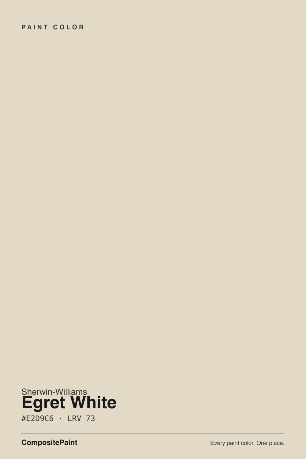
It is sold as a white and it behaves like a light greige. Hex #E2D9C6 sits at hue 41 with saturation near 33 percent, which is a lot of color for something this pale — on a full wall you see soft taupe-cream, not white. Under the warmth there is red, and the red is the part nobody warns you about. It is what makes this color flash pink beside the wrong neighbor, and it is also what keeps it from ever going green or cold.
At LRV 70 it bounces plenty of light, but it is not in the bright-white club and it does not pretend to be. Hold it against Alabaster (SW 7008, LRV 82) and Egret White stops reading as a white at all — it becomes the color and Alabaster becomes the white. That nine-point gap is the whole personality: enough depth that shadows look soft instead of dirty, light enough that a hallway with one window still feels open.
Undertone in one line: warm taupe over a red base — never green, never blue. When your sample looks pink on the wall, that red is being lit up by a yellow-based neighbor, not by a bad can of paint.
Where It Shines
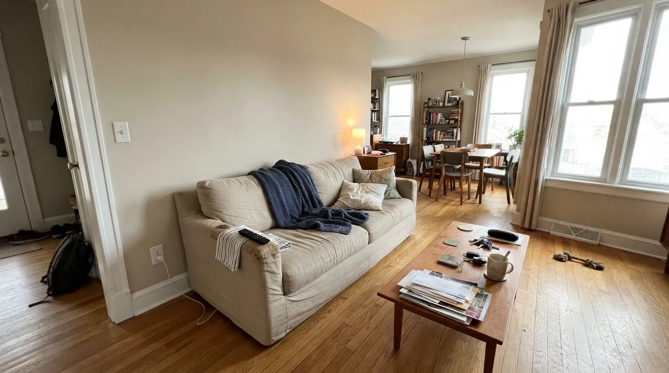
Give it daylight and warm materials and it does exactly what people hope a warm neutral will do. Oak floors, honey cabinets, travertine, unlacquered brass — it meets all of them halfway instead of arguing, and on cabinets it reads like paint that has been there a while rather than a fresh builder white.
Where It Fails
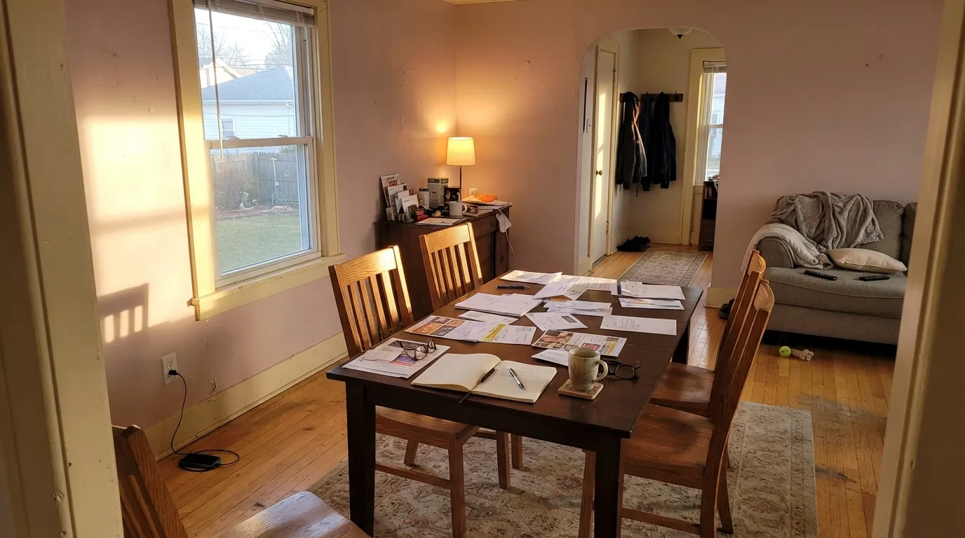
The bad Egret White stories are remarkably consistent, and all three are pairing problems rather than paint problems. If your room matches one of these, no second coat is going to save it.
This is the number one complaint: Egret White walls with Alabaster (SW 7008) or Greek Villa (SW 7551) trim. The yellow in the trim pushes the red in the wall forward and the wall goes visibly pink. Use a clean, low-yellow trim white — Pure White (SW 7005) — and the pink disappears.
Golden oak, honey travertine, or builder tan tile do the same thing the creamy trim does: they take the yellow, and the wall is left holding the red. People describe it as mauve or dusty pink. If your hard finishes are that yellow, Shoji White (SW 7042) leans green-taupe and sits calmly next to them.
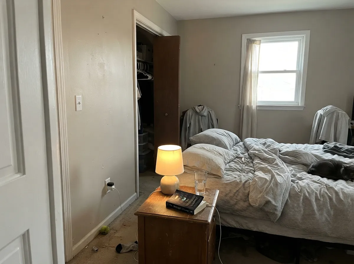
North light strips the cream out and leaves the grey-taupe underneath, so the room reads drab rather than soft. This is the room where people call it dingy. Go lighter and creamier with Alabaster (SW 7008), or keep Egret White and commit to 2700K lamps.
Room by Room
With real daylight it is a calm backdrop that makes wood furniture look intentional and art look framed. Eggshell on walls, Pure White (SW 7005) on trim in semi-gloss. In a big open room, run it into the dining side too — it holds up over long walls.
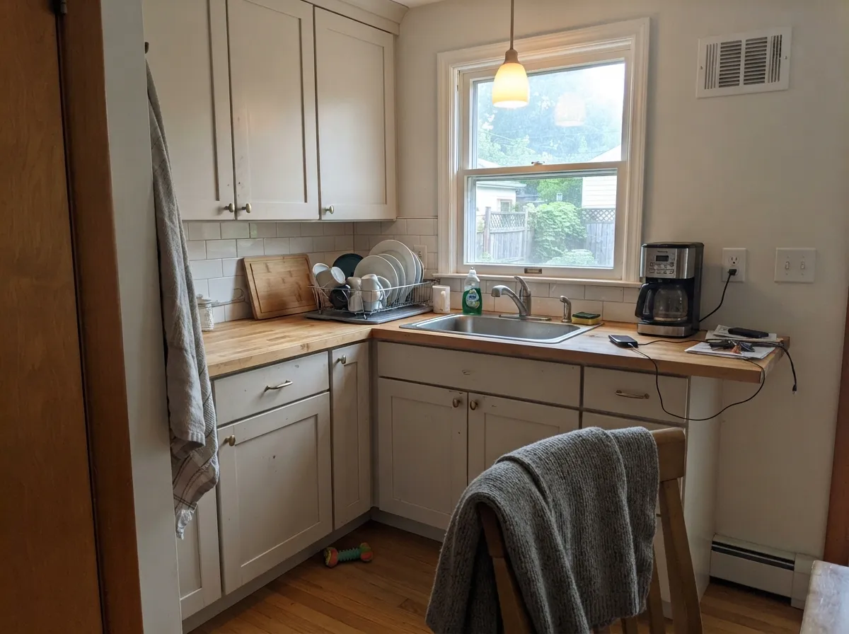
This is what people ask about most, and it delivers: satin cabinets in Egret White look softer and older than a stark white, and they hide knuckle marks. Pair with butcher block, brass, or a Pewter Green (SW 6208) island. Check it against your counters first — yellow-beige granite is where the pink shows up.
Under 2700K bulbs it turns quietly creamy at night, which is exactly what a bedroom wants. Eggshell walls, Snowbound (SW 7004) on trim and ceiling if you want a slightly brighter edge. Skip it if the room faces north and stays dark all winter.
With warm marble, wood vanities and brass it is lovely in satin. With yellow-beige builder tile it flashes pink, and with cool grey porcelain it looks tired. Tape a large sample directly above the tile before you commit.
At LRV 70 it is too soft to cut a clean line under most wall colors, so it reads muddy rather than crisp. It works in exactly one setup: walls and trim both Egret White, eggshell against semi-gloss, for a quiet monochrome. Otherwise trim in Pure White (SW 7005).
Full sun burns off the pink risk and it reads as a soft, warm white siding color instead of a cream. Frame it with Iron Ore (SW 7069) or Urbane Bronze (SW 7048) trim and a Naval (SW 6244) door. Full pairings in the exterior section below.
Your Light Is the Risk
Cool light pulls the taupe forward; soft and quiet, but never bright. Lamps put the cream back.
Warms into a soft, clean off-white all day. This is the room it was made for.
For an hour or two the red base wakes up and walls can read pink. Sample this wall.
2700K lamps: creamy and cozy. Cool 4000K LEDs: flat grey-beige. Change bulbs, not paint.
Most complaints about Egret White are a light mismatch. Upload a photo of your actual room and see it on your walls — then ask for the same wall in north light or evening lamps before you buy a single sample.
Need It From Another Brand?
Any paint counter can custom-tint Sherwin-Williams SW 7570 directly. If you would rather stay in one brand's own deck, these are the closest stock matches, measured as ΔE2000. Under 2 is a difference you will not see on the wall.
| Brand | Closest color | ΔE | LRV | |
|---|---|---|---|---|
| Behr | Taupe TeaseN210-1 · Behr | 0.5 | 70 | Color page → |
| Benjamin Moore | Athena858 · Benjamin Moore | 1.3 | 69 | Color page → |
| Valspar | Slush8005-2A · Valspar | 0.6 | 70 | Color page → |
| PPG / Glidden | In The CloudPPG0999-1 · PPG / Glidden | 1.5 | 71 | Color page → |
| Glidden | Whitecliff Beige30YY 69/048 · Glidden | 1.2 | 69 | Color page → |
| Dutch Boy | Pearly Gray442-1DB · Dutch Boy | 1.4 | 70 | Color page → |
Similar Sherwin-Williams Colors
The nearest shades to Egret White within Sherwin-Williams's own range, ranked by perceptual color distance — useful when you want the same look a touch lighter, darker, or warmer.
WCAG 2.1: AA is 4.5 : 1 for normal text, 3 : 1 for large text, AAA is 7 : 1.
Egret White vs the Colors You're Also Considering
Every Egret White sample board has the same rivals on it. The numbers show the real lightness gap — then it comes down to which risk you would rather live with.
Pick this if you want visible warmth and body, not another soft white.
Sherwin-Williams SW 7008 · LRV 82AlabasterPick this for a brighter, creamier white on trim, cabinets and ceilings.
Pick this when your floors and stone lean grey, cool or true beige.
Sherwin-Williams SW 7042 · LRV 74Shoji WhitePick this if your fixed finishes are yellow-beige — Shoji never flashes pink.
Within the brand the differences are small. Neutral Ground (SW 7568) at LRV 70 is a touch less yellow and reads slightly more neutral on a wall. White Sesame (SW 9586), #E3DBCD at LRV 71, is grayer and less creamy. Warm Winter (SW 9506), #E1D9C6 at LRV 70, is so close in hex that the two will be hard to tell apart.
Across brands the matches are unusually tight. Dunn-Edwards Instant Classic (DET672) at 0.44, Diamond Vogel Illusive Dream (0335) at 0.52, Benjamin Moore White Sand (964) at 0.56, and Kompozit White Elephant (0223) at 0.64 all sit under a color difference of 1, so any of them is the same color for practical purposes. Behr Chartreuse Frost (MQ3-17) at 0.8 and Glidden Navajo Sand (40YY 69/112) at 0.9 land in the same group. Farrow & Ball Blanc de Treillage (No. G1) at 1.54 is visually identical in normal room light.
Egret White Coordinating Colors
The rule with Egret White is simple: partner it with clean whites and true greiges, not with creams. Anything with a yellow base steals the warmth and leaves the red exposed, which is where the pink complaints come from. These are the partners that behave, indoors and out:
Egret White on Cabinets
Cabinets are the single most common question about this color, and the answer is mostly yes. In satin, Egret White gives doors a soft, settled look — the opposite of the bright builder white that shows every fingerprint around the pulls. At LRV 70 it also hides day-to-day scuffing better than Pure White or Extra White, which matters on a kitchen that gets used.
Two checks before you spray. First, hold a door-sized sample against the countertop: cream-and-tan granite is where the pink flash appears, while cool white or grey quartz makes the cabinets look deliberately warm. Second, decide the wall color at the same time — Snowbound (SW 7004) above Egret White cabinets keeps the contrast gentle, while a step-darker wall in Anew Gray (SW 7030) makes the cabinets look lighter than they are.
Egret White on Exteriors
Outside is where this color quietly wins. Direct sun flattens the red base that causes trouble indoors, so a whole facade in Egret White reads as a warm, soft white rather than a cream — and it never gives the blue glare that cheap bright whites throw on a sunny wall. Shaded north elevations will look a full step greyer than the sunny south side, so walk the house with the sample board before you commit.
The trim decides the character. Iron Ore (SW 7069) or Urbane Bronze (SW 7048) gives the modern-farmhouse frame most people are after; Naval (SW 6244) on the door adds one note of color that suits both. What to avoid outside is the same thing to avoid inside: cool blue-grey accent panels, which make the siding look dull by comparison.
Three Ready Palettes Built on Egret White
A color is never alone on the wall. These are complete combinations in the 60-30-10 pattern, with the reason each one holds together. Every one opens in the visualizer.
Pure White is clean enough to define the trim line without the yellow that makes Egret White go pink, so the two stay honest room after room. Urbane Bronze supplies the single dark note the scheme needs and picks up black hardware.
Try this palette in your roomSnowbound is lighter than the cabinets but barely warmer, so the wall reads as background and the cabinets keep their soft taupe character. Pewter Green grounds the room and makes the whole thing look designed rather than beige.
Try this palette in your roomOutdoors the sun bleaches the pink out and Egret White settles into a warm, soft white, which a near-black trim sharpens into real contrast. Naval on the door adds color without breaking the black-and-warm-white rhythm.
Try this palette in your roomEgret White FAQ
Does Egret White look pink?
It can, and this is the honest weak spot. The red under the warmth shows up when the color sits next to something yellow — creamy white trim, golden oak, tan travertine — or in strong late-afternoon west sun. With a clean trim white like Pure White (SW 7005) and cooler hard finishes, it reads as a warm taupe-white instead.
What trim white goes with Egret White walls?
Pure White (SW 7005) is the safe answer. It is clearly brighter at LRV 84 but low enough in yellow that it will not push the walls pink. Snowbound (SW 7004) also works. Avoid Alabaster and Greek Villa — both are creamy, and that is the exact pairing people regret.
Egret White or Alabaster for kitchen cabinets?
Alabaster if you want cabinets that still read as white, Egret White if you want them to look softly aged and quiet. Egret White is nine LRV points deeper, so it hides marks better and looks less new next to wood counters. In a dark kitchen Alabaster keeps more light on the doors.
Is Egret White the same as Benjamin Moore Pale Oak?
They are close enough that most people cannot tell them apart on a wall. Pale Oak (OC-20) sits at LRV 69 and leans a hair cooler and greyer; Egret White at LRV 70 is slightly lighter and warmer. If your painter buys one brand, take the match and move on.
Does it work with oak floors?
With mid-tone or white oak, yes — it is one of its best pairings. With orange-golden 1990s oak it is riskier, because that much yellow in the floor can push the wall toward pink or mauve. Put a large sample flat against the floor before you buy five gallons.
Will it look dingy next to white appliances or quartz?
Next to a bright white quartz counter or a white fridge it will look like a color, not a white — that is normal and usually fine, because the contrast reads intentional. It only looks dirty when the white beside it is creamy rather than crisp. Cool white quartz is a good partner here.
Can I use Egret White outside?
Yes, and it is arguably better outdoors than in. Full sun washes the red base out, so the pink flash people fight indoors mostly disappears and the siding reads soft warm white. Pair it with Iron Ore (SW 7069) or Urbane Bronze (SW 7048) trim and avoid cool blue-grey accents.
Have you painted with Egret White?
Rate it — one tap helps the next reader decide.
Ask a Question