City Loft
The light greige that behaves in most houses and flashes pink in a few, reviewed honestly: the rooms it saves, the rooms it ruins, and what to buy instead.

Jessica has spec'd whites and neutrals for more than 300 rooms and keeps a sample wall of painted drawdowns in her studio. Every color review is checked against real reader rooms in the comments and re-tested when a formula changes. About the testing process →
- 1Revere Pewter55
- 2Agreeable Gray60
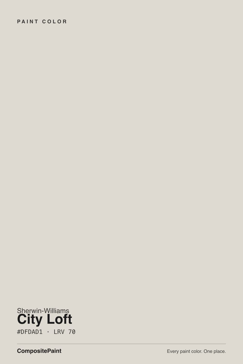
- 3City Loft70
- 4Pearly White77
- 5Dover White83
The Fast Verdict
City Loft is the color people land on when gray felt cold and beige felt yellow. It is light, quiet, and easy to live with, and it does the whole-house job better than most neutrals because it stays believable next to oak, tile, and stone in the same sightline.
The catch is the red in its base: in strong afternoon sun, or under warm LEDs, big walls can flash faintly pink or violet. Sample it on the west wall of your house before you buy five gallons.
Whole-house walls in open plans · north-facing rooms that need warmth without beige · kitchen cabinets with wood counters and brass · hallways and basements that need light back
Your afternoon sun is strong and pink bothers you · you want walls and trim in one color · your trim is a bright blue-white · you want a neutral with visible body on the wall
- Warm without a trace of yellow or green
- LRV 70 lifts dim hallways, basements, and north rooms
- Believable next to several floor tones in one open plan
- On cabinets it gives soft warm gray instead of stark white
- Rare light neutral that does not flash green outdoors or by a green sofa
- Can flash pink or violet in strong afternoon sun
- Washes out to near-nothing in very bright, sun-filled rooms
- Reads like primer if walls and trim are both City Loft
- Looks dull next to bright blue-based whites
What Color Is City Loft, Really?
A light greige built on red, not on yellow — and that one detail explains every good and bad review this color gets. Most soft neutrals in this lightness range lean yellow or green. City Loft leans a whisper of red, which is why it looks warm without ever looking buttery, and why it is the rare light neutral that does not flash green next to a lawn or a green sofa. It is also why it can go pink. You do not get one without the other.
At LRV 70 it is light, but it is not a white. Stand it next to Alabaster (SW 7008) at LRV 82 and City Loft suddenly has color in it — you can see it is a wall, not a blank. Stand it next to Agreeable Gray (SW 7029) at LRV 60 and it looks almost white by comparison. That middle position is the whole appeal: enough light for a dim hallway, enough body to look chosen. It is also the trap, because in a room drenched in sun it can slide back toward looking like primer.
Undertone in one line: warm greige with a red whisper — never yellow, never green, occasionally pink. If your sample looks purple, that is the red base meeting a cool LED bulb or a gray-blue floor, not a bad can of paint.
Where It Shines
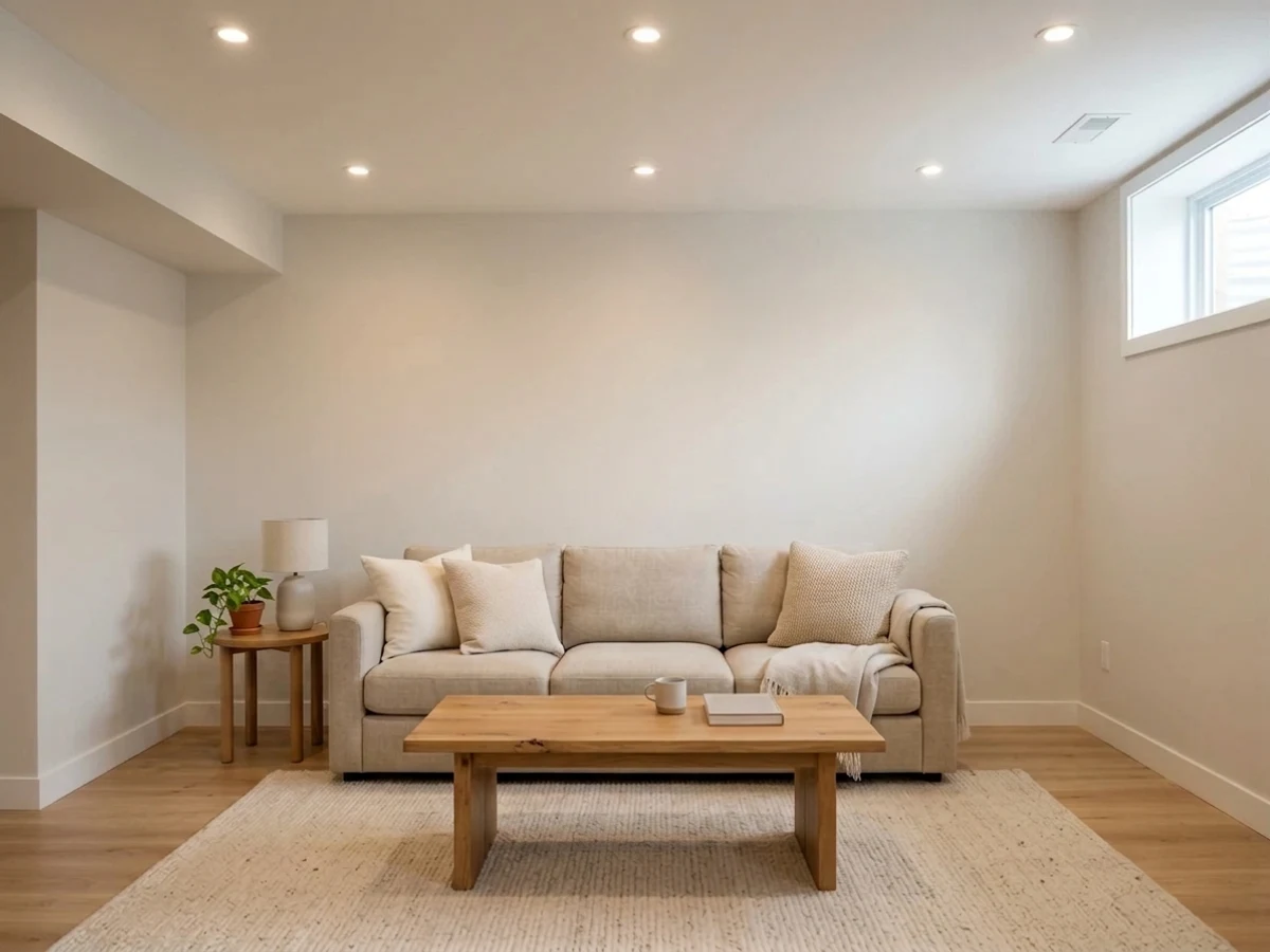
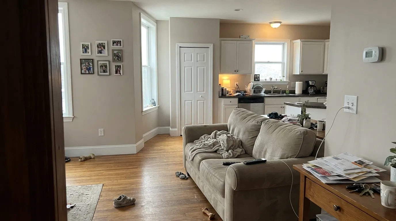
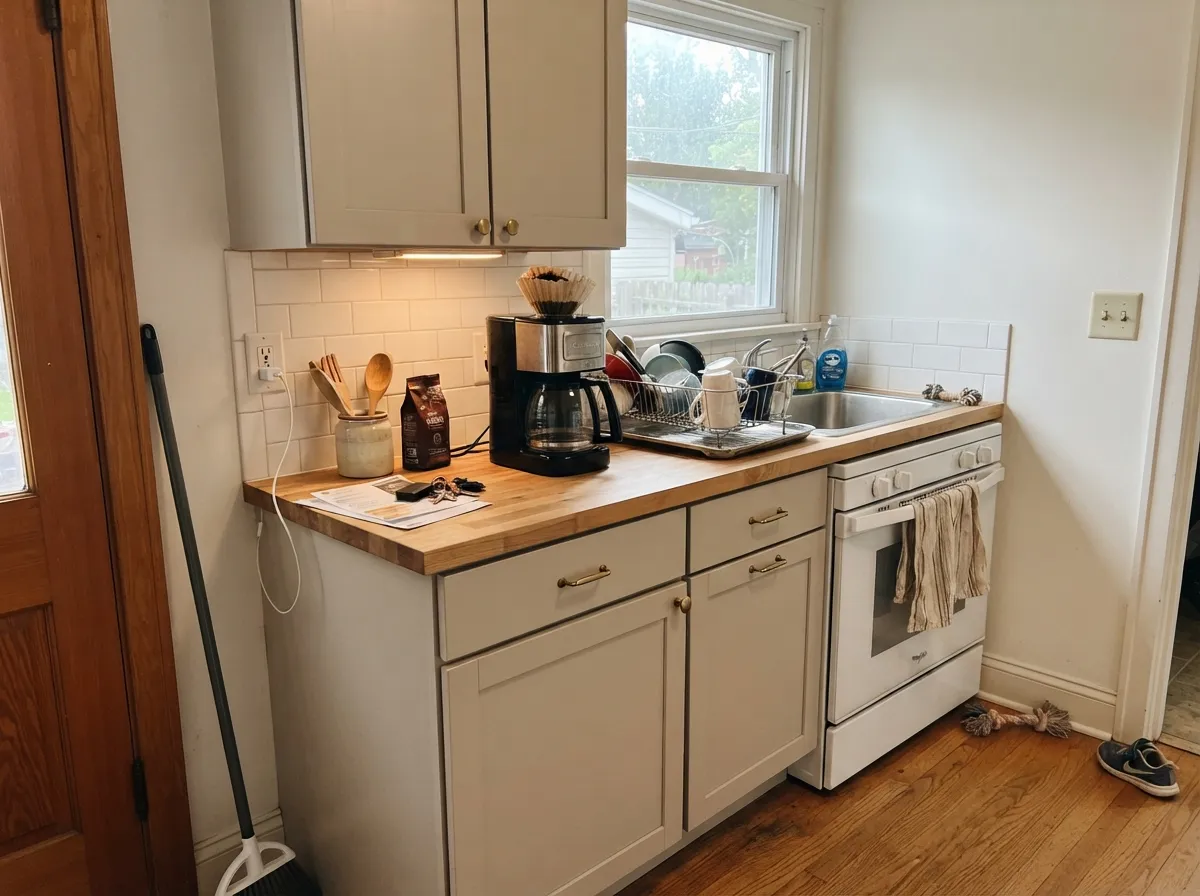
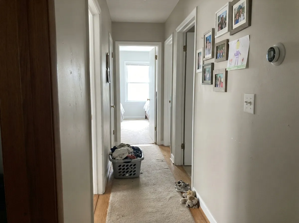
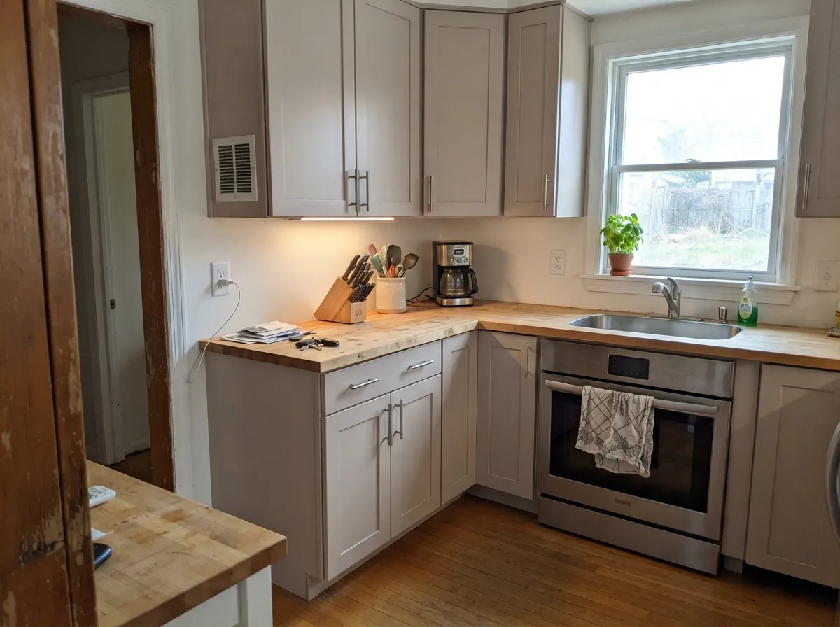
Give it a normal house with normal daylight and it just works. Open plans are where it earns its reputation: one color running past oak floors, gray tile, and a stone counter without arguing with any of them. On kitchen cabinets it reads as a soft warm gray that flatters butcher block and brass, and in hallways and basements the LRV 70 gives the light back.
Where It Fails
The complaints about City Loft are not random. They come from three very specific situations, and every one of them is predictable from a sample board. If your room is one of these, this is not your color and more coats will not save it.
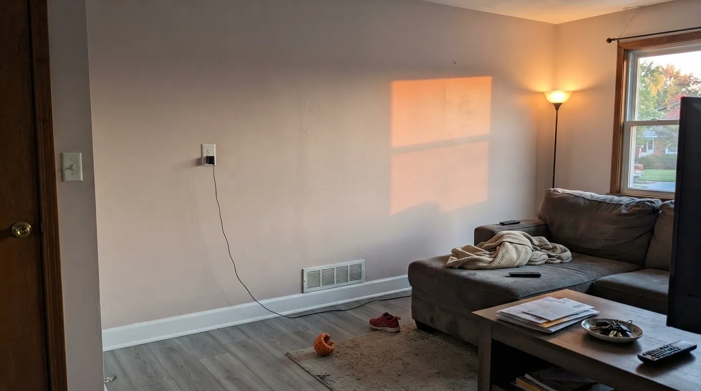
Low warm sun hits the red base and a big uninterrupted wall can flash pink, or violet if the floor is a cool gray. This is the single most-repeated complaint about this color. If you want the same softness without the red, use Shoji White (SW 7042) — warmer, yellow-based, and it never goes pink.
The one-color room trick works for whites in the 80s. At LRV 70 with almost no saturation, the whole room reads like unfinished primer instead of a finished neutral, and people call it dingy. Either put a real trim white on the woodwork — Pure White (SW 7005) — or, if you truly want one color everywhere, use Alabaster (SW 7008) instead.
Strong direct light bleaches it. At LRV 70 there is not enough pigment to hold up, and the walls flatten into nothing — the classic "it looks like we never painted" review. Step down in lightness: Agreeable Gray (SW 7029) at LRV 60 or Accessible Beige (SW 7036) at LRV 58 keep their color under that much sun.
Room by Room
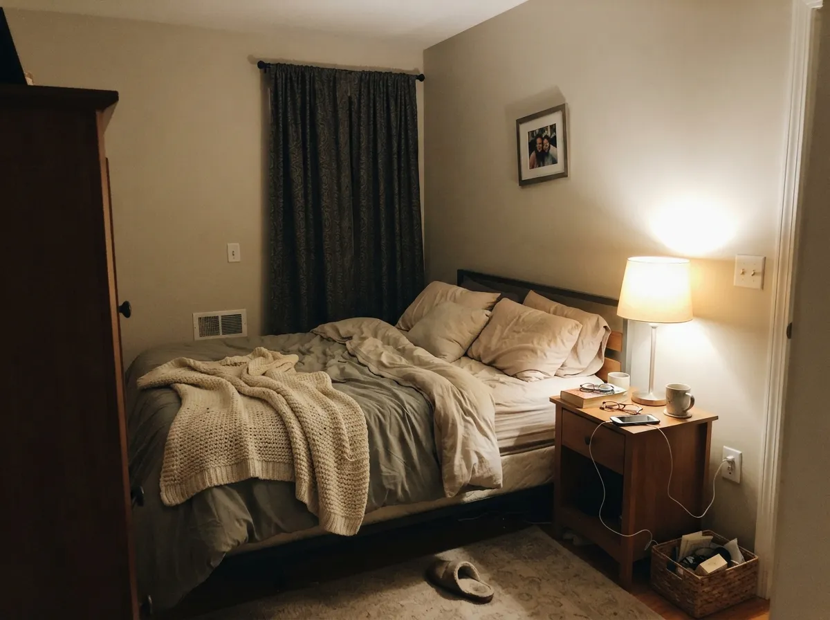
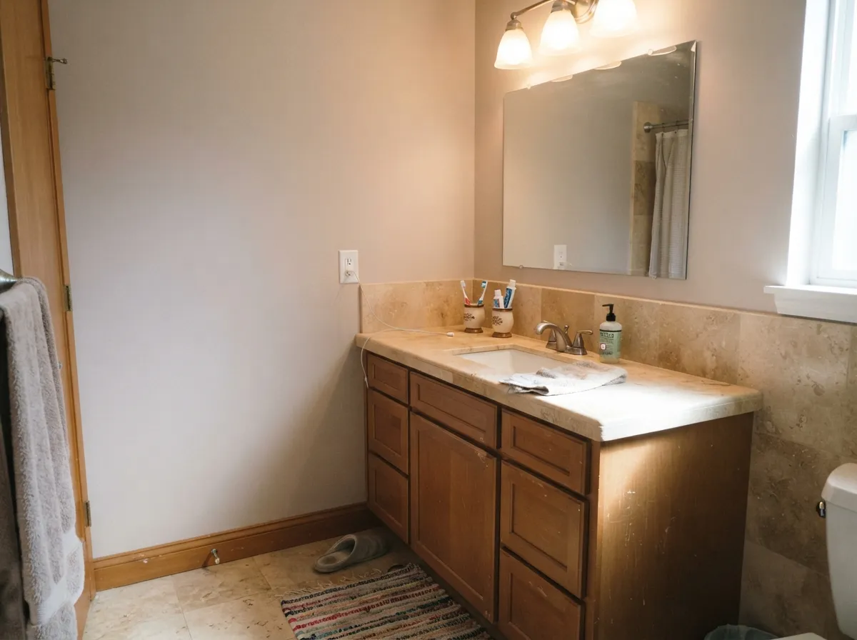
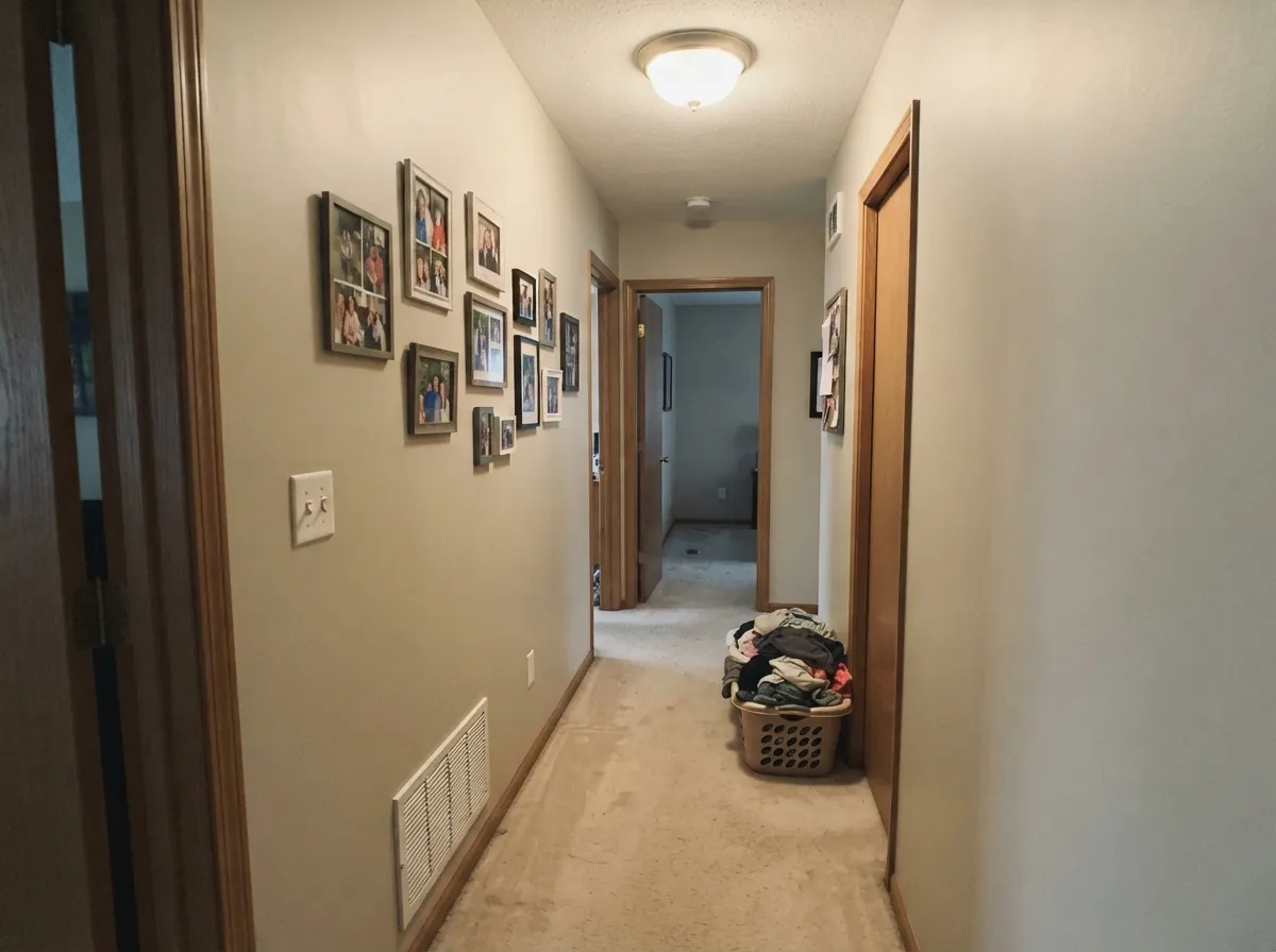
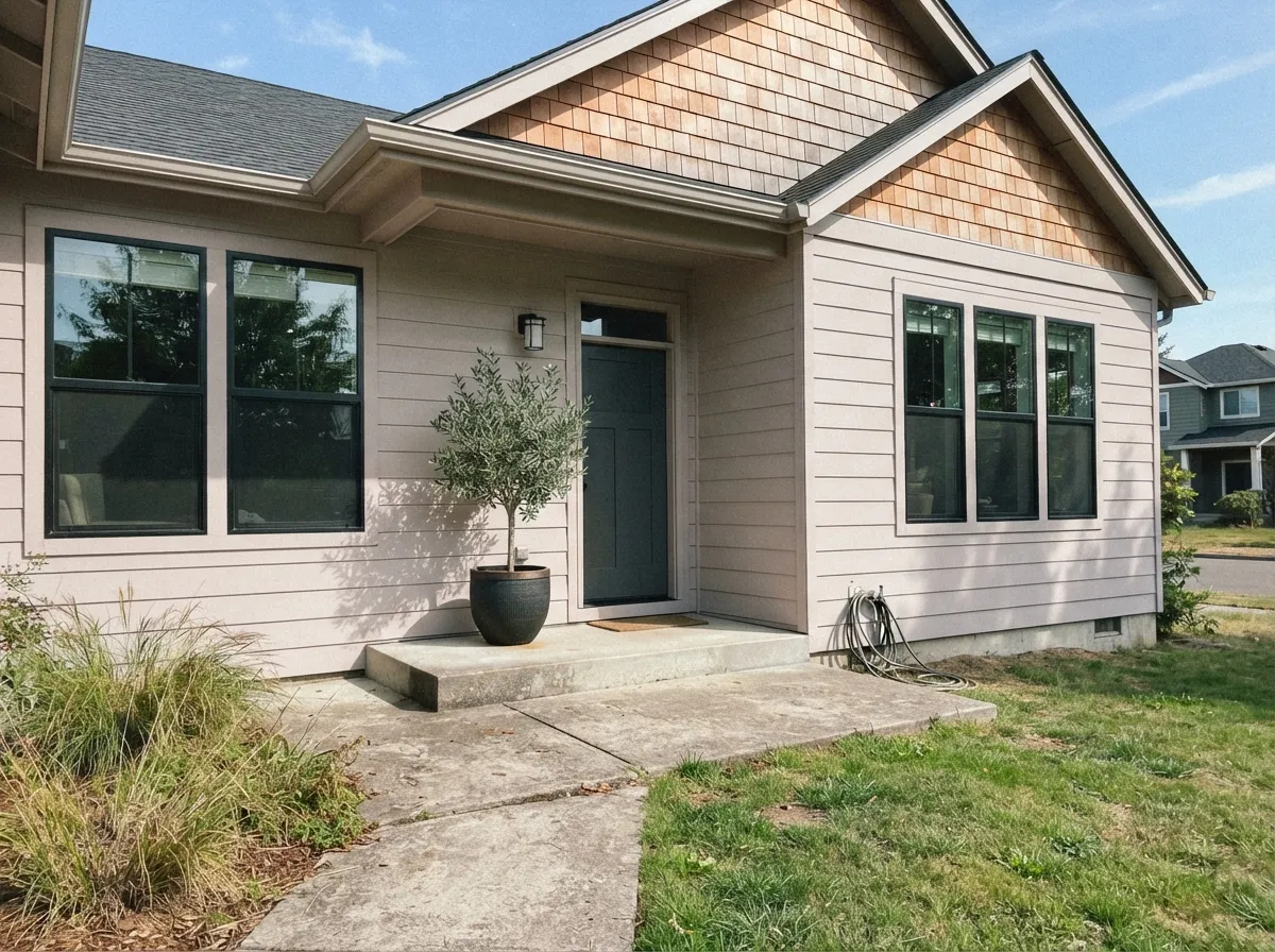
Your Light Is the Risk
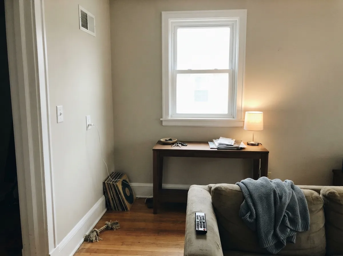
Cool daylight tames the red and it reads as a clean warm gray. Its best room.
Warms and creams up through the day. Lovely — until the glass is huge and it bleaches out.
Low warm sun pulls the red base forward and big walls can go faintly pink. Test here first.
2700K lamps: creamy and cozy. Cool 4000K LEDs: gray, and sometimes slightly violet.
Most complaints about City Loft are a light mismatch. Upload a photo of your actual room and see it on your walls — then ask for the same wall in north light or evening lamps before you buy a single sample.
Need It From Another Brand?
Any paint counter can custom-tint Sherwin-Williams SW 7631 directly. If you would rather stay in one brand's own deck, these are the closest stock matches, measured as ΔE2000. Under 2 is a difference you will not see on the wall.
| Brand | Closest color | ΔE | LRV | |
|---|---|---|---|---|
| Behr | Taupe TeaseN210-1 · Behr | 1.0 | 70 | Color page → |
| Benjamin Moore | Athena858 · Benjamin Moore | 1.2 | 69 | Color page → |
| Valspar | Dirty MartiniV174 · Valspar | 0.5 | 70.2 | Color page → |
| PPG / Glidden | In The CloudPPG0999-1 · PPG / Glidden | 1.0 | 71 | Color page → |
| Glidden | Whitecliff Beige30YY 69/048 · Glidden | 1.3 | 69 | Color page → |
| Dutch Boy | Pearly Gray442-1DB · Dutch Boy | 1.3 | 70 | Color page → |
Similar Sherwin-Williams Colors
The nearest shades to City Loft within Sherwin-Williams's own range, ranked by perceptual color distance — useful when you want the same look a touch lighter, darker, or warmer.
WCAG 2.1: AA is 4.5 : 1 for normal text, 3 : 1 for large text, AAA is 7 : 1.
City Loft vs the Colors You're Also Considering
Every City Loft sample board has the same rivals on it. The numbers show the real lightness gap — then it comes down to which risk you would rather live with.
Pick this for a cleaner, grayer neutral with no yellow in it.
Sherwin-Williams SW 7042 · LRV 74Shoji WhitePick this if your room faces west — it warms instead of turning pink.
Pick this when you want a wall color, not a white.
Sherwin-Williams SW 7008 · LRV 82AlabasterPick this for one-color rooms and for cabinets that should read white.
Inside the deck the neighbors are extremely close. Egret White (SW 7570) at LRV 70 shares nearly the same hex at #DFD9CF and leans a touch more beige. Simple White (SW 7021) at LRV 70 at #DFD9D2 carries slightly more pink-gray. Oat Milk (SW 9501) at LRV 70 goes yellower at #DEDACD, while Pacific Fog (SW 9627) at LRV 71 trades warmth for a cooler, grayer read. At this lightness the differences only show once the paint is on a wall.
Across brands the matches are tight. Valspar Dirty Martini (V174), LRV 70.2, and Dunn-Edwards Free Spirited (DEGR09), LRV 70, are both 0.51 away, and Behr Silver Drop (790C-2), LRV 70, is 0.97, so all three are the same color for practical purposes. PPG and Glidden In The Cloud (PPG0999-1), LRV 71, at 1.02 and Benjamin Moore Athena (858), LRV 69, at 1.23 are visually identical in normal room light. Farrow and Ball Blanc de Treillage (No. G1), LRV 69, at 2.6 and Diamond Vogel Saturnia (0369), LRV 71, at 2.67 are very close but worth sampling first.
City Loft Coordinating Colors
The rule with City Loft is to stay warm and change the value, not the temperature. Because the wall is already at LRV 70 with a red base, blue-based whites and cool grays are the two things that make it look dull or dirty. Partners that work sit either clearly lighter and warm, or clearly darker and grounded. These are the ones that come up again and again in real houses:
City Loft on Exteriors
Outside it behaves better than its soft reputation suggests. Full sun lifts it, so a house painted City Loft reads closer to a warm off-white than to the greige you see on the chip indoors — which means the pink risk that bothers people in a west-facing living room mostly disappears on a facade. It has become a common pick for the quiet modern look: light body, black windows, natural wood door.
The frame decides how it lands. With Iron Ore (SW 7069) or Tricorn Black (SW 6258) on windows, shutters, and the garage door you get real contrast and City Loft looks crisp. With Urbane Bronze (SW 7048) it goes softer and more organic, especially next to cedar or stone. Two cautions: the shaded north elevation will read a full step grayer than the sunny side, so walk the whole house with a large sample, and avoid cool blue-gray accents, which are what make it look dingy from the curb.
City Loft With Wood Floors and Wood Tones
This is the question readers ask most, and it has a clear answer: warm wood is City Loft's best friend. Medium and dark oak, walnut, butcher block, and cane all sit comfortably against it because the red in the paint softens the orange in the wood instead of amplifying it. If you have honey oak floors or oak cabinets you are keeping, City Loft is one of the few light neutrals that makes them look intentional rather than dated.
Cool gray-washed floors and gray LVP are the pairing to test carefully. Gray flooring pushes City Loft's red forward, and in the wrong light the wall goes pink above a gray floor. It is not automatically a dealbreaker — warm rugs, brass, and leather pull it back — but put a big sample board on the floor and look at it at three different times of day before you commit the whole house.
Three Ready Palettes Built on City Loft
A color is never alone on the wall. These are complete combinations in the 60-30-10 pattern, with the reason each one holds together. Every one opens in the visualizer.
Pure White at LRV 84 is bright enough to separate from a 70 LRV wall but warm enough not to make City Loft look dirty, which is the whole trim problem solved in one can. Urbane Bronze gives the scheme its single dark anchor without introducing a new color temperature.
Try this palette in your roomAlabaster is twelve LRV points lighter and shares the same warm family, so the cabinets read soft white against the walls instead of fighting them. Iron Ore on the island grounds all that lightness and makes brass hardware look deliberate.
Try this palette in your roomGreek Villa is a warm white in the low 80s, so it frames the walls without the blue snap that makes City Loft look gray and tired. Evergreen Fog is muted enough to sit beside a red-based neutral without either color looking off, and both quiet down together under lamplight.
Try this palette in your roomCity Loft FAQ
Does City Loft look pink?
Sometimes, yes. Its base is a soft red rather than yellow, so in late-afternoon west sun or against a cool gray floor a large wall can read faintly pink or violet. In north light and under warm 2700K bulbs it stays a warm gray. Sample it on the wall your sun actually hits, and look at it around 5 p.m.
City Loft or Agreeable Gray?
It comes down to how much light you have. City Loft at LRV 70 is the pick for hallways, basements, and north-facing rooms that need lifting. Agreeable Gray at LRV 60 has more body and holds up better in bright, sun-filled rooms where City Loft bleaches out. Agreeable Gray also leans a touch green, City Loft leans a touch red.
City Loft or Alabaster?
Alabaster is a white; City Loft is a wall color. If you want cabinets or a one-color room to read soft white, use Alabaster. If you want the room to have a visible warm neutral on the walls with a separate white trim, use City Loft. They also pair well together, with Alabaster as the trim and cabinet color.
Does City Loft go with oak floors?
Very well, especially medium and dark oak or walnut. The red in the paint meets the orange in the wood halfway, so the floor stops looking loud. With gray-washed or cool LVP flooring, be careful — that is the combination most likely to push the walls toward pink or violet.
How many coats does City Loft need?
Two over an existing light wall. Over builder beige or any medium color you will still want two, but tint the primer gray rather than leaving it white, because a light low-saturation color like this shows roller lap marks and patch shadows more than a deeper color does. Roll in full wall sections and keep a wet edge.
Can I use City Loft on the ceiling too?
Only if the trim is a separate white. City Loft walls plus a City Loft ceiling plus City Loft trim is the combination that gets called primer-looking. Walls and ceiling in City Loft with Pure White (SW 7005) trim works nicely and makes a low ceiling feel taller. Use flat overhead.
Have you painted with City Loft?
Rate it — one tap helps the next reader decide.
Ask a Question