Evergreen Fog
The sage that took over American kitchens, reviewed honestly: where it glows, the exact rooms where it turns muddy gray, and what to pick instead.

Jessica has spec'd whites and neutrals for more than 300 rooms and keeps a sample wall of painted drawdowns in her studio. Every color review is checked against real reader rooms in the comments and re-tested when a formula changes. About the testing process →
- 1Vintage Vogue12
- 2Sage Green22
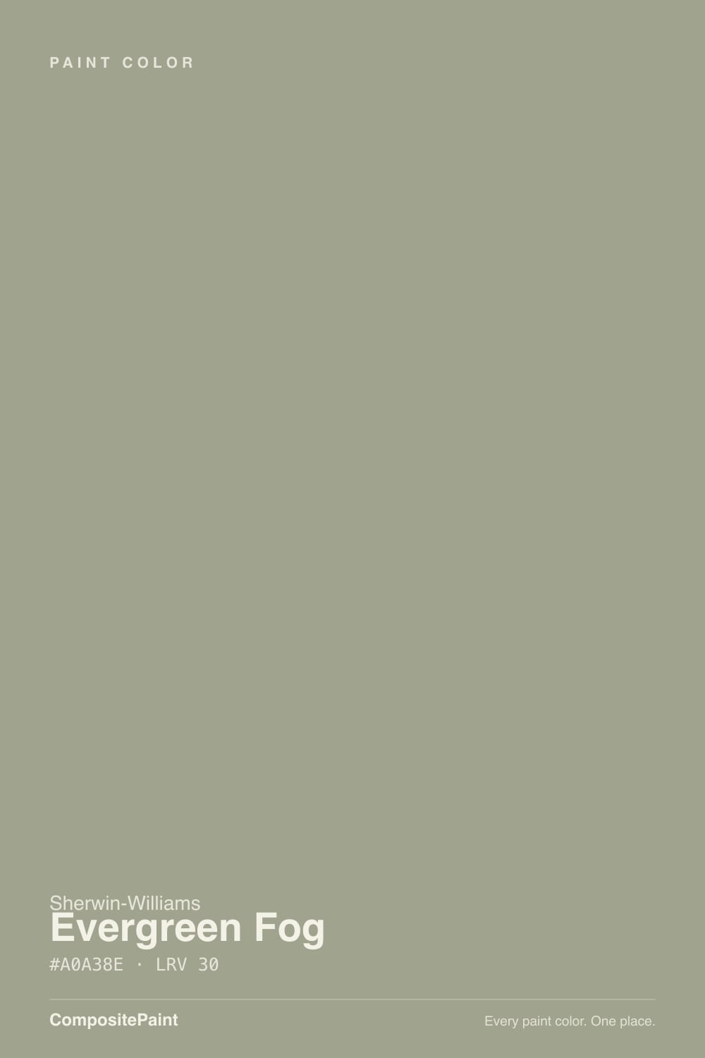
- 3Evergreen Fog30
- 4Clary Sage41
- 5October Mist47
The Fast Verdict
Evergreen Fog is the color that made sage cabinets normal, and four years past its Color of the Year win it still earns the spot. It is green enough to feel like a decision and gray enough to stop fighting your floors, your counters, or your wood.
The catch is that the green is fragile: take away warm light or spread it across a whole house exterior and it slides into a flat, blue-gray mud. Give it daylight and warm bulbs and it is one of the safest colors you can put on cabinetry.
Kitchen and bathroom cabinets · rooms with real daylight and warm wood · brass, bronze and aged-nickel hardware · anyone who wants color that still behaves like a neutral
Your room faces north and stays dim · your trim or cabinets are cream · you want obvious, unmistakable green · your woodwork is red-toned cherry
- Reads as color and as neutral at the same time — rare in a green
- The best-tested cabinet green in the Sherwin-Williams deck
- Flatters oak, walnut, brass, and aged bronze without effort
- Mid LRV 30 gives cabinets real depth without darkening the room
- Deepens attractively at night instead of going dull
- Goes flat, muddy gray in dim north-facing rooms
- Turns blue-gray across large exterior walls
- Fights cream trim and cream-toned cabinets
- Clashes with red-toned cherry and orange-heavy woodwork
What Color Is Evergreen Fog, Really?
A gray-green whose green has to be earned. On the chip it looks like a slightly dirty gray; on a full wall or a run of cabinet doors the sage finally shows up, because color builds as you add square footage. That gap between chip and wall is the single most common surprise with this color — people buy it expecting gray and get green, or buy it expecting green and get gray, depending entirely on how much of it they end up looking at.
At LRV 30 it is a genuine mid-tone with weight. Put it next to Sea Salt (SW 6204, LRV 63) and Evergreen Fog is more than twice as dark — Sea Salt is a tint you barely notice, Evergreen Fog is a color you commit to. Go the other way to Dried Thyme (SW 6186, LRV 21) and Evergreen Fog suddenly looks soft and half-neutral. It sits in the useful middle: dark enough that cabinets read as painted furniture, light enough that a whole room in it does not close in.
Undertone in one line: warm yellow-green, but only lightly held — in cool light or across a big exterior wall the warmth drains out and a blue-gray shows through. That drift is the color's real character flaw, and it is worth sampling for.
Where It Shines
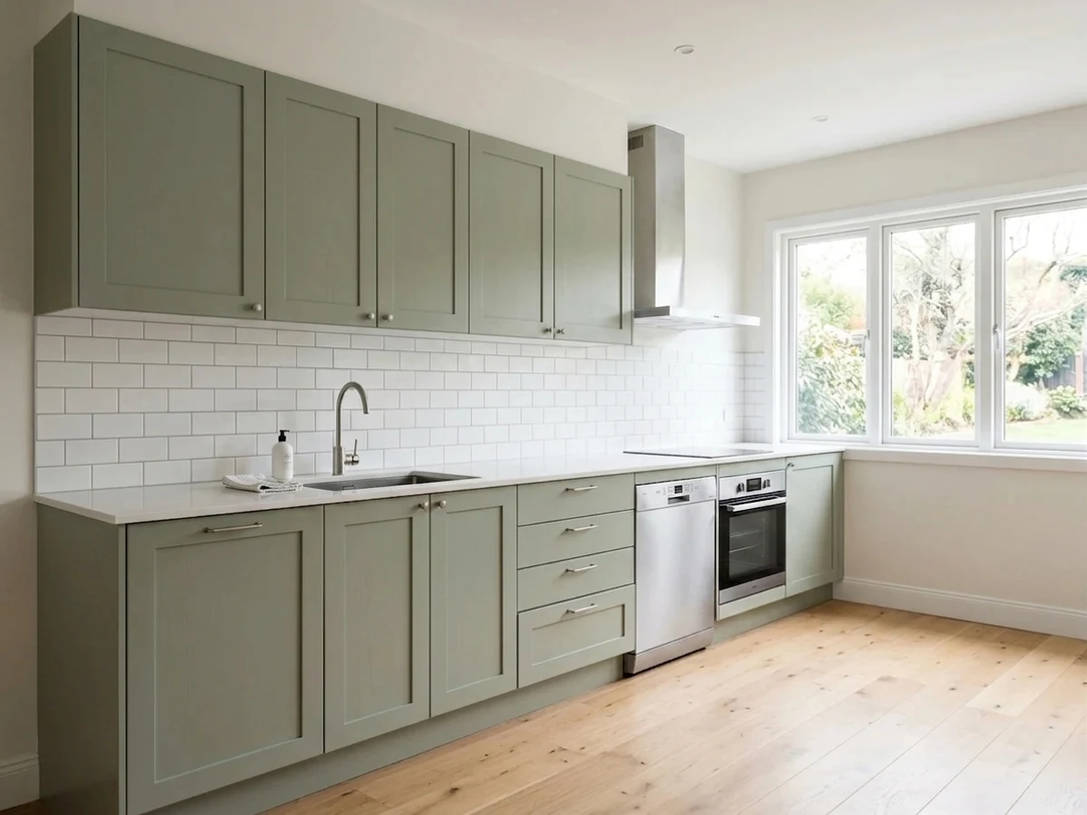
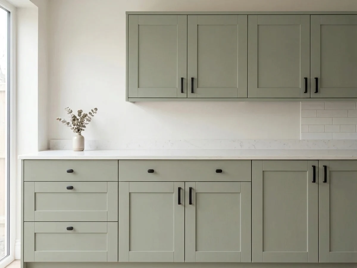
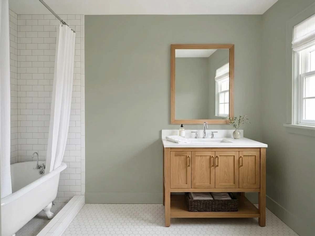
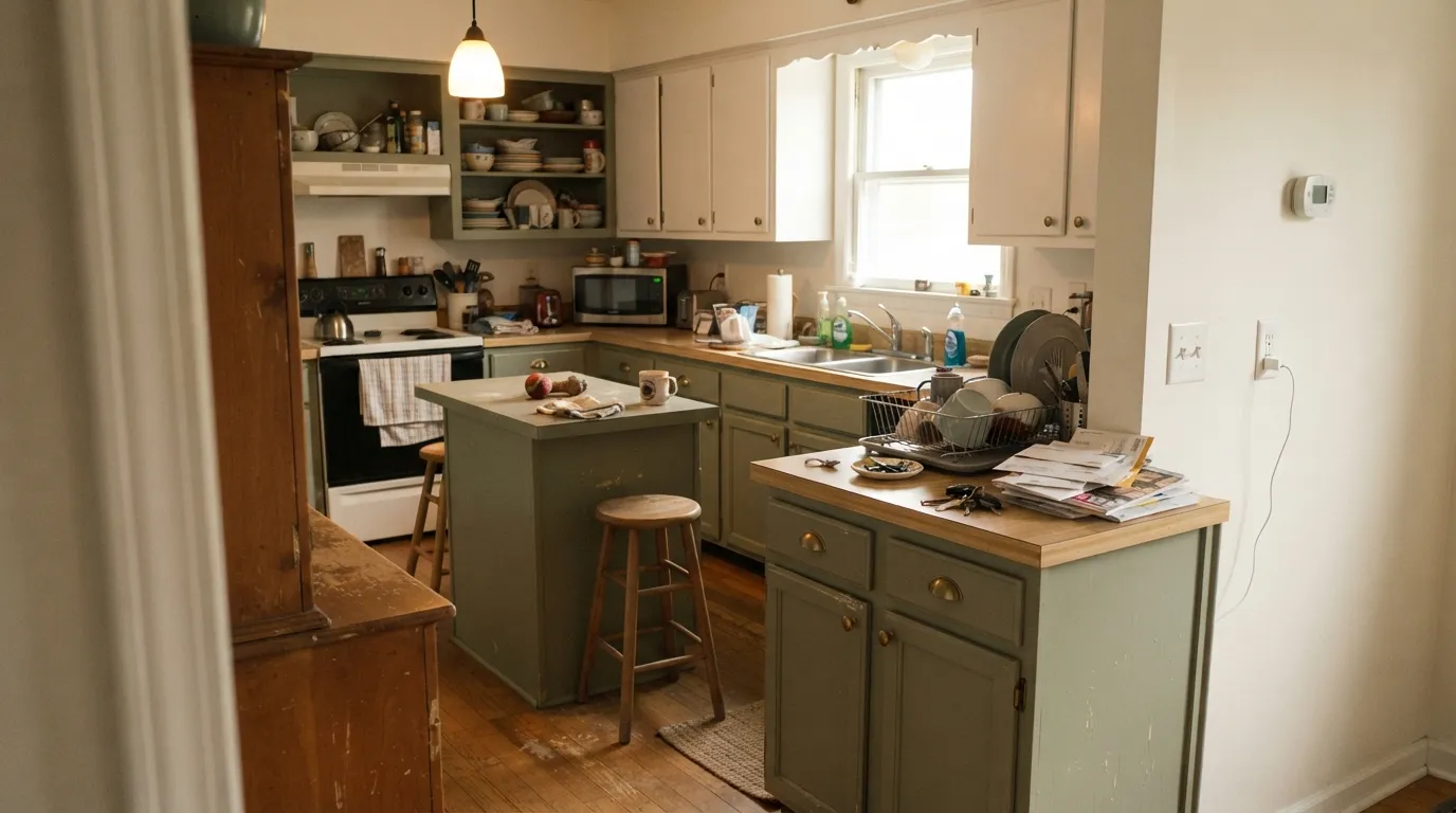
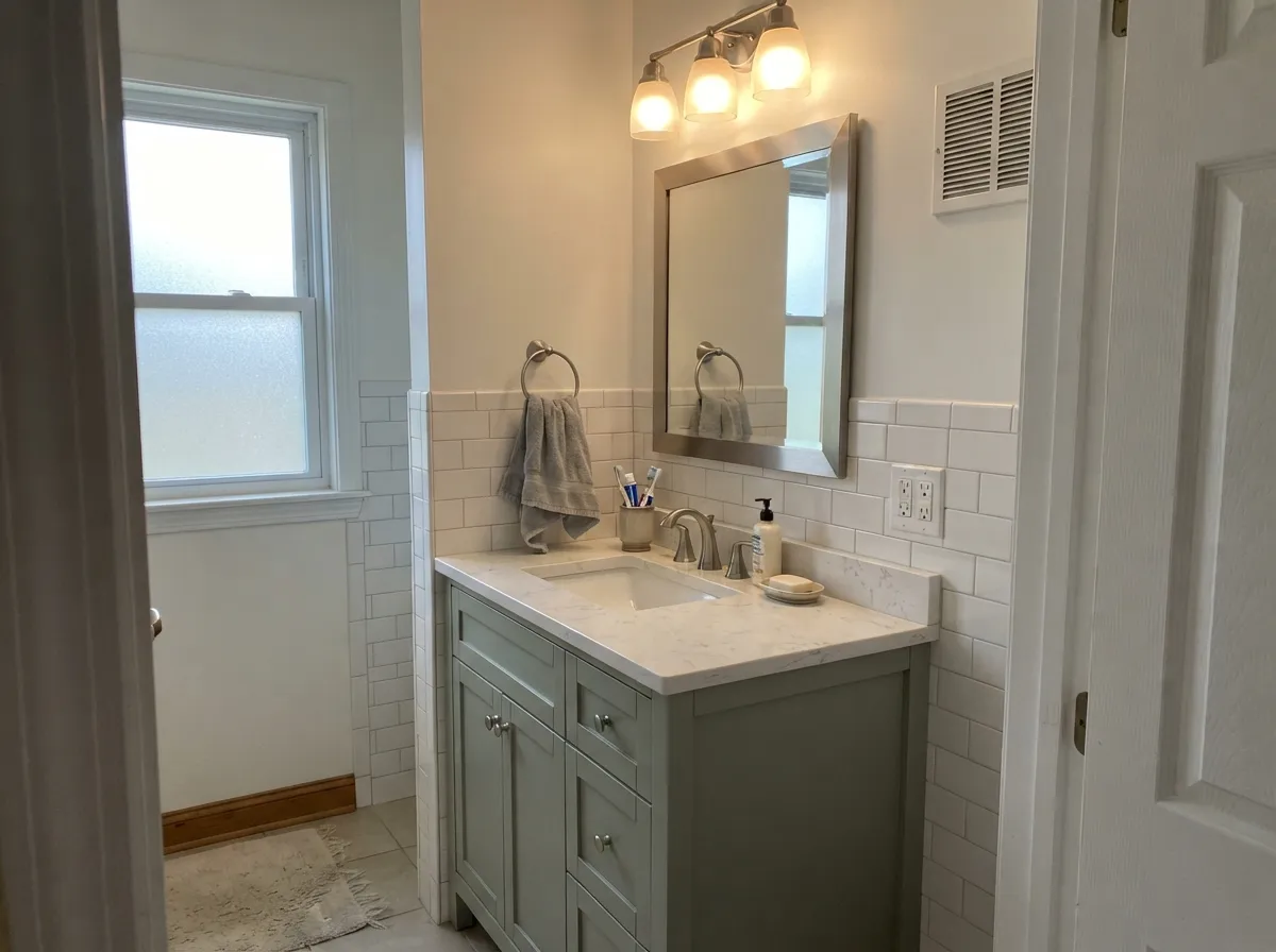
Cabinets are its home ground, and that is not marketing — it is where the color's low saturation stops being a compromise and starts being the point. Against warm white counters, oak floors, and brass pulls it reads like stained furniture rather than painted MDF. In a room with honest daylight it holds its green all day and never asks the rest of the kitchen to change.
Where It Fails
The bad Evergreen Fog stories are remarkably consistent, and none of them are about coverage or durability. All three come down to the same thing: something in the room pulled the warmth out of the green. If your situation matches one of these, pick a different color rather than a different painter.
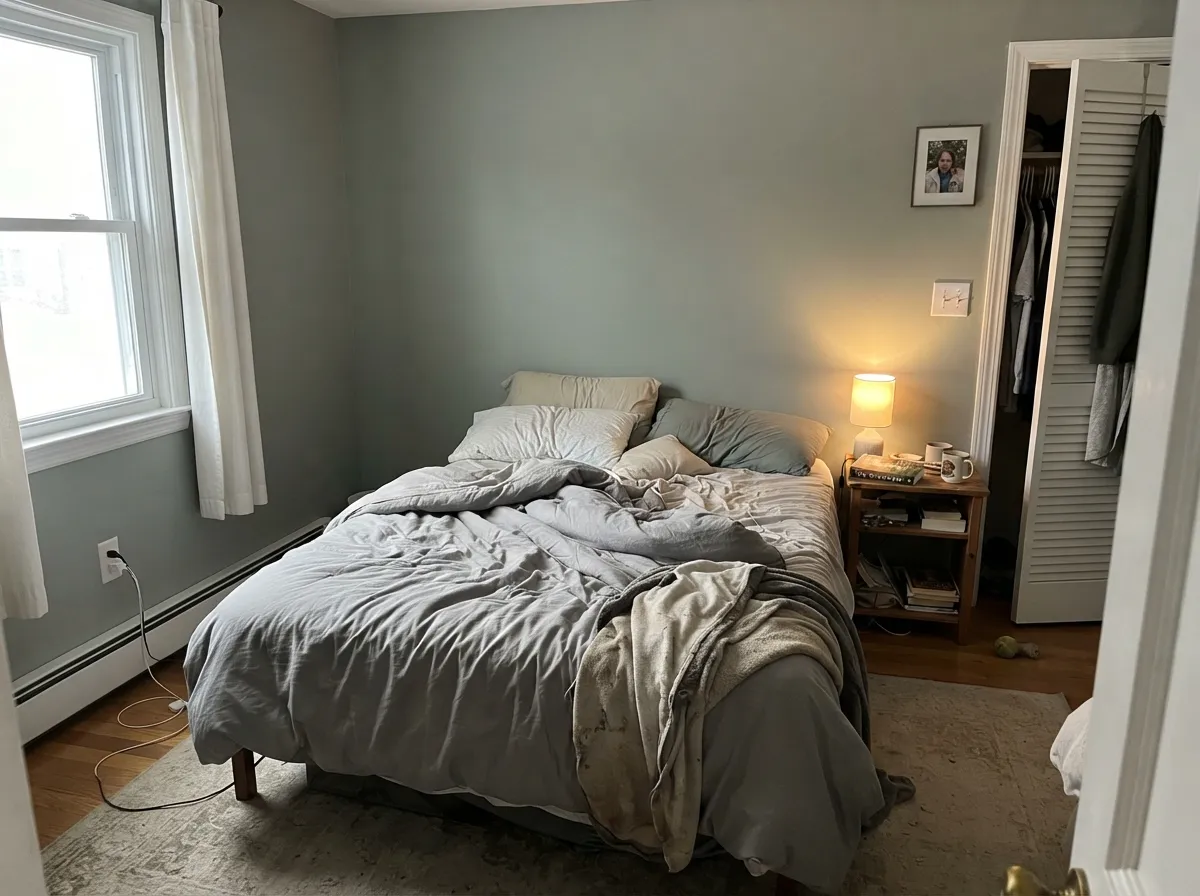
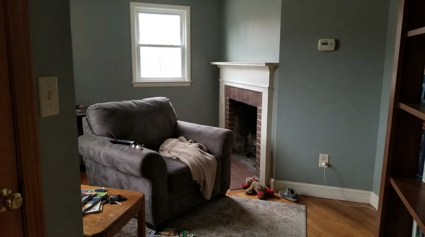
North light is cool and flat, and it strips out the small amount of yellow that keeps this color alive. At LRV 30 there is not enough light coming back to compensate, so the walls read as a deep, muddy gray with the green almost gone. People describe it as looking dirty or like nothing at all. In that room go lighter and warmer with Clary Sage (SW 6178), which keeps its green in weak light.
This is the most preventable mistake. Warm cream sits right where Evergreen Fog's own yellow lives, so the two cancel each other out: the cream looks dingy and yellowed, and the green next to it looks tired and washed. Do not trim it in a heavy cream. Use Pure White (SW 7005) or Extra White (SW 7006) for a clean edge, or Alabaster (SW 7008) if you want warmth but not custard.
Sampled on a board it looks sage. Spread across siding under open sky, the blue in it takes over and it reads gray-green to plain blue-gray — homeowners have put it up next to Oyster Bay (SW 6206) and found they could not tell the two apart at scale. If you want the green to stay green outside, step up to Retreat (SW 6207) or Pewter Green (SW 6208), both of which hold their color in full daylight.
Room by Room
Your Light Is the Risk
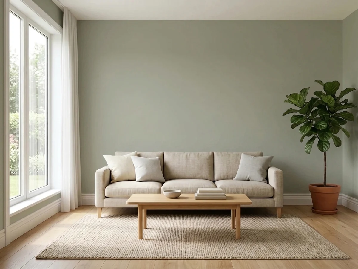
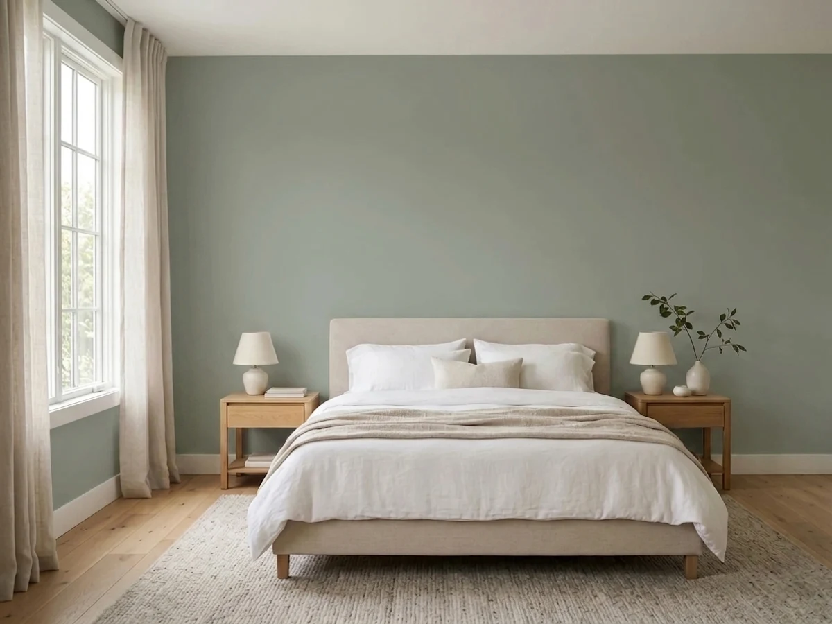
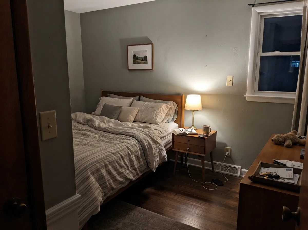
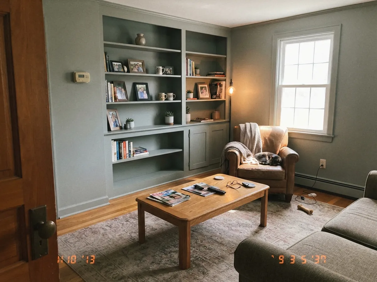
Warm, generous light pulls the yellow-green forward. The sage looks alive and soft all day.
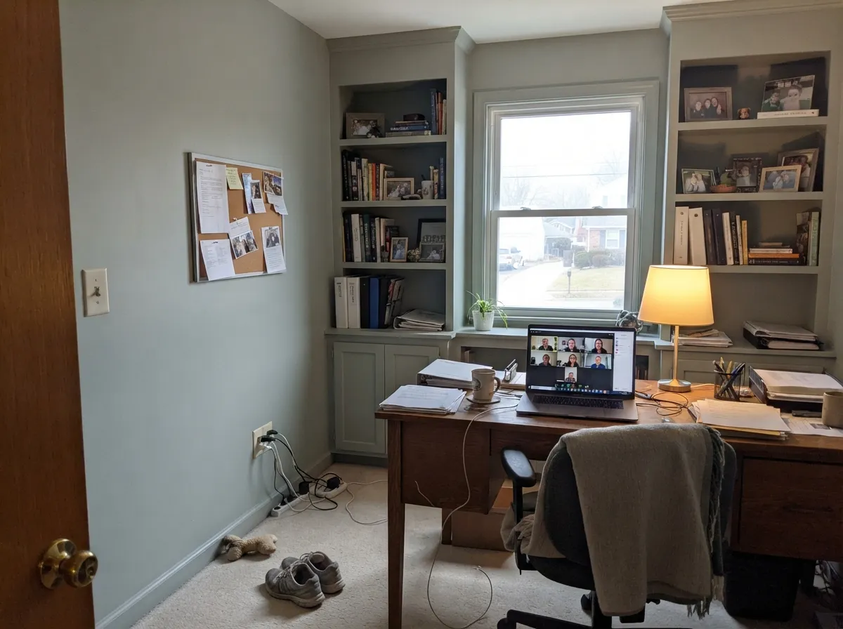
Cool light drains the warmth and leaves muddy gray. Test a big sample before committing.
2700K bulbs make it richer and cozier at night. Cool 4000K LEDs flatten it to gray.
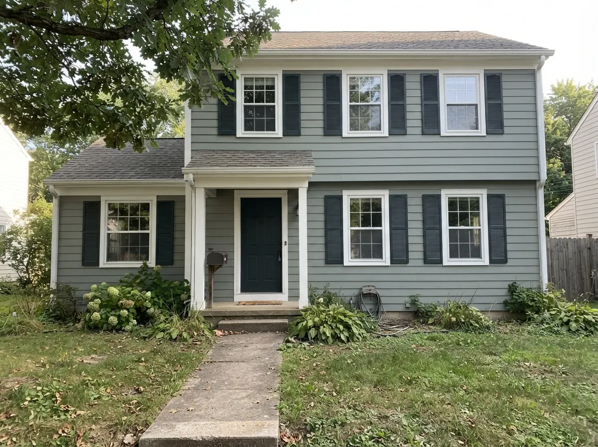
At exterior scale the blue takes over and the green fades. Sample on the actual siding.
Most complaints about Evergreen Fog are a light mismatch. Upload a photo of your actual room and see it on your walls — then ask for the same wall in north light or evening lamps before you buy a single sample.
Need It From Another Brand?
Any paint counter can custom-tint Sherwin-Williams SW 9130 directly. If you would rather stay in one brand's own deck, these are the closest stock matches, measured as ΔE2000. Under 2 is a difference you will not see on the wall.
| Brand | Closest color | ΔE | LRV | |
|---|---|---|---|---|
| Behr | Hunters HollowMQ6-21 · Behr | 0.9 | 30 | Color page → |
| Benjamin Moore | Graystone1475 · Benjamin Moore | 4.0 | 31 | Color page → |
| Valspar | Gray Expose5007-2A · Valspar | 1.5 | 30.6 | Color page → |
| PPG / Glidden | Green Tea LeafPPG1128-5 · PPG / Glidden | 2.8 | 31 | Color page → |
| Glidden | Eucalyptus Tree10GY 30/104 · Glidden | 2.4 | 30 | Color page → |
| Dutch Boy | Cypress Garden424-4DB · Dutch Boy | 3.9 | 32 | Color page → |
Similar Sherwin-Williams Colors
The nearest shades to Evergreen Fog within Sherwin-Williams's own range, ranked by perceptual color distance — useful when you want the same look a touch lighter, darker, or warmer.
WCAG 2.1: AA is 4.5 : 1 for normal text, 3 : 1 for large text, AAA is 7 : 1.
Evergreen Fog vs the Colors You're Also Considering
Every Evergreen Fog sample board has the same rivals on it. The numbers show the real lightness gap — then it comes down to which risk you would rather live with.
Pick this when you want green that still behaves like a warm neutral.
Sherwin-Williams SW 6186 · LRV 21Dried ThymePick this for obvious, moody sage on cabinets or a dark den.
Side-by-side comparison →Pick this for more depth and a calmer, grayer read on cabinets.
Sherwin-Williams SW 6178 · LRV 41Clary SagePick this for dim rooms — it keeps its green where this one loses it.
Compared with Coastal Plain (SW 6192), LRV 37, Evergreen Fog is deeper and slightly more gray-green, while Coastal Plain is lighter and reads a touch fresher. If you want the same sage feeling in a smaller or darker room, the higher LRV of Coastal Plain gives you more light back.
Dried Thyme (SW 6186), LRV 21, is a noticeably darker, more saturated sage. It makes a bolder cabinet or moody wall statement, where Evergreen Fog stays soft and more neutral. Choose Dried Thyme when you want obvious green; choose Evergreen Fog when you want green that behaves like a warm gray.
Against Benjamin Moore October Mist (1495), LRV 39, Evergreen Fog is darker and grayer. October Mist is lighter and leans a little more clearly green, so it suits rooms where you want airier walls; Evergreen Fog carries more weight and depth.
Evergreen Fog Coordinating Colors
The rule for coordinating with this color is to keep the whites clean and the neutrals earthy. It sits comfortably beside warm greiges and beiges because they share its low saturation, and it needs at least one genuinely dark color in the room to keep from going soft. What it does not want is a heavy cream anywhere nearby, or a cool blue-gray that competes with the blue already hiding in it.
These are the partners that show up again and again in kitchens and bedrooms that actually work:
Evergreen Fog on Kitchen Cabinets
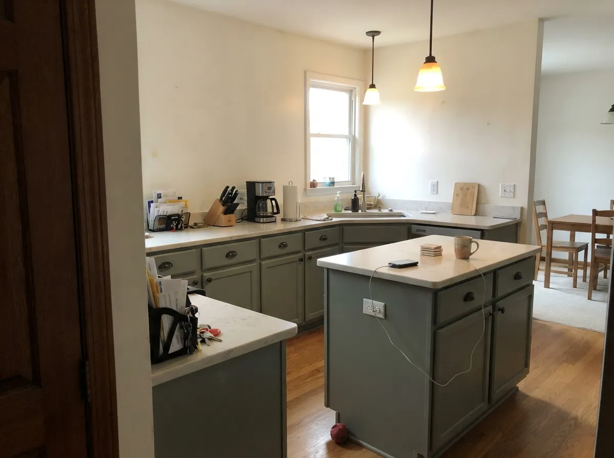
This is the use that built the color's reputation, and it deserves it. At LRV 30 painted doors have enough depth to read as furniture instead of as a paint job, but not so much that a galley kitchen gets gloomy. The muted green also solves the hardware question — brass, unlacquered brass, aged bronze, and antique nickel all look right against it, where a saturated green would force you into one metal.
The counter is where people go wrong. A warm white quartz or a lightly veined marble-look keeps everything calm; a cream-toned laminate or a heavily yellowed granite makes both the counter and the cabinets look tired. Keep the walls above in Alabaster (SW 7008) or Pure White (SW 7005) so the cabinets stay the focus.
If you are only doing part of the kitchen, put it on the lowers and the island and leave the uppers white. That version reads as designed and stays bright; a full run of Evergreen Fog uppers in a small kitchen is where the room starts feeling heavy.
Evergreen Fog on Exteriors
Outside is where this color behaves least like the sample chip. Open sky is cool light in enormous quantity, and it exaggerates the blue that sits under the green. Homeowners have painted a test wall and found it reading blue-gray rather than the sage they chose, close enough to neighboring gray-greens like Oyster Bay (SW 6206) that the difference vanishes from the curb.
That does not make it a bad exterior color — it makes it a color that needs help. Crisp white trim, not cream, and a true dark on the doors and shutters give the eye reference points that push the siding back toward green. Iron Ore (SW 7069) is the reliable choice; Urbane Bronze (SW 7048) is warmer and works better with brown or bronze windows. Check your roof before you commit, because a cool gray roof compounds the blue problem, and always sample on the actual siding facing the street rather than on a board in the garage.
Three Ready Palettes Built on Evergreen Fog
A color is never alone on the wall. These are complete combinations in the 60-30-10 pattern, with the reason each one holds together. Every one opens in the visualizer.
Alabaster is warm enough to sit beside the sage without going cream and dingy, so the cabinets stay the star. Urbane Bronze on the island supplies the dark note the scheme needs and makes brass hardware look intentional.
Try this palette in your roomPure White gives a clean edge that keeps the green looking deliberate rather than faded, which cream trim never does here. Naval is deep enough to anchor the room at night, and navy and sage share the same muted, low-saturation character.
Try this palette in your roomOutside, this color needs contrast to stop it reading blue-gray, so the trim white has to be crisp rather than soft. Iron Ore doors and shutters push the siding back toward green by giving the eye a true dark to measure against.
Try this palette in your roomEvergreen Fog FAQ
Will Evergreen Fog still look green in a north-facing room?
Usually not enough. North light is cool and takes out the warm yellow that holds the green together, so the walls settle into a deep gray-green that most people read as muddy. Warm 2700K bulbs recover some of it after dark, but daytime is the problem. If the room is north-facing and dim, use Clary Sage (SW 6178) instead.
Is Evergreen Fog dated now?
No. It was the 2022 Color of the Year and it is still one of the most-specified cabinet greens years later, which is the opposite of what happens to a trend color. Its saturation is too low to date the way bright greens do. The version that looks dated is the full sage kitchen with matching sage walls — keep the walls neutral and it holds up.
Can I use cream or off-white trim with it?
Heavy cream, no. Cream sits in the same yellow zone as this color's undertone, so the two flatten each other and the cream ends up looking dirty. Alabaster (SW 7008) is the warmest white that still works. For crisp separation, especially on cabinets and exteriors, use Pure White (SW 7005).
Does it work with orange-toned oak floors?
Yes, better than most colors. Green and orange sit opposite each other on the color wheel, so the sage quiets the orange instead of amplifying it the way beige and greige do. Honey oak, white oak, and butcher block all pair well. The wood to avoid is red-toned cherry, where the contrast turns loud.
What sheen should I use on cabinets?
Satin, in a urethane-fortified cabinet enamel like Emerald Urethane. Satin keeps the color muted and forgiving of door imperfections while still wiping clean around handles. Semi-gloss makes a muted green look plasticky, and anything flatter will not survive kitchen cleaning.
How many coats does it take?
Two over a light existing color on walls. Over raw or previously stained cabinets, prime first with a bonding primer and plan on two finish coats — mid-tone greens show roller lap marks and touch-ups more than pale colors do, so keep a wet edge and paint doors flat if you can.
Is it a safe choice for a whole house exterior?
Only with the right supporting colors. On large siding areas it drifts blue-gray and can end up indistinguishable from other muted gray-greens like Oyster Bay (SW 6206). Sample a full board on the real wall and check it against your roof. If the green disappears, Retreat (SW 6207) holds up better outdoors.
Have you painted with Evergreen Fog?
Rate it — one tap helps the next reader decide.
Ask a Question