Room Colors · Living Room
12 Best Living Room Paint Colors for 2026
ideas, combinations, and real rooms
12 curated picks from real living rooms — with the exact colors, honest reasons why, and the combinations that hold the room together.

Former interior stylist who can spot a green undertone from across a room. Jessica writes the color and mood pieces — what to choose, what pairs, and why your "white" looks pink.
The Fast Answer
Don't want to read 12 picks? These four are the safe answers.

Top Picks for the Living Room
Pick a color family, tap a shade to see the living room in it, then try it on your own room.
Living Room Color Trends 2026 — What's In, What's Out


- Cool gray-on-gray — Millennial gray walls, floors, and sofa in one room — designers now call it cold and emotionally flat.
- Stark bright white — Blue-white walls read sterile next to today's wood and linen; creamy whites won.
- Blue-leaning flat greige — The gray-tinged builder greige of the 2010s makes a room feel provisional, not lived in.
- The lone dark accent wall — One random navy or charcoal wall in a gray room reads 2015 — color now wraps the whole room or caps the ceiling line.
The 12 Best Living Room Paint Colors
Every pick below is a real rendered living room, not a chip. The lead color first; the swatches are the full scheme in the photo — walls, furniture, textiles, accent.

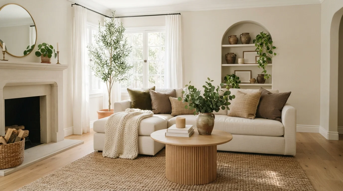
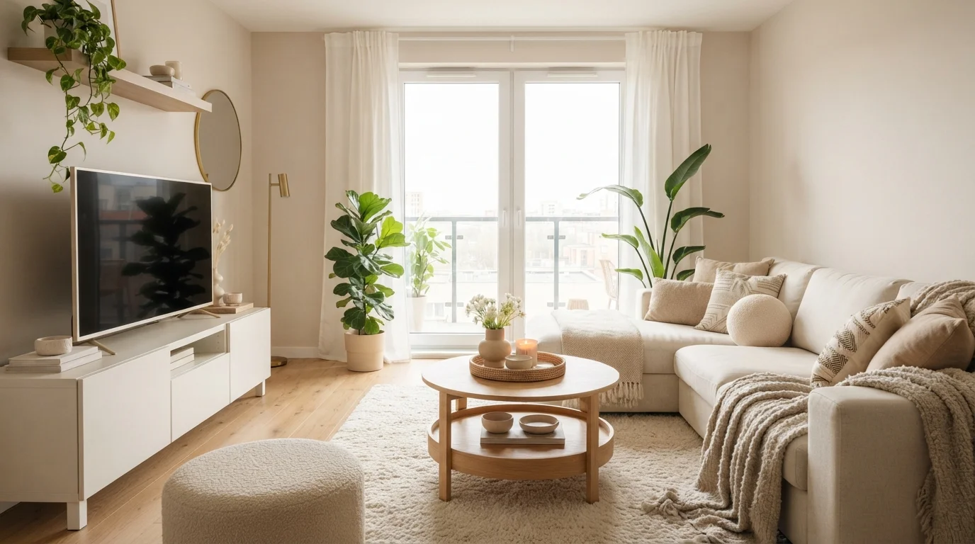
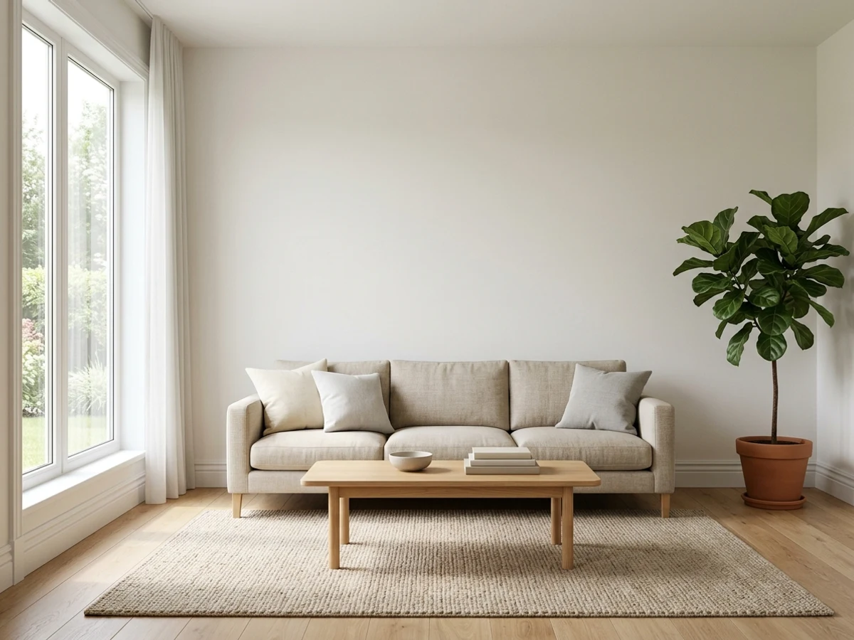
Soft beige walls and a honey-tan accent give this room a sun-warmed, easy calm you can sink right into after a long day.
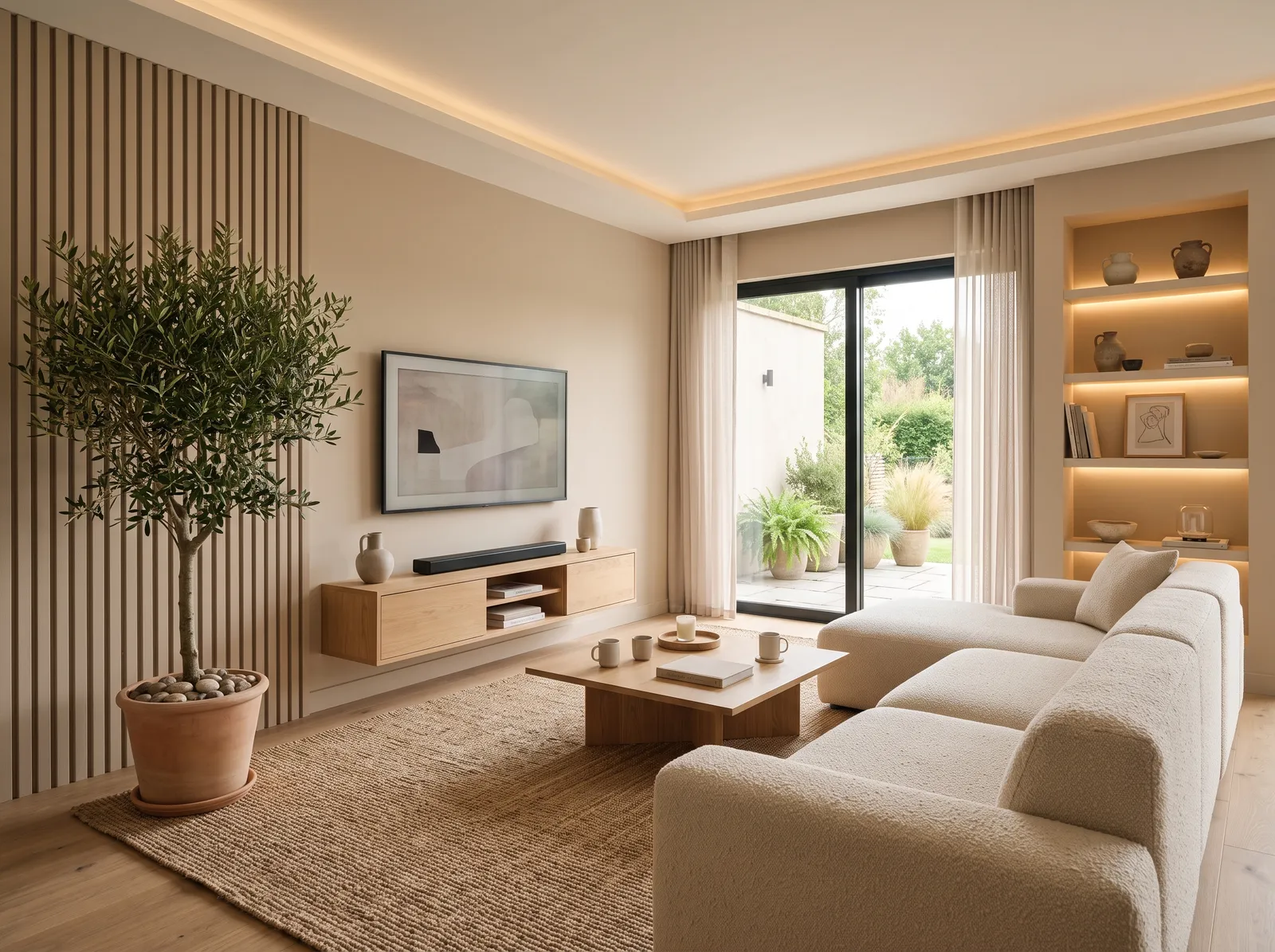
Beige is a soft, sandy neutral that instantly grounds a room. In this space, that gentle beige covers the walls, while a plush cream bouclé sofa invites you to sink in. A low-profile oak coffee table and matching floating cabinet bring in natural wood tones, anchored by a textured tan jute rug. The entire room feels incredibly calm, quiet, and cozy. This combination works beautifully because layering different textures in similar earthy tones keeps a monochrome space from looking flat. It is perfect for anyone wanting a peaceful, clutter-free sanctuary to unwind.
SEE FORTRESS STONE ON YOUR WALLS →
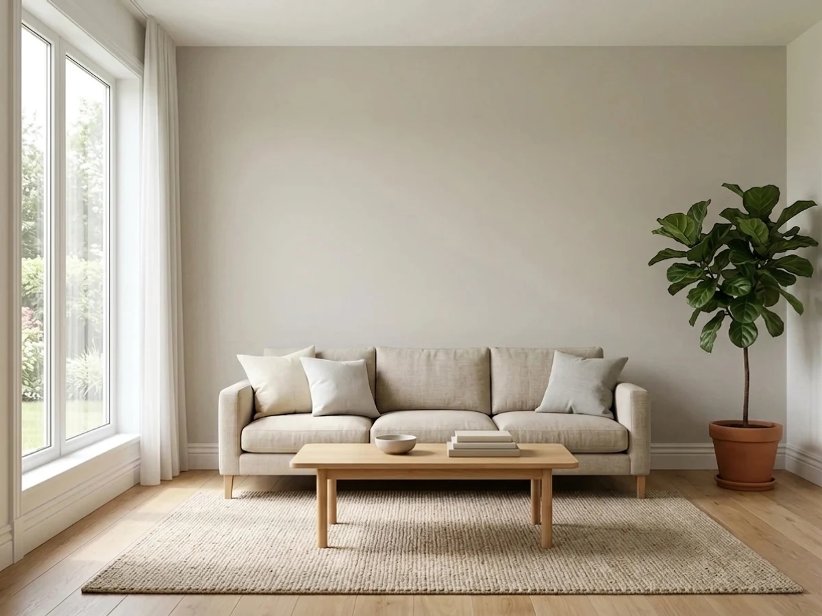
Cool greige walls warmed by a gentle off-white accent and wood slats make a quiet, grown-up space that still feels cozy.
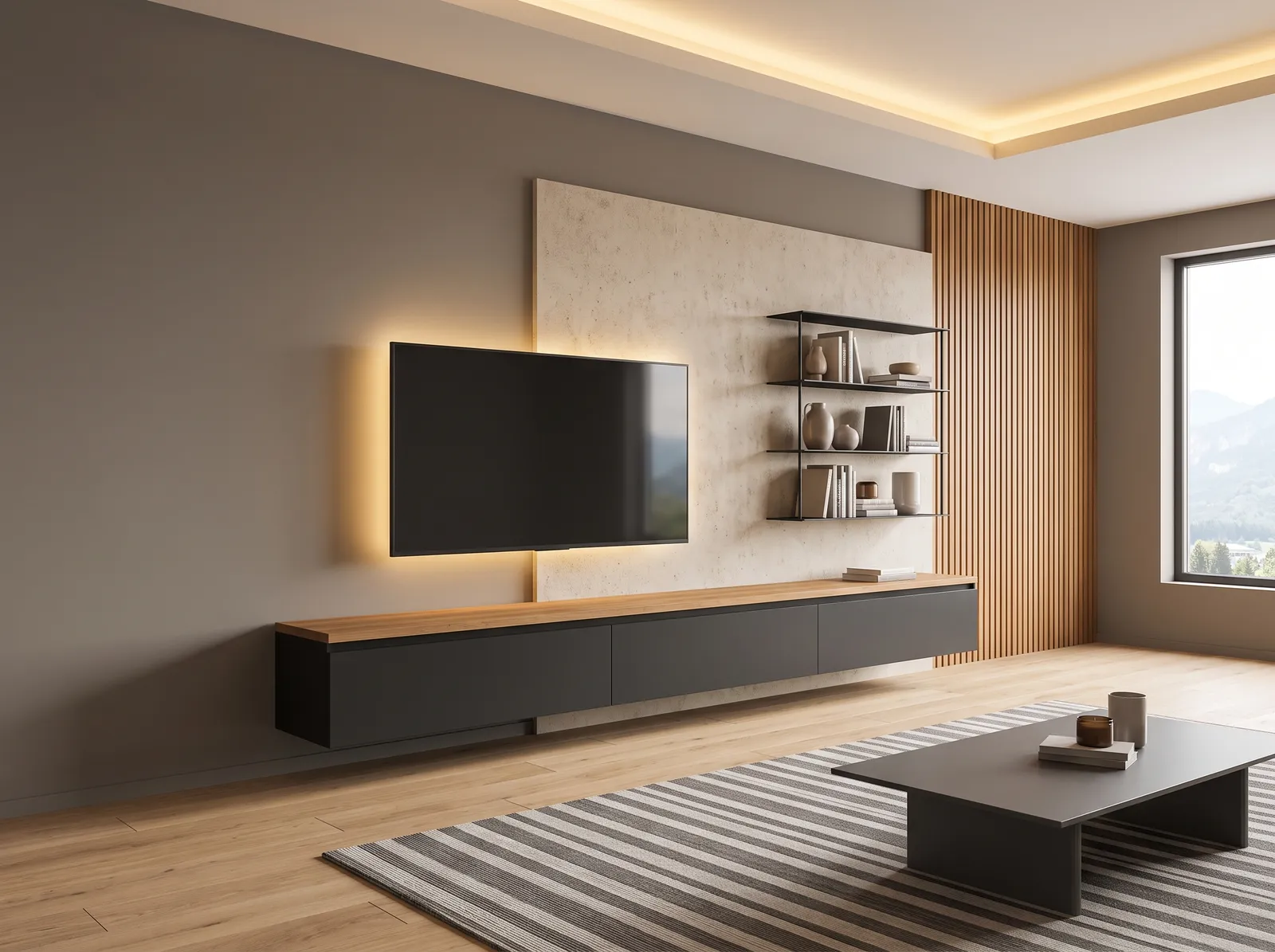
Taupe is a sophisticated, earthy gray-brown that brings instant depth to a room. In this modern space, you see that rich taupe on the main wall, paired with a floating charcoal cabinet and a matching dark coffee table. A striped gray rug anchors your view, while warm wood slats frame the TV area. The room feels incredibly calm, sleek, and cozy. This combination works beautifully because the deep charcoal elements ground the space, while the warm wood tones keep the grays from feeling sterile. It is perfect for anyone who loves minimalist design.
SEE SO SUBLIME ON YOUR WALLS →
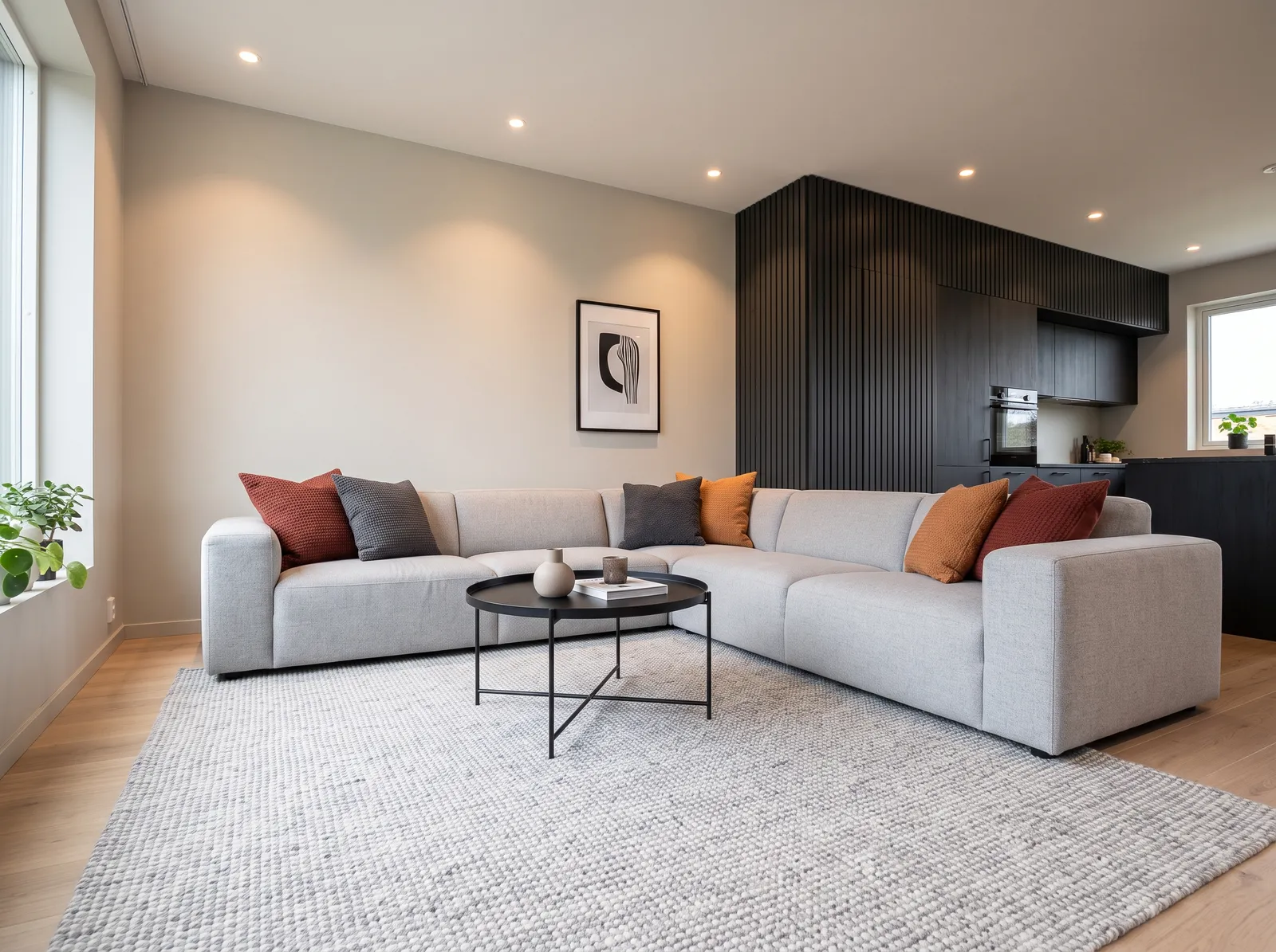
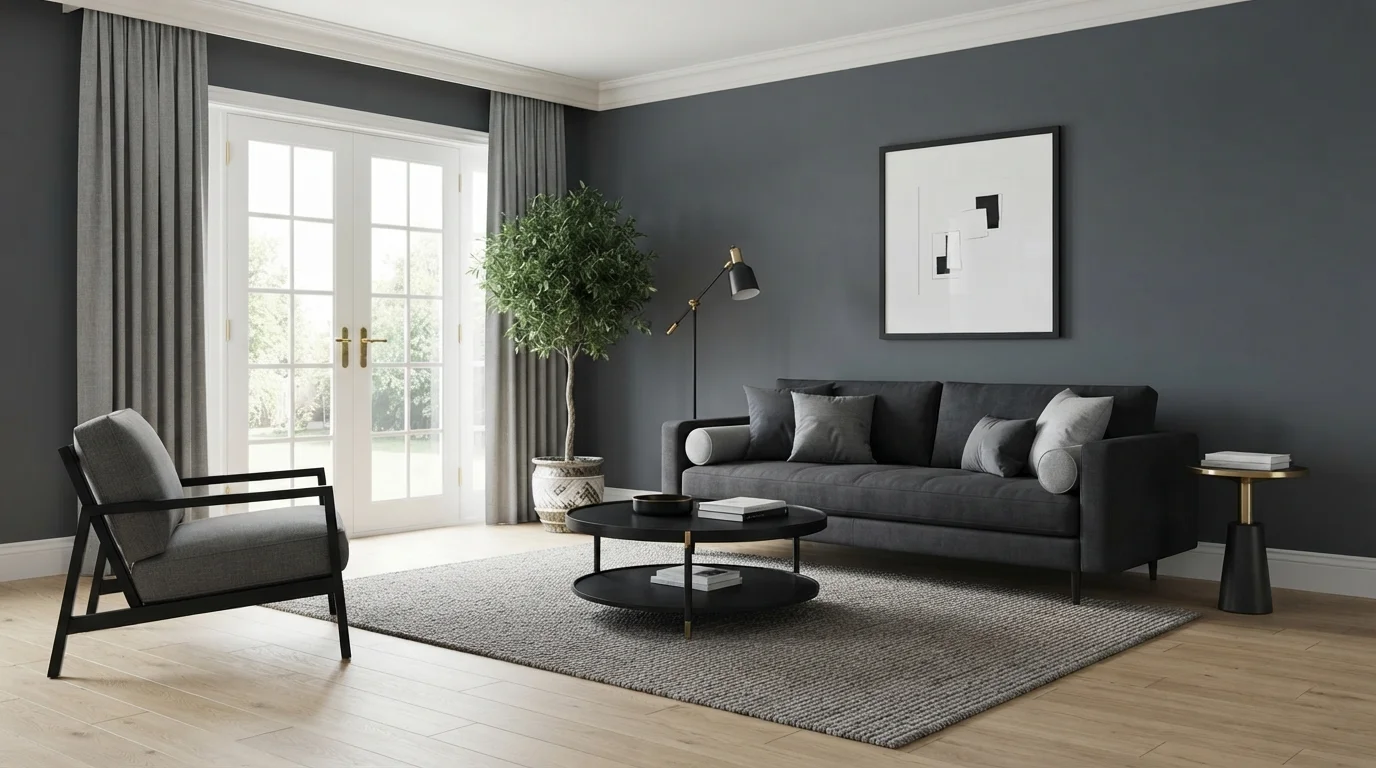
Gentle greige walls meet a near-black accent for a clean, modern look with just enough contrast to feel pulled together.
Greige is a soft, versatile blend of gray and beige. In this modern living space, greige covers the walls, while a light gray sectional sofa sits on a matching textured gray rug. Dark charcoal cabinets anchor the kitchen area, and a black coffee table centers the seating. The room feels incredibly calm and balanced. This combination works beautifully because the deep charcoal adds sharp contrast, while rust and mustard cushions inject just enough warmth to keep the cool grays from feeling sterile. It is perfect for anyone who loves clean, contemporary style with a cozy touch.
SEE HEARTHSTONE ON YOUR WALLS →
A creamy warm white wraps the room in soft, sunlit calm, letting natural light and the water view take center stage.
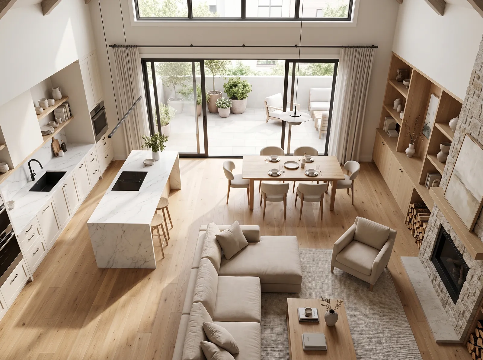
Cream is a soft, sandy white that brings instant sunshine indoors. In this airy living room, that gentle cream covers the walls, while the plush sectional sofa and cozy swivel chair match in a lighter off-white boucle. Built-in oak cabinets add rich wood tones, paired with a travertine coffee table and a faded taupe patterned rug. The space feels incredibly calm and luxurious, like a high-end coastal resort. Layering similar light tones keeps the room bright and open to the stunning harbor view. It is perfect for anyone who loves quiet luxury and breezy living.
SEE IT ON YOUR WALLS →
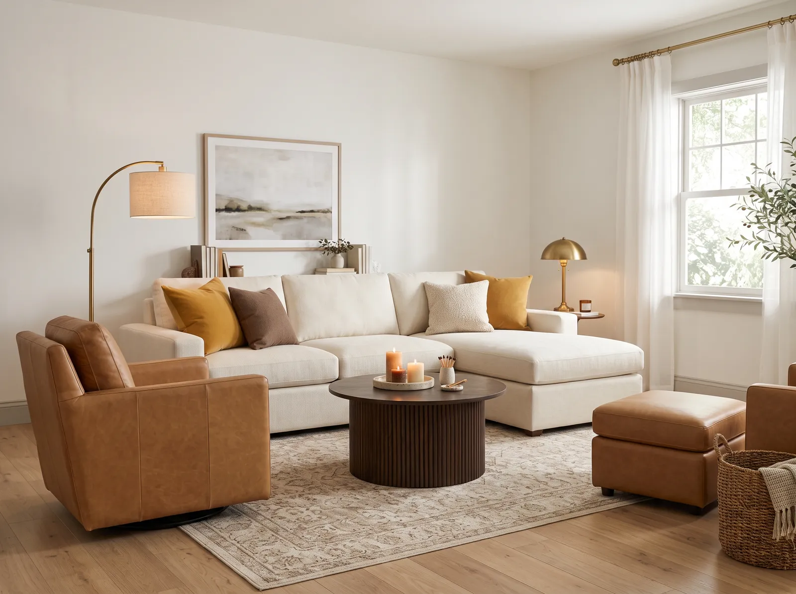
Soft warm white walls and pale trim let tan leather and brass glow, for a relaxed, layered, lived-in feel.
Cream is a gentle, warm off-white that instantly makes a space feel like a hug. In this living room, that soft cream coats the walls, perfectly matching the plush ivory sectional sofa. Rich cognac leather chairs and a dark, ribbed wood coffee table anchor the center of the room, while a faded beige patterned rug ties everything together. The space feels incredibly cozy and calm. This combination works beautifully because the deep leather and dark wood ground the airy cream tones. It is perfect for anyone who loves a relaxed, modern-organic sanctuary.
SEE HACIENDA WHITE ON YOUR WALLS →
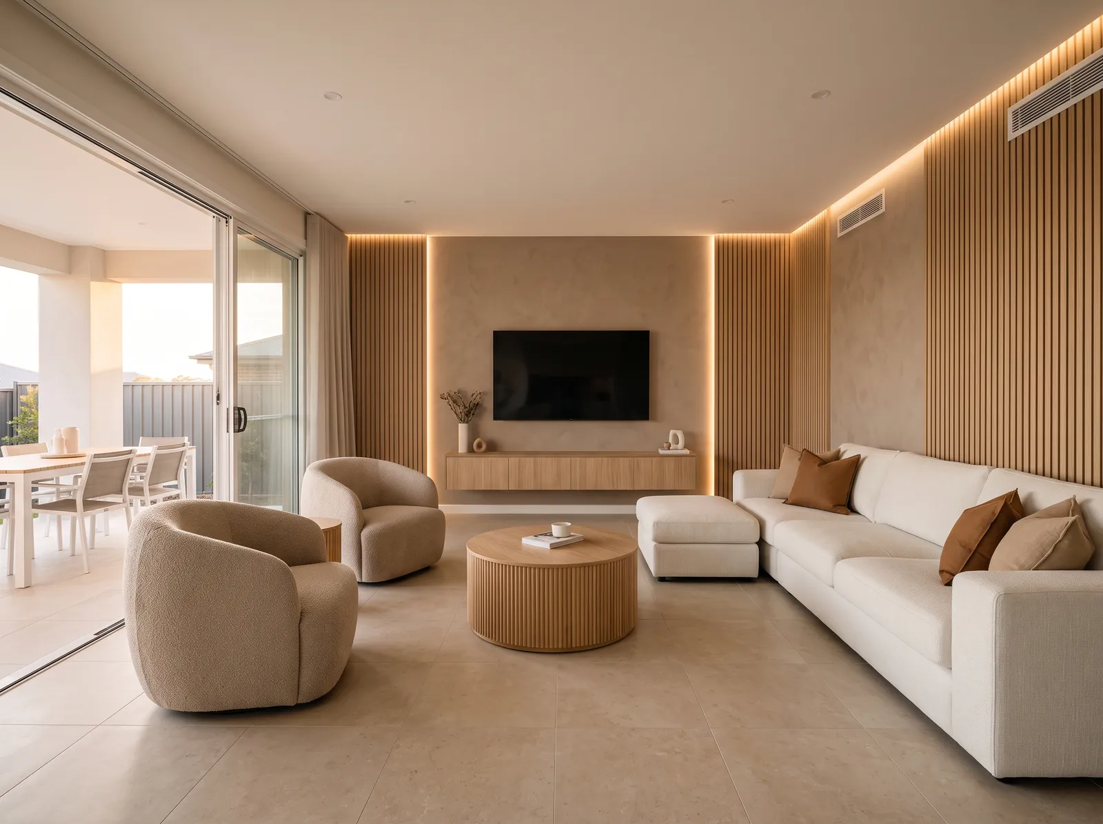
Warm beige walls under a soft white ceiling feel grounded and snug, the kind of room that wraps around you at dusk.
Sandy beige is a soft, earthy neutral that instantly grounds a space. Here, this soothing shade wraps the walls, matching the ribbed wooden panels and floating console. A crisp white sectional sofa anchors the room, while two curved boucle armchairs in deeper taupe invite you to relax. A round oak coffee table sits in the center, accented by caramel-brown pillows. The entire space feels incredibly calm. This combination works because layering different textures of similar natural tones creates depth without clutter. It is perfect for anyone wanting a minimalist home that feels welcoming.
SEE IT ON YOUR WALLS →
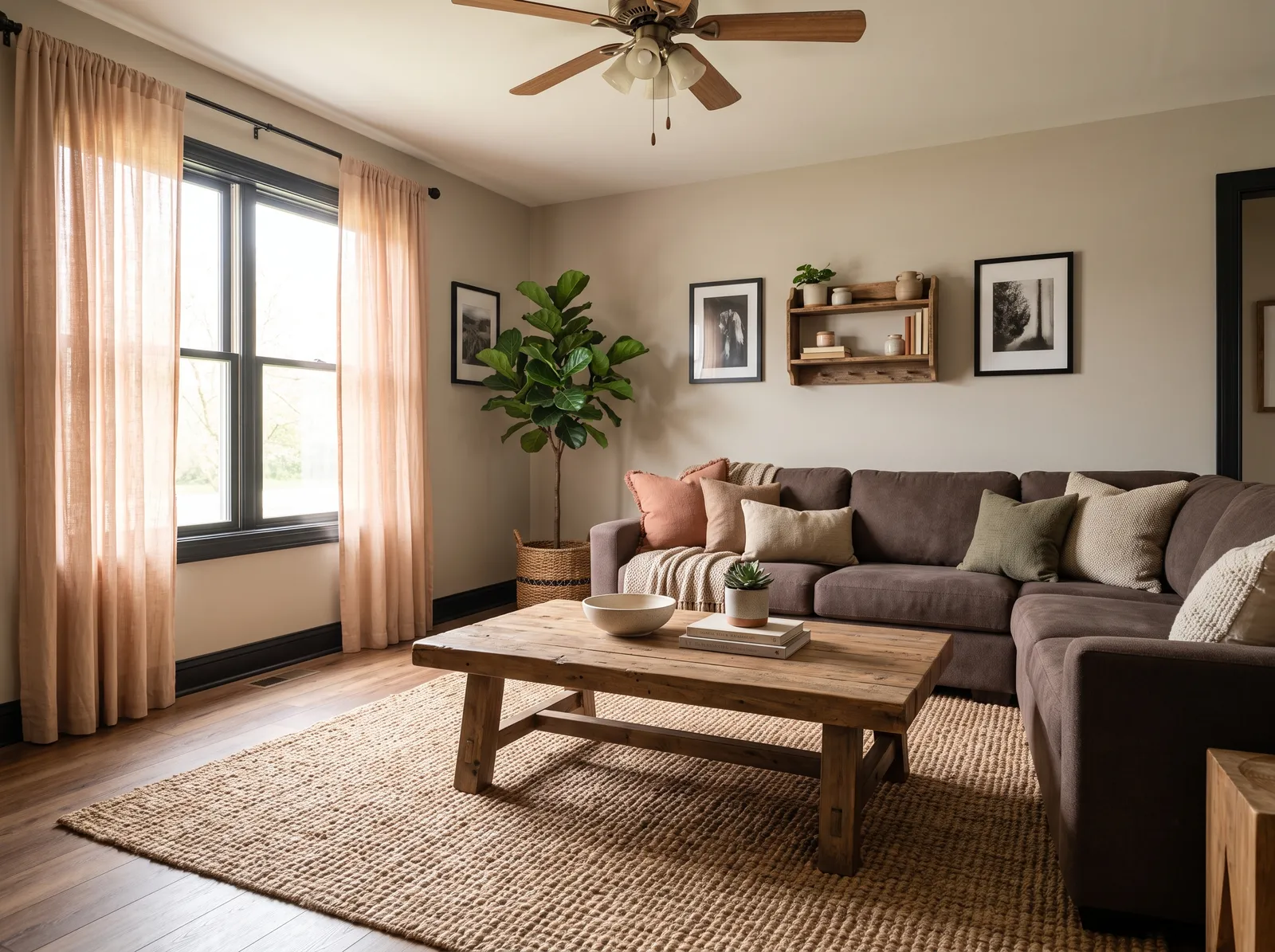
Warm greige walls and a soft white ceiling set a calm base, ready for cozy forest-green and rust touches to pop.
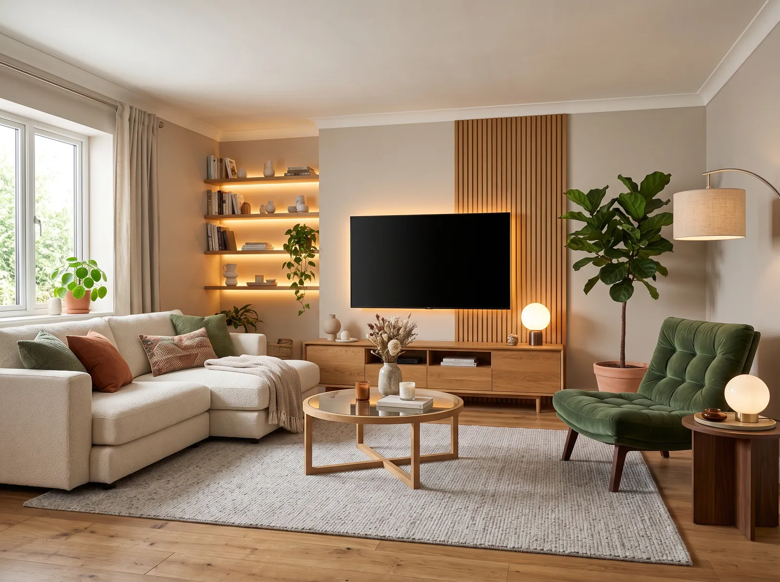
Greige is a comforting blend of gray and beige that feels incredibly grounding. Here, this soothing shade wraps the walls, setting a serene backdrop for the cream boucle sectional, light oak media console, and matching coffee table. A textured light gray rug anchors the seating area, while a plush olive green velvet armchair adds a rich pop of color. The entire space feels wonderfully cozy, calm, and organic. This combination works beautifully because the earthy greens and warm wood tones naturally complement the neutral base. It is perfect for anyone wanting a modern, nature-inspired sanctuary.
SEE HEARTHSTONE ON YOUR WALLS →
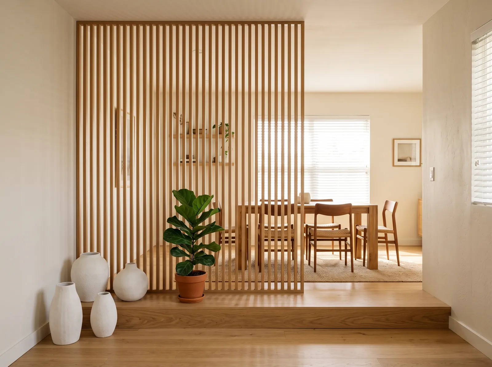
A gentle off-white keeps this room bright and airy, letting warm oak slats and green plants bring the quiet warmth.
Cream is a wonderfully soft, clean neutral that instantly makes a room feel open. Here, it wraps the walls, while a beautiful light oak wood defines the slatted room divider, dining table, and chairs. A textured oatmeal rug sits under the dining set, and a vibrant green potted plant adds a splash of life next to chalky white ceramic vases. The space feels incredibly calm, airy, and orderly. This combination works beautifully because the natural wood tones bring organic warmth to the bright, clean backdrop. It is perfect for anyone who loves minimalist, Japanese-inspired design.
SEE BLANK CANVAS ON YOUR WALLS →
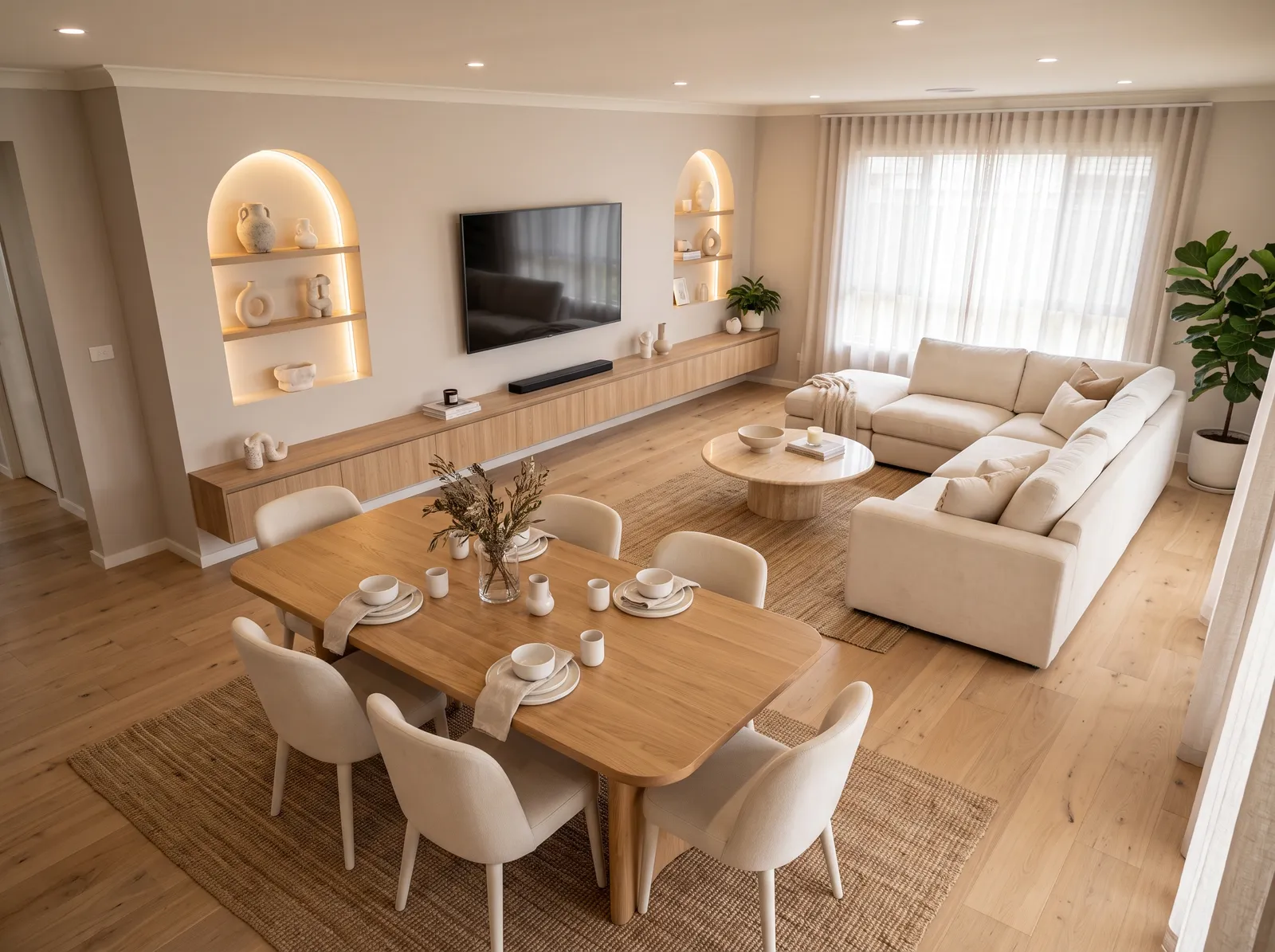
Warm sand walls and a creamy ceiling blend into one soft, sunny envelope that feels easy and grounded all day long.
Alabaster cream is a soft, sandy off-white that feels incredibly gentle. In this open-plan space, this soothing shade wraps the walls, while a matching cream sofa and off-white dining chairs keep the look light and airy. Natural oak wood on the dining table and floating cabinet adds organic warmth, grounded by textured jute rugs underfoot. The entire room feels wonderfully calm and cohesive. This monochromatic approach works beautifully because the varied natural textures prevent the single-color scheme from looking flat. It is perfect for anyone craving a serene, clutter-free sanctuary.
SEE IT ON YOUR WALLS →
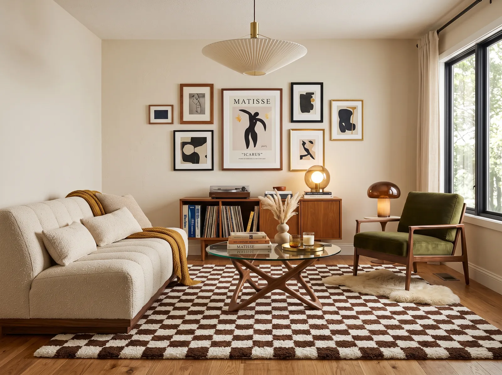
A warm oatmeal wall glows like soft morning light, the perfect cozy backdrop for olive velvet and mid-century wood.
Cream is a wonderfully soft, inviting neutral that instantly makes any space feel like home. In this living room, that gentle cream covers the walls, complementing the plush off-white bouclé sofa and the chocolate brown checkered rug. A warm wood cabinet anchors the wall, while a deep olive green armchair adds a lovely splash of natural color. The entire setup feels incredibly cozy and retro-inspired. This combination works so well because the earthy tones naturally balance each other. It is perfect for anyone wanting a stylish, mid-century modern retreat.
SEE DUST FLATS ON YOUR WALLS →
Earthy greige walls and a soft white panel let walnut wood and warm shelf lighting feel rich, calm, and modern.
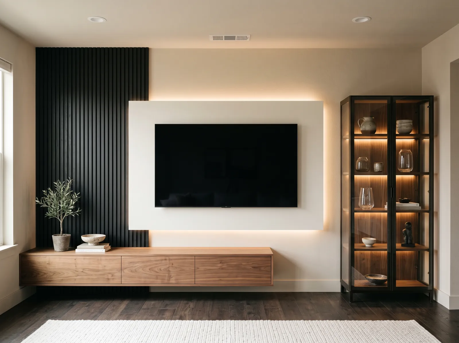
Cream is a wonderfully soft neutral that instantly takes the chill out of a room. In this modern space, that warm cream covers the walls, contrasting with the bold black slatted accent wall and sleek display cabinet. A floating walnut cabinet adds rich, organic warmth, while a textured off-white rug grounds the dark wood floor. The room feels incredibly calm and sophisticated. This combination works because the deep black accents anchor the light walls, creating high-contrast drama without feeling cold. It is perfect for anyone who loves clean, minimalist design with a cozy soul.
SEE SONORAN SANDS ON YOUR WALLS →
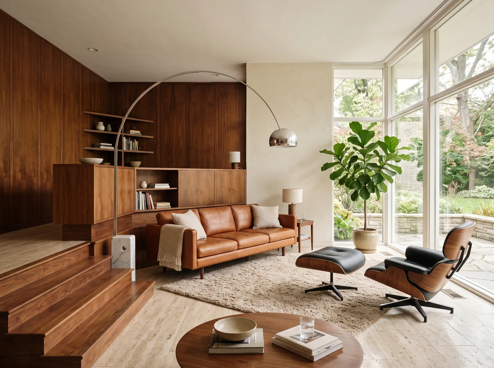
A warm creamy white softens all that walnut and cognac leather, giving this sunlit room a relaxed, timeless mood.
Cream is the ultimate friendly backdrop for a room. Here, it coats the main walls, beautifully balancing the rich walnut wood paneling and built-in cabinets. A cognac leather sofa sits on a textured oatmeal rug, while a classic black leather lounge chair adds a sharp, modern accent near the window. The space feels incredibly cozy, calm, and grounded. This combination works so well because the light walls keep the heavy wood tones from feeling too dark or enclosed. It is perfect for anyone who loves mid-century style with a relaxed, organic twist.
SEE IT ON YOUR WALLS →Living Room Wall Color Combinations
A wall color never works alone. These are the full schemes from the rooms above — the lead color first, then the supporting colors that make the photo work.
Soft beige walls and a honey-tan accent give this room a sun-warmed, easy calm you can sink right into after a long day.
TRY THIS PALETTE →Cool greige walls warmed by a gentle off-white accent and wood slats make a quiet, grown-up space that still feels cozy.
TRY THIS PALETTE →Gentle greige walls meet a near-black accent for a clean, modern look with just enough contrast to feel pulled together.
TRY THIS PALETTE →A creamy warm white wraps the room in soft, sunlit calm, letting natural light and the water view take center stage.
TRY THIS PALETTE →A simple, reliable formula: soft white trim and ceiling, a flexible wall color, and let the floor and furniture carry the warmth. A white like White Dove on trim and ceiling keeps the room feeling tall and clean against neutral or colored walls. If you want the trim to nearly disappear for a calm, seamless look, paint it the same color as the walls in a slightly higher sheen.
Match your color's undertone to your big pieces. Warm wood floors and tan leather love warm neutrals and greens like Sage; cooler gray floors and black metal fixtures sit better with grays, blues, and crisp whites. When the undertones agree, the whole room reads as intentional even with mismatched furniture.
Living Room Color Ideas by Color
Set on a color family already? Each page has its own real rooms and picks.
Light or Dark Living Room Colors?
Go Light (LRV 60+) If…
The room is small, faces north, or has to work at every hour. Light warm colors make it feel bigger and stay calm in evening light — the light you actually live in.
Go Dark (LRV Under 20) If…
You want the cocoon effect and the room has real daylight. Dark works best on one feature wall — or fully color-drenched in a large room with good windows.
A living room's windows change a color more than anything else. North-facing rooms get cool, flat light, so warm neutrals and greens with a little warmth in them stay friendly there, while pure grays can turn dull and chilly. South-facing rooms get strong, warm light all day, which lets you use cooler blues and crisp whites without them feeling sterile.
Day and night matter too. A color you love at noon can go gloomy under warm bulbs at night, when the living room is often used most. Always tape a sample to the wall and look at it in morning light, afternoon light, and again after dark with your lamps on before you commit.
LRV (light reflectance value) is a 0-to-100 scale of how much light a color bounces back, and it is your best tool for getting brightness right. Higher LRV colors like White Dove keep a small or dim living room feeling open and airy, which helps when you only have one or two windows. Lower LRV colors like Hale Navy soak up light and wrap the room in a cozy, lounge-like feel.
For an everyday living room that needs to feel both bright and warm, a mid-range LRV in the soft-neutral zone, where Revere Pewter and Agreeable Gray sit, is the comfortable middle ground. If you want drama, go dark on purpose and lean into it with good lighting rather than fighting it.
See It. Love It.
Paint It.
Upload one photo of your living room and try every color on this page on your own walls — in your own light, before you buy a drop of paint.

Revere PewterBeforeThe Right Finish for the Room
Living rooms are low-moisture and fairly low-traffic compared to kitchens or hallways, so you do not need a high-gloss, scrubbable wall. A matte or eggshell finish is the sweet spot. Matte hides wall imperfections and gives that soft, modern look most people want; eggshell adds a touch more durability and is easier to wipe down if you have kids or pets.
Save the satin and semi-gloss for trim, doors, and built-ins, where the slight shine adds contrast and stands up to bumps and fingerprints. Flatter finishes on the walls also cut glare, which keeps the room comfortable when sun pours through big windows or a TV is in the mix.
Common Living Room Mistakes to Avoid
The biggest one is picking a color from a tiny chip or a screen and skipping samples on the actual wall. Living rooms are large, and color intensifies as it covers more surface, so a gray that looked soft on a chip can turn cold and heavy across a full wall. The second mistake is ignoring undertones and ending up with walls that clash with the floor or sofa you already own.
People also go too bright in finish, which throws glare across the room and highlights every dent in the drywall. And many overlook nighttime: choose a color that still feels good under your lamps, since that is when most living rooms actually get used.
Wall area, gallons, and a real price range for the living room — walls, trim, and ceiling.
About Living Room Paint Colors
The living room is the room you live in most, so its color sets the tone for the whole home. It needs to feel welcoming when guests arrive, calm when you unwind at night, and bright enough to work during the day. That is a lot to ask from one color, which is why the best living room paint colors lean toward flexible, easy-to-live-with directions rather than bold statements.
Most people land in one of five families here: warm neutrals, soft grays, muted greens, gentle blues, and clean whites. Each one creates a different mood, and the right pick depends as much on your light and your furniture as on the color itself.
Every color on this site is mixed to order at a paint store, so you are not locked into one brand. If you fall for a shade like Revere Pewter or Hale Navy, you can take that color and have it cross-matched into almost any paint line you prefer.
The Questions Everyone Asks
What color should I paint my living room?
If you want one answer, start with the safe picks above — White Dove, Agreeable Gray, Revere Pewter, Hale Navy. They read well in any light and survive furniture changes. Then check the light: strong afternoon sun wants a step cooler, a north-facing room wants a step warmer.
What is the most popular living room paint color?
Soft warm neutrals are the runaway favorites because they flatter almost any furniture and light. Revere Pewter and Agreeable Gray are two of the most reached-for examples, since they sit between warm beige and gray and never feel cold or stark.
What finish should I use on living room walls?
Matte or eggshell is best for a living room. Matte gives a soft, modern look and hides wall flaws; eggshell adds a little durability and wipes clean more easily. Keep satin or semi-gloss for trim and doors.
How does my window direction change the color?
North-facing rooms get cool, flat light, so warmer neutrals and greens hold up best while pure grays can look dull. South-facing rooms get warm light all day, which lets cooler blues and clean whites stay fresh without feeling cold.
Should the ceiling and trim be a different color than the walls?
Usually yes. A soft white like White Dove on the trim and ceiling keeps the room feeling bright and tall against a colored or neutral wall. If you want a calmer, seamless look, you can paint the trim the same color as the walls in a slightly higher sheen.
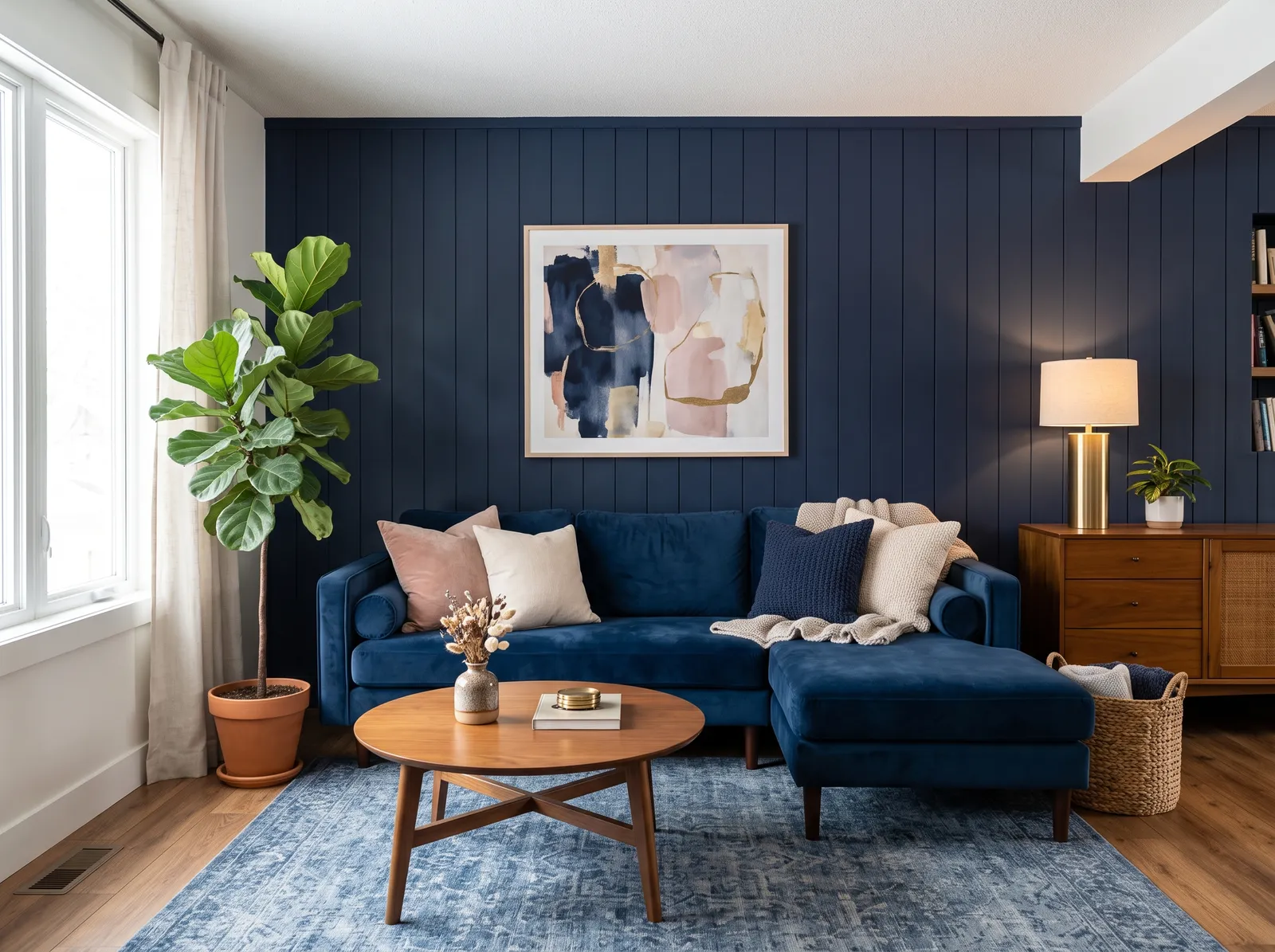
Can a dark color like Hale Navy work in a living room?
Yes, especially if you want a cozy, lounge-like feel. Dark colors have a low LRV and absorb light, so lean into it with good lamps and layered lighting rather than expecting the room to stay bright. Navy works well on a feature wall or built-ins.
Can I get one of these colors in the paint brand I already use?
Almost always. Every color shown here is mixed to order at the paint counter, so a shade like Sage or Revere Pewter can be cross-matched into most major paint lines. You are choosing a color, not locking into one brand.
How do I make a small living room feel bigger with paint?
Choose a higher-LRV color that reflects more light, like White Dove or a light warm neutral, and use a matte or eggshell finish to cut glare. Keeping the trim and ceiling close in tone to the walls also removes hard lines and makes the room feel more open.
What two-color combination works best in a living room?
The reliable pattern is a quiet main color plus one deep accent on a single wall. Keep trim and ceiling in one warm white so the two colors are the only event in the room — the combination cards above show complete schemes from real rooms.
What colors make a living room look bigger?
High-LRV, slightly warm colors — LRV 60–75 is the sweet spot. Paint the walls and trim close to the same light color so the corners blur, and keep the ceiling white. Stark cool white actually works against you; it creates hard shadows that show the room's edges.


Ask a Question