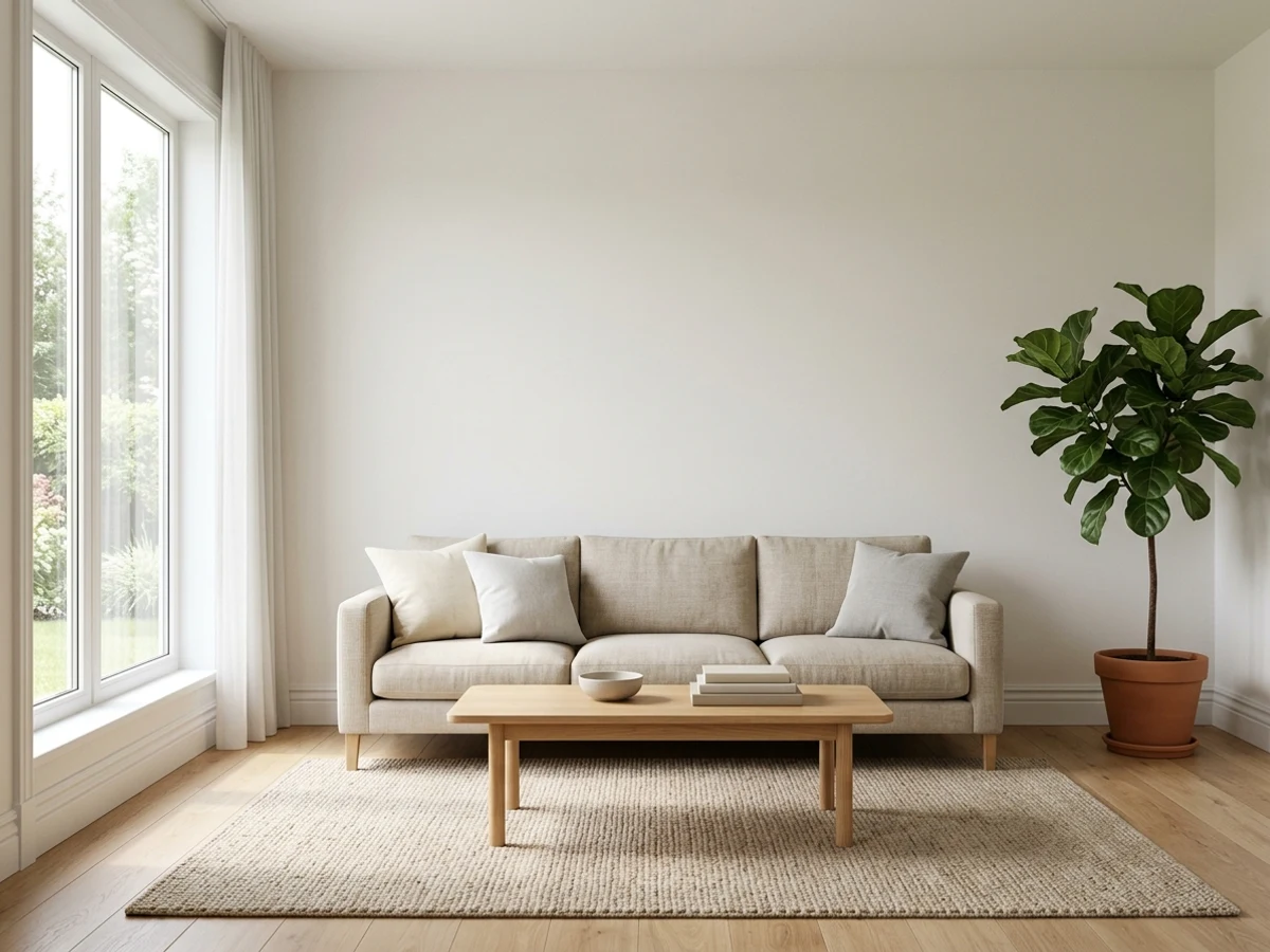
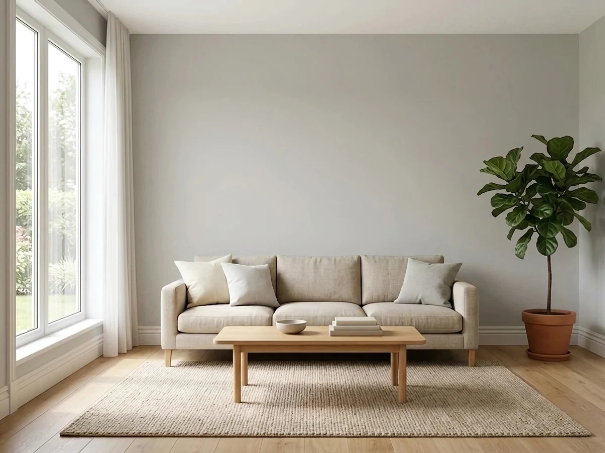
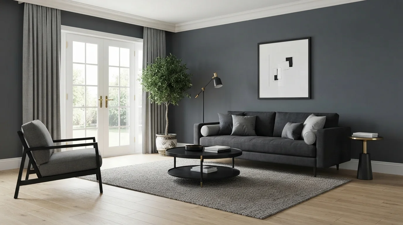
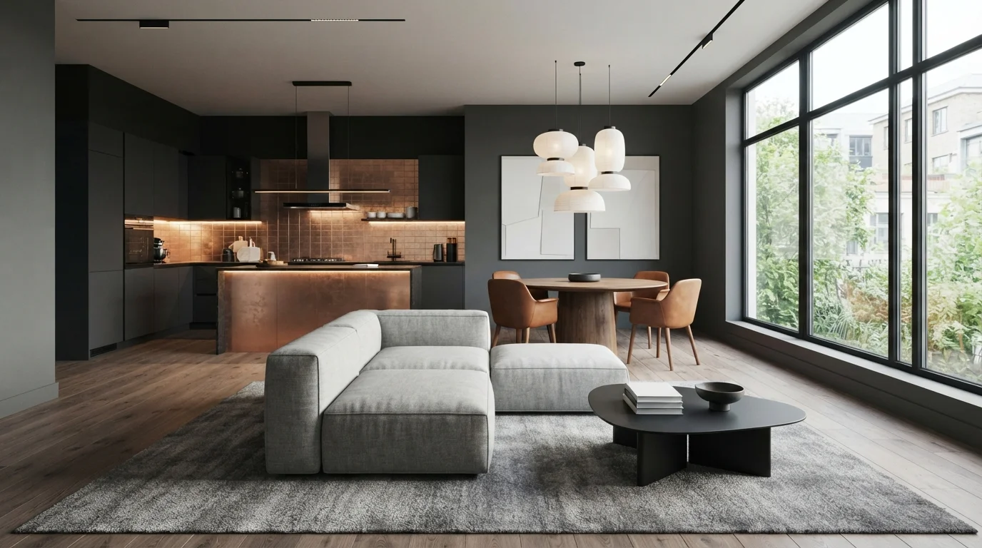
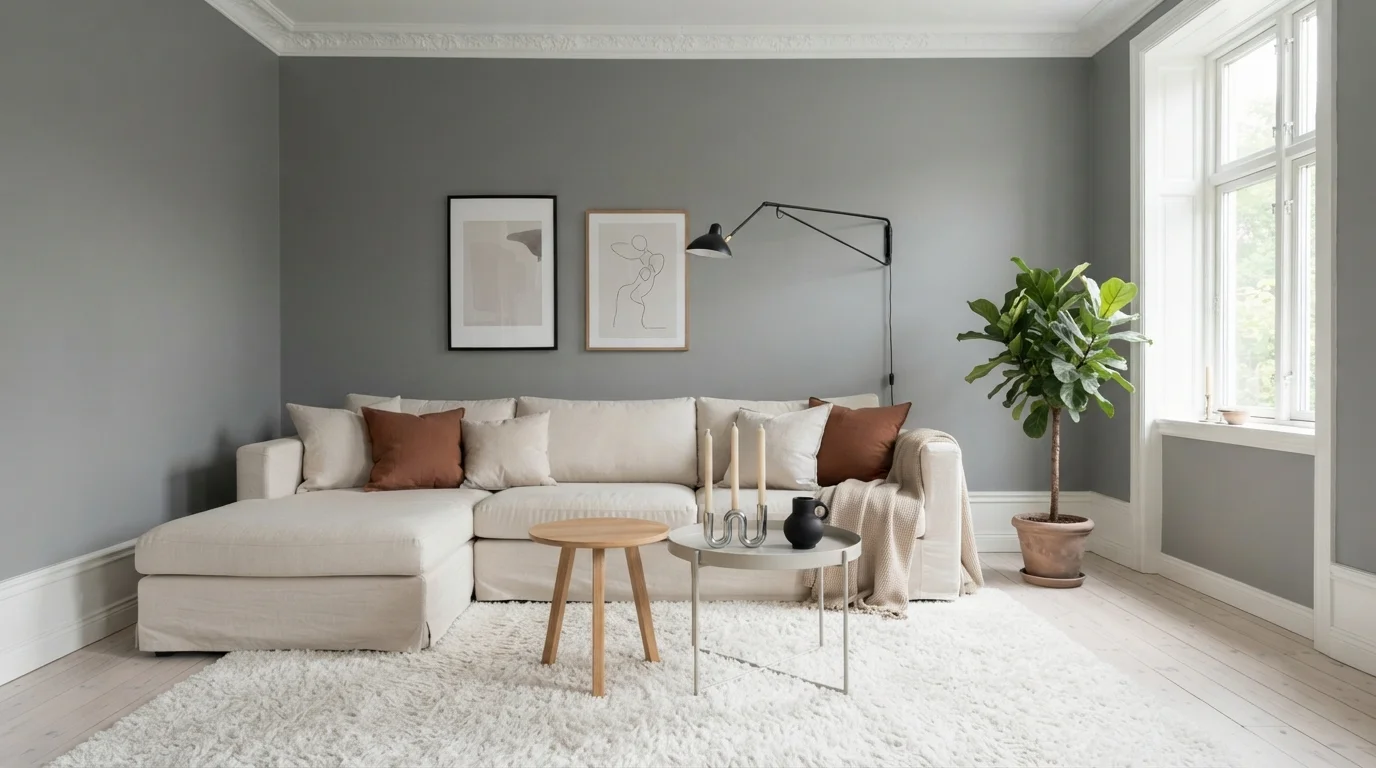
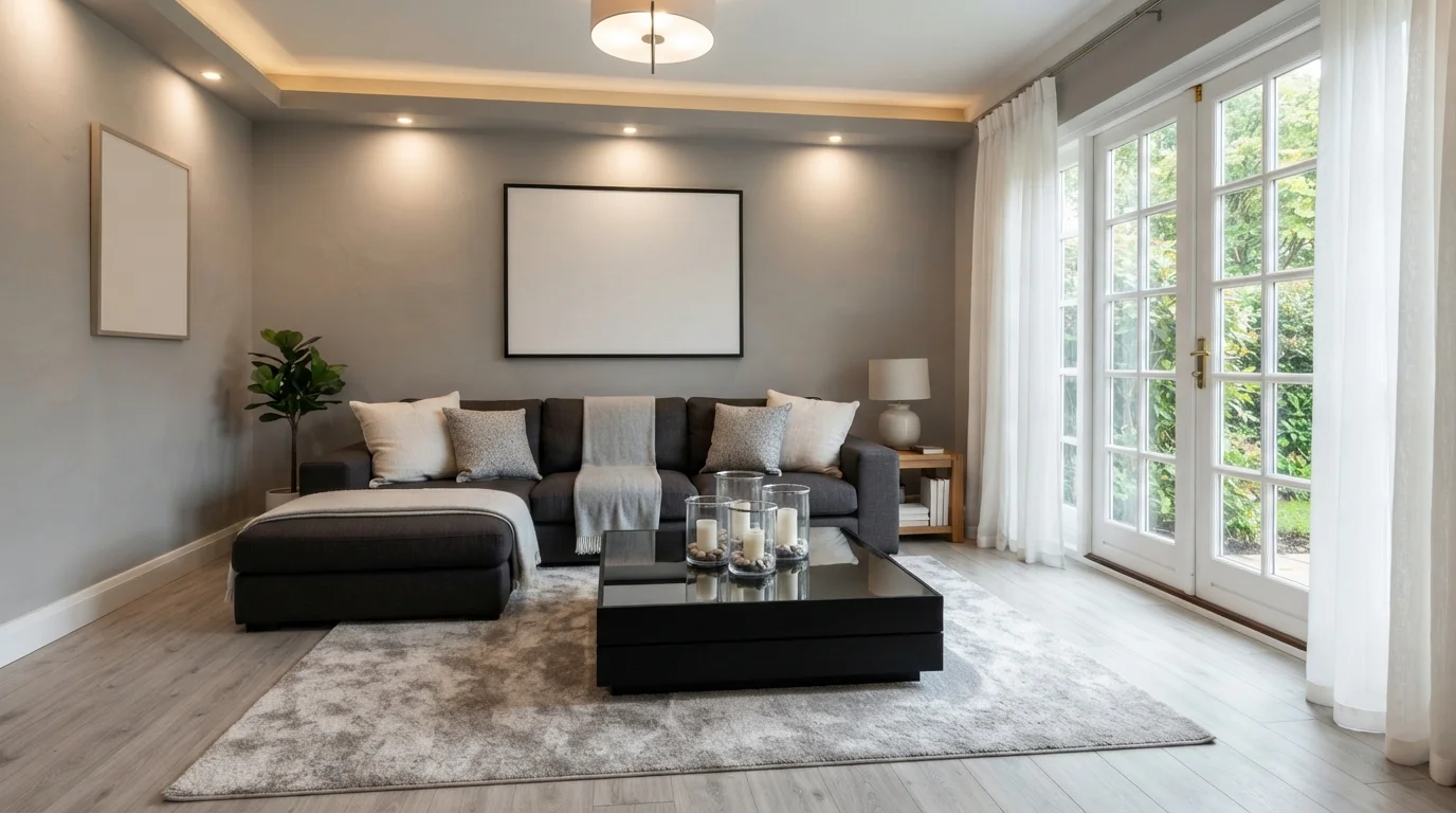
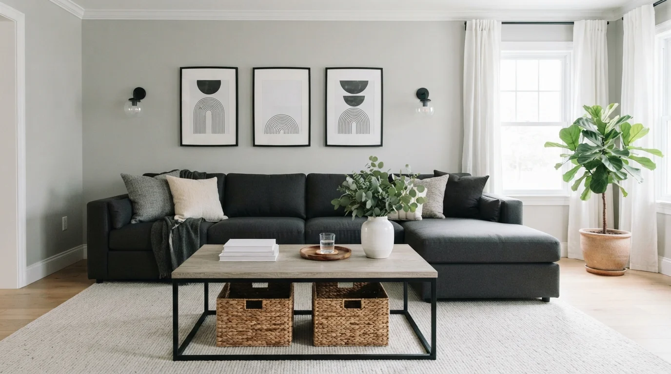
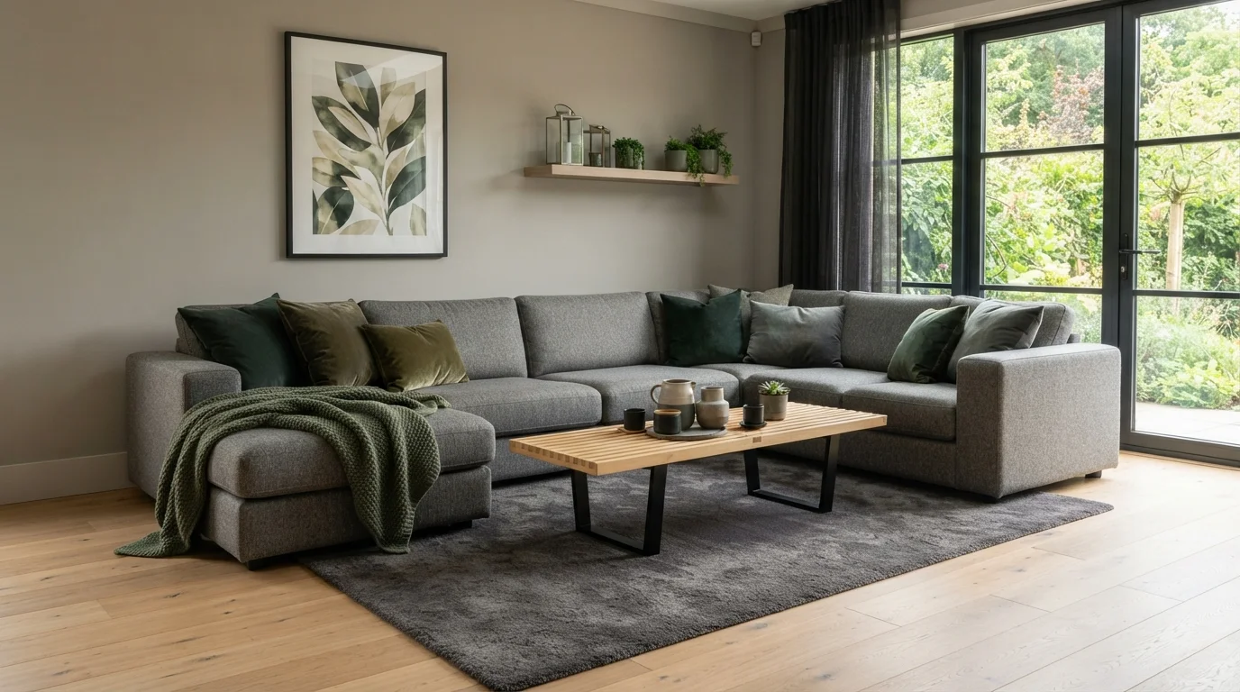
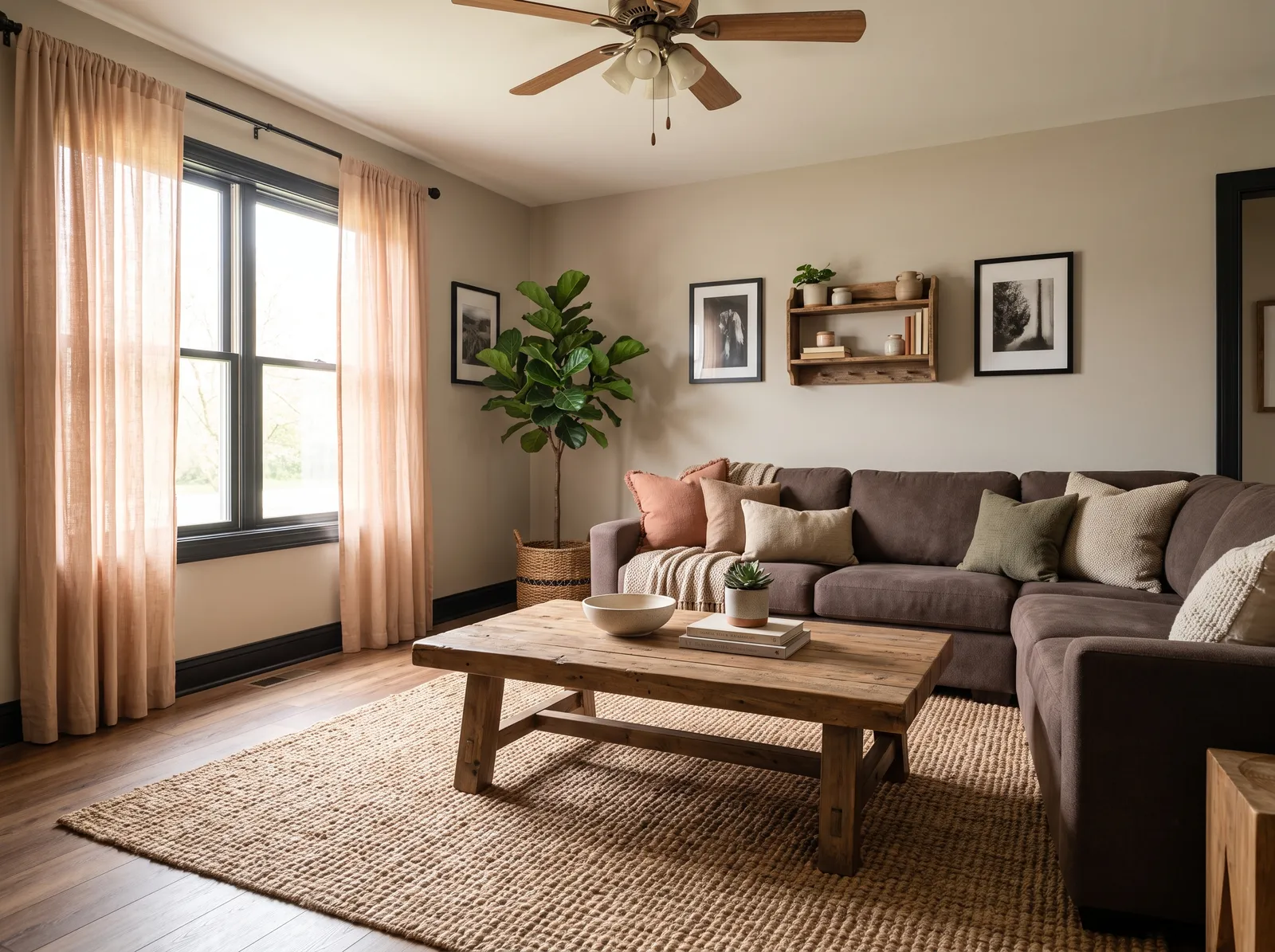
Gray stays the most reached-for neutral for living rooms because it does something beige can't: it fades into the background behind whatever furniture, art, or throw pillows come and go, while still reading as an intentional color choice rather than an unfinished one. A living room absorbs a lot of daily wear — movie nights, kids on the rug, guests on the sofa — so the wall color has to work with that use, not compete with it. That is the job every pick on this page is doing, from a near-white gray to a deeper, tailored tone.
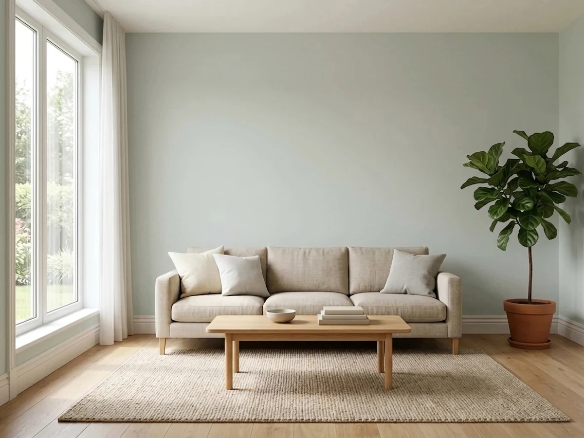
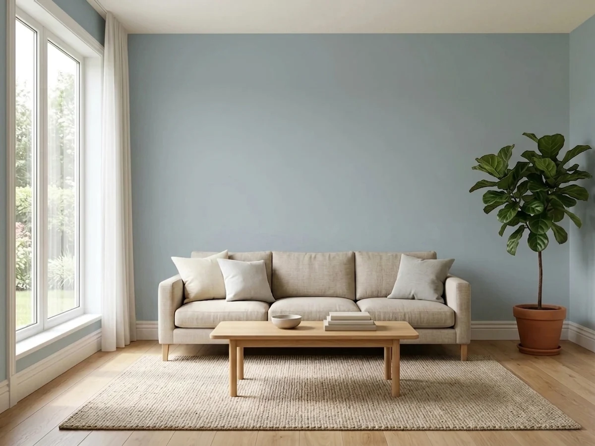
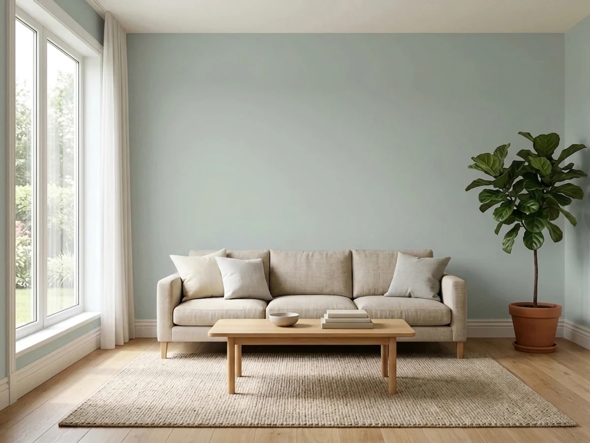
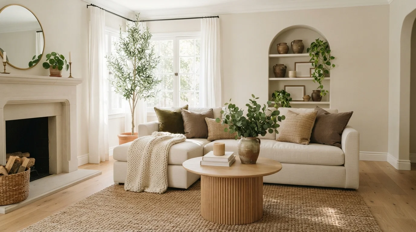
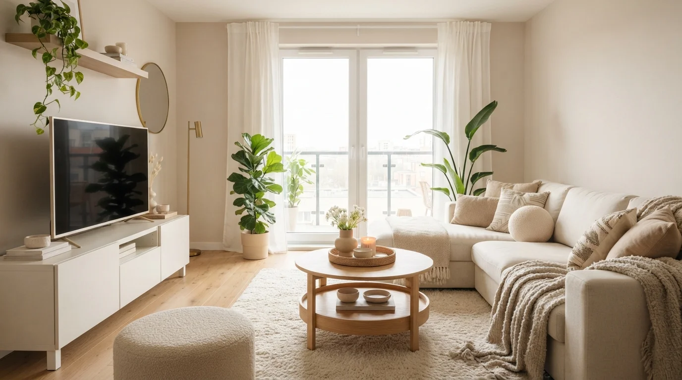
The picks split into two honest groups. Lighter grays — Sea Salt (Sherwin-Williams SW 6204, LRV 63), Glass Slipper (Benjamin Moore 1632, LRV 70), and Mocha Ice (Behr N150-1, LRV 70) — keep a living room feeling open and let daylight bounce around the space, which matters most if the room only gets afternoon sun or has windows on a single wall. Mid-tone picks like Quiet Moments (Benjamin Moore 1563, LRV 50) and Comfort Gray (Sherwin-Williams SW 6205, LRV 47) hold enough depth to register as a real color choice in photos and in person, without pulling as much light out of the room as a true charcoal would.
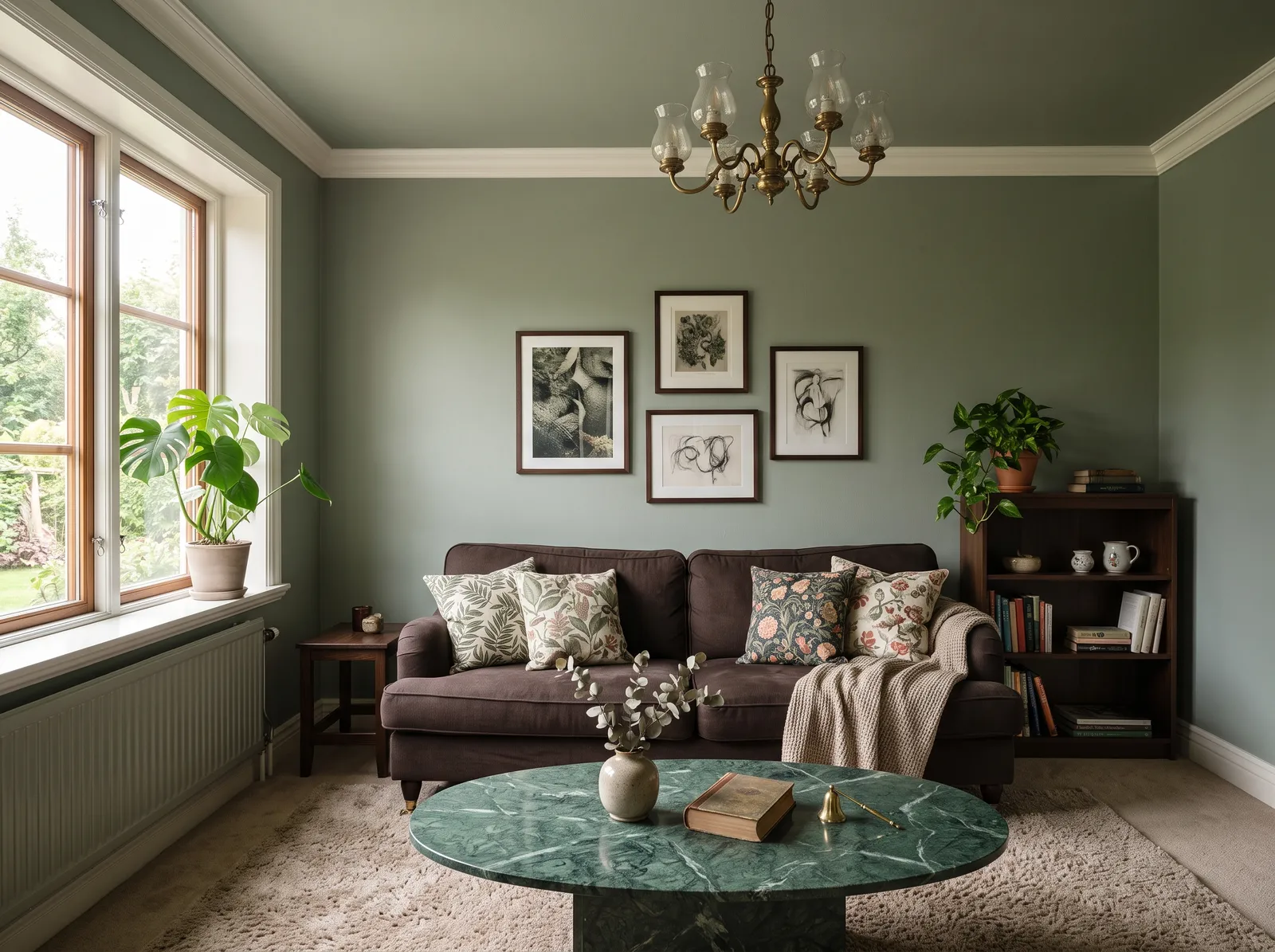
The rest of the lineup — Wedgewood Gray (Benjamin Moore HC-146), Beach Glass (Benjamin Moore 1564), and Quietude (Sherwin-Williams SW 6212) — all sit at LRV 41, the tightest cluster on this page. That closeness is useful: any of the three reads convincingly as "the gray living room" while carrying a slightly different undertone underneath — Wedgewood Gray leans cooler and more blue, while Beach Glass and Quietude both carry a soft, green-tinted gray. Sampling two or three of them side by side on the actual wall is worth the ten minutes before buying a full gallon.

 1
1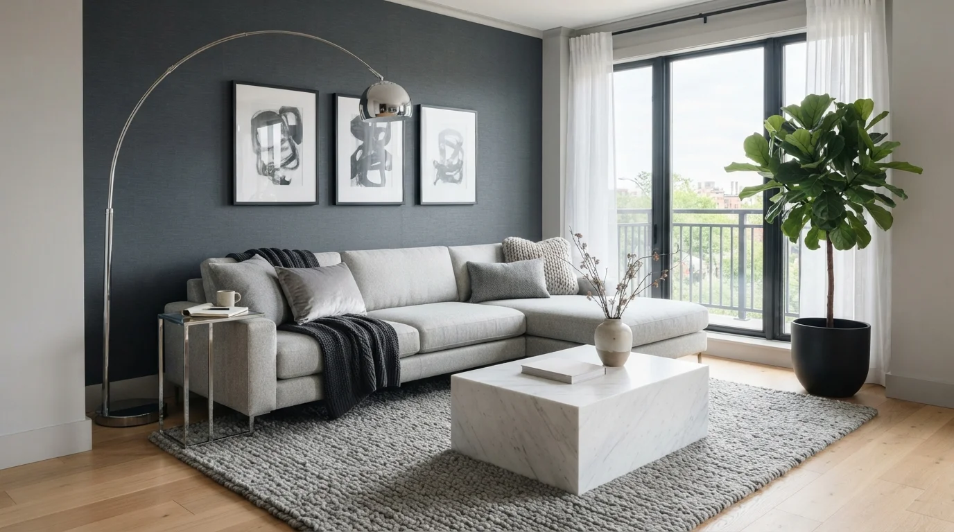
Ask a Question