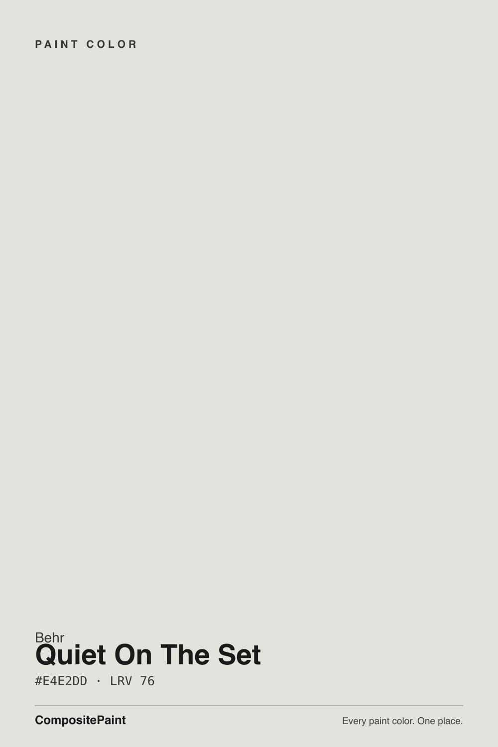
Color spec
| Brand | Behr |
| Name | Quiet On The Set |
| SKU | MQ3-04 |
| Hex | #E4E2DD |
| RGB | 228, 226, 221 |
| HSL | 43°, 11%, 88% |
| LRV | 76 |
| Undertone | warm red-orange tone |
| Family | White |
About Behr Quiet On The Set
Quiet On The Set is very light — LRV 76, close to white. It opens up small or dim rooms and keeps walls feeling airy. Its orange undertone is the part to watch: it gets picked up by whatever sits next to it, so test it against your trim, floor and the room's main light before committing. In north light it can read slightly cooler; a warm white trim alongside keeps it from going clinical.
Quiet On The Set shines on ceilings, trim and in small or low-light rooms where you need to stretch the light — and as a calm whole-home backdrop. As a white, it's a natural for trim, ceilings and cabinets, and a clean backdrop for art.
Closest matches by brand
18 brands within ΔE 5The closest matches per brand by ΔE2000, computed against each brand's full deck. Only colors within ΔE 5 (close enough to substitute on a wall) are shown — brands with no real match are left off. Tap any swatch for its full single-color spec; tap the brand title to browse all white from that brand.
Sherwin-Williams
Benjamin Moore
Valspar
PPG / Glidden
Glidden
Dutch Boy
HGTV Home by Sherwin-Williams
Dunn-Edwards
Magnolia Home
Farrow & Ball
Diamond Vogel
Hirshfield's
Rodda
C2 Paint
Clare
Portola Paints
Backdrop
Kompozit
Similar Behr colors
closest in the Behr deckThe nearest shades to Quiet On The Set within Behr's own range, ranked by perceptual color distance — useful when you want the same look a touch lighter, darker, or warmer.
Coordinated palette
Generated by hue-rotating #E4E2DD in HSL space. Pair Quiet On The Set with one accent and one neutral — the swatches below are starting points, not final picks.
Accessibility (WCAG contrast)
WCAG 2.1: AA = 4.5:1 normal text · AA Large = 3:1 large text · AAA = 7:1 normal text.
Behr Quiet On The Set Equivalents at Other Brands
Matching Quiet On The Set from a different paint counter? Below is the single closest color in each major US deck and how close it really is. Remember that any paint store can also custom-tint Behr MQ3-04 directly — these equivalents are for when you'd rather stay inside one brand's own deck.
Sherwin-Williams Equivalent of Quiet On The Set
Sherwin-Williams's nearest match is Origami White (SW 7636), visually identical in normal room light (ΔE 1.39). It sits at the same lightness (LRV 76 vs 76) and carries a warm red-orange undertone, so it substitutes for Quiet On The Set without repainting risk. See the full Origami White swatch →
Benjamin Moore Equivalent of Quiet On The Set
Benjamin Moore's nearest match is A la Mode (2109-70), visually identical in normal room light (ΔE 1.28). It sits at the same lightness (LRV 75 vs 76) and carries a warm red-orange undertone, so it substitutes for Quiet On The Set without repainting risk. See the full A la Mode swatch →
Valspar Equivalent of Quiet On The Set
The closest Valspar equivalent of Quiet On The Set is Permafrost (V159). At ΔE 0 the two are indistinguishable on a wall — it carries the same warm red-orange undertone and sits at the same lightness (LRV 76 vs 76). If Valspar is your counter, order Permafrost and you'll get the same color. See the full Permafrost swatch →
PPG / Glidden Equivalent of Quiet On The Set
The closest PPG / Glidden equivalent of Quiet On The Set is Arctic Cotton (PPG1002-2). At ΔE 0.83 the two are indistinguishable on a wall — it carries the same warm red-orange undertone and sits at the same lightness (LRV 76 vs 76). If PPG / Glidden is your counter, order Arctic Cotton and you'll get the same color. See the full Arctic Cotton swatch →
Glidden Equivalent of Quiet On The Set
Glidden's nearest match is Dusky Dawn (PPG1005-1), visually identical in normal room light (ΔE 1.67). It sits at the same lightness (LRV 76 vs 76) and carries a warm red-orange undertone, so it substitutes for Quiet On The Set without repainting risk. See the full Dusky Dawn swatch →
Dutch Boy Equivalent of Quiet On The Set
Dutch Boy's nearest match is Moon Pie (406-1DB), visually identical in normal room light (ΔE 1.89). It sits at the same lightness (LRV 75 vs 76) and carries a warm red-orange undertone, so it substitutes for Quiet On The Set without repainting risk. See the full Moon Pie swatch →
HGTV Home by Sherwin-Williams Equivalent of Quiet On The Set
HGTV Home by Sherwin-Williams's nearest match is Origami White (HGSW 4007), visually identical in normal room light (ΔE 1.39). It sits at the same lightness (LRV 76 vs 76) and carries a warm red-orange undertone, so it substitutes for Quiet On The Set without repainting risk. See the full Origami White swatch →
Dunn-Edwards Equivalent of Quiet On The Set
Dunn-Edwards's nearest match is Foggy Day (DE6226), visually identical in normal room light (ΔE 1.52). It runs slightly darker (LRV 71 vs 76) and carries a warm red-orange undertone, so it substitutes for Quiet On The Set without repainting risk. See the full Foggy Day swatch →
Magnolia Home Equivalent of Quiet On The Set
At Magnolia Home, the closest color to Quiet On The Set is Shiplap (JG-22) — very close at ΔE 2.12, though not an exact twin. It sits at the same lightness (LRV 77 vs 76) and carries a warm yellow undertone; sample both side by side if the room gets strong natural light. See the full Shiplap swatch →
Farrow & Ball Equivalent of Quiet On The Set
The closest Farrow & Ball equivalent of Quiet On The Set is Strong White (NO. 2001). At ΔE 0.49 the two are indistinguishable on a wall — it carries the same warm red-orange undertone and sits at the same lightness (LRV 76 vs 76). If Farrow & Ball is your counter, order Strong White and you'll get the same color. See the full Strong White swatch →
Diamond Vogel Equivalent of Quiet On The Set
The closest Diamond Vogel equivalent of Quiet On The Set is Cherish is the Word (0029). At ΔE 0.98 the two are indistinguishable on a wall — it carries the same warm yellow undertone and sits at the same lightness (LRV 76 vs 76). If Diamond Vogel is your counter, order Cherish is the Word and you'll get the same color. See the full Cherish is the Word swatch →
Hirshfield's Equivalent of Quiet On The Set
Hirshfield's's nearest match is Beryl Pearl (0509), visually identical in normal room light (ΔE 1.47). It sits at the same lightness (LRV 76 vs 76) and carries a cool green undertone, so it substitutes for Quiet On The Set without repainting risk. See the full Beryl Pearl swatch →
Rodda Equivalent of Quiet On The Set
Rodda's nearest match is Porcelain (CA026), visually identical in normal room light (ΔE 1.57). It sits at the same lightness (LRV 76 vs 76) and carries a warm yellow undertone, so it substitutes for Quiet On The Set without repainting risk. See the full Porcelain swatch →
C2 Paint Equivalent of Quiet On The Set
C2 Paint's nearest match is Shimmer (C2-788), visually identical in normal room light (ΔE 1.1). It runs slightly lighter (LRV 79 vs 76) and carries a warm red-orange undertone, so it substitutes for Quiet On The Set without repainting risk. See the full Shimmer swatch →
Clare Equivalent of Quiet On The Set
Clare's nearest match is On Point (PNT100-LT-11), visually identical in normal room light (ΔE 1.11). It runs slightly lighter (LRV 78 vs 76) and carries a warm red-orange undertone, so it substitutes for Quiet On The Set without repainting risk. See the full On Point swatch →
Portola Paints Equivalent of Quiet On The Set
At Portola Paints, the closest color to Quiet On The Set is Gem (GEM) — very close at ΔE 2.29, though not an exact twin. It sits at the same lightness (LRV 75 vs 76) and carries a warm yellow undertone; sample both side by side if the room gets strong natural light. See the full Gem swatch →
Kompozit Equivalent of Quiet On The Set
Kompozit's nearest match is Beryl Pearl (0509), visually identical in normal room light (ΔE 1.47). It sits at the same lightness (LRV 76 vs 76) and carries a cool green undertone, so it substitutes for Quiet On The Set without repainting risk. See the full Beryl Pearl swatch →