Room Colors · Kitchen Cabinets
6 Best Kitchen Cabinets Paint Colors for 2026
ideas, combinations, and real rooms
6 curated picks from real kitchen cabinetss — with the exact colors, honest reasons why, and the combinations that hold the room together.

Former interior stylist who can spot a green undertone from across a room. Jessica writes the color and mood pieces — what to choose, what pairs, and why your "white" looks pink.

Top Picks for the Kitchen Cabinets
Pick a color family, tap a shade to see the kitchen cabinets in it, then try it on your own room.
Kitchen Cabinets Color Trends 2026 — What's In, What's Out


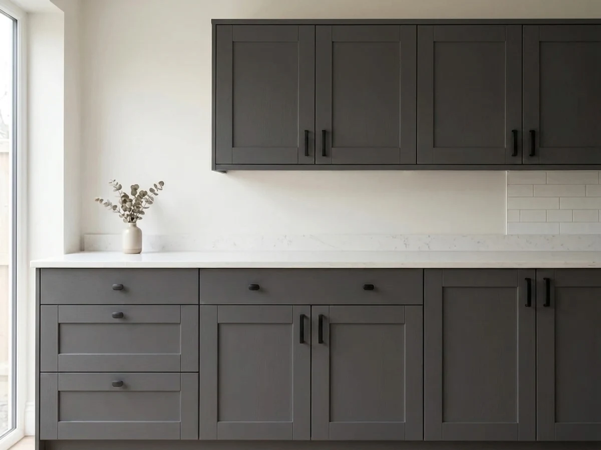
- Cool Gray Cabinets — Designers consistently flag cool-toned gray as the primary cabinet color as the fastest way to date a 2026 kitchen.
- Stark Bright-White Everything — The all-over blue-white kitchen reads clinical now; the same look survives only when the white warms up.
- Saturated Jewel-Tone Drenching — Deep emerald and inky jewel tones on every surface are giving way to softer, dustier versions of the same colors.
- Gray Island as the Default Accent — The white-kitchen-gray-island formula of the 2010s now signals a flip, not a design choice — the accent has moved to green, navy, and bronze.
The 6 Best Kitchen Cabinets Paint Colors
Every pick below is a real rendered kitchen cabinets, not a chip. The lead color first; the swatches are the full scheme in the photo — walls, furniture, textiles, accent.

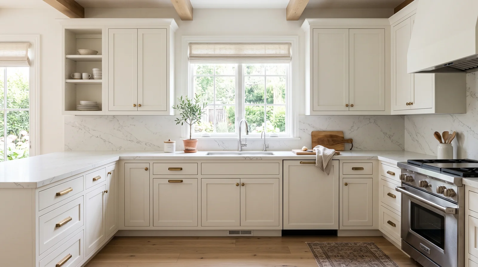
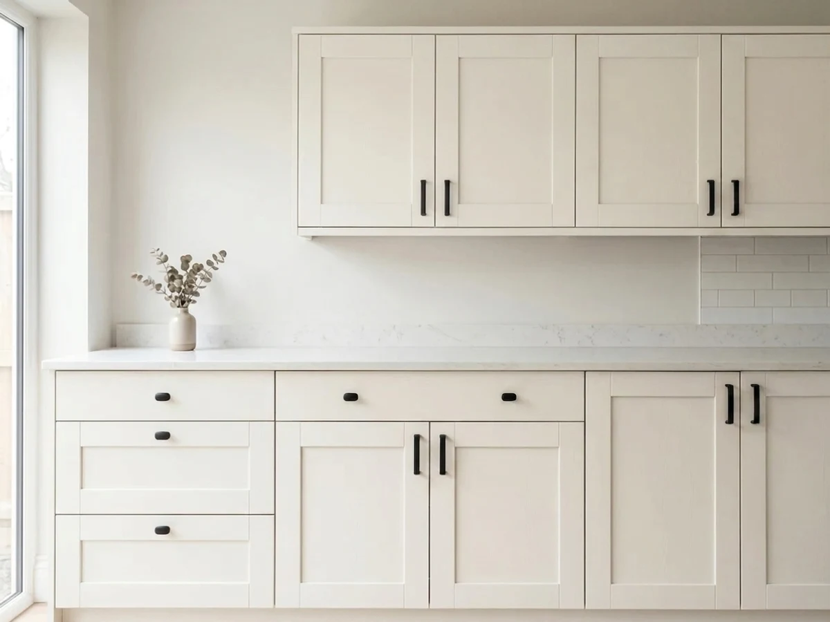
A soft, creamy white that makes the whole kitchen feel clean and calm without ever going cold or clinical.
White Dove (LRV 83) is the cabinet white pros reach for because it has just enough warmth to read soft under both daylight and evening bulbs — stark whites turn blue-gray next to it. It pairs with almost anything: marble-look quartz, brass or matte black pulls, and every wood floor tone from white oak to walnut. Keep the walls a hair brighter, like Chantilly Lace, so the cabinets read intentional rather than accidental. If your kitchen gets strong warm southern light and White Dove starts leaning cream, Pure White is the cleaner, cooler neighbor to sample instead.
SEE WHITE DOVE ON YOUR WALLS →
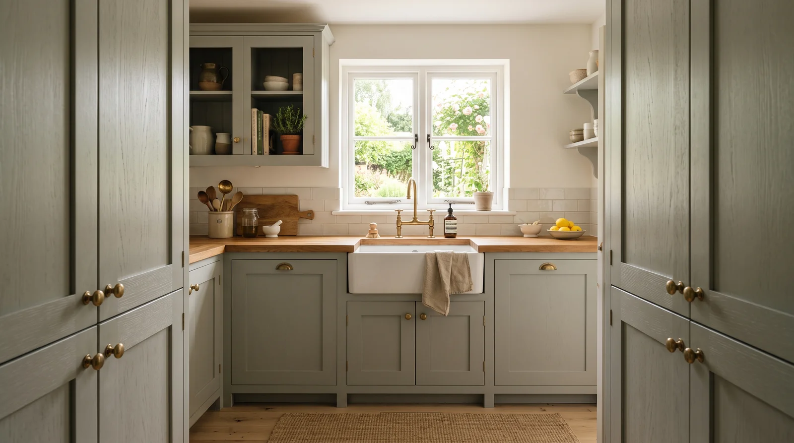
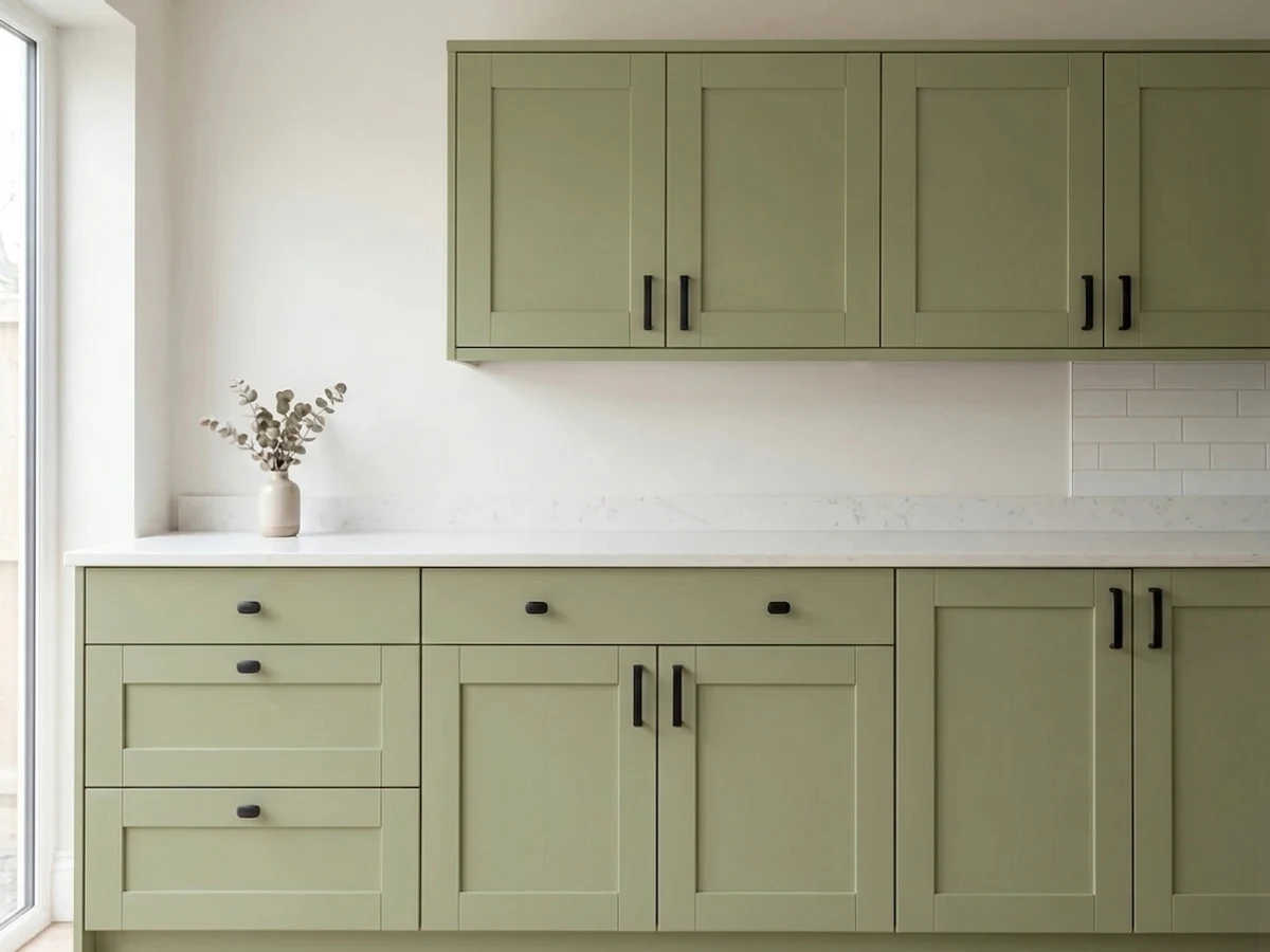
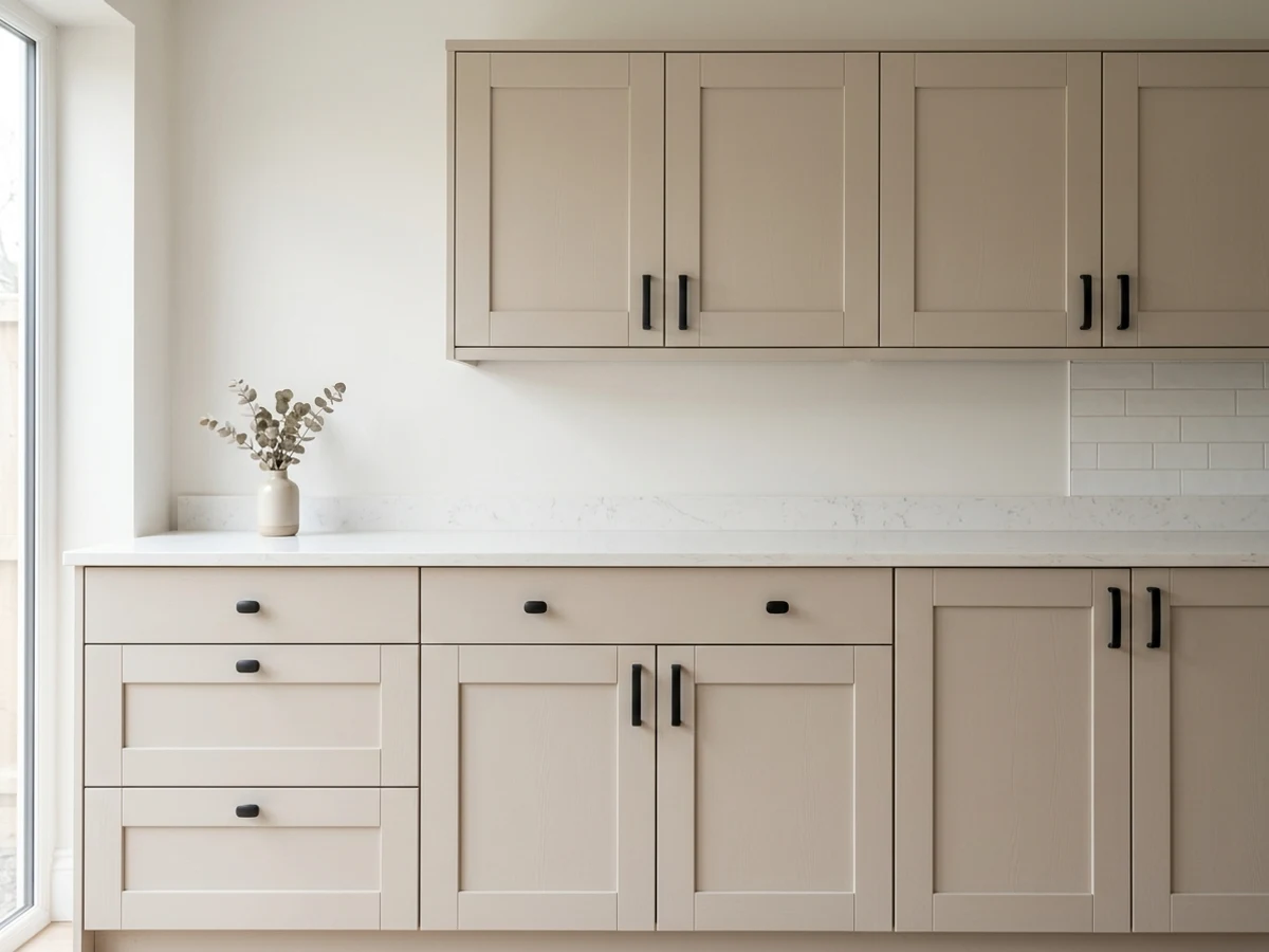
A gentle gray-sage that reads almost neutral — green enough to feel fresh, quiet enough to live with for a decade.
October Mist (LRV 47) is the easiest way into the green-cabinet wave because it behaves like a neutral: in a bright kitchen it looks softly green, in dimmer corners it settles toward gray-sage, and it never shouts. It loves warm white walls like Alabaster, butcher block or warm wood counters, and unlacquered brass or bronze hardware. This is the pick for full-kitchen sage — uppers and lowers both — where a deeper green would close the room in. If you want the cabinets to read clearly green even in low light, step down to Evergreen Fog instead.
SEE OCTOBER MIST ON YOUR WALLS →
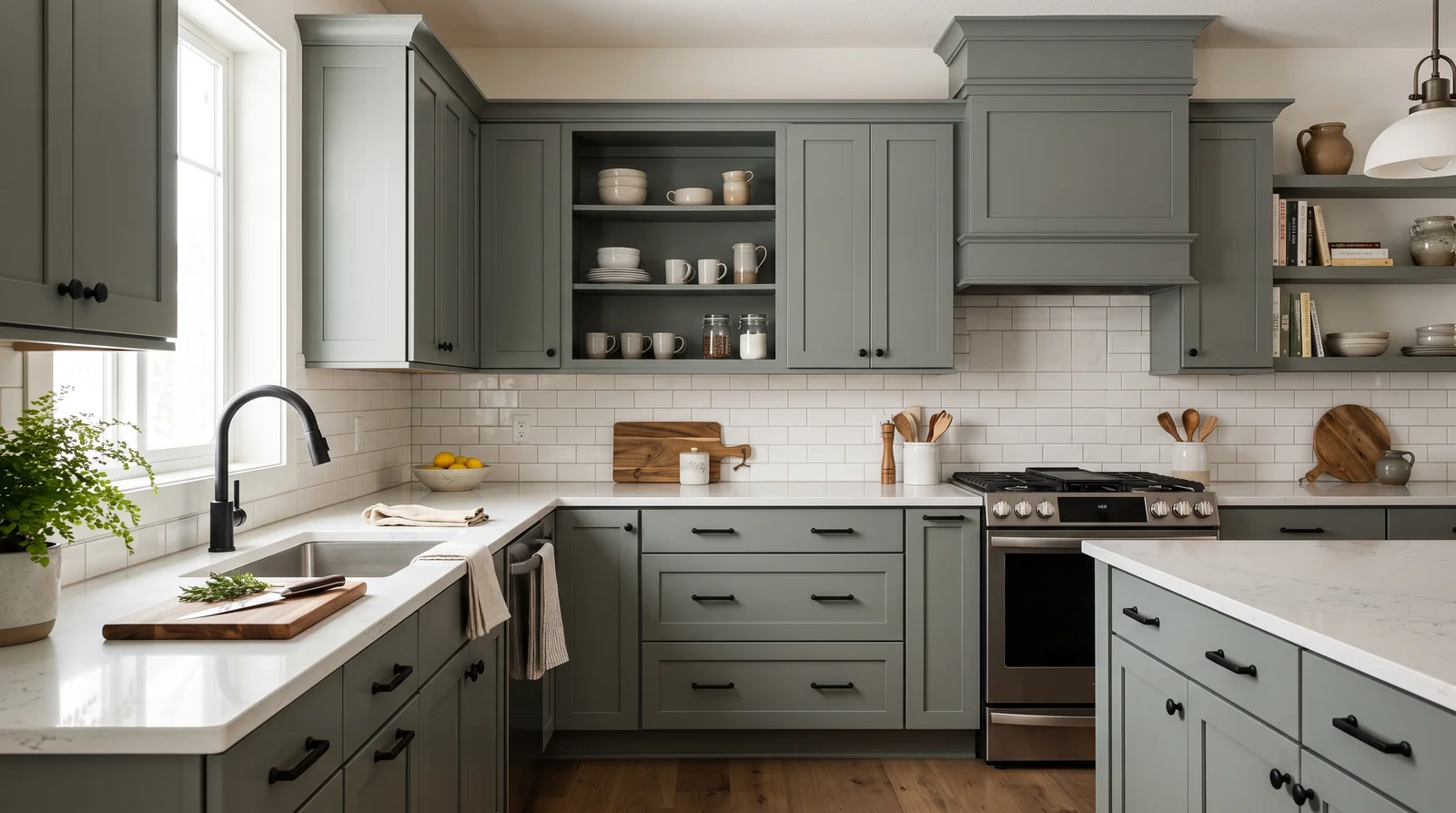
A muted mid-tone green with gray in its bones — moody enough to feel designed, soft enough for the whole kitchen.
Evergreen Fog (LRV 30) is the green that started the cabinet wave for a reason: it holds real color without the commitment of a dark. On cabinets it pairs beautifully with warm whites like Alabaster on the walls, white or veined quartz counters, and either brass or matte black pulls — it flatters both. It works on a full kitchen in good light, or lowers-only in a smaller one. If your kitchen is dim and north-facing, this can drift toward gray-olive; sample Pewter Green if you would rather commit to a deeper, truer green than fight the light.
SEE EVERGREEN FOG ON YOUR WALLS →
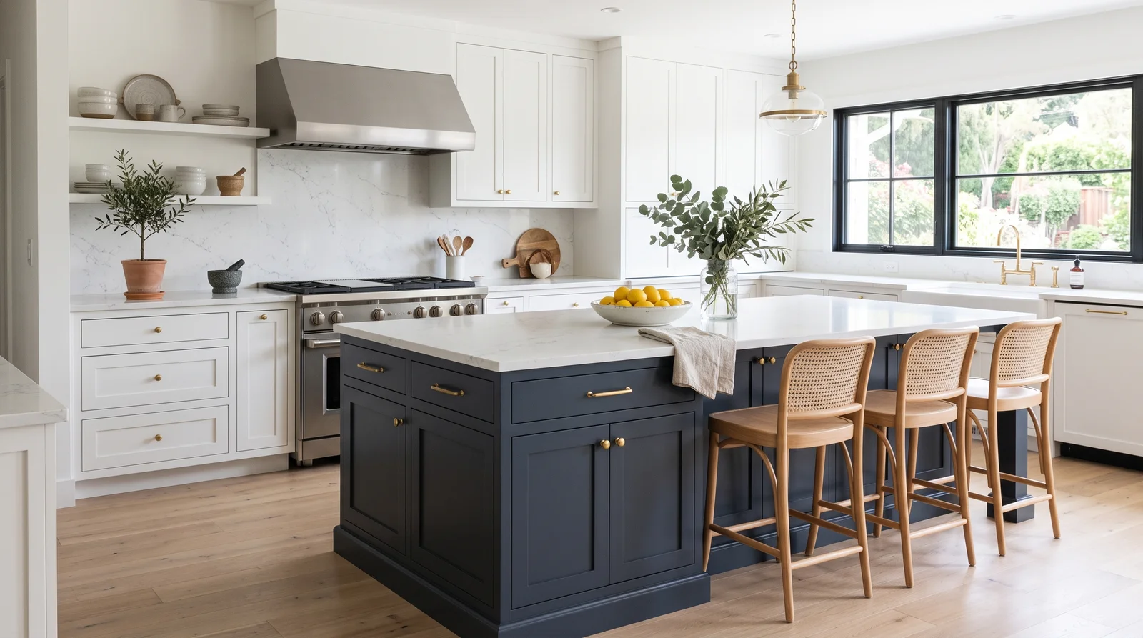
Crisp white perimeter cabinets around a deep navy island — the classic two-tone kitchen that still stops people at the doorway.
This is the two-tone formula that survived every trend cycle: Pure White (LRV 84) on the perimeter keeps the room bright and resale-safe, while Hale Navy (LRV 8) on the island gives the kitchen one confident anchor. Hale Navy is a softened, gray-leaning navy, so it reads rich rather than primary-blue, and brass hardware warms it instantly. It pairs with white quartz, marble looks, and both light and dark wood floors. If you want the navy more saturated and dramatic — closer to ink — Naval is the deeper neighbor; if the island is small, the extra depth can make it read near-black at night.
SEE HALE NAVY ON YOUR WALLS →
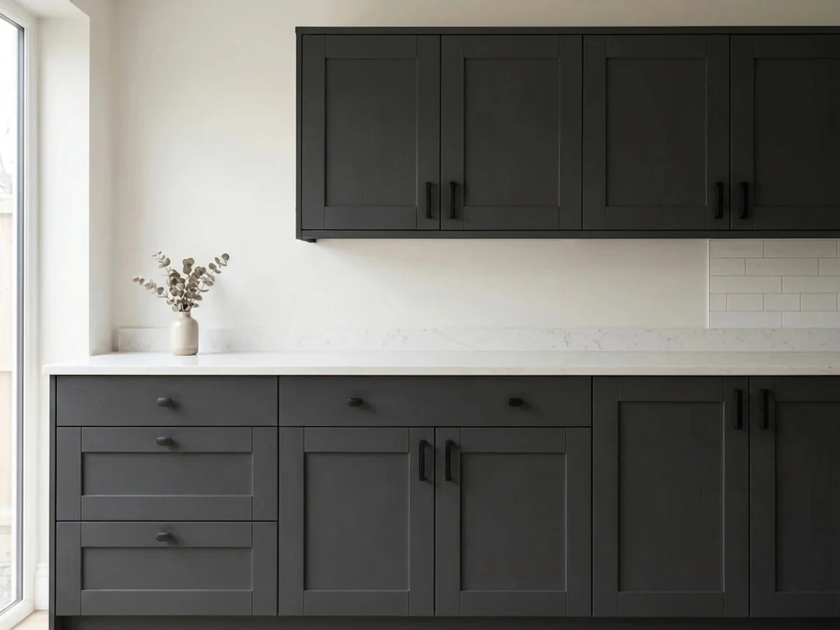
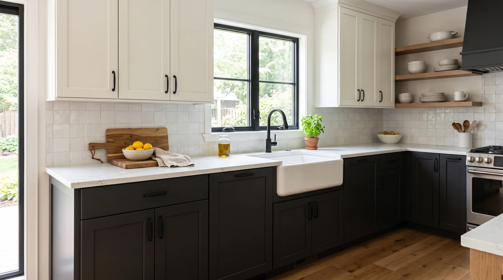
Soft-black lower cabinets under warm white uppers — grounded and tailored, like a good suit for the kitchen.
Iron Ore (LRV 6) is the soft black that made dark lowers mainstream: it has enough gray in it to show wood grain and shadow instead of going flat like a true black. Keeping it on the lowers only, with Alabaster uppers and walls above, anchors the room without darkening it — the classic fix for a kitchen that wants drama but has average light. It pairs with butcher block, white quartz, brass or black hardware, and hides scuffs at kick level better than any white ever will. On a tight budget, Behr's Cracked Pepper lands in nearly the same place for less per gallon.
SEE IRON ORE ON YOUR WALLS →
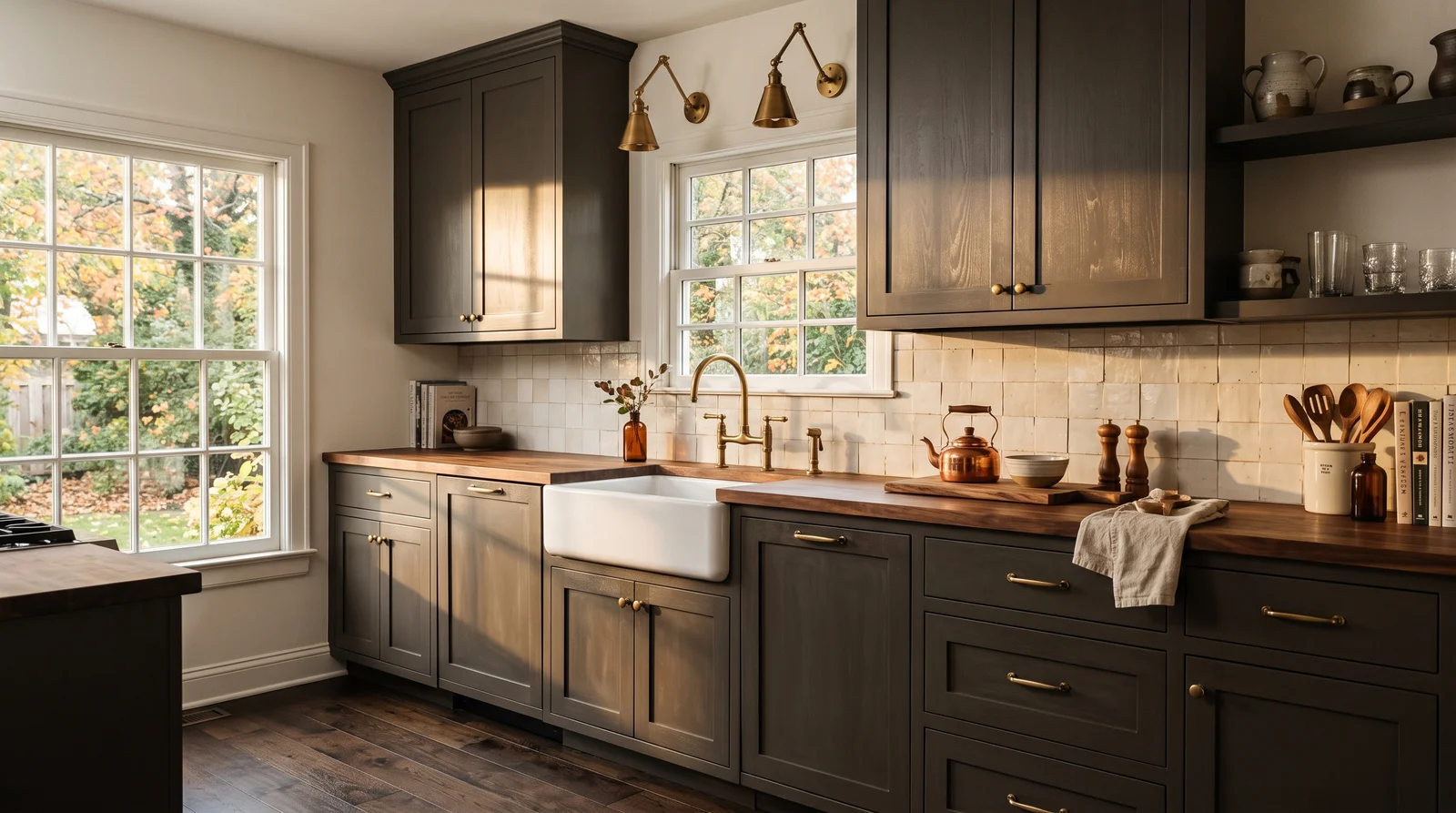
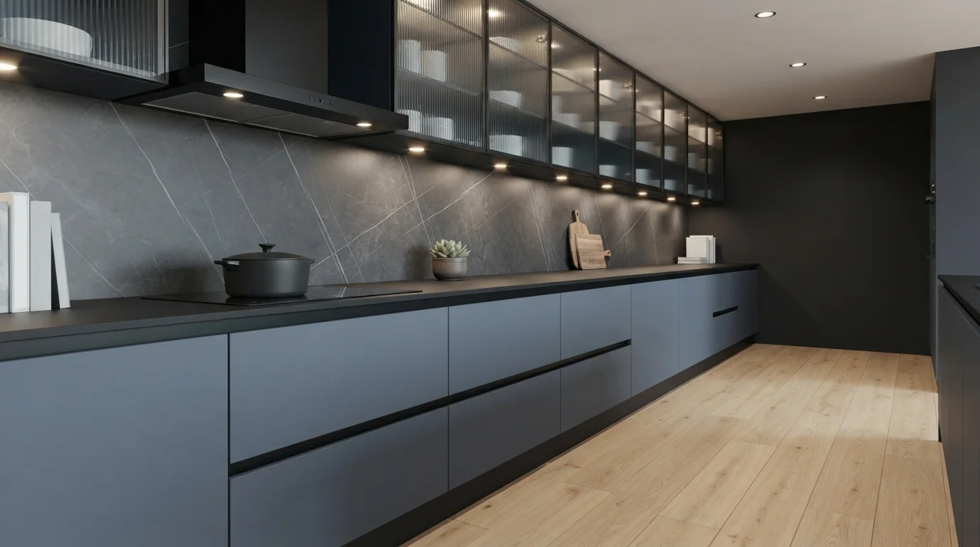
A smoky bronze-brown that wraps the cabinets in warmth — the moody kitchen that feels expensive instead of dark.
Urbane Bronze (LRV 8) is the statement dark for people who find navy too blue and black too hard: it is a warm gray-brown that glows amber at night and pairs naturally with wood, leather, and brass. Drenching a full run of cabinets in it — the growing one-color approach — works best in kitchens with decent natural light and warm-toned counters like butcher block or beige-veined stone. Against Alabaster walls it reads rich, not gloomy. If a full drench feels like too much commitment, Pewter Green delivers a similar depth with a green cast, and either color hides everyday cooking wear far better than white.
SEE URBANE BRONZE ON YOUR WALLS →Kitchen Cabinets Wall Color Combinations
A wall color never works alone. These are the full schemes from the rooms above — the lead color first, then the supporting colors that make the photo work.
A soft, creamy white that makes the whole kitchen feel clean and calm without ever going cold or clinical.
TRY THIS PALETTE →A gentle gray-sage that reads almost neutral — green enough to feel fresh, quiet enough to live with for a decade.
TRY THIS PALETTE →A muted mid-tone green with gray in its bones — moody enough to feel designed, soft enough for the whole kitchen.
TRY THIS PALETTE →Crisp white perimeter cabinets around a deep navy island — the classic two-tone kitchen that still stops people at the doorway.
TRY THIS PALETTE →Start from what you are keeping. Match or work with your countertop undertone first, then your floor, then trim and hardware. Warm wood floors and creamy counters love warm whites like Alabaster and soft greens like Sage; cool gray floors and white quartz sit better with crisp whites, blues like Hale Navy, or Charcoal.
For a calm look, keep walls and trim in a quiet companion to the cabinets rather than a hard contrast. White cabinets pair easily with a soft white or light greige wall. Deep cabinets like navy or charcoal look sharp against a warm white wall and ceiling, with brass or matte black hardware to finish the contrast. When in doubt, let the cabinets be the star and keep everything else low-key.
Kitchen Cabinets Color Ideas by Color
Set on a color family already? Each page has its own real rooms and picks.
Light or Dark Kitchen Cabinets Colors?
Go Light (LRV 60+) If…
The room is small, faces north, or has to work at every hour. Light warm colors make it feel bigger and stay calm in evening light — the light you actually live in.
Go Dark (LRV Under 20) If…
You want the cocoon effect and the room has real daylight. Dark works best on one feature wall — or fully color-drenched in a large room with good windows.
Light changes a cabinet color more than the swatch ever suggests. North-facing kitchens get cool, flat light, so warm whites like Alabaster and earthy greens like Sage stay friendly there, while cool grays can turn drab. South-facing kitchens get strong warm light, so they can carry cooler or deeper colors like Hale Navy or Charcoal without feeling heavy.
Always test the color on the actual cabinet doors and look at it morning, midday, and at night. Kitchens run on artificial light for hours every day, and warm LED bulbs push whites yellow while cool bulbs can make a green look gray. Paint a sample door, lean it where the real cabinets sit, and live with it for a few days before you commit.
LRV, or light reflectance value, is just how much light a color throws back, from near 0 for black to near 100 for the brightest white. High-LRV whites like Alabaster and White Dove keep a small or windowless kitchen feeling open, which is why white stays the default for tight galley layouts. If your kitchen is dark, lean high.
Low-LRV colors like Charcoal, true black, and Hale Navy soak up light and make a room feel cozy and grounded. That is great in a kitchen with big windows or a lot of square footage. In a darker kitchen, use those deep colors only on lower cabinets or an island so the room does not close in.
See It. Love It.
Paint It.
Upload one photo of your kitchen cabinets and try every color on this page on your own walls — in your own light, before you buy a drop of paint.

AlabasterBeforeThe Best Color Directions for Kitchen Cabinets
White is the safe, bright, resale-friendly choice, and warm whites like Alabaster and White Dove read soft instead of sterile. They bounce light around a small kitchen and let your counters, backsplash, and hardware do the talking. If you want clean but not stark, these creamy whites are where most people land.
Green, blue, and black are how you add personality. A soft sage like Sage or a leafy Eucalyptus feels calm and organic, almost like a neutral. A deep blue such as Hale Navy looks classic and confident, especially on a lower run of cabinets. Charcoal and true black anchor a room and hide scuffs better than you would think. A popular middle path is two-tone: white uppers to stay airy, a darker color like navy or charcoal on the base cabinets and island.
The Right Finish for Cabinets
Cabinets need a finish that wipes clean, because they catch grease, fingerprints, and splashes daily. Satin and semi-gloss are the standard choices: satin gives a soft, low-glare look that still cleans up, and semi-gloss is the most durable and washable but shows more shine and surface flaws. Most people choose satin for a modern look and semi-gloss when scrubbing matters most.
Skip flat and matte on cabinets. They mark easily and are hard to clean without burnishing. Whatever sheen you pick, surface prep does the heavy lifting: degrease, sand, and prime so the finish actually bonds and lasts.
Common Mistakes People Make Painting Cabinets
The biggest mistake is skipping prep. Cabinets are coated in invisible cooking grease, and paint will peel within months if you do not degrease, sand, and prime first. The second is rushing: cabinet paint needs days to cure hard, so closing drawers and stacking dishes too soon leaves dents and sticking.
The other classic errors are color-related. People judge the color from a tiny chip under store lighting instead of a painted sample in their own kitchen, and they pick a trendy gray that reads cold once the cabinets cover half the room. Test big, test in your real light, and choose a finish you can actually clean.
About Kitchen Cabinets Paint Colors
Cabinets are the biggest color decision in most kitchens. They cover more surface than the walls, they live at eye level, and they take more abuse than anything else in the room. So the color you pick has to do two jobs at once: set the mood of the whole space and survive years of hands, grease, and water.
The good news is that a handful of color directions almost always work on cabinets, because they flatter food, daylight, and the materials around them. White keeps things bright and timeless. Green and blue add character without going trendy. Black and deep gray ground a kitchen and read as quietly expensive. The trick is matching the color to your light, your finish, and the things you are not repainting, like the floor and the countertop.
Every color shown here is mixed to order, so a shade like White Dove or Hale Navy can be tinted at a paint counter no matter which brand carries it. If you love a color from one line but trust a different brand's paint, it can usually be cross-matched. That means you choose the color you want, then choose the paint that holds up best on cabinets.
The Questions Everyone Asks
What color should I paint my kitchen cabinets?
If you want one answer, start with the safe picks above — White Dove, Alabaster, Tricorn Black, Hale Navy. They read well in any light and survive furniture changes. Then check the light: strong afternoon sun wants a step cooler, a north-facing room wants a step warmer.
What is the most popular color for kitchen cabinets?
White is still the most popular, and warm whites like Alabaster and White Dove lead because they stay bright without looking sterile. After white, soft greens like Sage and deep blues like Hale Navy are the most common upgrades. Navy and charcoal are especially popular on islands and lower cabinets.
What sheen should I use on kitchen cabinets?
Use satin or semi-gloss. Satin gives a soft, low-glare finish that still wipes clean, and semi-gloss is the most durable and washable but shows more shine. Avoid flat or matte, since they mark easily and are hard to clean on a surface you touch every day.
Should I paint my cabinets a dark color in a small kitchen?
You can, but be strategic. Dark colors like Charcoal or Hale Navy have a low LRV and absorb light, which can make a small kitchen feel tighter. The usual fix is to put the dark color only on the lower cabinets or island and keep the uppers a high-LRV white like Alabaster to stay airy.
How do I pick a cabinet color that matches my countertops and floors?
Start with the things you are not changing. Match the undertone of your counters and floors first, then choose the cabinet color to suit them. Warm wood floors and cream counters pair well with warm whites and soft greens; cool gray floors and white quartz suit crisp whites, blues, or charcoal.
Why do my white cabinets look yellow or gray at night?
It is your light bulbs. Warm LED bulbs push whites toward yellow, and cool bulbs can flatten warm whites into gray. Test a painted sample under your actual kitchen lighting at night before you commit, and consider adjusting your bulb temperature if a white you love looks off.
Do I have to use a specific brand's paint to get a color like Hale Navy or Sage?
No. These colors are mixed to order, so any of them can be tinted at a paint counter, and a color from one brand can usually be cross-matched into another brand's paint. That lets you pick the exact shade you want and still use the cabinet paint you trust most.
What is the biggest mistake when painting kitchen cabinets?
Skipping prep. Cabinets carry a thin layer of cooking grease that keeps paint from sticking, so degreasing, sanding, and priming are non-negotiable. The second biggest mistake is using the cabinets before the paint fully cures, which leads to dents, sticking, and chips.
What two-color combination works best in a kitchen cabinets?
The reliable pattern is a quiet main color plus one deep accent on a single wall. Keep trim and ceiling in one warm white so the two colors are the only event in the room — the combination cards above show complete schemes from real rooms.
What colors make a kitchen cabinets look bigger?
High-LRV, slightly warm colors — LRV 60–75 is the sweet spot. Paint the walls and trim close to the same light color so the corners blur, and keep the ceiling white. Stark cool white actually works against you; it creates hard shadows that show the room's edges.

Ask a Question