Room Colors · Nursery
6 Best Nursery Paint Colors for 2026
ideas, combinations, and real rooms
6 curated picks from real nurserys — with the exact colors, honest reasons why, and the combinations that hold the room together.

Former interior stylist who can spot a green undertone from across a room. Jessica writes the color and mood pieces — what to choose, what pairs, and why your "white" looks pink.

Top Picks for the Nursery
Pick a color family, tap a shade to see the nursery in it, then try it on your own room.
Nursery Color Trends 2026 — What's In, What's Out


- Cold Gray Everything — Designers say cool builder gray reads as 2014 now and makes a baby's room feel chilly instead of calm.
- Pink-And-Gray Theme — The pastel-pink-with-stark-gray combo is widely called out as a dated early-2010s scheme that locks the room in its era.
- Bright Sugary Pastels — High-chroma candy pinks and blues are giving way to muted, dusted versions that don't overstimulate or scream nursery.
- Stark All-White Boxes — After years of crisp white-on-white baby rooms, 2026 palettes trade sterile brightness for warmth and gentle color.
The 6 Best Nursery Paint Colors
Every pick below is a real rendered nursery, not a chip. The lead color first; the swatches are the full scheme in the photo — walls, furniture, textiles, accent.

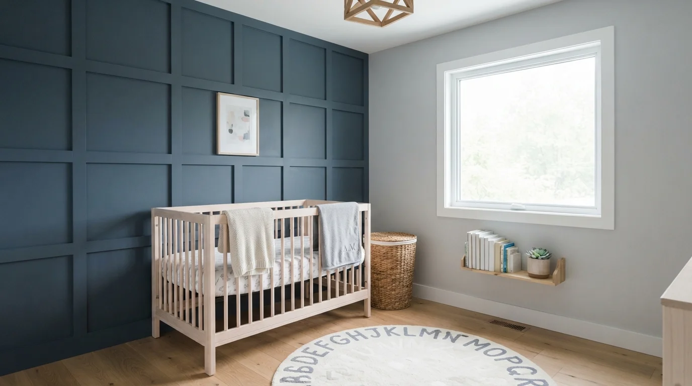
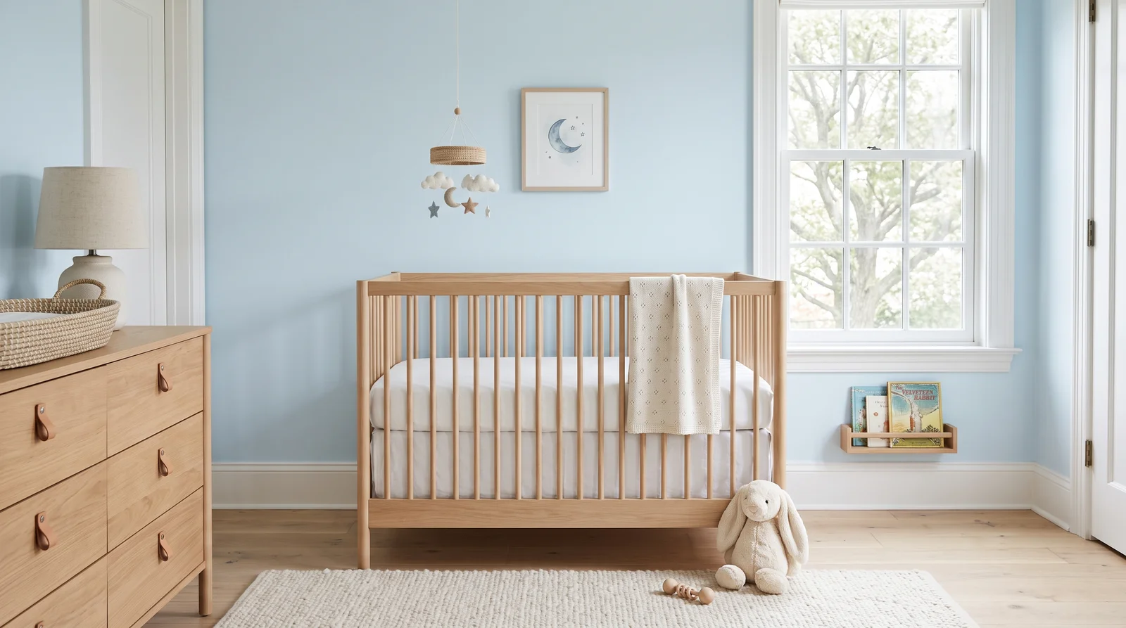
A barely-there sky blue that keeps the room feeling open and calm, best where soft daylight can move across the walls.
Breath of Fresh Air is the nursery blue that doesn't read as a boy's room — at LRV 69 it stays airy enough for a small space and settles into a quiet gray-blue by evening, which is exactly what you want at 2 a.m. It pairs naturally with a white-oak crib, White Dove trim, and cream textiles, so nothing fights for attention. If your room gets very cool northern light and the blue starts to feel chilly on the sample board, step sideways to Palladian Blue, which carries more green and stays warmer.
SEE IT ON YOUR WALLS →
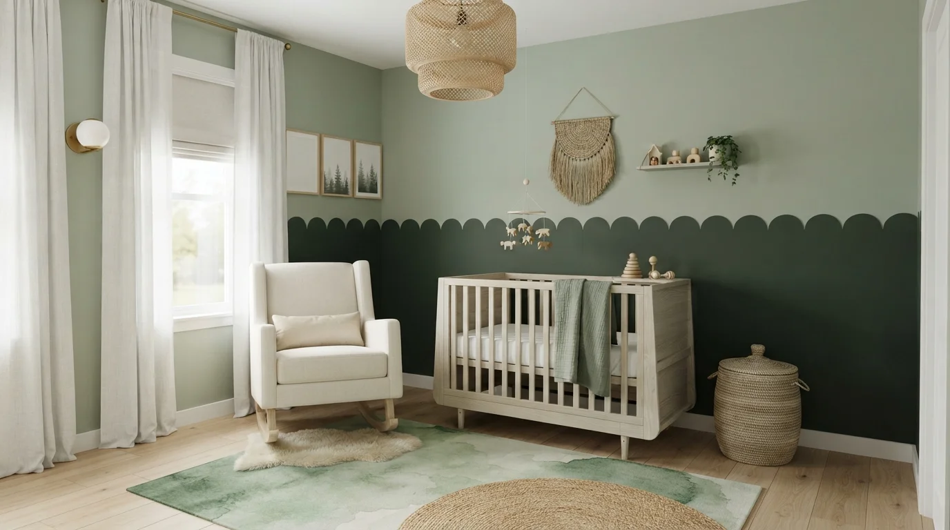
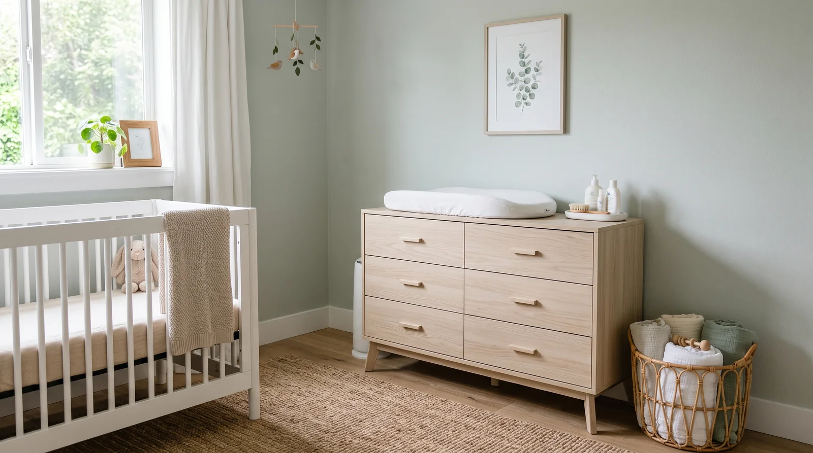
A gray-washed green-blue that feels like sea air, calm in any light and never sugary.
Sea Salt is the pick parents choose when they refuse to repaint in three years — it shifts between soft green and quiet gray depending on the hour, so it works over a crib now and behind a big-kid bed later. At LRV 63 it holds enough color to feel intentional against Pure White trim without ever closing the room in. It loves natural textures: rattan baskets, a jute rug, a light wood dresser. If your samples pull too blue in your light, Beach Glass is the slightly grayer, steadier neighbor.
SEE SEA SALT ON YOUR WALLS →
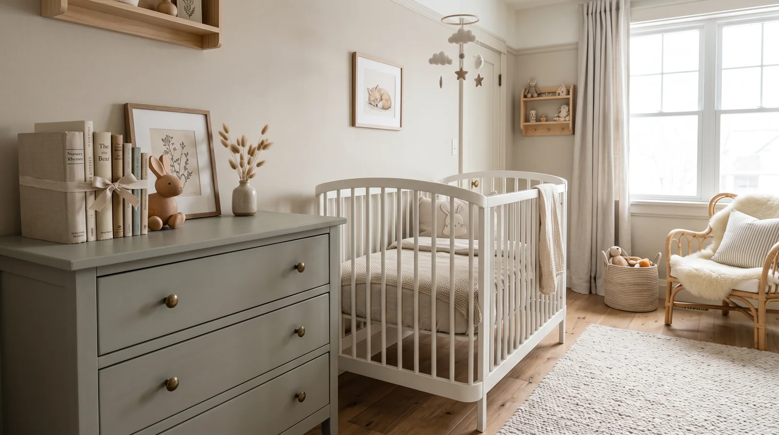
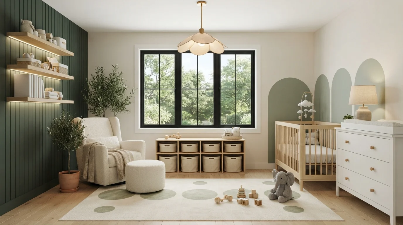
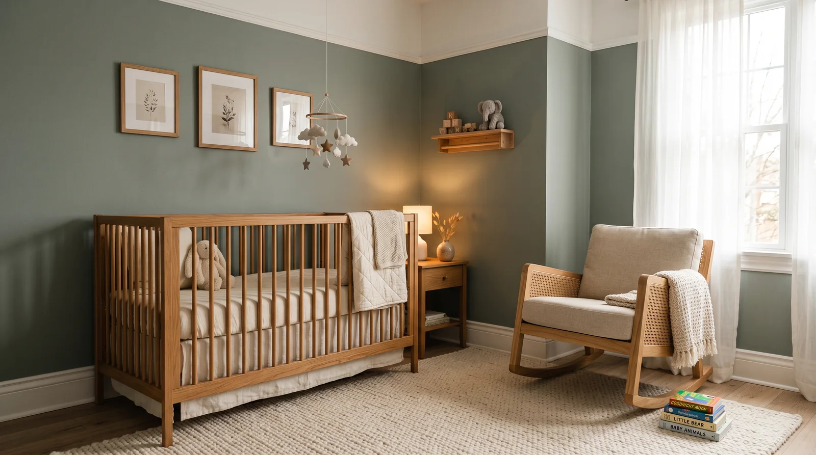
The deepest shade a nursery wants — a smoky sage that wraps the room like dusk and makes nap time feel inevitable.
At LRV 47, October Mist is as dark as most nurseries should go, and that's its job: it takes the edge off bright afternoons and gives the room a grounded, sleepy warmth that pale pastels can't. Keep the ceiling and trim in White Dove so the depth reads as cozy rather than dim, and let warm oak and brass-toned details do the contrast work. It's beautiful behind a caned rocker and linen curtains. In a genuinely dark room with one small source of daylight, choose Sea Salt instead and save this depth for a bigger space.
SEE OCTOBER MIST ON YOUR WALLS →
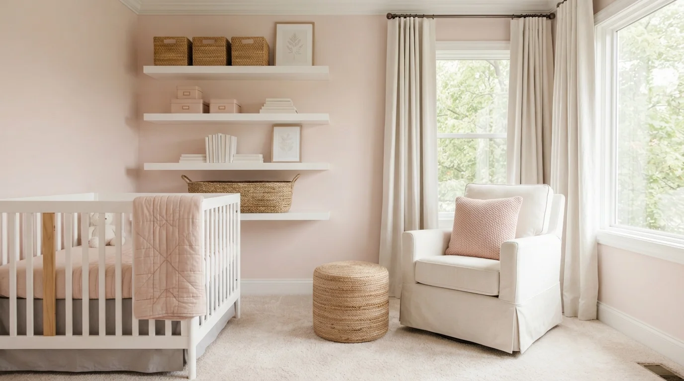
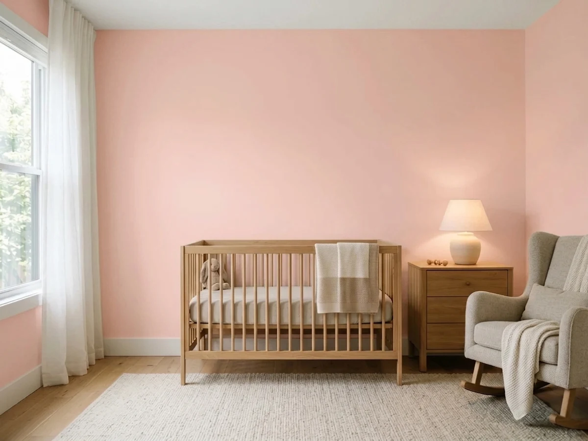
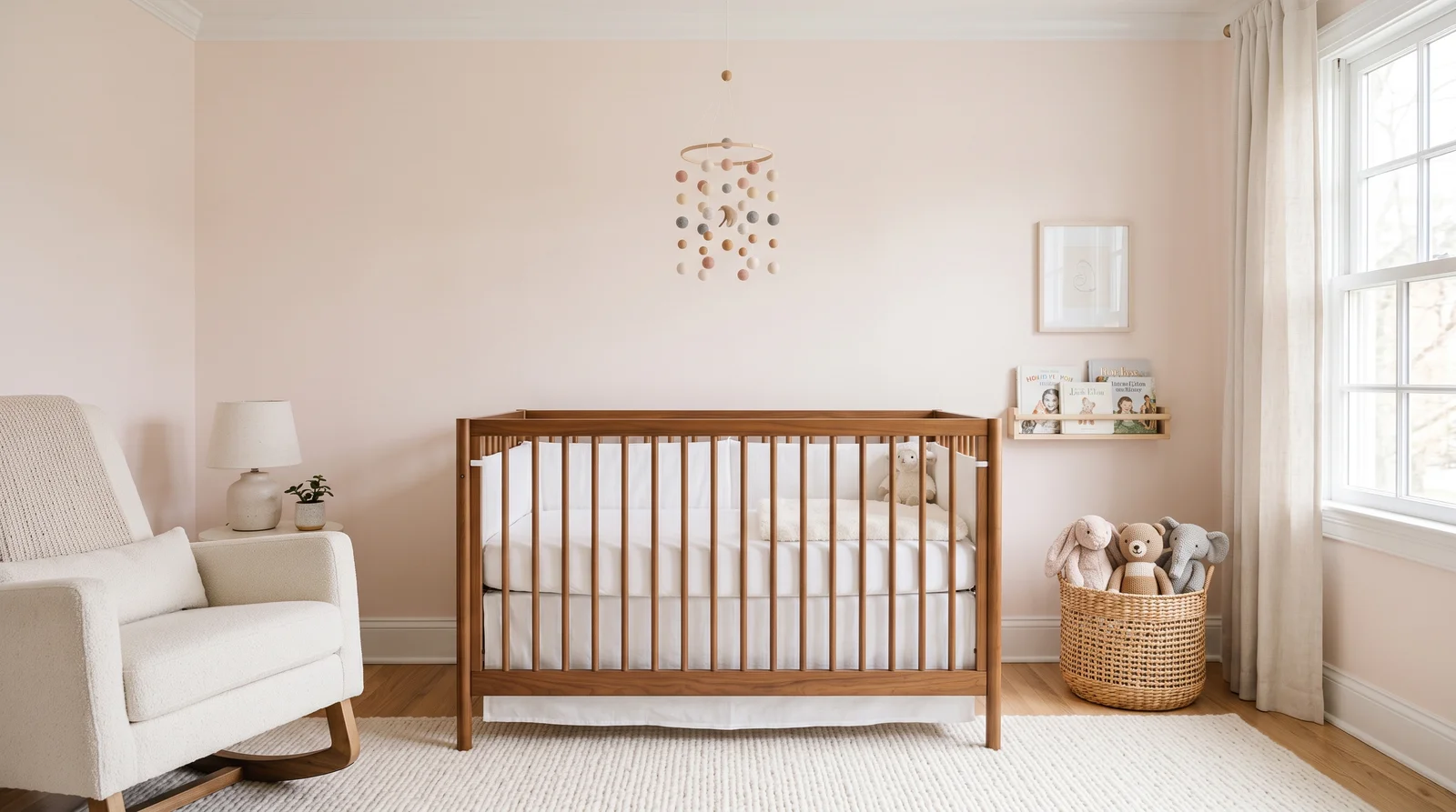
A pink so soft it reads almost neutral, glowing warm in morning light instead of shouting bubblegum.
First Light is the modern answer to the pink nursery — at LRV 76 it behaves like a warm white with a rosy heart, so it flatters the room without locking it into a theme. It's calm behind a white crib and genuinely lovely with walnut or caramel wood tones, and Chantilly Lace trim keeps the whole thing crisp. Because it's this light, it won't fight bold art or a colorful mobile later. If you want the pink to actually announce itself, Setting Plaster is the deeper, earthier route.
SEE FIRST LIGHT ON YOUR WALLS →
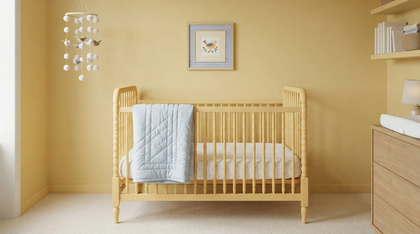
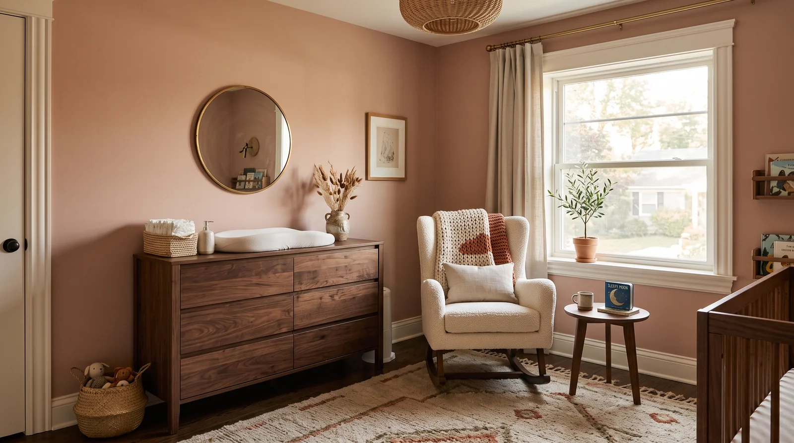
A sun-baked plaster blush with real warmth in it, made for rooms that get golden late-day light.
Setting Plaster is pink grown all the way up — more terracotta-adjacent clay than candy, and at LRV 56 it carries enough weight to make the room feel enveloping rather than pastel. It's the scheme for parents who want the nursery to match the rest of a warm, earthy house: Alabaster trim, a walnut dresser, cream bouclé. In cool light it can drift beige, so sample it on the wall that gets the least sun before committing; if it flattens there, First Light keeps the blush but adds back the brightness.
SEE IT ON YOUR WALLS →
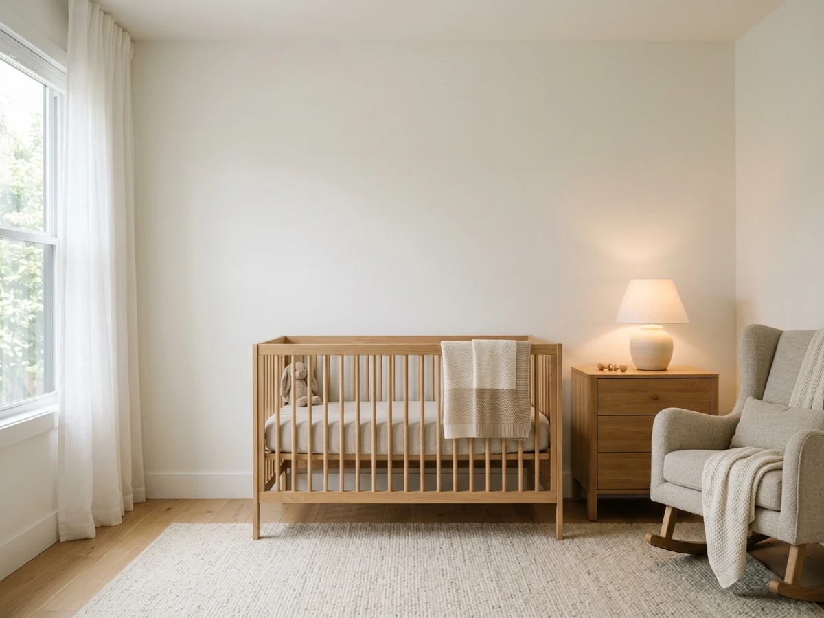
A warm greige envelope that lets textures and toys carry the color, quiet in every light the day throws at it.
Pale Oak is the neutral for parents who don't want to guess — at LRV 69 it's warm without going yellow and gray without going cold, so it flatters whatever crib, rug, and hand-me-downs actually end up in the room. A Beach Glass dresser is the easy way to add color you can repaint in an afternoon when tastes change. White Dove on trim keeps the scheme from flatlining into one beige plane. If your room runs dark and you need more bounce, White Dove on the walls too is the brighter version of the same idea.
SEE PALE OAK ON YOUR WALLS →Nursery Wall Color Combinations
A wall color never works alone. These are the full schemes from the rooms above — the lead color first, then the supporting colors that make the photo work.
A barely-there sky blue that keeps the room feeling open and calm, best where soft daylight can move across the walls.
TRY THIS PALETTE →A gray-washed green-blue that feels like sea air, calm in any light and never sugary.
TRY THIS PALETTE →The deepest shade a nursery wants — a smoky sage that wraps the room like dusk and makes nap time feel inevitable.
TRY THIS PALETTE →A pink so soft it reads almost neutral, glowing warm in morning light instead of shouting bubblegum.
TRY THIS PALETTE →The simplest, most timeless combination is a soft wall color with crisp white trim and a white or near-white ceiling. That keeps the focus on the wall color and makes any crib, dresser, or rug look intentional. White-painted furniture works with every shade here; natural wood tones pair especially well with greens like Seafoam and Mint and with Butter.
Floors set the temperature of the room too. Warm wood floors flatter pinks, yellows, and warm neutrals, while cooler gray floors or light carpet sit nicely under Baby Blue and mint greens. Pull one accent — curtains, a rug, or art — slightly deeper than the walls so the room has a little depth instead of reading washed out.
Nursery Color Ideas by Color
Set on a color family already? Each page has its own real rooms and picks.
Light or Dark Nursery Colors?
Go Light (LRV 60+) If…
The room is small, faces north, or has to work at every hour. Light warm colors make it feel bigger and stay calm in evening light — the light you actually live in.
Go Dark (LRV Under 20) If…
You want the cocoon effect and the room has real daylight. Dark works best on one feature wall — or fully color-drenched in a large room with good windows.
Light changes a paint color more than the swatch ever suggests, so check your windows first. North-facing nurseries get cool, flat light, so warmer picks like Blush, Butter, or a warm white keep the room from feeling gray. South-facing rooms get strong, warm sun all day, which can let cooler colors like Baby Blue, Seafoam, or Mint shine without going icy.
Nurseries live a double life: bright at naptime and dim at night. Always test your color in the actual room, on at least two walls, and look at it under both daylight and your nightlight or lamp. A soft pink can turn slightly orange under warm bulbs, and a cool mint can go gray after dark.
LRV (light reflectance value) tells you how light or dark a color reads, on a scale from 0 (black) to 100 (pure white). Most soft nursery colors land high, roughly in the 60s to 80s, which is what keeps the room feeling bright, open, and restful.
If your nursery is small or short on windows, stay in the higher LRV range so the walls bounce light and the space feels airy. If you want a cozier, more den-like feel for sleep, you can drop a little lower — but go gently, because a too-dark nursery can feel heavy rather than soothing.
See It. Love It.
Paint It.
Upload one photo of your nursery and try every color on this page on your own walls — in your own light, before you buy a drop of paint.

Soft SpotBeforeThe Best Color Directions For A Nursery
Soft and muted beats bright and saturated in a nursery almost every time. A pale pink like Blush or Millennial Pink feels warm and tender without turning the room hot pink. A gentle green like Mint or Seafoam reads fresh and unisex, and it pairs with almost any wood or fabric you already own.
Blue is the other classic for good reason. A quiet Baby Blue keeps the room airy and serene rather than cold. If you want warmth without color commitment, a creamy yellow like Butter or a warm off-white gives you a sunny, neutral base that grows with the child.
The Right Finish For A Nursery
Skip flat in a nursery. Little hands, spit-up, and the occasional marker mean you want a surface you can wipe down, so an eggshell or satin finish on the walls is the sweet spot — washable but still soft and glare-free.
Use a more durable semi-gloss or satin on trim, doors, and the closet, since those take the most knocks and clean up best. Keep the ceiling flat to hide imperfections and avoid glare above the crib. If your nursery shares a wall with a bathroom or runs humid, lean toward satin for a little extra moisture resistance.
Common Nursery Paint Mistakes
The biggest mistake is going too saturated. A bold color that looks adorable on a small chip can feel overwhelming across four walls, especially in a room meant for sleep. When in doubt, choose the softer version of the color you love.
The other classic misses: picking a color in the store instead of in the actual room, skipping a tested sample, and using flat paint that you can't clean. People also forget the room evolves — a baby-specific theme gets old fast, so a calm wall color like Blush, Mint, or Butter ages far better than a literal cartoon palette.
Wall area, gallons, and a real price range for the nursery — walls, trim, and ceiling.
About Nursery Paint Colors
A nursery is one of the easiest rooms to get right and one of the easiest to overthink. You want a color that feels calm during the day, soothing at night, and that you will still like a year from now when the room becomes a toddler's space. The good news is that soft, low-contrast colors do almost all the work here.
The most useful nursery palettes lean on gentle pinks, blues, greens, yellows, and warm neutrals. Think Millennial Pink, Seafoam, Baby Blue, Mint, Blush, and Butter — all soft, all forgiving, all easy to live with. None of them shout, and that is exactly the point in a room built for sleep and quiet.
One thing to keep in mind: every color shown here is mixed to order at a paint counter, so you are not locked into a single brand. If you love a shade from one brand but trust another's paint, most colors can be cross-matched between brands so you get the look and the formula you want.
The Questions Everyone Asks
What color should I paint my nursery?
If you want one answer, start with the safe picks above — Accessible Beige, Setting Plaster, Lemon Lily, Soft Spot. They read well in any light and survive furniture changes. Then check the light: strong afternoon sun wants a step cooler, a north-facing room wants a step warmer.
What are the best paint colors for a nursery?
Soft, low-contrast colors work best because they keep the room calm for sleep. Gentle picks like Blush, Millennial Pink, Mint, Seafoam, Baby Blue, and Butter are all easy to live with and pair with almost any furniture. Choose the muted version of whatever color you love rather than a bright, saturated one.
Are light or dark colors better for a nursery?
Light colors are usually the safer choice. They keep the room bright and airy, make a small space feel bigger, and read calm rather than heavy. If you want a cozier feel for sleep, you can go a touch deeper, but avoid anything truly dark since it can make the room feel closed in.
What paint finish should I use in a nursery?
Use eggshell or satin on the walls so you can wipe off spills and smudges without much glare. Put a tougher satin or semi-gloss on trim, doors, and the closet, and keep the ceiling flat to hide flaws and cut glare over the crib. Satin is also a smart pick if the room tends to be humid.
How does room light affect a nursery color?
Light can completely change how a color looks. North-facing rooms get cool light, so warmer colors like Blush or Butter help; south-facing rooms get warm sun that lets cooler colors like Baby Blue or Mint stay fresh. Always test your sample on the wall and look at it in daylight and again under your nightlight or lamp.
What color trim and ceiling go with nursery walls?
Crisp white trim and a white or near-white ceiling are the most timeless choice and let the wall color stand out. White-painted furniture works with everything, while natural wood looks great with greens and Butter. Add one accent slightly deeper than the walls so the room has some depth.
Can I match a nursery color from one brand using a different brand's paint?
Yes. Every color shown here is mixed to order at the paint counter, so you are not stuck with one company. Most shades can be cross-matched between brands, which means you can get the exact look you want in whichever paint you trust.
What is LRV and why does it matter for a nursery?
LRV, or light reflectance value, is a 0-to-100 scale that tells you how light or dark a color reads. Most soft nursery colors sit high, around the 60s to 80s, which keeps the room bright and restful. In a small or dim nursery, stay higher; drop only slightly if you want a cozier, sleepier feel.
What two-color combination works best in a nursery?
The reliable pattern is a quiet main color plus one deep accent on a single wall. Keep trim and ceiling in one warm white so the two colors are the only event in the room — the combination cards above show complete schemes from real rooms.
What colors make a nursery look bigger?
High-LRV, slightly warm colors — LRV 60–75 is the sweet spot. Paint the walls and trim close to the same light color so the corners blur, and keep the ceiling white. Stark cool white actually works against you; it creates hard shadows that show the room's edges.


Ask a Question