First Light
Benjamin Moore's 2020 Color of the Year, reviewed honestly: the rooms where the blush glows, the light that turns it mauve, and what to paint instead.

Jessica has spec'd whites and neutrals for more than 300 rooms and keeps a sample wall of painted drawdowns in her studio. Every color review is checked against real reader rooms in the comments and re-tested when a formula changes. About the testing process →
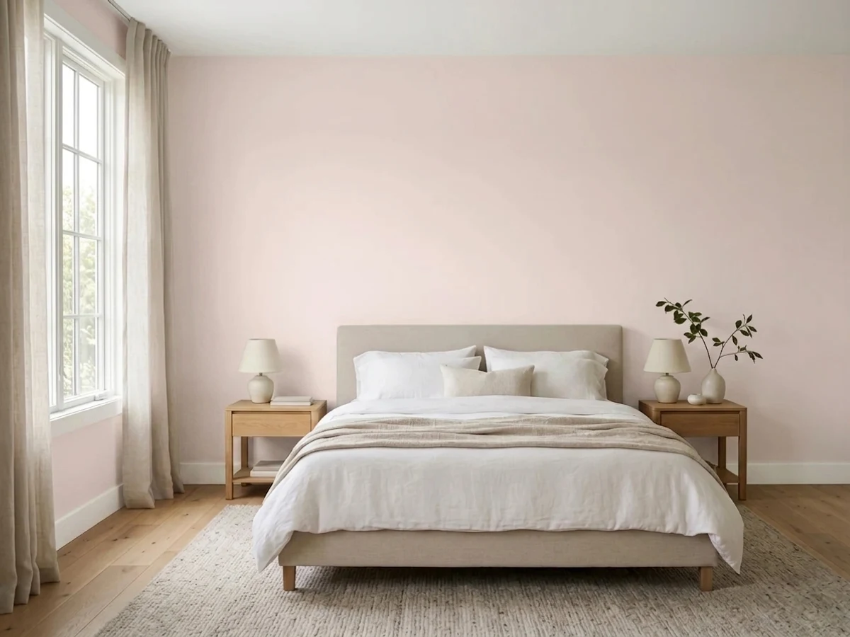
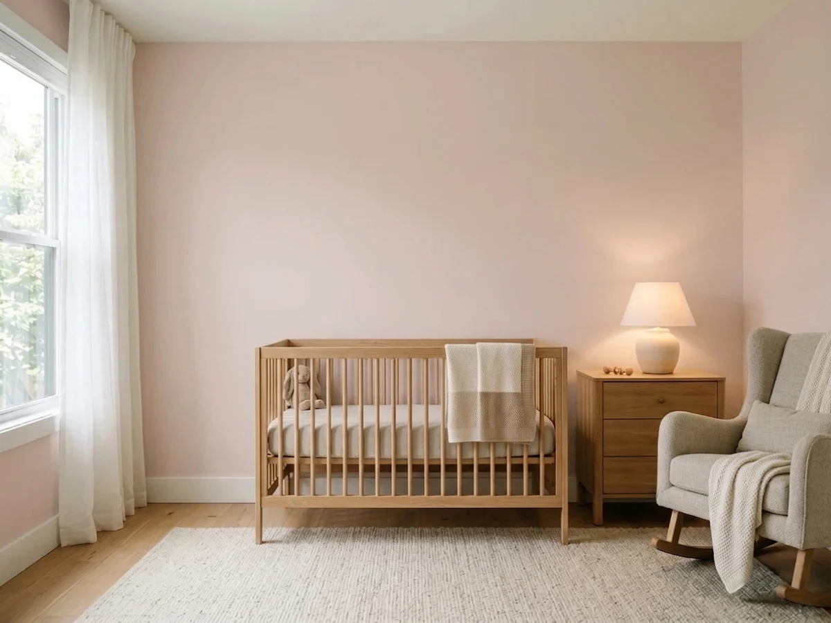
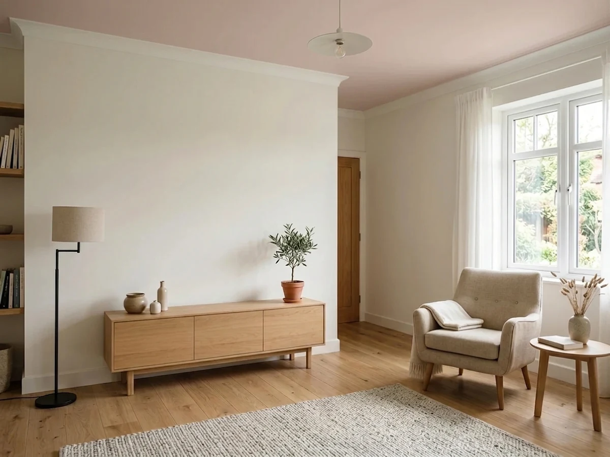
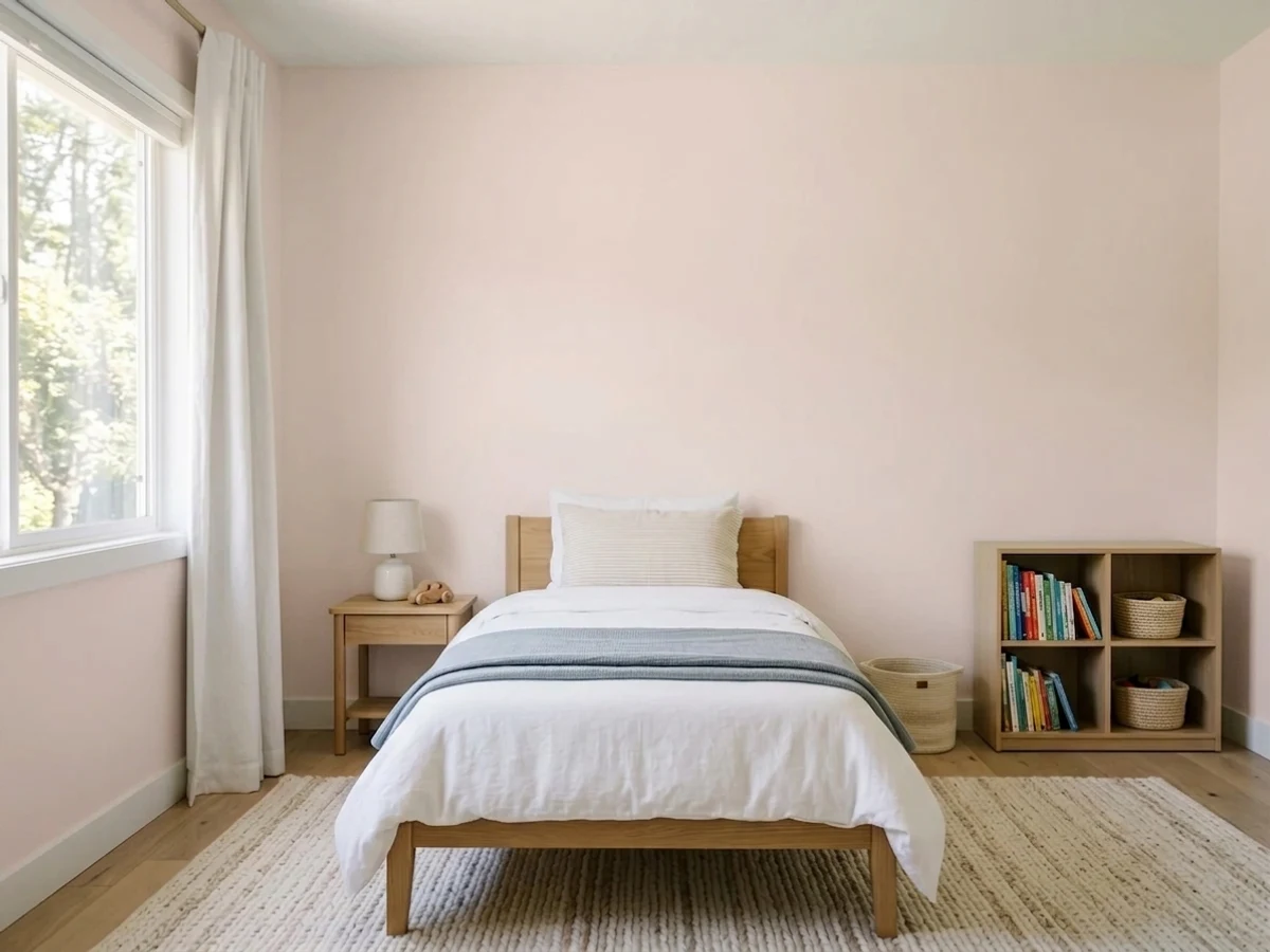
- 1Pale Cherry Blossom61
- 2Romance66
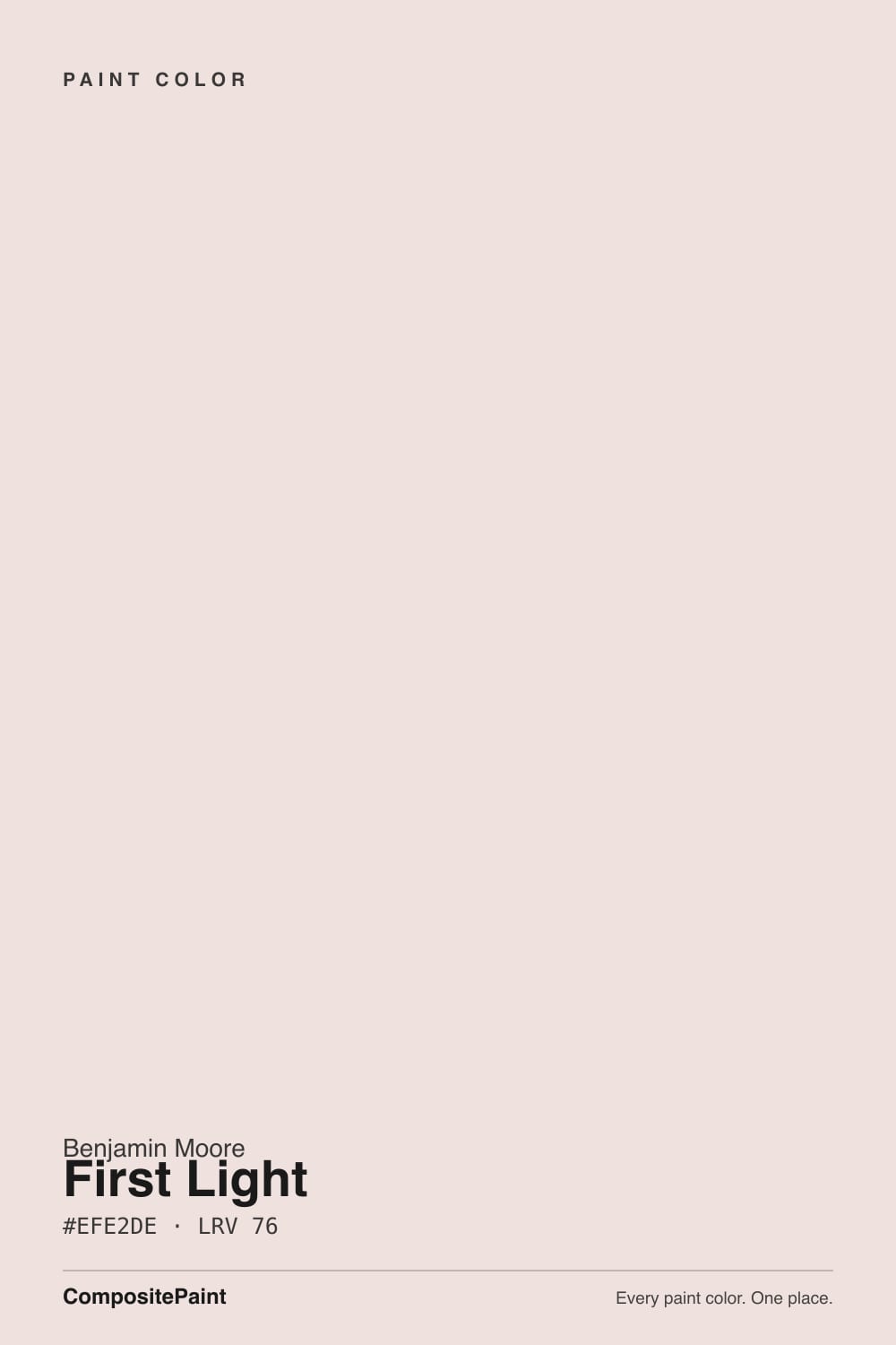
- 3First Light76
- 4Pink Bliss82
- 5Ballerina Gown87
The Fast Verdict
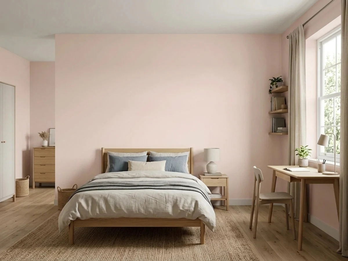
First Light is the pink for people who do not want a pink room. On a chip it looks like a warm white; on four walls it is clearly, softly blush. That gap is where every happy review and every disappointed one comes from. Give it morning or south light, crisp white trim, and a big sample board, and it is one of the loveliest quiet colors Benjamin Moore makes.
Bedrooms that need warmth without a real pink · Nurseries and kids' rooms that should still look good at age ten · East-facing rooms with morning sun · Powder rooms, hallways and windowless spaces
You want a white nobody will ever call pink · Your room faces north and stays cool and dim · Your trim is warm cream or ivory · Your floors, tile and counters are cool gray
- Gives a room real warmth without committing to an obvious pink
- Bright enough at LRV 76 to open small and windowless rooms
- Grown-up pink — works in a nursery and still works ten years later
- Flatters oak, walnut, rattan and brass hardware
- Reads soft next to crisp white trim instead of fighting it
- Goes dusty gray-mauve in cool north light
- Reads far pinker on four walls than it does on the chip
- Bounces pink onto ceilings, trim and facing walls in strong sun
- Looks cool and dingy next to cream or ivory woodwork
What Color Is First Light, Really?
It is a real pink, not a white with a rumor of pink. The hue is genuinely red-side, but the paint is mixed so light that on a two-inch chip your eye files it as a warm off-white and moves on. Roll it across a whole room and the blush shows up all at once. That is the single most important thing to know about this color, and it is why the same paint gets described as "barely there" by one person and "way pinker than I expected" by the next. Both are telling the truth about different amounts of wall.
At LRV 76 it is bright but not white-bright. Stand it next to Chantilly Lace at LRV 91 and First Light suddenly has a body and a color, the way a cheek has color. Next to Pink Bliss 2093-70 at LRV 82 the relationship flips: First Light is the deeper, dustier, more grown-up one, and Pink Bliss is the airy nursery pink. That middle position is exactly why designers reach for it — it is pink enough to feel intentional and pale enough to live with.
Undertone in one line: warm red, softened by a trace of gray — peach in strong sun, mauve in cool light, never a bubblegum or coral pink.
Where It Shines
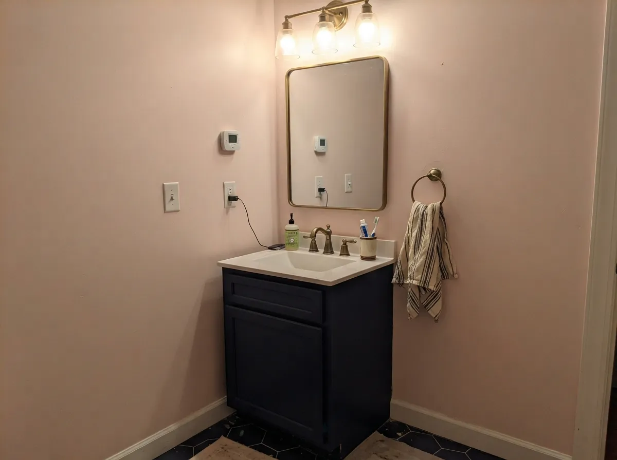
It does its best work in rooms you sleep in and rooms you pass through. Morning light is its friend: the blush warms up and the whole room looks like it is lit slightly better than it actually is. Small windowless spaces are the sleeper hit, because at LRV 76 it brightens like an off-white while giving you something warmer than beige.
Where It Fails
The complaints about First Light are remarkably consistent, and none of them are about the paint being bad. They are about light and about what sits next to it. If your room matches one of these three, a second coat will not save it.
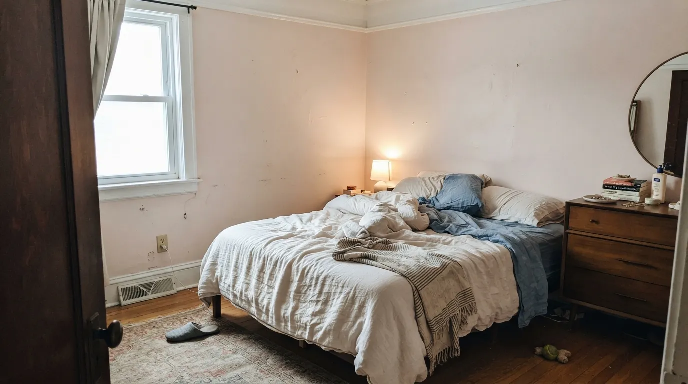
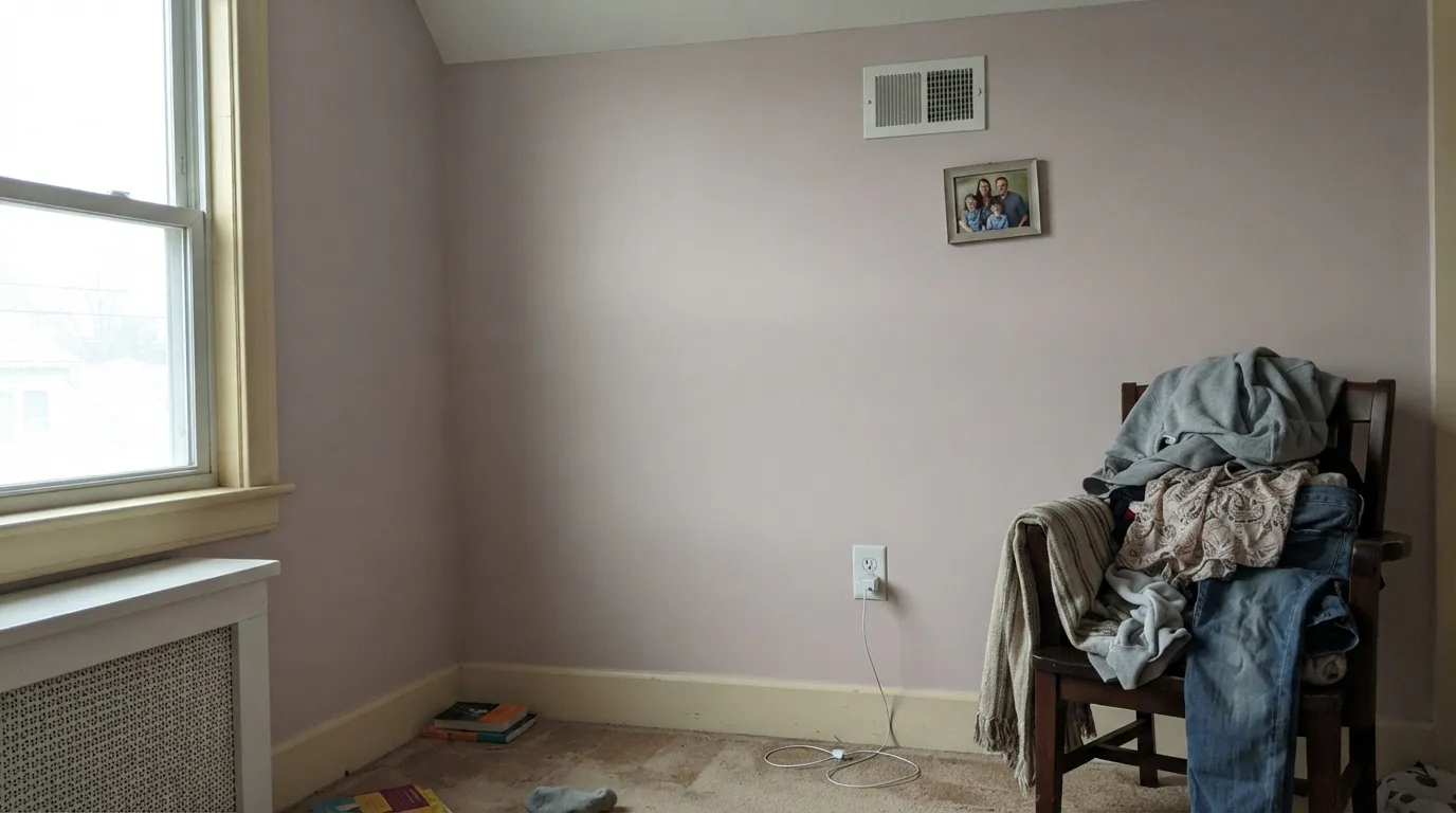
Cool north daylight kills the red and leaves the gray behind, so the walls go dusty mauve — pretty in a photo, drab in real life at 4 p.m. in February. If you want the blush to stay a blush in that room, go warmer and slightly cleaner with Mellow Pink 2094-70, or give up the pink and use Wild Rice 2097-70.
Builder ivory and old cream woodwork read yellow next to it, and yellow next to pale pink makes the walls look cool and slightly dirty instead of soft. This is the most common regret story and it is a pairing mistake, not a paint problem. Repaint the trim in Chantilly Lace OC-65, or keep the cream trim and switch the walls to Tropical Sand 2101-70.
In strong afternoon sun a large surface of First Light throws color onto the ceiling, the white trim and the wall opposite — people notice it most on the inside face of a door, where it tints the wall it faces. If your room gets hard west light and you want zero bounce, use Silver Satin OC-26, a warm off-white at almost the same LRV with no pink to throw.
Room by Room
Eggshell walls, semi-gloss trim in Chantilly Lace OC-65 or White Dove OC-17. The warmth reads restful rather than sweet, and it flatters skin tones in the mirror. Under 2700K lamps expect it to lean peach at night — most people like that, but check it before the whole house.
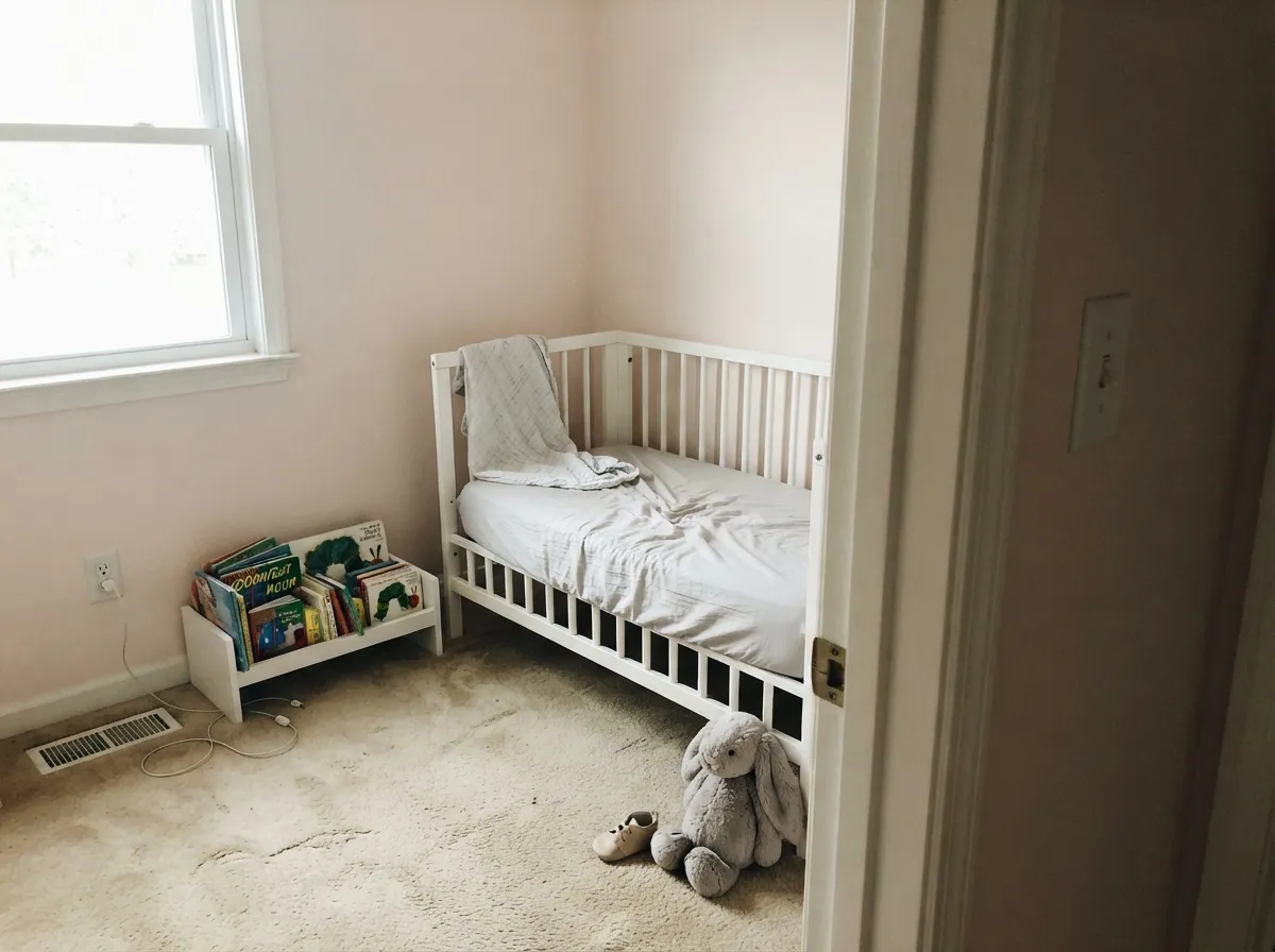
This is why most people find it, and it is a fair fit: it gives a pink room that will not embarrass a ten-year-old. Pair it with White Dove OC-17 trim and one muted accent like October Mist 1495 so the room has an adult color in it too. If you want less pink, Pink Bliss 2093-70 is the lighter step.
Works beautifully in east and south rooms where the blush stays warm and the wood furniture picks it up. In a dim north living room it flattens into gray-mauve and looks like a mistake. Sample a two-foot board on the darkest wall before you commit a whole open floor.
A small windowless room is where the pink is a gift, because it warms a space that would otherwise feel like a closet. Eggshell or satin on the walls, and skip it if the tile or vanity top is a cool gray marble — that combination pushes the pink toward mauve.
At LRV 76 it carries a windowless hall the way an off-white does, with more life in it. On a ceiling use flat, and use it over warmer walls so the whole shell reads soft. Do not put it on a ceiling above cool gray walls; the pink will look accidental.
A laundry room, bathroom vanity or a bedroom door in satin is charming. A busy kitchen is a stretch, because a pale warm color shows every hand mark and the pink bounces onto counters and backsplash. Use a urethane-fortified cabinet enamel if you do it.
Your Light Is the Risk
The blush warms up and the room glows early, then settles into a soft neutral by afternoon.
Direct sun feeds the red and the walls turn peachy by late afternoon. Bright, warm, and pinker than the chip.
Cool daylight strips the warmth and leaves gray-mauve. Still bright, but dusty. Sample here first.
2700K lamps push it toward apricot; 3500–4000K bulbs keep it a clean blush. Choose bulbs before you repaint.
Most complaints about First Light are a light mismatch. Upload a photo of your actual room and see it on your walls — then ask for the same wall in north light or evening lamps before you buy a single sample.
Need It From Another Brand?
Any paint counter can custom-tint Benjamin Moore 2102-70 directly. If you would rather stay in one brand's own deck, these are the closest stock matches, measured as ΔE2000. Under 2 is a difference you will not see on the wall.
| Brand | Closest color | ΔE | LRV | |
|---|---|---|---|---|
| Sherwin-Williams | Patient WhiteSW 6301 · Sherwin-Williams | 0.5 | 77 | Color page → |
| Behr | Malted Milk700C-2 · Behr | 1.9 | 77 | Color page → |
| Valspar | Bistro NapkinM211 · Valspar | 1.9 | 77.4 | Color page → |
| PPG / Glidden | Chantilly LacePPG1065-1 · PPG / Glidden | 1.1 | 78 | Color page → |
| Glidden | Chantilly LacePPG1065-1 · Glidden | 0.8 | 78 | Color page → |
| Dutch Boy | Delighted Pink104-1DB · Dutch Boy | 1.1 | 78 | Color page → |
Similar Benjamin Moore Colors
The nearest shades to First Light within Benjamin Moore's own range, ranked by perceptual color distance — useful when you want the same look a touch lighter, darker, or warmer.
WCAG 2.1: AA is 4.5 : 1 for normal text, 3 : 1 for large text, AAA is 7 : 1.
First Light vs the Colors You're Also Considering
Every First Light sample board has the same rivals on it. The numbers show the real lightness gap — then it comes down to which risk you would rather live with.
Pick this when you want the deeper, dustier, more adult version of the blush.
Benjamin Moore 2093-70 · LRV 82Pink BlissPick this for a nursery — it is lighter, cleaner and barely there at LRV 82.
Pick this if you actually want the room to read pink, not just warm.
Benjamin Moore 2097-70 · LRV 75Wild RicePick this when the sample looked too rosy — same brightness, soft tan instead of blush.
Tropical Sand 2101-70 at #EFE2DD and LRV 78 is the closest neighbor in the line. The hex differs by a single step, and the practical result is slightly less pink and slightly more sand. If First Light looks a shade too rosy on your wall, this is the correction. Wild Rice 2097-70 at #EDE2DC and LRV 75 goes further in that direction, trading the blush for a warm tan at essentially the same brightness. Victorian Lace 2100-70 at #EEE1DB and LRV 77 sits between the two.
Across brands, Sherwin-Williams Patient White SW 6301 at #EFE1DD and LRV 77 is a deltaE of 0.45, an effectively exact match. Behr Malted Milk 700C-2 at LRV 77 and Valspar Bistro Napkin M211 at LRV 77.4 both come in at deltaE 1.93, which reads as visually identical in normal room light. Farrow and Ball Salt No. CC5 at LRV 78 is a deltaE of 4.98, close but visibly different side by side, since it loses most of the pink for a cooler gray.
First Light Coordinating Colors
The rule for coordinating with First Light is to give it one clean white and one real anchor, then stop. It is a warm color with very little weight, so it needs something dark in the room or the whole scheme floats. It sits happily beside warm neutrals, muted greens and deep navies, and it argues with cream trim and cool blue-gray stone.
These are the partners that come up again and again in real rooms:
First Light in a Nursery or Girl's Room
This is the room most people are standing in when they look this color up, so it deserves a straight answer: it is a good nursery color and a better kid-room color. The reason is the gray in it. A clean baby pink dates the room to one age; First Light stays quiet enough to survive a bunk bed, a desk and a teenager who has decided pink is over.
Two practical notes. First, buy the bulbs you plan to live with before you judge it — 2700K lamps in a small bedroom make it noticeably peachier at night than it looks at noon. Second, do not use pink-adjacent bedding and curtains with it; the wall is doing the pink already, and repeating it is what tips a nice room into a themed one. One muted green or a charcoal in the room fixes that instantly.
First Light With Wood Tones and Floors
Warm wood is where this color pays off. Honey oak, red oak, walnut, rattan and cane all sit against it comfortably, because the wall meets their warmth instead of correcting it. If you have builder-grade orange oak floors, First Light is one of the few pale colors that makes them look intentional rather than dated — the shared red note reads as a decision.
Cool gray floors are the pairing to test properly. Gray LVP, limewashed oak and blue-gray tile all pull the wall toward mauve, and in a north room that combination goes flat fast. It is not automatically wrong — warm rugs, brass and wood furniture pull it back — but tape a large sample directly above the floor and look at it in the evening, not just at midday, before you buy five gallons.
Three Ready Palettes Built on First Light
A color is never alone on the wall. These are complete combinations in the 60-30-10 pattern, with the reason each one holds together. Every one opens in the visualizer.
Clean white trim is what keeps the pink looking chosen instead of faded, and Chantilly Lace is the crispest white in the deck. One charcoal note carries the eye and stops the room from reading like a cake.
Try this palette in your roomWhite Dove softens the edge between wall and trim so the room feels wrapped rather than outlined. The muted sage accent is the piece that makes it a room instead of a nursery — it stays right when the crib leaves.
Try this palette in your roomIn a small windowless room the blush does the warming and the navy vanity does the anchoring, so 60-30-10 lands without any third color. Brass fixtures pick up the red tone in the walls and tie the two ends together.
Try this palette in your roomFirst Light FAQ
Is First Light actually pink, or does it read as a white?
It reads as a warm off-white on a chip and as a soft pink on a finished wall. Surface area is what changes it: a sample card hides the color, four walls announce it. Paint two coats on a large board and lean it against your trim before you decide.
Is it too pink for a nursery?
No — it is usually the opposite complaint. At LRV 76 the pink is diluted enough that the room reads calm rather than candy, which is why it is one of the most-used nursery colors in the deck. If you want even less pink, use Pink Bliss 2093-70; if you want more, use Mellow Pink 2094-70.
First Light or Pink Bliss?
Pink Bliss 2093-70 at LRV 82 is lighter, cleaner and closer to a plain warm white. First Light is dustier and holds more color, so it still shows as pink next to white trim in bright daylight. For a baby's room pick Pink Bliss; for a bedroom you want to keep for years, First Light.
What trim white goes with First Light walls?
Go crisp. Chantilly Lace OC-65 is the standard answer and makes the blush look deliberate. White Dove OC-17 is the softer option when you want less contrast. Avoid cream and ivory trim — the yellow in them makes First Light look cool and slightly dirty.
Will it work in a north-facing bedroom?
It will be bright, but it will not be pink. North daylight mutes the red and the walls settle into a gray-mauve. Some people love that; if you wanted blush, either add warm 2700K lamps or move to Mellow Pink 2094-70, which holds its warmth in cool light.
How many coats does it take, and what sheen?
Two coats over any light existing color, three if you are covering a saturated one — pale tints have little pigment to hide with. Eggshell on walls, flat on ceilings, semi-gloss on trim. Cut in and roll the same wall while the edge is wet, because pale warm colors show lap marks around the cut line more than mid-tones do.
Does it go with gray floors or oak floors?
Oak, walnut and rattan are easy — the warmth matches and the room looks intentional. Cool gray LVP and gray-washed wood are the risky pairing, because the floor pulls the wall toward mauve. If your floors are gray, sample on the wall directly above them, not on a card in your hand.
Have you painted with First Light?
Rate it — one tap helps the next reader decide.
Ask a Question