Pink Bliss
The palest pink in the Benjamin Moore deck, reviewed honestly: the light where it glows soft pink, the light where it disappears into plain cream, and what to pick instead.

Jessica has spec'd whites and neutrals for more than 300 rooms and keeps a sample wall of painted drawdowns in her studio. Every color review is checked against real reader rooms in the comments and re-tested when a formula changes. About the testing process →
- 1Pale Cherry Blossom61
- 2First Light76
- 3Pink Bliss82
- 4Ballerina Gown87
The Fast Verdict
Pink Bliss is pink with the volume turned almost all the way down — a peach-warm blush pulled so far toward white that most rooms read as "soft and warm," not "pink room." That restraint is the whole appeal: it lets nervous first-timers try pink without committing to it, and it plays beautifully with gold, black, and warm white. The tradeoff is real, though — at LRV 82 it sits closer to a warm white than to any other pink in the deck, and bright daylight can wash the color right out.
Nurseries and girls' bedrooms · gold or brass hardware and fixtures · anyone who wants a hint of pink, not a statement · dim rooms that need warmth without a color commitment
You want a wall that reads unmistakably pink from across the room · your room gets strong direct south sun all day · your trim is a bright white like Chantilly Lace or Extra White · you're chasing a moodier, dustier blush
- The softest, least committal pink in the deck — a whisper, not a statement
- Extremely easy to pair: works with white, gold, black, and gray without reading as a themed pink room
- High LRV (82) keeps small nurseries and bedrooms bright
- Glows gently under warm lamp light instead of turning garish
- A low-risk way to try pink before committing to something bolder
- Washes out to near-invisible warm cream in bright daylight — the most common complaint
- Cool LED bulbs flatten it toward flat gray-white at night
- Too subtle for anyone who wants a wall that reads clearly pink
- Loses definition next to a brighter white trim, the same trap as any near-white
What Color Is Pink Bliss, Really?
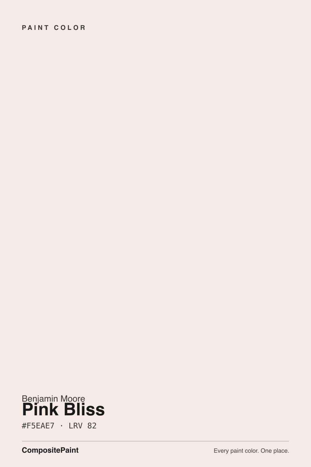
A sheer, warm-leaning blush built on a peach-beige base pulled almost to the vanishing point. The undertone is warm first — a faint coral-peach, not a cool rose or a mauve-violet — and the chroma is so low that Benjamin Moore's own marketing calls it delicate as chiffon. That description is accurate: this is not a saturated pink turned pastel, it is a whisper of pink laid over what is essentially a warm off-white. Owners who describe it well call it "a polite nod to pink" rather than a full commitment, and that is exactly the market it fills — the color people reach for when they want a nursery or bedroom to feel soft without turning into a themed pink room.
At LRV 82 it sits in near-white territory, only a few points below Benjamin Moore's own White Dove (85) and well above its own sibling First Light (76). That gap explains both halves of its reputation: it is one of the brightest, most light-friendly pinks you can buy, and it is also the one most likely to get lost. Put it on a big sunny wall and the peach can flatten out until the room simply reads "warm cream" — the single most common complaint from owners who wanted a visibly pink nursery and got a subtle one instead.
Undertone in one line: warm peach-pink first, never cool, never mauve. If the wall looks like plain warm white in bright light, that is the color's low chroma being honest about itself, not a defect; if it looks noticeably more coral in the evening, that is a 2700K bulb doing exactly what warm bulbs do to a peach-based pink.
Where It Shines
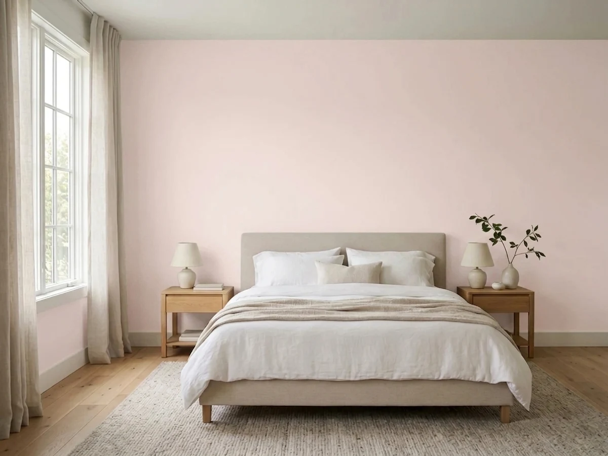
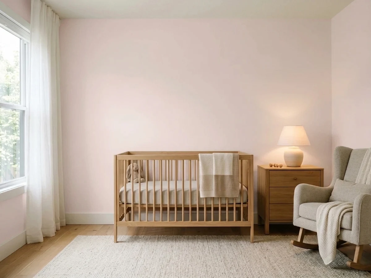
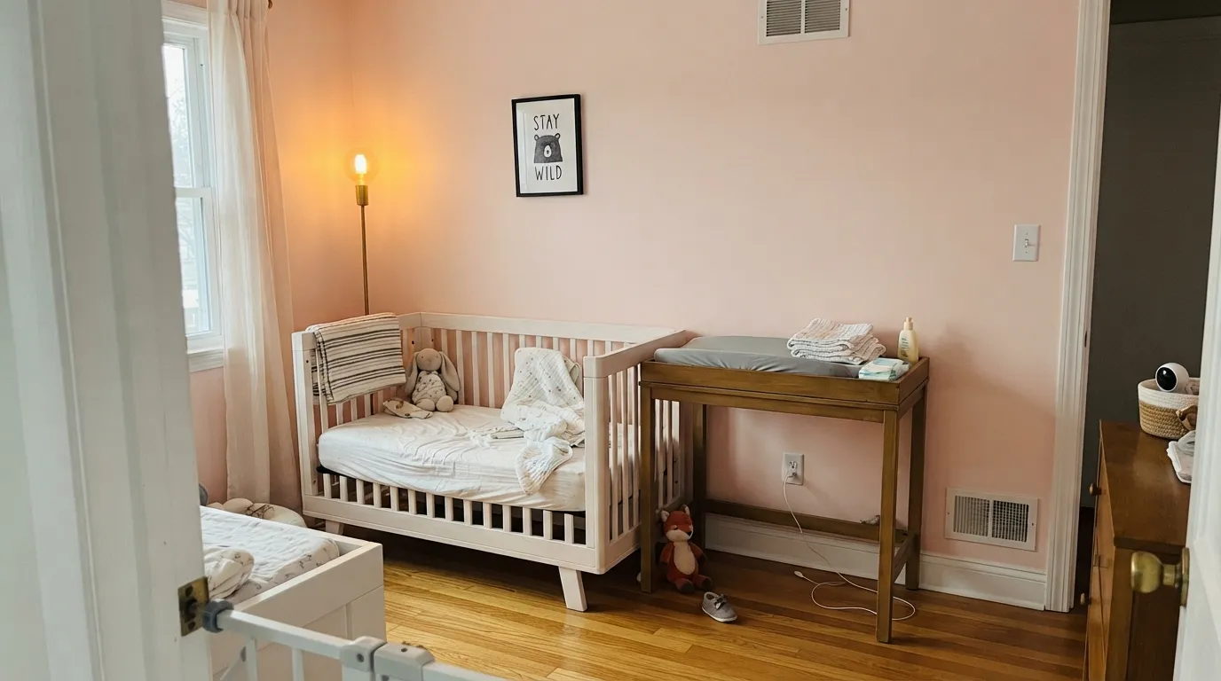
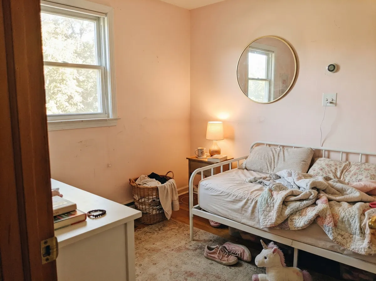
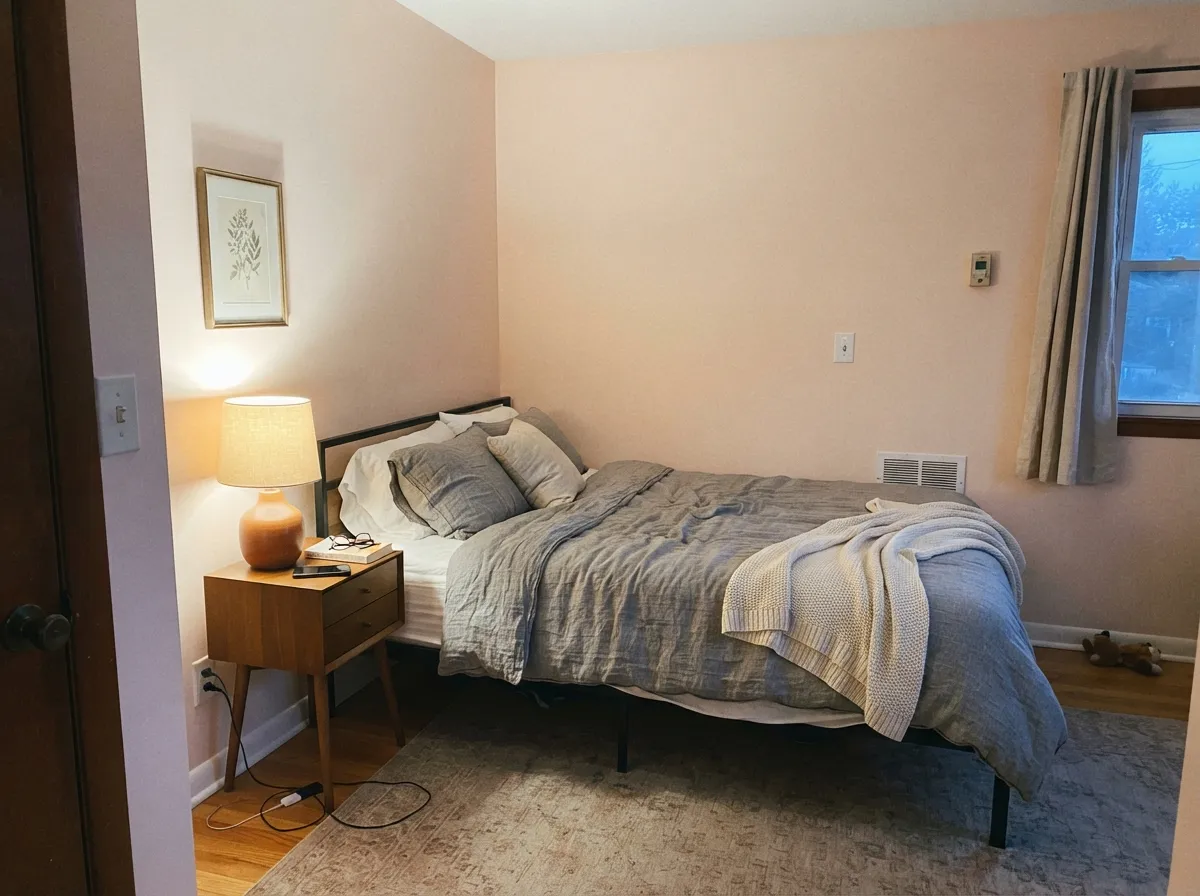
This color earns its keep in soft, warm light and gentle company. In a nursery or a girl's bedroom under morning daylight and one warm lamp, the peach comes forward just enough to feel deliberately pink without ever tipping saccharine. It is genuinely versatile pairing: designers reach for it with gold and brass hardware in an otherwise white room for a pretty, polished look, and just as often ground it with charcoal or black furniture for a bolder, less nursery-specific contrast. Either way it stays quiet enough that nobody mistakes the room for a themed pink space.
Where It Fails
Almost every disappointed review of Pink Bliss comes down to one of three predictable situations, and all three show up before the first gallon is even opened. None of them are the paint failing — they are a very pale, very low-chroma pink being asked to do a job it was never built for.
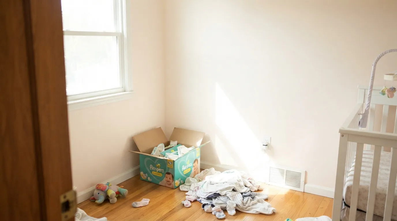
Strong daylight is the enemy of any color this pale. On a south-facing wall in full sun, the low chroma bleaches out and the room reads as plain warm cream — several owners report exactly this and recommend a different color if a visibly pink wall is the goal. If your room gets hard midday sun, sample it there first, or size up to Pale Cherry Blossom or SW Romance for a pink that holds its color in strong light.
Warm 2700K light pulls the peach forward and the wall glows gently pink after dark. Cool white LEDs do the opposite: they strip the warmth and leave a flat, slightly gray-white cast that reads like an off-color paint job rather than a soft pink. This is a bulb problem, not a paint problem — swap the bulbs before you second-guess the color.
Because Pink Bliss sits so close to white on the LRV scale, it behaves like White Dove or any other near-white: a crisp, bright trim white (Chantilly Lace, Extra White) makes the wall look washed-out and dingy by comparison instead of softly pink. Trim in a warm white like White Dove or Swiss Coffee — or Pink Bliss itself in semi-gloss — keeps the color reading as a deliberate blush.
Room by Room
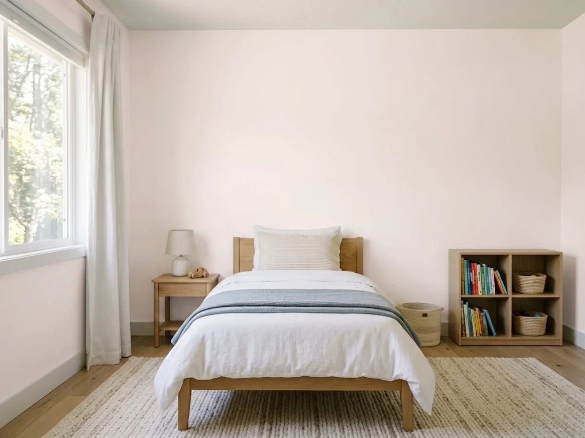
Morning light, white furniture, gold or brass fixtures — this is the room Pink Bliss was built for. It reads soft and pretty without going saccharine, and it is pale enough that the room won't feel dated in five years the way a saturated pink might.
In an adult bedroom it works as a warmer, softer alternative to a plain white wall rather than as a "pink room" statement. Pair it with charcoal or black furniture and brass lamps to keep it grown-up.
With warm-toned tile, brass fittings and a wood vanity it is genuinely lovely and small enough a room to take the risk. Cool blue-gray tile or chrome fixtures fight it the same way they fight any warm pink.
Too pale and too quiet to anchor a large open room through a full day of changing light — it tends to read as an undecided cream rather than a confident color choice. Better used in a reading nook or a single accent wall than across an open floor plan.
On its own trim job it disappears; it only reads as a deliberate whisper of color when it is trimming a deeper pink like Pale Cherry Blossom or Romance, not when it's sitting against a plain white wall.
Full outdoor sun does to Pink Bliss what indoor sun does, only worse: at this chroma it washes out to a barely-there off-white and simply looks like weathered paint rather than an intentional pink. Save it for interiors.
Your Light Is the Risk
Gentle east-facing daylight is where the peach undertone reads clearest as pink, not cream — the light most nursery photos of this color are taken in.
Direct sun bleaches the low-chroma color toward plain warm white. Readers who wanted a visibly pink room report a cream one instead. Test the sunniest wall first.
Warmest and most clearly pink around sunrise and sunset; softens toward a quiet off-white through the middle of the day. Normal, not a flaw.
2700K lamps pull the peach forward and the room glows gently pink. Cool LEDs strip the warmth and leave a flat, gray-white wall — change the bulbs, not the paint.
Most complaints about Pink Bliss are a light mismatch. Upload a photo of your actual room and see it on your walls — then ask for the same wall in north light or evening lamps before you buy a single sample.
Need It From Another Brand?
Any paint counter can custom-tint Benjamin Moore 2093-70 directly. If you would rather stay in one brand's own deck, these are the closest stock matches, measured as ΔE2000. Under 2 is a difference you will not see on the wall.
| Brand | Closest color | ΔE | LRV | |
|---|---|---|---|---|
| Sherwin-Williams | Fancy PinkSW 7107 · Sherwin-Williams | 1.5 | 83 | Color page → |
| Behr | Quartz White770A-1 · Behr | 1.0 | 85 | Color page → |
| Valspar | Innocent PinkP077 · Valspar | 1.6 | 82.1 | Color page → |
| PPG / Glidden | Summer LilyPPG1191-1 · PPG / Glidden | 1.6 | 84 | Color page → |
| Glidden | Frosty Peach Ribbon60YR 83/043 · Glidden | 0.5 | 83 | Color page → |
| Dutch Boy | Sweet Tart101-1DB · Dutch Boy | 2.9 | 83 | Color page → |
Similar Benjamin Moore Colors
The nearest shades to Pink Bliss within Benjamin Moore's own range, ranked by perceptual color distance — useful when you want the same look a touch lighter, darker, or warmer.
WCAG 2.1: AA is 4.5 : 1 for normal text, 3 : 1 for large text, AAA is 7 : 1.
Pink Bliss vs the Colors You're Also Considering
Every Pink Bliss sample board has the same rivals on it. The numbers show the real lightness gap — then it comes down to which risk you would rather live with.
Pick this for the palest whisper possible — Pink Bliss is a full six LRV points lighter and reads even quieter.
Benjamin Moore 2102-70 · LRV 76First LightPick this for a little more depth and a gray-violet backdrop — First Light behaves like a warm off-white until the light turns it pink, one deliberate step down from Pink Bliss.
Pick this if you're nervous about committing to pink at all — Pale Cherry Blossom won't let anyone pretend it's a white.
Benjamin Moore 2101-60 · LRV 61Pale Cherry BlossomPick this if you want a wall that reads unmistakably pink in every light, not just the good hours.
Pick this for the safest possible dose — Pink Bliss can pass as a warm white in a way Romance never could.
Sherwin-Williams SW 6323 · LRV 66RomancePick this if your painter works in Sherwin-Williams and you actually want the pink to show up on the wall, not hide from it.
Pick this for the faintest permitted blush — White Dove carries none, Pink Bliss carries just enough.
Benjamin Moore OC-17 · LRV 85White DovePick this if you decide during sampling that you don't want any pink at all — it's the warm white Pink Bliss is quietly imitating anyway.
Its Benjamin Moore neighbors are separated by very little. Pink Essence 881 at #F1EBE8 and LRV 83 is the grayer, cooler option. Cream Puff 2174-70 at #F9E9E4 and LRV 82 and Shell Pink 883 at #F8EAE3 and LRV 82 both carry more yellow, so they read peachier. Hint of Pink 884 at #F7E8E2 and LRV 81 and Gentle Butterfly 2173-70 at #F7E8E2 and LRV 82 sit in the same peach direction. Pink Bliss is the more balanced blush of the group.
Across brands the matches are tight. Glidden Frosty Peach Ribbon 60YR 83/043 at deltaE 0.46, Behr Soothing Pink RD-W6 at deltaE 0.78, and C2 Helium C2-531 at deltaE 0.92 are all effectively the same color. Sherwin-Williams Fancy Pink SW 7107 at deltaE 1.47 and Valspar Innocent Pink P077 at deltaE 1.55 are visually identical in normal room light.
Farrow and Ball Wevet No. 273 at #ECEBE9 and deltaE 4.58 is close but visibly different side by side: it drops the pink and reads as a cool, plain off-white.
Pink Bliss Coordinating Colors
The rule for coordinating with Pink Bliss is to give it something with more presence than it has itself — a bright warm trim, a black or charcoal anchor, or a deeper cousin from its own pink family. Since the wall color carries so little chroma on its own, these partners are doing the work of keeping the room from reading as plain cream:
A Quiet Color, Not a Famous One
Pink Bliss has never been a Color of the Year and has no viral design moment attached to its name — it is a steady, dependable member of Benjamin Moore's pale-pink lineup, sitting alongside First Light, Pale Cherry Blossom, and cousins like Sherwin-Williams Romance. What separates them from each other is almost entirely LRV: the lower the number, the more color the paint is willing to hold onto in average light. Pink Bliss, at LRV 82, chose to hold the least.
That honesty is worth stating plainly: this is a quiet workhorse, not a headline color. Its popularity comes from nursery boards and "safest pale pink" round-ups rather than a single famous room, and that is exactly the kind of reputation a paint this pale should have — dependable, low-risk, and easy to live with, rather than dramatic.
Pink Bliss With Wood Tones and Metals
Warm oak and honey-toned wood are a natural match — the peach undertone in the paint meets the warmth in the wood halfway, and neither looks orange next to the other. Cool gray-washed floors do the opposite: they pull whatever pink is left in the wall toward a duller, slightly muddy cast, since gray floors read cool and this paint has nothing cool in it to answer with.
Metals matter more than usual with a color this pale. Unlacquered brass and gold hardware are the classic, near-foolproof pairing — the warmth flatters the peach and the peach flatters the metal back. Matte black and aged bronze work too, for a less nursery-specific look. Polished chrome and cool nickel are the one combination to sample carefully; the cold metal can make the already-faint pink look even fainter by contrast.
Three Ready Palettes Built on Pink Bliss
A color is never alone on the wall. These are complete combinations in the 60-30-10 pattern, with the reason each one holds together. Every one opens in the visualizer.
White Dove trim keeps the blush from reading as bright-white-adjacent and washed out, and one near-black anchor — a crib frame, a mirror, a rocking chair — gives the pale room the definition it needs so it never drifts toward plain cream.
Try this palette in your roomLayering two depths of the same pink family solves Pink Bliss's biggest weakness on its own: the deeper Pale Cherry Blossom wall anchors the room in visible color so the paler Pink Bliss walls read as a deliberate lighter half, not a wash-out.
Try this palette in your roomA warm greige accent grounds the pink so the room reads sophisticated guest-room, not nursery — Revere Pewter shares Pink Bliss's warm base, so the handoff between the two never fights.
Try this palette in your roomPink Bliss FAQ
Is Pink Bliss too pink, or too pale to read as pink at all?
Both, depending on the room — and that split is the honest story of this color. In soft, warm light it reads as a clear, gentle pink. In bright daylight or under a bright white trim, it can wash out to plain warm cream. Sample it on your actual wall, in your actual light, before deciding.
What's the difference between Pink Bliss and First Light?
LRV, mainly. Pink Bliss sits at 82, First Light at 76 — six points darker, with more of a gray-violet backdrop that keeps it looking pink even when the light dims. Pink Bliss is the paler, purer, more purely peach version; First Light holds its color better in mixed light.
Does Pink Bliss work for more than a nursery?
Yes. Paired with charcoal or black furniture and brass lighting it reads as a grown-up warm neutral with a hint of blush rather than a kid's room color — the same restraint that makes it a safe nursery pick also makes it work in an adult bedroom or guest room.
What trim color goes with Pink Bliss walls?
A warm white — White Dove or Swiss Coffee — or Pink Bliss itself in semi-gloss. A stark, cool white like Chantilly Lace or Extra White makes the pale pink walls look washed-out and dingy by comparison, the same trap that catches White Dove.
Does it look different under LED bulbs versus warm bulbs?
Noticeably. Warm 2700K bulbs pull the peach undertone forward and the wall glows softly pink at night. Cool white LEDs flatten that warmth and can leave the wall looking gray-white instead of pink — swap the bulbs before assuming the paint is wrong.
Is Pink Bliss good for a nursery that isn't meant to look 'too girly'?
It's one of the better choices for exactly that. Because the color carries so little chroma, pairing it with black, charcoal, or gray furniture and neutral bedding keeps the room from reading as a themed pink space — it reads as a warm, soft neutral that happens to have a blush cast.
Have you painted with Pink Bliss?
Rate it — one tap helps the next reader decide.
Ask a Question